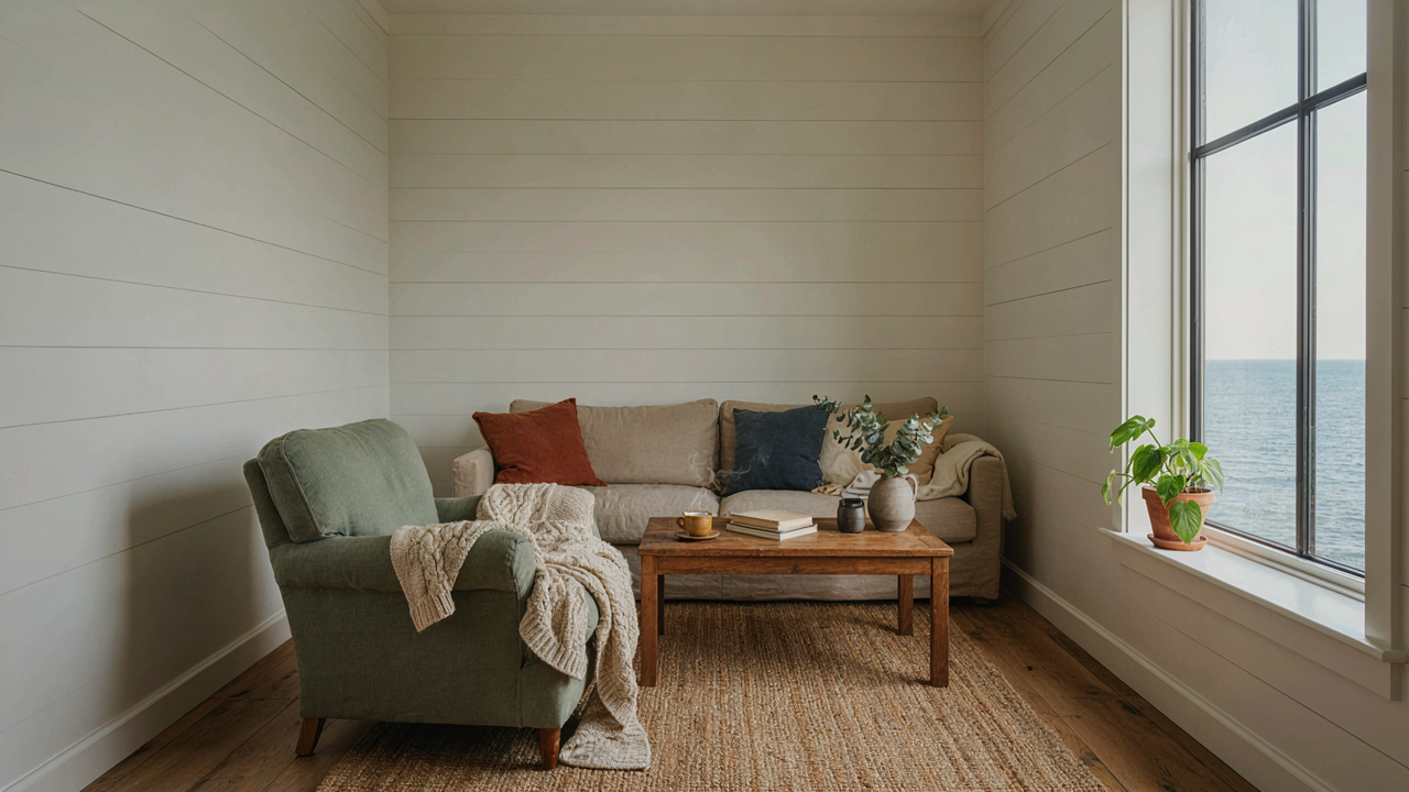
The Shiplap Delusion: Why “Cozy” Is Code For “Uninspired”
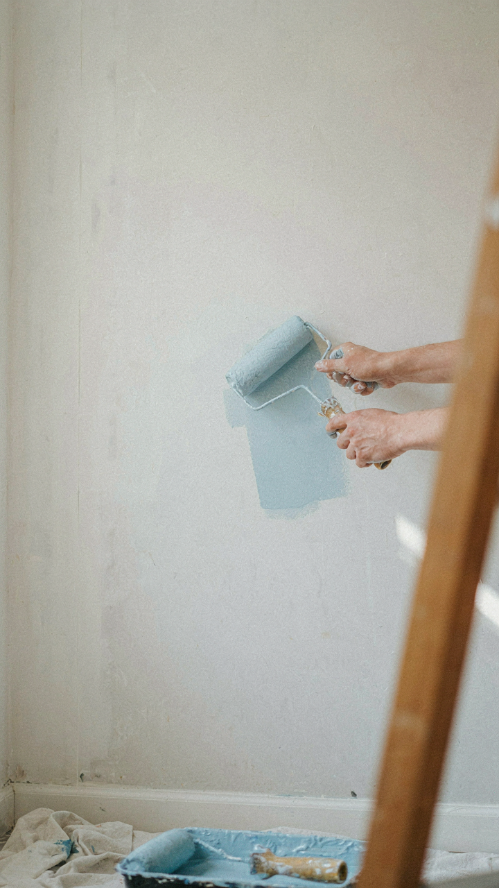
What Shiplap Actually Does To A Room
You want people to think your home is intentional. That’s the real reason you’re considering shiplap. The mechanism is simple: shiplap reads as “designed” because it interrupts blank drywall. But interruption alone isn’t design. Shiplap boards are horizontal planks with rabbeted edges that overlap slightly, creating shadow lines. Those lines break visual monotony. That’s it. No magic, no atmosphere generation. The boards themselves are structurally irrelevant indoors and became fashionable only when HGTV needed visual texture for camera angles. Rooms with shiplap feel “finished” because variation registers as effort, not because the material carries inherent coziness.
The problem compounds when you treat shiplap as a substitute for actual spatial decisions. Paint color, light quality, furniture scale, and wall proportions determine whether a room feels welcoming or claustrophobic. Shiplap handles none of that. Installing it on every surface is like adding seasoning to hide that you didn’t cook the meat. Coastal design especially suffers from this laziness. Shiplap became coastal shorthand because weathered wood exists on actual boats and beach houses, but correlation isn’t causation. A room with poor natural light and cramped dimensions will feel cramped and dark whether the walls are shiplap or marble.
The Real Coastal Principle Hiding Under Trend Noise
Coastal design succeeds through material honesty, not material abundance. The principle borrows from systems thinking: constraints force clarity. A genuine coastal room acknowledges its climate and light conditions, then works within them. Shiplap in high-humidity coastal zones faces real problems. Salt air corrodes fasteners, moisture swells boards unevenly, and paint peels faster. Most cottage shiplap installations ignore this entirely. Homeowners buy pre-finished shiplap, install it over drywall with standard fasteners, then watch it cup and gap within seasons. That’s not design. That’s buying an aesthetic without the engineering to support it.
Authentic coastal interiors use shiplap because it tolerates moisture and ages visibly in ways that look intentional. Real fish shacks and working boathouses use overlapped wooden planking specifically to shed water. You can paint over that function, but you can’t delete it. The design decision comes first: what does this room actually need to withstand? Then you choose materials that serve that need. If you live inland in stable humidity and picked shiplap purely for Instagram appeal, you’re manufacturing false constraint. Install it if the answer to “why” is structural or climatic. Otherwise, you’re not designing a coastal room. You’re designing a room that looks like other rooms people saw online.
Shiplap As Narrative: Engineering Visual Weight
How Horizontal Lines Reshape A Room
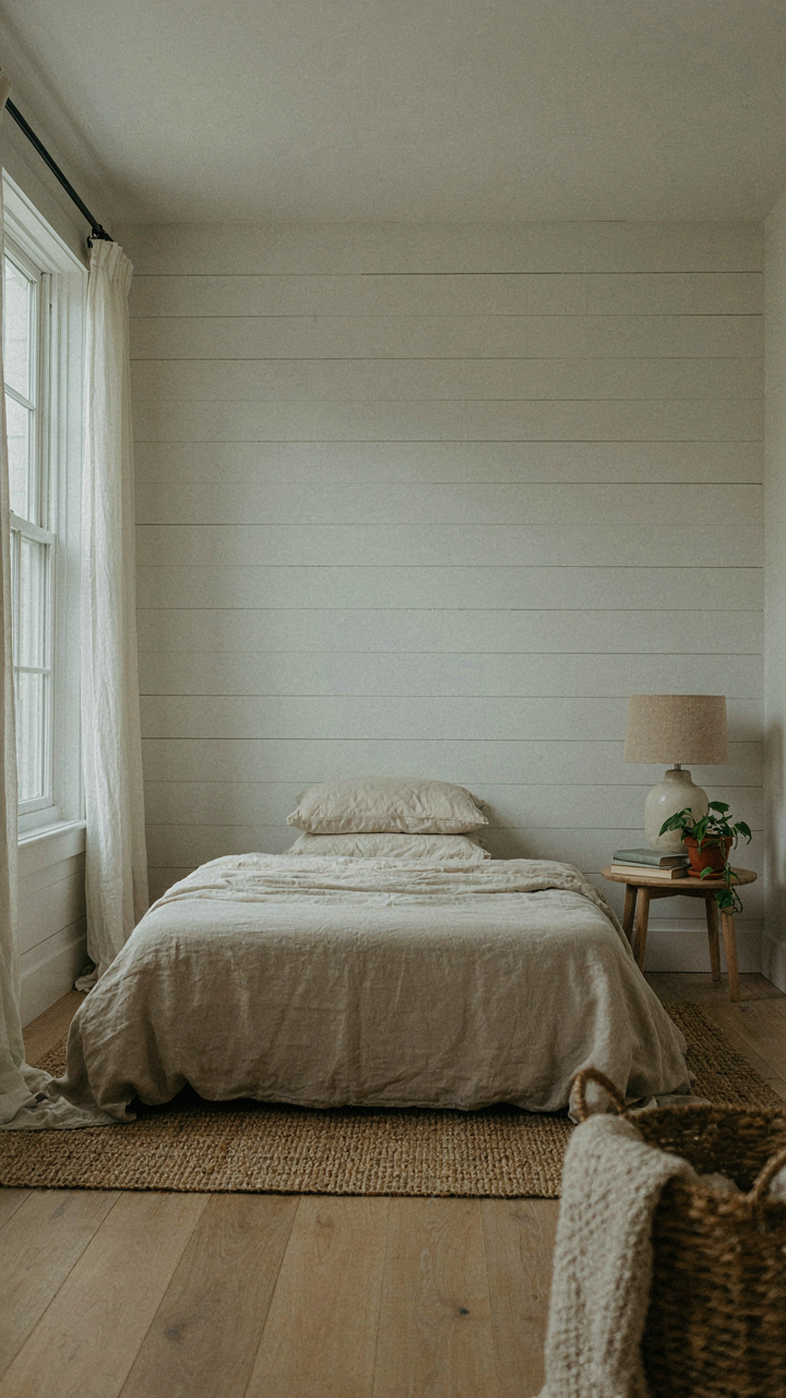
You want horizontal shiplap because it makes you look like you understand design without actually studying it. Here’s what’s actually happening: horizontal orientation uses the principle of visual weight distribution from architecture. The eye travels left to right along each board, and that lateral movement stretches perceived space. A ten-by-ten room gains an illusion of width when shiplap runs horizontal because the boards interrupt vertical plane scanning. The effect compounds when you paint boards in consistent color—no contrast means the eye doesn’t stop at individual planks, it follows the line instead.

Horizontal shiplap also creates flow. Literally. The continuous horizontal gesture pulls attention across the room rather than up or down, which calms the spatial experience. This matters in cottages because coastal and cozy rooms need psychological ease, not drama. When you install horizontal shiplap at waist height or full wall, you anchor the room horizontally. The visual weight settles. Your eye doesn’t jump. Install horizontal shiplap from the baseboard to at least seventy-two inches high for maximum expansion effect without making the ceiling feel lower.
When Vertical Shiplap Demands Attention
Vertical shiplap is not the neutral choice—conventional design advice gets this wrong. Vertical orientation contradicts the comfort logic of horizontal boards. It activates the room instead of settling it. Using terminology from spatial psychology, vertical shiplap creates “visual ascension,” meaning your eye moves up the wall and elongates the perceived ceiling height. Cottage spaces rarely need this. Vertical shiplap works only when you want formality or focus, and most cottages reject both.
When you do run vertical shiplap, the decision should be tactical. Use it on a single accent wall to draw focus toward a fireplace, window, or entryway. Never frame the entire room vertically—that creates visual tension and erases the cozy effect. The narrow space between vertical boards also catches light differently than horizontal boards, adding texture that reads as busier. In small rooms, busier means cramped. Run vertical shiplap only in spaces above eight feet ceiling height, and only when you’re deliberately selecting a focal wall over ambient warmth.
The Subtlety Protocol: When Less Shiplap Is More
Where You Place It Matters More Than How Much
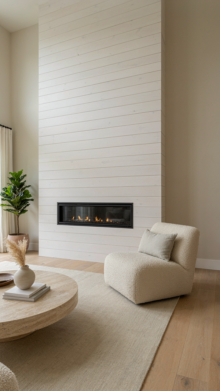
You want shiplap everywhere because you’re afraid a room won’t read as “cottage” without proof. That’s the real problem. The mechanism is contrast. Shiplap only signals cottage style when it competes visually with other materials in the room. Use saturation economics here: scarcity increases perceived value. A single accent wall of shiplap against drywall reads intentional. Shiplap floor-to-ceiling on every surface becomes wallpaper, and wallpaper reads dated or theme-park forced.

Strategic placement means choosing walls that anchor the room’s focal point. In a bedroom, this is the wall behind the bed. In a living room, it’s the wall opposite where people sit and face when they enter. The fireplace wall works if the fireplace is the natural eye magnet already. Apply shiplap to the wall your eyes naturally rest on, not the walls you forgot about until you were halfway through the project. This compounds the visual impact without requiring more material or labor.
Saturation Kills The Signal
The common advice is “use shiplap in moderation.” That’s lazy. What actually kills the effect is redundancy without contrast. Three shiplap walls in a four-wall bedroom don’t read as cozy cottage. They read as inconsistent. Your brain registers the pattern and stops noticing it. Shiplap loses power when there’s nothing to contrast against. A room needs visual resting points, which means walls that recede and let the shiplapped surface dominate.
Limit shiplap installation to one wall per room, or two if the room is large and those walls are perpendicular and frame a corner functional space like a reading nook. The wood grain, shadow lines, and horizontal boards demand visual real estate. Give them one clear stage. Everything else in the room becomes the supporting actor that makes shiplap the lead. This is how you build rooms that feel intentional instead of overcorrected.
Beyond White Shiplap: The Unseen Power Of Pigment
How Paint Changes The Boards, Not Erases Them
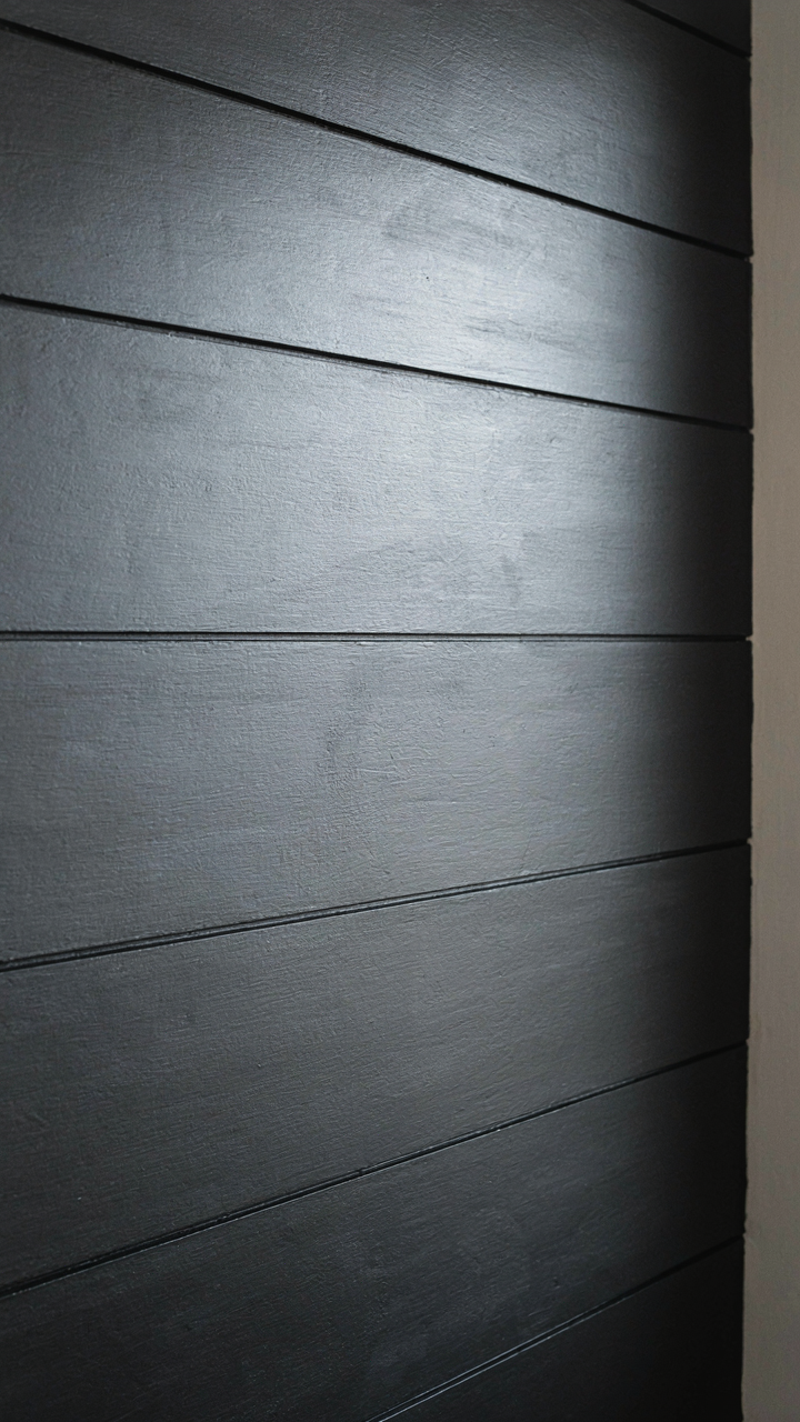
You want to paint shiplap because you think white is boring, but you’re really asking whether you can make an expensive material look intentional instead of default. The mechanism is simple: paint sits in the grooves between boards and on the face, but the shadow lines remain. The groove depth stays constant. Light still catches the edges. What changes is contrast. Dark paint deepens the shadow effect. Light paint flattens it. This isn’t obliteration—it’s manipulation of how shadow reads against the painted surface. The board profile stays intact regardless of color choice.

Paint thickness matters more than most people admit. Two coats of quality paint obscure nothing about shiplap structure because shiplap boards are typically three-quarters of an inch thick with grooves cut one-quarter to three-eighths inch deep. Those dimensions don’t disappear under paint. What actually happens is the eye reads the groove differently depending on value contrast. Matte finishes emphasize texture. Semi-gloss finishes flatten it slightly by reflecting light off the grooves themselves. The board profile remains your primary design element. Paint is the variable you’re controlling, not the boards themselves.
Color Creates Emotional Friction In Enclosed Spaces
Color psychology applies here like acoustic design applies to a room—the principle predicts behavior, and the outcome depends on environment size and containment. A small cottage bedroom painted sage green hits differently than the same color in a warehouse loft. Smaller spaces amplify color intensity. The shiplap boards become the container holding that color, not the escape route from it. Warm tones like cream, terracotta, or soft gray move walls closer perceptually. Cool tones like blue-gray or pale blue push them back. This matters in cottage spaces because most cottage rooms are undersized by modern standards.
The practical step: paint a two-by-three-foot test section on shiplap in your actual room, observe it at three different times of day, then decide. Artificial light flattens warm colors and mutes cool ones. Morning light has different color temperature than evening light. Your eye will anchor to whichever color dominates your view longest. In cottage rooms with shiplap, the walls occupy more visual real estate than in open-concept spaces, so your color choice compounds faster. Test under the lighting conditions you’ll actually live in before committing to full coverage.
The Biomimicry Of Texture: Cedar Shingle Walls And Shiplap
Why Your Brain Trusts Repetition
You want cottage shiplap walls because they signal safety to your nervous system, and you’re willing to pay for that feeling. Biomimicry teaches us that organisms evolve patterns that communicate survival. The overlapping rhythm of shiplap—each board sitting slightly proud of the one below it—mimics the scale pattern found in fish skin, bird feathers, and tree bark. Your eye reads this as natural, therefore trustworthy. The mechanism isn’t aesthetic preference. It’s pattern recognition firing millions of years old.

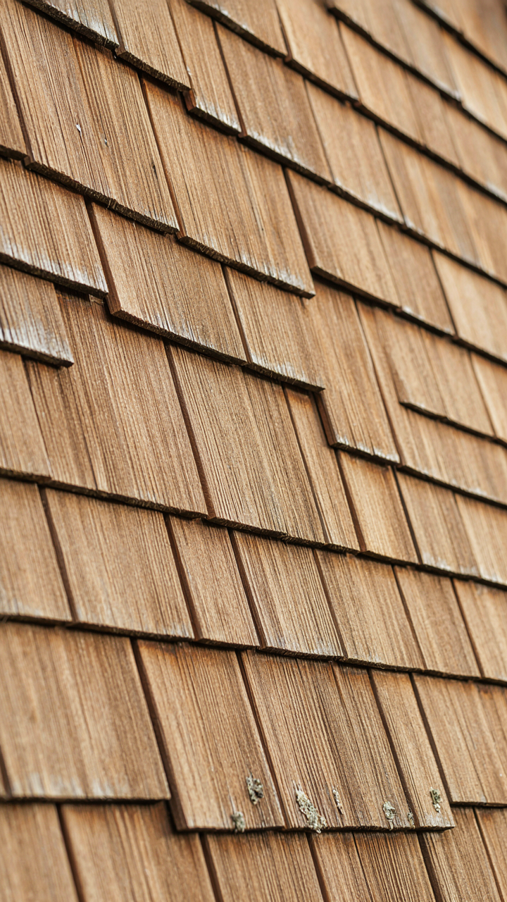
Cedar shingle walls use the same principle at a larger scale. The staggered, weathered surface creates visual rhythm without monotony. Coastal homes adopted this because cedar resists salt air better than pine, and the visible grain patterns add information density to the wall. Your brain processes complexity as authenticity. Blank drywall reads as artificial because it contains no pattern. Shiplap gives you just enough visual data to feel grounded without demanding active attention.
Touch Completes What Vision Started
The texture of shiplap isn’t decoration. It’s functional sensory feedback that anchors you to a room. Every surface you can see, you expect to feel—and shiplap delivers on that contract. The shadow line between each board creates a slight ridge. Your fingertips register this discontinuity. That tactile confirmation of what your eyes saw closes a loop in your proprioception. Rooms without this feedback feel sterile because your sensory systems detect the lie.
Cedar shingle walls deepen this effect through material variation. Authentic cedar develops soft grain patterns and weathering that invite touch. The wood grain becomes a topographic map your hand reads unconsciously. When designing cottage spaces, the goal isn’t to make walls pretty. The goal is to give your body consistent, accurate sensory data so your nervous system stops scanning for threats. Install shiplap at arm’s height where hands naturally rest. This placement multiplies the sensory payoff.
Shiplap’s Structural Illusion: Floor To Ceiling Dynamics
When Walls Disappear Into Height
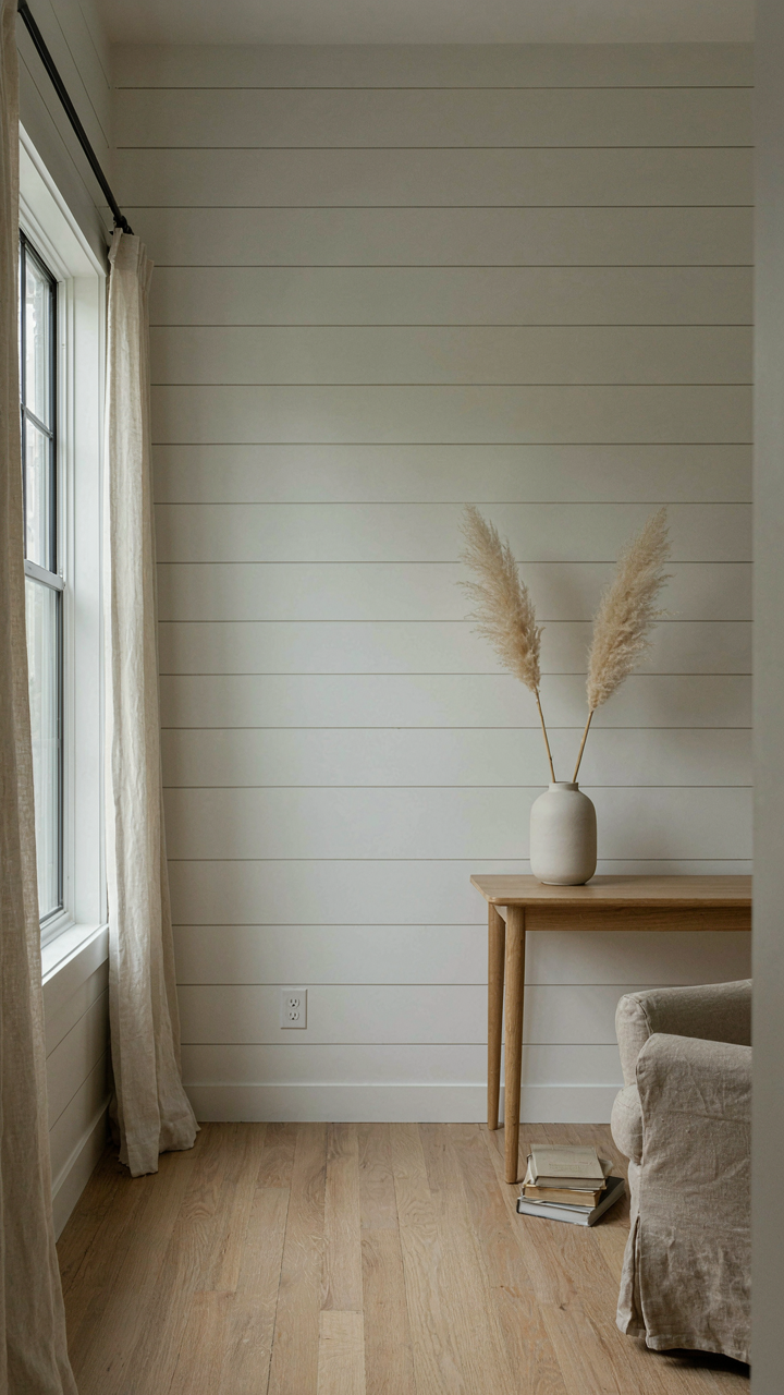
You want floor-to-ceiling shiplap because you think it makes rooms feel bigger. That’s half true, but the real mechanism is borrowed from visual perception: continuity breaks scale. When your eye tracks unbroken horizontal lines from baseboards to crown molding, it doesn’t count the wall as a barrier anymore. It becomes a surface your brain processes as one plane, not a series of separate elements competing for attention.

Shiplap’s overlap creates a rhythm. That rhythm only works when it’s consistent and uninterrupted. Stop the shiplap halfway up a wall and you’ve just installed a visual stop sign. The eye lands, hesitates, recalculates the room’s proportions. Full-height shiplap forces the eye to move vertically instead, which is the neurological equivalent of elongating the space without adding square footage.
Anchors That Hold Or Break The Room
The mistake everyone makes is thinking continuity means sameness. Empty rooms and walls don’t feel cohesive, they feel hollow. You need visual anchors spaced deliberately so the eye has landing zones but the path remains unbroken.
A fireplace surround in shiplap creates a vertical anchor. A window frame in shiplap does the same. Built-in shelving interrupts the continuity strategically, giving the space structure without fragmenting it into separate visual zones. The key is that these anchors still align with the shiplap’s horizontal lines. If your shelves sit askew to the boards’ rhythm, you’ve broken the spell. Install anchors so their edges align with the shiplap’s natural reveal lines or you’ll fight against the geometry you paid for.
The Unspoken Language Of Shiplap Gaps
Shadow Lines Define Depth And Precision
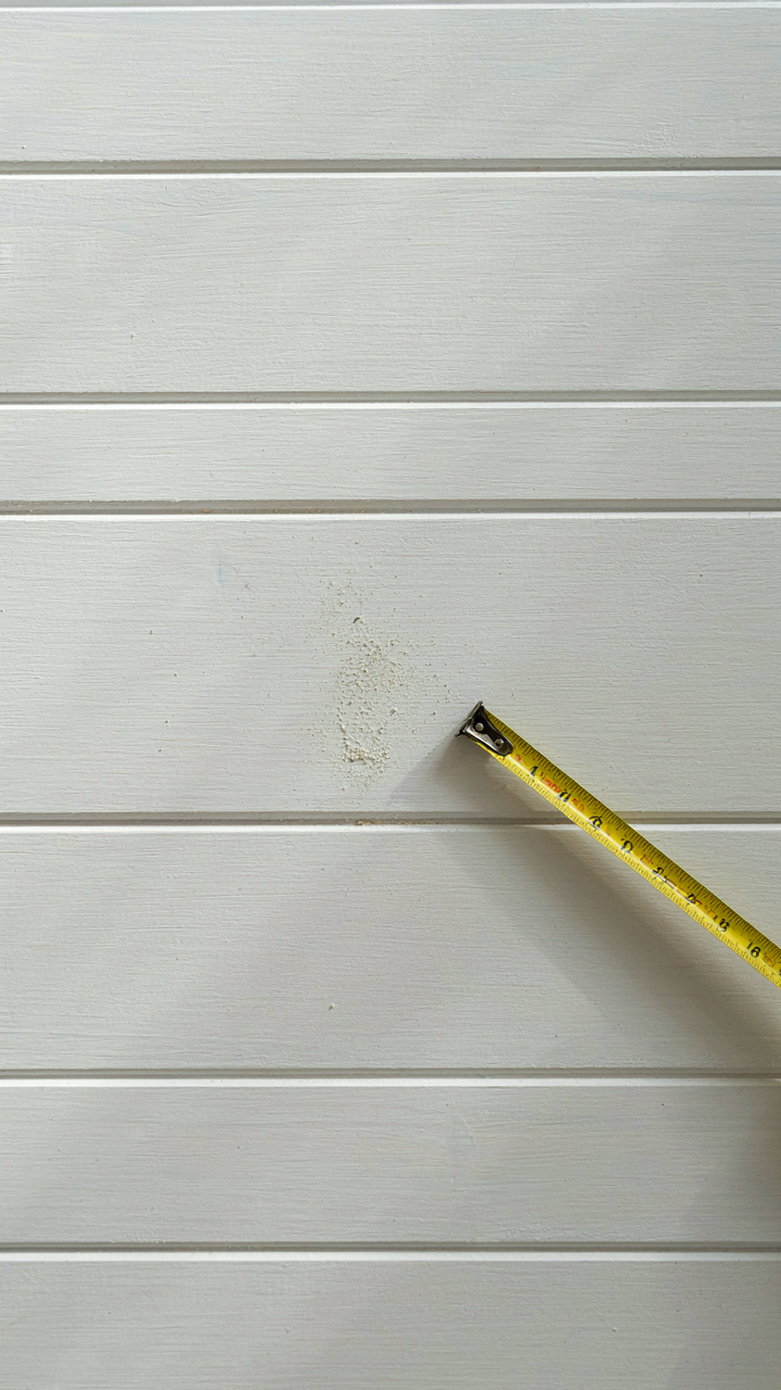
You care about this because inconsistent gaps make a room look cheap, and cheap reads as careless. The mechanism is simple: shiplap creates shadow lines where boards overlap, and those shadows only register as intentional when the gaps stay uniform. Architects call this “visual rhythm”—the eye tracks repetition and detects deviation. In shiplap, the gap width controls shadow depth. A 1/8-inch gap throws minimal shadow. A 1/4-inch gap deepens it. Mix them randomly and the wall loses its visual anchor.

The gap itself isn’t decorative filler. It’s structural necessity that became aesthetic language. Wood moves with humidity. Shiplap boards expand and contract. Without gaps, boards buckle or split. Early builders knew this. Modern installers often forget it’s the constraint that creates the look, not the other way around. Specify your gap width at the start and hold it through every board, or stop pretending the walls were installed with intention.
Consistency Reveals Who Built It
Consistent gaps are the fastest tell of actual craftsmanship versus rushed work. Installers who rush treat gaps as whatever emerges naturally. Installers who care measure and shim. The gap consistency matters because it’s nearly invisible labor—buyers see the result but not the decision behind it. A wall installed with 3/16-inch gaps throughout signals someone who planned the work. Random gaps signal someone who nailed and moved on.
This isn’t about perfectionism. It’s about the math. If you install 200 linear feet of shiplap and allow gaps to drift by 1/16-inch per board, by the end of the wall your visual rhythm collapses into noise. Measure gap width every third board. Adjust shims before fastening. Check twice. This takes an extra hour per room. That hour is the entire difference between a wall that holds attention and one that your brain dismisses as background.
Contextual Shiplap: Avoiding Architectural Anomaly

Match Period Details First
You want shiplap to feel intentional, not like a trend you slapped onto a house that doesn’t support it. Here’s the mechanism: shiplap works within specific architectural eras because those eras either used it or built spaces where it belongs structurally. Farmhouses, cottages, and coastal homes predating 1950 often featured board-and-batten or simple shiplap siding. Your interior shiplap needs to acknowledge what era your bones actually occupy.

The common mistake is treating all walls as blank slates. They’re not. A 1920s bungalow has different proportions, ceiling heights, and detail profiles than a 1980s colonial. Shiplap boards sized at 5.5 inches wide look correct on a cottage with 8-foot ceilings. The same boards make an 9.5-foot formal dining room feel cottage-trapped. Match board width to your ceiling height, door frame proportions, and the existing trim profile. This isn’t decoration. This is respecting what the structure already told you.
Visual Weight And Room Purpose
Shiplap in a living room either anchors the space or suffocates it. The principle at work here comes from interior architecture: visual mass must scale with function. A living room expects people to linger, talk, and move through multiple zones. Wall treatment density matters. Paint all four walls cottage shiplap and you’ve created a box, not a room. Paint one accent wall or use shiplap only on a fireplace feature and you’ve created hierarchy.
The actual protocol is simple. Identify what your living room wants people to do first. If it’s conversation near a fireplace, shiplap that wall and one adjacent wall maximum. If it’s a reading nook in a corner, shiplap only that corner and leave the remaining walls neutral. The shiplap stops drawing attention once you’ve completed its job of defining function. Leave at least one full wall open to prevent the room from closing in on itself.
The Maintenance Myth: Preserving Shiplap’s Integrity
What Actually Breaks On Shiplap
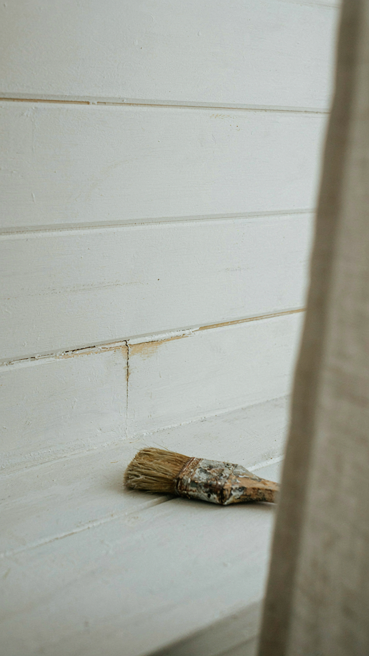
You want shiplap to be maintenance-free because you’re tired of fixing things in your home. It won’t be. Shiplap fails through moisture infiltration at the joints, not the boards themselves. Water moves horizontally along the overlapping edges, then vertically into the wall cavity behind. This is basic capillary action: the overlap creates a pathway, not a barrier.

The overlap joint is shiplap’s structural weakness. Paint and caulk fail first because they can’t flex with seasonal wood movement. Once the seal cracks, moisture reaches the substrate. In coastal rooms, salt air accelerates this degradation. The paint failure point is your early warning system, and most people ignore it until the damage spreads behind the wall.
- Joint sealant failure: Caulk shrinks and cracks within 3-5 years in high-humidity zones. Resealing every 18-24 months prevents water entry into gaps.
- Fastener rust: Exposed nails or screws oxidize in coastal air, leaving stains that bleed through paint. Stainless steel fasteners cost more upfront but eliminate this failure mode entirely.
- Paint checking and peeling: Humidity causes paint to bubble and crack at the lap joints first. This signals moisture is already moving through the wood interface.
- Wood rot in the lap zone: The underside of the overlapping board stays damp longer. Rot starts here and spreads laterally before becoming visible on the face.
- Substrate damage: Drywall or wood backing absorbs moisture, swells, and loses structural integrity. Once substrate fails, the entire wall section needs replacement, not just the shiplap.
The real timeline isn’t five years or ten years. It’s about exposure and sealing quality. Coastal rooms with poor ventilation see failure in 3-4 years. Properly sealed interior shiplap in controlled humidity can last 15-20 years without intervention. The difference is whether you acknowledge that joints are the failure point and treat them accordingly.
Sealing Against The Real Enemy
The common advice is to caulk and paint shiplap like any other wall. That’s incomplete. Shiplap demands a two-phase seal: one at the lap joint itself, one at the paint layer. Skip the first phase and the second becomes cosmetic only.
Start with paintable exterior-grade caulk at every lap joint before priming. Use 100-percent silicone or polyurethane formulations that maintain flexibility. This seals the wood-to-wood interface where capillary action operates. Then apply primer and finish paint with a paint rated for moisture-prone areas, like kitchen or bathroom paint. In coastal rooms, add an extra coat of paint at the joints specifically. The lap joint requires three coats minimum, not two. Follow this protocol: caulk joint, prime entire wall, first finish coat, second coat with extra coverage at joints, third coat at joints only. Inspect and re-caulk every 24 months in high-humidity zones.
Shiplap Beyond Walls: Expanding The Design Vocabulary
Ceilings And Built Ins As Structural Anchors
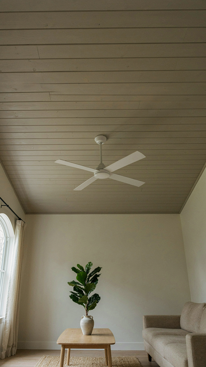
You want permission to use shiplap everywhere because you’re afraid blank surfaces will expose your design choices as incomplete. The real mechanism is borrowed from architecture’s load-bearing principle: not every surface needs to carry visual weight, but the ones that do must anchor the entire room’s rhythm. Shiplap on ceilings works because it creates a horizontal plane that actually stops the eye—it doesn’t float. On built-ins, shiplap functions as visual containment, making shelving feel integrated rather than bolted-on. The spacing between boards becomes the design language, not an afterthought.
Ceiling shiplap demands darker stain or paint than walls because overhead surfaces read differently in natural light. The boards catch shadow at sharper angles, making lighter finishes feel washed out or cheap. Built-in applications work best with consistent board width and tight joints that match your wall shiplap, otherwise you fragment the narrative instead of extending it. The install angle matters here too: horizontal boards on ceilings ground the space, while vertical boards on built-in interiors create intentional visual lift without competing with wall treatments.
The Coherence Framework
Design coherence isn’t about matching everything, it’s about establishing one visual rule and following it consistently. Shiplap becomes that rule when you limit it to specific zones instead of treating it like wallpaper. A coastal cottage uses shiplap on walls plus ceiling in the primary bedroom, then switches to smooth drywall with painted trim in the hall—this creates visual rest and prevents sensory overload. The constraint is what makes the material feel intentional rather than trendy. When every surface wears shiplap, you’ve abandoned design language for decoration.
The integrated narrative emerges from restraint and material repetition in unexpected places. Use shiplap on the ceiling only in one room. Frame a doorway with it. Wrap a window seat in boards while keeping adjacent walls smooth. This strategy forces visitors to notice the material’s actual texture and spacing rather than treating shiplap as ambient background. Each application tells the viewer where you wanted focus—the mechanism is attention redirection through material choice.
Your Design Insecurity Isn’t About Shiplap; It’s About Failing To Engineer Authentic Narrative In Your Space

You don’t need more cottage shiplap walls. You need a reason they exist in your home. Most people slap shiplap everywhere because they saw it on Instagram, not because it solves a real problem in their space. Stop copying aesthetics. Start asking what story your walls tell about who you actually are. Pick one room this week. Install shiplap only where it anchors a specific memory, mood, or function you’ve deliberately chosen. Everything else stays blank. Your walls either whisper your truth or scream somebody else’s.