
The Asymmetry Advantage: Beyond Pretty Turrets In Queen Anne Architecture

Why Imbalance Holds Attention Better Than Balance
You want the house that stops people mid-conversation. That’s the real reason you’re reading this. Queen Anne houses do that because they violate the symmetry rule that every other architectural style obeys. Borrowing from visual perception psychology: the brain treats symmetry as “solved” and stops scanning. Asymmetry forces continued engagement.
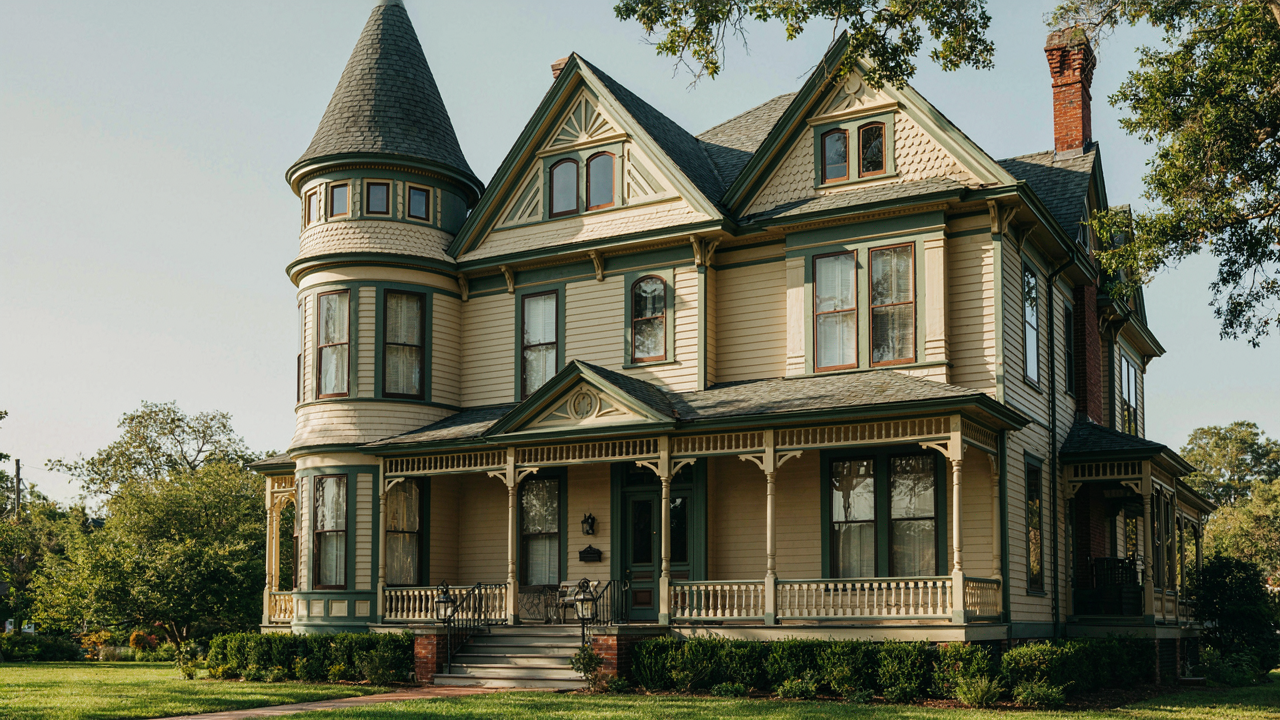
Queen Anne facades break the classical left-right mirror that defined Georgian and Federal homes. A turret sits off-center. Windows vary in size and placement. Rooflines jag instead of slope predictably. This isn’t random chaos masquerading as style. Builders used asymmetry as a structural truth: they added rooms where function demanded them, not where a grid required them. The visual payoff was the unsettling, magnetic effect of a house that refuses to bore you.
The Trap Of Overthinking The Exterior
Most people buy Queen Anne for the turret and then ruin it by symmetrizing everything else. They add matching shutters. They balance the porch columns. They turn a dynamic facade into a neutered version of itself. Stop doing this. The historical record shows Queen Anne homes gained their cultural grip precisely because they abandoned balance as a requirement.
The mechanism is straightforward: you identify which facade elements already break rhythm, then you reinforce that breaking rather than correct it. If your porch columns are uneven, keep them that way. If your window sizes step up the tower differently on each side, that’s the design talking. If trim patterns change across surfaces, that was the original choice. Work with the asymmetry your house inherited, not against it.
Deconstructing The Queen Anne Style House: Function Dictates Form
Interior Flow Drives Exterior Eccentricity
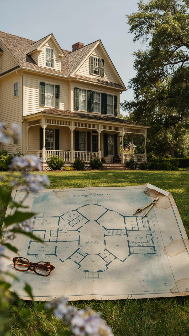
You want the turret and the wraparound porch because you think they signal taste. What you’re actually responding to is the floor plan that made those features necessary. Queen Anne homes weren’t designed backward from aesthetics. Architects built them to solve real problems: separating formal from informal living, creating privacy in dense urban lots, and maximizing light in rooms without electricity.

The exterior irregularity you see isn’t decoration pretending to be structure. It’s structure expressing function through volume. A turret occupies corner footage that a box couldn’t use. The wraparound porch splits service areas from social zones without interior hallways. Bay windows project outward to steal additional square footage from tight lots. Borrow the principle from architecture itself: form follows the movement patterns people actually need, not the symmetry architects prefer.
Where Ornament Actually Ends And Purpose Begins
Everyone says Queen Anne is “ornately decorated.” That’s lazy framing and it misses the point. Trim, brackets, shingles, and spindles weren’t added for flair. They solved material and engineering problems builders faced in the 1880s and 1890s. Wood shingles in varied patterns added structural integrity to exterior walls. Decorative brackets supported deep roof overhangs that protected the wooden siding underneath. Spindle work created railings that didn’t require metal manufacturing at scale.
The real mechanism: ornament emerged where materials needed reinforcement or where builders optimized for what they could produce locally. A bracket isn’t pretty first and structural second. It does load-bearing work while looking intentional. A Queen Anne house strips down to reveal that builders eliminated nothing decorative that didn’t carry weight or serve drainage and protection. Strip away a single ornamental element and you’ve broken something that was keeping the building intact.
The Victorian Homes Exterior “Layering Protocol” For Depth
How Materials Stack To Create Presence
You want your house to signal money and taste without saying a word. That’s the real reason you’re reading this. Queen Anne Victorians solve this through material sequencing, borrowed from military fortification strategy where defenders layer defensive structures at increasing distances from the core. Each material type occupies a specific depth zone on the facade, and the progression matters more than the individual choices.

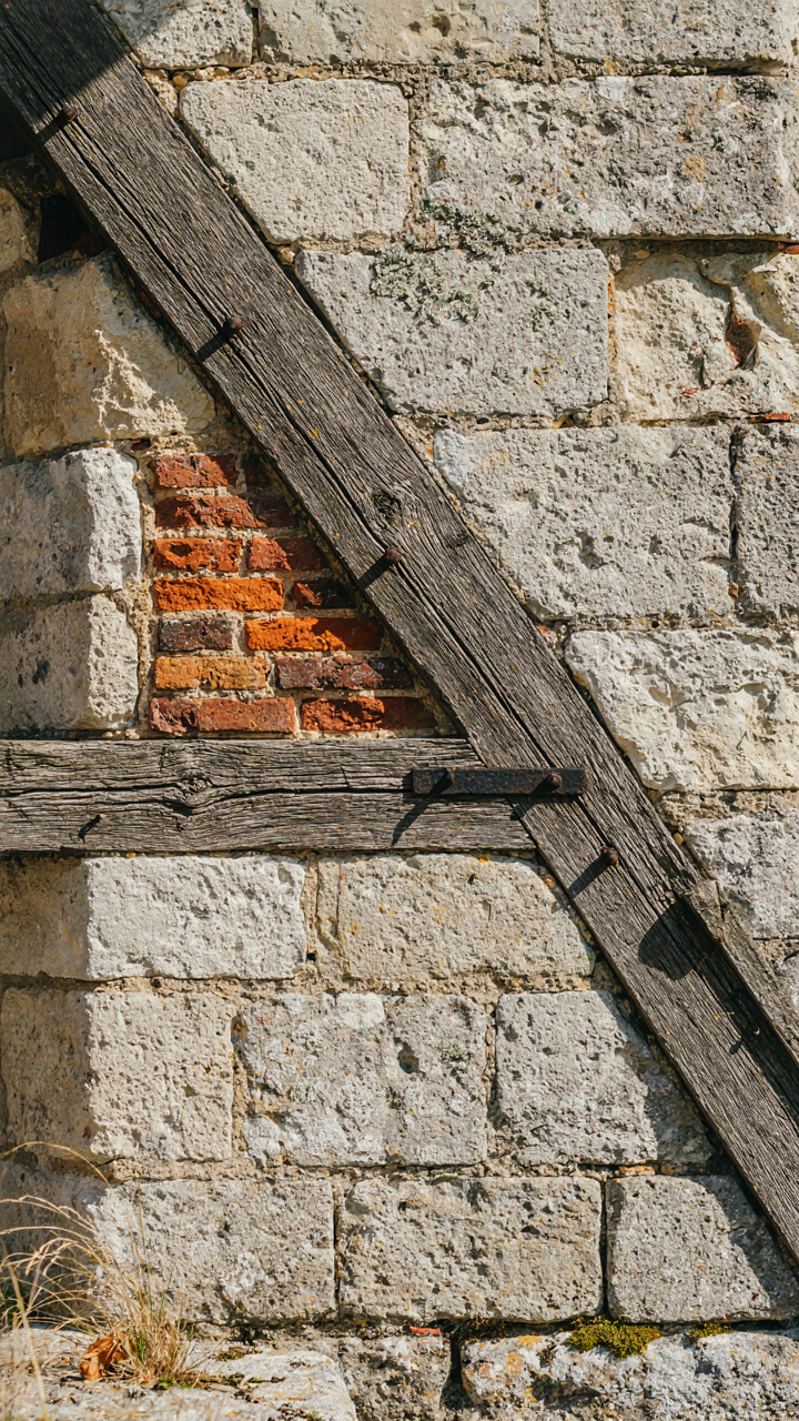
The exterior moves from heavy base to ornamental cap in deliberate stages. Stone or brick forms the foundation and first story, establishing mass and permanence. Shingle or clapboard siding wraps the upper stories, introducing texture variation without sacrificing structural honesty. Trim, brackets, and window casings operate as the final layer, applied last and read first because they catch light and shadow differently than the base materials.
- Rusticated Stone Base: Heavy ashlar or rough-faced stone at ground level creates visual weight and suggests permanence. Signals structural integrity before the eye moves upward to lighter materials.
- Brick Mid-Story: Solid masonry in the primary living zones establishes the home’s bulk and anchors the design. Color variation within bricks adds texture without competing with trim.
- Varied Shingles Upper Facade: Fish-scale, straight-cut, or patterned shingles on upper stories introduce rhythm and visual interest. The texture catches light to emphasize the facade’s complexity.
- Applied Millwork Details: Painted wood trim, corner boards, and window surrounds sit proud of the wall plane. These cast shadows and create the apparent intricacy that defines the style.
- Contrasting Paint Palette: Multiple paint colors isolate materials from each other, making each layer readable as distinct. Typically base materials stay darker while trim stays lighter to advance visually.
The protocol prevents amateurish flatness. Without this sequencing, you end up with a plain box covered in decoration. Queen Anne exteriors work because the materials graduate in visual weight from foundation to roofline, and each transition marks a deliberate boundary that the eye reads as intentional complexity.
Depth Through Contrast And Articulation
The common mistake is assuming visual complexity comes from adding more details everywhere. Wrong. The mechanism is selective articulation, which means you interrupt flat planes at specific intervals, not at random. A blank wall reads as absence regardless of its finish. You need recessed elements, projected bays, and shadow lines positioned to create measurable depth, not perceived busyness.
Queen Anne homes use projecting bays and turrets as the primary depth strategy because these elements cast actual shadows that change throughout the day. A two-story bay window throws a shadow line that reads from the street as genuine architectural projection, not appliqued decoration. Wraparound porches serve the same function, creating a forecourt that separates the occupied space from the public street. These aren’t cosmetic choices. They restructure how light and shadow move across the facade throughout daylight hours, continuously reinforcing visual complexity without increasing material cost significantly.
The secondary move involves vertical and horizontal lines that break up wall plane monotony without adding structural depth. Corner boards, pilaster strips, and belt courses interrupt the facade’s horizontal reading and establish a grid that organizes the composition. Grouped windows with mullion patterns read as denser than single windows of equal area because the visual divisions create multiple focal points rather than one unified opening. When you establish this articulation vocabulary early, every subsequent detail works within the established system, preventing clutter and maintaining legibility at both near and far viewing distances.

Queen Anne Victorian House: Master The Trim, Not Just Apply It
Trim As Load Bearing Visual Architecture
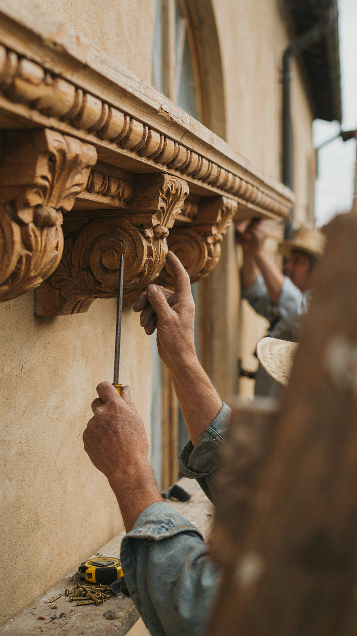
You want trim because you think it signals wealth and taste. The real mechanism is structural emphasis: Queen Anne trim doesn’t decorate surfaces—it anchors the eye to the load paths of the house itself. In architectural terms, trim functions like load distribution in engineering. It breaks up large wall planes into smaller visual units, making the structure read as intentional rather than blank. The Victorians understood this. They placed heavier profiles at corners, around openings, and along horizontal breaks where the eye naturally stops. Random trim placement reads as applied decoration. Strategic placement reads as part of the skeleton.
Queen Anne trim hierarchy mirrors the house’s actual framing. Thick, ornamental cornices sit at the roofline where the structure transitions from wall to roof. Window casings grow more elaborate on primary facades and simpler on service areas. This wasn’t aesthetic choice—it communicated function and importance to anyone looking at the house. The trim guided the viewer through the building’s logic. When you reverse-engineer an original Queen Anne house, you see trim concentrating where structural logic demands emphasis. That’s the protocol: identify the house’s visual frame first, then place trim to reinforce it, not contradict it.
Profile Selection That Reads From The Street
Most people select trim by picking the fanciest profile at the millwork supplier and hoping it works. That approach fails because Victorian trim had specific purposes based on scale and location. A profile that works on a 14-foot-wide facade reads as flimsy on a 30-foot expanse. The rule most guides miss: profile depth and complexity scale with distance from the viewer. Closer details demand finer work; distant profiles need bolder geometry to register. Queen Anne homes used ogee and cavetto profiles on door casings where the eye stops and examines detail closely. They used simple crown molding on string courses thirty feet up where complexity dissolves into shadow anyway.
Historical accuracy requires matching profiles to their original function and placement context. An elaborate bed molding at the cornice line differs from a simple stop molding at an interior door jamb for a reason—the cornice catches light from below and needs shadow depth, while interior stops need clean geometry in even lighting. Salvage original examples from the same period and region when possible; architectural salvage yards often have Queen Anne trim that’s already proven its visual weight in similar light conditions. The move: mock up profiles at actual scale and view them from the street distance where they’ll be seen, not the lumberyard. That’s where the decision gets made.

Casas Victorianas: The Shadow And Light Mechanics Of A Dynamic Facade
How Contrast Makes You Notice
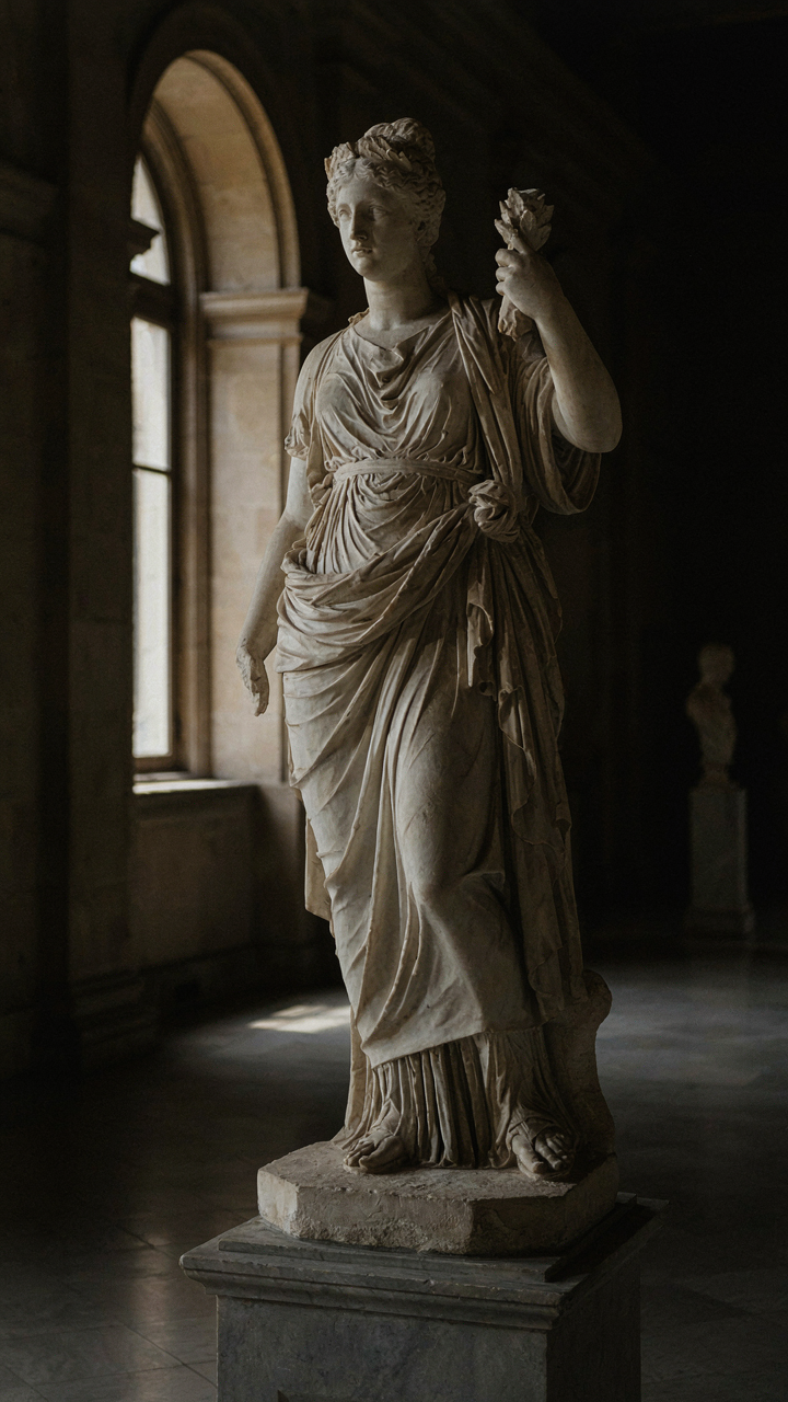
You want people to see your house as intentional and expensive, not as a generic box with windows. The Queen Anne facade borrows chiaroscuro’s core principle: shadow and light don’t just exist—they direct attention and create depth. Paint contrasts between trim and wall surfaces exploit this hard. A dark body with pale ornament pops because your eye tracks the boundary. A pale body with dark shadow lines reads as recessed depth instead of flat surface. The mechanism is visual hierarchy through value separation, not through decoration.
Queen Anne carpenters understood this without naming it. Projecting bays cast their own shadow on the lower wall. Deep window recesses create dark voids that make the surrounding surface appear more solid. Turrets catch light at multiple angles simultaneously, so no single plane reads as flat. The architecture moves because contrast moves your perception through it. This isn’t aesthetic preference—it’s how human vision processes depth on a two-dimensional surface.
Planes That Build Visual Weight
The common mistake is treating Queen Anne as “just add more stuff.” Wrong. The real strategy is layering vertical and horizontal planes so each one casts a shadow on what sits behind it. Projecting window casings, belt courses, and corbels aren’t ornament—they’re depth generators. Each projects maybe 6 to 12 inches. Each one creates a shadow line that reads darker than the wall behind. Stack enough of these, and the facade develops visible dimension instead of reading as a smooth shell.
Recesses work the inverse. A ground-floor loggia or recessed entry reads heavier because shadow fills it. That dark zone adds visual weight to the base. Turrets create multiple recessed walls meeting at angles, so shadow accumulates in those corners. The eye interprets shadow as mass. Combine projections on the upper facade with deep recesses at the base, and the house reads as both ornate and structurally sound. The facade gains presence because light and shadow distribute unevenly across it. Start by mapping where natural light hits your facade at morning, noon, and dusk, then position projections to enhance those shadow patterns.

Queen Anne House: The Hidden Logic Of The Irregular Footprint

Why Angles Beat Rectangles
You want to know how to make a house feel expensive without spending more money. The answer is irregular geometry. Queen Anne architects rejected the rectangular box because a rectangle tells the eye it has seen everything in one glance. An irregular footprint forces the eye to work, creating perceived complexity and therefore perceived value. This isn’t decoration. It’s optical strategy.
The mechanism borrowed from visual perception: contrast breaks monotony. A rectangular wall reads as one unit. An angled wall, a protruding bay, a recessed section, a turret breaking the plane creates multiple focal points. Each plane catches light differently. Each angle generates shadow. The brain interprets this complexity as intentionality, craftsmanship, and cost. Queen Anne builders understood this without needing to name it.
How Disruption Shapes Movement Through Space
The advice about Queen Anne floor plans is usually wrong: people describe them as “organic” or “flowing” or some other vague nonsense. The truth is sharper. Irregular footprints force functional decisions that typical rectangular layouts never demand. A bay window intrudes into what would be empty floor space in a conventional home. A turret creates an awkward room that demands a specific use. Corridors angle rather than run straight. Movement through the house becomes a sequence of reveals instead of a grid you can memorize in ten seconds.
This constraint generates character because constraint always does. The builder cannot simply repeat the same wall-window-wall pattern. Each elevation presents a different problem. Rooms occupy unexpected positions. Windows appear where standard logic says they shouldn’t. The inhabitant experiences the house as a collection of distinct spaces rather than variations on a template. When you walk into a room, you know exactly which room it is because its geometry is unrepeatable.

Victorian Style Homes: Color Theory Beyond “Pretty” Palettes
How Dark Colors Compress Space Visually
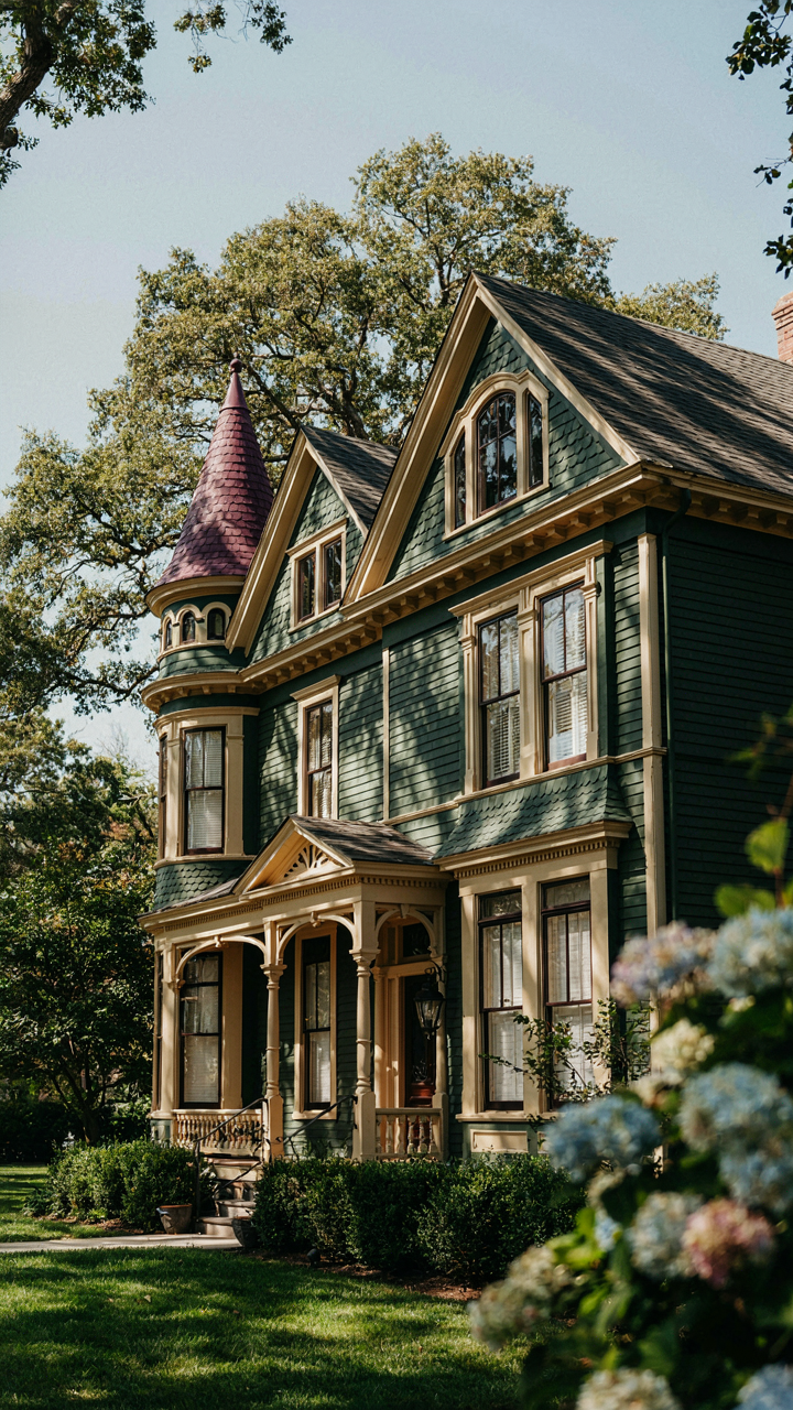
You want your Queen Anne to feel imposing without actually being larger, which is why this matters. Architects borrowed from optical physics: darker hues absorb light rather than reflect it, creating the illusion of recession. A deep forest green or burgundy on exterior walls makes a facade appear closer and denser than pale versions of the same structure. Queen Anne relied on this effect deliberately through shadow and mass perception.
Victorian builders understood that color density changes how far away a surface feels. Apply a charcoal or deep plum to a recessed turret and it visually pulls inward, making the entire form read as more compact and intricate. The opposite works too: cream or butter tones on projecting bay windows push outward. This wasn’t accident. It was calculation built into the specification of every exterior paint batch.
Contrast Patterns That Expose Architectural Bones
The common advice says to use trim colors for “visual interest.” That’s incomplete. Queen Anne’s actual mechanism was using contrast to make structural geometry legible from distance. High-contrast pairs like cream millwork against deep-red walls don’t decorate the house; they reveal the load-bearing frame underneath.
Paint the ornamental brackets, cornices, and window surrounds in a lighter shade than the wall body and suddenly every geometric decision becomes visible. This isn’t decoration layered on top. It’s emphasizing the architecture that already exists. Pick your darkest wall color first, then select trim that sits at least three value steps lighter on the Munsell scale to guarantee the contrast reads at street distance.

The Evolution Of Queen Anne: Why Authenticity Is A Moving Target
How Geography Rewrote The Rules
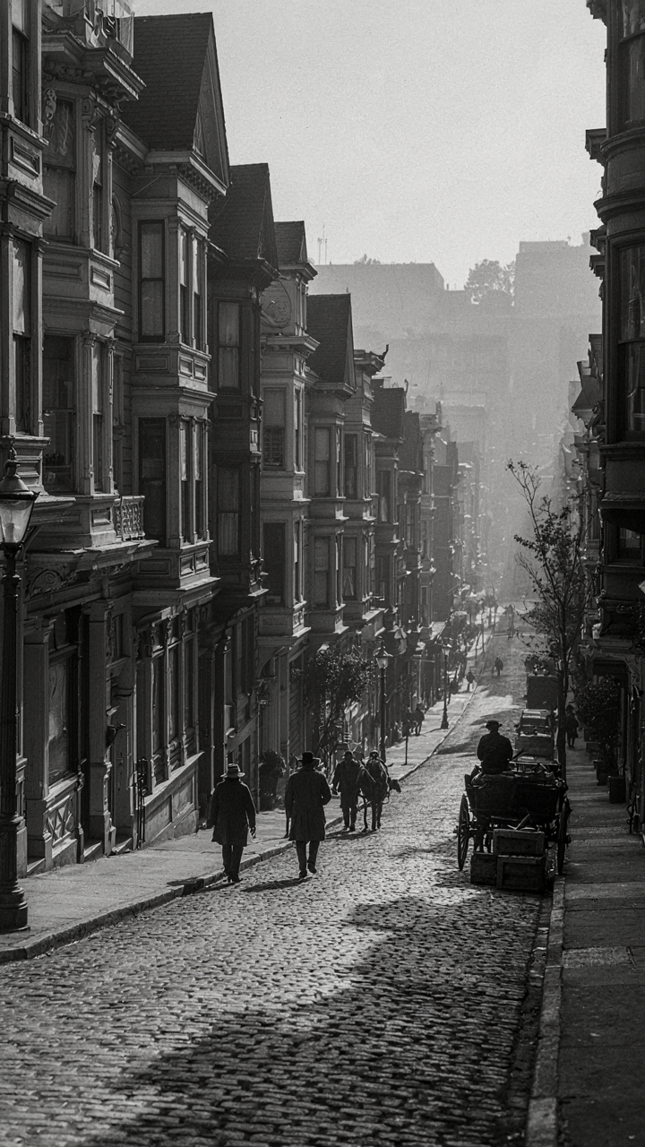
You want to nail “authentic” Queen Anne because you think it exists as one fixed thing. It doesn’t. Borrow from evolutionary biology: Queen Anne Victorian didn’t evolve from a single ancestor but adapted to local environments. San Francisco bay windows served climate and density constraints. Boston’s narrower lots produced vertical emphasis. Philadelphia’s brick stock shaped detail work differently than California’s redwood availability. These weren’t stylistic choices—they were material and geographic necessities.
The East Coast and West Coast expressions diverged enough that calling them identical is lazy history. Eastern examples favored darker brick, tighter ornamentation, steeper roofs for snow load. Western versions went lighter, broader, with deeper overhangs for sun. Neither is “more authentic.” They’re both Queen Anne responding to real constraints. If you’re designing or restoring, geography determines which precedents to follow, not some abstract rulebook.
The Trap Of Museum Interpretations
Every architectural history book shows the same three houses. This kills your ability to see the actual range. Real Queen Anne homes varied wildly because builders worked from local practice, carpenter knowledge, and budget realities—not from studying pattern books in every case. A contractor in rural Wisconsin built differently than one in downtown Philadelphia because his clients, materials, and crew skill were different. Museums curate the exceptional. You see the polished examples and assume that’s the standard.
Stop using “textbook Queen Anne” as your reference. Pull images from tax assessor records, local historic society archives, and vernacular examples in your actual region. The weird, asymmetrical house on the corner that nobody photographs is often more representative than the famous mansion. This shift changes everything about restoration decisions. You stop fighting the building’s actual character and start working with what’s actually there. That’s where real authenticity lives.

Queen Anne House Exterior: The Unseen Engineering Of Grandeur
How Asymmetry Actually Stands Up
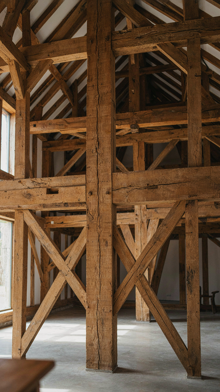
You want the turret and the wraparound porch because they signal wealth and taste. Here’s what nobody tells you: the mechanism that makes Queen Anne exteriors work is load distribution through breaking the box. Architects borrowed from timber framing principles—specifically, the concept of redundant load paths. Instead of one clear structural grid, Queen Anne homes multiply their support points. Wrap-around porches, bay windows, and turrets aren’t decorative additions bolted onto a simple rectangle. They’re integrated structural units that share wall and foundation loads, creating what engineers call a “distributed truss effect” across the facade.
The real complexity hides in the foundation and framing strategy. Queen Anne homes use concentrated pier systems under major load points like turret bases and porch columns, not uniform perimeter footings. Wall cavities thicken at stress concentrations. Bay windows transfer their weight through angled knee braces to the primary frame, not just to the exterior wall below them. This means the ornate exterior you see is actually the structural system made visible. Remove the aesthetic layer and the engineering remains functional. Builders didn’t add decoration then figure out how to support it. They designed support structures and dressed them.
Where Ornament Creates Material Problems Nobody Addresses
The common advice says: ornate details just require more maintenance. That’s incomplete. Ornament in Queen Anne design creates material incompatibility zones that cause rapid failure. Decorative shingles, wraparound trim, and turret cladding force moisture into dead zones where wood, mortar, and sealant meet at opposing angles. These interfaces don’t drain cleanly. Water traps and cycles through freeze-thaw stress in ways flat walls never experience.
Turrets present the worst case. The polygonal or circular plan creates corners that radiate outward at compound angles. Caulking and flashing compound at each seam. Dissimilar materials expand and contract at different rates. A wood shingle on the turret moves differently than the copper or slate roof transition below it. Builders install complex hip-and-valley roof systems that require recutting shingles for each angle change. If you own or renovate a Queen Anne, the exterior isn’t a surface problem. It’s a material orchestration problem. Ignore one junction and you’ve planted a decay vector that will reach the framing inside three seasons.
The Real Obstacle Isn’t The House, It’s Your Timid Adherence To Predictable Symmetry
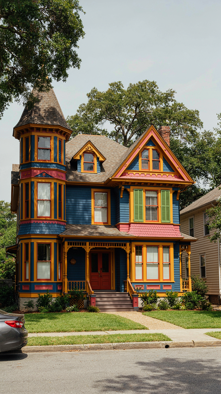
Queen Anne Victorians demand asymmetry. They reward visual tension. Yet most people neutering these homes into beige mediocrity do it because balanced, boring feels safe. Stop optimizing for the approval of people with no taste. Pull one turret forward. Clash your trim colors. Let the house breathe its actual personality. The homes that sell and inspire aren’t the ones playing it safe—they’re the ones that commit to their own weirdness.



