
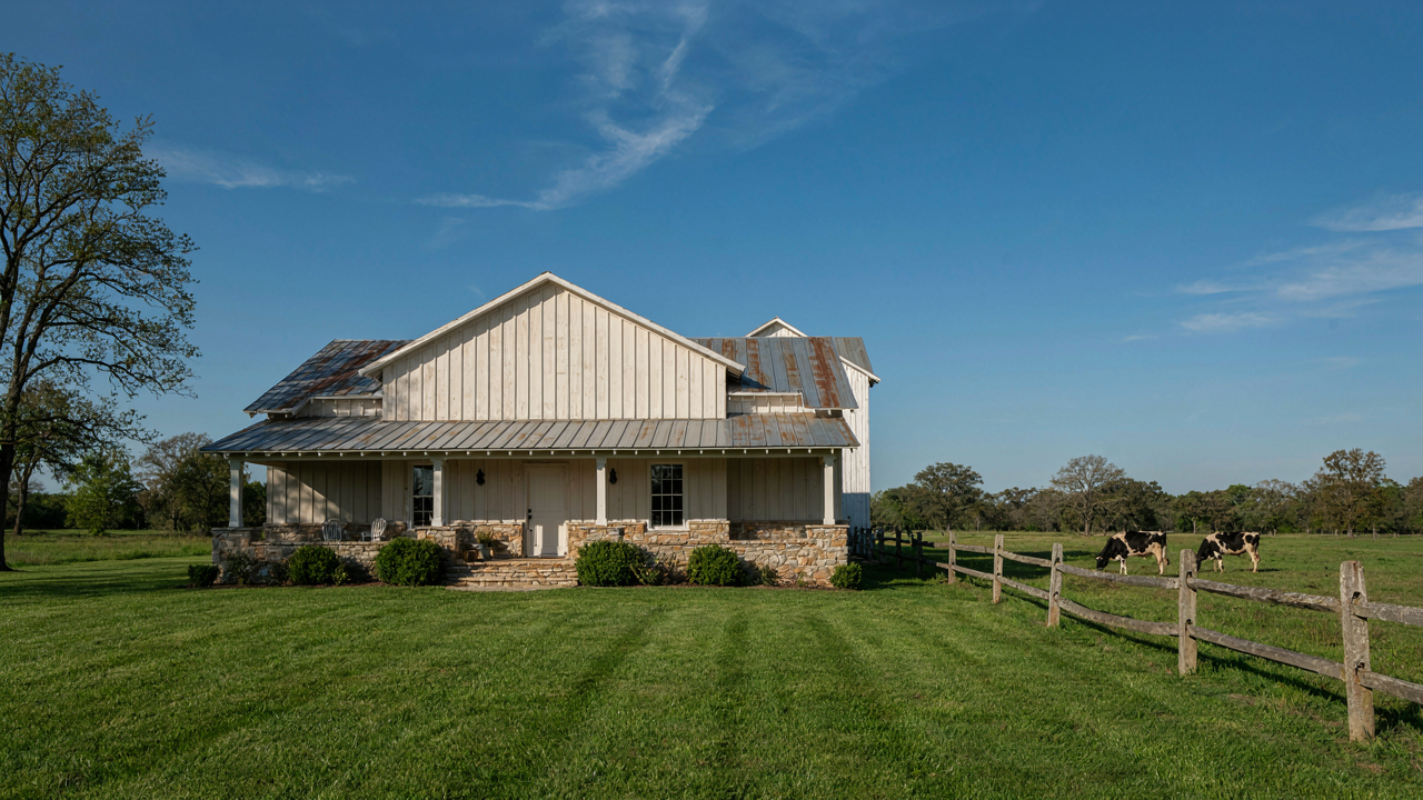
The Ranch Home Blueprint: Unpacking Its Unsung Utility
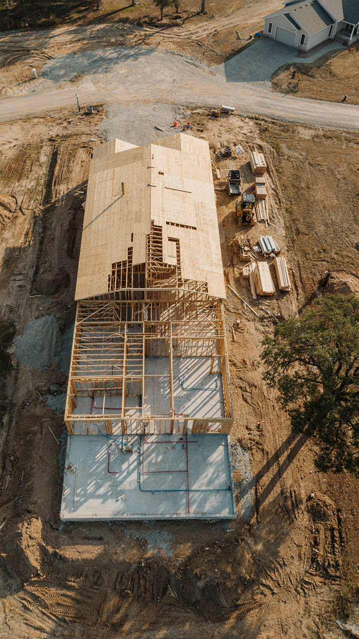
Why Ranch Design Actually Matters Beyond Instagram
You want ranch farmhouse because it signals competence and permanence. But that’s not why it works. The original ranch blueprint emerged in the 1930s American Southwest as a direct response to climate and land economics. Builders stacked all living spaces horizontally to minimize construction cost, reduce heating surface area, and let workers move between rooms without climbing stairs. Form followed function so closely that the aesthetic became almost accidental.
The ranch rejected Victorian verticality and cramped farmhouse stacking because those designs wasted money on climates where they didn’t belong. A single story meant fewer walls per square foot, cheaper roofing, simpler plumbing runs, and faster construction with unskilled labor. Ranches scaled across the postwar boom not because they were pretty, but because they solved a mechanical problem: how to house families affordably in open country where land was cheap and labor was scarce.
How Horizontal Lines Solve Real Problems
Borrowing from physics, a ranch home operates on the principle of load distribution. Low slung lines aren’t decorative. They spread weight across a wider foundation footprint instead of concentrating it vertically, reducing soil settlement and foundation cracking in unstable ground. Wide eaves protect walls from rain and sun damage more effectively than tall structures where weather hits harder at corners and joints.
Ranches kept rooms connected visually across one plane. This reduced hallway length and dead space, cutting material and heating costs. The low profile also meant exterior walls faced fewer temperature swings than vertical structures, so siding lasted longer with less maintenance. A rancher uses passive thermal strategy before active systems become necessary. That horizontal discipline cuts operational expense from the first day you occupy it.
Farmhouse Fallacies: What “Country Warmth” Actually Means
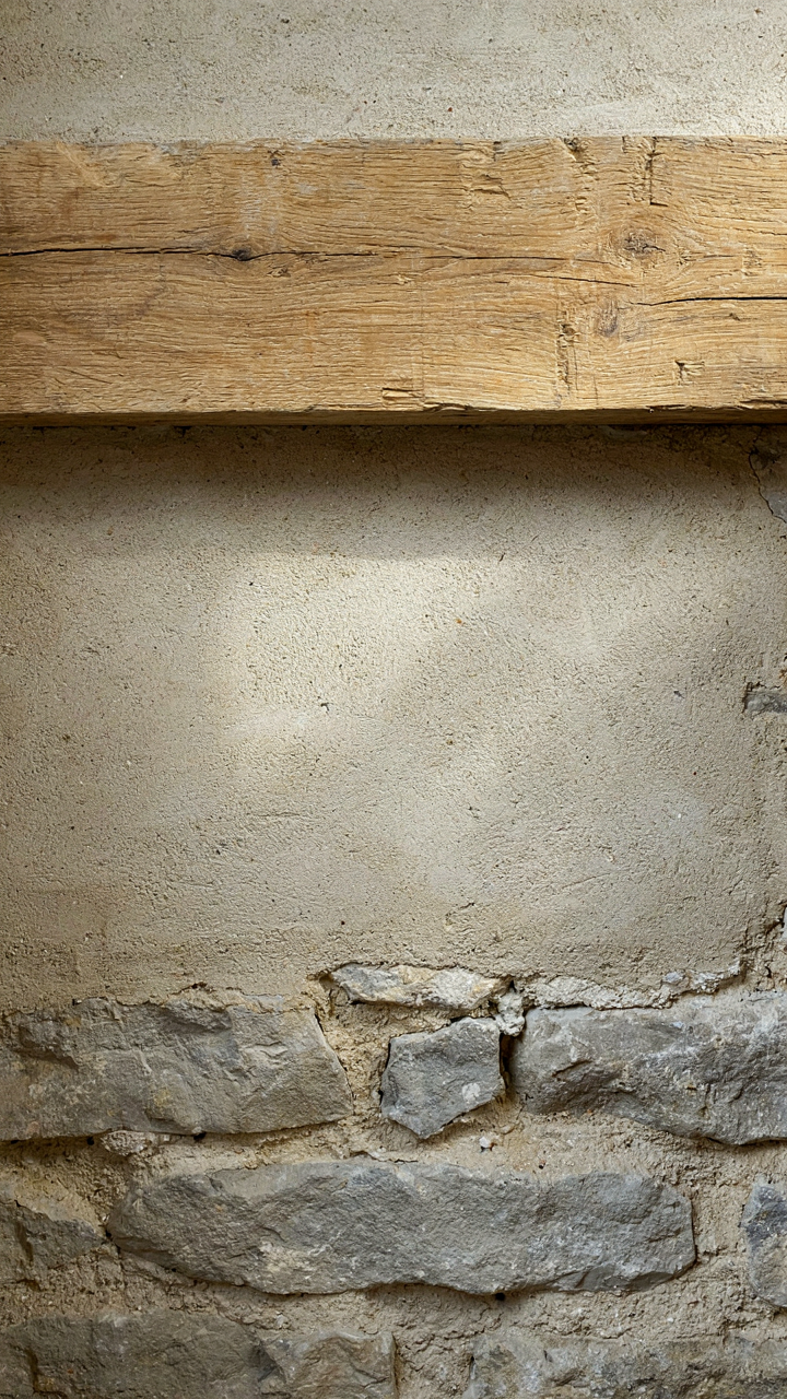
Beyond Shiplap: Authentic Farmhouse Material Palettes
You want people to see your home and know you have taste without trying too hard. The mechanism here is borrowed from semiotics: farmhouse materials work as a sign system, and most people get the signal wrong. Shiplap became the universal farmhouse placeholder because it’s cheap, visible, and photographs well. But authentic ranch farmhouses never relied on one dominant material to communicate anything. They used what was locally available and what performed a job.

Real farmhouse material palettes mix dimensional variety on purpose. Stone foundations stay exposed. Raw wood beams carry real structural load, not decorative pretense. Metal hardware shows age and use. Plaster walls crack naturally. Concrete floors in working areas transition to wood where people gather. The warmth comes from material honesty, not from painting everything cream and calling it vintage. When you layer materials that each have a specific function, the space reads as earned rather than assembled.
Warmth Through Texture, Not Just Tchotchkes
Everyone thinks farmhouse warmth lives in the accessories: vintage signs, mason jars, galvanized metal. This is lazy styling masquerading as design. Actual warmth in a ranch farmhouse emerges from how surfaces feel to move through, not from what you hang on them. A plastered wall has different tactile and visual properties than drywall. Hand-hewn beams catch light differently than smooth lumber. Worn wood flooring absorbs sound and reflects it unevenly, making a space feel inhabited rather than controlled.
Build texture through material selection and finish treatment, then stop adding objects. Wide-plank flooring with variable widths creates visual rhythm that scrolled molding cannot match. Leave mortar joints visible in stone or brick rather than smoothing them flush. Use lime-based finishes that have surface irregularity built in. These decisions establish warmth at the structural level. Once the envelope communicates texture and use, you need almost nothing else to complete the room.
The Modern Farmhouse Ranch: A Study In Strategic Subtraction
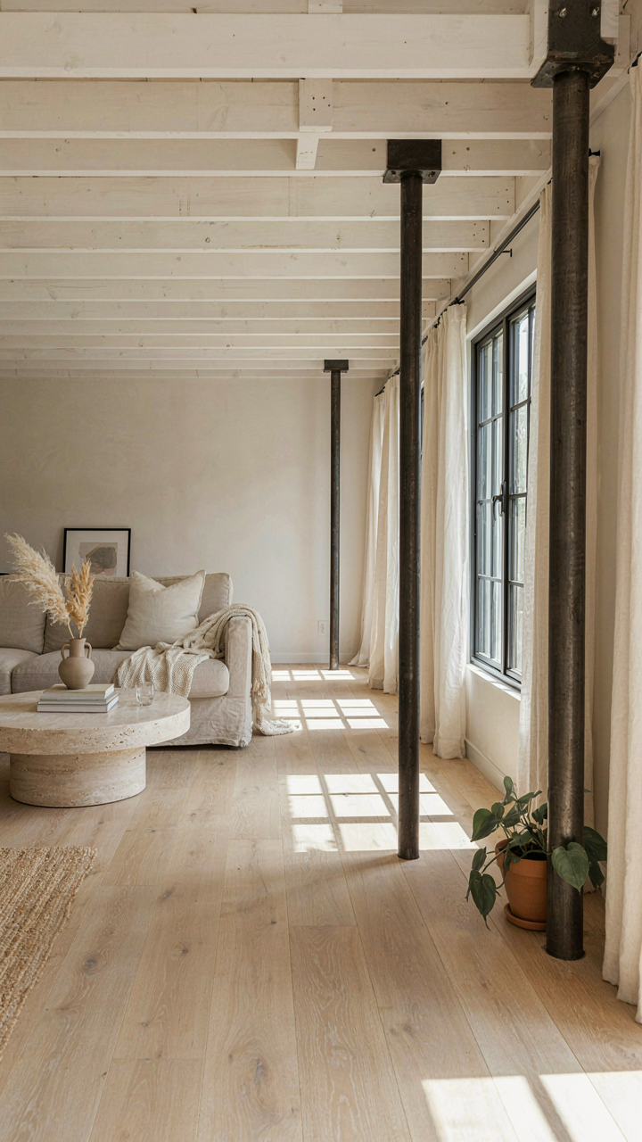
Stripping Back To Structural Honesty
You want people to think your house cost more than it did. That’s the real reason you’re reading this. The mechanism that makes a ranch work is exposure of its bones. Most ranches hide their structure behind layers of trim, siding, and ornamentation. Modern farmhouse ranches do the opposite. They expose beams, leave brick visible, and let the roof line speak. This isn’t minimalism for its own sake. It’s architectural transparency that reads as intentional design rather than budget constraint.

The 1950s ranch buried its structure under aesthetic noise. Wood framing stayed hidden. Brick stayed hidden. Post and beam construction disappeared behind drywall. Modern farmhouse ranches reclaim that structural language and amplify it. Exposed ceiling joists, visible support columns, open rafter tails at eaves. These aren’t decorative choices. They’re the actual architecture performing visibly. The strategy works because viewers can’t distinguish between structural necessity and intentional design when both are present simultaneously.
What Remains When Everything Else Goes
Common advice says minimalist interiors mean empty rooms. That’s incomplete. Removing clutter doesn’t mean removing substance. It means removing decisions that compete with the core architectural statement. In a ranch farmhouse, that core statement is horizontal mass, low sightlines, and material texture. Every interior element either amplifies or fights these qualities.
Start by identifying what your ranch’s actual structure is doing. Are beams running parallel to the front facade? Are roof lines creating strong horizontal bands? Are stone or brick planes creating visual weight? Once identified, remove everything that contradicts those lines. Furniture gets lower and deeper. Color palette narrows. Decor reduces to objects with genuine material presence. The protocol is simple: every item in the room must either support the horizontal narrative or sit outside the primary sightline entirely.
Ranch Farmhouse Exterior: The “Less Is More” Facade
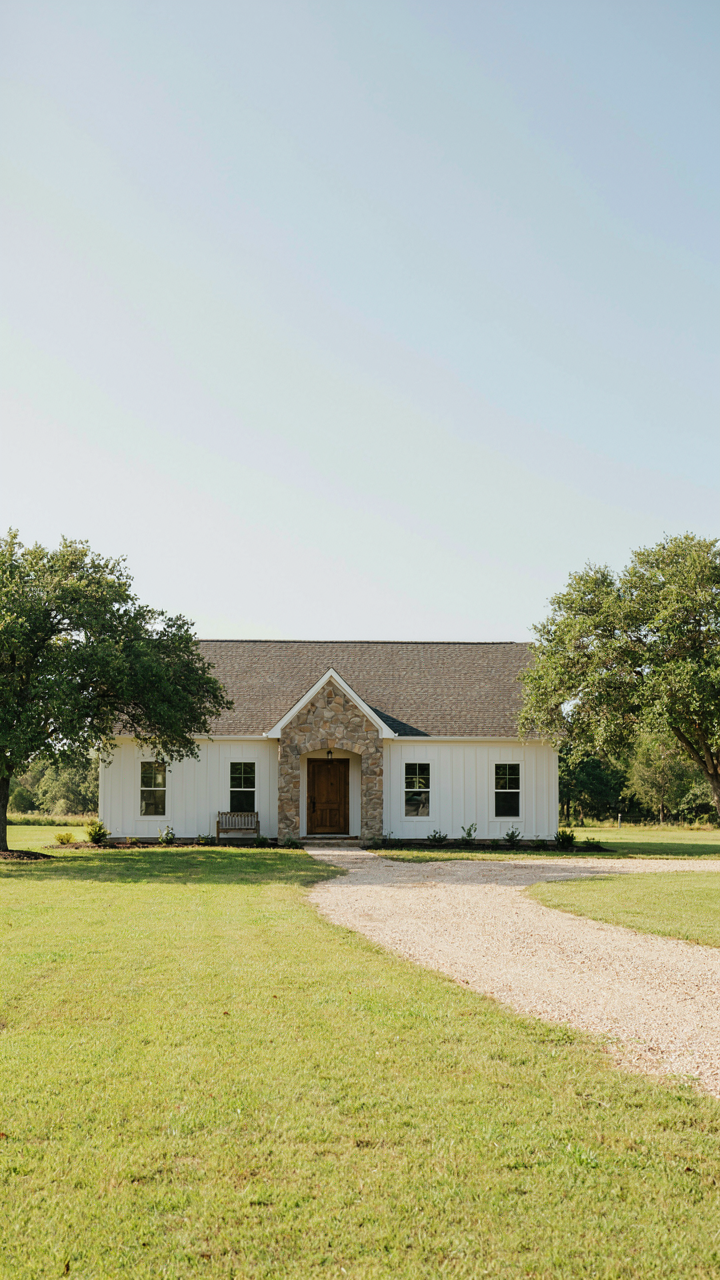
Streamlined Exterior With Farmhouse Materials
You want people to know you have taste without appearing to try. That’s the real mechanism at work here, and it’s why most ranch farmhouse exteriors fail. They pile on details. The actual move is restraint paired with material honesty. A ranch’s low horizontal lines are the skeleton. Farmhouse materials like board and batten siding, natural stone, or metal roofing become the accent, not the costume. This isn’t about minimalism or maximalism. It’s about letting the form do the work.

The exterior should read as one thing from the street, not a collection of competing textures fighting for attention. Use one primary siding material across the majority of the facade, then introduce a secondary material in specific zones: around the foundation, framing the entryway, or defining a covered porch. Weathered metal accents on gutters, downspouts, or trim reinforce the farmhouse identity without cluttering the composition. The goal is clarity. A clean exterior makes the house feel larger, more intentional, and more valuable than it actually is.
Reducing Visual Noise For Cohesion
The common advice says “add character through variety.” This is wrong. Visual noise isn’t character. It’s distraction. Think of an exterior the way signal-to-noise ratio works in engineering: every element either strengthens the message or weakens it. A ranch farmhouse sends one message: honest proportions and durable materials. A random window shape, mismatched trim colors, or conflicting siding patterns muddies that signal and makes the house feel confused instead of confident.
Eliminate visual friction by standardizing your choices across the facade. Use the same window style throughout. Keep trim color consistent. Stick with one roofline rhythm rather than breaking it with arbitrary peaks or valleys. The porch, the garage entry, and the main entry should all operate within the same material language. When you control the variables, the eye moves across the exterior with purpose instead of bouncing around. The house reads as deliberate. Deliberate always looks more expensive.
The “Elegance Of Constraint” Protocol For Ranch Style House Interiors
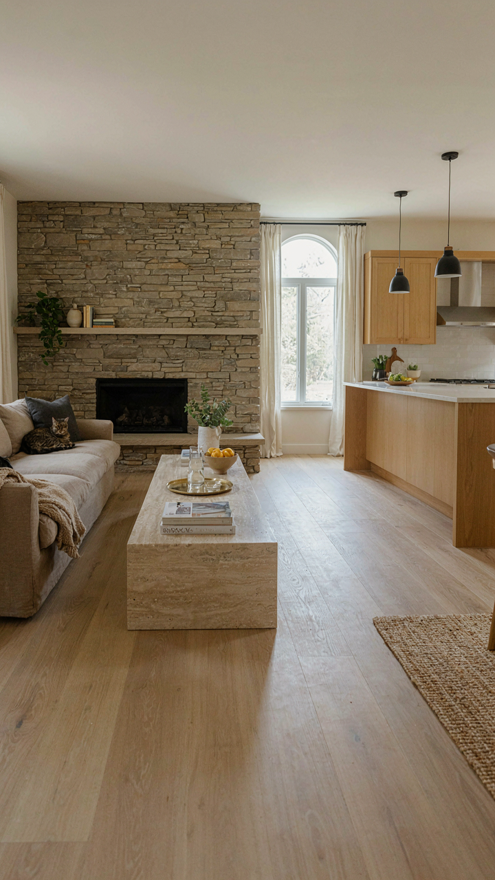
Open Plan Flow Respects Human Movement Patterns
You want permission to break the rules without looking cheap. Here’s what actually matters: ranch homes were built around horizontal sightlines and continuous flow because ranchers needed to move cattle, equipment, and family through space without walls fragmenting labor. That’s the mechanism. The open plan isn’t aesthetic nostalgia—it’s functional geometry.

Modern interiors trash this by over-furnishing. They load rooms with statement pieces, creating visual noise that contradicts the ranch’s core operating principle: sight lines matter. When you can see from kitchen to living room to entry without obstruction, your brain processes the space as larger and more intentional. Add clutter or force separation, and you’ve neutered the format. The protocol is simple: every furniture placement should strengthen, not interrupt, the sightline from the home’s entry through its deepest rooms.
Focal Points Work When They Anchor, Not Dominate
Common advice says “add farmhouse accents everywhere to feel authentic.” That’s how you end up with five competing visual anchors fighting for attention. A focal point only works if the eye stops there voluntarily, not because the designer forced a theme.
In a ranch interior, the fireplace, kitchen island, or large window should dominate one zone completely. Everything else recedes. A stone fireplace wall becomes the focal point in the living area, so your furnishings face it and serve it. A farmhouse table commands the dining space, so accessories stay minimal elsewhere. The mechanism is constraint: one strong anchor per zone prevents visual exhaustion and maintains the low-slung spatial calm that makes ranch farmhouses work. Mark the anchor, then build outward with discipline.
Beyond Texas Ranch Style Homes: Regional Adaptations
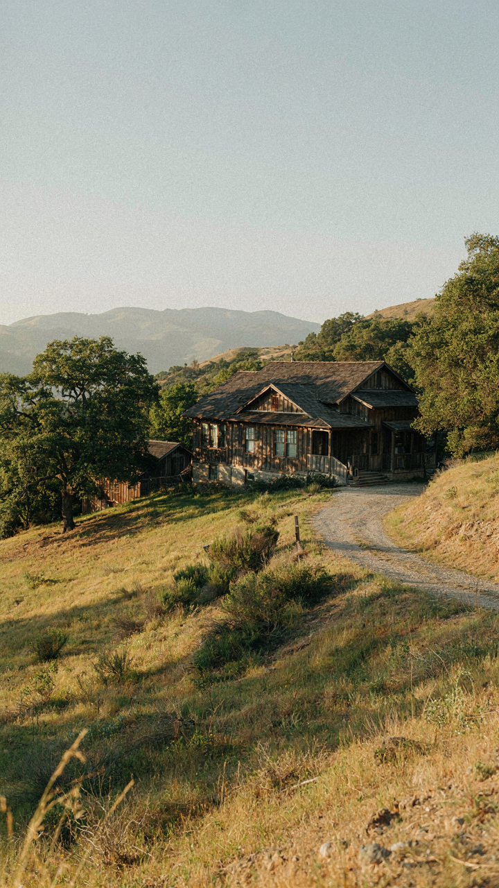
How Geography Rewrites Ranch DNA
You want to know how to make ranch farmhouse work everywhere because you’re afraid it only belongs in one place. Here’s the actual mechanism: ranch style spreads because its core constraint—low horizontal mass—solves the same problem across different climates. Wind exposure demands sprawl. Heat demands overhangs. Cold demands compact footprints. The geography doesn’t break ranch. It just tells you which constraint to prioritize first.

The Texas ranch evolved under specific pressure: open land, intense sun, livestock operations demanding visibility across acres. California adapted it to hillsides by anchoring the low line to steep terrain. The Great Plains version tightened the footprint against wind load. The Midwest stretched it wider for agricultural storage. None of these are decorative tweaks. Each one is a direct response to what the land actually does to a building.
Materials Change When Climate Demands It
The common advice says choose local materials for authenticity. That’s incomplete. You choose materials because the local climate will destroy anything else within ten years. This operates like material science: thermal cycling breaks bonds. Humidity rots cellulose. Salt air corrodes metal. Dry heat checks wood. Your material list isn’t a style choice. It’s a survival protocol.
Southwest ranches use limestone and adobe because those materials stay stable under extreme temperature swings and low moisture. Their thick walls aren’t romantic—they’re thermally necessary. Great Lakes ranches use stone foundations and metal roofing because freeze-thaw cycles destroy concrete and organic materials. The exterior overhangs grow deeper in wet climates to shield siding from rain load. In dry regions, overhangs shrink because they don’t need to protect against precipitation. Build from what the weather demands, not what you saw in a photo.
The Symbiotic Design Method For Ranch House Plan Integration
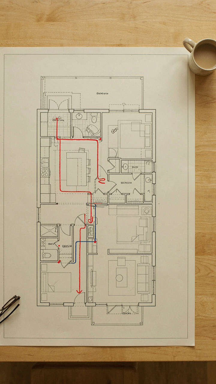
How Spatial Feedback Loops Control Your Layout
You want your ranch to feel effortless. That desire for invisible functionality is why you’re reading this. But most ranch plans fail because owners treat rooms as independent boxes instead of a feedback system where one space’s efficiency directly determines another’s usability.

Cybernetics, the study of control systems and feedback loops, maps directly onto ranch layout planning. A ranch’s low, horizontal form creates tight spatial adjacencies that either amplify or kill functionality. The kitchen’s placement determines traffic patterns through the dining area, which determines how the living room gets used, which determines whether the bedside hallway becomes a highway or a quiet zone. Ignore this chain and you inherit congestion you can’t retrofit.
Start by mapping actual movement patterns, not theoretical ones. Where does someone entering the front door actually walk to reach the kitchen? Does the path cross the living room seating? Does the laundry room placement force someone to walk through a bedroom corridor? Each redundant crossing is a feedback failure. The mechanism works in reverse too: eliminating one poorly placed doorway cascades into quieter bedrooms, less kitchen interruption, and actual usable space instead of wasted circulation zones.
Maximizing Function Within Fixed Dimensions
The common advice is to make rooms “flow well” or “connect naturally.” That’s useless. Real optimization means calculating the exact square footage your daily routines actually require, then fitting everything else around that constraint without compromise.
Ranch footprints are typically 1,200 to 2,000 square feet, which means every dimension choice subtracts from living space. A hallway that’s six feet wide instead of four costs you 400 square feet of usable area over a 50-foot run. A master bedroom that could be 12 by 14 instead of 14 by 16 recovers 56 square feet. These aren’t aesthetic choices; they’re allocation decisions. The ranches that work hardest are the ones where owners calculated their actual furniture and circulation needs first, then built the envelope around that math, not the other way around.
Build a footprint audit: kitchen requires 120 square feet minimum for appliances and counter workspace. Primary bedroom needs 180 square feet for bed, dressers, and a path to the bathroom. Living areas need 200 square feet for seating that doesn’t face a wall. List every functional requirement, add them up, then work backward to understand what gets squeezed or eliminated. This forces the real trade-off conversation before you build.

Ranch Exterior: Mastering The Horizontal Dominance
Landscaping That Locks The Low Profile
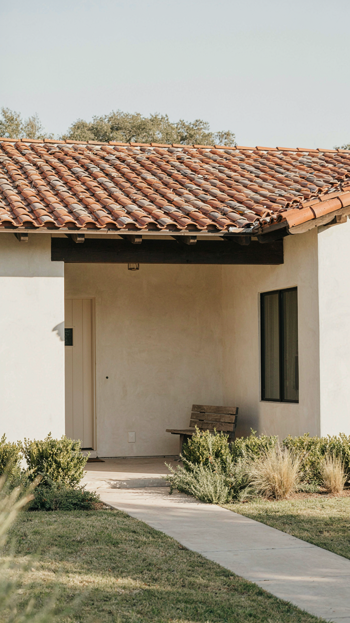
You want people to immediately feel that this house belongs to the land, not on top of it. That’s the real play here, and landscaping is how you make it stick. In physics, we call this visual weight distribution. A ranch farmhouse uses the same principle: the landscape anchors the building’s horizontal pull by refusing to compete with the roofline.
Plant low-growing shrubs and ground covers along the foundation. Keep trees set back from the front elevation. Use hardscaping like stone or gravel in bands that run parallel to the structure. This horizontal repetition doesn’t just look intentional, it reinforces the architectural intention. The eye follows the lines you lay down.
Rooflines And Eaves That Anchor Everything
Deep eaves are not decoration on a ranch. They’re structural honesty made visible. The overhang extends the roofline’s horizontal dominance beyond the walls, creating shadow lines that read from a distance. Shallow eaves break this visual contract and make the house appear disconnected from its own form.
Specify 24 to 36 inch eaves on all sides, even the rear. Use fascia boards that run clean and uninterrupted along the entire perimeter. The roof pitch matters too: a shallow slope (4 to 6 on 12) maintains the low-slung silhouette better than a steep pitch. These dimensions aren’t arbitrary. They’re the protocol that keeps horizontal dominance from collapsing into something that just looks squat.

Farmhouse Lighting: Illuminating Function, Not Just Decor
Task Lighting That Serves Work, Not Instagram
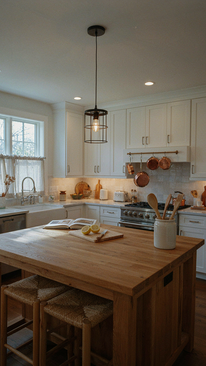
You want lighting that looks effortlessly rustic while secretly signaling you have your life together. Here’s what actually matters: farmhouse kitchens and work spaces originated around task lighting because people needed to see what they were doing, not because it looked good. The mechanism is simple. Overhead ambient light creates shadows and dead zones. Task lighting eliminates them by placing the source where the work happens.
Install pendant lights over kitchen islands at 12 to 18 inches below the ceiling. Use recessed fixtures above countertops where food prep occurs. Place sconces flanking bathroom mirrors at eye level, roughly 60 inches from the floor. These positions match how farmers and ranchers actually lit their workspaces. The fixture style comes second to placement. A simple metal cage, barn pulley, or clear glass shade works because the light reaches the surface that matters. Function determines authenticity here, not aesthetic choice.
Natural Light Integration Creates Depth
Large windows facing south and east aren’t decoration in a farmhouse layout. They’re a heating and visibility system that cost nothing to operate. Farmhouse designs evolved with this constraint because electricity didn’t exist when most were built. The architecture shaped around daylight flow remains valid today, not for nostalgia but for actual performance.
Position work surfaces and seating zones perpendicular to primary windows rather than facing them directly. This prevents glare and lets natural light fill the space without washing out color and texture. Use sheer curtains or plantation shutters to diffuse harsh afternoon sun while maintaining sightlines to the land outside. Layered natural and artificial lighting creates warmth through contrast, not through yellow bulbs and design language. The depth comes from having multiple light sources that serve different times of day and different activities.
Materials That Matter: Curating Your Ranch Farmhouse Palette
The Honest Materials That Hold Up
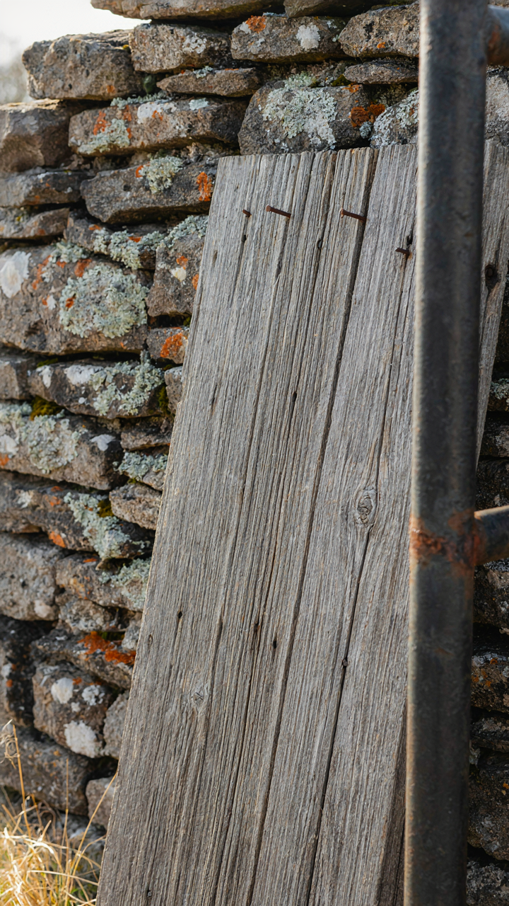
You want people to walk into your home and feel like it cost more than it did. That’s the real reason material selection matters. Here’s the mechanism: ranch farmhouse works because it uses materials that actually improve with age instead of materials that deteriorate and broadcast cheapness. When wood develops patina, stone weathers naturally, and metal oxidizes, the home gains character. Nothing reads as fake.
- Reclaimed or distressed wood: Weathered barn wood and salvaged beams create authentic texture. They establish history without requiring you to actually own a hundred-year-old structure.
- Untreated or sealed stone: Limestone, fieldstone, and slate age visibly. They develop lichen and color variation that manufactured finishes can’t replicate in a decade.
- Blackened or oiled steel: Metal accents in doors, railings, and fixtures oxidize predictably. The patina deepens rather than flakes, signaling durability.
- Concrete: Polished or sealed concrete works as flooring and countertops. It accepts stain and wears into a matte finish that feels intentional, not neglected.
- Brick in varied tones: Locally fired brick varies in color and texture. Mixed batches create depth that uniform modern brick cannot match.
Use materials where you can see the manufacturing process. A board with visible grain, a stone with uneven edges, a metal fastener that shows its welding—these communicate that someone chose them deliberately, not defaulted to them.
Texture Without The Visual Noise
Most advice says to layer textures everywhere. That creates clutter, not depth. Contrast builds depth. Borrowing from visual hierarchy principles used in graphic design, you establish a dominant material, introduce one secondary material for transition, then use a single accent. The eye needs somewhere to rest.
Pair smooth plaster walls with rough-hewn beam headers. Add a stone fireplace surround. Stop there. The brain registers depth because materials interrupt each other, not because you’ve covered every surface in variation. Too many textures fight for attention and make the space feel nervous. A ranch farmhouse should feel settled, which means visual restraint. Choose your three materials before you start, then commit to them through the whole space.
The Only Thing Holding Back Your Ranch Farmhouse Is Your Fear Of Subtraction
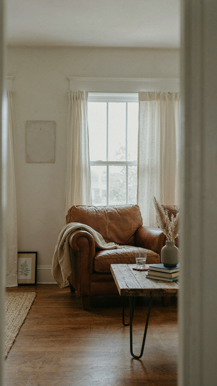
Most people furnish a ranch farmhouse by adding. They pile on rustic signs, throw blankets, barn doors, and call it done. You won’t. Today, walk through your space and remove one thing. Not rearrange. Remove. That single act breaks the scarcity mindset that tells you more equals better. A ranch farmhouse breathes through emptiness, not clutter. Restraint builds character faster than any design trend ever will.



