
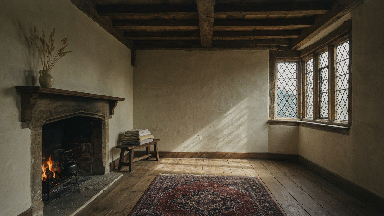
The Dark Wood Illusion: More Than Meets The Eye
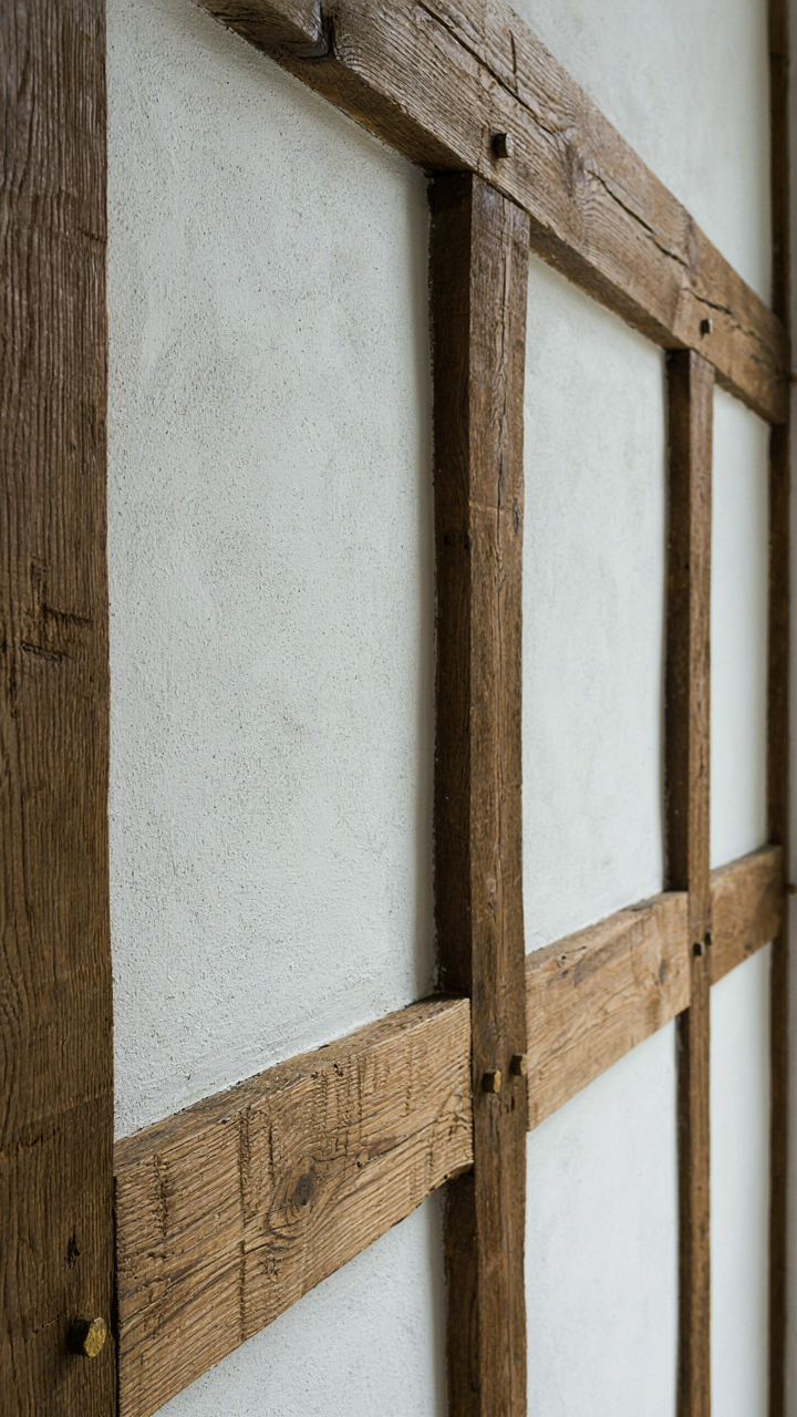
Dark Wood Creates Perceived Depth
You want dark wood in a Tudor interior because you think it signals authenticity and status. Here’s what actually happens: dark surfaces recede visually, making rooms feel larger than they are. This isn’t decoration. It’s optical physics. Architects call it atmospheric perspective, and Tudor builders deployed it deliberately. Oak beams and dark paneling absorb light instead of reflecting it, which forces your eye to travel farther into the space before hitting a visual wall.
The mechanism works because human perception measures distance partly through light gradation. Dark surfaces break that gradation early, creating an illusion of depth that compensates for the relatively low ceilings and compact footprints of actual Tudor structures. This is why period interiors don’t feel claustrophobic despite their physical constraints. The darkness isn’t moody. It’s structural.
Balancing Dark Wood Without Creating Dead Space
Most advice says “add lighter accents to balance dark wood.” That’s incomplete. Lighter accents alone create visual noise without solving the real problem: dead zones where light dies and the room feels swallowed. The actual protocol is strategic placement of reflective surfaces alongside dark wood, not scattering pale objects everywhere. White plaster walls do this. They interrupt dark wood’s light absorption and create visual breathing room. Tudor interiors paired dark oak with lime-washed plaster specifically to achieve this balance.
Place your darkest wood pieces—beams, wainscoting, furniture—where they frame lighter surfaces rather than dominate them. A dark timber frame works when it borders white plaster above. The contrast doesn’t fight the dark wood. It completes the system. Rooms collapse when dark wood covers all surfaces equally because nothing anchors your eye. Alternate dark wood with light plaster, not white clutter.
Plaster’s Unsung Power: Texture As A Statement
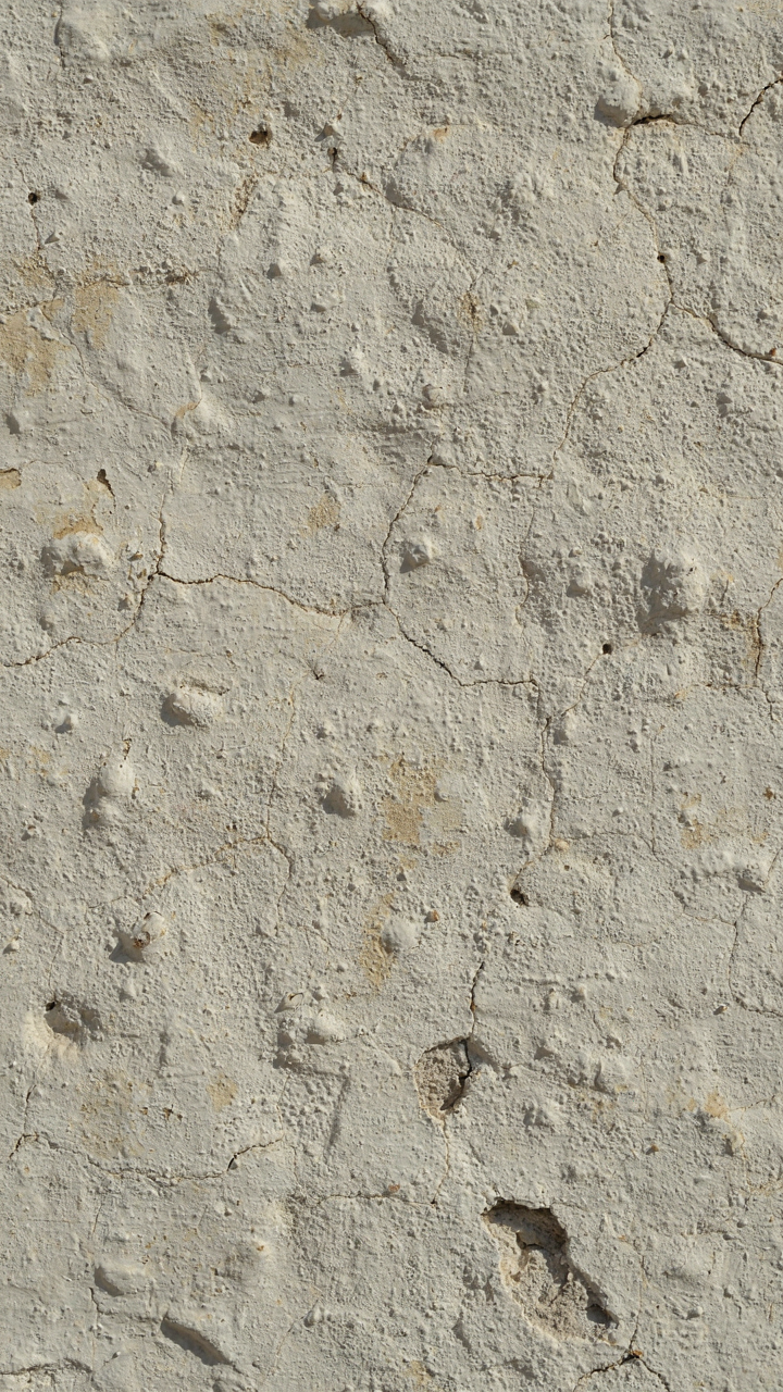
How Surface Finish Controls The Room
You want plaster because it looks expensive and permanent. The actual mechanism is optical. Rough plaster scatters light in every direction through its peaks and valleys, diffusing it across the wall surface. Smooth plaster reflects light more uniformly, creating a flatter plane. In Tudor interiors, this distinction determined whether a room felt enclosed or airy. The texture you choose isn’t decoration. It’s a light management system.

Tudor builders used rough lime plaster because they lacked alternatives and because rough surfaces masked structural movement in timber frames. That limitation became a design feature. Rough plaster absorbed sound, reduced glare from candlelight, and created visual depth without adding material. The texture absorbed rather than bounced light, which made rooms feel warmer and more intimate. Smooth plaster arrived later with gypsum-based compounds in the 17th century, but Tudors rarely pursued it.
Lime Plaster Over Modern Drywall And Why It Matters
Most advice says drywall with a plaster skim coat gets you “close enough.” That’s incomplete. Authentic lime plaster and modern drywall operate on different physical principles. Lime plaster breathes and moves with timber frames. It’s flexible. Drywall is rigid and cracks when the frame shifts. In a Tudor home with active timberwork, drywall will fail. Lime plaster accepts movement as part of the system.
Lime plaster also ages visibly in ways drywall cannot. It develops microcracking patterns, uneven color variation, and surface wear that reads as authenticity. Drywall with texture spray looks applied yesterday. If you’re building or restoring, lime plaster costs more upfront but avoids the rupture that comes when modern materials meet old frame movement. Apply lime mortar directly to lath or stone, never over drywall substrate.
The Tudor Light Manipulation Protocol
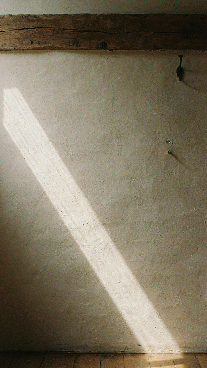
How Daylight Controls Spatial Perception
You want your dark wood and plaster to look intentional rather than like you’re living in a cave. Here’s what actually matters: daylight creates contrast, and contrast is what makes Tudor interiors work instead of collapse into visual mud. Think of it like military strategy—you’re positioning your forces (light and shadow) to dominate specific zones and create hierarchy. Windows in Tudor homes weren’t centered for symmetry. They were placed to rake across plaster surfaces and highlight the timber frame’s depth. East and west-facing windows throw long shadows that emphasize the dimensional quality of exposed beams. South light flattens everything, which is why north-facing rooms feel more dramatic with dark wood. The mechanism is simple: angle determines whether your eye reads depth or flatness. Place key surfaces perpendicular to morning or afternoon light, not parallel to it. Dark oak absorbs light while white plaster reflects it, creating automatic contrast without adding anything else. This interplay is the entire foundation of why Tudor interiors appear richer than their actual material count suggests.

Shadows cast by timber frames become architectural elements themselves when light hits at the right angle. A beam that looks like a dark stripe in flat light becomes sculptural at sunrise. This wasn’t accident in period homes—it was built into room orientation and window placement. You control this by understanding your room’s light path through each season. Winter sun is lower and travels south; summer sun is higher and moves faster. Adjust furniture placement and reserve your most visually complex surfaces for times when light activates them. The real protocol: observe your space for one full day before committing to layout. Photograph the same wall at dawn, midday, and dusk. Dark wood reveals its actual color and texture only when sidelit. Place it where you get sidelight during your peak usage hours.
Artificial Illumination And Layered Depth
Most people add accent lighting to Tudor rooms and wonder why it feels like a restaurant. The issue is treating artificial light as decoration rather than as a tool to mimic what daylight already does well. You need light positioned to graze surfaces, not to illuminate them evenly. Wall sconces belong between timber frame members, throwing light up and down to emphasize the grid structure. Uplighting on plaster exaggerates texture. Downlighting on dark wood creates shadow within shadow, which deepens the perceived thickness of beams. Strategic darkness is the actual mechanism—artificial light gains power through constraint, not spread.
Candles were Tudor reality, not just aesthetic choice. They produced low, warm, directional light that emphasized depth and left large areas in shadow. Modern replicas of this use dimmable warm-toned bulbs positioned low and aimed at surfaces rather than the room. Avoid overhead fixtures or anything that floods the space uniformly. Instead, layer sources: one at waist height on each wall, one higher to hit upper beams, one low to catch plaster texture. Test each position before installation. The protocol is to establish pools of light separated by genuine shadow, not ambient glow interrupted by bright spots. Dark wood and light plaster want contrast to deliver their visual weight. Artificial light either amplifies this or erases it.
Beyond Beams: Structural Aesthetics In English Tudor House Interior
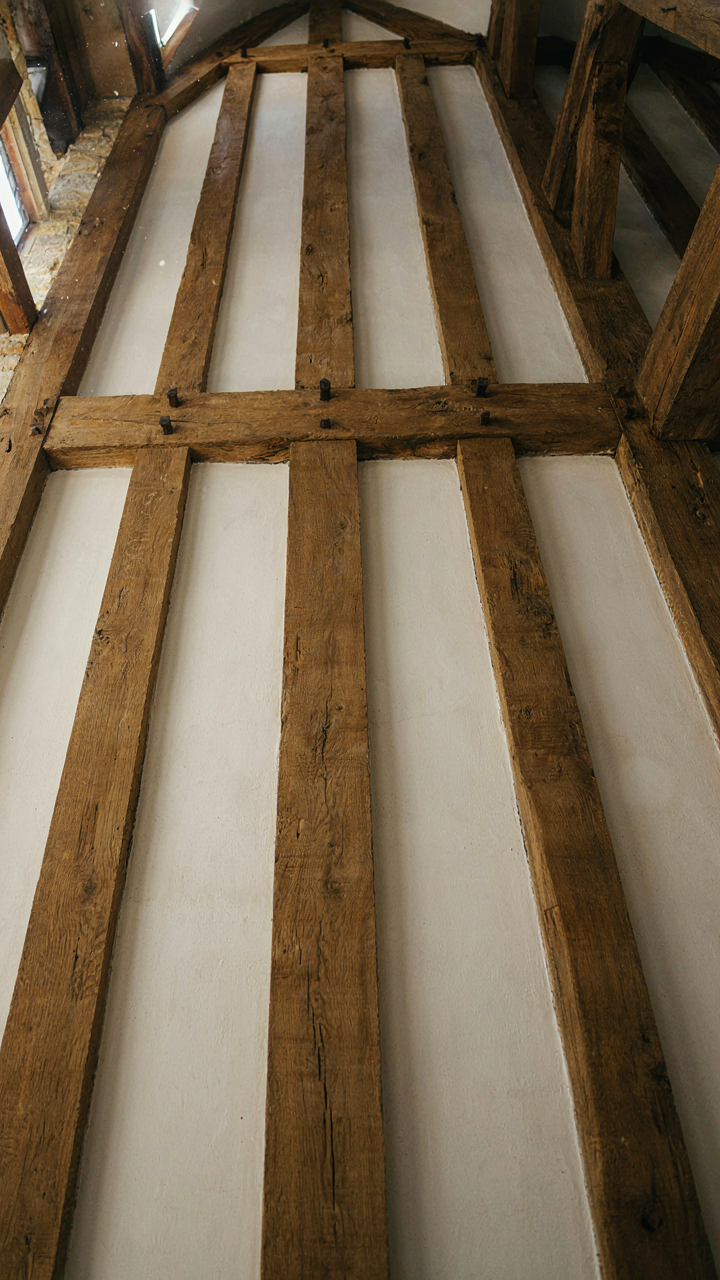
When Timber Becomes The Ornament
You want exposed beams because they signal authenticity. That’s the real driver. But here’s what actually happens: timber framing in Tudor interiors operates on the load-bearing principle from architecture itself. The structure must perform its job first, then the aesthetic follows. Builders didn’t expose beams for decoration. They exposed them because the frame was the building. The plaster infill came later, between the timber skeleton. When you see a Tudor room today with dark oak beams crossing white plaster walls, you’re looking at the honest expression of how the thing was actually built.

The beam placement wasn’t random or ornamental choice. It responded to roof load, span requirements, and the geometry of timber availability. Dark color comes from age and smoke accumulation over centuries, not stain applied for effect. A working Tudor interior showed its engineering. Rooms with high ceilings and widely spaced beams meant wealth and structural capability. Rooms with tight beam spacing signaled modest construction. That visual difference still reads today. When you choose beam placement in a modern Tudor-inspired space, you’re choosing to either honor that logic or fake it. Most people fake it, which is why most Tudor interiors feel hollow.
Merging Old Logic With Modern Needs
The common advice says hide modern structure behind Tudor facades. That’s incomplete. Modern building codes require different support systems than medieval timber framing. Trying to hide steel beams under plasterboard or fake timber defeats the purpose of having either material. The real move is integration through honest material contrast. You can run a steel beam across a room and expose it, but don’t pretend it’s oak. Let it be what it is. The Tudor principle was structural visibility. Apply that principle to your materials, not to your materials pretending to be something else.
When you need load-bearing capacity that timber alone can’t provide, use steel or reinforced headers, but position them where a Tudor frame would have placed them, which is usually along walls or at bay ends. This respects spatial flow and sight lines. The plaster infill method still works with modern materials. You can frame sections of wall with modern studs, then cover with plaster and leave strategic beam elements exposed. The mechanism is separation of function. Load-bearing elements stay visible. Infill and secondary structure recede. When you’re planning a space, identify what must carry load first, then design the visible elements around that reality.
Furnishing Inside Tudor Homes: Intentionality Over Replication
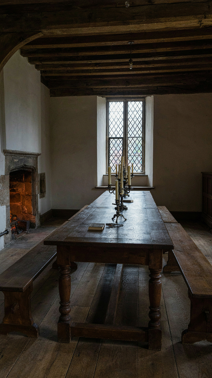
Weight And Permanence Over Trend
You want this room to feel like it matters, like you didn’t assemble it from a catalog. The mechanism is mass. In physics, mass creates gravitational pull and anchors objects in space. In Tudor interiors, mass works the same way: heavy furniture grounds a room and signals that these pieces belong there, not that they’re temporary placeholders. Light, disposable furniture does the opposite. It floats. It whispers that you’re renting this aesthetic.

Tudor homes used substantial oak, elm, and walnut because those woods were local and because they lasted generations. Furniture makers built for permanence, not replacement cycles. Your pieces don’t need to be antique to work. They need density. A solid wood table with real joinery, a substantial chest, a credenza with actual heft. These items establish visual weight that plaster walls and dark timber frames demand. Without them, you’re decorating an empty stage.
Avoiding The Theater Problem
Most people get this wrong: they treat Tudor interiors like historical reenactment, hunting for “authentic” pieces or buying reproduction furniture that screams “I researched this.” That’s the costume drama trap. It kills the room because it signals performance rather than habitation. Real Tudor homes evolved over centuries of actual living. They weren’t designed all at once by a committee trying to match a theme.
The mechanism is consistency of intention, not consistency of era. Your pieces should reflect how people actually used these spaces: gradually, practically, without worrying whether each chair matched the others perfectly. One quality oak table, a mix of functional seating from different decades, a few brass or iron fixtures that serve purposes beyond decoration. The coherence comes from choosing things that work together, not from matching a museum checklist. Everything should answer the question: does this earn its place by function or genuine material beauty?
The Cognitive Load Of Authenticity: Tudor Style Homes Interior
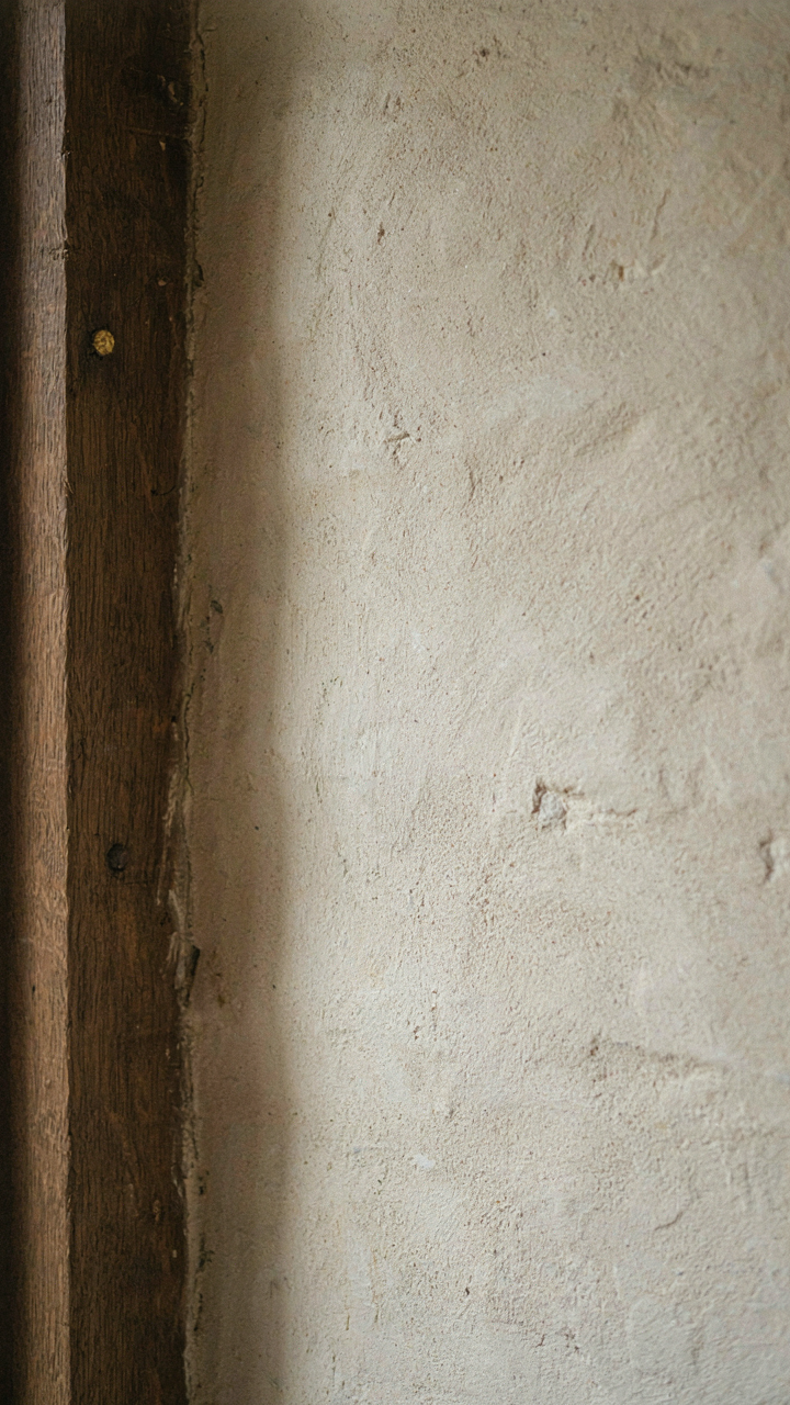
When Your Choices Start Talking Back To You
You want a Tudor interior because it signals taste and historical knowledge, but what you’re really after is permission to stop deciding. The mechanism is feedback loops in design. Each choice you make constrains the next one. A dark oak beam isn’t just aesthetic—it immediately rejects certain paint colors, window treatments, and furniture styles. This isn’t a problem to solve. It’s the actual system working.

Tudor interiors function on constraint stacking. Install exposed timber framing and your room now enforces its own logic. Plaster color must read against wood grain. Proportions must respect the structural grid the beams create. Light fixtures can’t be modern without breaking the contract you made with the materials. The feedback is immediate and silent. You either feel it or you don’t. Most people don’t, which is why they keep adding details that conflict.
The Collision Point Where Materials Become Mandatory
This is where consensus design advice fails completely. People think you layer Tudor elements like mixing paint colors. You pick a timber style, then a plaster tone, then lighting, treating each decision in isolation. Wrong. The real mechanism is emergence—in systems theory, when separate components interact, they create properties that none of the individual parts possess alone. A single oak beam means nothing. A room full of them, combined with lime plaster, specific window placement, and period-appropriate scale, creates a constraint field that either holds or collapses.
The materials themselves have non-negotiable properties. Oak expands and contracts seasonally. Lime plaster breathes and absorbs moisture. This means your HVAC system, your paint products, your restoration choices must respect what these materials actually do, not what you wish they’d do. Window size relates directly to wall strength determined by timber placement. When these factors combine properly, the room achieves coherence. When they don’t, you end up with a costume, not a space that functions. The protocol is simple: identify the dominant material constraint first, then build every other decision from it.
Color Palettes: Subverting Expectations In Tudor Interiors
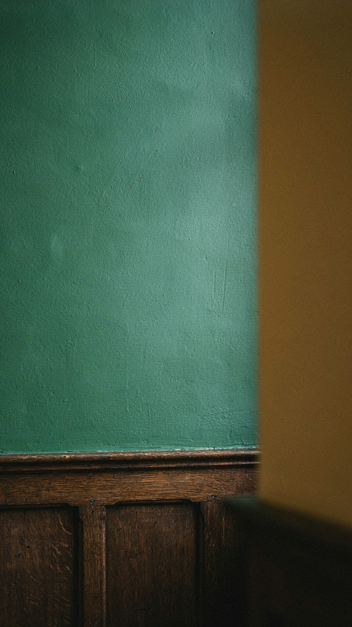
Clashing Colors That Actually Work
You want permission to break the rules without looking like you failed at decorating. Here’s the mechanism: Tudor interiors weren’t designed around harmony. They were built on contrast, the same principle that drives visual hierarchy in graphic design. Dark wood paneling against cream plaster created tension. That tension is what made the space legible and memorable instead of boring.

The common advice is wrong. People say mix one accent color with neutrals. Tudor rooms ignored this. They paired deep forest green with burnt orange, burgundy with ochre yellow, navy with rust. These weren’t soft transitions. They were deliberate collisions that forced the eye to engage. The dark wood frame became the mediator, the arbiter that made the clash feel intentional rather than chaotic.
The Power Of Restraint Through Saturation
Muted tones aren’t a compromise or a safe choice. They’re a dominance move. In economics, scarcity creates value. The same principle applies here: unsaturated colors command more attention than bright ones because they demand closer inspection. A muted sage green on plaster reads as sophisticated. A bright kelly green reads as uncertain.
Tudor interiors leveraged low saturation to signal control. They used pigments that were expensive or difficult to achieve at scale. Indigo required import costs. Ochre needed specific earth sources. The limitation became the aesthetic. When you restrict your palette to authentic, muted tones and let the wood structure handle visual weight, the room doesn’t compete for attention. It settles into authority. The protocol is simple: source one or two muted base tones, let dark wood carry the architectural work, then add a single accent in low saturation to break the visual plane without fragmenting it.
Tudor House Interior Design: The Functional Fallacy
Making Old Houses Actually Work
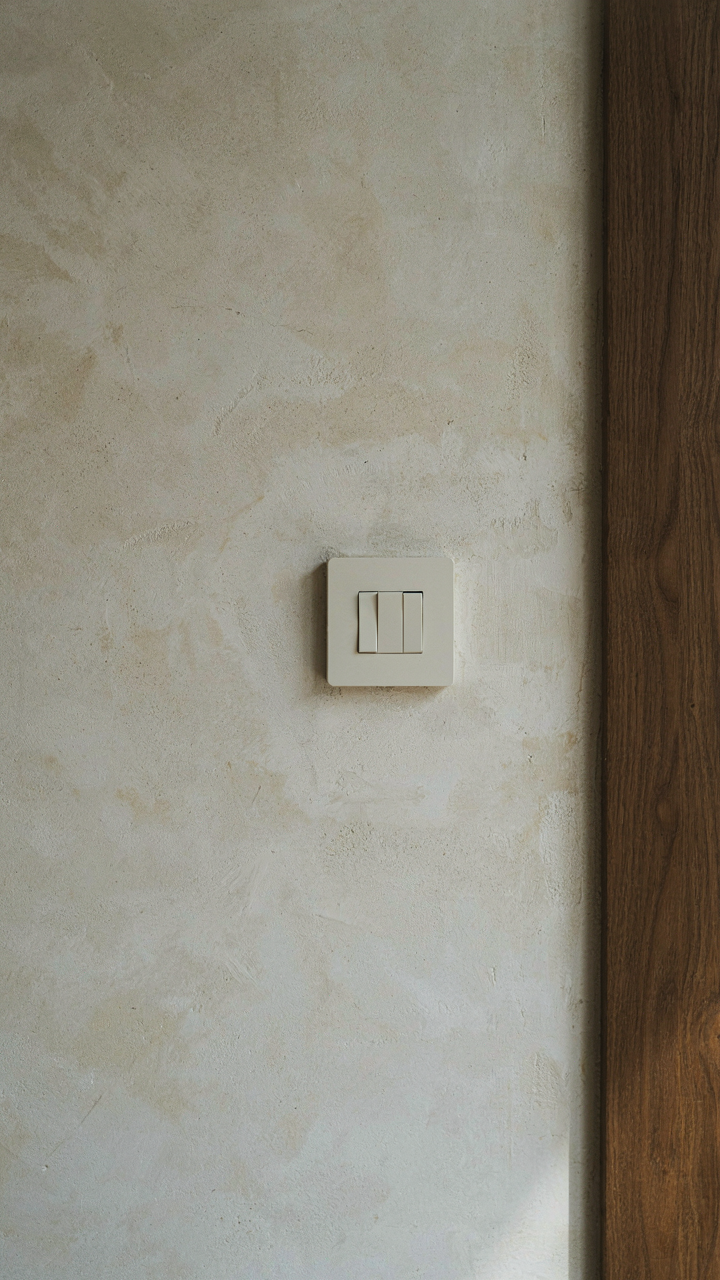
You want a Tudor interior because it signals taste and history, but you’re terrified it won’t have outlets, climate control, or space for modern life. Here’s the mechanism: Tudor homes weren’t designed for your needs, so you have to retrofit without erasing what makes them valuable. The dark wood and plaster aren’t decoration—they’re structural. Work within that constraint instead of fighting it.

Plaster walls hide routing options that drywall doesn’t. Run conduit and cabling through the cavity spaces between the timber frame and outer walls before replastering. This approach mirrors how electricians worked before surface-mounted solutions became standard. You preserve the interior’s integrity while gaining the infrastructure required for heating systems, network lines, and modern lighting without visible wire trays or boxes destroying the aesthetic.
Hidden Integration Points
Smart technology integration fails when people treat Tudor rooms like blank canvases. They’re not. Timber framing creates natural cavities that route wiring vertically and horizontally without visible penetration of plaster surfaces. Identify load-bearing posts and non-structural walls during your assessment phase. Non-load-bearing walls can be selectively opened for concealed conduit runs.
Install thermostats and electrical outlet boxes in locations where they existed historically or where furniture placement naturally obscures them. A Tudor room functioned with its fireplace as the primary heat source and candles for light—recognizing this, position your modern systems in analogous locations. Underfloor heating works better than baseboard radiators in these spaces because it doesn’t require visible lines breaking the plaster planes. The mechanism: hide systems where historical equivalents would have created visual hierarchy anyway.
Craftsmanship: The Underestimated Factor In Tudor Style
The Real Cost Of Skipping Quality
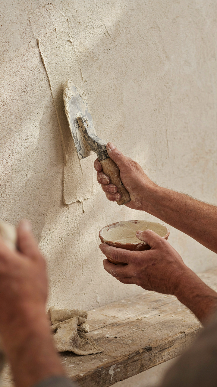
You want Tudor style to look expensive without paying for it. That’s the actual motive here, and it doesn’t work. Think of craftsmanship like structural load in architecture: the visible surface depends entirely on what holds it. Cheap plasterwork, poorly fitted timber, and machine-cut beams collapse the entire aesthetic within months as materials shift and joints fail visibly.

Tudor interiors from the 16th century survive because makers understood wood movement and joinery tolerances. Modern reproduction fails not because the style is dated, but because the investment stops at visual approximation. Hand-finished plasterwork costs three to five times more than spray-applied finishes because it requires someone who reads the wall, adjusts for settling, and stops when the surface actually works rather than when the job is finished. You either commit to this or accept that your space will look false and dated within a few years.
Finding The Makers Who Still Work This Way
The common advice tells you to search “Tudor specialists” online and call contractors. That produces generic companies running crews through standardized jobs. Real artisan work lives in regional timber framers who still hand-dress beams, specialized plaster contractors who studied under European craftspeople, and local joiners whose names appear in architectural records. These people don’t advertise heavily because their work books fill through reputation and referral within the design community.
Start by contacting local historical societies and asking which contractors they recommend for period-accurate restoration work. Visit completed projects in person and touch the plasterwork and timber joints. Ask the owner directly who did the work and whether they’d hire them again. The maker who explains wood grain direction and plaster cure time before quoting is different from the one who sends a standard estimate. Demand to see previous work in similar scale and material, then visit one site unannounced to see how details aged.
The Real Obstacle Isn’t Style, It’s Your Unwillingness To Defy Fleeting Trends For Enduring Substance
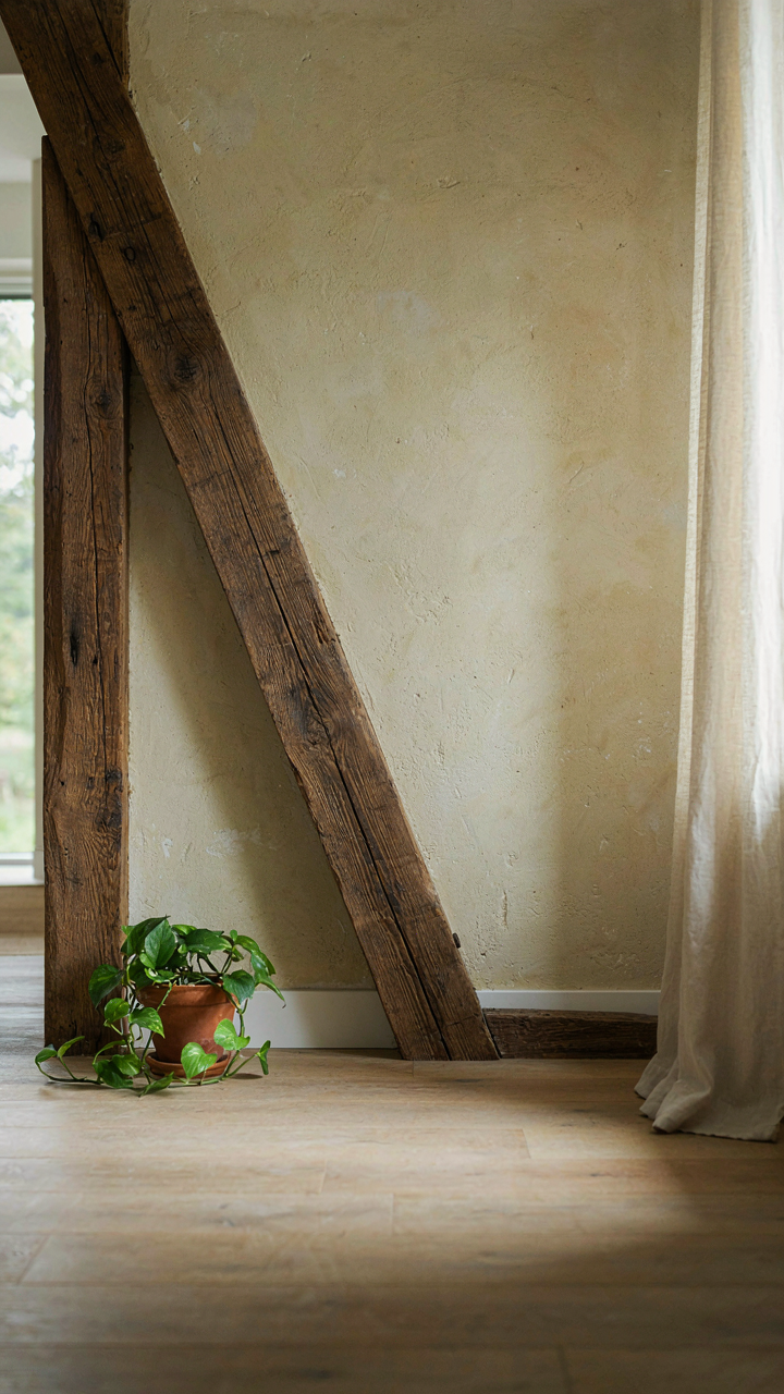
Most people choose interiors based on what Instagram showed them last week. A tudor interior demands you commit to materials that outlast your attention span. Dark wood and exposed plaster aren’t trends you abandon when you get bored. They’re decisions that compound in value for decades. Pick one room this week. Source one authentic element, whether it’s reclaimed timber or lime plaster. Stop waiting for permission to build something that matters. Your home reflects your discipline.



