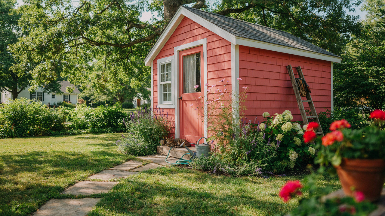
The Folly Of Trendy She Shed Paint Colors
Why Trend Followers End Up With Yesterday’s Shed
You’re worried that picking the wrong color makes your shed look cheap and outdated, which reflects back on you. That’s the real fear underneath this choice. Here’s the mechanism: trends in exterior paint follow a predictable cycle of adoption, saturation, then abandonment. When a color becomes “in,” it enters the market. Manufacturers stock it. Everyone sees it everywhere. Then, within three to five years, it signals “I followed the crowd in 2022” rather than “I made a deliberate choice.”
The reason this happens is supply and visibility. Trendy colors get heavy marketing push and shelf dominance. Retailers highlight them. Blogs repeat them. Your neighbor uses them. This creates the illusion of timelessness when it’s actually just saturation. Once that wave passes, the color becomes a timestamp. Paint manufacturers know this. They rotate seasonal collections precisely to make last year’s “it color” feel stale. By then, your shed is already committed to the surface.
The Three To Five Year Expiration Date
Trendy shed colors have a documented lifespan in the residential design cycle, much like fashion seasons in fashion marketing, where a trend peaks and collapses on a predictable schedule. Consider gray exterior paint. It dominated the market from roughly 2010 to 2016. It appeared fresh. Modern. Neutral. Then it became ubiquitous. Now a gray shed reads as a specific era, not a timeless choice. The same trajectory happened with pale blues and soft greens before that.
Popular shed colors don’t fade from the paint surface. They fade from cultural relevance. A color that feels current today will feel dated the moment the industry shifts its marketing weight to the next palette. This isn’t opinion. It’s the mechanics of how trend cycles work in home exterior categories. Your shed won’t be replaced for ten to twenty years, but your paint color will feel wrong in five. The only defense is choosing a color outside the current trend cycle entirely, which requires you to step away from what feels safe and familiar right now.
Beyond Beige: Unearthing Your True She Shed Identity
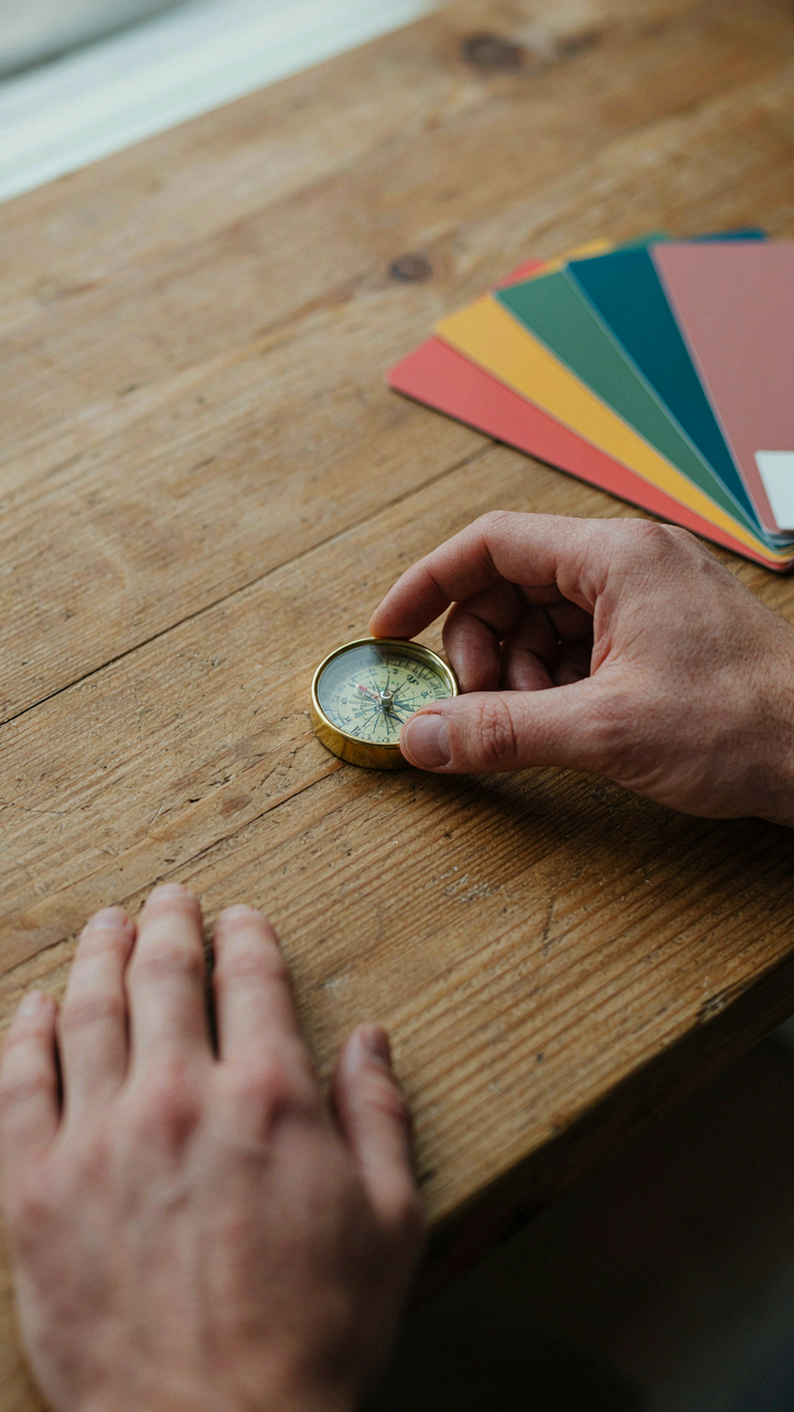
What Your Color Actually Signals
You’re worried people will walk into your space and think you lack taste. Color psychology—borrowed from marketing and environmental design—treats paint as a signal system, not decoration. Your shed’s color is a boundary statement: it tells visitors what you value before they see anything else. The mechanism is simple: warm colors activate approach behavior, cool colors create distance, neutrals disappear into the background. Pick wrong and your sanctuary broadcasts confusion about who you are.

The mistake most people make is choosing colors based on trend cycles or what they’ve seen online. That’s borrowed identity, not yours. Your shed color must map to how you actually spend time there. If you retreat to focus, muted greens and soft grays work mechanically because they suppress visual noise. If you gather people there, warmer tones—terracotta, sage with warmth undertones, soft ochre—invite lingering without overstimulating. Test paint samples on all four walls for three days minimum. Artificial lighting changes perception dramatically, and you need to see how the color performs during your actual usage times.
The Personality To Paint Translation
Your personality doesn’t determine your color preference. Your functional needs do. People who value control and precision often default to cool neutrals, but that’s correlation, not causation. What matters is matching the psychological function of a color to the actual work you do in that space. If you’re there to create—painting, writing, crafting—high-saturation colors can drain cognitive resources over long sessions. Low-saturation versions of the same hue deliver the visual identity without the fatigue tax.
This is where most guidance fails: it treats personality as mystical. It’s not. Document a typical session in your shed. How long do you stay? Do you want energy or calm? Is the space a performance venue for hosting others, or a solo refuge? Paint colors that suppress decision fatigue last. Your personality might love bold color, but if you’re spending four hours on detail work, a saturated jewel tone will exhaust your visual system by hour two. Choose based on functional output, not aesthetic preference.
The “Contrast Code” For Dynamic Shed Colors Ideas Paint
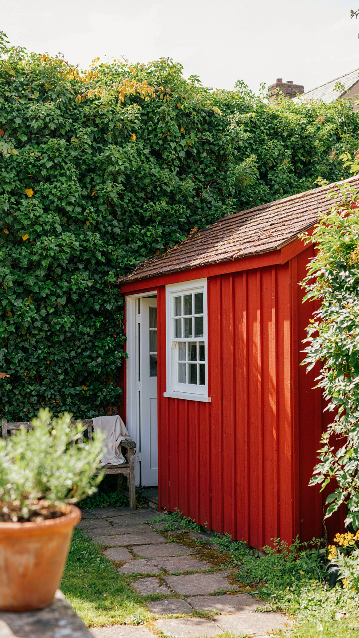
Complementary Colors Build Visual Tension
You want your shed to matter to you—not disappear into the yard like every other box structure in the neighborhood. Here’s the mechanism: complementary colors sit opposite each other on the color wheel, and when placed adjacent, they create optical vibration that makes both colors appear more saturated and alive than either would alone.
Paint one wall a deep teal and the trim a warm coral, and neither color looks muted or “safe.” This isn’t decoration theory—it’s how human vision processes contrast. The eye can’t rest, so it reports back: this space has intentionality. Your brain reads intention as care, and care reads as status.
Trim And Accent Paint Strategy
The common advice treats trim as an afterthought—a neutral frame for the main color. Wrong. Trim either kills momentum or multiplies it.
- Base Wall Color: Choose a mid-tone or saturated shade that anchors the entire structure and sets the emotional temperature of the space.
- Door Frame Accent: Paint the door frame a shade two to three values darker or brighter than walls to create a visual anchor point that draws the eye.
- Window Trim Contrast: If windows exist, make trim either match the door for consistency or contrast sharply with walls to emphasize architectural breaks.
- Soffit And Fascia: Keep these either neutral to recede or match the accent color to create horizontal lines that lengthen visual perception of the structure.
- Interior Trim Continuity: Paint interior trim a shade lighter than walls to expand perceived space and prevent the interior from feeling boxed in.
Strategic trim reframes the entire shed from a monolithic shape into a composition with depth. Test accent colors on a 2×3 foot board and view it at different times of day—morning light, afternoon glare, and evening shadow all shift perception. The trim color you choose at 10 AM may look wrong at 4 PM if you skip this step.
The Environment As Your Palette: Paint Colors For Sheds Backyards
Match Your Backdrop, Not Your House
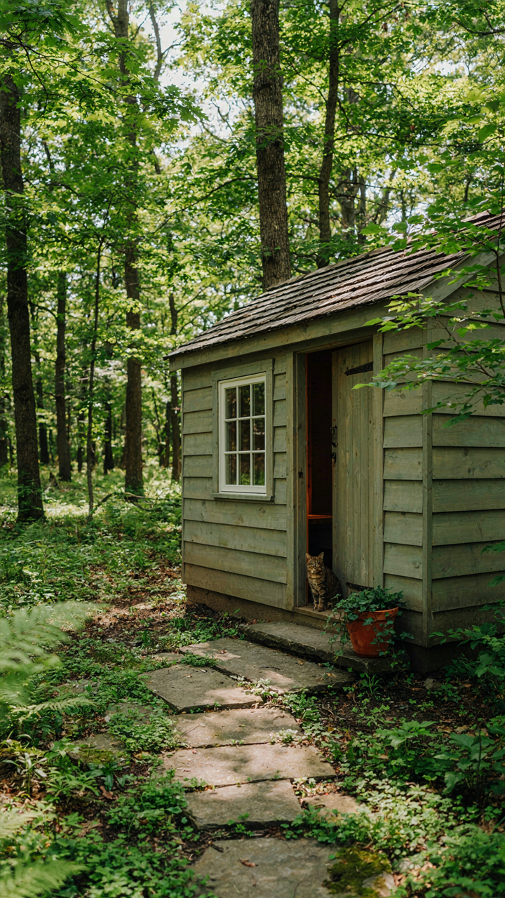
You want the shed to disappear into the yard so visitors think it belongs there, not that you added it. That’s the real motive. Most people start by grabbing colors from their home’s exterior, which is the wrong anchor point entirely. Your shed lives in the landscape first and the property second. The surrounding trees, soil, and plantings form the actual context that determines whether a color feels native or intrusive.
Study what dominates your yard’s visual field. If mature oaks and maples create a canopy, greens and deep grays will recede. If you’re surrounded by dry brush or open lawn, warmer earth tones like taupe or soft brown read as intentional rather than accidental. Pull three color samples from the natural materials already on your property, not from a Benjamin Moore deck. Hold them on the shed at different times of day. The goal is invisibility through belonging, not through camouflage paint.
The Predator Principle For Natural Integration
Military camouflage teaches us this principle: concealment works when an object breaks up its outline by matching surrounding planes and depth, not just color. Apply this to she shed paint colors directly. A monochromatic shed pops because it reads as a flat shape against varied textures behind it. Successful integration requires visual disruption through strategic color placement on different structural planes.
Paint the main walls one tone and the roof trim or door frame a slightly deeper or lighter variant from the same family. This breaks the shed’s silhouette so the eye doesn’t lock onto a single form. Test your color choices by photographing the shed from fifteen feet away in morning light. If it still reads as a distinct rectangular object, your palette needs more variance. The mechanism is simple: contrast adjacent surfaces enough to dissolve the building’s edge into the yard’s existing visual complexity.
The “Durability Doctrine” For Lasting Shed Colours
Which Paint Type Actually Survives Weather
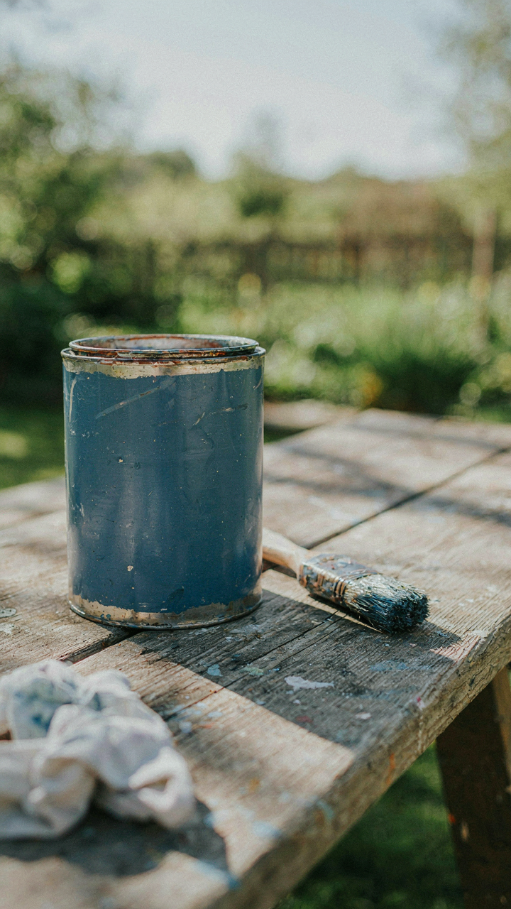
You want your shed to look intentional in three years, not abandoned. That’s the real fear here—watching your color choice fade into mediocrity while you’re stuck looking at it. The mechanism is simple: exterior paint fails because water penetrates the film, wood swells, and adhesion breaks. Not all paint resists this equally. Think of exterior coatings like military strategy—you need the right defensive perimeter for your specific terrain.

Acrylic latex dominates residential shed painting because it flexes with wood movement and breathes. Oil-based paint hardens into a rigid shell that cracks when wood expands and contracts with temperature swings. Acrylic holds up because it tolerates movement without fracturing. Most contractors recommend 100-percent acrylic latex for sheds—not the budget acrylic blends. The difference matters: premium acrylics contain more resin and fewer fillers, which means better water resistance and color retention over five to seven years.
Surface Prep Separates Fading From Lasting
Everyone knows you need to prep wood. Nobody actually does it right. Pressure washing leaves behind moisture that traps under fresh paint, collapsing your color integrity before month two. The real protocol is different: scrape off loose paint, sand to bare wood or solid coating, then wait 48 hours minimum for the wood to stabilize moisture content below 16 percent.
Primer matters more than most painters admit. A quality exterior primer bonds to raw wood fibers and seals tannin bleed—those brown stains that sabotage light colors from underneath. Skipping primer means your chosen color sits on an unstable foundation. One coat of primer plus two coats of paint beats three coats of paint alone. Apply in dry conditions above 50 degrees, and you’ve engineered durability into the system rather than hoping for it.
Lighting: The Unseen Architect Of She Shed Paint Colors
How Natural Light Transforms Shed Colors Exterior
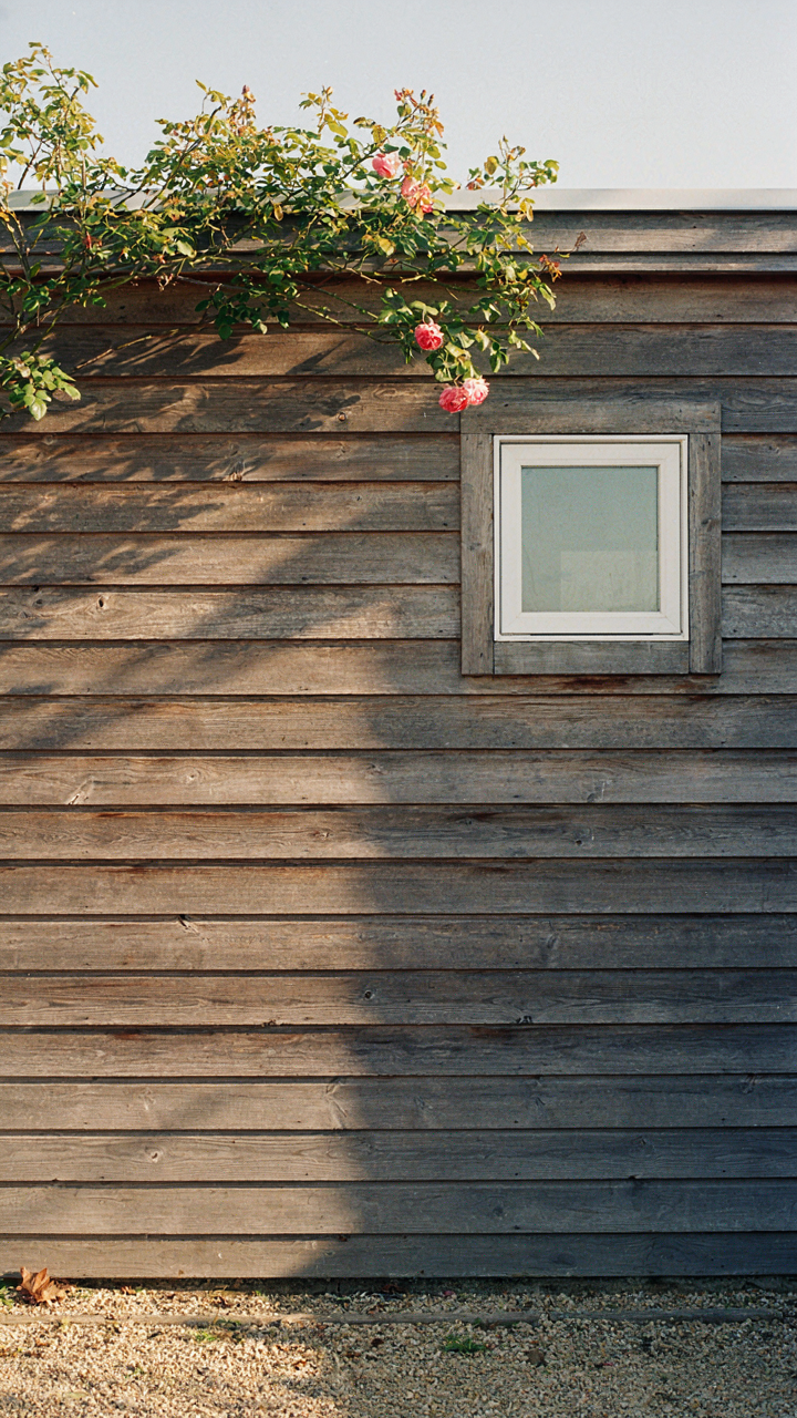
You care about this because you don’t want to pick a color that looks like a mistake by 3 PM. Light behaves like a filter in optics—it doesn’t change the pigment itself, but it shifts how your eye perceives it. North-facing sheds receive cool, indirect light that makes warm colors flatten and cool colors recede further. South-facing exposure amplifies saturation and pushes colors toward their truest form, which means a soft sage reads as almost clinical in direct afternoon sun.
The time of year matters more than most people admit. Winter light is weak and blue-shifted in most climates, which dulls warm tones and makes pastels vanish entirely. Summer noon light is harsh and white, revealing every flaw in uneven paint application. Test your chosen color on the actual wall at 9 AM, 12 PM, and 4 PM before committing. The color you approve at one moment will betray you at another if you skip this step.
How Artificial Lighting Changes Interior Shed Paint Colors
Interior shed lighting is where the real control lives, and most advice skips the mechanism entirely. Color temperature in Kelvin defines how warm or cool light appears—2700K feels amber, 5000K feels clinical white. A warm-toned paint like terracotta absorbs more light wavelength at 5000K and appears muddy, but at 2700K it glows because the light itself carries the warmth your eye expects to find in the pigment.
LED bulbs have flattened this advantage. Older incandescent bulbs had built-in color distortion that actually worked in favor of cozy interior sheds. Modern LEDs render color more accurately, which means your soft blue won’t hide under warm light anymore—it will look exactly like what it is. Choose your interior she shed paint color under the exact bulb type and wattage you’ll actually install, then verify it again after installation. This single decision prevents the most common “the color looked different at the store” complaint.
The “Micro Climate Matrix” Of Shed Colors Ideas Paint Exterior
How Heat Absorption Changes Your Actual Space
You want this space to feel comfortable without running an AC unit all summer. That’s the real reason you care about color thermodynamics. Dark paint absorbs more solar radiation and converts it to heat. Light paint reflects it. Physics doesn’t negotiate here: a black shed exterior will run 15 to 20 degrees Fahrenheit hotter inside than a white one under direct sun. Medium tones fall somewhere between, but the gradient is linear and predictable.

The interior temperature directly affects usability. A scorching shed becomes a liability in peak summer, forcing you to either ventilate constantly or avoid it during the hottest hours. Light colors buy you functional hours. If your shed faces south or west and receives six-plus hours of direct sun, choose whites, creams, or pale grays for the exterior. Dark colors work only on north-facing structures or those shaded by trees for most of the day. Test the actual sun path on your property before committing to paint.
Matching Paint To Your Specific Sun Exposure
The common advice says “just pick what you like.” That ignores the fact that paint performance changes based on how many hours of direct sunlight hit your shed each day. A north-facing exterior lives in perpetual shade and can carry darker tones without heat penalty. A south-facing wall needs reflective colors to remain approachable. East and west exposures split the difference but catch intense morning or afternoon rays, requiring careful color selection based on which side matters more for your workflow.
Map your shed’s sun exposure over a full day before choosing paint. Note which walls get hit hardest and when. If your work happens in afternoon hours and the shed faces west, select a reflective color for that wall. Warm neutrals like greige or soft tan perform well across most exposures because they reflect enough light while avoiding the clinical feel of pure white. The goal is balancing thermal comfort with the actual hours you spend inside.
The “Personal Brand” Of Your She Shed Paint Colors
Your Space Reflects What You Actually Value
You want people to know you have taste. That’s the real reason you’re reading this. The mechanism is simple: paint color is the fastest visual signal your shed broadcasts about who you are. It costs almost nothing to change, which makes it one of the highest-leverage identity statements you can make in that space. Choose deliberately or choose by accident. There is no neutral.

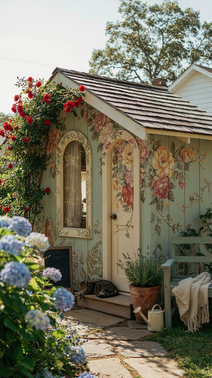
Your she shed paint color does one job: it tells a story before anyone steps inside. Soft greiges and warm whites say “refined retreat.” Deep forest greens or charcoal grays say “intentional and moody.” Cream with terra cotta accents say “I know design history.” The color you pick isn’t decoration. It’s a declaration of what you think matters enough to spend time around.
Stop Following The Beige Consensus
Most advice tells you to go neutral and safe. This is wrong. Neutral paint sells houses to strangers. Your she shed is not for strangers. The common guidance misses the actual mechanism: a space with zero visual conviction feels like a waiting room, not a refuge. Beige and greige dominate because they’re inoffensive, not because they’re right for you.
The real move is picking a color that matches how you actually want to feel in that space, then committing to it. If you want energy, go dusty terracotta or warm ochre. If you want calm, pick a soft sage or pale blue-gray. If you want drama, use charcoal or deep navy. The specificity is what makes it work. Paint your shed the color that makes you want to stay there, not the color that makes you nervous about resale value.
The Real Obstacle Isn’t The Paint; It’s Your Fear Of Owning Your Aesthetic
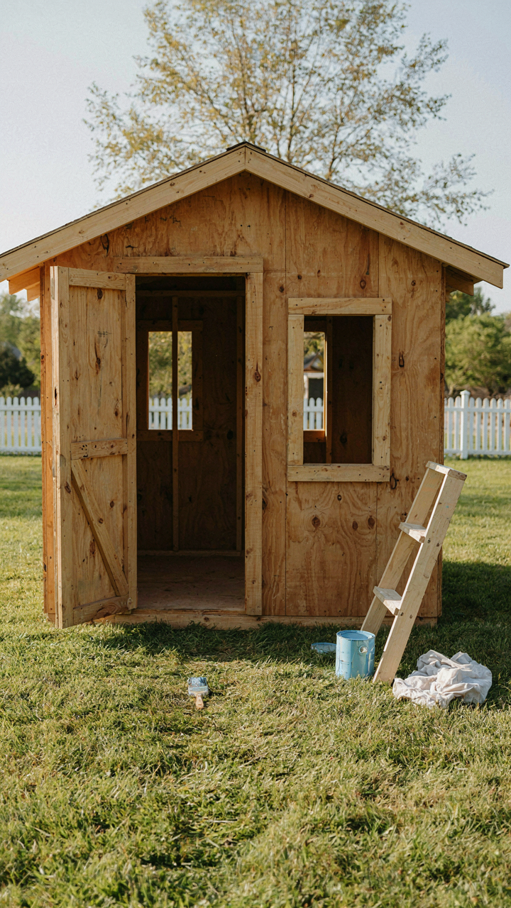
Most people never paint their she shed because they’re waiting for permission. Permission from who? Nobody knows. You already own the space. Stop outsourcing your taste to design magazines and pick a color that makes you feel alive when you walk through the door. Today, go buy a sample can of the shade that actually calls to you, not the one that looks safe. Paint a wall. See how it feels. The only bad color is the one you never had the guts to try.