
The Illusion Protocol: Manipulating Space With Coastal Paint Colors
Light Reflection Expands Perceived Square Footage
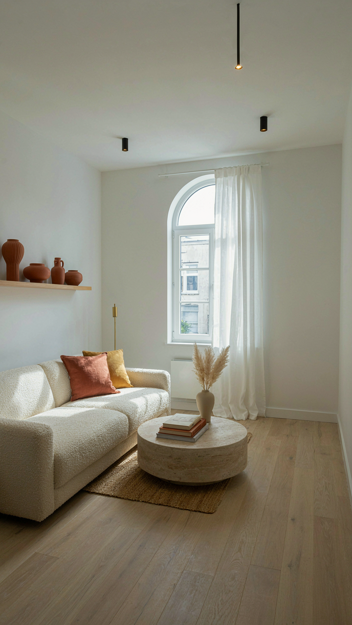
You want your cottage to feel bigger than it actually is. That’s the real reason you’re reading this. The mechanism is optical: light colors reflect more wavelengths back into the room, which your brain reads as spatial depth rather than compression.
Coastal cottages exploit this through high-LRV (light reflectance value) paint finishes. Soft whites, pale grays, and barely-tinted creams bounce available light around tight rooms. Use flat or eggshell finishes to avoid hot spots that read as artificial. The payoff is measurable—a room painted in 80+ LRV colors feels physically larger than the same space in 40 LRV tones. Apply this to walls first, then accent trim and doors with slightly lower values to create visual breathing room without sacrificing the expansion effect.
Thermal Temperature Dictates Emotional Residency
The common advice calls this “warm versus cool.” That’s incomplete. Thermal psychology works like thermoregulation: your nervous system responds to color temperature before your conscious mind registers aesthetics. Cool palettes (blues, greens, gray-whites) lower perceived room temperature and activate calm states. Warm palettes (sand tones, cream, pale ochre) raise perceived warmth and trigger slight alertness.
Coastal cottages typically lean cool because the adjacent ocean temperature creates subconscious expectation. But this is where most designers miss the lever: pair cool wall colors with warm accent trim or a single warm architectural element. This creates contrast without visual chaos. The mechanism is simple—your eye travels between the two temperatures, which keeps the space from feeling static or cold. Choose your dominant palette (cool or warm), then deploy the inverse as no more than 15-20 percent of visible surfaces to maintain equilibrium.
Beyond Beige: The Coastal Color Palette Of Subtle Saturation
Why Muted Tones Win Over Bright
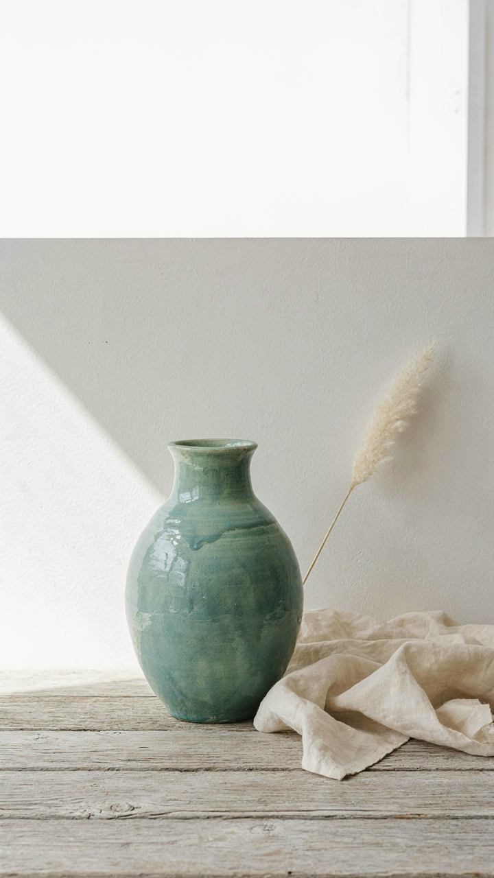
You want people to think your taste is refined, not that you’re compensating with loudness. Here’s the mechanism: muted tones work because they recede visually, which makes rooms feel larger and lets the actual architecture breathe. Saturation acts like volume in design. When you lower it, attention shifts from the color itself to how light moves across surfaces, the grain of wood, the texture of linen. Vibrant coastal colors fail because they demand constant attention and age faster psychologically. Your eye stops seeing them after three months.

Muted saturation doesn’t mean gray. It means colors pulled from actual coastal environments: sea glass greens with the brightness dialed back 40 percent, sandy taupes, weathered blues that read closer to slate. Historic coastal cottages in New England and the UK used these tones not for aesthetic reasons but for practical ones: they masked salt spray damage and faded predictably in sun exposure. You’re borrowing a maintenance solution and getting timelessness as a side effect. The palette stays relevant because it mirrors what nature actually produces on coastlines, not what a brand wants to sell you.
Texture Does The Heavy Lifting
Most design advice says to layer colors. That’s backwards. Layer texture instead, then add color as a supporting player. Think of it like contrast ratio in photography: you don’t increase brightness to create drama, you increase the difference between light and dark values. Matte finishes, woven materials, and rough surfaces create visual interest that saturation cannot. A muted sage green on rough plaster reads deeper than a brighter sage on smooth drywall. The friction between material and light does the work.
This is why coastal cottages with limited color palettes don’t feel boring. A room painted in one muted tone gains complexity through linen, weathered wood trim, unglazed ceramic, and soft furnishings. Each material catches light differently. When you add texture first, you can use softer, less saturated colors without losing dimension. Start by selecting your materials and finishes, then choose a color that complements the texture values already present. This inverts the typical design process and produces spaces that feel intentional instead of assembled.
The Alchemist’s Mix: Crafting Unique Coastal Paint Combinations
Unexpected Pairings For Sophisticated Outcomes
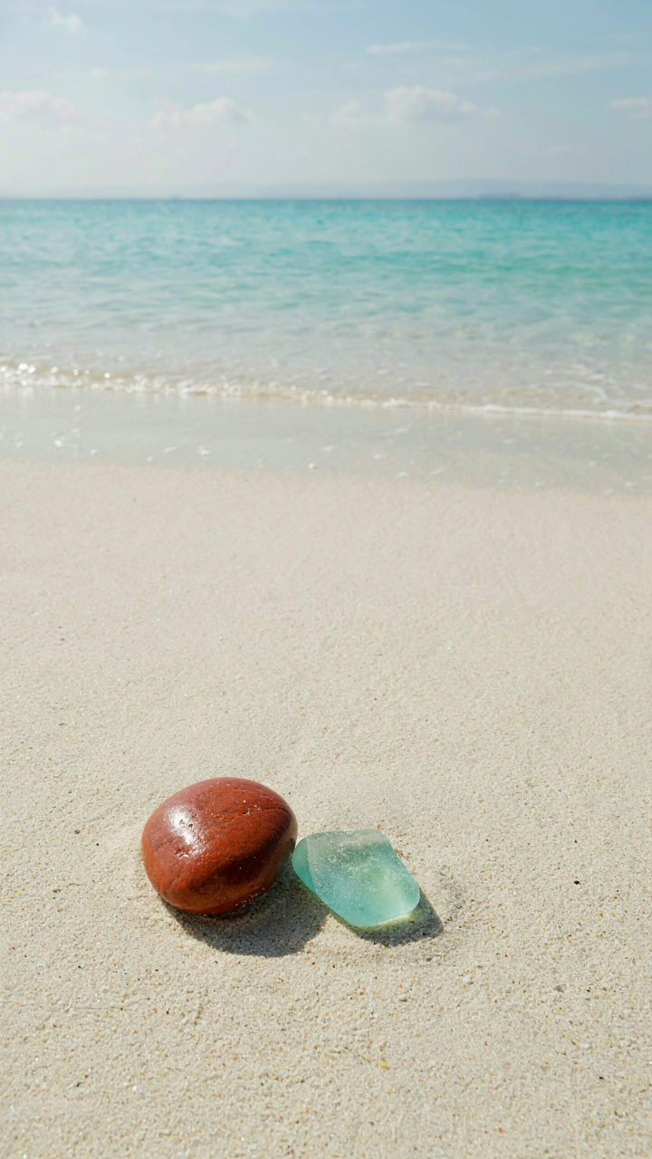
You want your cottage to feel curated, not decorated. That’s the real game here. The mechanism is contrast displacement: you’re borrowing from color theory’s principle of simultaneous contrast, which states that colors shift their perceived value when placed next to their opposites. In coastal schemes, this means pairing a muted sage with warm terracotta, or soft gray-blue with aged brass tones. The ocean doesn’t live in monochrome. Neither should your walls.
Most coastal cottages fail because they treat color as a matching game. Pair dusty olive with warm cream trim instead of the expected white. Use a low-saturation rust accent wall with cool seafoam cabinetry. These combinations work because they honor the actual palette of coastal environments: weathered wood, oxidized metal, sun-faded textiles, and mineral deposits. The pairing feels earned, not assembled from a trend list.
Blend, Don’t Just Match
The common advice says to “coordinate colors harmoniously.” That’s backwards. Coordination kills specificity. Blending means layering undertones so colors talk to each other across different surfaces. A dusty mauve trim works with pale blue walls because they share gray undertones, not because they match. Paint your main walls in a cool-toned greige. Add cabinetry in warm-toned greige. They read as one system, not a coincidence.
This is why paint swatches fail most people. You need to see undertones in context: how a color shifts under natural light at different times, how it relates to existing wood tones and metal fixtures. Apply test patches across multiple walls and observe for a full week. The blend emerges through observation, not assumption. Once undertones align, your palette locks in place and feels inevitable rather than chosen.
Coastal Farmhouse Color Palette: The Erosion Principle

What Geology Actually Teaches Design
You want your cottage to look like it belongs there, not like you bought a paint deck and made choices. That requires understanding how materials actually change over time, not just copying Instagram.

Geology calls this weathering: the mechanical and chemical breakdown of rock surfaces exposed to air, water, and salt. In coastal cottage color schemes, weathering translates to one principle: colors that appear faded weren’t designed that way. They arrived there through loss. Driftwood isn’t beige because a designer picked it from a swatch. It’s bleached gray because UV light and salt spray stripped pigment from wood grain for years. Sea glass isn’t frosted blue or green by intention. Waves frosted it by grinding it against sand until the surface diffused light instead of reflecting it. The mechanism is specific: colors in coastal farmhouse palettes work because they mirror the exact visual output of material degradation, not because they evoke a feeling.
This distinction matters because it shapes every color decision you make. A coastal cottage palette that looks authentic uses colors that could plausibly result from exposure, not sentiment. Soft greens appear soft because they suggest lichen or algae growth on stone. Dusty whites suggest salt deposits and chalk weathering. Muted teals suggest oxidized copper gutters or sea glass tumbled into frosted opacity. When you reverse-engineer the material process, you stop guessing.
Patina As The Design Blueprint
Most design advice says to choose colors that feel “lived in” or “weathered.” That’s too vague to execute. The real move is to identify which materials actually degrade in coastal environments, then match their end state.
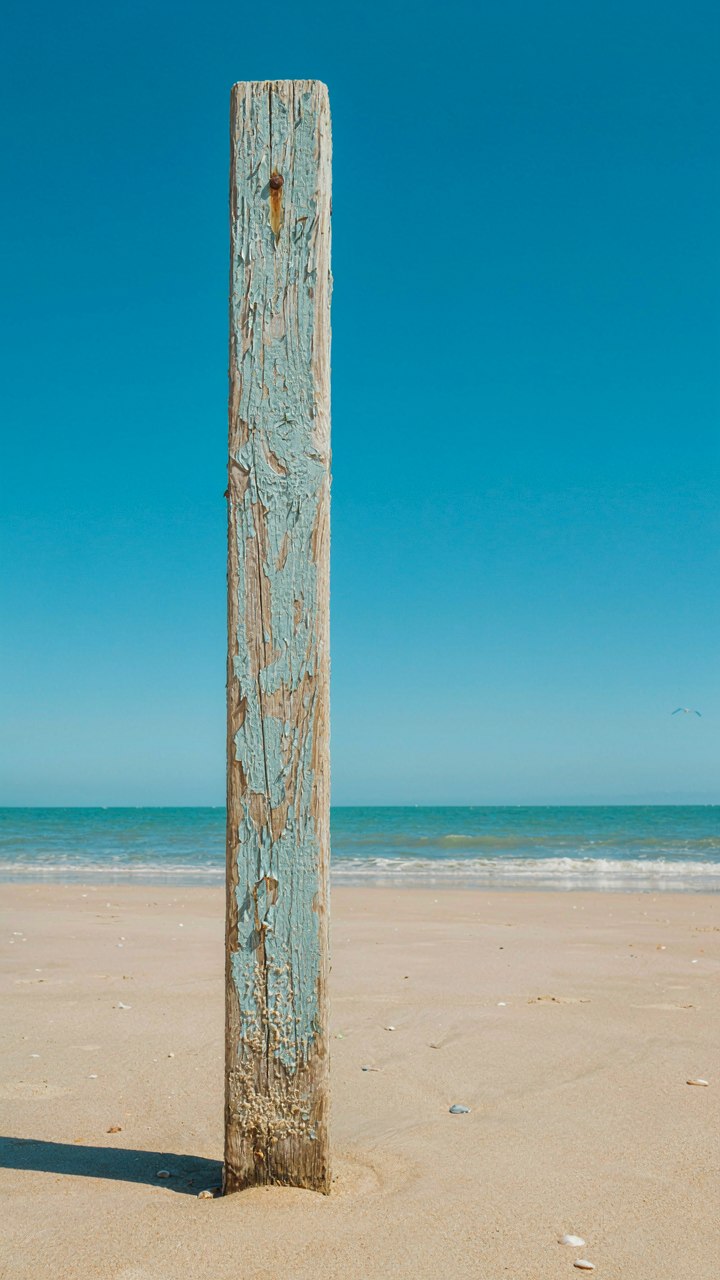
Copper oxidizes to soft blue-green and brown. Iron rusts to warm orange-brown and deep burgundy. Wood bleaches to silver-gray or pale tan. Concrete develops mineral stains and lichen that read as soft sage or gray-brown. Paint peels to reveal cream or pale yellow undertones. Stone accumulates salt deposits that appear chalky white or beige. When you observe these actual transformations in real coastal cottages, you stop theorizing about color and start copying documented material failure. The palette emerges from geology, not aesthetics. Your cottage’s trim color should match what would happen to that material if neglected for a decade, not what a designer thinks looks rustic.
Beach House Colors: The Spectrum Of Light Absorption
Why Light Wavelength Determines Paint Behavior
You want this section because you’re betting your cottage won’t look dated in five years, and you’re hoping some physics rule will guarantee it. That’s not how this works. Light absorption is the actual mechanism that decides whether a color reads as calming or jarring on your walls.

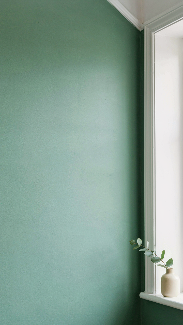
Physics tells us wavelength is everything. Shorter wavelengths scatter more, longer ones penetrate deeper. In paint terms, this means a soft blue absorbs the red end of the spectrum and reflects blue back at you. Sea glass greens and sand taupes work in coastal cottages because their wavelengths align with how your eye processes light at different times of day—not because they’re trendy. Morning light hits differently than afternoon. Paint that works at noon might flatten at dusk if you picked the wrong undertone family.
Matte Finishes Absorb Light, Gloss Reflects It
Everyone says use matte for coastal cottages. That’s incomplete. The real distinction is absorption versus reflection, and each has a job depending on where the light actually lands in your space.
Matte surfaces absorb more light wavelengths because their microscopic texture traps photons. A matte eggshell in greige on a north-facing wall will read warmer and more forgiving than the same color in semigloss because it’s swallowing light rather than bouncing it back. Gloss finishes amplify color intensity by reflecting light directly outward. This matters for trim and doors in sea-cottage schemes—glossy white trim reads crisp and clean because it’s returning almost all wavelengths. The mechanism is simple: absorptive surfaces dampen color perception, reflective surfaces intensify it. Choose finish based on whether you want a wall to recede or advance, not based on what’s conventional for coastal design.
The Minimalist Beach House Color Palette Protocol
Restricting Your Palette To Amplify What Matters
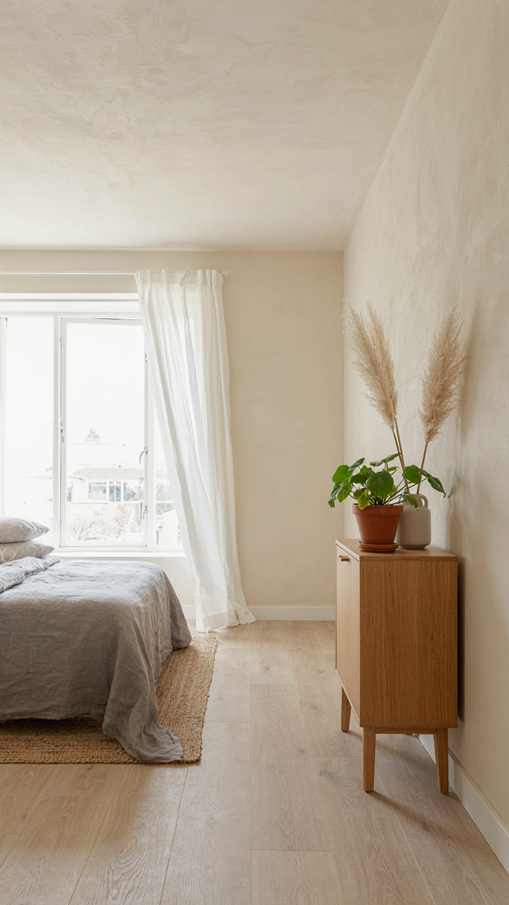
You want minimalism in coastal design because it signals taste and control. The real mechanism is constraint. When you remove colors, each remaining one gains visual weight. Design borrowed from signal processing: reducing noise amplifies signal. In coastal cottages, this means three to four base colors do more work than eight. The colors you eliminate matter more than the ones you keep.
- Dominant neutral (60% of space): Off white, greige, or warm sand. Establishes the visual foundation and recedes, allowing accent colors to read clearly against calm backdrop.
- Secondary neutral (30% of space): Soft gray, linen, or pale driftwood tone. Prevents the space from feeling sterile while maintaining cohesion and visual rest.
- Accent color one (7% of space): Deep blue gray, muted sage, or weathered teal. Drawn from actual sea glass or stone found on the site’s local beach.
- Accent color two (3% of space): Warm earthy tone like aged clay or faded rust. Used sparingly on trim, a single wall, or functional elements like shutters.
- Texture substitution over color addition: Linen, wool, weathered wood, and stone replace new colors. The eye perceives variation through surface quality, not hue multiplication.

The moment you add a fifth color, you’re no longer minimalist. You’re decorating. Stick to this ratio religiously. Paint the walls first in your dominant neutral. Live with it for two weeks. Only then introduce accents. This forces you to see what the space actually needs instead of what design trends suggest it should have.
Curated Restraint For Visual Clarity
The common advice says “let the view be the star.” That’s incomplete. The view competes with your interior colors unless you make one transparent and one loud. Restraint here means strategic suppression, not boring uniformity. Your palette stops the eye from scanning everywhere at once, which is what actually creates clarity and calm.
Choose your secondary colors from materials already present in the space. Pull grays from the concrete foundation. Pull warm tones from wood beams. Pull blues from light reflecting off water at different times of day. This isn’t poetic observation. It’s mechanical matching. When interior colors echo exterior materials, the eye registers them as cohesive rather than chosen. Paint two walls and leave the other two bare wood or natural plaster. The room reads as intentional, not decorated.
Coastal Colour Palette: Strategic Accents, Not Overload
When Color Works Against You
You want the room to feel intentional, not accidental. That’s the real anxiety here. The mechanism most designers miss is restraint as dominance. Borrow from music production: coastal cottages need negative space the way a mix needs silence. One accent color placed correctly does more work than five scattered across the room. The mistake isn’t using bold color. It’s deploying it without a structural reason.
Accent colors in coastal cottages work best when they anchor a functional zone, not decorate it. A weathered teal on a built-in bookcase, a rust-orange on interior shutters, a muted sage on a single accent wall near seating. These placements give the eye a landing spot. They create hierarchy. The color stops working the moment it becomes decorative noise, spread thin across throw pillows and artwork that lack architectural weight.
The Difference Between Inspired And Costumed
The common advice here is wrong. Designers say “bring in touches of color that feel natural to the coast.” That’s backwards. Touching everything up lightly creates a theme park, not a home. Coastal inspiration means stealing the mechanism of how light and texture work in seaside environments, then applying it to your actual material constraints.
Real coastal cottages earn their color palette through material exposure and weathering. Faded wood, oxidized metal, salt-bleached rope. These aren’t decorative choices. They’re the result of time and environment. To avoid theming your space, work backward from material: choose finishes and textiles that actually fade and age in your climate, rather than trying to fake the aesthetic of erosion through paint swatches.
The Unspoken Rules Of Coastal Paint: Durability And Longevity
Salt Air Doesn’t Care About Your Aesthetic
You want your cottage to look good in five years, not fade into surrender by year two. That’s the real reason you’re reading this section. Salt, UV exposure, and humidity don’t operate on the same timeline as interior paint in a climate-controlled living room. Coastal environments accelerate chemical breakdown through oxidation and corrosion mechanisms identical to how rust forms on metal. Your paint color holds only as long as the resin binders resist molecular degradation.

The common advice says “use coastal paint.” That’s incomplete. Coastal paint is a marketing term. What matters is binder chemistry and pigment stability. Acrylic latex binders outperform oil-based formulas in salt environments because they cure through water evaporation rather than oxidation, making them less susceptible to salt-induced breakdown. The pigments in your sea glass gray or driftwood beige will fade if they can’t resist UV radiation. Iron oxide pigments hold color better than synthetic organics in coastal zones. Check the paint’s UV absorption rating and salt-spray test results, not just the color name.
Quality Paint Stops The Fade Cycle Before It Starts
Most cottage owners treat paint as a consumable expense rather than a durability investment. They buy mid-range exterior paint, get two years of acceptable color, then repaint. Premium coastal formulas cost 40 to 60 percent more upfront but extend the repainting interval to seven to ten years. The mechanism is simple: higher pigment concentration and superior resin chemistry resist salt and sun longer. Cheaper formulas use lower pigment loads, which means less color saturation and faster oxidative breakdown.
Fade patterns in coastal cottages aren’t random. South and west-facing walls fade faster due to sun exposure intensity. Surfaces near salt spray zones deteriorate quicker through corrosive chemical reactions. Apply premium paint designed for marine environments to all exterior surfaces, prioritizing sun-exposed walls. Schedule repainting based on visual degradation, not arbitrary timelines. Inspect your cottage annually and repaint the first wall that shows significant color shift before the failure spreads to adjacent surfaces.
The Real Obstacle Isn’t Choosing Colors; It’s Accepting That Peace Is Engineered, Not Inherited
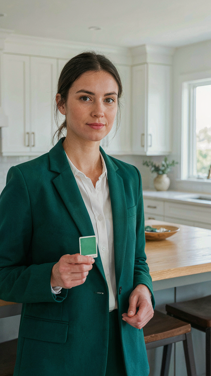
Most people treat their homes like museums instead of machines. You pick coastal cottage colors and expect calm to arrive automatically. It won’t. Peace demands deliberate design. Your nervous system responds to environment faster than your conscious mind catches up. Stop scrolling inspiration boards. Pick one sea glass green or sand beige today and commit to it for thirty days. Watch how your body changes before your mind understands why. The color isn’t calming you. Your decision to stop second-guessing yourself is.