The Myth Of Muted Hues: Why “Tasteful” Is Often Timid
The Safety Trap That Kills Character
You want permission to use bold color because you’re afraid of being judged for it. That’s the real mechanism at work. The design industry spent decades selling “neutral restraint” as sophistication, when the actual reason was easier to execute, cheaper to market, and safer to defend to risk-averse clients. Painted lady Victorians rejected this logic entirely. They used high-saturation, high-contrast palettes because restraint hadn’t been invented as a status marker yet. The colors weren’t accidents. They were declarations.
What changed isn’t architecture or taste. It’s psychology. Modern consensus treats bold exterior color as gauche, which means choosing it now requires active resistance to perceived judgment. The people who built these homes had no such consensus to rebel against. They simply wanted their house visible, memorable, and architecturally distinct from its neighbors. That visibility came through pigment saturation, not through subtlety. The safer your color choice feels today, the closer you are to erasing what made Victorian painted ladies work in the first place.
When Palettes Become Invisible
Generic color advice tells you to “choose a cohesive palette” and “let the architecture breathe.” This is incomplete. What it really means is: dilute every color until nothing conflicts, then hope the viewer notices the building at all. Economics explains this drift. In business, the cost of a failed choice scales with visibility. A muted palette fails quietly. A bold one fails loudly. Architects and builders started optimizing for invisibility.
Painted lady colors demand the opposite. A Victorian exterior with three or four competing hues works because the contrast itself becomes the visual organizing principle. The eye doesn’t get bored. The facade doesn’t fade into the streetscape. Every element gains definition through adjacency to a different color value. When you mute these relationships, you don’t create sophistication. You create visual noise that the brain stops processing. Start with historical paint layer analysis of actual Victorian homes in your region, then match saturation and contrast before matching the specific hues.
San Francisco Painted Ladies: Beyond The Postcard Facade
What The Original Victorians Actually Did
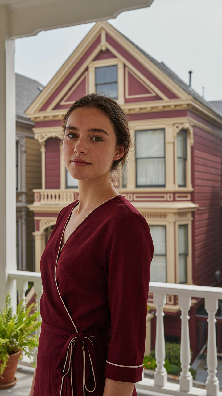
You want to believe the Painted Ladies represent some coherent design philosophy, when really they’re just what happens when paint becomes affordable and neighborhoods stop burning down. The original Victorian color theory wasn’t romantic—it was optical physics applied to masonry. Victorians used contrast because it worked: dark base colors receded, bright accent colors on trim popped forward, and the three-color scheme made buildings read as structured objects instead of blank walls in fog.

The mechanism is simple. Light pigments reflect more wavelengths. Dark pigments absorb them. Victorians stacked these opposites—typically a deep burgundy or forest green body with cream or pale yellow trim, then a third shade on the roof line—because human eyes parse depth through value contrast, not through sentiment. They weren’t being bold for status. They were solving a visibility problem in climates where overcast skies flatten everything into gray.
How Industrial Paint Changed What Was Possible
Before the mid-1800s, paint was expensive and limited in range. Most buildings wore ochre, umber, or basic earth tones because those pigments cost nothing. Once synthetic pigments arrived and competition dropped prices, homeowners could suddenly afford reds, blues, and greens that would have bankrupted them a generation earlier. That’s not art history—that’s market penetration changing what people could actually build.
San Francisco’s Painted Ladies weren’t a design movement someone decided on. They were the visible result of paint becoming a commodity. Homeowners chose bold combinations because they could, not because some aesthetic authority blessed it. The neighborhoods that kept these colors intact—Alamo Square, parts of the Mission—did so because they couldn’t afford to repaint frequently enough to follow trends. Economics locked in the look. Now we call it heritage.
The Hue Hierarchy Protocol: Dominance, Accent, And Subtlety
Where The Visual Weight Actually Lives
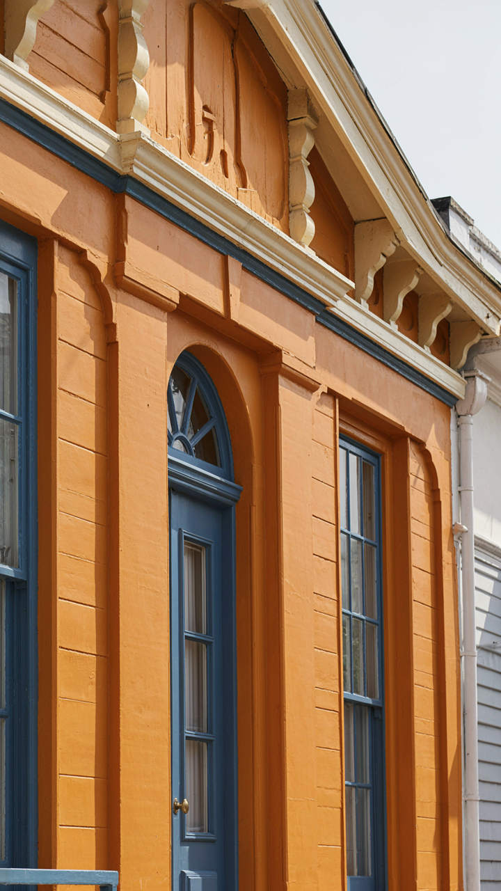
You want this to look expensive and intentional, not like you guessed. That fear drives most people to play it safe with one color and trim. The real mechanism borrowed from visual hierarchy in graphic design: establish dominance first. One hue must occupy 60-70% of your exterior surface area. This is your primary color, and it sets the entire conversation. Everything else responds to it.

Victorian homes demand this structure because their architecture already competes for attention. Without a clear dominant hue, you create visual chaos instead of sophistication. Painted ladies work because they respect dominance before they break the rules with accents. Your primary color should cover all body panels, siding, or clapboard. Choose it based on the orientation of your home and how light hits it throughout the day.
- Primary Hue (60-70% coverage): The main body color on all walls and large surfaces. Carries the structural weight of the entire palette. Sets mood and reads from street distance. Examples include deep reds, forest greens, navy blues, or warm ochres used on Victorian-era homes.
- Secondary Hue (20-25% coverage): Applied to trim, cornices, or architectural details that frame the primary. Creates visual separation and emphasizes molding. Works best as a complementary or lighter version of the primary. Typically reserved for bands, fascia, or decorative elements.
- Tertiary or Accent Hue (5-10% coverage): Strategic color on doors, shutters, or small details. Adds personality without disrupting hierarchy. Often the boldest choice in the palette. Should contrast enough to read clearly but not pull focus from the primary.
- Neutral Substrate: Unpainted wood, stone, or masonry that remains visible. Acts as a fourth color whether you plan it or not. Reduces overall saturation and prevents the palette from feeling artificial or overwhelming.
- Shadow and Recessed Areas: Architectural depth creates natural value shifts. Darker recesses in cornices or under eaves read as a fifth subtle color. Work with this, not against it, when selecting your primary hue.
The discipline is in restraint, not abundance. Most people who fail with painted ladies add too many colors in equal measure. They treat the exterior like a palette instead of a hierarchy. Once your primary hue covers the bulk of the surface, secondary and accent colors become negotiable. The structure holds everything together.
Contrast Placement And The Depth Illusion
Complementary colors create maximum visual tension, but that tension needs a location to work. Paint theory suggests placing contrasts where you want the eye to land first, but Victorian architecture already has visual anchors. Use them. Doors, shutters, and cornices are natural focal points because the architecture frames them. Place your highest-contrast accent there, not scattered across random surfaces.
The practical method: identify which architectural features project forward or sit recessed. Forward-facing elements like bay windows or protruding cornices can absorb bolder accents because they already command attention through dimension. Recessed areas like shutters benefit from contrasting shades that push them forward visually. Avoid placing contrasting hues on flat, featureless sections of wall. The architecture itself must justify the color change, or the palette reads as indecisive.
Purple Victorian House Exterior: The Unconventional Power Play
Why Purple Actually Signals Restraint, Not Rebellion
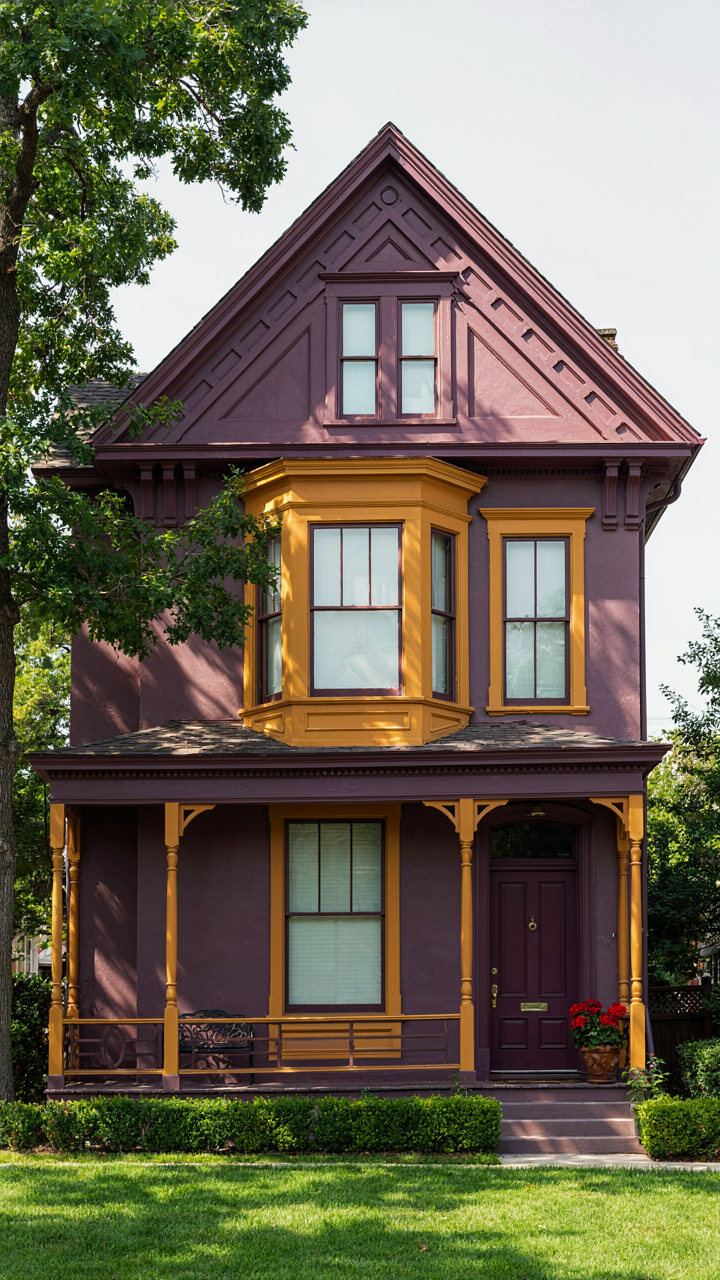
You want purple on your Victorian because you think it breaks the mold. It doesn’t. That’s the real mechanism at work here. In color psychology, purple occupies the position of perceived luxury without aggression, which Victorians understood as constraint masquerading as taste. Purple exteriors appeared most often on homes where owners had money but needed to signal refinement over novelty. The color carried weight without announcing itself. This is the opposite of what most people believe about bold choices.
Victorian builders reserved purple for specific conditions: high-income residential districts, homes with strong architectural detail that could hold the color, and regions where mauve and plum pigments were economically accessible. The pigments came from synthetic aniline dyes developed in the 1850s onward, making purple-toned exteriors a status marker of access to modern chemistry. When purple works on a Victorian exterior today, it works because the house already signals solidity through form and material. The color amplifies existing authority rather than creating it from nothing.
Pairing Purple With Colors That Actually Clash
The common advice here is garbage. Stop pairing purple with cream or sage. That combination dilutes both colors into the background. The real leverage sits in pairing purple with warm, saturated accent colors that force contrast without harmony. Think deep mustard on trim, rust on railings, or burnt orange on doors. These pairings work because they occupy opposite positions on the color wheel while sharing tonal weight. Purple requires ballast, not balance. A purple exterior paired with pale accents reads as indecision. Paired with colors of equal intensity, it reads as intention.
The material you use for accent colors matters more than the color itself. High-gloss mustard trim on a matte purple body creates visual separation that reads as deliberate. Flat finishes bleed together and lose definition. Test pairings on sample boards in actual sunlight at different times of day. Purple shifts dramatically between morning light and afternoon shadow. Mustard and rust shift less, which is why they function as anchors. Apply the strongest accent color to elements that receive the most direct sun exposure on your house’s orientation.
The “Game Theory” Of Painted Ladies Houses: Anticipating Visual Impact
What Your Neighbors Actually Signal Back
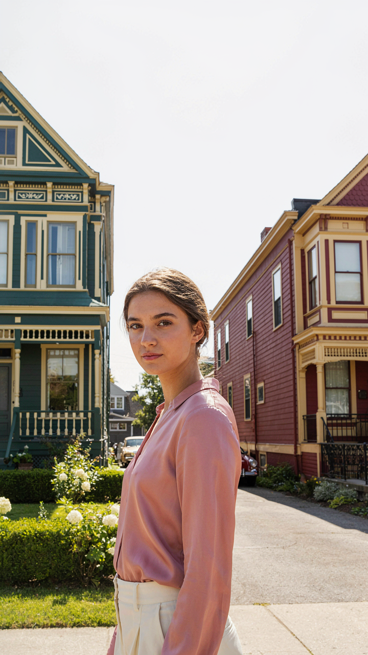
You’re worried about looking foolish. That’s why you’re reading this. Game theory—the study of how actors predict and respond to each other’s moves—reveals the real mechanism: painted lady colors don’t exist in a vacuum. They trigger a cascade of judgments based on what adjacent houses signal back to yours. Your color choice is a move. Neighbors perceive it as either congruent with local status or a deviation from it. That perception shifts property values and social positioning instantly. The mechanism is reciprocal signaling, not isolated aesthetics.

Painted lady colors work because they operate within a bounded range: rich, saturated, historically rooted hues that read as intentional rather than reckless. Victorian exteriors used colors like deep burgundy, forest green, ochre, and slate blue because these pigments signaled wealth and stability. When you deploy them correctly, you’re not breaking the social contract of the neighborhood—you’re restating it in a higher register. The colors that fail are those that feel random or trendy because they broadcast uncertainty. Pick a color that mirrors what the best houses on your block already communicate.
Curb Appeal Through Strategic Constraint
The common advice says more color combinations equal more visual interest. Wrong. Constraint is what creates perceived value. In game theory, limiting your moves forces opponents to predict your intent more carefully. With painted lady colors, this means selecting a primary hue, then letting trim and accent colors support it rather than compete. A deep forest green body with cream trim and burgundy accents reads as deliberate. The same green with five competing secondary colors reads as decoration. Restraint signals competence.
Your trim and accent colors should contrast enough to define architectural edges, but not so aggressively that they overwhelm the primary color’s dominance. Historically, painted lady homes used complementary pairs: deep greens with cream or light gray, burgundy with pale yellow or white, slate blue with warm tan. The secondary color’s job is architectural articulation, not visual excitement. Apply this rule to your own house: identify one dominant color that matches your home’s era and neighborhood context, then use no more than one supporting accent color. This approach guarantees higher perceived curb appeal than homes that treat every surface as a new decision.
Purple And Green Victorian House: A Timeless, Underutilized Pairing
The Saturation Problem
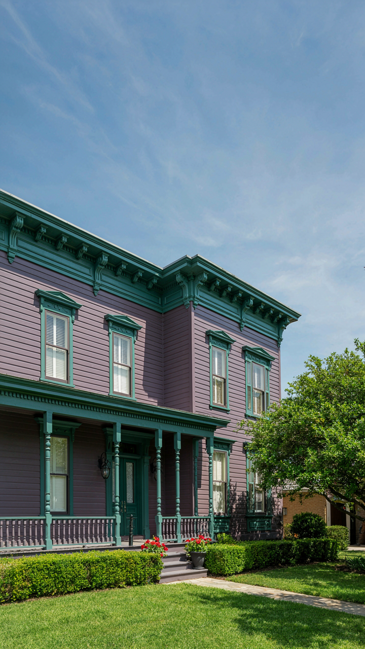
You want this pairing to work because it signals taste without screaming for attention. Here’s what stops most people: they treat purple and green as equals in visual weight, which creates chaos instead of hierarchy.

Think of saturation like electrical current. High-saturation purple (think royal or eggplant) and high-saturation green generate competing frequencies that strain the eye. Victorian exteriors succeed when one color carries the load at full intensity while the other recedes. Deep forest green as the base with a measured purple accent—or the inverse with muted purple walls and jewel-tone green trim—lets the house breathe.
When Contrast Becomes Noise
The standard advice says “use complementary colors for drama.” That’s lazy. Purple and green aren’t true complements on the color wheel, which means pairing them requires actual decision-making instead of formula.
The real failure happens when both colors occupy the mid-saturation range at equal areas. A purple body with medium green shutters creates visual vibration, not elegance. Solution: commit to dominance. Let one color own 70 to 80 percent of the facade surface area while the other functions as punctuation on architectural details like cornices, window frames, or doors. This isn’t about subtlety. It’s about preventing your house from looking indecisive.
San Francisco Painted Ladies Houses: Beyond The Obvious Palette
What The Instagram Photos Won’t Show You
You want the famous Alamo Square palette because it signals taste without effort. Here’s what actually matters: those seven-house “Painted Ladies” use a three-color depth system, not random Victorian whimsy. The base color sits neutral and recessive. The body color claims the visual weight. The accent color—applied to trim, cornices, window frames—creates the contrast that makes the whole thing read from the street. Most homeowners copy the colors and botch the placement, which erases the entire effect.

San Francisco’s lesser-known schemes work the same principle but start from your home’s actual bone structure. The Postcard Row homes work because their proportions demanded those specific tonal relationships. A narrow Edwardian on a steep hill needs different color distribution than a wide Stick-style Victorian on flat ground. The color choice isn’t decorative. It’s structural. You’re using pigment to either exaggerate or minimize what your architecture already does.
Making The Formula Work On Your Building
The common advice says “just pick colors you love.” That’s how you end up with a painted lady that looks diluted or confused from fifty feet away. What actually works is treating your home’s existing materials as the constraint, not the inspiration. If your mortar is gray, your base color needs to harmonize with that specific gray, not fight it. If your roof is weathered composition shingle, your trim color has to account for how light bounces off that roof back onto your walls.
Start by photographing your home at three times of day: morning sun, noon, and late afternoon. The color you choose will shift under each lighting condition. Victorian painted ladies in San Francisco use colors that maintain readability across fog, overcast, and direct sun. Apply your three-color system to a large test panel on the least visible wall first. Live with it for two weeks before committing to full exterior coverage.
Painted Ladies Victorian Homes: The Structural Articulation Advantage
How Color Reveals What Matters
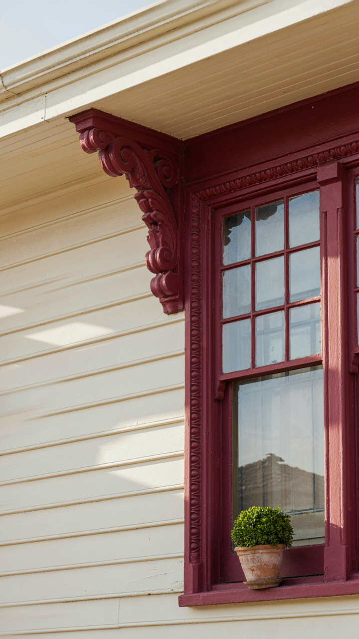
You want people to notice your house is expensive before they step foot on the property. That’s the real reason structural articulation matters. Painted lady schemes use contrasting hues to separate architectural elements—cornices, brackets, window trim, quoins—so each component reads as distinct rather than blurred into one mass. This isn’t decoration. It’s information design applied to a building facade.

The mechanism borrowed from visual hierarchy: contrast creates emphasis. In graphic design, you’d use weight or size. On a Victorian, you use color saturation and value separation. A deep burgundy trim against cream siding doesn’t just look intentional—it forces the eye to track where the structure actually is. The ornament becomes legible. The craftsmanship becomes visible. Without this separation, those expensive details vanish into shadow and distance.
Shadow And Surface Work Together
Light doesn’t fall evenly across a facade. Recesses get darker. Projections catch full sun. Most painted lady advice ignores this and recommends colors in a vacuum, which produces flat results. The real play is understanding that a highlight color on a sunny-facing cornice will read differently than the same color in a north-facing shadow.
Choose your primary color for midtone surfaces first, where light is diffuse. Then shift your trim color by at least 20 to 30 percent in value—either deeper or lighter—depending on whether that trim catches consistent direct sun or lives in permanent shade. A cream trim that works on an east-facing gable may look washed out on a north wall. Apply the color to the actual structure and observe it at three different times of day before committing to the full exterior paint job.
Purple Victorian House Design: From Concept To Unignorable Reality
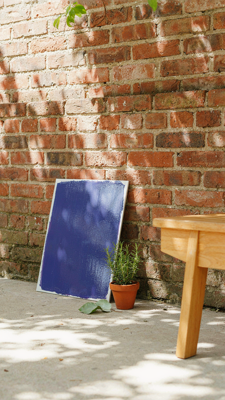
How To Paint A Bold Exterior Step By Step
You want this because you’re tired of looking like everyone else on the block, and you’re banking on purple to fix that without admitting you’re actually afraid of commitment. Here’s the mechanism: painted lady palettes work because they layer complementary colors in specific zones, not because they’re randomly bold. Your purple exterior needs structural logic or it reads as a mistake.

Start with a base purple on main walls. Choose either blue-purple (cooler, recessive) or red-purple (warmer, advancing). The distinction matters because one makes your house feel larger, the other bolder. Next, select trim colors from the painted lady tradition: cream, soft gray, or muted sage work as architectural breathe-room. Apply the darkest purple to recessed areas like beneath eaves or around windows to create shadow depth. Use your secondary color on doors and accent surfaces to anchor the scheme and prevent monotony.
- Base Purple Selection: Decide between blue-based purples (like periwinkle or lavender) or red-based purples (like mauve or plum). Blue purples recede and feel calmer. Red purples advance and demand attention.
- Trim Color Strategy: Paint trim in contrasting light tones, not white. Cream, dove gray, or pale yellow allows purple to breathe while maintaining Victorian proportion and detail visibility.
- Accent Application: Use a darker purple shade or complementary color on doors, shutters, and corbels to create visual interest and break visual fatigue across large wall areas.
- Test Patches First: Paint 3×3 foot sections on each elevation in different lighting conditions. Morning, afternoon, and evening light shift purple perception dramatically, especially with undertones.
- Surface Preparation Matters: Strip existing paint or prime bare wood properly. Purple shows imperfections and chalking worse than neutral tones. One coat failure means visible splotching across your entire facade.
Preparation is where most people fail. They assume bold color forgives poor surface work. It doesn’t. Purple amplifies every repair line and texture variation. Sand glossy surfaces to matte, fill gaps with caulk that matches trim color, and use a quality exterior primer designed for color holdout. The paint you choose matters less than the substrate it sits on.
Standing Firm When Doubt Creeps In
The real resistance isn’t about color. It’s about permitting yourself to stand out in a neighborhood built on sameness. Your brain will invent practical objections to avoid the social exposure of being visibly different. Resale value concerns, neighbor judgment, “wrong era for this street” all surface when you’re actually just negotiating your own comfort with visibility.
Painted lady exteriors existed because Victorians rejected uniformity as boring and signaled status through color choice and architectural confidence. You’re not inventing boldness. You’re reclaiming a principle that fell out of fashion during the mid-century beige consensus. The doubt you feel is cultural lag, not design failure. When the fear becomes loudest, that’s the signal to commit harder, not retreat. Document your color choices in writing before paint day. Commit to living with your selection for one full year minimum. This prevents the panic-repaint cycle that kills unconventional choices before they can settle into your perception.
The True Barrier To A Bold Exterior Isn’t The Paint; It’s Your Timid Aesthetic Paralysis
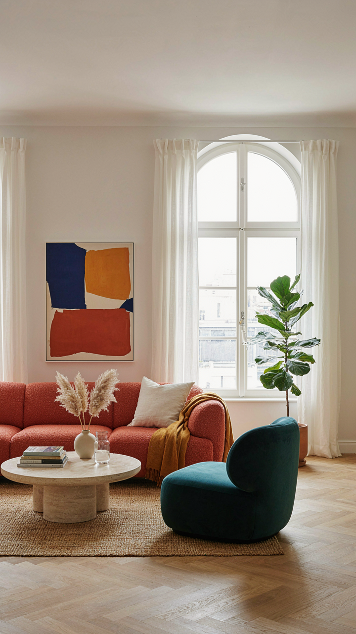
You already know which painted lady colors make your gut light up. The real problem is you’re waiting for permission that will never come. Your neighbors won’t care in six months. Your resale value won’t tank. What will tank is another year of looking at a house that doesn’t reflect who you actually are. Pick your color today. Order samples. Slap them on your exterior where the light hits hardest. Stop designing for a version of yourself that doesn’t exist yet. Paint for the person you are right now.