The Original Intent: Why Less Was More
When Every Surface Had To Earn Its Place
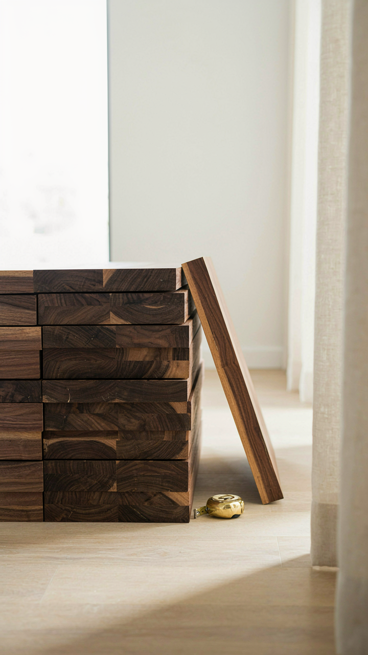
You want permission to buy less stuff and call it design. That’s the real draw here. But the actual mechanism was harder: post-war ranch designers couldn’t afford waste, so they built a system where nothing existed without justifying its presence through pure utility. Form followed function not as philosophy but as constraint. A side table wasn’t decoration. It held a lamp that lit the room. A credenza stored records and electronics that didn’t fit elsewhere. Warm wood wasn’t chosen for mood. It was chosen because it hid wear, required less maintenance than painted surfaces, and manufacturers had excess inventory after defense contracts ended.
The ranch home itself emerged from this same pragmatism. Developers needed to move inventory fast on suburban land that was cheap but finite. Sprawling horizontally cost less than building up. Open floor plans reduced framing materials and labor. Every design choice traced back to cost, speed, and measurability. This wasn’t aspirational. It was what remained when you stripped away pretense and budget constraints forced honesty about what a room actually needed to do.
Material Honesty Masquerading As Restraint
In systems thinking, there’s a concept called “exergy”—the useful energy available for work after accounting for waste. Mid-century ranch interiors operated on pure exergy: materials showed their true nature rather than disguising it. Wood stayed wood. Metal stayed visible. Upholstery covered function, not decoration. This wasn’t minimalism as a lifestyle brand. It was the economic reality of post-war America. Labor was expensive. Embellishment was luxury. Families needed to furnish homes on GI Bill budgets and working-class salaries that didn’t permit excess.
Manufacturers exploited this constraint into competitive advantage. Warm-toned woods like walnut, teak, and oak could mask dust and scratches better than lighter finishes. Solid wood furniture didn’t require veneer tricks or complex joinery that added time to production. Flat-pack assembly saved shipping costs. Every material selection moved the needle on profitability while appearing to serve the homeowner’s taste. The design language of “warm wood ranch” was really a supply chain optimization that got repackaged as an aesthetic. Most people still mistake the result for intention rather than inevitability.
The 70s House Trap: Avoiding Stagnant Homage
Timeless Bones, Disposable Details
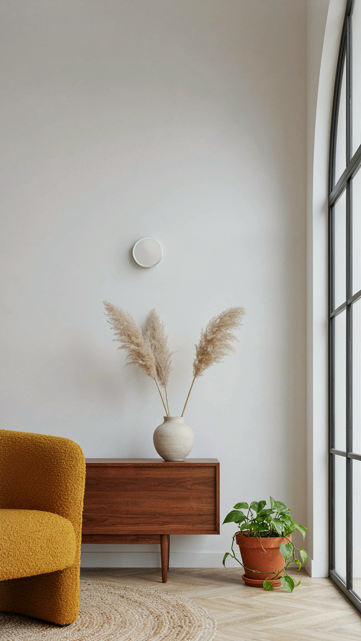
You’re scared of dating your space. That fear makes you cling to every surface detail from the mid century era, treating 1950s and 1960s design like a museum exhibit instead of a living system. The mechanism is simple: you’re confusing the structural principles of mid century ranch design with the aesthetic choices that surrounded them.

Mid century ranches work because of their bones, not their accessories. Open floor plans. Load-bearing walls placed for sight lines, not arbitrary division. Horizontal sightlines that extend sight distance. Post and beam construction. These principles don’t age. The color palettes, material finishes, and decorative objects? Those were responses to what was available and affordable in their decade. Separate them now or your space reads like arrested nostalgia.
Wiring Without The Visible Wound
The most common advice tells you to hide technology. That’s incomplete. Smart home infrastructure and modern climate control require infrastructure that, if hidden poorly, creates maintenance nightmares and routing conflicts with original structural elements. The real play is integration by principle, not concealment.
Run new wiring in walls built after original construction, or use floor raceways in concrete slabs where original plumbing allows it. Thermostats and speakers mount on walls where mid century ranches already had utility: the kitchen soffit, the wall between living and dining space, the transition zone near the entry. Hide cables behind existing beam columns or along the underside of soffit edges, not through walls that carry structural load. This takes planning, not camouflage.
Warm Wood’s Strategic Deployment: Not Just A Surface
Wood Grain As Directional Force
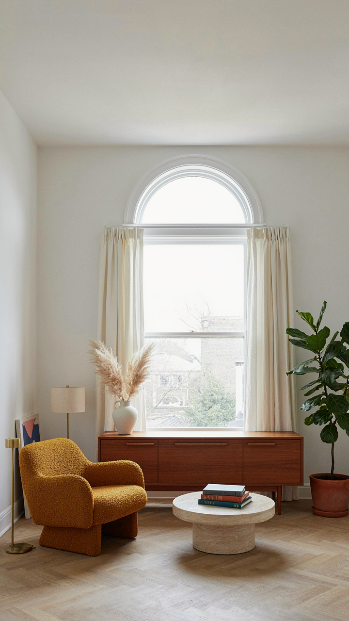
You’re reading this because you want the room to feel expensive without looking like you tried. The real mechanism at work is borrowed from visual hierarchy in graphic design: grain direction controls eye movement the same way leading lines control a photograph. Horizontal grain pulls the eye across space and makes rooms feel wider. Vertical grain draws attention upward, adding ceiling height perception. Diagonal grain creates tension and movement. Mid century ranch interiors deploy this deliberately, not accidentally.
The designers of the 1950s understood that wood surfaces weren’t neutral backgrounds. A teak credenza with horizontal grain running left to right anchors the living room and makes a modest space feel deliberate. When you place vertical-grain walnut paneling on a single wall, you’re not decorating—you’re engineering sight lines. The grain becomes the instruction manual for where attention lands. Placing grain direction without intention wastes the material’s ability to reshape perception.
Wood As Anchor Not Overwhelm
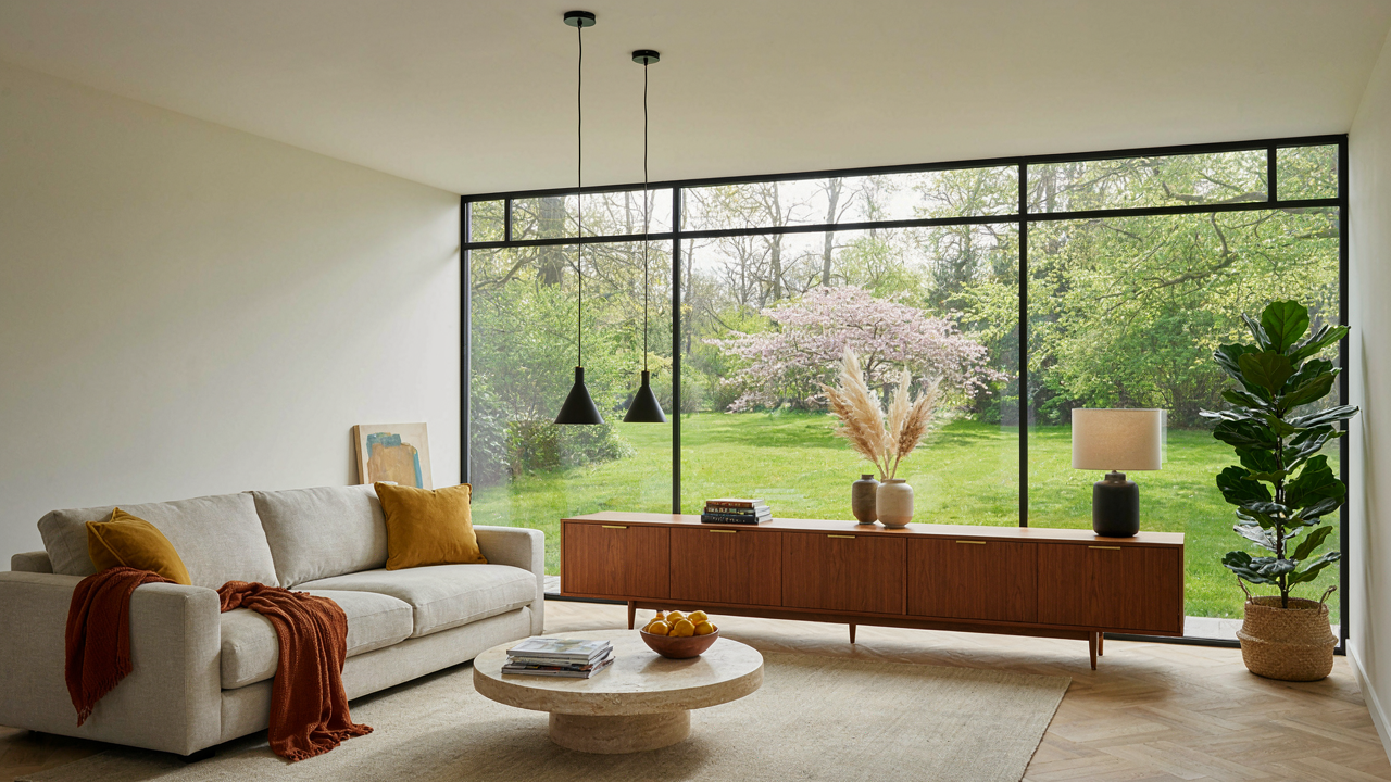
The common advice says “bring in warm wood tones” as if wood is just color. It isn’t. Wood functions as mass and weight in a room. One overscaled wood element anchors the space and stops visual noise. Two competing wood pieces fight for dominance and create fatigue instead of calm. Mid century ranch design got this right by anchoring the room around a single wood focal point—typically a credenza, wall panel, or fireplace surround—then using lighter woods or non-wood materials elsewhere.
The mechanism is mass distribution. A substantial wood credenza with solid legs and honest joinery reads as intentional. It stops the eye and says “this is the room.” Everything else serves it. Secondary wood elements in lighter finish or thinner profile become supporting players, not competitors. This prevents the interior from becoming a timber warehouse. The anchor piece absorbs visual weight so the rest of the room can breathe. Position your primary wood element first, then restrict secondary wood to accent roles only.
The MCM Living Flow Protocol: Optimizing Space
Open Concept Redefined: Zones Of Intentionality
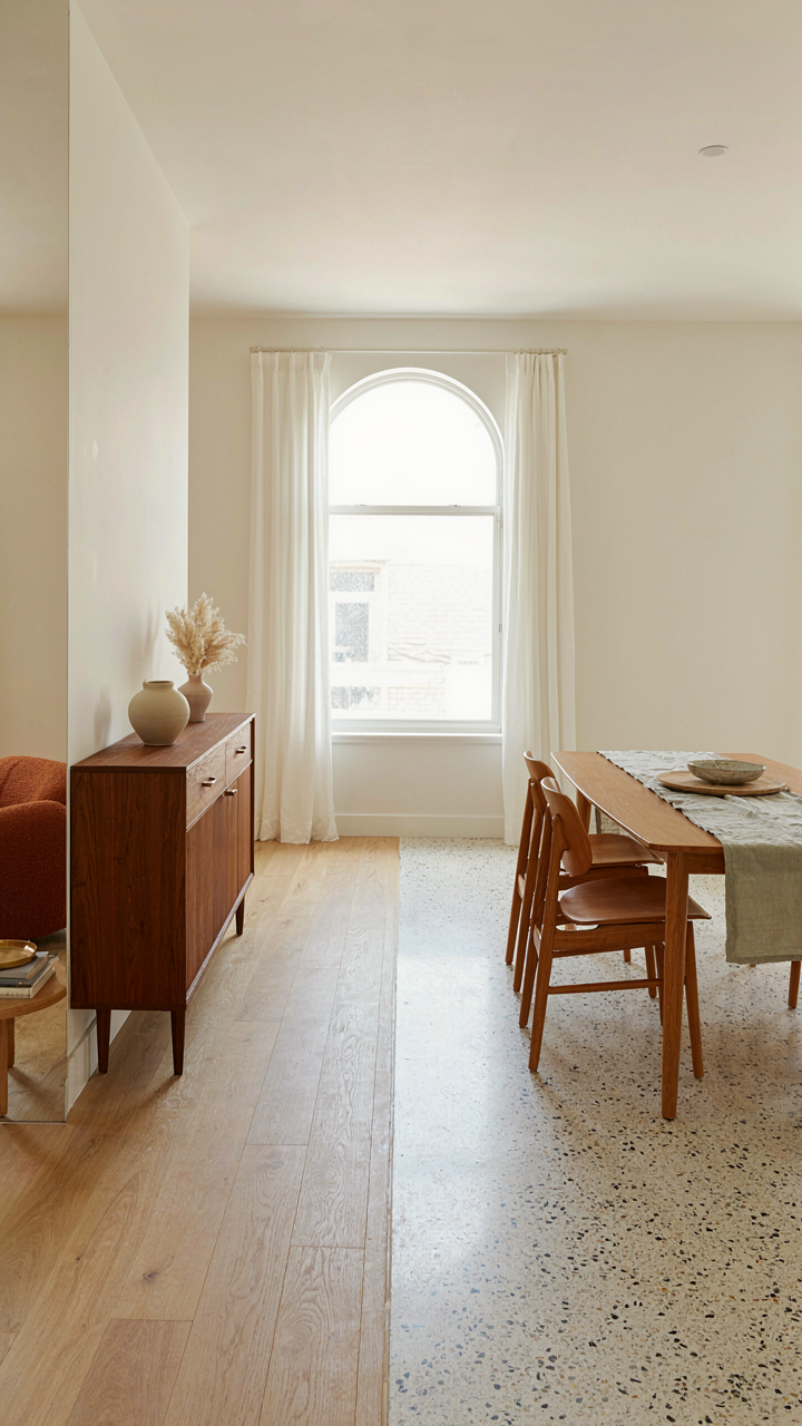
You want open concept because you think it signals sophistication and makes your space feel bigger. That’s not the real mechanism. Mid-century ranch design used open floor plans to create activity zones without walls, borrowing the principle of “functional segregation” from urban planning. Each area had a purpose and invisible boundaries defined by furniture placement, flooring material shifts, and sightlines, not drywall.
The ranch home’s deep footprint demanded this. A living room that bled directly into a dining area without architectural separation needed visual anchors to work. Warm wood tones reinforced zone breaks naturally. A walnut credenza against the living room side, a teak dining table on the other, and the flooring material changing between them told your eye where one function ended and another began. The space stayed open but read as intentional, not chaotic.
Sightlines And Spatial Continuity As Active Design Tools
Architecture uses sightlines as load-bearing elements of perception. A sightline is the unobstructed view from one point in a room to another, and mid-century ranch designers treated them like functional infrastructure. You could see through the living room to a hallway, down that hallway to a bedroom doorway, and the visual continuity made modest square footage feel expansive without adding walls.
Warm wood furniture placement controls sightlines deliberately. A low-profile sideboard in walnut positioned perpendicular to the entry point blocks peripheral vision just enough to define the living room without closing it off. A wood-framed pass-through between kitchen and dining room maintains visual flow while creating the subtle separation your eye needs to understand functional division. The wood doesn’t block the sightline, it frames it. Test your layout by standing at the entry threshold and noting what your eye naturally follows. Rearrange wood pieces until the path feels continuous but sectioned.
Color Theory For Mid Century Interior: The “Silent Negotiators”
How Color Shifts Spatial Perception
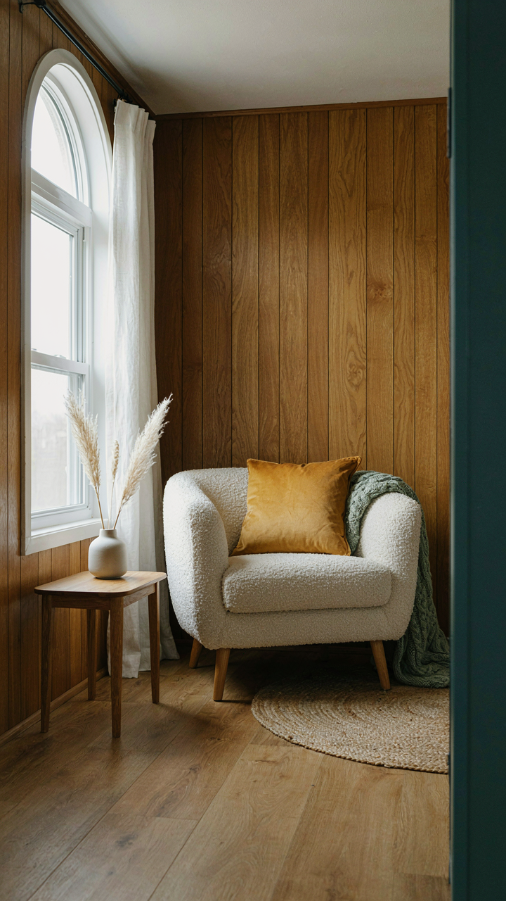
You want to know this because you’re afraid your ranch feels small and cheap. Here’s the mechanism: color psychology operates like contrast in visual hierarchy. Warm woods anchor a room’s visual weight to the floor and walls. Cool colors recede. Warm colors advance. Mid century designers weaponized this. A walnut-paneled room with cream walls reads as intimate and grounded, not cramped. The warm wood establishes a baseline. Everything else either supports or disrupts that anchor. Placement of color intensity determines whether a space expands or contracts in the viewer’s mind.

The ranch’s low ceilings demand respect for this rule. Paint a 9-foot ceiling dark and it drops further. Paint adjacent walls a warm neutral and the room feels wider, not taller. Mid century ranch interiors typically used this exact play: wood tones for intimacy, light walls for boundary dissolution. The eye travels unobstructed through space instead of stopping at architectural limitations. This isn’t decoration. It’s optical engineering. Your color decisions either fight the room’s architecture or align with it.
Neutrals That Earn Their Space
Most advice about neutrals in ranch homes is incomplete. “Use beige and white” sounds safe. That’s lazy. Real neutral strategy in mid century ranch design means selecting warm off-whites and grays that share undertones with your wood palette. If your walls are walnut or teak, your neutrals must carry the same warmth signature. A cool gray next to warm wood creates visual friction, not balance. The wood and walls become competitors instead of partners.
Purpose-driven neutrals serve a single function: they silence the background so accent colors land with precision. A cream wall behind a credenza doesn’t fight the wood grain. It lets the furniture’s line and form dominate. Mid century ranch interiors used neutrals this way deliberately. Walls receded. Furniture and warm wood emerged as the visual focal points. When selecting your neutral base, match the undertone temperature of your dominant wood tone first. Everything else flows from that decision.
Curating The Mid Century Modern Interiors Arsenal
Know The Difference Between Permanent And Temporary Purchases
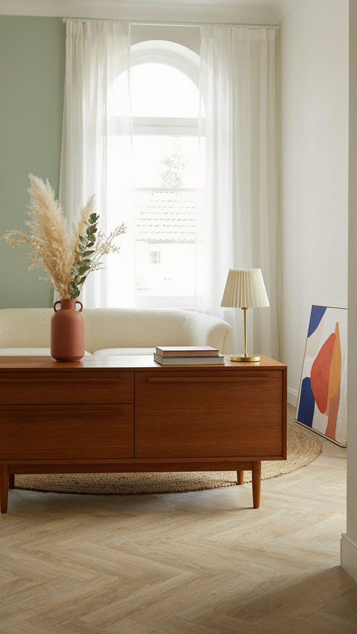
You’re worried about wasting money on pieces that’ll look dated in five years. Here’s what matters: economics calls this asset depreciation, and mid century ranch interiors have an inverted depreciation curve. Most decor loses value immediately. Authentic mid century pieces hold or gain value because scarcity increases as originals disappear. A 1960s walnut credenza appreciates. A particle board entertainment unit depreciates the moment you buy it. The mechanism is simple: original mid century pieces are finite assets. Everything else is consumable.
This distinction changes your entire buying strategy. Stop treating all furniture the same. Investment pieces require different criteria: authentic materials (solid wood, not veneer over particleboard), documented makers when possible, and structural integrity that survives decades. Disposable decor fills gaps, creates visual interest, and adapts as your taste evolves without financial damage. The real leverage isn’t in how much you spend on each category. It’s in knowing which category each purchase belongs to before you commit.
Originals Versus Reissues Versus Inspired Pieces
The common advice says “authenticity matters most” and stops there. That’s incomplete. What actually matters is understanding which authenticity tier serves your specific space and budget. Mid century ranch interiors don’t require all-original furniture to read correctly. The style functions because of proportions, materials, and spatial logic, not provenance alone. Reissues (licensed reproductions from original manufacturers or authorized licensees) maintain design integrity. Inspired pieces (new work following mid century principles without copying) fill specific functional needs originals never addressed because nobody needed them then.
- Original pieces from 1945-1975: Solid wood construction, period-specific hardware, authentic finishes. Highest cost, best appreciation. Examples include Herman Miller, Knoll, and regional craftsmen pieces still identifiable through manufacturer marks.
- Licensed reissues from original manufacturers: Eames, Herman Miller, and Knoll produce authorized reproductions using original specifications. Quality matches originals but costs less. These maintain design integrity without collector premiums.
- High-quality reissues from dedicated makers: Companies like Article and Modern Essentials recreate mid century aesthetics with modern manufacturing. Solid construction, affordable entry point, no authentication uncertainty.
- Inspired contemporary pieces: New furniture designed within mid century proportional logic. Serves functions originals didn’t address, blends seamlessly with authentic pieces when material and scale match.
- Vintage mid century non-designer pieces: Unlabeled production furniture from department stores and regional makers. Authentic era and materials, lower cost than designer pieces, builds ranch authenticity without investment.
The strategy is straightforward: anchor rooms with investment pieces you actually want to keep for decades. Build around them with reissues for consistency and peace of mind. Use inspired pieces where originals don’t solve your actual living problem. Stop treating authenticity as binary. It exists on a spectrum where your budget and use case determine the right position.
The “Cozy Mid Century Modern Kitchen” Algorithm
Kitchen Work Triangle Principles
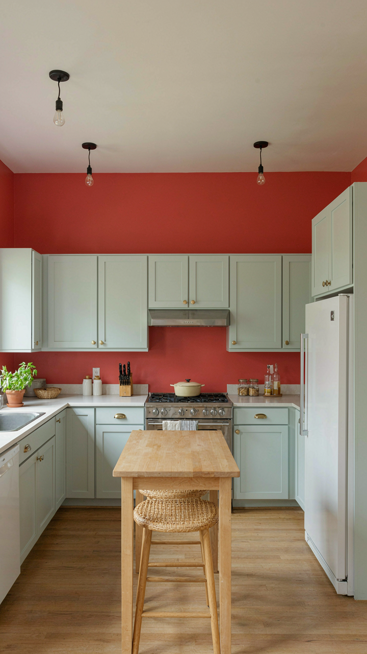
You want this kitchen to feel intentional and efficient because it proves you understand design beyond aesthetics. The real mechanism is borrowed from operations management: a kitchen functions like a supply chain, and the work triangle—the path between sink, stove, and refrigerator—is your throughput optimization. Efficient kitchens route traffic without bottlenecks. Mid century ranch kitchens typically placed these three points 4 to 9 feet apart, the distance that minimizes wasted steps without creating a cramped workspace. Architects understood this was not decoration.

The work triangle survives because it solves a genuine problem: movement efficiency. A poorly arranged kitchen forces you to cross your own path repeatedly, draining energy from actual cooking. Mid century builders encoded this logic into floor plans because ranch homes were designed for families who cooked daily and valued time savings. Measure your current distances. If any two points sit closer than 4 feet or farther than 9 feet, that arrangement defeats the original logic and you feel it immediately.
Material Durability Under Daily Stress
The advice that mid century kitchens should stay “authentic to the era” misses the real payoff: materials chosen then were tested under biological and chemical decay—the same pressures acting on your kitchen today. Formica countertops, knotty pine cabinetry, and laminate backsplashes survived because they resisted moisture, staining, and bacterial growth better than alternatives available at the time. This was not nostalgia; it was material science solving a specific problem. Your kitchen operates under identical pressures whether you’re using 1955 or 2025 materials, so the principles remain tactical.
Knotty pine cabinets still outperform veneer-faced particle board in humid environments because solid wood allows microscopic airflow, preventing the mold that thrives in sealed cavities. Formica holds up to heat and impact better than solid surface materials that crack under thermal shock. Real wood requires maintenance—finish checks, occasional refinishing—but that cost is transparent and predictable. The hidden cost arrives with cheaper alternatives: accelerated deterioration, hidden mold, and cabinet replacement cycles shorter than the original warranty. Choose materials that degrade visibly and slowly, not materials that fail suddenly after appearing fine.
Light As Architect: Shaping Your Midcentury Home Design
Natural Light Through Strategic Glass
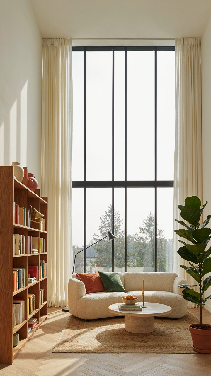
You want this space to feel intentional, not cluttered, which means you’re really after permission to stop overthinking every corner. Here’s the mechanism: midcentury ranch homes were built with long sight lines and large window walls specifically because architects understood that unbroken natural light creates the illusion of space without adding furniture. Your window treatments are filters, not blockers. Sheer curtains, louvered shutters, or bare glass during daylight hours let warm wood grain read as dimensional instead of flat.

The common mistake is treating windows like problems to solve with heavy drapes. Midcentury design exposed them. Horizontal wood slats on eaves, deep overhangs, and recessed windows controlled glare without killing the light source. If your ranch has smaller windows, that’s fine, but place them strategically to backlight wood surfaces at specific times of day. Light hitting wood grain creates depth that no paint color can replicate. Mount horizontal blinds inside the frame rather than over it to maintain clean sightlines.
Layered Artificial Lighting Anchors The Room
Ambient, task, and accent lighting aren’t design vocabulary borrowed from theater; they’re the three frequencies that make your wood-heavy space readable instead of dark and cave-like. Most ranch interiors fail here because homeowners default to a single ceiling fixture that flattens everything into sameness. Midcentury designers knew that warm wood demands pools of light at different levels to activate its texture.
Position recessed downlights to graze wood wall paneling, not wash it flat. Add table lamps with linen shades positioned at eye level on sideboards or credenzas to anchor seating zones. Install low-voltage track lighting aimed at artwork or shelving that holds warm wood accessories. The protocol is simple: install one light source per functional area, none of them overhead-dominant, all of them dimmable. This staging prevents your wood-forward palette from reading as monotone.
The Real Obstacle Isn’t Aesthetics; It’s Your Resistance To Evolving Beyond Predictable Nostalgia

Most people freeze when decorating because they mistake authenticity for limitation. You think mid century ranch means you’re locked into one narrow vision. You’re not. The real move is grabbing one warm wood piece this week, something that actually fits your life, and building from there instead of waiting for the perfect plan that never comes. Stop collecting inspiration and start collecting furniture. Your home won’t feel real until you do something.