
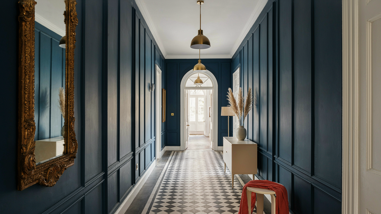
The “Heritage Hoax” Of Tiled Hallway Ideas

Pattern Obsession Versus Real Performance
You want to believe Victorian design choices were smarter than yours. They weren’t. Victorians filled hallways with intricate tile patterns because they had access to cheap labor and believed visual complexity signaled wealth. The mechanism is pure status display, not function. Pattern density bore no relationship to durability or maintenance ease.
Victorian encaustic and majolica tiles looked stunning but demanded constant upkeep. Grout deteriorated quickly. Tiles chipped under boot heels. The patterns masked dirt effectively, which solved a real problem in gas-lit, coal-burning homes where grime accumulated fast. Strip away the nostalgia and you find a choice born from necessity, not insight. Modern glazed porcelain achieves the same dirt-hiding visual with half the maintenance cost.
Original Materials Had Hard Limits
The common advice ignores what Victorian tiles actually were: handmade ceramics with inconsistent firing and uneven glaze density. Installers worked without precise spacing tools. Grout formulas lacked modern additives. These limitations created a leaky, fragile system by today’s standards. That’s not charm. That’s a product defect dressed up as heritage.
Today’s engineered tiles include stabilized clay bodies and consistent glazing that resist staining and cracking. Polymer-modified grout stays flexible instead of powdering into gaps. The performance advantage isn’t marginal. It’s structural. If you’re installing tiled hallways now, using period-accurate materials to match a look is one choice. Claiming those materials perform better is a lie your Instagram feed is selling you.
Victorian Paneling: Beyond The Period Piece

How Paneling Creates Spatial Hierarchy
You want paneling because it looks expensive and signals taste. The real mechanism is architectural scale. Paneling divides wall volume into smaller visual sections, which compresses the apparent height of a hallway and makes it feel intentional rather than just a corridor you walk through. Think of it as load-bearing in design language, not structure: it carries visual weight and anchors the eye. Victorian hallways used this strategically. The dado rail typically sat at 36 to 42 inches, creating a visual break that made tall narrow spaces feel proportioned.

Paneling works because it interrupts monotony. A plain hallway wall reads as unfinished. Paneled walls read as deliberate composition. The vertical lines and horizontal divisions force your eye to track them, which makes the space register as designed. Install wainscoting at standard Victorian heights, not wherever impulse suggests. The proportion matters more than the material. Without that discipline, paneling becomes decoration pretending to be architecture.
Materials That Don’t Betray The Intention
Most advice says match the era exactly. Wrong. Victorian paneling used whatever material conveyed solidity and expense at the time. Today that means you stop chasing historical costume and pick materials that age well under hallway conditions: moisture, dust, hand contact. Paint-grade hardwood, quality MDF in high-traffic zones, and real plaster for upper walls above the dado. Skip thin veneers. They warp and delaminate in hallways where temperature and humidity shift constantly.
The paneling delivers impact through finish and proportion, not material pedigree. Satin or matte paint in deep colors (charcoal, forest green, deep navy) makes paneling systems read as intentional surfaces, not nostalgic props. Apply finish that handles scuffing and moisture without repainting every two years. The material is only visible when it fails. Choose it for durability first, then let the proportions and color do the design work.
The Modern Victorian Hallway: Controlled Contrast Protocol
When Period Authenticity Meets Present Day
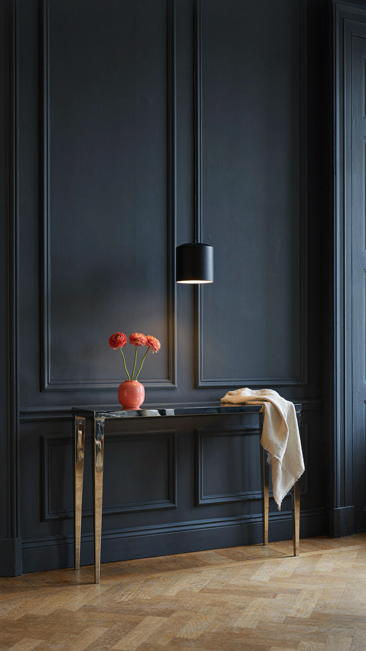
You want permission to break the rules without looking like you broke them. That’s the real question here. The mechanism is this: Victorian design established a visual hierarchy so rigid that introducing one contemporary element actually strengthens the period aesthetic instead of weakening it. The constraint creates legitimacy. Think of it like tension in physics, where opposing forces don’t cancel out but instead create a stable structure. A sleek pendant light over tiled Victorian floors doesn’t dilute the period, it anchors it.

The mistake most people make is treating Victorian hallways like museum exhibits that demand purity. They treat period like a cage instead of a framework. Contemporary elements work when they answer a functional problem the original era didn’t have. Steel-framed mirrors, modern brass fixtures, or minimalist console tables slot into Victorian spaces without apology because they solve real constraints of living now. The tiled floors and paneling stay. Everything else negotiates its place based on utility, not nostalgia.
Building Tension Into The Layout
Visual tension isn’t about clashing colors or bad taste, it’s about creating focal points that make a narrow hallway feel intentional rather than transitional. A Victorian hallway already has texture from tile work and wall paneling, so tension comes from breaking the visual rhythm with something the eye doesn’t expect. This could be a contemporary artwork hung low against high ceilings, or a single modern console table positioned asymmetrically. The hallway stops being a pass-through and becomes a destination.
The mechanism is specificity over softness. One bold contemporary choice beats five compromised ones. A statement light fixture draws attention upward and makes ceiling height feel engineered rather than accidental. A textured contemporary rug over Victorian tile creates a deliberate pause underfoot. When you position these elements with intention, the hallway reads as designed, not decorated. The result is a space that respects its origins while refusing to apologize for the present.
Small Victorian Hallway: The Illusion Of Grandeur
How Constraint Creates Perception
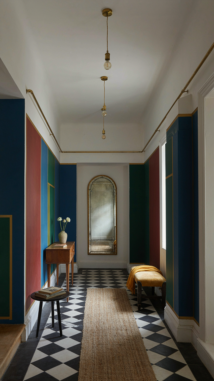
You want a small Victorian hallway to feel important because you know visitors form opinions in seconds, and cramped spaces read as cheap. The mechanism comes from spatial psychology: your brain calculates perceived distance based on visual reference points, not actual square footage. Remove clutter and establish a clear sightline down the hallway, and your brain recalibrates the space as deeper and more deliberate than it actually is. This is how constraint becomes composition.

Victorians understood this without naming it. They paneled hallways not for decoration but to break up wall planes and create rhythm, which makes the eye travel slower and perceives distance as longer. Wall height matters more than floor width in a narrow corridor. Paint the ceiling slightly lighter than the walls, and you compress the vertical plane upward, making the space feel taller and therefore grander. Apply this principle: segment the hallway visually through paneling height rather than fighting against its actual dimensions.
Mirroring And Reflection
Mirrors don’t add square footage, but they do route light and redirect visual attention, which reframes how the brain maps the space. Place a mirror opposite a window or light source in a Victorian hallway, and light bounces back into the corridor instead of terminating at a dead wall. The eye perceives doubled depth. Avoid mirrors facing mirrors, which creates confusion rather than expansion. One strategic mirror placed perpendicular to the main sightline works better than two fighting each other for visual dominance.
Tiled floors amplify this effect because they reflect light differently than wood or carpet. Victorian-era encaustic or Minton tiles have matte finishes that diffuse rather than mirror, but the geometric pattern itself creates the illusion of continuity and rhythm. Your eye follows the tile pattern down the hallway, which stretches perceived distance. Install tiles in a running bond or geometric pattern that moves the eye forward. Add one framed mirror at the hallway’s terminus, and light + geometry + reflection combine to make the space feel purposeful rather than cramped.
The “Signal To Noise” Ratio Of Victorian Hallways
Curating Elements For Maximum Impact
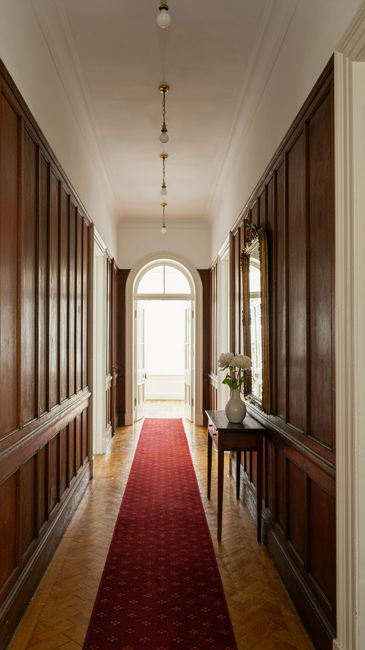
You want people to notice the good bones of your Victorian hallway, not get lost in visual clutter that dilutes the impact. Information theory teaches us that signal-to-noise ratio determines how much useful information reaches the observer, and in hallway design, every object either reinforces the Victorian aesthetic or competes against it. Most people hang too much on walls and crowd floors, mistaking abundance for richness when Victorian spaces actually operated on restraint and hierarchy.

The Victorian hallway succeeded because it forced a choice: tiled floors anchor the ground plane, paneling establishes the vertical framework, and a single focal point—often a mirror, pendant light, or console table—commands attention. Everything else becomes secondary. Paneling divides walls into proportional zones that make clutter visible immediately, so you cannot hide mediocre choices behind complexity. Apply this ruthlessly. Remove one item per wall before adding anything new.
Eliminate Visual Noise, Highlight Core Features
The common advice about Victorian hallways is to “layer textures and add character,” which typically means cramming in coat racks, umbrella stands, side tables, and framed prints until the space feels like a shop. That’s wrong. Victorian design used constraint as a design tool, not decoration as abundance. Your tiled floor and wall paneling are already working hard; they don’t need a soundtrack of accessories fighting for attention.
Identify the three to five strongest architectural features in your hallway: the paneling proportions, the tile pattern rhythm, the ceiling height, a doorway arch, or a staircase line. Everything you add must amplify one of these, not whisper against them. Keep surfaces clear. A single well-scaled mirror reflects light and depth without clutter. A console table with one brass lamp and nothing else on top reads as intentional, not empty. The mechanism is this: fewer objects at higher visual weight create the impression of wealth and control that actually defined Victorian propriety.
Lighting The Victorian House Hallway: Strategic Illumination
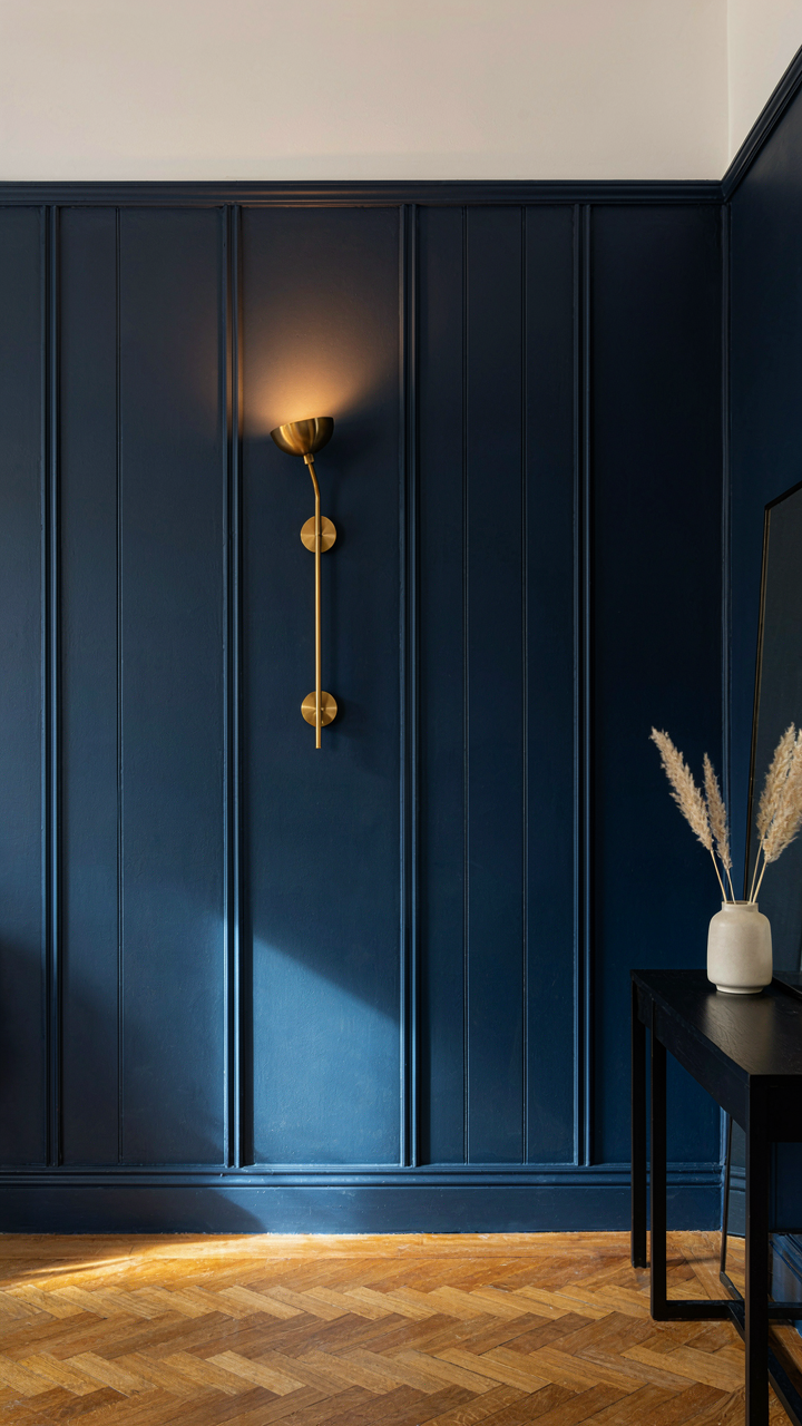
Multiple Light Sources Work In Layers
You want this hallway to feel intentional, not like a museum nobody visits. The real mechanism here is borrowed from architecture’s concept of layering: each light layer handles a distinct job, so none of them fails. Most people throw up one ceiling fixture and call it done. That’s why their hallways feel flat and hostile.

Victorian hallways need three light tiers. Ambient light provides baseline visibility. Task lighting handles the functional zones where people actually move. Accent lighting gives the space dimension without drama. This isn’t about adding more fixtures randomly. It’s about assigning each fixture a specific purpose so the room stays usable at any time of day.
- Ceiling or flush mount fixtures: Central source for ambient coverage across the full hallway length. Typically placed every 8 to 10 feet in longer corridors. Use fixtures with appropriate wattage for your hallway width.
- Wall sconces: Position at eye level on either side of the hallway to eliminate shadows cast by overhead fixtures. Pair them with tiled walls to bounce light evenly. Works best installed 60 inches from floor.
- Picture lights or rail lighting: Direct focused light onto artwork, mirrors, or architectural details like paneling. Adds visual hierarchy without competing with ambient sources. Keep intensity lower than overhead fixtures.
- Floor or low-level accent lighting: Highlights baseboards, tile transitions, or architectural edges. Creates sense of depth and guides foot traffic during low-light hours. Rarely the primary light source but improves overall balance.
- Dimmer switches: Allow you to adjust ambient and task lighting independently based on time of day and occupancy. Prevents overlighting during evening hours while maintaining functionality during daytime.
The Victorian hallway demands control over light intensity at different times. Dimmers on your main ceiling fixture let you drop brightness by 30 to 50 percent during evening without losing the space’s usability. Wall sconces work best when wired on a separate circuit, giving you flexibility to run sconces alone during low-traffic periods. This prevents the hallway from feeling like an operating room at midnight while still keeping it navigable.
Fixtures That Command The Space
Real Victorian hallways didn’t treat lighting as invisible infrastructure. Fixtures were deliberate architectural statements, often cast brass or bronze with glass or crystal details. Modern versions copy the form but skip the actual presence, which is why they disappear into the walls. The fixture itself shapes how people perceive the entire hallway.
A single well-chosen pendant or chandelier hung at the center of a long hallway does more work than three mediocre flush mounts scattered randomly. The weight and scale of the fixture signal to your eye that this is a designed space, not a default hallway. Choose fixtures with visible hardware and materials that complement your tiled floors and paneling. Brass or aged bronze reads Victorian. Polished chrome or frameless glass reads modern and kills the whole aesthetic.
Sconce placement matters more than quantity. Two quality sconces mounted symmetrically on either side of a mirror or architectural break point anchor the space visually. One sconce per wall section if your hallway is longer than 12 feet. Mount them 60 inches from the floor so they cast light across face height without creating harsh shadows on the paneling. The bulbs inside should emit warm color temperature, between 2700 to 3000 Kelvin, to match the warmth Victorian interiors originally had under gas lighting.

Hallway Designs: Beyond The Blueprint
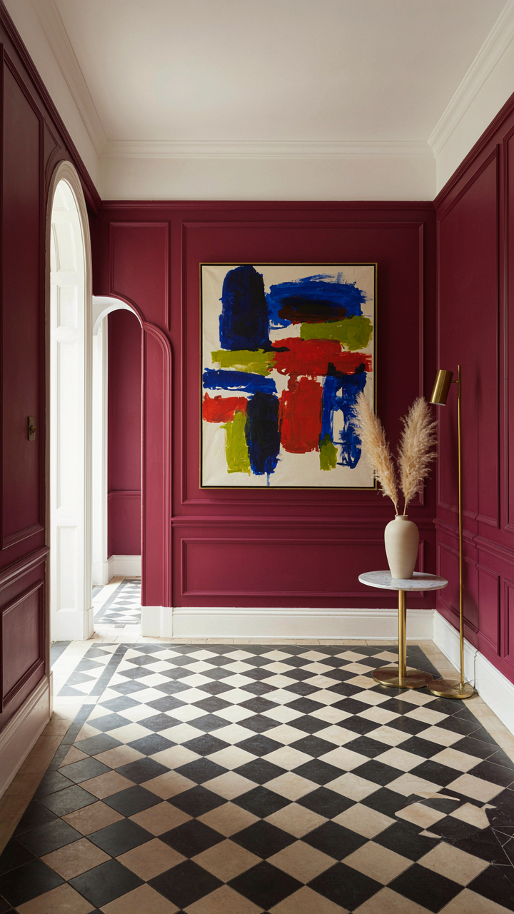
Movement And Sightlines
You want the hallway to feel intentional instead of like a leftover space, which is really about protecting your status as someone who understands design—not just someone who owns old tiles. The mechanism is sightline control. Victorian hallways functioned as circulation arteries, and their width, length, and sight lines determined how people moved through the home and what they noticed first. Narrow hallways with tiled floors created visual compression that led the eye toward an endpoint. Wide hallways distributed attention across walls and created moments of pause.
Stop designing hallway flow as a straight line. Victorian architects interrupted long corridors with transitions: archways, changes in ceiling height, or shifts in tile pattern. A tiled floor that runs unbroken feels static. A floor where tile pattern changes at 12 feet signals a boundary without a wall. This teaches the body to move deliberately, not shuffle through a tunnel. Mark transitions through material, not just furniture, so movement becomes architectural rather than accidental.
Placement That Anchors Space
Furniture in a Victorian hallway isn’t decoration filling emptiness—it’s punctuation that prevents the space from feeling like a pass-through. Console tables, tall mirrors, and narrow cabinets work because they occupy vertical real estate without blocking the path. The mistake most people make is treating hallway furniture as secondary. It’s not. A single piece positioned against a paneled wall creates a focal point and justifies why someone should pause in that hallway instead of rushing through it.
Art placement follows the same rule: one strong piece at eye level beats three competing pieces scattered across the walls. In a Victorian hallway with tiled floors, the tile pattern already commands visual attention at foot level, so hang artwork at 60 inches from the floor to create a second focal point that doesn’t fight the ground. This creates visual rhythm and makes the hallway feel intentional. Measure, place, and commit—don’t leave placement to feel.

Tiled Hallway Floor Victorian: Maintenance Myths Exposed
Modern Sealants And Cleaning Protocols
You want to believe your Victorian tiles will survive neglect if you just buy the right product. They won’t. The real mechanism here is porosity. Victorian floor tiles, especially encaustic and quarry varieties, absorb moisture and dirt at the molecular level. Modern penetrating sealants work like a capillary barrier in materials science: they fill micro-pores without creating a surface film, letting the tile breathe while blocking water infiltration. This matters because the wrong sealant choice (topical coatings that peel) will cost you twice the money and three times the effort.
Cleaning protocol determines whether sealant actually performs. Use pH-neutral cleaners only. Acidic solutions strip sealant and etch grout joints. Alkaline solutions leave residue that dulls the surface. The pattern: spray cleaner, wait two minutes for suspension, mop with minimal water, dry immediately. Reapply sealant every two to three years on high-traffic hallways. This isn’t optional maintenance—it’s the cost of keeping Victorian tile functional instead of watching it degrade into a porous, stained liability.
The Sealed Path To Lasting Floors
Victorian hallway tiles demand a maintenance schedule because time compounds damage faster than most homeowners expect. Your annual inspection matters more than occasional deep cleaning. Look for grout erosion, hairline cracks in grout lines, and darkened patches where moisture penetrates. These signals tell you sealant has failed and the tile is absorbing groundwater again.
- Spring inspection ritual: Check grout joints for crumbling, test sealant with water droplets (they should bead, not absorb), and photograph problem areas for tracking progression.
- Grout repointing every 10-15 years: Remove failed grout with a rotary tool, fill with matching lime-based mortar, and seal immediately. Victorian tiles paired with modern epoxy grout creates incompatible expansion rates.
- Quarterly deep clean protocol: Use soft-bristle brush with pH-neutral cleaner, never steam clean (heat opens pores), and ensure complete drying before foot traffic resumes.
- Sealant reapplication timing: Every 24-36 months in hallways, every 36-48 months in low-traffic zones. Test with water first—if beading stops, reseal that section immediately.
- Immediate spot repair process: Spill or stain detected means clean within hours, apply poultice if needed for oil stains, then test sealant integrity in that zone before reopening to traffic.
The mechanism is intervention frequency. Victorian tiles last decades when you catch degradation early and arrest it systematically. Neglect them for five years and you’ll pay for full restoration or replacement. The difference between a maintained Victorian hallway and a ruined one comes down to whether you inspect twice yearly and reseal on schedule.

The Real Obstacle To A Compelling Victorian Hallway Is Your Fear Of Breaking Established, Diluted Rules
You’re staring at design Pinterest boards because you want permission to do something different. You won’t get it. The rules everyone repeats about victorian hallways exist because they’re safe, not because they’re right. Pick one element you hate about the traditional approach—the dark wood, the ornate wallpaper, the stiff formality—and remove it completely. Your hallway transforms the moment you stop decorating like you’re afraid of offending a ghost. Build something only you would build, and everyone else will call it inspired.