The Grand Illusion: Beyond Surface Level Opulence In Victorian Parlor Design
What Everyone Gets Wrong About Victorian Excess
You want permission to buy expensive things and call it history. The truth is simpler: Victorians didn’t fill parlors with ornament because they lacked restraint. They engineered visual complexity as a status signal, yes, but the mechanism was actually economic. Wallpaper, heavy drapery, and carved trim were manufacturable, scalable, and replaceable. A merchant class ascending needed to display wealth without the centuries-long investment of real architecture. Ornament solved a practical problem: how to look established in one generation instead of three.
The common narrative frames Victorian design as excess for its own sake. That misses the calculation. Every element in a parlor communicated purchasing power and access to production. Gilded frames, machine-made plasterwork, and printed wallpapers weren’t indulgences. They were distributed versions of what only old money could afford through land and custom craftsmanship. The parlor became the stage where new wealth performed its legitimacy using the language of established taste.
The Room As Social Infrastructure
Think of the Victorian parlor through systems theory, which tracks how inputs move through structures to produce outputs. The input was family reputation and business standing. The parlor was the processing mechanism. A merchant displayed his daughters there, seated among proof of capital. He received business associates in that room and hosted civic figures. The output was access to networks, advantageous marriages, and social credibility. The room’s visual density wasn’t decoration. It was the infrastructure that converted money into belonging.
Most advice treats the parlor as a display box for things you like. Wrong framing. The Victorians understood the room as a negotiation space where every surface transmitted information about the occupants. Heavy, dark colors signaled stability. Symmetrical arrangement conveyed order and control. Visible craftsmanship broadcast that the family could afford skilled labor. To recreate a Victorian parlor without understanding this mechanism is to build a museum exhibit instead of a functional space. Start by defining what reputation your room needs to build, then let that logic drive every color and trim choice you make.
Color Theory: The Psychology Of Rich Hues In Victorian Era Interior

Jewel Tones Work Because They Control Status Signals
You care about this because you want people to know you have money and taste without saying it. Here’s the actual mechanism: the Victorian era had access to synthetic dyes for the first time in history, which made deep saturated colors affordable for the middle class. Prussian blue, aniline purples, and chrome greens became status markers because they were expensive to produce and required skilled application. The wealthy doubled down and used deeper, more complex versions of these same hues to stay visibly ahead.

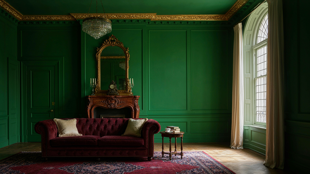
Deep jewel tones don’t work through psychology. They work through contrast and light absorption. A deep emerald or burgundy on your walls creates visual depth because it reflects less ambient light than pale colors do, which makes the room feel more enclosed and intentional. This forces the eye to focus on objects placed against that backdrop, which is why portraits and furniture suddenly read as more valuable. The color itself is the frame. Apply jewel tones to at least two walls, not all four, to anchor the space without collapsing it.
How Light Defines Color Hierarchy
The common advice says “add more light to make jewel tones work.” That’s backward. You need to control light strategically to make rich colors legible and prevent them from turning into black voids at night. Victorians solved this with layered lighting: overhead fixtures for general illumination, wall sconces flanking mirrors or artwork for accent light, and table lamps positioned to highlight specific furniture pieces or architectural details.
The real tactic is using light to reveal texture and depth in your ornate trim, not to brighten the walls themselves. When you aim light across the surface of carved molding or dentil work at an angle, shadows emphasize the three-dimensional pattern. This makes inexpensive trim read as more expensive because the eye perceives detail it would otherwise miss. Position your primary light sources to graze your trim surfaces rather than flood them head-on.
The Ornamentation Protocol: Mastering Intricate Trim In Victorian Rooms

Where Trim Actually Works
You want trim because it signals you know something most people don’t. That’s the real draw, and it’s worth naming because it changes how you deploy it. Trim isn’t decoration. Think of it as architecture’s signal system. Crown molding, dado rails, and baseboards function like military ranks: each occupies a specific zone and communicates a functional boundary. The Victorians understood this. They didn’t stack molding because they liked repetition. They layered it because each piece solved a structural or visual problem at a different height.

The hierarchy starts at the wall’s foundation. Baseboard trim protects the wall from furniture and foot traffic while anchoring the room’s mass to the floor. Picture rails sit at shoulder height and served the practical purpose of hanging heavy artwork without destroying plaster. Crown molding at the ceiling line creates a visual stop between wall and ceiling planes. Each placement is load-bearing information. Without this system, your room reads as undisciplined, even if the colors are perfect.
When Details Stop Being Honest
The common advice says Victorian carved trim exists to show wealth. Incomplete. Carved details performed symbol work, but they also encoded social rules directly into the woodwork. A palmette carved into a dado rail told visitors this parlor operated under specific conventions. A guilloché pattern signaled classical education. These weren’t random flourishes. Each motif came from a narrow vocabulary that Victorians recognized instantly.
But here’s what people miss: not all carved details were original to the room. Victorian parlors accumulated trim across decades. Earlier homes inherited Regency florals. Later renovations introduced heavier Rococo Revival carving. The most effective Victorian parlors don’t fight this layering. They acknowledge it. This means choosing your carved details by asking which design language the room’s bones already speak. Install a design vocabulary the space earned, not one you imported. The mechanism is coherence through restraint, not abundance.
Victorian House Interiors: The Layered Approach To Decor

Textiles Create Depth Through Material Contrast
You want your parlor to feel expensive without looking like you’re trying too hard. The mechanism is simple: Victorian interiors used fabric layering to create visual and tactile density that made rooms feel intentional and controlled. Think of it like acoustic engineering—you’re dampening visual noise through strategic material placement, not random accumulation.

Victorians understood that a single fabric choice broadcasts incompleteness. They layered velvet curtains over linen undercurtains, added damask upholstery to furniture frames, and deployed wool rugs beneath everything. Each layer absorbed light differently and created depth perception that a flat, monochrome room cannot achieve.
- Heavy Velvet For Curtains: Absorbs light and defines window treatment as the visual anchor. Rich colors like burgundy, forest green, or deep plum maintain period accuracy while adding weight to the room’s overall composition.
- Damask Or Jacquard Upholstery: Patterned fabric on sofas and chairs creates texture without cluttering the space. The repeating pattern reads as deliberate design rather than decoration and grounds furniture pieces as intentional focal points.
- Wool Or Silk Blend Rugs: Establishes the floor plane with warmth and defines furniture groupings. Multiple rugs in complementary colors layered strategically anchor seating areas and create spatial hierarchy.
- Tasseled Throw Pillows: Break up large upholstered surfaces and introduce secondary colors. Placement on seating reinforces the formal gathering function of Victorian parlors without feeling staged.
- Linen Undercurtains: Provides light filtration while softening direct window exposure. Layering linen beneath heavier fabrics was standard practice and reduces glare that competes with candlelight and gaslight ambiance.
Material contrast prevents flatness. When you stop treating fabrics as interchangeable and start seeing them as textural building blocks, your parlor shifts from decorated room to inhabited space.
Furniture Placement Creates Conversation Geometry
Victorian parlors were not designed for passive seating. The furniture arrangement had to facilitate face-to-face conversation and social hierarchy simultaneously. Most people arrange furniture around a television or focal wall—the opposite of what actually worked in functional Victorian spaces.
Victorians positioned seating pieces to create intimate clusters rather than rows. A settee faced two chairs at a distance of five to six feet, creating a triangle that allowed eye contact without strain. Occasional tables positioned between furniture pieces held tea service, books, or candles. Side chairs lined walls as flexible seating for larger gatherings. This layout demanded movement and conversation flow rather than static positioning. The physical arrangement enforced the parlor’s actual purpose: controlled social interaction with clear status positions and escape routes.
The Curated Chaos Principle: Collecting For Victorian Parlor Sitting Rooms

Why Restraint Beats Maximalism
You want permission to buy more stuff without looking like you’re running a clearance sale. The real mechanism here is constraint, not abundance. Victorian parlors worked because homeowners operated under physical and financial limits. They kept what mattered and arranged it with intention. Modern collectors mistake Victorian abundance for permission to accumulate without editing. The parlor’s power came from density with purpose, not density with panic-buying.

A curated collection requires decisions. You eliminate pieces that don’t earn their visual weight. Victorians replaced items seasonally or when finances allowed upgrades. They didn’t display everything at once. Start by identifying the core function of your parlor: conversation anchor, display stage, or retreat space. Every object must support that function or create deliberate contrast. This single filter removes 60 percent of acquisition impulses before they happen.
Finding Authentic Pieces Without The Markup
Most advice tells you to hit estate sales and auctions. That’s incomplete. Estate sales price items based on current market demand, not historical availability. You’ll pay peak price for the exact reproductions shops mass-produce. The real sourcing mechanism comes from specificity: hunt for pieces that dealers overlook because they’re hard to categorize or sell quickly.
Focus on regional maker marks and construction methods, not brand names or mint condition. Victorian furniture from different decades shows different joinery, wood types, and hardware. A piece with water damage or worn veneer costs 40 to 60 percent less but photographs identically once placed. Buy for placement, not archive status. Check local architectural salvage yards for original trim, hardware, and fireplace surrounds before ordering reproduction versions online. These sources have lower competition and faster inventory turnover.
Lighting The Old Victorian Living Room: Beyond The Gaslight

Candlelight To Electric: Historical Evolution
You want this section because you’re afraid a Victorian parlor without period-correct lighting looks like a theme park. That fear is justified. The mechanism is simple: Victorians didn’t choose their lighting for aesthetics alone. They chose it based on what was available, what cost meant, and what status it signaled in their specific decade.

Early Victorian parlors relied on candles and oil lamps because gas hadn’t arrived yet. By the 1870s, gas fixtures dominated middle and upper-class homes, casting a steady yellow glow that required no flame maintenance. Electric lighting appeared in wealthy homes by the 1890s but remained rare in average parlors until the 1920s. Most homeowners never lived through all three in one room. Your choices depend entirely on which Victorian decade you’re actually referencing, not what looks “Victorian” in aggregate.
Pools Of Light Over Uniform Brightness
Stop thinking about lighting a room. Think about lighting zones. This is an acoustic engineering principle applied to vision: you create distinct pressure points of illumination rather than dispersing energy uniformly across a surface. Victorian parlors used this naturally because their fixtures were weak by modern standards.
A single gas chandelier or early electric fixture produced light equivalent to 200-400 candlepower. That’s nowhere near enough to flood a parlor evenly. Instead, Victorians positioned reading lamps near seating areas, wall sconces beside mirrors, and central overhead fixtures for movement and formal gatherings. The parlor became a map of intentional shadow. Replicate this by placing table lamps on side tables near chairs, mounting brass wall sconces at specific focal points, and using a dimmed central fixture as ambiance rather than primary light. This layering creates the actual Victorian experience, not just the appearance of one.
The Parlor Room As A Microcosm: Applying Biological Principles

Every Element Serves A Function
You want this section to justify spending money on “design principles” instead of just buying furniture. Here’s the truth: a Victorian parlor works because every object occupies a niche. Borrow the ecological term “niche”—in biology, it’s the role an organism plays in its environment. A parlor’s color palette, trim work, and furnishings occupy niches too. Wallpaper doesn’t just cover walls; it absorbs sound and defines spatial zones. Gas sconces didn’t just light rooms; they created focal points and heat distribution. Remove any piece and the room loses function, not just aesthetics.

The Victorians engineered this accidentally through repetition and observation. They lived in these rooms constantly. They watched what worked. A dado rail (the horizontal trim at chair-back height) prevented damage from furniture friction while dividing wall space proportionally. A burgundy or forest green upper wall absorbed light and made ceilings feel higher without adding height. Crown molding forced the eye upward and concealed the seam where ceiling meets wall—a structural problem solved through ornament. Each decision arrested a real problem, which is why rooms designed this way feel stable rather than decorated.
Symbiotic Relationships Of Decor And Architecture
Architecture and decor don’t coexist in a Victorian parlor; they depend on each other for survival. A tall ceiling requires substantial crown molding or it reads as empty. Heavy drapes require deep window casings and multiple layers of trim to frame them proportionally. Ornate plaster ceiling medallions demand corresponding wall color intensity to avoid visual chaos. The relationship flows both directions: architecture fails without decor support, and decor fails without architectural anchors.
The mechanism is proportional reciprocity. When one element scales up, the others must scale to match or the room fractures visually. A 12-foot ceiling with delicate wallpaper reads cheap. Thick velvet curtains with minimal trim reads cluttered. The Victorian parlor builders solved this by forcing all systems to scale together. Before adding any ornamental element, establish your ceiling height and room perimeter. Then lock your trim scale to ceiling height and your color intensity to trim density. This sequence prevents the cosmetic mistakes that make rooms feel off without anyone naming why.
Modernizing Victorian Interior Design: Avoiding Pastiche

The Comfort Layer Trap
You want the look without the dysfunction because admitting a Victorian parlor doesn’t work for actual living feels like failure. The real mechanism: Victorians designed parlors for performance, not function. They were stages for social display, not spaces for breathing. Modern life requires climate control that doesn’t announce itself, seating that doesn’t punish your spine after thirty minutes, and lighting that adjusts without theatrical dimming switches everywhere.

Insert mechanical systems before you place a single piece of furniture. Run HVAC ducts behind walls or within floor joists, not visible brass pipes mimicking radiators. Choose period-appropriate colors and trim, then add a modern thermostat with a minimal faceplate. Insulate properly so heavy drapes don’t become your only temperature tool. This is the load-bearing wall of modernization: everything else hangs on whether your space breathes.
Reference, Don’t Replica
The common advice here is wrong: recreating every detail from a museum makes the space feel like a costume, not a home. The signal strength drops when you try to be too faithful. Victorian parlors used ornate trim as a wealth display because mass production didn’t exist yet. That constraint built the aesthetic. Your job isn’t copying the constraint but respecting the proportional logic it created.
Source one statement element from actual Victorian design: a plasterwork ceiling medallion, a fireplace mantel style, or wall paneling proportions. Build around that anchor. Everything else gets filtered through contemporary materials and restraint. A room with authentic Victorian crown molding, modern plumbing fixtures, and current upholstery reads as intentional, not confused. The edit is the modernization, not the compromise.
The Unspoken Language Of The Victorian Era Room: Status And Subtlety

Decor As Social Currency
You care about this because you want people to know you’re not broke. The Victorian parlor wasn’t about beauty—it was about signaling. Wealthy families deployed specific materials, colors, and trim styles the way a chess player positions pieces. Mahogany versus pine. Silk versus cotton. Hand-painted wallpaper versus printed. Each choice broadcast your place in the hierarchy. Visitors read the room before they read the host.

The mechanism works through material rarity. In the 1800s, deep jewel tones like burgundy and forest green required expensive dyes. Ornate plasterwork and gilded trim demanded skilled craftsmen paid by the hour. A family that could afford rich color on every wall and complex trim around the ceiling communicated one thing: we have capital. The parlor became a ledger written in pounds sterling and labor hours.
The Subtlety That Costs More
Everyone knows ostentatious wealth exists. Nobody talks about how restraint costs more money than excess. The real Victorian power move wasn’t cramming every surface with decoration—it was knowing which surfaces to leave alone. A single accent wall in deep crimson. Ornate trim confined to the fireplace surround. This demanded taste, which required education, which required money. The poorest families over-decorated from anxiety. The richest knew what to leave bare.
The actual mechanism is selectivity as proof of abundance. When you can afford to decorate everything but choose not to, you signal control. You’re not desperate to prove anything. This is why the best Victorian parlors feel balanced despite their complexity. The eye rests on negative space. The ornate trim frames emptiness deliberately. Implement this by identifying one architectural focal point—fireplace, window alcove, or wall plane—then concentrate your rich color and trim there, leaving adjoining areas neutral.
The True Obstacle Is Not Taste, But The Courage To Defy Modern Sterility And Embrace Deliberate Grandeur

Most people don’t avoid a Victorian parlor because they lack taste. They avoid it because grandeur demands commitment. You must choose color. You must choose ornate trim. You must choose density over the safety of blank walls. Today, pick one room in your home and commit to one rich color for it. Not beige. Not gray. Something that announces itself. Your space will stop apologizing for existing, and so will you.