The Turret Room Deception: Why Most Ideas Fail

What Everyone Gets Wrong About Round Spaces
You want the turret room because it signals taste and money. But here’s the mechanism: people treat round rooms like rectangular ones with curved walls added as a novelty. That’s the fatal error. In architecture, a turret’s geometry isn’t decoration—it’s a load-bearing constraint. The Victorians built turrets as structural projections anchored by weight distribution, not as romantic afterthoughts. Your walls curve because the foundation and roof frame demanded it, not because someone wanted whimsy.
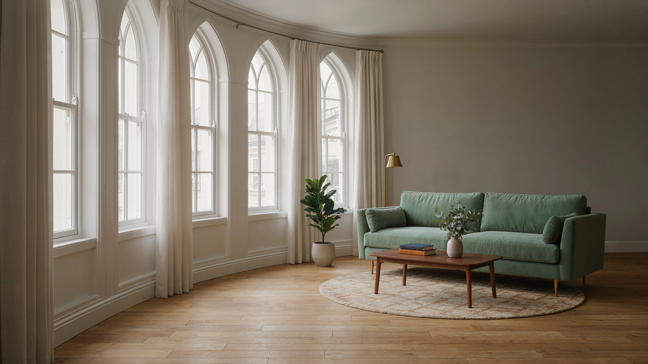
Most advice suggests filling the space with statement furniture or centering a focal point. Wrong. Round rooms have no natural focal wall. Every angle reads equally, which means centered placement creates visual tension instead of rest. The real move is understanding that your turret’s purpose—often a stairwell, sitting area, or observation post in its original Victorian design—predetermines where function and aesthetics align. Fight the geometry and you lose.
The Price Of Copying Pinterest Turrets
Superficial imitation costs more than originality because it demands solving problems twice. When you drop Victorian ornament into a round space without solving the actual layout problem, you layer aesthetics on top of dysfunction. The Victorians filled turrets with built-in seating, fitted cabinetry, and curved bookcases because those pieces solved the geometry. They didn’t buy a chair and hope it looked good from all angles.
The mistake is treating the turret room as a design challenge when it’s actually a spatial puzzle first. You cannot furnish your way out of bad planning. Start by mapping sunlight patterns across the curved walls over one full day, then position function where light creates zones naturally. Only then place form. This reversed sequence prevents wasting money on pieces that fight the space instead of occupying it.
Unlocking The Queen Anne Window Ideas: Light As A Lever
How Turret Geometry Changes Everything
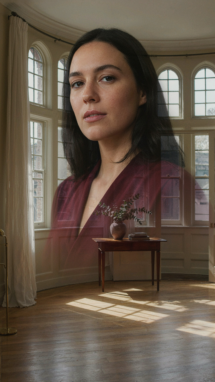
You want natural light in a turret because it signals wealth and taste. But most people miss the actual mechanism: a turret’s curved walls and multiple window exposures create a light multiplier that rectangular rooms cannot match. The curve itself acts as a reflective geometry—each wall surface bounces incoming light across the room’s circumference rather than absorbing it into corners. Queen Anne turrets typically feature 5 to 8 exterior walls, each one a separate opportunity for window placement. This isn’t decoration. It’s physics applied to floorplan.

Standard advice tells you to “maximize windows.” Wrong. You maximize angles. A single tall window on a curved wall creates shadow bands as light crosses the room’s radius. Two or three windows positioned on different walls at different heights eliminate dead zones. Place primary windows (south or west-facing, depending on your hemisphere) to hit the turret’s furthest interior wall first, then let secondary windows on adjacent walls catch the refracted light. The result is continuous illumination without the glare spike that kills usability.
Mirror Placement As Tactical Geometry
Light bounces predictably. Treat mirror placement like ballistics—calculate entry angle and exit target before installing anything. A turret’s curved walls mean flat mirrors work better than you’d expect in a square room because the curve naturally disperses reflected light instead of concentrating it into bright spots. Victorians understood this and used mirrors strategically on turret walls, not as decoration but as functional redirects for winter light.
Position mirrors on the wall opposite your primary light source, angled slightly downward to throw light toward the room’s center and lower third where people actually work or sit. Avoid mirror placement directly across from windows—the reflection amplifies glare and wastes the light’s potential energy. Reflective surfaces like polished brass, gilded frames, and even light-colored plaster catch and redistribute ambient light throughout the day as the sun’s angle changes. Update your reflection surfaces quarterly by cleaning them thoroughly; dust reduces reflective capacity by up to 30 percent, though this varies by surface material and climate conditions.
The Castle Tower Interior: Function Dictates Form
What The Room Actually Does
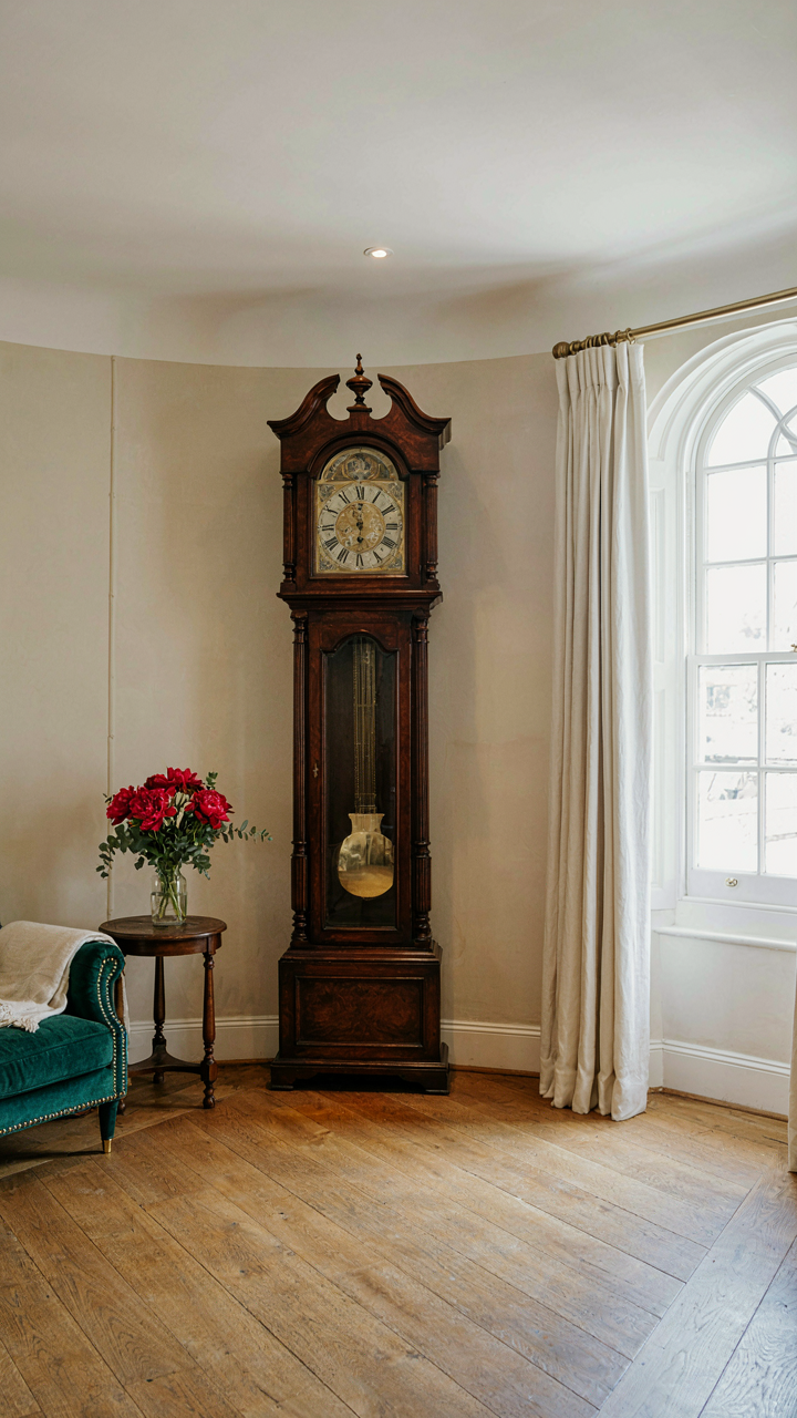
You want the turret to feel special because you believe it will make the space feel intentional. Here’s what actually matters: a Victorian turret room is a circulation dead end with multiple curved walls and inconsistent natural light. That’s your constraint. Every design choice either works inside that constraint or fights it and loses.

The turret’s primary function in Victorian homes was defensive visibility or storage accessibility. Architects didn’t build them for aesthetics. The round footprint created usable perimeter space but eliminated the wall continuity that rectangular rooms depend on. When you ignore how the room actually functions, you end up pushing furniture against curves, creating dead zones, and wondering why the space feels incomplete.
Where Trends Fail And Structure Wins
Most Victorian turret advice suggests maximum pattern, color, and historical ornament because it “feels period.” This is incomplete thinking. Architectural integrity means working with the room’s geometry first, not against it. The turret’s curve is the feature. Everything else serves it or disappears.
Trend chasing in a turret means fighting the natural light angles, the furniture placement limits, and the sightline breaks that curves create. You either acknowledge these constraints and design within them, or you create visual noise that exposes them. The strongest turret interiors use minimal detail because the architecture doesn’t need competition. Decide whether the room’s curve is your design statement. If it is, subordinate everything else to make it read clearly.
Minimalism In Casas Victorianas: The Scarcity Principle
Curated Elements Over Cluttered Collections
You want permission to strip down a Victorian turret without feeling like you’re erasing history. Economics calls this the scarcity principle: value rises when supply drops. A turret with twelve objects commands more attention than one with fifty. Victorian rooms were crammed because Victorians could afford to buy things. You can afford to remove them.

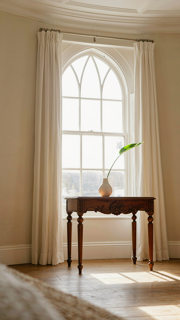
The mechanism is signal-to-noise ratio. When every surface holds inventory, your eye lands nowhere. A single mahogany side table in a turret window becomes the room’s anchor. Two paintings on walls that could hold ten become focal points instead of decoration. Restraint forces the turret’s geometry and light to work harder for you. This is how you stop fighting the space and start using it.
The Unspoken Power Of Elimination
Everyone says “less is more” and stops there, which is incomplete. What actually happens is that fewer objects force each one to justify its existence through either function or genuine beauty. A Victorian turret doesn’t need seven side tables to feel period-appropriate. It needs one exceptional table and clear sight lines to the curved walls and windows.
The practical move is this: commit to removing items from a turret room until you actively miss one. Stop removing at that point. Don’t aim for minimalism as an aesthetic goal. Aim for the exact threshold where every remaining object either performs a task or has a reason you can articulate in one sentence. That threshold is where the room finally breathes.
The Turret Library: Intellectual Sanctuary Protocol
Curating Books By Actual Use, Not Aesthetic
You want a turret library because it signals you read difficult things. The mechanism that actually matters is constraint. A round room with limited wall space forces you to choose between books you genuinely return to and books you keep for appearance. This friction is the feature, not the bug.

Victorian turrets averaged 12 to 16 feet in diameter. That’s roughly 100 to 150 square feet of usable floor space. Your shelf capacity is fixed. The moment you accept that number, you stop treating your library as a status display and start treating it as a working reference system. Stock only what you’ll consult or reread within a 12-month cycle. Donate the rest.
Desk Placement And Light Geometry
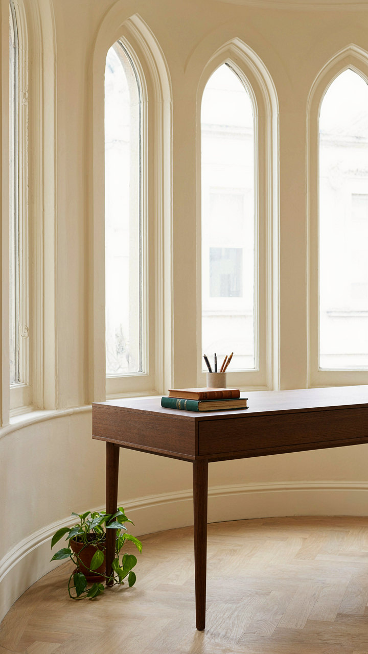
Ergonomics borrowed from architecture gives us the concept of solar orientation. Position your desk to capture morning light from the turret’s curved windows without creating glare on your work surface. Turret windows sit perpendicular to conventional walls, meaning direct sun hits at angles that shift throughout the day.
- Window-facing desk: Place the desk 3 to 4 feet back from windows to use natural light without heat load or reflective distraction during peak hours.
- Task lighting on swing arms: Mount articulated lamps to shelving to fill shadow zones the curved walls create as sun moves across the room.
- Chair height to sill ratio: Set your seated eye line 12 to 18 inches below window sill height to reduce glare while maintaining sight lines outside.
- Curved desk footprint: Use a curved work surface that mirrors the room’s geometry instead of fighting it, reducing wasted corner space and improving reach.
- Work surface depth: Keep desk depth to 24 inches maximum in a tight turret to preserve floor space and prevent you from storing junk you won’t use.
Most people treat turret rooms as quaint spaces for decoration. The real move is building a work geometry that respects the room’s circular constraint rather than imposing linear furniture logic onto it. Measure twice before buying anything that doesn’t follow the curve.
Bay Window Victorian: Beyond The Ornament
The Load Bearing Truth
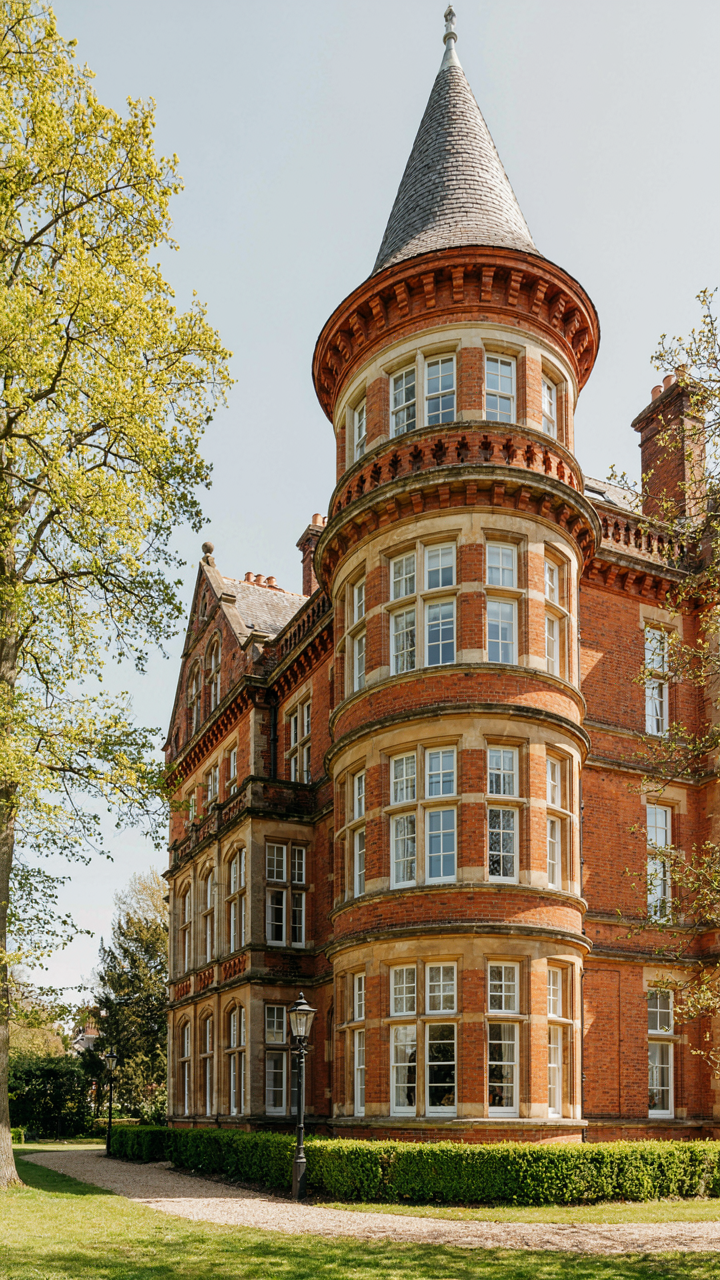
You want the turret room to look distinguished without admitting you’re paying attention to how it functions. Here’s the mechanism: Victorian architects didn’t add bay windows for decoration. They solved a structural problem. The curved or angled exterior wall distributes load differently than a flat wall does, borrowing from masonry principles where curved surfaces transfer weight outward and downward more efficiently than straight ones. A turret’s rounded geometry creates natural buttressing. This matters because it lets you place larger windows without compromising the wall’s integrity.

The bay window in a Victorian turret isn’t just an aesthetic choice. It’s the structural reason the room can exist as designed. Builders used this principle to maximize light in rooms where square footage was limited and land was expensive. The curved wall itself becomes part of the support system. When you restore or design a turret room, respecting this load path determines whether you can modify window placement, remove interior walls, or add weight safely. Ignore the structure, and you’re gambling with the entire envelope.
Function Demands The Design
The turret room forces you to choose between competing needs: natural light, usable wall space, and furniture placement. Most decorators treat this as a pure aesthetics problem. It isn’t. Turret geometry creates dead zones and uneven wall lengths that destroy standard room layouts. A circular turret with bay windows has no straight wall long enough for a bed or desk without awkward angles. The light pattern changes throughout the day because the curved walls and angled windows redirect sunlight unpredictably.
Map your turret’s function before selecting furniture or finishes. Measure the actual usable wall segments, not the total perimeter. Identify which areas stay in shadow despite the bay windows. Determine the window placement that serves your actual activity, not just fills the space with light. Bay windows in turrets work best when they’re anchored to one specific zone: a reading nook that claims the light, a vanity that sits perpendicular to the curve, a workspace that treats the curvature as a feature, not a problem.
Turret Room Ideas: The OODA Loop Approach
Observe, Orient, Decide, Act In Design
You want a turret room that feels intentional instead of like you decorated around a problem. Military strategy borrowed the OODA loop from Boyd’s energy maneuver theory, and the mechanism applies directly: in a circular turret space, your Observe phase means measuring light angles at different times, noting where heat concentrates, and identifying which curved wall section actually functions versus which feels dead. Most designers skip this entirely and just throw furniture at the geometry.

Orient yourself to the Victorian era’s actual constraints. Turrets existed for sight lines and social status, not ergonomics. Your round walls curve inward at unpredictable angles depending on the turret’s diameter and the room’s height. Before deciding on a layout, map the thermal and luminous reality of the space. Document where direct sun hits at dawn, noon, and dusk. Note which curved wall portions face north (cooler) and which catch afternoon heat. This observation phase takes two to three days of attention, not a single walkthrough.
Rapid Iteration On Spatial Configuration
The common advice about turret rooms is to embrace the curves and build furniture around them. That’s incomplete. You test configurations by temporarily placing pieces and living with them for 48 hours, not visualizing from photos. The OODA loop’s speed advantage comes from cycling through Decide and Act quickly enough to compress decision time.
Start with one functional anchor: a seating position, a desk, or a bed that solves for the room’s actual purpose. Place it in the location your observation phase identified as optimal for light and thermal comfort. Then add secondary pieces one at a time, leaving gaps between each addition. Live in that incomplete configuration for two days. Document what works and what creates dead space or traffic problems. After iteration three or four, your optimal layout emerges from behavioral data, not theory. Turret geometry stops being a constraint when you stop fighting the curve and instead build density into specific sections of the perimeter.
Victorian Turret Room: The Power Of Negative Space
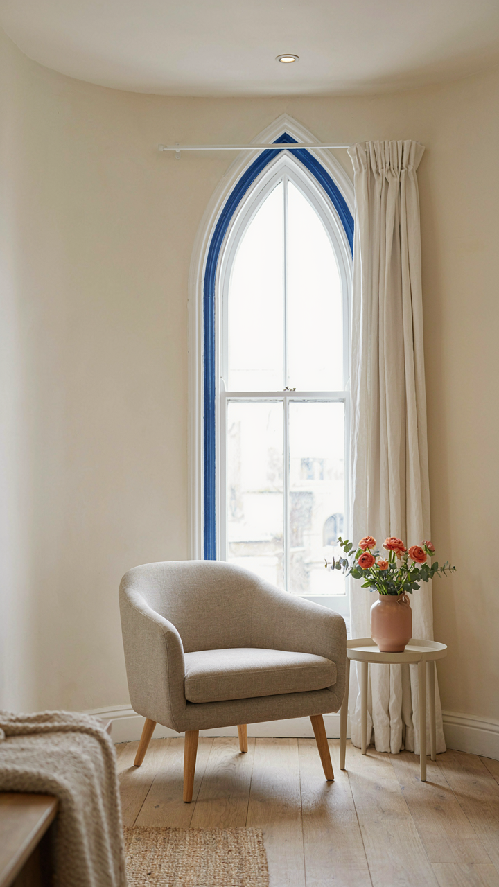
Empty Wall Creates Focal Point
You want the turret room to feel intentional, not like you’re afraid of silence. The mechanism is borrowed from visual hierarchy in design: negative space functions as contrast. Without it, nothing stands out. Victorian turrets flooded with sunlight demand restraint. Leave walls bare. Let curves and light do the work. This is harder than filling every inch because it requires conviction.

A single piece of furniture or artwork anchors the room when surrounded by emptiness. The curved walls already command attention. Adding more competes for it. Victorians understood this with their parlor design, where one ornate mirror or painting dominated a wall. The turret’s geometry is the statement. Everything else should defer to it.
Sight Lines That Rest, Not Scan
Common advice says “balance” and “flow.” That’s meaningless. The real mechanism is cognitive load. Your eye either rests on a target or exhausts itself searching. In a round room with multiple windows, place furniture to create stopping points. Arrange seating to face the view or a wall accent, not a cluttered corner. The curve naturally guides movement. Obstruct that guidance with visual noise and you’ve wasted the architecture.
Victorian turret rooms worked because restraint forced the occupant to focus on what mattered: light, shape, and a single curated object. Position a chair at the room’s sweetest light angle. Place a small table beside it. Leave the rest open. This simple protocol transforms the turret from a showpiece into a functional sanctuary.
Authenticity In Turret Rooms: Resisting The Theme Park
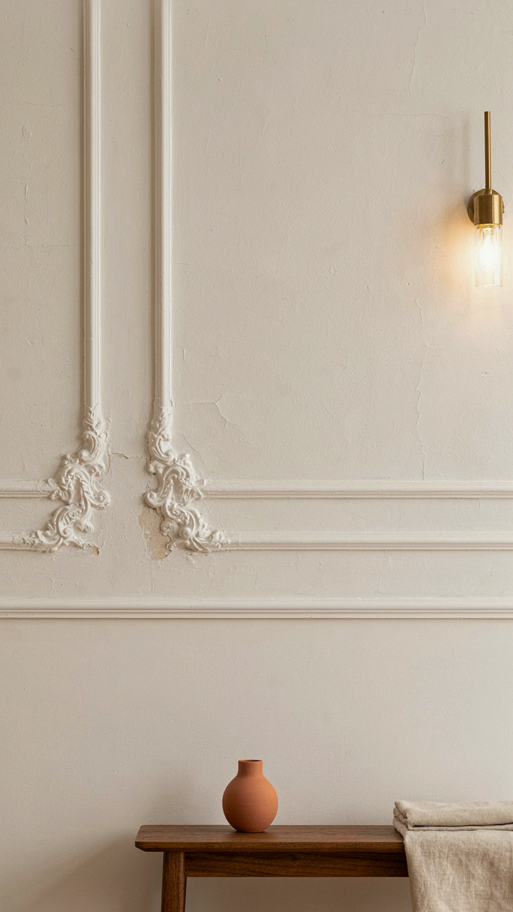
The Real Cost Of Reproduction
You want the room to feel legitimate because you’re spending money on it, and fake always feels like wasted money in hindsight. The mechanism is simple: mass-produced Victorian reproductions exist in the same visual language as the originals, but they lack the material degradation that signals age. Your brain registers this gap instantly. Genuine plaster molding has micro-fractures and uneven surfaces from 100+ years of settlement and humidity cycles. Reproduction casting replicates surface detail but not the tactile evidence of time that makes a room feel earned rather than purchased.

Original features command attention because they represent actual constraint. A turret room with authentic crown molding installed during the 1880s reflects the specific labor cost, tool limitations, and architectural intention of that moment. You cannot replicate this by buying the same profile from a supplier. The difference between original and reproduction is the difference between evidence and storytelling without proof. Identify which original elements you can preserve, and budget restoration over replacement.
Layers Build Authority, Not Decoration
Victorian turret rooms don’t whisper about history, they document it through material choices that reveal different periods of occupation. Think of this in archaeological terms: each layer of paint, wallpaper, or finish tells you when someone invested in the space and what they valued. A room with a single cohesive “period look” is staging. A room where you can see the 1920s wallpaper under the 1960s paint under the original plaster is a document you inhabit.
Genuine storytelling means accepting imperfection and letting previous decisions remain visible where it matters. The ornamental brackets in an authentic turret may show different finishing techniques because they were repaired in the 1920s. That inconsistency is the actual story. When you renovate, resist the impulse to sand everything smooth and unify the finish. Keep one section of original wallpaper behind a radiator. Leave evidence. Let someone fifty years from now see what you chose to protect.
The Investment Fallacy: Prioritizing Value Over Volume
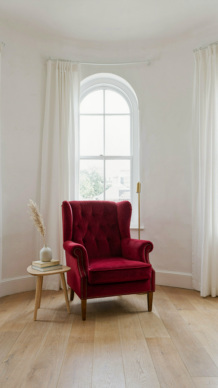
Fewer Pieces That Actually Work
You want permission to buy less stuff so you feel smarter about spending more. Here’s the mechanism: a turret room’s circular geometry punishes clutter harder than rectangular spaces do. Every object reads as a spoke radiating from center. Economics calls this “signal to noise ratio”—in a turret, the noise compounds exponentially.
Victorian turret rooms functioned as studies, sitting rooms, or bedrooms precisely because their isolation allowed focused use. This wasn’t romantic. It was practical. A single statement piece—an upholstered wingback, a period secretary desk, a quality mirror—commands attention in round space where everything competes for visual weight. Most people fill voids out of habit. That’s the real waste.
- Upholstered furniture with hardwood frames: Select one substantial piece rather than three lightweight chairs. Victorian frames used kiln-dried oak or walnut that lasted generations. Modern reproductions in quality woods outlast trend cycles.
- Period-appropriate rugs in natural fibers: A single sisal or wool rug anchors the circular floor better than multiple smaller pieces. Turkish or Brussels weave from the era defines zones without fragmenting sight lines.
- Functional lighting fixtures: Choose a ceiling fixture and one table lamp rather than scattered ambient sources. Victorian gas converted to electric fixtures provide authentic scale without the maintenance burden.
- Window treatments in heavy fabric: A single curtain rod with quality linen or damask panels reduces visual clutter compared to layered sheers plus drapes plus valances that most people default to.
- Antique or quality reproduction storage: One substantial cabinet or tall bookcase replaces the need for scattered side tables. Closed storage in turrets improves sightlines and proportions immediately.
The selection process itself matters more than the purchase. Victorian interiors weren’t designed through abundance. They reflected constraint transformed into intention. Every turret room from the 1880s onward existed because the homeowner could afford the structural excess—then furnished it sparingly to prove it.
The Compounding Effect Of Restraint
Long-term impact doesn’t mean durability, though that matters. It means the room improves in your use of it. Sparse turrets with quality pieces become more functional as you learn their exact purpose. You stop fighting the space and start navigating it. That cognitive ease compounds.
A turret filled with cheap reproductions and trend pieces requires constant mental processing. Your brain works harder to ignore irrelevant objects. After three years, you’ve replaced half the room twice. A turret with five substantial pieces of real wood, genuine upholstery, and authentic fixtures requires zero replacement. Instead, you know exactly where everything is. The room becomes invisible in its competence, which is the highest compliment a space can receive. This is when the investment pays—not in resale value, but in daily friction reduction.
Your Fear Of Empty Space, Not A Lack Of Ideas, Is The True Enemy Of A Timeless Turret
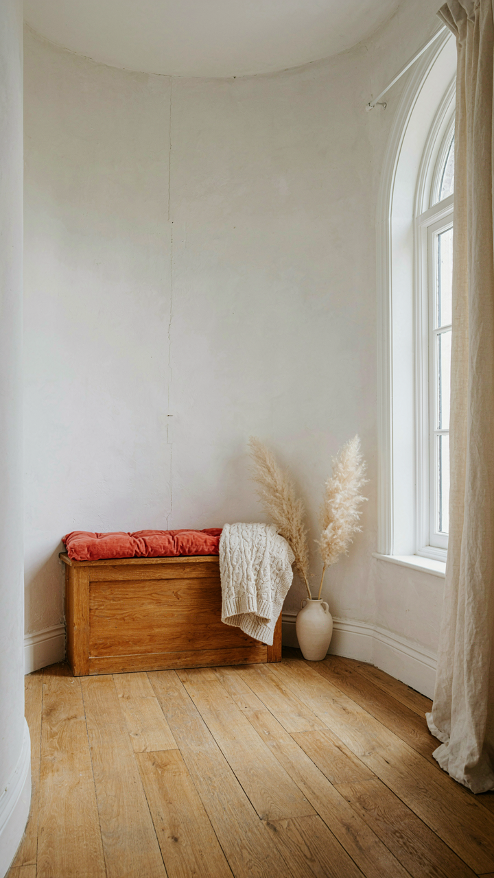
Most people kill their victorian turret room by filling every inch because silence terrifies them. You don’t need more furniture or more wallpaper. You need permission to leave gaps. Pick one anchor piece today—a single chair, a table, a window seat—and build only what that demands. The turret doesn’t reward clutter. It rewards restraint. Less stuff means more of what made you want the room in the first place.