Beyond The Gilded Cage: Deconstructing Victorian Wallpaper Myths

What Victorians Actually Wanted From Their Walls
You want permission to use Victorian wallpaper without looking like you’re trapped in a theme park. The real mechanism is this: Victorian homeowners didn’t chase “Victorian aesthetic” as a unified concept. They chased status through novelty and material expense. Wallpaper itself was the flex. Before industrial production scaled up in the 1840s onward, hand-painted or block-printed papers cost real money. A homeowner displayed wealth by rotating patterns, covering entire rooms top to bottom, and demonstrating they could afford the labor to install it properly.
The consensus narrative treats Victorian wallpaper as ornate, dark, and historically “correct.” Wrong. Victorians tested every direction at once. Early Victorian rooms (1837-1850s) ran lighter, with smaller repeating patterns and more breathing room. Mid to late Victorian (1860s-1890s) experimented with Arts and Crafts restraint alongside maximalist florals. The dark damasks and heavy jewel tones people default to were popular, yes, but so were pale greens, soft pinks, and geometric restraint. What mattered was that the paper announced itself as intentional decoration, not background.
Pattern Logic Wasn’t What You Think
Victorian pattern design operated like genetic material in reproduction: one trait didn’t guarantee the whole organism. Most people assume Victorians loved chaos and dense florals everywhere. The actual rule was layering by function and social visibility. A drawing room might feature a bold damask or large-scale floral because guests saw it. A bedroom could run quieter, sometimes just a solid color above dado rail with paper only in the upper portion. Servants’ quarters got minimal paper or none.
The print itself told a story about production capacity and the designer’s standing. Block-printed papers showed hand labor, cost more, and appeared in higher-status homes. By the 1880s, machine printing democratized patterns, which meant wealthy homeowners shifted toward more subtle designs to stay ahead. This wasn’t aesthetics driving choice. This was economics forcing novelty. Understanding which patterns signaled status in which decade tells you whether your room sits in 1850 or 1880, and that timing determines what actually works on the walls.
The Stratification Principle: Building Authentic Layers
Design History As Geological Layers
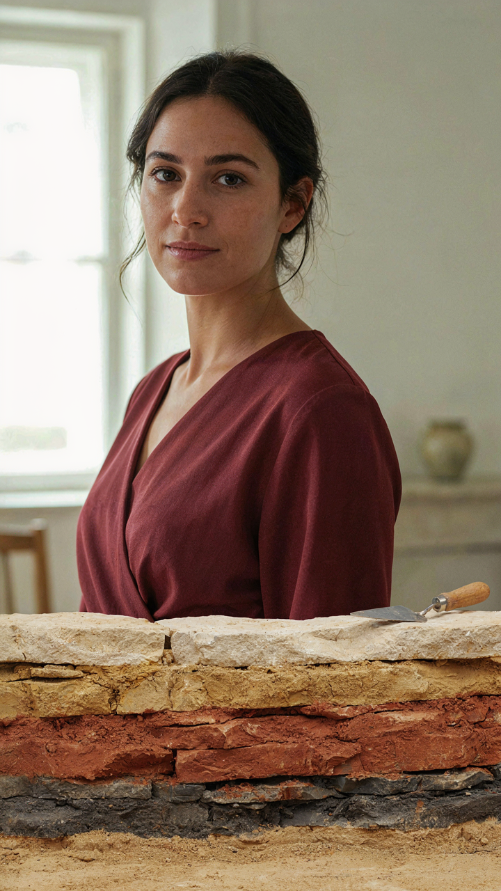
You want your room to look intentional, not like you hired someone who watched a YouTube tutorial. The real mechanism is this: Victorian rooms didn’t arrive finished. They accumulated. Understanding this means treating design history like geology treats earth—as distinct, datable strata that reveal what happened when.

Early Victorians (1837-1860s) favored dense floral patterns with strong reds and greens, often on darker grounds. Mid-Victorian (1860s-1880s) brought William Morris and the Arts and Crafts movement, shifting toward naturalistic botanicals and smaller repeats. Late Victorian (1880s-1901) went ornate again with Art Nouveau influence and metallic accents. Each period left fingerprints on paper type, dye chemistry, and repeat scale. Your job is reading those fingerprints to layer authentically, not just stacking patterns that happen to coexist.
Dating Installations Through Paper Evidence
Stratigraphy is geology’s method for ordering events in time through layered deposits. Apply that directly: wallpaper itself is the deposit. Old papers have identifiable traits you can read without guessing.
Hand-blocked papers (pre-1850s) show repeat inconsistencies and slight color variation across the sheet because printers re-inked between impressions. Machine-printed papers (post-1850s) display perfect pattern uniformity and registration. Paste composition matters too—flour-based adhesives from the 1800s leave different residue than synthetic glues from the 1900s. Flock wallpapers, common mid-to-late Victorian, used wool or silk fibers glued to paper, creating texture that doesn’t survive poorly stored samples. Paper weight itself shifted heavier in later decades. Check the back of existing samples under magnification. Thin, brittle paper with visible rag content suggests early Victorian; thicker, more uniform paper suggests late Victorian or later. This tells you exactly where your layers sit in time, which matters when you’re adding new pieces without destroying what’s already there.
The Anachronistic Edge: Juxtaposing Old Pattern With New
When Discord Works Better Than Matching
You want permission to break the rules without looking like you failed at decorating. That’s the real ask here. The mechanism is contrast theory from graphic design: tension between elements demands attention, and attention signals intentionality. Victorian wallpaper patterns already contain competing visual weights. Adding modern elements doesn’t dilute the room. It sharpens it. The pattern reads as chosen rather than inherited.

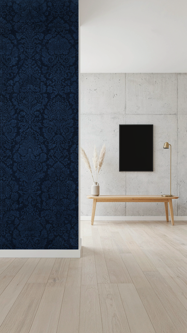
Most designers hide the collision. They soften it, blend it, apologize for it with neutral paint or contemporary furniture that whispers instead of speaks. That’s wrong. A Victorian damask or floral pattern paired with stark modern lines, concrete, or steel creates cognitive friction. Your eye processes the mismatch as deliberate curation, not accident. The wallpaper becomes the statement instead of the backdrop.
Anchoring With Quiet Depth
Victorian background wallpapers solve the problem everyone avoids naming: how to use bold historic pattern without the room feeling frozen in time. A background wallpaper is the pattern that doesn’t compete for attention. It contains smaller repeats, lower saturation, or denser designs that read as texture from distance rather than focal geometry. Manufacturers like Cole and Son produce these specifically. They’re the structural foundation, not the visual event.
Use the background wallpaper on three walls or recessed areas. This establishes the historic language without oversaturation. Then place your one contemporary anchor on the fourth wall or focal surface. A modern artwork, floating shelves, or a single bold modern element now reads as intentional dialogue rather than confusion. The Victorian wallpaper stops being period decoration and becomes the foil that makes contemporary design sharper.
Victorian Gothic Wallpaper: The Shadow Layer Protocol
When Darkness Becomes Structure
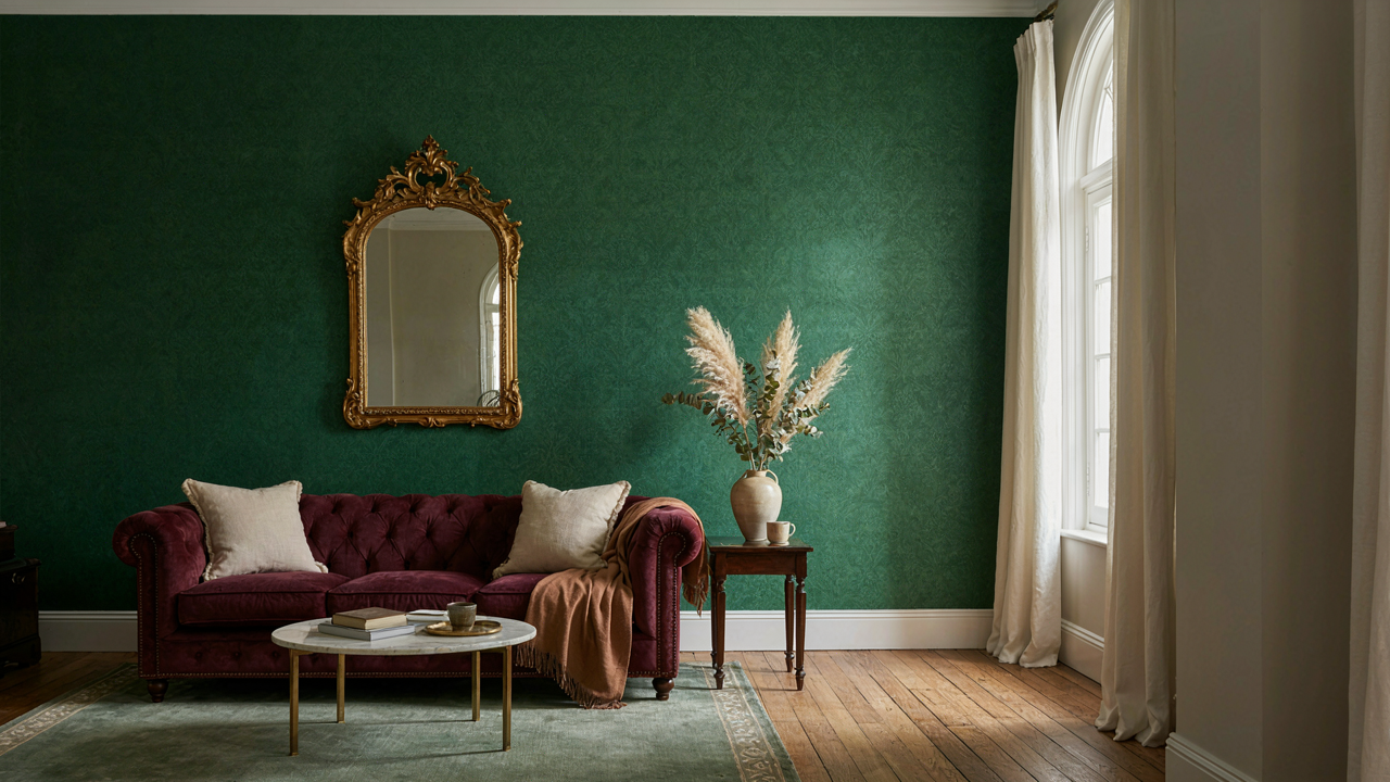
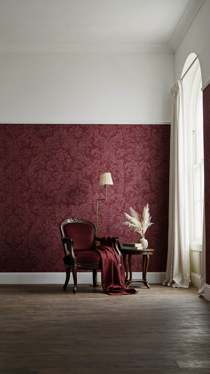
You want gothic wallpaper because you think it signals taste and historical knowledge. What actually matters: darkness functions as a spatial tool, not a decoration. Victorian gothic wallpapers used deep colors and heavy patterns to compress rooms psychologically, making them feel intentional and contained rather than sparse. The Victorians borrowed this from architectural theory—negative space is as structural as positive space. Dark walls don’t fill emptiness; they define it. The mechanism: deep jewel tones, black grounds, and intricate motifs create visual weight that stops the eye, preventing rooms from feeling flat or unfinished.

Pattern density in gothic wallpapers wasn’t random. Designers packed designs with repeating motifs—damasks, florals, geometric grilles—to give the eye nowhere to rest, which paradoxically makes a room feel more grounded. Papers from the mid to late Victorian era featured coal-tar dyes that produced reliable blacks and deep purples, so these weren’t aspirational choices; they were technically achievable at scale. Apply this: select patterns with no more than 20 percent negative space. The wall becomes a active element in the room’s architecture, not a backdrop.
How Contrast Reveals Scale
Most advice says pair dark wallpaper with light trim and call it done. That’s incomplete. Contrast isn’t about aesthetics; it’s about perception of volume. When you place a deep-toned pattern against bright woodwork or plaster, you create visual boundaries that make ceilings read as higher and walls as more substantial. Victorian rooms used this systematically: dark papers stopped at the dado rail, light papers or paint above, and the eye measured the room in sections rather than as one box. The shadow layer protocol requires you to map your room’s actual proportions first, then place contrast where the room needs structural emphasis, not where trends suggest it.
The technical execution: dark wallpaper should occupy no less than one-third of the wall height and no more than two-thirds, depending on ceiling height. Rooms under nine feet need the lighter upper section; rooms above ten feet can absorb darker papers reaching closer to the cornice. When dark and light meet, install them with a physical dividing line—a dado rail, a border paper, or a paint line—so the contrast reads as intentional architecture rather than a design choice that happened.
Curated Chaos: The Vintage Pattern Wallpaper Method
Imperfection As Design Strategy
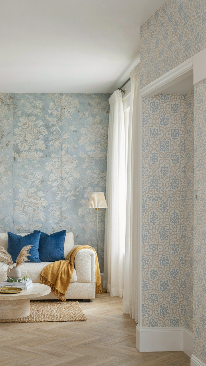
You want permission to stop chasing the Instagram version of Victorian rooms, and this section gives it to you. The real mechanism: Victorian interiors weren’t precious or spotless. They accumulated. Wallpaper faded from sunlight, darkened from coal smoke and gas lamps, and showed seams where panels overlapped. People lived in these spaces for decades without replacing them. That patina wasn’t a failure. It was the texture of actual time. Accepting worn wallpaper isn’t settling for damaged goods—it’s choosing authenticity over the sanitized museum version everyone pretends existed.

The practical move is deliberate imperfection. Choose wallpapers with slight color variation in the print itself, or papers featuring designs that already show age through their pattern language—floral damasks where the background reads slightly mottled, or small-scale geometric prints where repeat inconsistencies aren’t flaws but period accuracy. Victorian manufacturers used woodblock and later roller printing methods that produced natural variation between batches and even within rolls. Recreating that texture means the room doesn’t demand restoration or perfection. It demands living in it.
Competing Scales Win
In design strategy, scale operates like leverage in physics—the same force applied at different distances produces different effects. Victorian pattern wallpaper worked this way: a large-scale floral motif on walls, smaller geometric borders, tiny repeating damasks on dado rails. Each scale competed for visual attention and created depth through contrast, not through layering materials. Mixing wallpaper patterns across a single room wasn’t decorative excess. It was the actual structure holding the space together.
The execution requires brutal clarity about where scale shifts happen. Apply a dominant large-pattern wallpaper to the main wall area. Introduce a medium-scale pattern at the dado line or on a feature wall—something visually distinct but not jarring. Add small-scale geometric or floral papers to upper frieze areas or alcoves. The patterns must differ enough in size that each occupies its own visual territory. Install samples at full scale on your walls and observe them from standing position and across the room. If two patterns compete for dominance at the same scale, one fails. If they occupy different visual zones, they create rhythm instead of chaos.
Edwardian Wallpaper And Beyond: The Evolution Of Elegance
When The Pattern Grammar Shifted
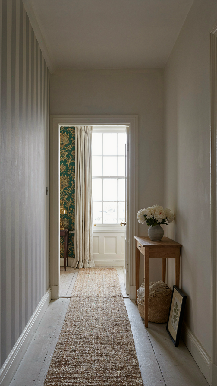
You want to know how to layer periods without looking confused—or worse, like you’re decorating by committee. The real mechanism is this: Edwardian design didn’t reject Victorian wallpaper. It weaponized restraint. Where Victorians filled every surface with density and competition, Edwardians thinned the visual load while keeping the same materials and printing techniques. The shift wasn’t about what was possible. It was about what looked expensive.

The transition happened between roughly 1901 and 1910, driven partly by reaction to Arts and Crafts ideology, partly by changes in manufacturing economics. Edwardian wallpapers used the same wood-block and machine printing methods as their Victorian predecessors, but designers reduced pattern repeat size, simplified figure-ground relationships, and left more breathing room. The substrate remained linen and paper pulp. The printing stayed hand-coordinated where quality mattered. The difference was philosophical, not technical. In a layered historic room, this matters because it lets you stack periods without visual chaos.
Light Did What Color Couldn’t
Don’t listen to the common take that Edwardian meant “lighter colors.” That’s incomplete. Edwardian wallpaper used color strategically by introducing visual air—larger unpatterned fields, thinner line weights, fewer simultaneous hues per design. A deep emerald green Edwardian paper reads differently than a dense Victorian emerald because the pattern breathes. The mechanism is optical weight, not hue alone. Printers reduced the ink coverage footprint while maintaining depth of tone.
This reframing changes how you layer rooms. A pale cream Victorian damask paired with a slightly darker but airier Edwardian stripe won’t fight each other. The eye processes pattern density before color temperature. When stacking wallpapers vertically or in adjacent rooms, lead with pattern density variance, then adjust color within the same value family. Edwardian papers in halls transition better to Victorian papers in parlors precisely because the pattern grammar is different enough that the eye doesn’t scan them as competing statements of the same aesthetic philosophy.
The Unseen Layer: Psychology Of Victorian Wallpaper Choices
Pattern Recognition And Visual Dominance
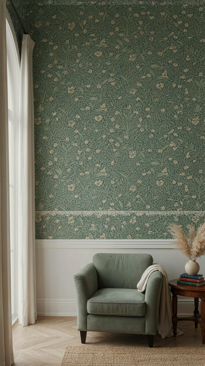
You want wallpaper to make you feel sophisticated without admitting that’s the entire reason you’re reading this section. Here’s the actual mechanism: your brain processes pattern density before it processes color. Victorian wallpaper works because it hijacks visual hierarchy through repetition. The eye doesn’t wander on a heavily patterned surface the way it does on blank walls. Dense florals, geometric tessellations, and damask repeats create what neuroscience calls “visual clustering”—your brain groups repeating elements into unified fields rather than individual objects, which reduces cognitive load and produces calm.

The Victorians understood this through experimentation, not research papers. They layered patterns specifically to control where attention landed in a room. A small-scale William Morris print on a dado rail grounds the eye low, while larger ceiling patterns recede. This isn’t decoration—it’s architectural psychology. When you place high-contrast patterns at seated eye level and softer repeats above, you’re literally reshaping how someone perceives the room’s proportions and their place inside it.
Substance Over Surface Treatment
Most advice tells you to “choose patterns you love” and call it design. That’s lazy. Real impact comes from matching pattern scale to actual room geometry and how bodies move through the space. A Victorian parlor with ten-foot ceilings can absorb large-scale repeats. A narrow hallway with seven-foot ceilings needs tighter patterns or the space feels suffocating. The disconnect happens when people pick wallpaper from swatches under artificial light, then install it in north-facing rooms where the pattern collapses into shadow.
- Scale-to-ceiling ratio: Divide ceiling height by the largest repeating pattern unit. Under 12:1 creates visual tension; over 18:1 loses impact in the space.
- Light direction mapping: Victorian rooms with northern exposure need higher-value base colors with darker pattern overlay to maintain definition. Southern rooms tolerate deeper ground tones.
- Saturation by function: High-traffic spaces benefit from muted, complex patterns that hide wear and dust. Formal rooms tolerate higher saturation and sharper contrast.
- Layering geometry: When combining wallpaper with dado rails or picture rails, the upper and lower patterns must contrast in scale, not just color, or both patterns flatten visually.
- Installation sequence: Hang borders and accents last, after mains are set. This prevents pattern misalignment that kills the rhythm even experienced viewers can’t name.
Execution determines whether a room reads as intentional or accidental. Most people install Victorian wallpaper and stop. Actual depth comes from understanding where pattern repeats fall relative to windows, doors, and furniture placement, then ensuring transitions between walls and architectural features land on complete pattern units rather than cut-offs.
The Anti Replication Manifesto: Your Unique Victorian Statement
When Authenticity Becomes A Prison
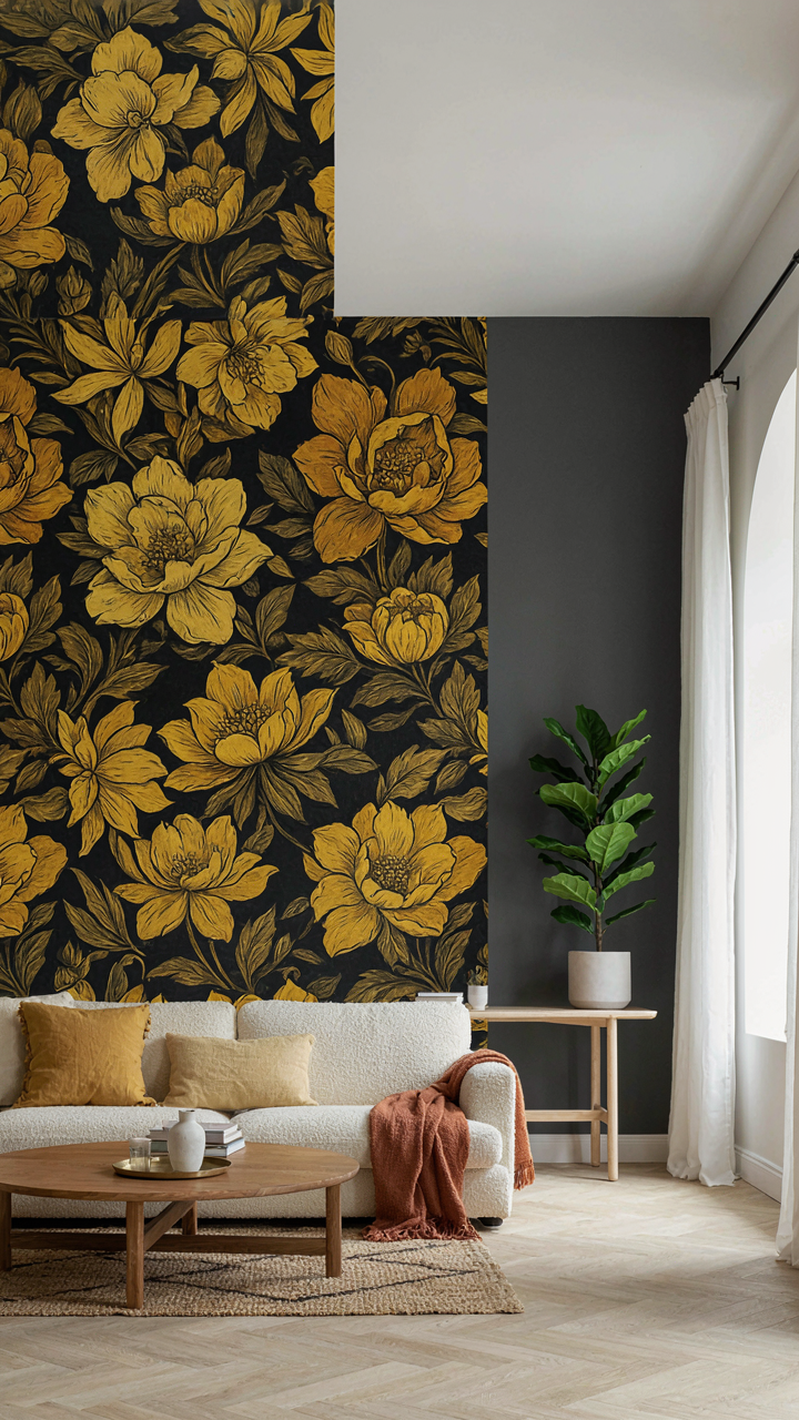
You want permission to break the rules without looking ignorant. The mechanism most people miss is that Victorian interiors were never uniform—they were statements of individual taste within a cultural framework. Replicating a museum room verbatim signals you have money but no point of view. The Victorians themselves mixed periods, imported textiles from India and Japan, and updated their walls constantly. Fidelity to a single aesthetic is actually the opposite of what Victorians did.

The trap is treating Victorian wallpaper as a locked historical artifact. It’s not. Victorians bought what moved them and layered it against what they already owned. Your job isn’t to recreate 1887 perfectly—it’s to understand the logic of their choices and make different ones. That distinction changes everything about how you approach pattern, color, and placement in a room with existing architecture and furnishings.
Pattern Speaks Before You Do
Wallpaper is a direct signal of intention, not decoration. The Victorians understood this: floral densely packed meant formality and expense, geometric suggested modernity, damask referenced wealth. Don’t choose pattern because it looks “Victorian”—choose it because it says something specific about how you use the room. If you’re layering a library with existing built-in shelving, a dense botanical or architectural pattern anchors intellectualism. If you’re working with a parlor meant for gathering, tighter, repeating geometric motifs create visual rhythm without chaos.
Your personal narrative emerges when you stop matching and start contrasting. Use wallpaper to amplify the room’s actual function, not to perform historicity for guests. Pick one wall or alcove to commit fully to pattern, then balance the rest with solid color or minimal texture. This creates depth and prevents the room from feeling like a set piece. The pattern you choose should feel like a choice you’d defend, not a choice a decorator made for you.
The Only Layer You Truly Fear Peeling Back Is Your Own Lack Of Authentic Vision
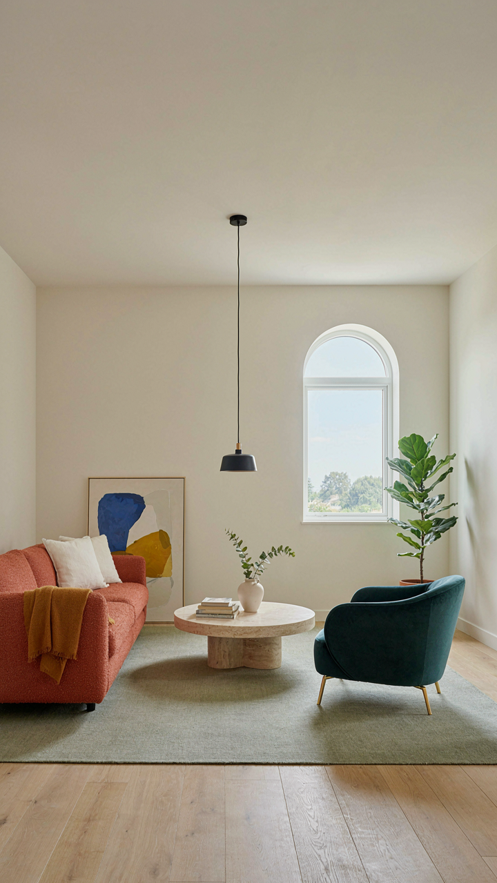
Most people don’t fail with victorian wallpaper because they pick the wrong pattern. They fail because they copy someone else’s vision instead of trusting their own. Stop scrolling Pinterest for validation. Pick one room today, one wall even, and commit to a pattern that makes you uncomfortable in the best way. Your hesitation isn’t a sign to retreat. It’s proof you’re onto something real. The rooms that haunt people aren’t the ones that played it safe.