Beyond Beige: The Swedish Cottage Color Deception
What The Pigment Actually Was
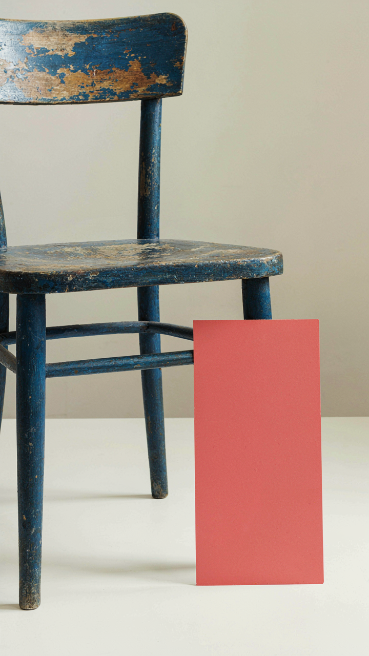
You want to believe Swedish cottage interiors are timeless because that justifies spending money on them now. Here’s what actually happened: Swedish rural furniture makers used whatever pigments were available and affordable in their region during the 18th and 19th centuries. Iron oxide, ochre, and vegetable-based dyes dominated because they were local, cheap, and durable. These pigments aged into muted, desaturated tones not because of aesthetic philosophy but because that’s what oxidation does over time.
Modern paint manufacturers now sell “Swedish cottage” colors that attempt to replicate this aged appearance upfront. The problem is immediate. A freshly painted piece in “Gustavian Gray” looks flat and manufactured compared to furniture that spent 150 years darkening and weathering unevenly. The difference between a historic pigment application and a modern approximation isn’t subtle if you’ve seen both side by side. One has depth created by time; the other has depth created by marketing.
Design That Outlasts Fashion
The common advice says Swedish design is minimalist and therefore timeless. That’s incomplete. Swedish cottage design survived because it rejected ornament that required skilled labor or expensive materials, not because minimalism is inherently ageless. A painted wooden chair with a rush seat works in 1850 and 2024 for the same reason: it’s functional, repairable, and doesn’t depend on trend cycles to stay relevant.
Swedish design rejects fleeting fads through material honesty, not aesthetic purity. When painted furniture dominates because wood was abundant and labor-intensive carving was wasteful, you get a style that persists. The mechanism is economic constraint producing accidental durability. Apply this directly: choose painted pieces and colors based on what your climate and light will do to them over a decade, not what Instagram shows you today. Your selection criteria should be repair-ability and material replacement cost, not trend alignment.
The Falu Red Paradox: More Than Just A Color
How Iron Oxide Became A Design Decision
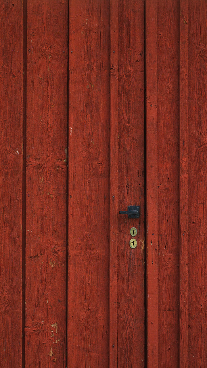
You want Falu red because it signals authenticity and heritage. The real reason it works is industrial chemistry remapped as durability. Iron oxide, the base pigment, oxidizes on wood surfaces and hardens into a protective layer rather than sitting on top like paint. Metallurgy teaches us about phase transitions—how materials shift states. Falu red performs that same shift: it moves from pigment into the wood grain itself, creating a bond instead of a coating.

Swedish cottage builders didn’t choose this color for romance. They chose it because it was the waste byproduct of copper mining in Falun, making it cheap and abundant. The iron oxide functioned as both pigment and preservative in one application. You apply it once and it improves with exposure to light and weather. That’s not a design trend. That’s material economics masquerading as tradition.
When Durability Stops Being A Side Effect
Most advice treats durability as a bonus feature of cottage aesthetics. Wrong. In Scandinavian cottage design, durability was the primary constraint that shaped every visual choice. Painted furniture survived harsh winters and poor storage conditions because the paint system was engineered first, appearance second. The thick application, the iron oxide saturation, the multiple coats—these weren’t stylistic decisions.
Painted furniture endures because Scandinavian builders solved for replacement cost before they solved for beauty. When you own one table for fifty years instead of one table per decade, the economics of the finish change completely. The painting technique became standardized because it worked. Apply this mechanism to your own space: build your finishes and furniture around what lasts, then let the aesthetic emerge from the constraint itself.
Swedish Home: Painted Furniture As A Functional Imperative

Why Swedes Paint Instead Of Replace
You want painted furniture to look timeless and elevated, but what you’re actually after is permission to stop replacing things. Here’s the mechanism: Swedish cottage culture emerged from scarcity, not aesthetics. Rural families painted furniture because buying new pieces wasn’t an option. That constraint became a design philosophy. Paint refreshes surfaces, extends usable life, and keeps pieces in rotation for decades. The Swedish approach treats paint as maintenance, not decoration. A chair painted every decade outlasts two new chairs. This isn’t about style. It’s about economics dressed as taste.

The reason painted furniture dominates Swedish cottage interiors has nothing to do with romance. Harsh Scandinavian winters deteriorated wood quickly. Paint protected surfaces from moisture and temperature swings. Swedish craftspeople painted what they owned because the alternative was loss. That practical choice created the aesthetic we now copy. Modern interpretations strip away the survival logic and keep only the look. Real Swedish cottage design still treats paint as structural defense, not ornamental choice. The painted finish does the work before it does anything else.
Paint As A Durability Protocol
- Moisture Barrier Function: Paint seals wood grain against humidity penetration. This prevents swelling, warping, and rot that compromise structural integrity over time in humid kitchens or near water sources.
- UV Protection Layer: Pigmented paint reflects and absorbs sunlight that would otherwise bleach and checker wood surfaces. Cottage furniture near windows requires this protection to maintain both color and material stability.
- Repair Concealment: Paint masks gouges, dents, and wood damage that develops through use. Repainting refreshes the surface without requiring replacement, keeping original joinery and construction intact.
- Thermal Stability: Paint creates a buffer against temperature fluctuations that cause wood to expand and contract. Swedish homes experience extreme seasonal shifts that would crack unfinished wood regularly.
- Surface Renewal Without Reconstruction: Stripping and repainting cost less than rebuilding comparable pieces. A cottage table painted four times across eighty years beats replacing it twice in durability and cost.
Swedish cottage interiors showcase painted furniture because the paint extends asset life economically. Each paint cycle resets the clock on surface degradation. You sand, prime, and paint to add fifteen to twenty years of usable life per application. The mechanism isn’t mystical. Paint creates a controlled barrier that slows the natural decay process. A well-maintained painted piece becomes a multi-generational asset. This is why Swedish families kept the same furniture across generations, refreshing it with new colors rather than discarding it. The painted finish is the entire durability strategy.
The Deceptive Simplicity Of Scandinavian Interior Cottage Design
Restraint As A Design Decision, Not A Limitation
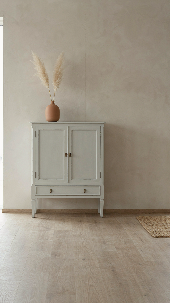
You’re drawn to Swedish cottage interiors because they look effortless, and effortless reads as taste. That’s the trap. Swedish cottage design isn’t sparse because Swedes lack resources or imagination. It’s sparse because every object in the room serves a deliberate purpose, and nothing else gets invited to the party. The constraint is intentional architecture, not accident.
Minimalism masks maximal intention in cottage design. A painted Gustavian cabinet isn’t minimal because it has less decoration than a baroque chest. It’s minimal because the painted finish, the placement, and the negative space around it all work together to anchor the room’s entire visual weight. Remove any element and the system collapses. Swedish cottage designers didn’t remove things until nothing was left. They removed everything that didn’t work.
When Form Stops Following Function
The conventional advice says “form follows function,” but Swedish cottage design inverts this. A painted wooden chair isn’t functional first and then decorated. The paint color, the wood type, and the structural design all emerged from the same constraint: what survives in a northern climate while serving a specific role in a working cottage. Function and form didn’t compete. They merged.
The mechanism is constraint-driven design. Swedish cottages operated under real limits: wood availability, heating costs, daylight hours, and family labor for maintenance. Painted furniture solved multiple problems at once. Paint protected wood from weather and moisture. Light colors reflected scarce daylight. Worn finishes hid daily use marks. When you design under actual constraints rather than aesthetic preferences, every detail becomes load-bearing. Nothing exists to look pretty alone.
Swedish Kitchens: The Anti Showroom Approach
Layouts That Actually Work For Living
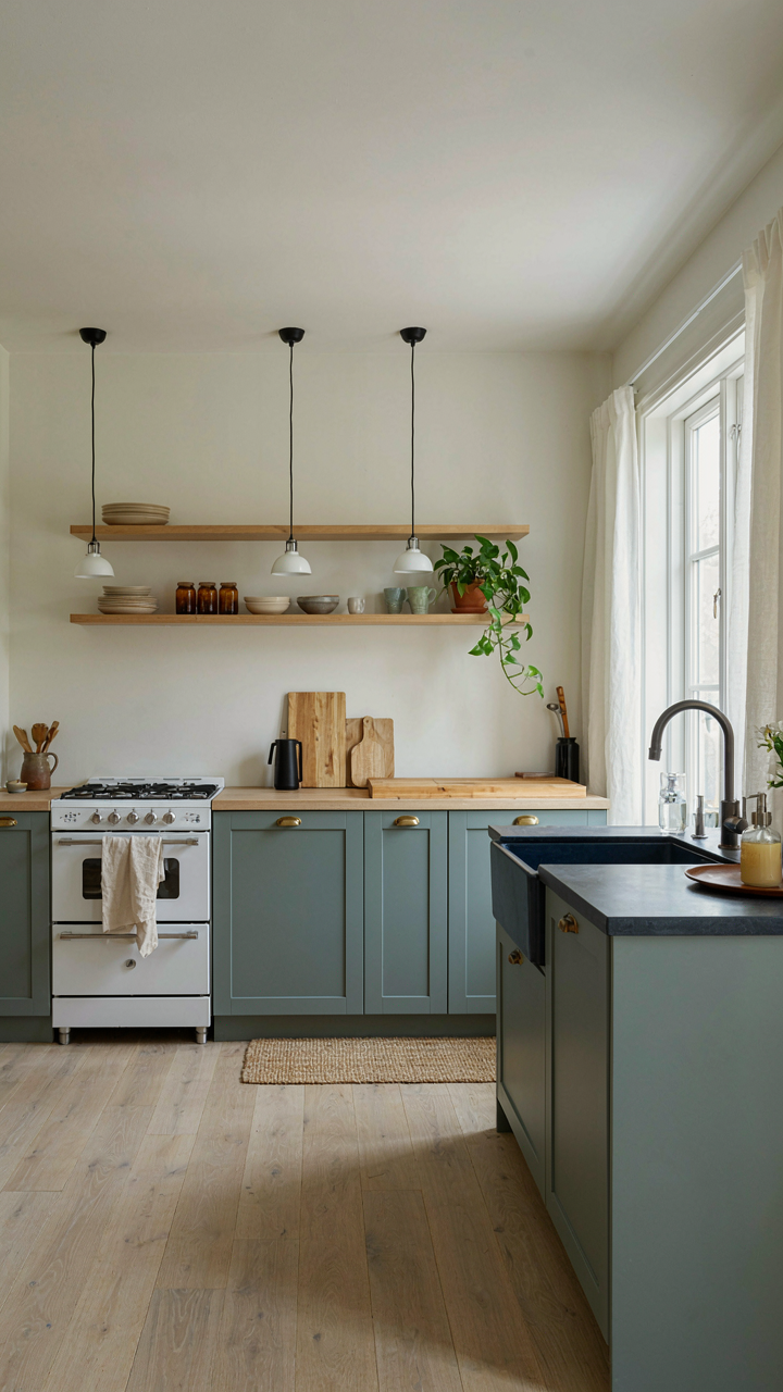
You want your kitchen to look intentional, not like you’re performing competence for guests. The real mechanism is this: Swedish cottage kitchens prioritize workflow over visual balance. Designers worked backward from task frequency, not forward from aesthetic preference. A work triangle between stove, sink, and prep surface defines the space before color or style enters the room. Cramped kitchens in rural Swedish homes demanded ruthless efficiency. That constraint produced designs that still work decades later because they solve problems, not create Instagram moments.
Modern interpretations miss this entirely. People place islands for symmetry, then can’t move through the space. Swedish cottage design puts storage where you reach, work surfaces where you stand longest, and pathways where bodies actually move. The painted furniture trend comes after these mechanics lock in, never before. When you reverse the order, you get pretty kitchens that punish you daily.
Shelving That Serves Actual Needs
The open shelving trend is lazy advice masquerading as design wisdom. Yes, Swedish cottages used open shelves, but not because they looked clean. Closed cabinets required wood and hardware they couldn’t afford. Open shelves worked when dishes rotated through daily use, when nothing sat idle collecting dust. Modern homes store things differently. You own more objects, use them less frequently, and actually need protection from humidity and cooking spray.

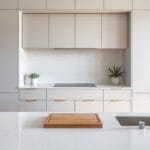
Real Swedish cottage kitchens mixed open and closed storage strategically. Upper walls got open shelves for items in constant rotation: everyday dishes, glasses, cooking tools. Lower cabinetry stayed closed, holding seasonal equipment and bulk staples. Painted finishes on closed doors provided color and personality without demanding perfect organization. Copy the principle, not the visual: use open shelving only for items you handle multiple times weekly. Everything else gets doors. Paint those doors with cottage colors like muted greens or soft blues. This keeps your kitchen functional instead of becoming a prop.
The Swedish Cottage Lighting Manifesto
Windows As Load Bearing Walls
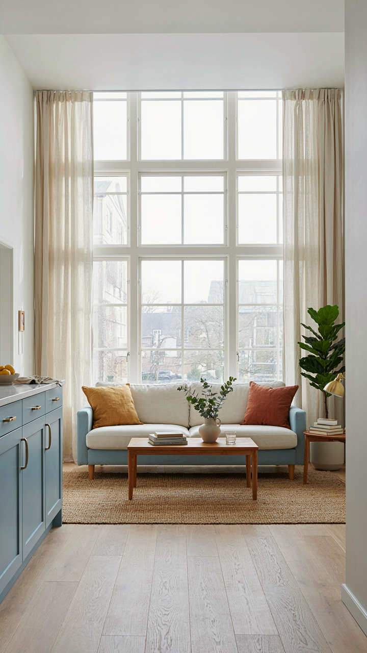
You want the soft, effortless look without admitting you need natural light to hide design flaws. Here’s what actually matters: Swedish cottage design treats windows as structural elements, not decorative afterthoughts. Northern European climates demand maximum light capture during short winter days. This isn’t about aesthetics—it’s about survival economics translated into interior layout. Position your main seating and work zones perpendicular to window walls. This positioning captures ambient light across the full depth of a room rather than funneling it into one corner. The mechanism is simple: more surface area exposed to incoming light means less artificial compensation needed later.
Painted furniture works best in spaces where natural light already dominates. Soft whites, pale blues, and muted greens on cabinets and tables actually reflect available daylight back into the room, amplifying what’s already coming through glass. This is the opposite of what dark, heavy pieces do. Place your lightest painted surfaces within direct sight lines of windows. The reflection doesn’t happen by accident or mood—it happens through material properties and geometry.
Focused Fixtures Over Ambient Glow
Everyone says “create ambiance” with layered lighting. They’re wrong. Swedish cottages use artificial light for specific tasks because historically, light sources were scarce and expensive. Utility beats mood in spaces that need to function. Install directional fixtures above work surfaces: dining tables, desks, reading corners. Use warm-toned bulbs (2700K or lower) only where people spend extended time. Hallways, bathrooms, and transitional spaces get brighter, cooler light for navigation and safety. This isn’t about creating an Instagram moment. It’s about eliminating wasted energy while maintaining visibility where it counts.

Pendant lights hanging at consistent heights over painted wooden tables or desks ground these fixtures as functional anchors, not decoration. Position them 30 to 36 inches above work surfaces. Avoid overhead ceiling fixtures that blast uniform light across the entire cottage—they flatten the room and compete with natural light during daytime hours. The cottage stays visually coherent when artificial light activates only when and where you actually need it.
Sweden Kitchen: The Unspoken Rule Of Materiality
Materials That Tell The Truth
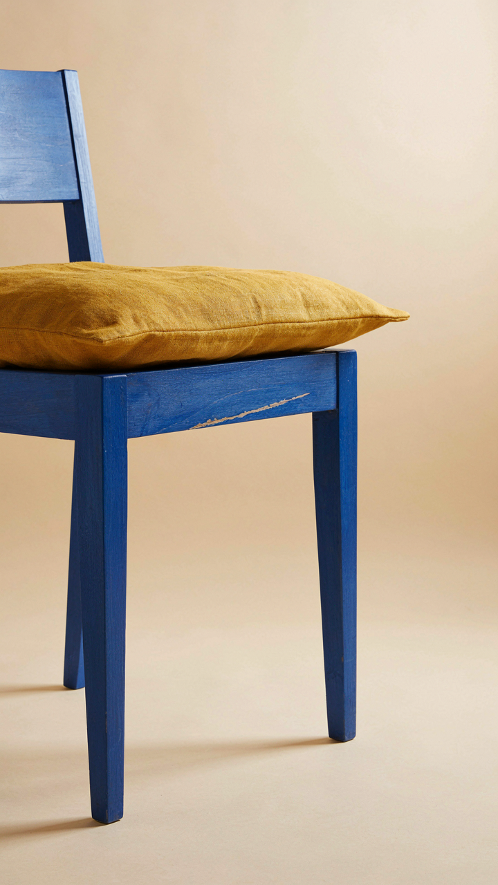
You want this aesthetic because it signals you’re not chasing trends. Here’s what actually happens: Swedish cottage interiors use materials as a filtering mechanism borrowed from industrial design, where constraint breeds clarity. Wood, linen, and ceramic aren’t chosen for prettiness. They’re chosen because they age visibly and honestly. When a painted wooden chair scratches, the wear becomes part of the design narrative instead of a flaw to hide.
The materials work because they’re tactile and functional first. Linen wrinkles without apology. Wood expands and contracts with humidity. Ceramic chips and shows its clay body underneath glaze. These aren’t bugs in the system. They’re features that keep the space from feeling sterile or disposable. A Swedish cottage kitchen rejects the premise that surfaces should stay perfect.
The Rejection Of Surface Coating Culture
Most design advice tells you to choose materials for appearance alone. That’s incomplete and it shows. Swedish cottage kitchens deliberately avoid materials that prioritize looking new over functioning well. No plastic laminates mimicking wood grain. No veneers hiding particle board. No high-gloss finishes that hide nothing but demand constant maintenance anyway.
The mechanism is simple: authentic materials reduce cognitive load. Your eye doesn’t register contradiction between what something looks like and what it actually is. Paint a wooden cabinet and the paint sits on real wood. Wear happens naturally. There’s no moment where you realize the surface is a lie. This directness is what makes the space feel restful instead of managed. The kitchen stops demanding your attention and starts just working.
The Swedish Design Interior Editing Protocol
Ruthless Decluttering A Non Negotiable Step
You want your home to feel calm but you’re actually hoping decluttering fixes your life. It doesn’t. But here’s what it does: decluttering works like triage in emergency medicine. You sort items into three categories, not to feel productive, but to expose what’s actually taking up your cognitive and physical space. Swedish cottage interiors work because they apply this principle ruthlessly. Nothing sits in the room by accident or obligation.
- Surfaces with visible objects: Every item on tables, shelves, and walls must justify its presence. If it’s decorative, it has to be functional too, or it goes.
- Furniture that serves one purpose only: Swedish cottage design eliminates multi-use pieces that don’t earn their footprint. A chair exists to sit in, not to hold laundry.
- Textiles and soft goods: Keep linens that are used seasonally. Remove duplicates, worn pieces, and anything that’s “maybe someday” fabric.
- Kitchen and storage items: Painted cabinets and open shelving expose clutter instantly. You can only display what you actually use.
- Decorative accessories older than five years: Sentiment is not a storage strategy. Items you haven’t actively noticed in years are candidates for removal.
The common advice says declutter to “make space feel bigger.” Wrong. You declutter to stop the visual noise that prevents you from seeing the actual design you’re building. In Swedish cottage interiors, every empty inch of wall and every bare shelf is part of the composition. You’re not removing things to be minimal. You’re removing them so the painted furniture and intentional pieces become the focus instead of background noise.
Every Item Earns Its Place Or It Leaves
The real principle here isn’t about owning less. It’s about ownership friction. If an object costs you mental energy to maintain, justify, or move around, it’s a debt you’re paying in attention every single day. Swedish cottage design reverses this by making ownership a decision you defend actively, not a default you tolerate passively. This means you ask one question before anything enters your space: does this object reduce or increase the cognitive load of the room?

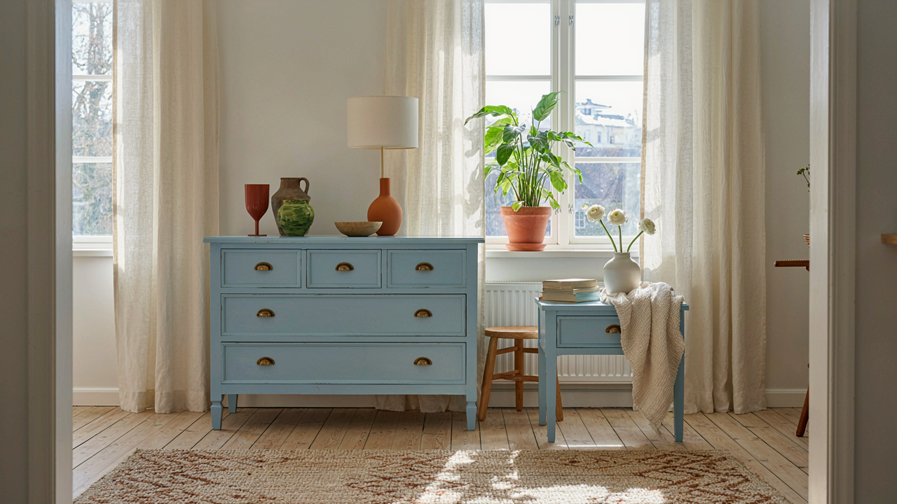
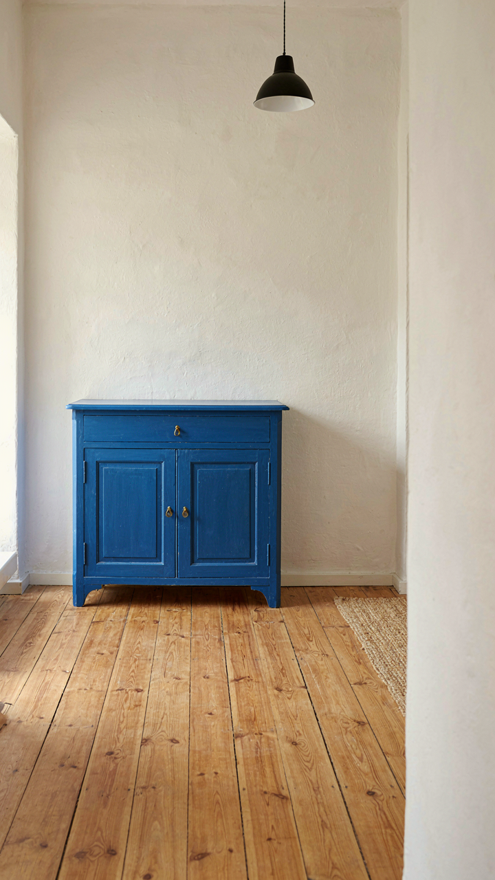
Painted furniture in Swedish cottages works because the pieces themselves are the statement. A hand-painted blue cabinet isn’t there to fill empty space. It’s there because the color, the finish, and the form create a specific feeling in the room that nothing else can replicate. Everything else either supports that focal point or leaves. No exceptions. The protocol is simple: if you can’t articulate why an item belongs next to your painted pieces, remove it before you install it. This editing step is the difference between a styled room and a functioning space.
Beyond Replication: Cultivating Your Own Swedish Cottage Aesthetic
Stop Treating Your Home Like A Pinterest Board
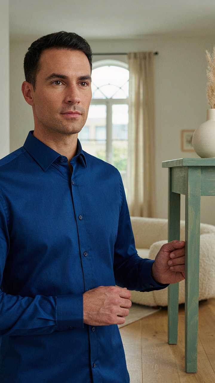
You want to feel like you belong somewhere that isn’t yours. That’s the real reason you’re here. Swedish cottage interiors work because they signal competence and taste without screaming for attention, and you’re betting that copying the surfaces will transfer that signal to you. It won’t. The mechanism is constraint, not decoration. Swedish cottage design emerged from material scarcity and climate necessity in rural Dalarna and other regions. Families painted furniture because replacement cost money they didn’t have. They chose muted pigments because those dyes were affordable and available. The aesthetic wasn’t born from preference. It was born from solving a problem with what existed.
When you copy only the visual layer, you lose the logic underneath. You end up with expensive paint colors that feel hollow because you chose them for how they photograph, not for how they function in your life. The painted furniture becomes costume instead of infrastructure. Your space will feel borrowed because it is. You need to understand what problem you’re actually solving before you pick a single color or piece.
Extract Principles, Not Surfaces
Systems thinking applies here, and the core principle is redundancy through simplicity. Swedish cottage spaces solved for durability and repair using limited materials and repeatable techniques. One paint formulation worked across multiple pieces. One color palette worked across seasons because nobody had the budget to redecorate. One functional layout persisted because moving furniture was labor intensive. This redundancy made the system robust.

Your job is to identify which constraints shape your actual life, then build your aesthetic around solving them. Do you have kids who destroy surfaces? Paint furniture in a finish that takes impact. Do you live where light changes dramatically? Choose pigments that shift with your seasons instead of fighting them. Do you have limited budget? Build a repeatable painting technique and commit to it across pieces over time. The Swedish cottage interior that lasts doesn’t copy Swedish precedent. It copies the mechanism: solve your real constraints first, then let the aesthetic emerge from that logic.
The Timelessness Trap: Why Your Swedish Cottage Needs Imperfection
Patina As A Witness To Living
You want your painted furniture to look timeless because you’re afraid it’ll look dated in five years and you’ll have wasted money. That’s the real calculation. Here’s what actually happens: patina works like compound interest in biology—the more damage accumulates over time, the more value the object gains because it proves use. Swedish cottage interiors survive because they wear visibly.
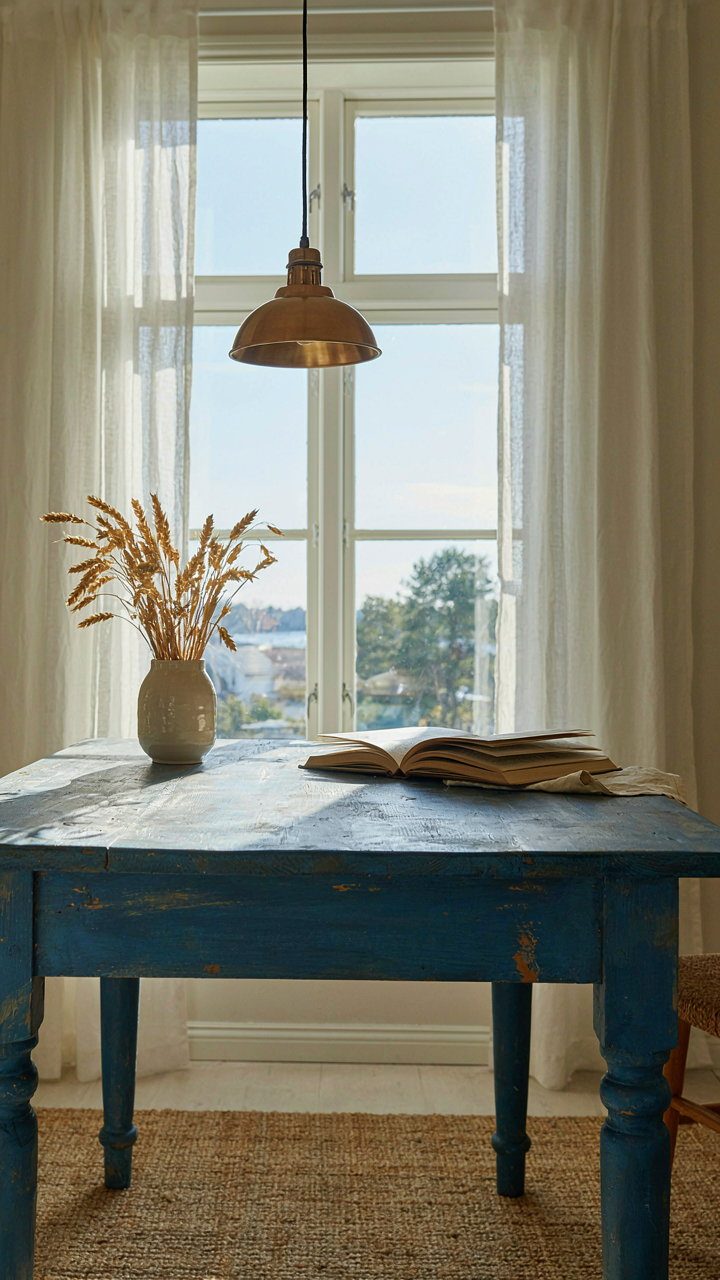
Patina isn’t decay you tolerate. It’s documentation. A painted chair with chipped edges, faded color from sunlight, and scratches from decades of movement tells a factual story about inhabitation. This is why antique Swedish furniture commands prices—the wear proves authenticity and survival. Your new painted piece needs permission to age this way from day one, or you’ll sand and repaint it into stylistic death.
When Wear Becomes The Design
The common advice says distress your furniture to fake age. Wrong. That’s cosmetic theater that reads cheap because it lacks the randomness of actual living. Real imperfection follows patterns—high-traffic areas fade first, edges round from contact, color loss concentrates where hands grip. Embracing wear means building your painted furniture to show these patterns naturally, then leaving them untouched when they arrive.
Swedish cottage design survives by refusing to hide function. Worn paint on a bedroom dresser reveals which drawers get used most. Faded color on a kitchen table shows where light hits daily. These marks aren’t flaws to repair—they’re the mechanism that transforms a new object into something that belongs to a specific place and time. Stop refinishing when the imperfection starts. That’s when the piece becomes real.
Your True Obstacle Isn’t Finding The Right Paint, It’s Escaping The Herd Mentality Of Interior Design
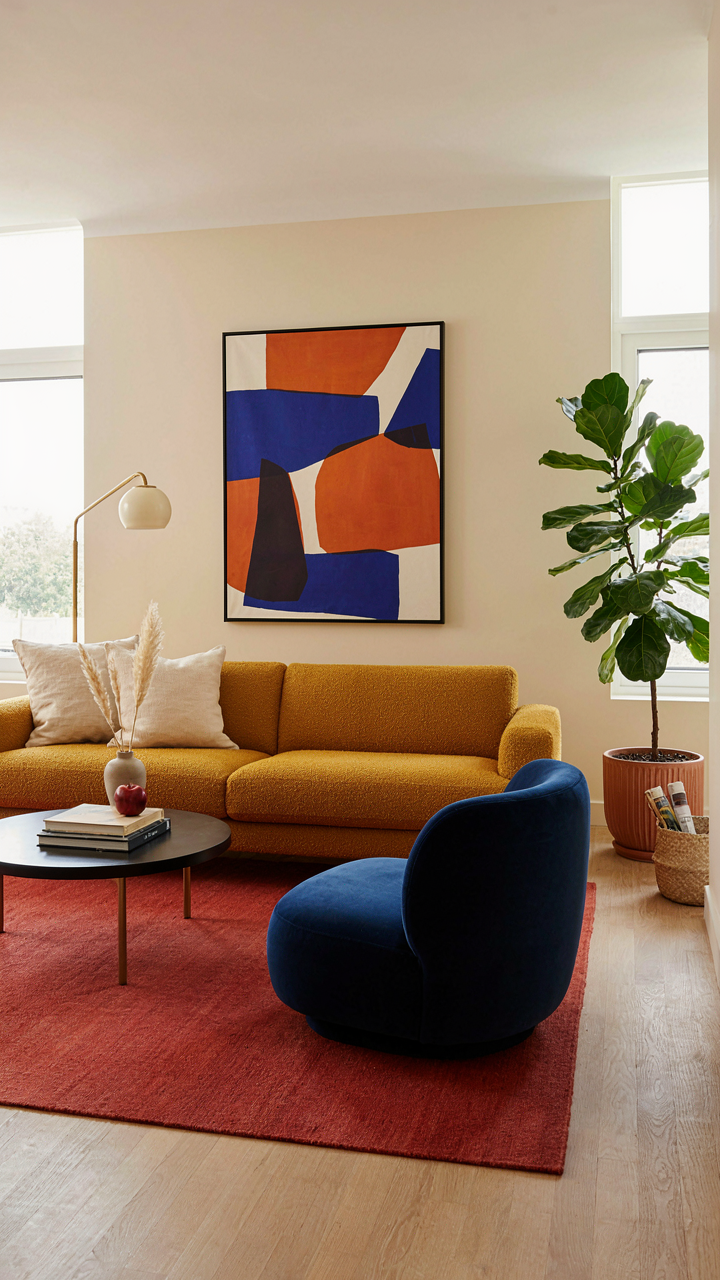
Most people copy what they see on Pinterest instead of building what they actually want to live in. Swedish cottage design works because it came from real constraints, not aesthetic trends. Your move is simple: pick one room and paint one piece of furniture this week. Not to match some mood board. Paint it because you need it functional and beautiful on your terms. Everything else you do in design flows from that one decision about what you actually want versus what you think you should want.