Beyond Beige: The Sensory Illusion Of English Cottage Color Palette

How Light Actually Defines Color
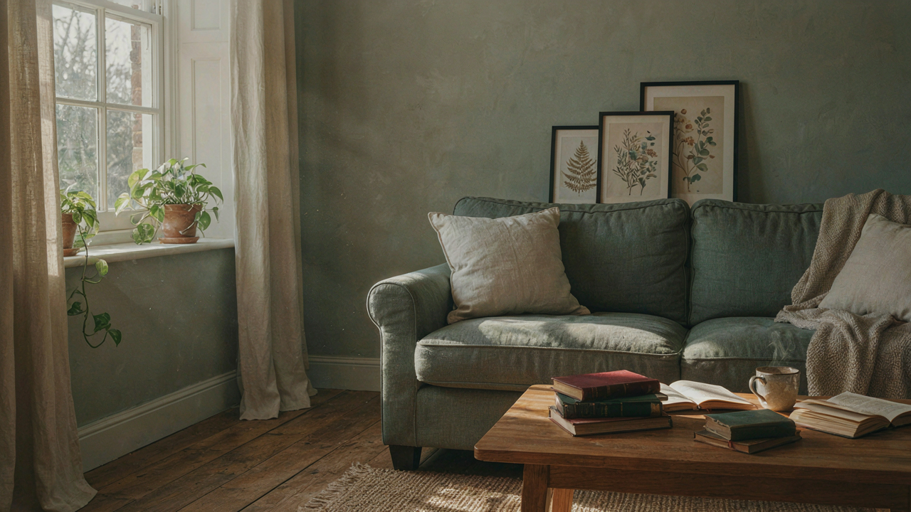
You want people to think your room is timeless and intentional, not dated or accidental. Here’s what matters: color doesn’t exist in the room. Light does. Physics determines everything. When photons hit a surface, the material absorbs certain wavelengths and reflects others back to your eye. A “soft white” wall doesn’t look soft because of paint chemistry—it looks soft because it reflects most wavelengths evenly, which signals your brain that nothing is competing for attention. Cottage palettes work because they’re built on materials and hues that reflect light diffusely rather than harshly.
Traditional cottage interiors used lime-based paints, plaster, and natural textiles. These materials scatter light rather than bounce it back with gloss or intensity. A matte cream absorbs and diffuses light differently than a glossy white. The cottage palette isn’t about the color names—it’s about the finish and the refraction rate. When you’re selecting colors for a cottage room, the reflection behavior of the paint matters more than whether you picked “Cornsilk” or “Old Lace.” Test samples under your actual light source, at different times of day. The color changes because the light angle changes, proving that light, not pigment alone, creates the visual effect.
Contrast Creates Depth Without Drama
Flat color reads as flat space. This isn’t aesthetic theory—it’s visual perception. Your brain interprets contrast as distance and dimension. Cottages don’t use contrast the way modern minimalism does. They layer it subtly through shadow play and material texture. A room with uniform color feels smaller and duller because your eye has no visual pathway to follow. A room where a slightly darker trim catches shadows at corners and baseboards signals depth without feeling designed or precious.
The mechanism is shadow absorption. Darker values—think muted greens, soft grays, or dusty blues in trim or accent walls—sit where light naturally falls less. They catch the shadow your eye expects and confirms spatial volume. This is why cottage rooms don’t need bold color blocking. A pale linen wall paired with a trim shade three or four values darker creates visual weight distribution that makes the room feel larger and more intentional. Place the darker value where shadows naturally gather: baseboards, window frames, built-in shelving, or recessed corners. Light does the rest.
The Cottage Core Color Palette Algorithm: Deconstructing “Soft”

Hue Adjacency: The Neighbor Effect
You want “soft” because you’re afraid bold color looks cheap. Here’s what actually matters: soft isn’t about muting everything. It’s about proximity. Borrow the color theory principle of analogous harmony from painting. Analogous means adjacent on the color wheel. Cottage palettes work because they stack hues that live next to each other, not across from each other. Cream beside sage beside dusty blue reads as intentional restraint. Cream beside coral reads as indecision or poor taste. The mechanism is neurological: your brain processes neighboring hues as a single unified family. Distance between hues on the wheel determines tension. Minimal distance equals cohesion.

The practical application is narrow. Work within a two to three-hue bandwidth on the color wheel. If you start with muted greens (sage, celadon, pistachio), stay in the green-to-blue range. Don’t jump to terracotta or mauve. These feel borrowed from a different room. Interior designers call this “color blocking,” but they miss the real rule: never cross the wheel in a cottage palette without a neutral buffer between them. Test adjacency by printing color swatches and laying them side by side. If they feel like cousins, keep them. If they feel like strangers, they don’t belong in the same four walls.
Value Gradation: The Depth Sequencing
This is where most advice fails. People say “use lights and darks for interest.” Wrong. Cottage palettes don’t use contrast for drama. They use value gradation as a functional depth cue. Value means brightness. Think of it like architecture’s load-bearing structure. You’re not creating visual excitement. You’re creating visual hierarchy through incremental steps, not jumps. A room needs the lightest value on the largest surface (usually walls), mid-values on secondary surfaces (trim, upholstery), and the darkest value in the smallest doses (accent textiles, furniture edges). This prevents flatness and keeps the eye moving without shock.
The sequence matters more than the individual colors. Map your darkest value to no more than 10 to 15 percent of the room. Mid-values occupy 40 to 50 percent. Lightest values take 35 to 50 percent. This ratio holds whether you’re using cream, green, or blue. If you reverse it (dark walls, light trim), you’ve inverted the system and lost the soft effect immediately. Start by choosing your wall color first, then select paint or fabric that’s two shades lighter for trim, and one shade darker for one accent piece. This creates the illusion of depth without requiring color variation.
The Alchemist’s Guide To Timelessness: Pigment & Patina
Where Color Comes From Matters
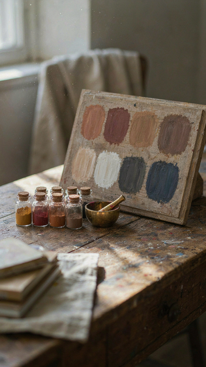
You want your cottage to look like it belongs in a magazine spread fifty years from now, not outdated in five. The real mechanism is this: synthetic pigments fade unevenly and shift toward their chemical breakdown products, while natural pigments age with coherence because they’re already decomposing slowly over decades. You’re not buying a color. You’re buying how that color will die.

Natural dyes come from specific sources with predictable aging patterns. Mineral pigments like ochre and iron oxide change gradually because iron oxidizes at a stable rate. Botanical dyes from madder root, weld, or indigo fade in characteristic directions. The consistency matters because your eye detects when colors age together versus when one wall looks fresh while another has shifted into a different family entirely. Heritage paints formulated with these pigments hold their visual relationship to the room across years.
How Surfaces Hide And Reveal Time
Common advice says matte finishes hide flaws. That’s incomplete. Matte, chalky, and distressed surfaces work through the physics of light diffusion, the same principle that makes frost appear uniform even when the ice underneath is irregular. The roughness scatters light rays so your brain receives averaged color information instead of pinpoint reflections that expose inconsistency.
Distressed finishes perform the same job but add a narrative layer: they telegraph that aging is intentional, not accidental wear. A chalky matte finish on greige walls absorbs light rather than bouncing it back, which makes the pigment read as deeper and more restful than the same hue in satin would. Apply matte finish with a roller in one direction, let it cure fully, then selectively sand edges and high-traffic zones. The mechanism is exposure of the base layer underneath, which creates micro-shadows that read as depth.
The Biomimicry Of Color: Forest Floor And Fading Sky

What Nature Clusters Together
You want this to feel timeless without effort—which means you’re banking on nature to do the design work for you. That’s the mechanism: colors don’t exist in isolation in nature, so rooms feel off when you force them to. Ecology teaches us about niche compatibility—the principle that certain organisms thrive together because their environmental needs align. In a cottage color palette, niche compatibility means pairing colors that actually coexist in one specific ecosystem, not cherry-picking from different biomes.

A forest floor palette works because those colors share the same light conditions and decay patterns. Warm grays, muted browns, pale greens, and cream tones appear together under a canopy because they’re all filtered through the same dappled light. When you pull colors from one ecological niche instead of mixing arbitrary ones, the palette reads as coherent rather than assembled. The room stops feeling curated and starts feeling inevitable.
Shifting The Palette Across Months
Most design advice about seasonal color shifts suggests swapping out large pieces—a lazy approach that wastes money and attention. The real mechanism is saturation and value, not hue rotation. A cottage palette adjusts by pulling darker, more saturated versions of core colors in fall and winter (forest greens become deeper, creams warm toward ochre), then lightens and desaturates them in spring and summer (those greens fade toward gray-green, creams go cooler).
You control this through textiles and smaller furnishings rather than walls. Switch linen colors, rotate throw blankets, adjust accent pillows. The underlying palette stays the same. This keeps the bones of the room stable while signaling seasonal transition without visual whiplash. The mechanism is subtle enough that guests notice the room feels fresher or cozier without understanding why.
The Cottagecore Color Palette Spectrum: Micro Adjustments For Macro Impact
How Light Rewires Small Spaces
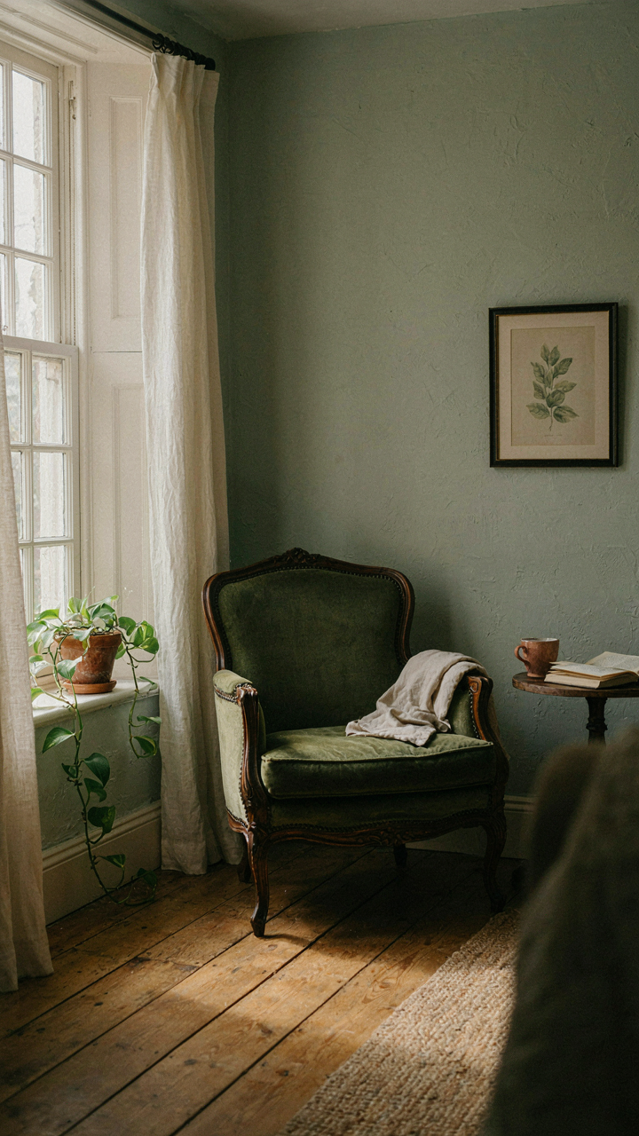
You want your cottage room to feel bigger without admitting you’re afraid of small spaces. Here’s the mechanism: physics teaches us albedo, the reflectivity of a surface. In cottage color palettes, light values control how much light bounces back into the room instead of absorbing into walls. Cream, pale sage, and off white have high albedos. They multiply perceived depth by forcing light to travel further before it dies.

The real move isn’t just picking light colors. It’s understanding that warm light sources (incandescent, candlelight) hit cool pastels differently than cool light sources hit warm creams. A pale blue under warm lamplight feels cold and smaller. The same pale blue under daylight reads expansive. Match your palette’s undertone to your dominant light source, then the room expands without you doing anything else.
Saturated Anchors In Open Rooms
The common advice here is wrong: cottage doesn’t mean everything must be pale. Large rooms collapse into visual chaos when every surface reads as background. Leverage visual weight distribution from architecture, the principle that heavy elements need strategic placement to balance space. A saturated color like deep forest green or muted terracotta on a single accent wall, fireplace, or built in doesn’t shrink the room. It gives the eye a place to land.
Cottage color palettes work in large rooms when you treat saturation like load bearing structure. One deeply saturated surface per room. Everything else stays light or muted. This prevents the eye from skipping around and makes the large space feel intentional instead of empty. Place your saturated anchor where you want the room’s visual center. That becomes your focal point. The rest supports it.
The Color Palette Cottage Feedback Loop: Testing & Iteration
Your Eyes Lie Until They Don’t
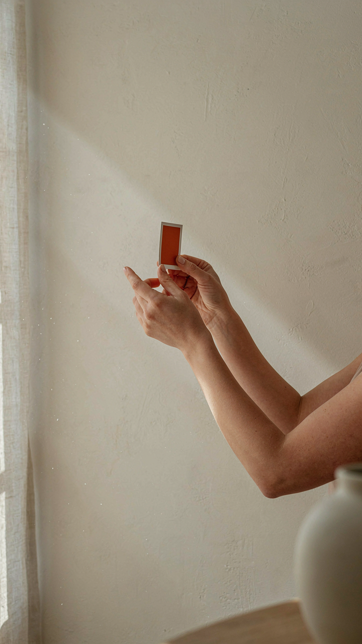
You want certainty before you commit. That’s the real fear here—picking a cottage color palette and discovering six months in that it ruins the room. The mechanism you need to understand comes from visual perception psychology: your eyes don’t see colors in isolation. They adapt to context, light source, and surrounding hues through a process called chromatic adaptation. A soft sage green looks entirely different under morning north light versus afternoon south light. Your brain recalibrates the same pigment moment to moment. This is why paint samples fail and why designer color matching matters less than the actual walls in actual rooms.

The consequence is brutal: you cannot trust your first impression of any cottage color, period. Your visual system biases toward novelty and contrast when you first see a new hue. After three days, adaptation kicks in and the color settles into what it actually is. Ignore this lag and you’ll repaint in frustration. The real play is designing a feedback loop that forces adaptation before commitment. You test under the exact light conditions of your space, in the exact season you’ll live with it, over enough time for your eyes to stop lying.
Test Colors Across Real Variables
The standard advice says “buy sample paint and slap it on the wall.” That’s incomplete and lazy. You need small swatches tested across varied light conditions because cottage color palettes live or die on how they respond to natural and artificial light. North-facing rooms demand warmer undertones in soft neutrals. South-facing rooms expose cool undertones and wash out pale creams. West light hits harder in afternoon and shifts warm colors hot. East light is clean and cool in morning, neutral by midday.
- Paint chips on poster board, not walls first: Move them room to room across 3-5 days. Observe under morning, noon, and evening light. This costs nothing and reveals which colors your space actually rejects.
- Sample pint cans on actual walls, corner placement: Paint a 2-by-3-foot section in an inconspicuous corner. Live with it for one week minimum. Your brain needs time to recalibrate past the novelty shock.
- Test adjacent rooms simultaneously: Cottage palettes rely on color flow between spaces. Paint samples in connected rooms side by side so you see how one color relates to the next under the same light.
- Photograph samples under different times: Phone photos bypass your eye’s real-time adaptation and show what an objective lens sees. Compare morning photos to evening photos of the same swatch.
- Test with actual furniture and fabrics nearby: Colors shift perception based on what sits next to them. A pale greige reads different next to a linen sofa versus bare drywall.
Light variables determine whether a cottage palette feels cohesive or wrong. The iteration protocol is simple: commit to the smallest viable test, observe it under all relevant light conditions across a minimum seven-day window, then document your response before moving to the next candidate. When adaptation settles and you still want the color, paint.
The Antidote To Trend Chasing: Building A Cottage Color Palette Foundation
Core Neutrals Anchor Longevity
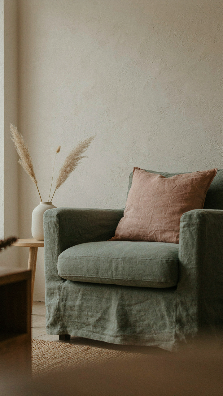
You want this to feel timeless so you don’t have to redo it in three years and feel stupid about your choices. Here’s the mechanism: neutrals work because they’re not fighting for attention. They let everything else—light, texture, objects—shift without the bones of the room screaming. In cottage design, core neutrals aren’t beige blandness. They’re warm off-whites, soft grays, and muted taupes that reference plaster, linen, and aged wood. These tones stay relevant because they’re derived from materials that actually age in homes, not from color forecasting.

The trick is committing to one neutral as your base before you pick accents. If you choose warm cream as your wall color, every decision after that filters through that lens. It’s not restriction. It’s focus. When you lock in a core neutral, you eliminate the constant second-guessing that kills coherence. Paint a room in this base, live with it for two weeks, then add accents. Your eyes will tell you what works because there’s actual contrast to judge against instead of staring at swatches in fluorescent lighting.
Strategic Color Injection Without Expiration
Most advice says “add pops of color” and leaves you guessing what that means and where you’ll regret it. The real mechanism borrowed from inventory management: rotate your accents but anchor your colors in a narrow range. A cottage palette uses accent colors that cluster around earth tones, muted jewel tones, or soft botanical shades. These hold their relevance longer than bright primary colors because they’re tethered to nature, which doesn’t trend.
Strategic injection means choosing one dominant accent color that appears in multiple places—textiles, trim, one accent wall—and one secondary accent that’s softer. This creates visual weight and memory without chaos. The secondary accent can rotate out without disrupting the room’s core identity. If your dominant accent is a muted sage green in your upholstery, your secondary might be a dusty rose in throw pillows. In five years, you swap the pillows. The green stays. This is how you build something that lasts without looking frozen in time.
The Cottage Core Color Palette Blueprint: Layering For Depth
How Textiles Control Temperature Perception
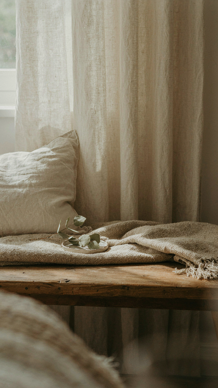
You want your room to feel intentional, not accidentally mismatched, so you’re looking for a framework that justifies your color choices. Textile thermodynamics from fabric science explains this: materials absorb and reflect light wavelengths differently based on fiber content and weave density, which directly controls whether a surface reads as warm or cool to your eye. A linen weave scatters light differently than a velvet pile. This isn’t metaphorical warmth. It’s optical behavior you can leverage.

Cottage palettes fail when people treat all neutrals as identical. Raw linen in cream reflects differently than wool in the same tone. Wool absorbs more light, reading warmer and heavier. Cotton blends sit between them. The mechanism: layer your textiles by fiber type, not just color name. A cool cream linen wall texture anchors a space. Add warm wool upholstery on seating. Finish with cool cotton for soft furnishings. Your eye perceives depth because the materials themselves behave differently under light, not because you picked three shades of beige.
Anchoring Color To What Doesn’t Move
Most cottage advice tells you to pick a palette, then apply it everywhere. That’s backward. Your fixed architecture sets the constraints. Paint, plaster, and built-in cabinetry don’t change. Your movable pieces do. Paint the fixed walls in the most muted tone your palette allows. Ceilings and trim go even lighter or warmer to recede. Then your furniture, textiles, and accessories carry the actual color play within that established frame.
This is why cottage rooms feel cohesive across decades. The bones stay consistent. A 1980s floral sofa leaves; a 2020s linen one arrives. The room adapts because the architecture locked down a narrow, stable color band. Your fixed elements are the container. Work within it, not against it. When redecorating, keep walls and trim untouched. Swap only the pieces you control. This discipline prevents color drift that makes spaces feel chaotic.
The Legacy Pigments: Colors That Tell A Story
When Practicality Chose The Palette
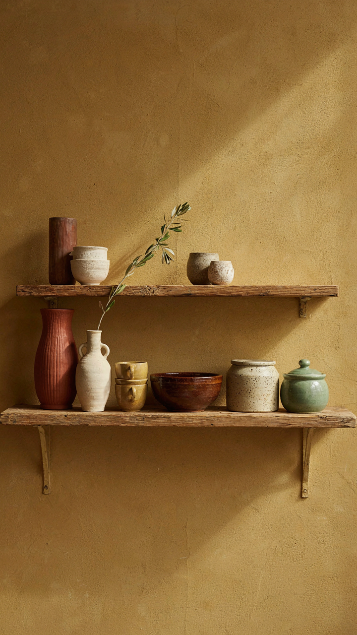
You want these colors because you’re searching for permission to stop chasing trends. The real mechanism is this: traditional cottage colors exist because they solve a material problem, not an aesthetic one. Rural cottages used pigments derived from what the land provided—ochres from iron oxide in soil, blues from indigo or woad, reds from madder root. These weren’t choices. They were inventory.

The colors that survived became default because they worked with what builders had. Limewash, the primary cottage finish, accepts earth pigments naturally and ages without becoming toxic or unstable. Soft yellows, warm grays, muted greens, and pale blues weren’t invented by designers—they emerged from the physics of available materials meeting local climate. When you choose these colors now, you’re choosing a palette already tested across centuries and geographies.
Your Objects Demand Specificity
Most advice on cottage color palettes treats your home like a museum backdrop. Wrong. Your walls serve one job: they anchor the objects and people actually in the room. The mechanism here comes from semiotics—how meaning attaches to color through association and contrast. A pale cream wall doesn’t read as “timeless” in a vacuum. It reads as timeless because your grandmother’s quilt, your inherited candlestick, or your collected pottery commands visual weight against it.
Start by inventorying what stays in the room. That vintage rug, the wood tones of your furniture, the ceramics on shelves—these dictate which legacy pigment works. If your pieces carry warm undertones, ochre-based walls ground them. If they’re cooler, greyed-green walls don’t compete. The palette becomes personal not through decoration, but through hierarchy. Your objects become the story. The walls become the paper they’re printed on.
Stop Chasing Cozy. Build A System For Sensory Immersion, Or Settle For Fleeting Trends
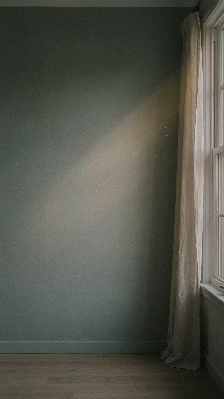
Most people pick cottage colors and call it done. That’s why their rooms feel generic in six months. Real longevity comes from understanding how these palettes anchor you emotionally, not aesthetically. Pick one wall in your home right now. Commit to a single soft, muted tone that makes you pause when you enter. Live with it for two weeks before adding anything else. Your gut will tell you if the color actually works or if you’re just chasing the Instagram version of home. The rooms that last aren’t designed. They’re built on conviction.