The Mimicry Trap: Why Copying Prairie Lines Fails

Aesthetic Decoration Versus Structural Logic
You want the look without understanding why it works, and that gap is where your money disappears. Frank Lloyd Wright’s Prairie style wasn’t a surface treatment—it was a response to specific environmental and social conditions of early 1900s Midwest America. The horizontal lines extended from the flat landscape. The overhanging eaves protected against sun and rain. The open floor plans rejected Victorian compartmentalization. Copy only the lines, and you’re left with a costume that contradicts how you actually live.
The common advice says “add horizontal trim and low-pitched roofs” to get Prairie style. Wrong. Those elements serve no function when detached from the underlying spatial logic. A shallow roof overhang that doesn’t shield your windows from harsh sun is decoration pretending to be architecture. The real mechanism: Wright designed every detail to solve a problem in the home’s climate, geography, or social use. Strip away the problem, and the detail becomes meaningless ornament that ages poorly.
The Cost Of Borrowed Aesthetics Without Intent
Stylistic appropriation drains resources because it demands maintenance without delivering performance. You’re paying for form that doesn’t earn its keep. A Wright-inspired home with authentic Prairie proportions and overhangs actually reduces cooling costs and extends material life. A superficial version with cosmetic horizontals and shallow depth satisfies Instagram but requires constant upkeep. The elements exist only to signal style, not to function.
The mechanism is simple: decorative elements without structural purpose accumulate problems faster than integrated design. They collect water in wrong places. They create shadowing that reveals poor material choices. They age visibly because they’re not load-bearing anything or protecting anything. To avoid this trap, demand that every horizontal line, every overhang, every material choice solves something tangible in your climate or daily use. If you can remove it without changing how the house performs, it’s decoration masquerading as design.
Usonian House: The Unsung Blueprint For Modern Simplicity

Affordable, Functional, Truly American Architecture
You want to believe affordable housing can be beautiful. The mechanism most people miss: Wright didn’t compromise on design to cut costs. He redesigned the entire system. Usonian homes eliminated the basement, the attic, and the hallway. He flattened the roof pitch. He moved the kitchen to the center as a workspace, not a hidden room. These weren’t sacrifices. They were architectural decisions that made construction cheaper because they required less material and fewer labor hours.

Wright built nearly 60 Usonian homes between 1936 and 1959, pricing them around fifteen thousand dollars when a typical house cost double that. The homes worked because he thought in systems, not aesthetics. The slab foundation sat directly on the earth. Radiant heating ran through the concrete. No separate furnace room needed. The open floor plan eliminated interior walls. Clients participated in construction through a cost-sharing model called the Usonian Fellowship, further reducing expenses while maintaining Wright’s design intent.
Design Constraints That Drive Function
Borrowing from industrial engineering, every Usonian home operated on a principle called design for manufacturability. Instead of custom building each element, Wright created a modular grid system, usually four feet, that determined window placement, wall positions, and structural spacing. This constraint eliminated waste and decision paralysis. Every dimension followed the grid or a simple fraction of it.
The constraint became the generator of character, not a limitation on it. Each Usonian home looked distinct because the grid adapted to the specific site and budget, not because the architect indulged in ornamentation. No baseboards. No crown molding. No applied decoration anywhere. The materials spoke: natural wood, concrete, brick, stone. A Usonian home built in 1947 is still livable because Wright designed for durability and maintenance simplicity, not trend. The real mechanism: restrict your variables first, and the design solves itself.
Lloyd Wright Architecture: The Systems Thinking Protocol
Structure, Site, And Inhabitant As One Problem
You want this section to validate that good design is about harmony and balance. The real mechanism is constraint elimination. Wright treated structure, site, and inhabitant as a single system where removing friction between any two parts forced better decisions in all three. Most architects separate these concerns. Wright didn’t. A wall wasn’t a barrier between inside and outside—it was the mediator that determined how light entered, how temperature moved, and how the inhabitant experienced transition.

The Prairie School approach used materials and forms that responded to the land itself, not imposed upon it. Horizontal lines mirrored the flat Midwest landscape. Stone came from regional quarries. Windows framed specific views rather than providing generic light. When you design this way, the house doesn’t sit on the site—it emerges from negotiation with it. The inhabitant moves through spaces shaped by what the land demanded, which means behavior and comfort follow naturally rather than requiring adjustment.
Ecology Before Environmental Trends
This is where conventional advice falls apart completely. Most designers now talk about sustainability as a checklist: recycled materials, solar panels, water capture. Wright solved this differently. He borrowed from systems theory—the principle of feedback loops—and applied it to how a building maintains its own stability over time. A feedback loop in ecology means output from one organism becomes input for another, creating self-regulation. In Wright homes, overhangs controlled sun exposure seasonally, thermal mass in materials stabilized interior temperature, natural ventilation paths reduced mechanical dependence.
The real payoff isn’t environmental virtue signaling. It’s that homes designed this way cost less to operate and require less intervention to stay comfortable. Broad overhangs on south-facing walls in cold climates let winter sun penetrate deep into interiors while blocking summer heat. Clerestory windows positioned above sight lines pull warm air up in winter, vent it naturally in summer. These aren’t features you add—they’re decisions baked into orientation and form from the start.
The True Frank Lloyd Wright Exteriors: Inside Out Design
Interior Movement Dictates Exterior Form
You want a home that looks intentional from the street. The real mechanism is this: Wright didn’t design exteriors first, then fit interiors inside them. He designed living patterns, then let the building envelope follow. Think of it like topology in mathematics, where the shape exists only to serve the flow underneath it. Most architects reverse this. They sketch a facade, then force rooms to fit. Wright’s exteriors are visible proof that your life inside matters more than curb appeal.

The prairie line exemplifies this inversion. Horizontal lines on Wright’s exteriors weren’t aesthetic choices. They extended from interior sightlines and furniture placement. When you stand in a Wright-inspired home, your eye naturally travels along those same horizontal planes. The walls, windows, and roof overhangs become the architecture of movement, not obstruction. This is why generic moderne homes with horizontal bands feel empty, while Wright’s work feels inhabited before anyone moves in.
Landscape Integration Through Material Logic
Most design advice calls this “harmony with nature.” That’s lazy framing. What matters is material continuity. Wright used local stone, wood species native to the region, and earth tones pulled from the actual site. In the Midwest, this meant warm ochres and grays. In Arizona, deep reds and sand tones. The building doesn’t blend into landscape through romance. It disappears because the palette is already there.
The overhang serves a mechanical function, not a visual one. It controls water, creates microclimates around the foundation, and extends the interior into exterior space without weather damage. Windows sit flush with exterior walls rather than recessed, allowing interior and exterior sightlines to align. The foundation sits visible, made of the same material as surrounding earth, so the building appears to emerge from ground rather than sit atop it. This matters because it rewires how inhabitants think about their relationship to land.
70s House Aesthetic Exterior: The Perversion Of Prairie Style
When Wright’s Principles Became Visual Wallpaper
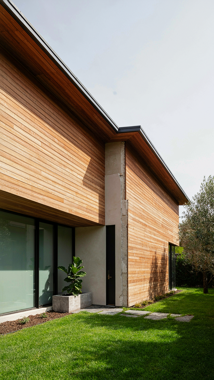
You want to know this because you’re buying or building something you think carries Wright’s DNA, and you don’t want to look stupid realizing you’ve paid for a costume. Here’s the mechanism: Prairie Style wasn’t a surface treatment. It was a structural philosophy built on horizontal lines that extended from the interior logic of the home outward. The 1970s borrowed the horizontal lines, stripped away the reasoning, and slapped them on houses with completely different spatial intentions. The result looks like Wright but functions like everything he opposed.

Original Prairie homes used horizontal lines to echo the flat Midwestern landscape and to organize space through visual continuity. The lines weren’t decoration. They were a direct statement about how the house related to its site and how inhabitants moved through it. Developers in the 70s saw the aesthetic, mass-produced the gesture without the structure, and created homes where horizontal bands sat on boxes that had no connection to their surroundings. The exterior became a brand, not a building system.
Aesthetic Imitation Versus Structural Inheritance
Distinguishing real influence requires understanding that Wright designed from constraint backward. Economics, materials, and site determined the form first. Appearance followed inevitably. The 70s trend worked in reverse: aesthetic preference determined the form, and everything else got forced to comply. A genuine Prairie influenced home will show consistent logic between its horizontal lines and its interior spatial flow. The lines mark room divisions, connect to fenestration patterns, and respond to the land’s actual contours. Fake versions show horizontal banding that has no relationship to what happens inside or how the house sits on the lot.
Real differentiation happens at the foundation and roof line. Genuine Prairie inspired homes extend their horizontal bands continuously from grade to soffit, creating the illusion that the house grows from the earth. Superficial versions stack horizontal elements like trim, breaking the continuity and exposing the fact that the lines are applied, not intrinsic. Look at where the lines intersect with corners, windows, and edges. If they break, hesitate, or change character, you’re looking at visual borrowing, not structural understanding. Check if the horizontal emphasis actually controls the interior layout or if it’s purely ornamental.
Frank Lloyd Interior Design: The Art Of Deliberate Restriction
Built In Furniture Solves The Space Problem You Won’t Admit
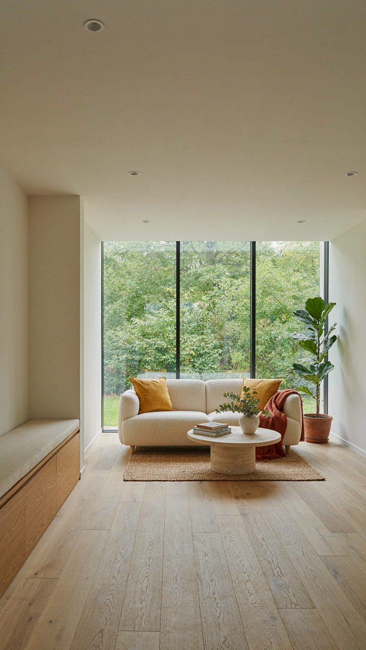
You want a home that looks intentional without feeling cramped. That’s the real tension nobody names. Wright solved this through constraint, not abundance. Built-in furniture treats the room as a system, not a container. Every piece connects to structure. Storage becomes wall. Seating becomes architecture. The mechanism: fixed furniture eliminates dead space and visual noise simultaneously because it occupies vertical real estate instead of floating objects that fragment the floor plan.

Wright designed built-ins as extensions of the home’s skeleton, not afterthoughts. Desks, benches, and cabinets grew from walls and anchored to floors. This approach reduced the square footage needed for function by 20 to 30 percent in comparable homes. The psychology works too. When furniture is structural, the brain reads the room as coherent. Separate pieces create visual chaos. Built-ins create order through integration. To apply this: sketch your room’s walls first, then identify which functions (work, storage, seating) must occupy that space, then design furniture that anchors to structure rather than floating independently.
Honest Materials Without The Decoration Trap
Most people confuse material authenticity with leaving things raw and unfinished. Wrong. Wright’s material palette wasn’t about exposing brick and leaving it at that. Economics teaches diminishing returns. The same principle applies here: every layer of decorative finish past the honest expression of material wastes visual effort. Wright used oak, limestone, stucco, and copper not as statements but as answers. The material did the work. No paint hid the grain. No veneer faked the texture.
- Oak and wood trim: Exposed grain and color variation in flooring and millwork create visual movement without applied pattern. Wright often stained rather than painted to preserve wood character.
- Limestone and concrete: Used in walls and floors to suggest permanence and mass. Their natural color palette—warm grays and taupes—required no additional surface treatment to anchor a room.
- Copper and bronze: Hardware and accent metalwork that patinas over time. The aging process becomes part of the design rather than a maintenance problem to hide.
- Stucco and plaster: Applied in matte finishes to walls and ceilings. The slight texture variation from application itself provided visual interest without pattern printing or wallcovering.
- Brick and tile: Used in their standard form without glazing or sealing beyond functional protection. Mortar color choice mattered more than surface treatment.
Select materials that improve with age and require minimal intervention to maintain their visual integrity. The decision to use a material commits you to its honest appearance. When you accept that oak will show wear, that concrete will develop patina, and that copper will oxidize, you stop fighting the material and start designing with it. This is where the real efficiency lives. Material restraint demands better initial selection, not better finishing products later.
Frank Lloyd Wright Homes: The Financial Fallacy
The Affordable Wrightian Myth
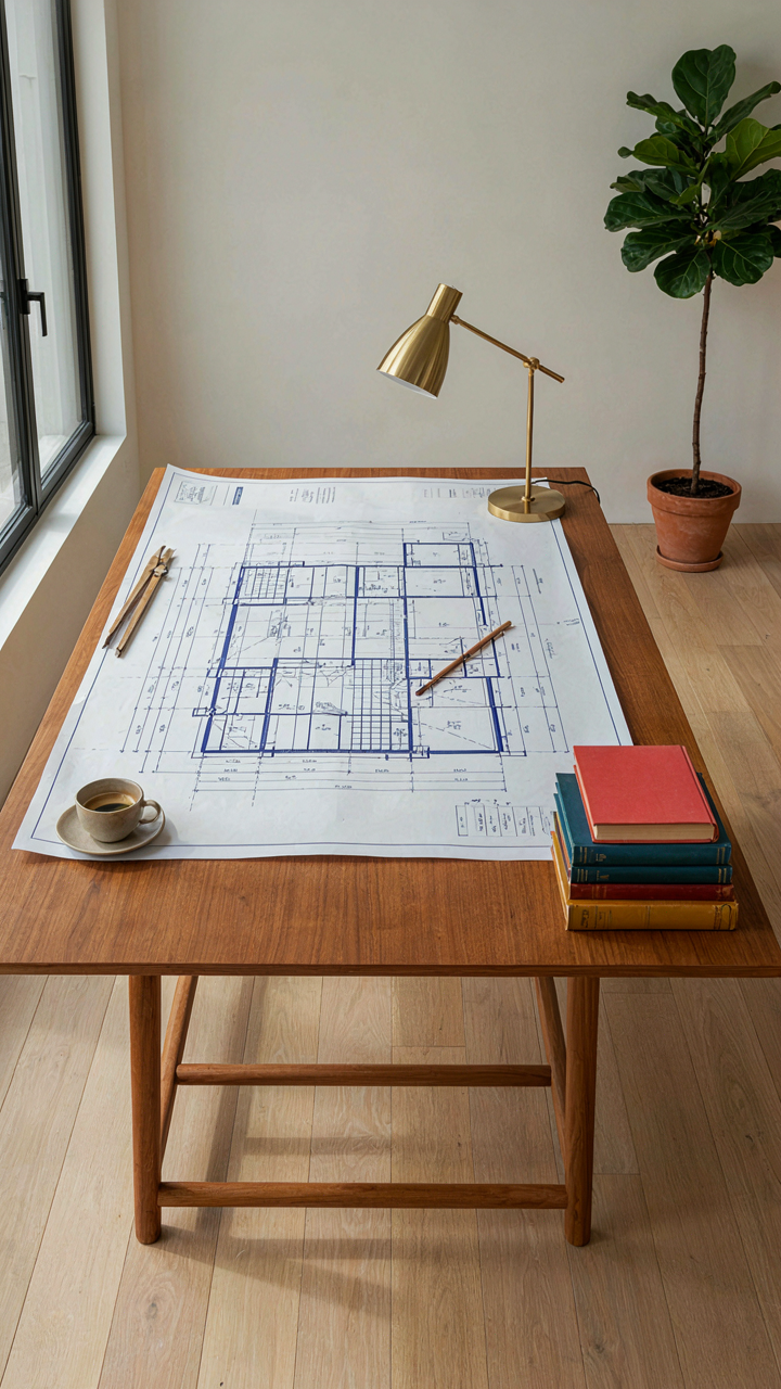
You want to believe a Wright-inspired home costs less than a standard build. That’s the trap. The real mechanism is that Wright’s design philosophy demands custom solutions at every decision point, and custom always costs more than standardized. There is no “affordable Wright” because the entire system resists mass production.

Wright rejected conventional building methods. His homes required site-specific foundation work, custom millwork, built-in furniture, and material specifications that contractors couldn’t source from stock suppliers. Builders today selling “Wright-inspired” homes at standard prices are cutting the core elements that made his work distinct. You’re buying the aesthetic, not the system.
Authenticity Versus The Imitation Tax
Economics teaches the concept of asymmetric information: one party knows more than the other. In Wright-inspired homes, this manifests as the gap between what buyers think they’re getting and what they actually receive. An authentic Wright approach costs 15 to 40 percent more than conventional construction because it demands coordination that disrupts typical builder workflow.
Imitation Wright homes use stock floor plans with horizontal siding and geometric trim. They cost what they should: standard price for standard work. Authentic approaches involve custom site surveys, integrated structural systems, tailored material selections, and coordination with craftspeople instead of mass-produced suppliers. The imitation tax isn’t the premium you pay for real design. It’s what you lose when you choose cheap over honest.
70s Houses Architecture: Lessons From Failed Adaptations
The Shortcuts That Killed The Prairie Line
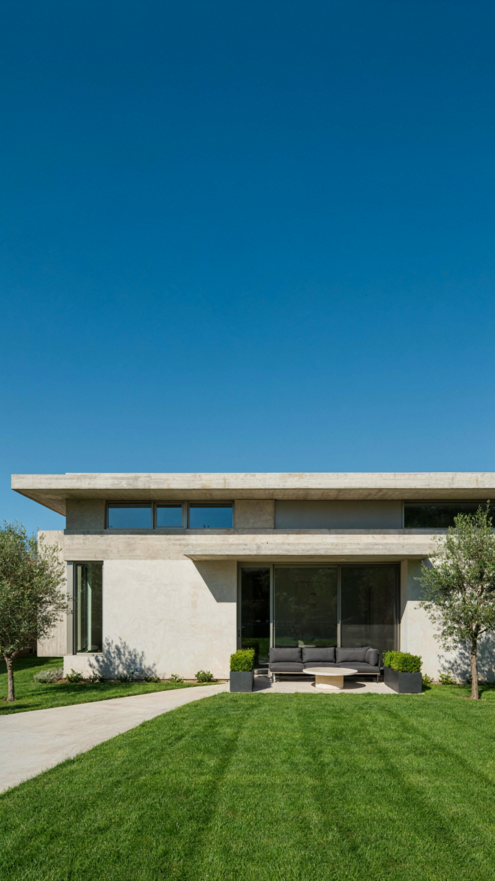
You want to build a Wright-inspired home because you think it signals taste. The real problem: most 1970s architects copied the appearance while abandoning the structural logic that made Wright’s work function. In engineering terms, they treated his designs like aesthetic veneer instead of load-bearing system. The prairie line wasn’t decoration. It was a visual expression of how Wright organized space through horizontal cantilevers, open floor plans, and integration with landscape. Remove the structural reasoning and you get a house that looks right but behaves wrong.

The 70s version stripped away what mattered. Builders kept the low rooflines and horizontal bands of windows but ditched the overhangs, the carefully calculated sightlines, the material continuity between interior and exterior. They used cheaper materials, abandoned the custom detailing, and crammed standard floor plans underneath a Wright-adjacent exterior. The result was a building that photographed like his work but solved none of the problems he solved. These homes aged poorly because they were solving a different problem: how to look modern without the cost of actually being modern.
Building Without Repeating That Failure
The common advice says study Wright’s aesthetics. That’s backwards. Study his constraints first. Wright designed for specific sites, specific clients, and specific construction methods available in his era. When you copy his forms without understanding what problems they solved on that particular land, you’re cargo-culting. Start by mapping your actual site conditions: solar exposure, wind patterns, how the land slopes, where neighbors sit relative to your windows. Then decide whether horizontal lines serve those conditions or just echo fashion.
The mechanism is simple: every design decision must trace back to a functional requirement, not a stylistic preference. If you’re using a low-pitched roof, it should manage water runoff correctly for your climate and extend far enough to protect the walls beneath. If you’re running ribbon windows horizontally, they should frame the view you actually want to see and provide the light distribution your interior layout requires. Document this reasoning before you draw. Any Wright-inspired element that doesn’t solve a problem on your property is just decoration wearing someone else’s philosophy.
70s House Aesthetic Modern: Reclaiming Organic Principles
What The 70s Actually Got Right
You want permission to like something retro without looking foolish. Here’s the mechanism: the 1970s didn’t invent organic architecture, but it did strip Wright’s principles down to their structural skeleton, removing the craftsman ornament that required money and skill nobody had anymore. The honest materials and open floor plans survived. The ego didn’t.

Wright despised the 1970s aesthetic, but that’s irrelevant. His actual tenets—horizontal lines that ground a house to its site, materials that age honestly, spaces that flow without walls—persisted in modest homes when high-end architecture abandoned them. The decade proved these ideas worked at scale without the Taliesin budget.
Building Horizontality Into Contemporary Space
Horizontal lines are load-bearing strategy borrowed from structural engineering, where stress distributes across a wider span more efficiently than vertical concentration. Apply this to a Wright-inspired home: roof overhangs and ribbon windows don’t just reference the prairie. They reduce the visual weight of the structure and anchor the house to the ground plane through proportion, not ornamentation.
Most advice says “add lines to your elevation.” That misses it. The lines have to relate to the actual site topology and the human scale of movement through space. A 70s ranch with correct overhangs and continuous sightlines into landscape reads as intentional, not dated. The concrete step: measure your roof overhang against the ceiling height of your interior spaces. If they don’t match proportionally, the line breaks the spell.
Frank Lloyd Interior Design: The Unseen Force Of Space
Compression And Release
You want to know about Wright’s interiors because you sense they make you feel something most homes don’t, and you’re hoping to replicate that feeling without understanding its actual mechanism. Wright borrowed from physics a principle called tension and release: the way pressure builds and then resolves creates a visceral response in the body. In Wright homes, this translates directly into how rooms contract and expand.
A low ceiling in an entry hallway doesn’t just look intentional—it creates measurable compression. Your shoulders narrow. Ceiling height drops to seven feet or lower. Then Wright opens into a living room with soaring overhangs and clerestory windows. The spatial contrast hits your nervous system before your conscious mind registers it. This isn’t decoration. It’s manipulation of your body’s spatial awareness through planned architectural sequences that force attention and reset perception.
The Void As Working Element
Most design advice treats emptiness as wasted space. That’s incomplete. Wright understood that leaving space empty serves the same function as filling it—both are active choices that guide how you move and where your eye travels.
In Wright interiors, negative space isn’t background. It’s material. A room with minimal furniture and a single focal point (a hearth, a view, a sculptural element) forces the brain to stop scanning and settle. Wright used this ruthlessly in his residential work, particularly in the Prairie style homes where horizontal planes extend far enough that the void becomes part of the composition. The absence of clutter becomes the point. When designing a Wright-inspired interior, identify one dominant feature per room, strip away competing visual noise, and let the architecture itself be the content rather than a frame for objects.
The Obsession With Mimicking Frank Lloyd Wright’s Style Misses The Point: True Mastery Isn’t Imitation, But The Ruthless Pursuit Of Integrated Living
Stop buying Wright’s aesthetic off the shelf. The prairie lines, the overhangs, the horizontal geometry—these weren’t decorative choices. They were weapons against separation. Wright designed homes where every element fought against fragmentation. You don’t build a Frank Lloyd Wright inspired home by copying forms. You build it by asking what fragments your life, then eliminating it. Today, map one room in your house where function and flow collapse. Redesign it for integration, not style. Your space should reflect how you actually live, not how Wright lived a century ago.