The Myth Of Muted: Why “Soft” French Country Colors Are A Trap
Beige Everything Isn’t French Country
You want people to think you have taste without having to commit to anything. That’s why every design blog sells you the lie that French country means drowning everything in beige and calling it sophisticated. It’s not. The real mechanism here is that pastels alone feel safe, so they’ve become the default recommendation for anyone afraid of color.
Actual French country interiors use restraint strategically, not universally. Provence farmhouses pair deep ochres with cream walls. Normandy cottages balance slate blues against whitewash. The mistake people make is confusing “understated” with “monochromatic.” These spaces work because of deliberate contrast, not because someone picked six shades of taupe and stopped thinking.
Contrast Builds The French Country Effect
Think of it like contrast in photography: a single tone disappears. The French country palette succeeds through signal-to-noise ratio. Your eye needs a reference point to understand what’s intentional versus what’s just… there.
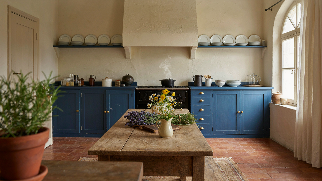
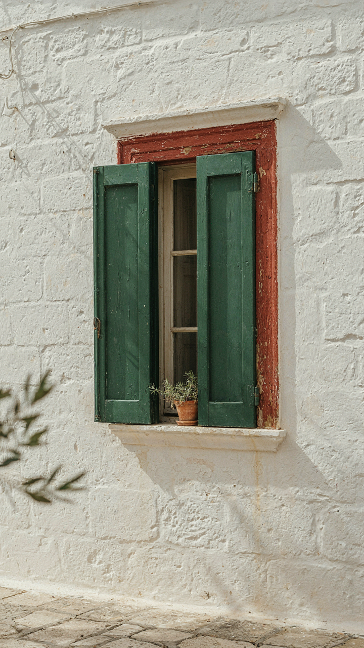
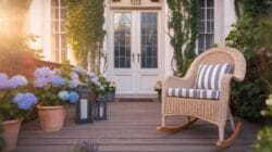
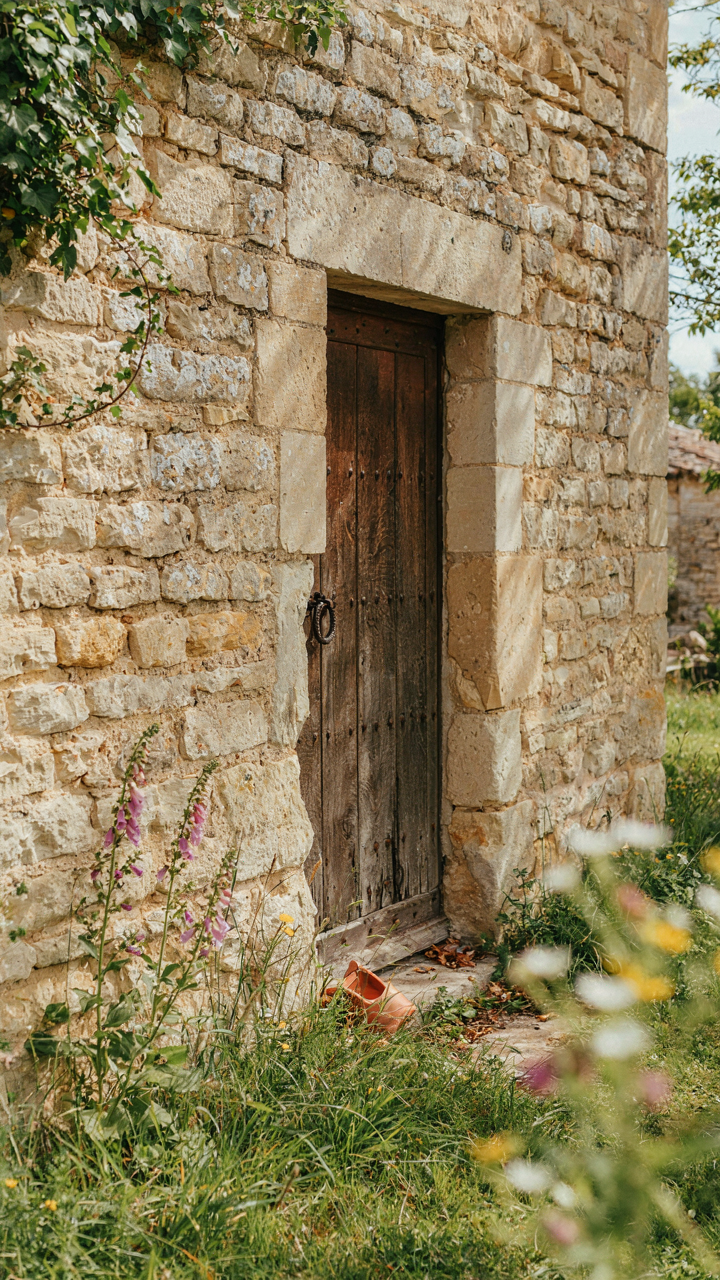
Traditional French country combines deep, earthy anchors with bright neutrals. Deep red terracotta trim against whitewashed stone. Forest green shutters framing pale linen walls. Navy blue cabinet doors with cream-colored hardware. These aren’t afterthoughts. They’re the structural logic that makes the soft colors readable. Without them, muted becomes forgettable. The mechanism you’re looking for: apply one deep, saturated color to architectural elements (shutters, trim, cabinet faces), then let everything else stay light. That single decision creates the French country read.
The Provençal Paradox: Bold Hues In French Country Color Schemes
When Muted Isn’t The Only Move
You’re worried that French country means beige restraint. It doesn’t. The mechanism is this: Provençal interiors use saturation strategically, not universally. Saturated color works when it anchors a space through repetition and natural material contrast, not when it competes for attention.
Ochre, terracotta, and deep blue appear in French country rooms because they derive from local earth and pigments historically available in the region. These aren’t soft pastels. They’re confident colors backed by material authenticity. The mistake most people make is treating saturation as an all-or-nothing choice. In Provençal design, you deploy it where it matters: a painted cabinet, a feature wall, or textile accents. The rest of the room breathes neutral.
Texture And Light Do The Real Work
Color contrast without material contrast reads as flat and decorative. The load-bearing mechanism here comes from industrial design: surface finish determines how color behaves under light. A matte ochre wall absorbs light differently than a glazed ceramic bowl in the same hue.
Stone, linen, wood, and plaster surfaces in French country interiors modulate color intensity without changing the pigment itself. A saturated blue shutters against whitewashed plaster creates visual depth. The same blue on smooth drywall feels cheap. Light direction matters more than people admit. Northern light flattens bold colors. Southern light (common in Provence) intensifies them. You don’t soften strong color through dilution. You soften it through material texture and strategic light direction.
The Patina Principle: Age As A French Country Color Palette Element
Worn Finishes Drive The Entire Palette
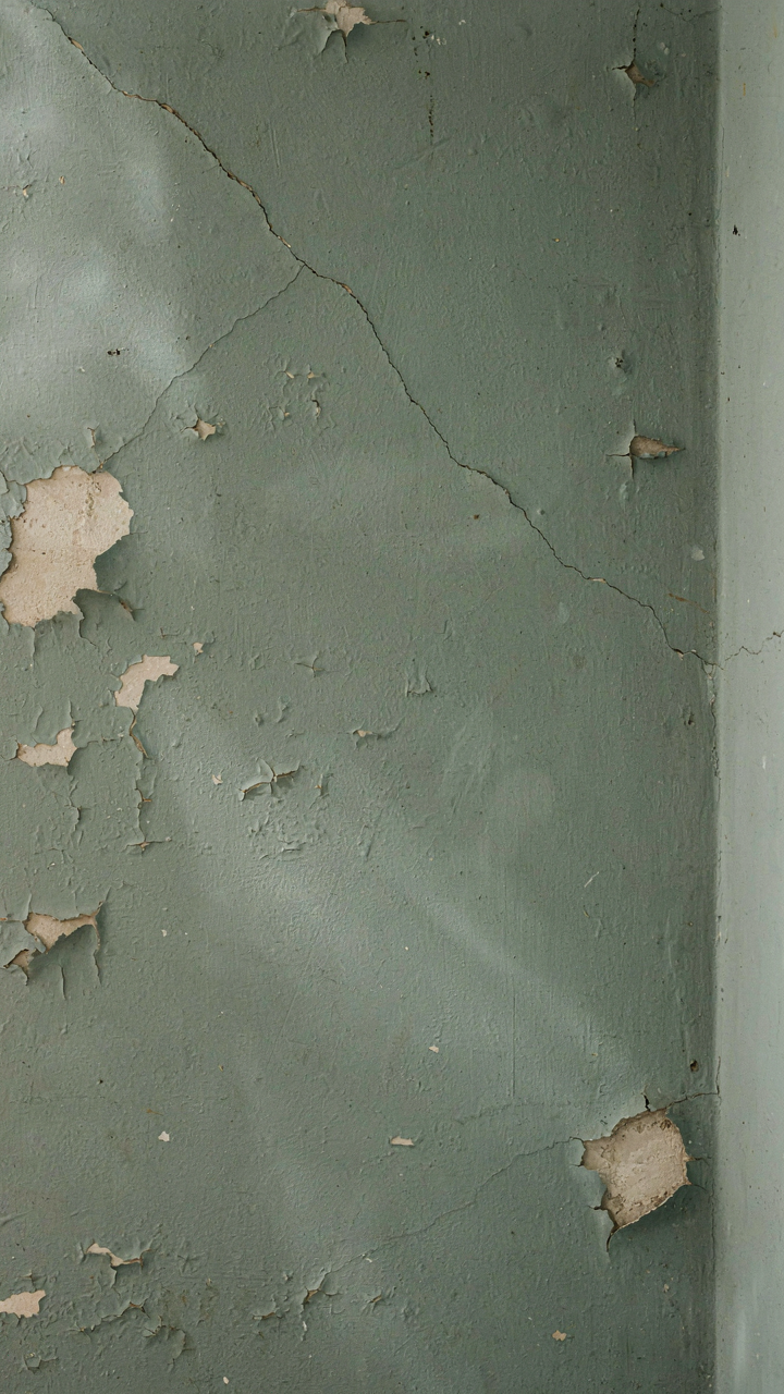
You want patina because it signals authenticity you didn’t have to earn. That’s the real move here. French country color works backward from decay. The palette isn’t built on what’s fresh; it’s built on what time has stripped away. Rust reds, dusty blues, chalky whites, and muted greens all exist because pigments fade, moisture stains surfaces, and paint oxidizes. The mechanism is simple: intentional imperfection reads as truth in a way perfection never does.
French country interiors don’t fight this process; they build the palette around it. When you see a soft sage green or a cream with gray undertones, you’re looking at colors that already account for deterioration. The finish itself becomes part of the color statement. Matte and chalky surfaces catch light differently than glossy ones, shifting how the eye perceives the actual pigment underneath. This is why French country paint colors feel aged before you even move in.
Simulate Aging Without The Wait
People skip this step because it takes intention. Most paint formulas now include chalky or matte additives specifically designed to mimic aged surfaces without actual degradation. You’re not faking; you’re compressing time. Techniques like dry brushing, lime washing, or applying paint over a primer that deliberately contrasts create the visual markers of age: color variation, surface texture, hint of underlying layers showing through.
The protocol is direct. Prime with a contrasting base layer. Apply your topcoat in thin, uneven layers. Sand high traffic areas and edges where wear naturally occurs. Use a matte or chalky finish paint rather than satin or gloss. The goal isn’t to make walls look damaged; it’s to build in the visual evidence that the color has weathered naturally. This single step determines whether your palette reads as intentional French country or merely pale and tired.
The Terroir Method: Grounding Your French Cottage Color Palette

Stone And Soil Shape Your Color Story
You want your palette to feel authentic rather than like you copied a design magazine. The mechanism is simple: geology dictates what materials existed locally, which dictated what colors people actually lived with. Borrowing from geology means studying the limestone, slate, and clay native to the region you’re referencing—not inventing colors from thin air.
French regions built their structures from what the earth provided. Provence limestone runs warm beige and ochre. Burgundy uses cooler grey limestone. Normandy favors granite with deeper grey and taupe undertones. When you anchor your palette to these geological facts, the colors feel grounded because they genuinely reflect what those places are made from. Examine the actual stone in photos of authentic farmhouses, not stylized interior shots. The palette emerges from material reality, not trend cycles.
Flora Grows The Secondary Palette
Most people layer French country colors by guessing at complementary tones. This fails because they skip the regional flora that actually informed historical color choices. Botany teaches us that plant pigments are substrate specific—they produce different hues depending on soil chemistry and climate. Your palette’s secondary colors should mirror plants thriving in the specific French region you’re designing around.
Provence’s lavender produces purple tones because of the region’s mineral-rich, alkaline soil. Normandy’s hedgerows and apple orchards yield greens and soft greys. Burgundy’s grape vines and forests establish deeper forest greens and burgundy accents. Pick a region first. Identify its dominant plants. Pull colors directly from those plants at different seasons. This gives you color relationships that feel intentional instead of arbitrary. You’re not adding color—you’re documenting what already grows there.
The Light Manipulation Protocol: Beyond French Country Paint
How Morning Light Shifts Your Color Choices
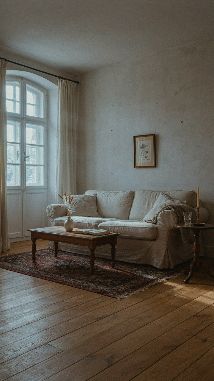
You want your space to look intentional, not like you guessed. Here’s what nobody tells you: the french country palette only exists in specific light conditions. Borrow a term from physics—wavelength—and map it onto color perception. Morning light carries shorter blue wavelengths. This makes warm terracottas, ochres, and cream tones appear muted and slightly greenish until the sun climbs higher. The same lavender that reads sophisticated at noon looks flat and grayish at 7 AM.
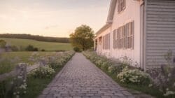
The mechanism is straightforward. North-facing rooms receive consistent, cool light all day. South-facing rooms flood with warm afternoon light that saturates warm tones and bleaches cool ones. East-facing spaces get that blue-heavy morning window for 4-6 hours, then shift warm. West-facing rooms fight harsh afternoon heat that distorts perception entirely. Before you commit to any french country color, observe your actual light source for a full day cycle. Paint sample cards at 8 AM, noon, and 5 PM. The color you choose must work in the light that dominates your space most.
Artificial Lighting As A Color Control System
Most people light a room to see it. That’s backwards. You light a room to make the palette work on purpose. French country interiors relied on candlelight and firelight—warm, directional, low output. Modern incandescent bulbs mimicked this warmth at 2700K color temperature. LED bulbs now dominate, and most default to 4000K or higher, which strips warmth and flattens the soft ochres and sage greens that define the aesthetic.
The tactical choice: use warm white bulbs rated 2700K in ambient fixtures. Place them on dimmers. Layer your lighting with task lights over work surfaces and accent lights on textured walls. This prevents the flat, medical-office effect that kills french country mood. Recessed ceiling lights destroy the palette by casting shadows that make muted tones look dingy. Instead, use wall sconces, table lamps, and floor lamps at eye level or below. Position light sources to graze textured surfaces like plaster, linen, or stone. The texture then sells the color, not the bulb wattage alone.
The Wabi Sabi Of French Country: Imperfection As A Color Choice
How Entropy Shapes Your Color Story
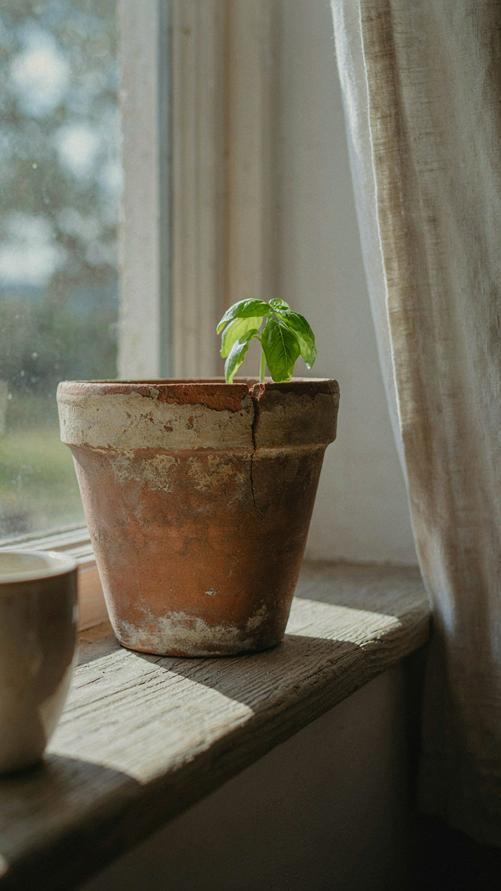
You want permission to stop chasing pristine. That’s what this is really about. In physics, entropy describes how systems lose order over time, and your french country color palette operates on the same principle. Colors don’t stay saturated. Pigments fade. Walls weather. The palette embraces this decay instead of fighting it. Faded lavender isn’t a mistake. It’s the intended endpoint. French country design borrowed this truth centuries before physics had a name for it, treating color loss as design currency rather than failure.
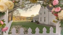
The mechanism matters here because it flips your entire buying strategy. Instead of selecting colors to resist time, you select colors that improve when time touches them. A muted terracotta or dusty ochre doesn’t look worse after five years of light exposure. It looks more authentic. The constraint isn’t your budget or your taste. It’s your willingness to let materials age visibly.
Natural Wear As Your Design Partner
Cottage color palette strategy stops pretending stasis exists. Materials change. Linen fades. Plaster cracks. Paint yellows slightly. You either design around this or you fight a losing battle against entropy that costs time and money. French country interiors acknowledged centuries ago that accepting wear is cheaper than resisting it. The palette works because every color in it looks better slightly aged than it does fresh from the can.
This means your color selection process shifts from “what looks perfect now” to “what trajectory am I accepting.” Soft greens from natural earth pigments shift warmer as they oxidize. Warm creams develop subtle shadow marks where light doesn’t reach them. You’re not choosing a static color. You’re choosing a transition. Apply your palette knowing it will deepen, soften, and settle over years. That’s not degradation. That’s the design working as specified.
The Texture Color Interplay: More Than Just French Country Paint Colors
How Material Texture Shifts Color Perception
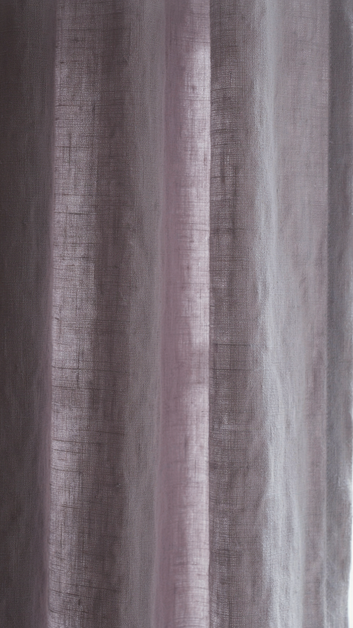
You’re hoping texture will do the heavy lifting so your color choices look effortless and intentional. It won’t. But here’s the mechanism: texture operates like physics does with light refraction. Rough surfaces scatter light across multiple planes, making colors read darker and more muted. Smooth surfaces reflect light uniformly, pushing colors toward their stated value. A lavender on linen absorbs light differently than lavender on glazed ceramic.
- Linen and raw canvas: Matte weave absorbs light, deepening warm tones like ochre and cream. Colors lose saturation and gain earthiness through diffusion across fabric fibers.
- Plaster and chalk paint: Porous surfaces grab pigment unevenly, creating micro shadows. This makes soft grays and whites appear less sterile and more lived-in.
- Terracotta and clay tiles: Natural firing creates pitting and variation. Rust reds and burnt oranges shift between warm and cool depending on light angle and shadow depth.
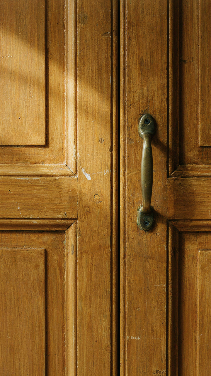
- Waxed or oiled wood: Sealed wood reflects more light than raw wood. The same taupe reads brighter on finished floors than on unfinished beams.
- Aged metals and hardware: Patina creates surface irregularity. Brass and iron shift from warm to cool throughout the day as texture interacts with changing light direction.

French country design works because it respects this rule: texture changes the color you actually see, not just the color you think you chose. Test your palette on the exact material you’re using before committing budget.
Layering Textures To Build Depth
The common mistake is treating texture as decoration instead of color modifier. You layer textures not for visual interest but to create chromatic separation using the same hue. A cream-colored room with matte plaster walls, raw linen drapes, and waxed wood furniture doesn’t look the same cream everywhere, even though you specified one color across all materials.
This depth comes from texture acting as a filter between the paint color and your eye. Start with your base color on the wall in a matte finish. Introduce one secondary texture in a complementary material, like linen upholstery that reads one shade deeper due to its weave. Add a third textural layer, like sealed wood trim, which reads lighter by reflecting available light. The palette stays cohesive because the base hue anchors everything, but the viewer’s eye moves through tonal variation that texture created, not paint mixing.
The Anti Trend French Country Color Palette: Timeless Vs. Trendy
When Trends Betray Your Investment
You’re worried you’ll pick the wrong colors and your space will feel dated in three years. Here’s the mechanism: trends in French country design move fast because they’re driven by what’s easy to photograph and sell, not by what actually lasts. The real French country palette didn’t emerge from Instagram. It emerged from regional clay, available pigments, and centuries of constraint. That’s why it survives.

Most color advice tells you to “just pick what you love.” That’s incomplete. You need to distinguish between colors that trend and colors that endure. French country works because it borrowed from agricultural economics: farmers used ochre, umber, and lime because those pigments were local and cheap. The palette stuck because the mechanism behind it wasn’t fashion. It was resource availability.
Colors Built To Outlast Fashion Cycles
A French country scheme endures when you anchor it in the historical pigment palette: ochre, umber, chalk white, slate gray, and soft lavender. These colors haven’t cycled in and out of favor because they never competed for trend status. They were practical first, beautiful second. When you build on that foundation instead of chasing current mood board aesthetics, your space remains relevant because relevance wasn’t the goal. Durability was.
The protocol is simple: start with one historical anchor color from the region’s working palette. Ochre walls in Provence. Chalk white trim in Normandy. Gray stone tones in Burgundy. Then layer in two supporting colors that appear in that same region’s vernacular buildings, textiles, and landscapes. Avoid colors that read as “designed.” French country rooms age well because they look like they happened, not like they were curated.
The Real Obstacle Isn’t Your Color Choice; It’s Your Fear Of Imperfection
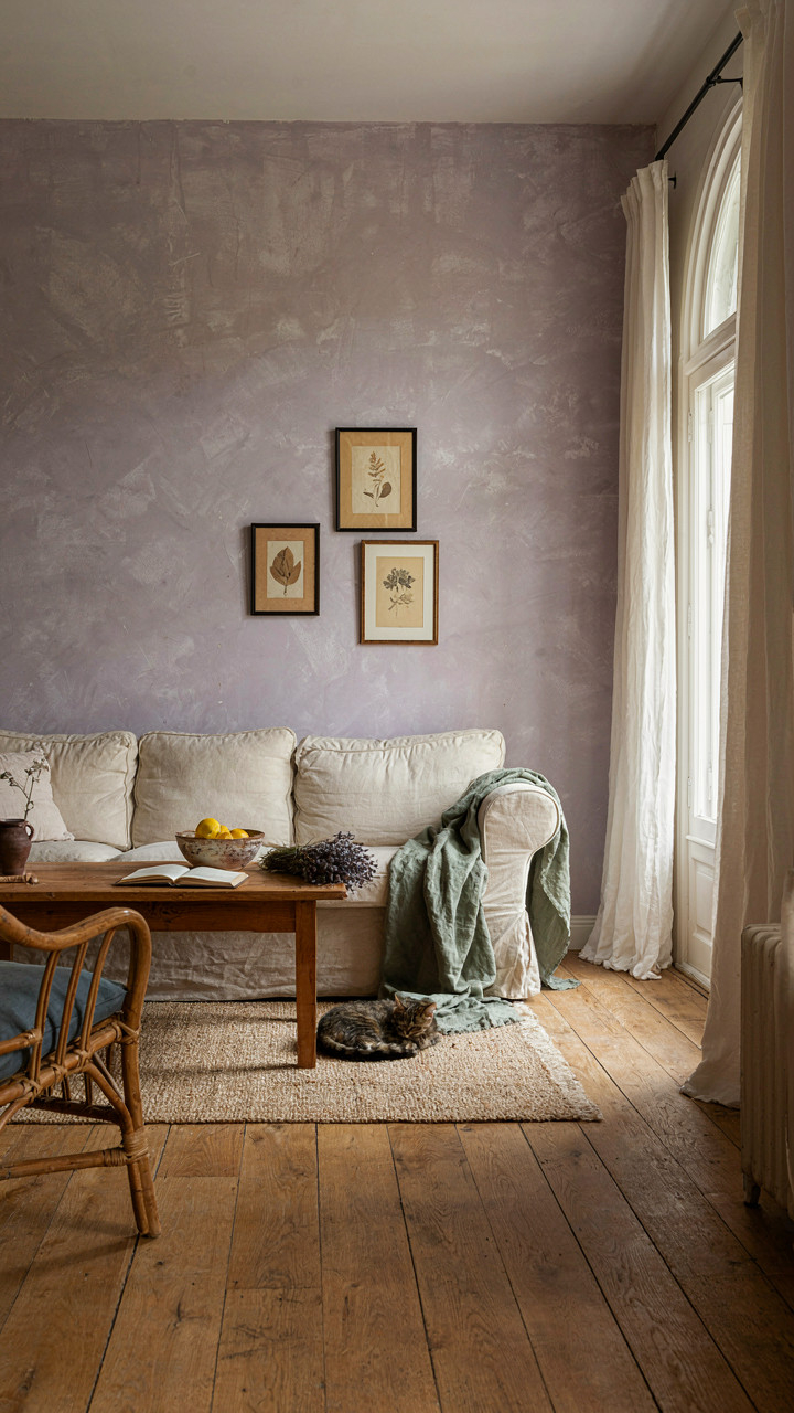
You’re waiting for permission to commit to lavender walls or linen accents. You’re not. The french country palette works because the French stopped obsessing over matching everything perfectly. They layered imperfect colors and trusted their instincts. Pick one color from this palette today. Paint a single accent wall. You’ll realize the fear was bigger than the actual decision. Imperfection is what makes a space feel lived in, not sterile.