
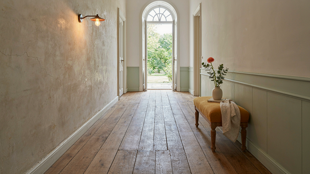
The Faux Aged Fallacy: Why New “Old” Misses The Mark
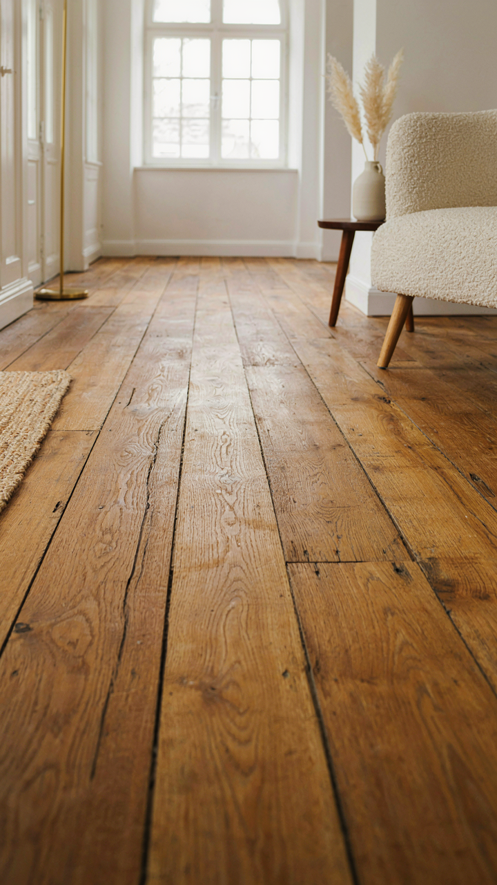
Mass Produced Distress Never Reads As Real
You want people to think your hallway has history without admitting you bought it yesterday. This is the core problem that factory distressing tries to solve, and it fails because the mechanism of authentic aging is time plus specific use patterns, not random scratches applied in a factory.
Distressed finishes from mass production follow predictable damage templates. A chisel mark hits the same wood species the same way. A stain blotch lands in the identical spot across ten thousand units. Your eye catches the pattern, and your brain registers it as fake before you name why. Real aged floors accumulate damage from where people actually walked, where furniture sat for decades, where spills happened once and stained unevenly.
The Weight Of Actual Wear
Genuine patina requires friction. A wooden hallway floor in a 19th century French farmhouse shows wear in traffic zones because bodies moved through it daily for a century. The wood compressed. The finish thinned. The grain darkened from dust and footfall oils. Factory distressing cannot replicate the specific density and depth of this compression because it does not account for the tonnage of actual use over time.
When you source authentically aged materials or accept the wear pattern your current floor develops naturally, you sidestep the visual fraud entirely. An old plank floor with real scuffs and variations in tone reads as lived-in because it was. Your eye trusts what it sees because the damage corresponds to how objects and bodies actually move through space.
Aged Floors: The Gravity Of History Underfoot
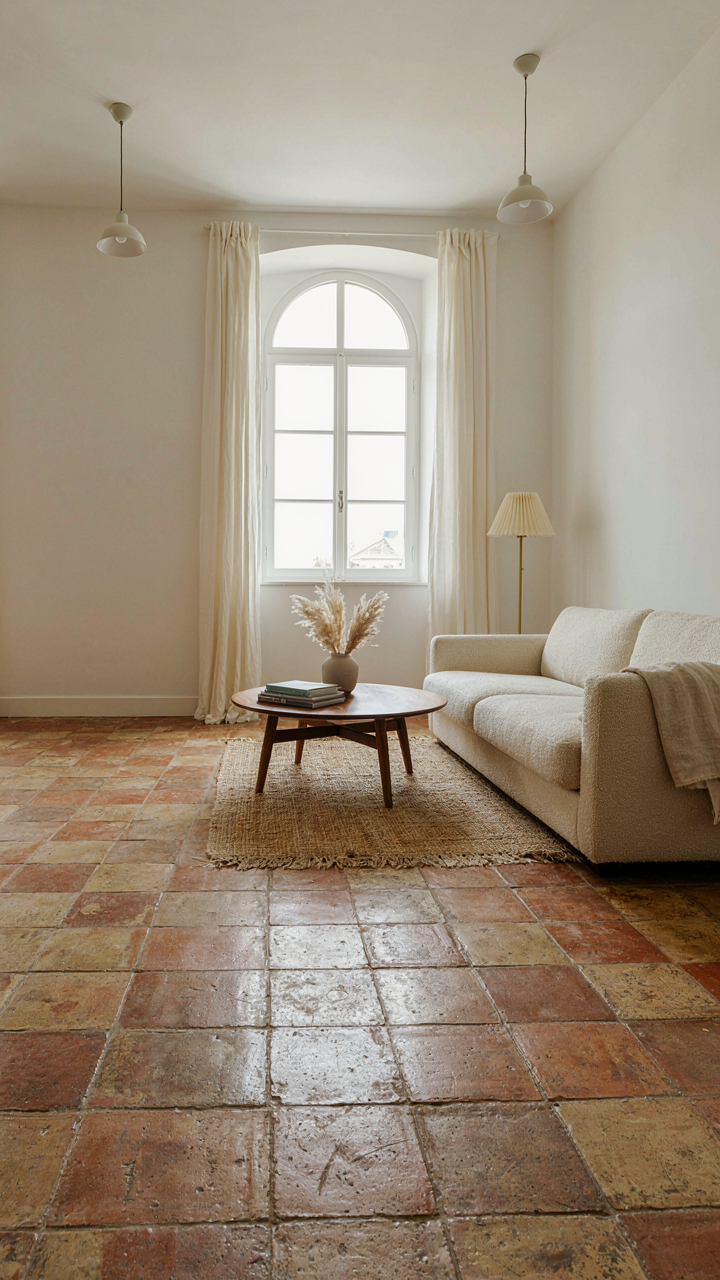
Where To Find Real Reclaimed Material
You want aged floors because you think they signal taste and permanence. Here’s the mechanism: reclaimed materials cost more upfront, which triggers status perception. The scarcity is real, not manufactured. Reclaimed French oak, limestone, and terracotta come from actual 18th and 19th century buildings across Provence, Burgundy, and the Loire Valley. Salvage dealers, European architectural reclamation yards, and specialized importers stock these materials. Prices reflect authenticity, not marketing.

Most surfaces have legitimate patina from decades of foot traffic and weathering. French terracotta tiles from Burgundy or Provence show uneven wear patterns impossible to fake. Reclaimed limestone carries tool marks from period cutters. Salvage yards document provenance when they have it. Verify material age by examining grain patterns, tool marks, and wear consistency before purchasing anything positioned as period-authentic.
Installation That Preserves Visual Weight
The real work happens during install, not purchase. Think in layers like archaeology does: older materials demand specific preparation to look grounded rather than placed. Uneven subflooring kills authenticity instantly. French country hallways traditionally sat atop packed earth or rubble foundations, which created slight settling and irregular surfaces. Modern installation must replicate that visual irregularity without creating genuine structural problems. Use a leveling compound applied in variable depths to suggest age and settlement, then install materials with wider grout lines and hand-set placement rather than grid patterns.
Aged floors command visual weight through installation imperfection. Stone or terracotta laid with consistent spacing and modern precision reads as reproduction. Hand-set placement with grout line variation of one-eighth inch to one-quarter inch creates the visual gravity that triggers recognition. Stagger the direction of terracotta tiles slightly rather than locking them into running bond patterns. Finish grout with natural color lime-based products, never bright Portland cement, which flattens the depth of reclaimed materials and breaks the illusion within weeks.
Sconces As Storytellers: Illumination With Intent
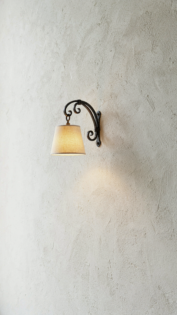
Choosing Fixtures With Subtle Historical Resonance
You want the sconce to do the work of telling people you understand something they don’t. That’s the real reason this matters. The mechanism is simple: a fixture with period-appropriate design cues signals restraint, which signals knowledge. Most people grab whatever looks old without understanding the actual era they’re referencing. French country design spans centuries, but the hallway sconce should reflect 18th or 19th-century Provence or Normandy aesthetics. Look for brass or wrought iron bodies with minimal ornamentation, fabric shades in linen or linen-cotton blends, and functional geometry over decorative excess. The fixture should feel like it solved a problem, not that it was designed to impress.

Authentic French country sconces avoided the industrial polish that defines modern brass. They used weathered brass, oil-rubbed finishes, or raw iron left to age naturally. The shade sits close to the wall, typically without elaborate mounting hardware. If you’re sourcing reproduction pieces, verify the material composition before purchasing. Cast brass degrades differently than stamped brass, and that difference shows in the patina. The goal is a fixture that looks like it’s been there for decades, not one installed last month that happens to have an old aesthetic applied to it.
Placement For Dramatic Shadow Play
Shadow work operates like chiaroscuro in painting, where contrast creates depth. Your hallway needs strategic light gaps to avoid the flattened effect of even illumination. Place sconces at 60 to 66 inches from the floor on either side of the hallway at intervals of 6 to 8 feet. This spacing creates pools of light with intentional shadow zones between them. The human eye reads these transitions as sophisticated rather than seeing them as poor lighting design. Most hallways fail here by spacing fixtures too close together, destroying the shadow interplay that makes the space feel dimensional.
The wall itself becomes your partner in this composition. A textured or aged plaster finish catches sconce light unevenly, which is exactly what you want. Smooth, modern drywall neutralizes the effect entirely. If your hallway has uneven walls or visible aging, the sconce placement amplifies those features rather than fighting them. Install each fixture to angle light slightly downward and outward, never straight into the hall. This creates a frame of shadow around the ceiling while keeping the walking path illuminated. Test the placement with temporary fixtures before committing to drilling and wiring.
The Principle Of Controlled Entropy
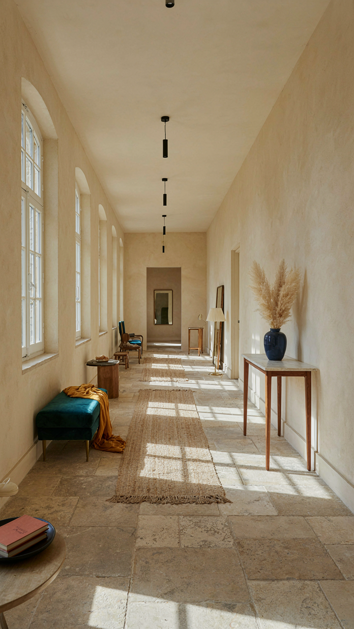
Imperfection As A Design Tool
You want aged floors and sconces because you think they signal taste. That’s the surface. The real mechanism is thermodynamics. In physics, entropy measures disorder. In a French country hallway, entropy is the tool, not the problem. Aged floors don’t just look worn. They distribute visual weight unevenly. This breaks the sterile symmetry that signals “new money.” Sconces cast uneven light. Shadows pool differently on each wall. The hallway stops feeling like a catalog page.

The mistake most people make is adding imperfection decoratively. A single sconce on a perfectly symmetrical wall reads as an error, not intention. Authentic French Provincial hallways accumulated wear through actual use. Stone floors developed dips where footsteps landed for decades. Plaster cracked where humidity shifted. Sconces were placed where light was needed, not where geometry demanded balance. This is entropy that serves function first. Your hallway needs this reversed causality: place aged materials where light and traffic naturally concentrate them, not where they look artfully scattered.
Balanced Disorder In French Provincial
French Provincial design emerged from rural necessity, not aesthetic theory. Rooms were furnished with what survived and what function required. A hallway connecting kitchen to bedrooms didn’t care about matched pairs. One sconce might be older brass, another wrought iron. The aged floor showed more wear where the passage narrowed. This wasn’t planned imbalance. It was the visible record of competing demands. Modern hallway design tries to replicate this by being intentionally imperfect, which defeats the entire mechanism. The moment you choose disorder, it becomes decoration.
Controlled entropy means establishing constraints that force real asymmetry. If your hallway narrows at one end, place the aged flooring where traffic concentrates, not where sight lines balance. Light one side more heavily than the other if that’s where the entry or exit lives. Sconce height can vary if wall structure or existing electrical dictates it. The constraint isn’t visual balance. The constraint is material honesty. Match your sconce placement to actual electrical locations and task lighting needs. The aged floor follows foot traffic and moisture patterns, not a predetermined layout grid.
Beyond Beige: The French Country Palette Deconstructed
The Core Neutrals That Actually Work
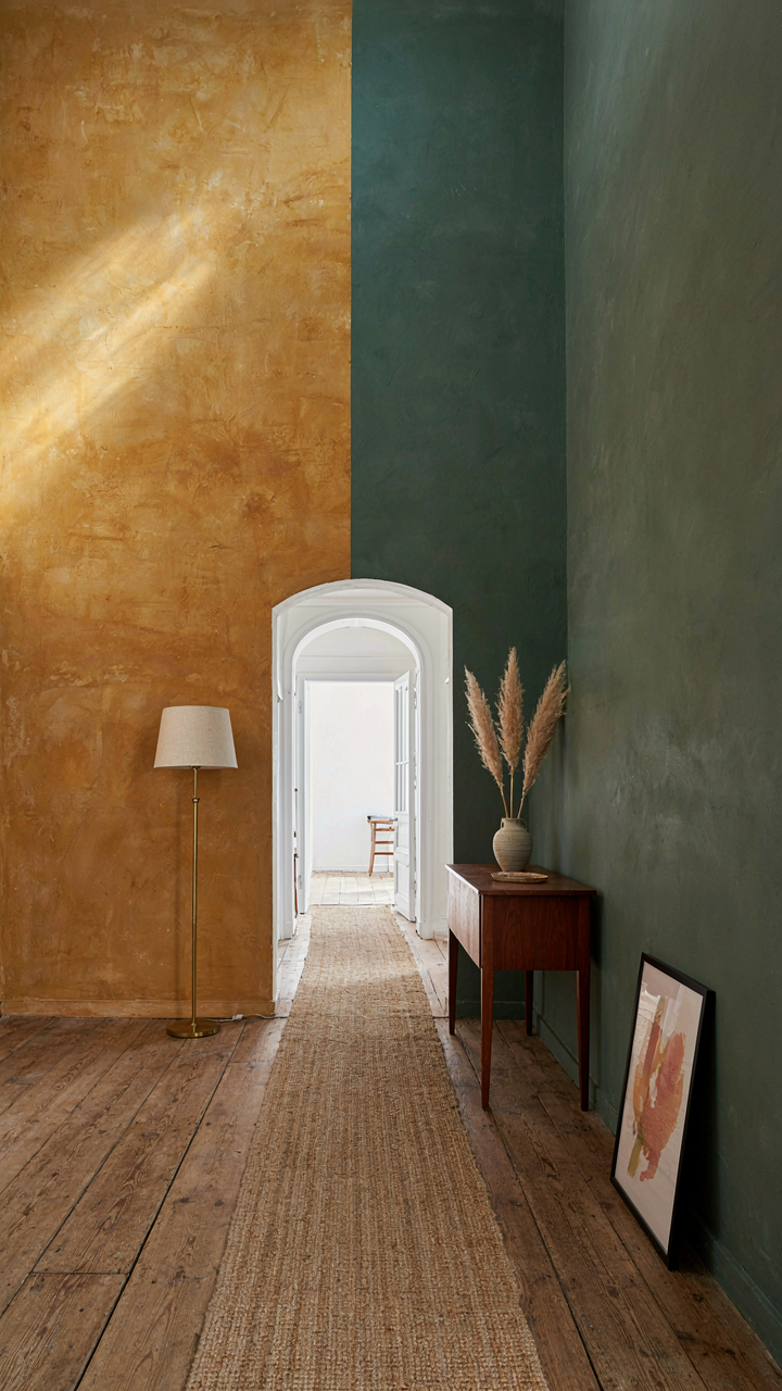
You want beige because you think it’s safe. It’s not. Beige without strategy reads as indecision, and your hallway becomes forgettable. The mechanism here is contrast through restraint. French country interiors use earthy undertones—ochre, taupe, warm gray—but only as a base layer. These muted pigments come from natural materials: limestone walls, terracotta tile, aged plaster. The palette stays tight because the goal is to make other elements stand out, not to fill every surface with color.

The real work happens when you layer these neutrals against texture and age. An ochre-tinted wall becomes dimensional when light hits patina on brass sconces or worn floorboards underneath. Strip away the fantasy: French country hallways don’t feel cohesive because the colors match. They feel cohesive because the undertones echo what came before—centuries of building material chemistry. Your floor dictates your wall tone. Pick the neutral second.
Strategic Darkness For Real Depth
Most design advice tells you to keep hallways light. That’s wrong for French country specifically. Hallways need contrast, and contrast requires depth. Use deeper hues—forest green, charcoal, deep plum—on accent walls or upper portions of walls to compress the space visually and make it feel intentional rather than narrow. The darkness anchors aged sconces and makes them perform. A dark wall behind brass or iron fixtures creates the shadow that reveals the patina. Without that visual weight, the sconce just hangs there.
The protocol is straightforward. Paint one wall a muted dark tone, keep the others in your core neutral, and install sconces on the dark wall. The sconce casts light onto the neutral walls. This creates layered illumination and visual hierarchy. The aged floor bridges both tones, tying the composition together. Depth isn’t created by using more colors. It’s created by using fewer colors with intentional value contrast.
The Material Matrix: Texture Over Trend
Raw Materials Do The Work You Can’t
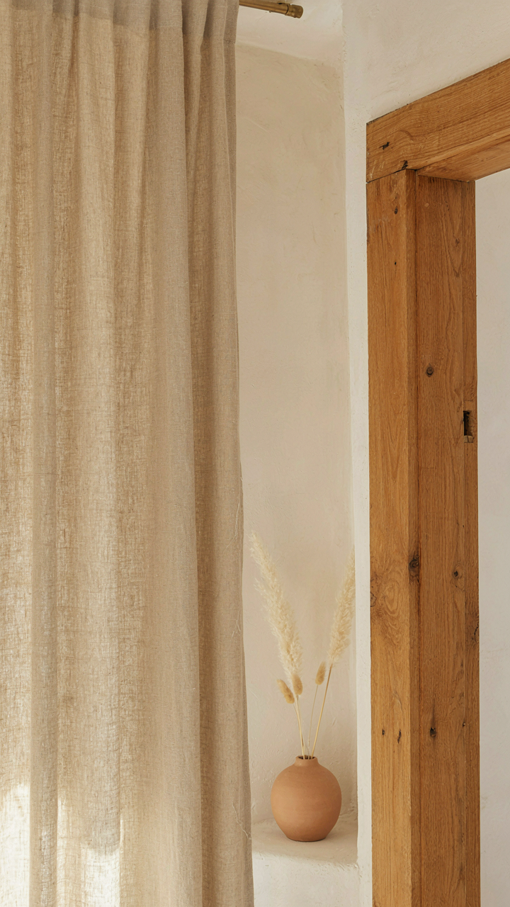
You want people to feel something when they walk through your hallway, and you’re hoping the right objects will do that for you. They won’t. The mechanism is friction—literal tactile friction between skin and surface. French country hallways work because they use materials that create resistance, not smoothness. Linen absorbs light instead of bouncing it back. Raw wood shows grain instead of hiding it. Iron oxidizes instead of staying uniform. Unfinished plaster holds dust instead of repelling it. Each material refuses to perform the trick of looking polished.

This directness is why French country hallway design outlasts trends. The materials themselves carry weight. You’re not decorating with surfaces—you’re choosing what your hallway is actually made from. Aged oak flooring doesn’t need a finish to tell its story. Wrought iron sconces don’t need paint to read as authentic. When you stop trying to make materials look better than they are, they start looking better than anything manufactured ever could.
Building Depth Through Deliberate Contrast
Texture layering works like signal-to-noise ratios in information design: contrast creates clarity. Too many textures flatten into visual noise. Too few become boring. A French country hallway needs exactly three to four dominant textures competing for attention, not blending into one another.
- Aged Wood Flooring Against Plaster Walls: The grain and wear patterns in timber create horizontal movement while vertical plaster surfaces stay quiet, forcing eyes to move and rest in rhythm.
- Iron Sconces On Textured Walls: Metal hardware catches light differently than surrounding surfaces, creating focal points without requiring brightness or shine.
- Linen Curtains Or Runners Over Hard Floors: Soft fabric against hard surfaces creates the most basic contrast—one that registers as intentional, not accidental.
- Exposed Stone Or Raw Plaster Patches: Intentionally incomplete finishes create the impression of age without requiring actual age, anchoring the space in history.
- Waxed Versus Unwaxed Wood Details: Varying sheen levels on wooden elements—beams, trim, furniture—prevents monotone and suggests genuine use patterns over time.
The real work happens when you resist matching finishes. A waxed table next to unwaxed trim. Polished iron hinges beside matte iron railings. This deliberate mismatch signals restraint—the opposite of what modern interior design trains you to do. Build your hallway by selecting one primary texture, then introducing a secondary texture that contradicts it, then a third that settles the tension between the first two.
The “Coup De Grâce” Method: Curating Hallway Vignettes
Objects That Earn Their Space
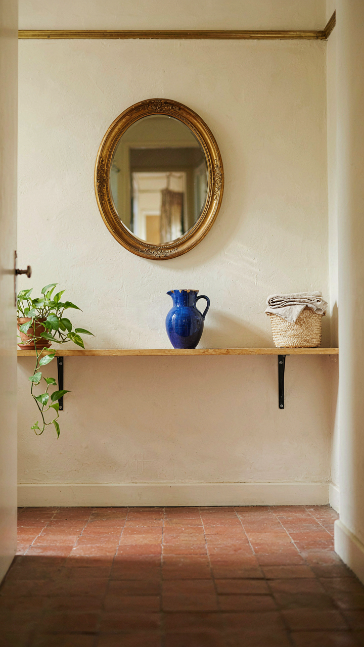
You want your hallway to look intentional without looking staged, which means you’re really asking: how do I prove I have taste without trying too hard. The mechanism is scarcity. French country design works because it uses worn objects as evidence of time and use, not decoration. A chipped ceramic pitcher from Provence carries weight that a pristine reproduction never will. Aged surfaces and patina function as credibility markers in a hallway. They tell a story about restraint and actual ownership rather than catalog consumption.

The common advice says “mix old and new.” That’s incomplete. What actually works is selecting objects with visible wear patterns that match the aged floors and sconce finishes you’ve already installed. A terracotta floor tile and a hand-thrown ceramic piece share the same language of imperfection. A wrought iron sconce and an old wooden frame both show the effects of time. When objects communicate through material degradation rather than color matching, they feel collected rather than coordinated. This is why a single well-chosen piece anchors a hallway better than five safe ones.
The Architecture Of Visual Breathing Room
Visual rhythm comes from design fields like music and architecture—hallways need both rests and focal points, just as a composition needs silence and sound. The real error most people make is treating hallway vignettes like they’re static displays. They’re not. They’re navigation points. When you place a sconce above an object, or position a worn mirror between two pieces of wall paneling, you’re creating visual pauses that slow the viewer’s movement through the space. This is intentional. A hallway without pauses feels like a corridor. One with them feels like a sequence.
Spacing matters more than selection. If objects cluster or spread too thin, the hallway loses narrative. The protocol: identify three to five anchor points along the hallway’s length. At each point, place a single vignette composed of one primary object (a mirror, a painting, a sculptural piece) and one secondary element (a sconce, a shelf with two objects maximum). Leave wall space visible between groupings. This creates the visual breath that makes aged surfaces and patina feel intentional rather than accumulated.
Scaling Authenticity: Adapting French Grandeur
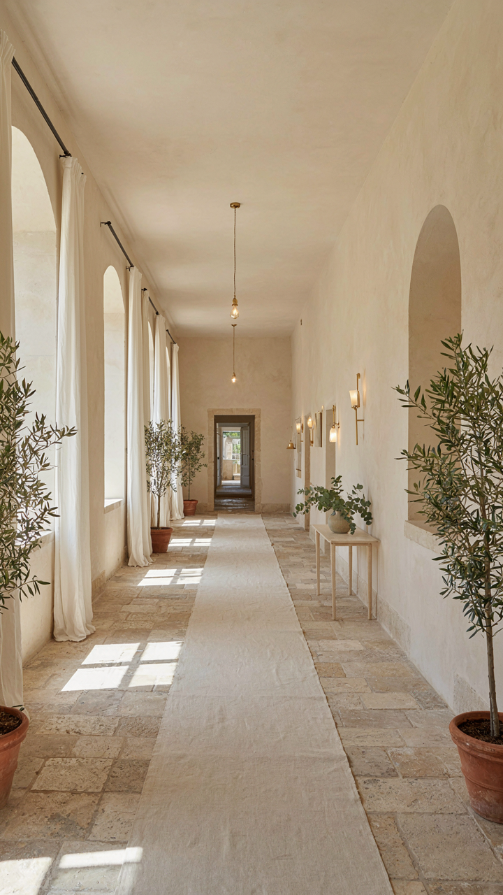
When Space Shrinks, Detail Multiplies
You want the prestige of a French country hallway without owning a château. That’s the real problem here. The mechanism is inversion: smaller rooms demand higher material and finish quality to read as intentional rather than cramped. A 8-foot hallway doesn’t need fewer sconces or thinner molding. It needs better proportions and more refined surfaces. French country design scaled down isn’t diluted—it’s concentrated.

Think of it like signal-to-noise ratio in information design. Your hallway is the signal channel. Large estates diffuse their elegance across 40-foot passages and high ceilings. You compress that same elegance into 120 square feet. This means every element—aged flooring, sconce placement, wall finish—carries more visual weight. A single scratch in a hallway floor reads louder when there’s less floor. A poorly hung sconce becomes obvious when the wall it hangs on has nowhere to hide.
The Caricature Risk Is Real
Most advice tells you to keep things “subtle and restrained” in small spaces. That’s backward. Subtlety dies in tight quarters. What actually prevents caricature is material authenticity and spacing logic. A hallway plastered with fake aged beams and tourist-level sconces reads as theme park, not French. Authentic aged hardwoods, properly spaced brass sconces at 48-inch intervals, and plaster finishes with actual texture prevent the costume effect.
The line between homage and parody is material choice and proportion, not restraint. Use real aged wood or genuine stone. Space sconces the way they functioned in actual French country homes, not wherever looks balanced. Install a single hallway runner in linen or wool rather than filling every inch with pattern. Your hallway authenticates itself through what actually works, not through how cautiously you deploy it.
The Investment Fallacy: Time As Your Truest Currency
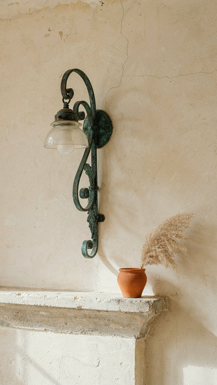
Collecting What Actually Lasts
You want permission to spend money on a French country hallway because you think it proves you have taste. Here’s the mechanism: most people buy finished rooms instead of building them over time. They grab matching sconces, order aged flooring samples, and call it done. They miss the actual economics. Time compounds value in design the way it does in capital. A single authentic French sconce from the 1920s appreciates while mass-produced replicas depreciate the moment you own them.

The real play is patient acquisition. You hunt for one genuine piece per season, not ten pieces per month. A reclaimed stone threshold from a French farmhouse renovation. A hand-forged wall bracket that carries actual use marks. These objects have provenance baked into their physical form. You cannot fake the patina of 80 years. When you space acquisitions across years, you build a hallway that feels inhabited, not decorated. You also dodge the trap of trend fatigue because nothing entered your space to follow a 2024 mood board.
Provenance Before The Instagram Moment
The common advice says source everything at once to maintain visual cohesion. That’s backwards. Cohesion comes from restraint and repetition, not from synchronized purchasing. Economics teaches us diminishing marginal utility: the first sconce matters more than the third. A hallway with one truly old mirror and four new walls reads as intentional. A hallway with five matched new pieces reads as a catalog page.
Start by defining the single non-negotiable element: aged flooring or authentic sconces. Then wait. Let that element sit for months while you source one complementary piece that respects its age and material. An aged floor demands sconces that match its era, not its color palette. A genuine Provençal sconce from the 1800s demands flooring weathered in similar light and footfall. You’re not decorating. You’re restoring a narrative. The protocol: acquire one piece quarterly, verify its origin, and position it before adding the next.
The Real Obstacle Isn’t Finding Authentic Pieces, But Trusting Your Own Eye To Curate Their Narrative

Most people kill their french country hallway by overthinking it. They hunt for the “right” sconce, the “correct” floor finish, the approved color palette. What actually matters is this: you decide what aged means in your home. Pull three design images you love today. Not because they match some rulebook, but because they move you. Notice what repeats. That pattern is your permission slip. Stop waiting for a designer to validate your eye. Your hallway won’t come alive until you do.