Beyond Beige: The True Palette Of French Provincial Decor Living Room

What French Provincial Color Actually Is
You want beige because you’re afraid of commitment. You think muted equals safe. Here’s the mechanism: French provincial emerged from specific regions with specific clay, stone, and light. The palette wasn’t born from timidity. It came from what local materials could produce. Provence gave warm ochres and terracotta. Normandy produced cooler grays and greens. The Dordogne favored deep burgundies and forest tones. These weren’t aesthetic choices divorced from geography. They were the only choices available. That constraint created coherence, not blandness.
The mistake everyone makes is treating French provincial as a single color story. It isn’t. It’s regional. A Provence living room and a Normandy living room share nothing except curves and proportion. You choose a region first, then you choose the palette that region actually used. The color doesn’t float above the room like a Instagram filter. It anchors every object to a specific place and time.
Where The Real Colors Come From
Economics built French provincial style, not Pinterest boards. Peasants and rural nobility used what they could source. A living room in Provence pulled from clay earth, weathered shutters, and tile roofs visible from the window. A living room in Brittany pulled from stone, slate, and the sea-dampened light that made everything slightly cooler and grayer. The colors you see aren’t romantic interpretations. They’re the actual inventory of what existed outside the door.
Import one accent from your chosen region and anchor it. A Provençal ochre wall happens once, usually behind a furniture grouping. A Normandy gray-green appears on woodwork or a single upholstered piece. The supporting colors—cream, off-white, or soft gray—fill the rest. This isn’t minimalism. This is restraint with purpose. You’re not adding colors to a room. You’re extracting them from a place and letting them organize your furniture and light.
The Curved Line Fallacy: More Than Just A Pretty Arch
Curves Solve Movement Problems First
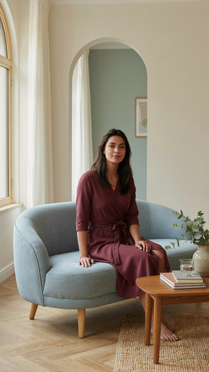
You want curved lines because they feel sophisticated and you’re betting they’ll make your space look expensive. Here’s what actually matters: curves in French provincial interiors exist to redirect traffic and sight lines through rooms that weren’t designed for modern living patterns. Think of this as applied physics in interior space. A straight wall forces your eye to stop. A curved line, whether in a settee back or an archway, creates momentum that pulls the viewer through the room without friction.

French provincial design emerged from practical constraints in 18th-century homes where rooms served multiple functions. Curves weren’t ornamental excess. They were load-bearing solutions and space multipliers in rooms that had to work harder. A rounded camelback sofa takes up the same footprint as a straight one but feels less like a barrier. The curve communicates openness. Place a curved console behind a settee and you’ve created a circulation path instead of a dead zone. This is the mechanism. Without understanding it, you’re just buying expensive furniture that looks nice.
Strategic Placement Before Style Choices
The common mistake is arranging furniture to frame a focal point, then adding curves for visual interest. Wrong sequence. Map your actual movement patterns first: where people enter, where they naturally pause, where sightlines converge. Then choose curved pieces to facilitate those patterns, not fight them. A curved credenza positioned at the room’s natural turning point doesn’t block flow. It channels it.
In authentic French provincial rooms, curved furniture often faced the fireplace or a window because that’s where people lingered. The curves encouraged them to settle into those zones without making the gesture look accidental. Placement was functional disguised as style. Take the same approach. Position a curved chaise or fauteuil where natural light enters or where conversation naturally clusters. The curve becomes a quiet invitation to occupy that spot. This transforms furniture from decoration into navigation infrastructure. The result reads as intentional and flows without seeming choreographed.
The Artisan’s Imperative: Craft Over Mass Produced French Provincial Decor
Where To Find Real Pieces
You want the status signal without the risk of owning a fake. Here’s the mechanism: French Provincial authenticity lives in the supply chain, not the piece itself. Economics teaches us scarcity drives value, and in French Provincial furniture, scarcity is the inverse relationship between production volume and handwork hours. Mass producers flatten this ratio. Real sourcing means finding makers and dealers who can’t scale fast enough to cheat the craft.

Regional European antique dealers beat online marketplaces because they have skin in the game. They source from estates, auctions, and restoration shops in Provence, Normandy, and the Loire Valley. These dealers stake their reputation on provenance, not inventory turnover. Direct contact with a dealer who specializes in a single region for decades beats algorithm-driven searches every time. Ask for construction photos and maker marks before purchase.
How To Spot Real Materials And Build
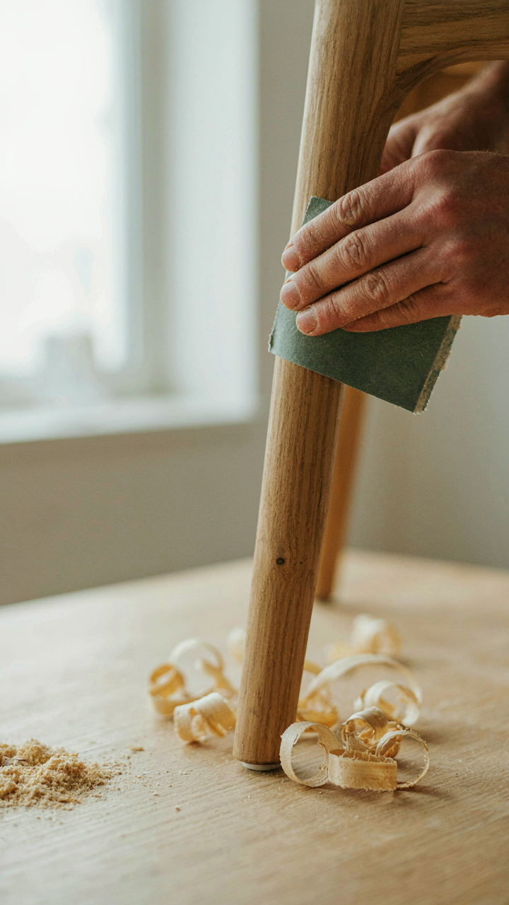
The common advice says “look for solid wood” and stops there. That’s incomplete. French Provincial curves demand structural integrity you can verify, not assume. Genuine pieces use mortise and tenon joinery, visible grain patterns that vary, and hand tool marks on the underside. Veneered surfaces are acceptable if applied over solid wood substrate, not particleboard. Run your finger along joints and inside edges. Machine routing creates uniform lines. Hand planes leave subtle variations.
Curved lines in authentic French Provincial require steam bending or carving from solid blocks. Factories inject foam into molds. The weight tells you the truth: solid wood pieces feel dense. Lift a chair leg or examine the underside of a table. Genuine finishes show wear patterns, not uniform patina. Refinished pieces still reveal construction method through joinery inspection. Demand detailed close-up photos of joints, underside, and finish wear before committing capital.
The Unspoken Rules Of French Home Design Living Room Scale
Grand Gestures Anchored To Actual Human Size
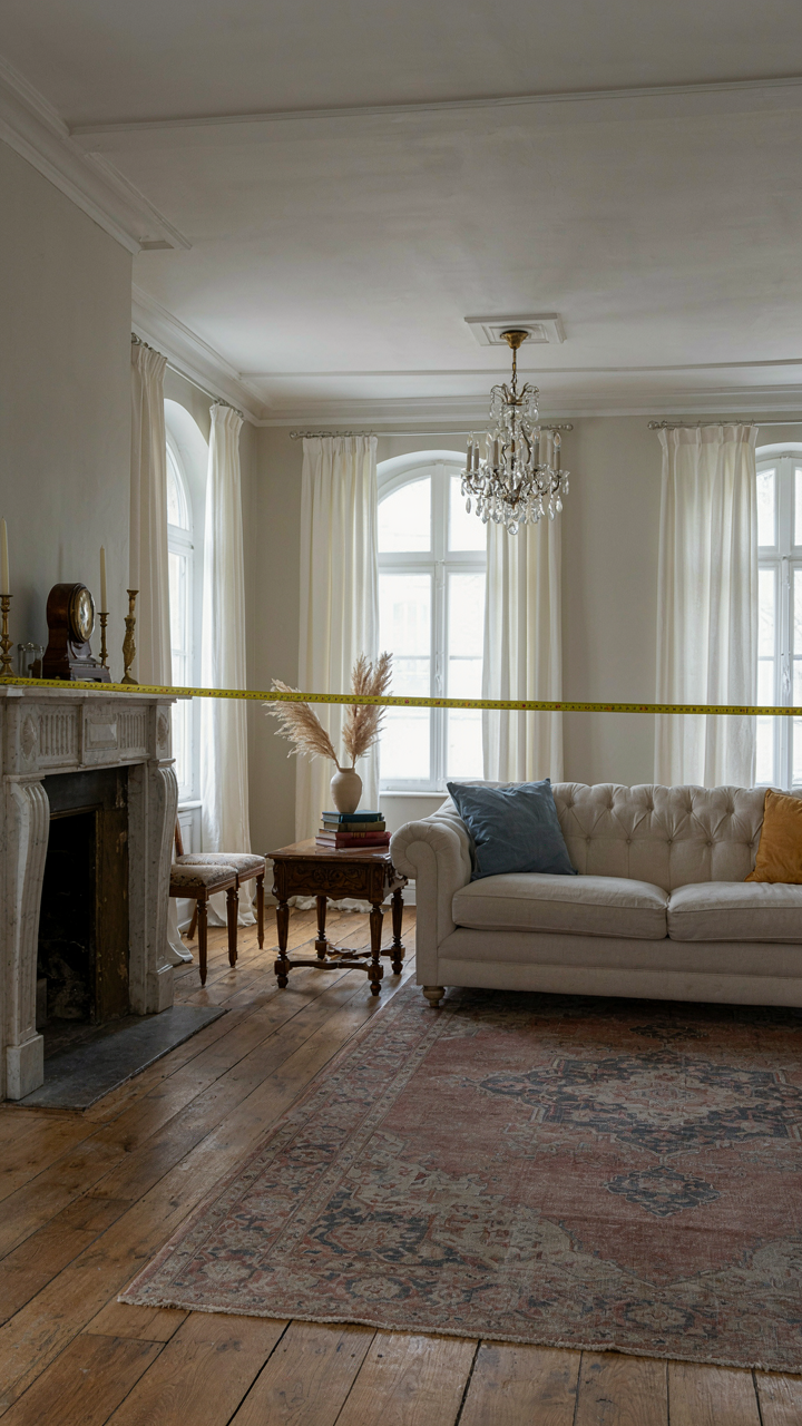
You want permission to buy that oversized settee without looking like you’re compensating for something. Here’s the mechanism: French provincial design borrowed from architecture’s concept of “human scale” – the proportional relationship between a space and the body moving through it. A curved sofa that swallows half the room isn’t grand. It’s just gone.
French provincial rooms work because they layer scale deliberately. A statement piece like a curved Bergère chair or serpentine sectional occupies space without dominating it. The trick is counterweight: balance it with smaller, intentional furniture clusters. A pair of occasional tables, a console, and a modest side chair create visual rhythm. The room feels generous because you can actually move and sit without the furniture deciding everything for you.
When Proportion Fails You’re Just Moving Boxes
Most advice tells you to measure your room and scale furniture proportionally. That’s incomplete. The real problem nobody states: people confuse wall coverage with balance. A curved sectional that takes up 40 percent of floor space can feel cramped if the remaining 60 percent sits empty and purposeless.
French provincial rooms solve this through negative space discipline. Curved lines soften the room, yes, but their actual job is creating visual pathways. A serpentine-backed sofa curves inward slightly, preserving sightlines to windows or architectural details. The room stays readable. If your sectional curves outward aggressively or fills dead center without relation to the room’s geometry, scale collapses. Anchor curved pieces to the perimeter or to fixed architectural elements like fireplaces. Floating them in the middle turns your living room into furniture storage.
Modern French Living Room: Blending Eras, Not Confusing Them
When Old Furniture Meets New Walls
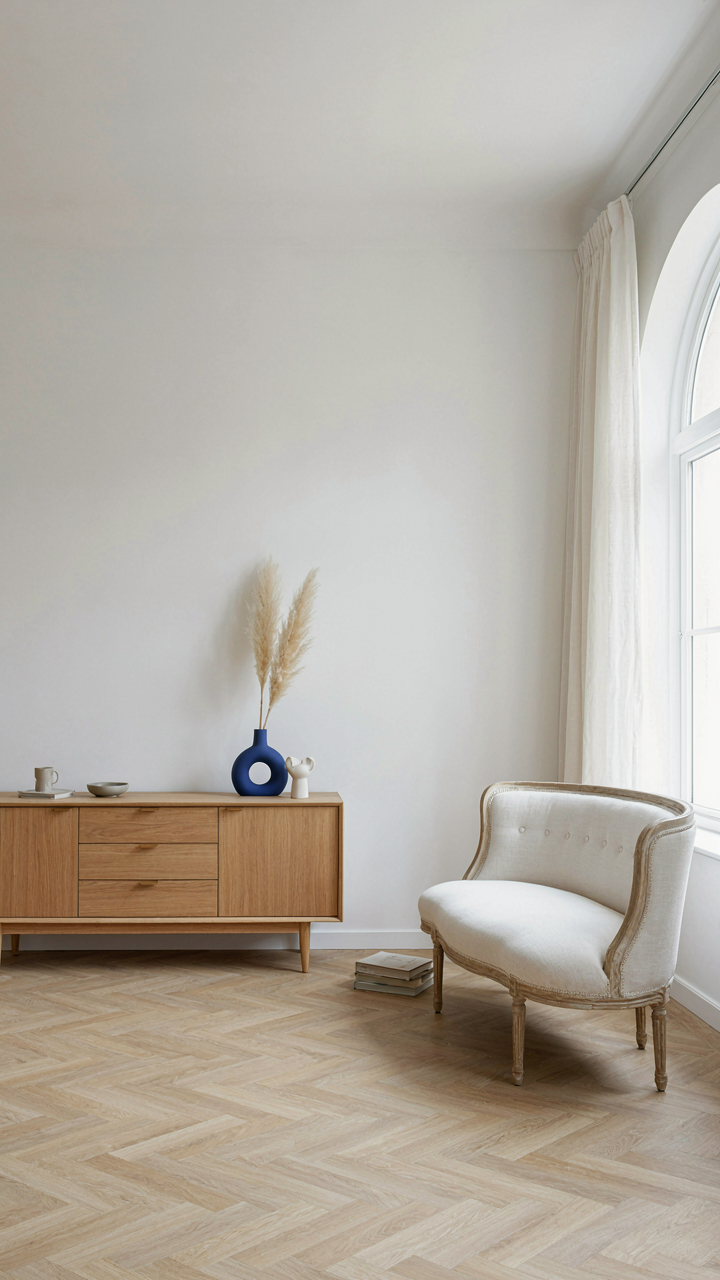
You want permission to mix periods without looking like you raided three estate sales blindfolded. Here’s the mechanism: French provincial design already spans centuries—from Louis XIV ornament to rustic farmhouse simplicity. Contemporary elements don’t clash with this lineage. They clash when you treat them as separate languages instead of different dialects of the same conversation about proportion and material honesty.

The mistake people make is adding modern pieces as apologies. A sleek side table next to a curved Louis XVI settee works because both honor restraint in form. A mid-century credenza with clean lines complements a provincial room because it respects the same discipline that shaped the original pieces. Add modern elements that share the DNA: curved edges, natural materials, structural clarity. The furniture talks to itself through method, not through style matching.
Restraint Separates Intentional From Accidental
Common advice tells you to “balance old with new.” That’s empty. The real principle comes from signal-to-noise ratio in communication: each element competes for attention, and only the essential ones survive. A provincial living room with curved lines already has visual weight in the architecture. Layering modern pieces means you remove something first, not add without accounting for density.
Incoherent clutter happens when you treat the room like a museum display case—one of everything, all at scale, nothing dominant. Intentional fusion means the contemporary piece solves a problem the room has. A modern sectional with curved arms anchors the seating because it needs to. A contemporary metal lamp provides function the period fixtures cannot. Every addition answers a specific friction point. If you cannot name the friction, the piece belongs somewhere else.
The Romantic Living Room Aesthetic Protocol
How Light Shapes Perceived Value
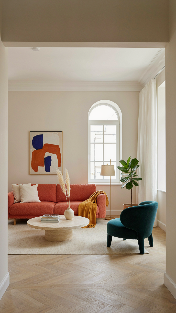
You want this room to feel expensive without saying so out loud. That’s the real game here. Light is the mechanism that controls perceived quality in any space, and French provincial interiors depend on it completely. The style emerged during periods when natural light was scarce and precious, so rooms were designed to trap and amplify whatever entered through windows. Curved moldings, pale fabrics, and reflective surfaces bounce light around the room instead of letting it die in corners.

The texture game separates this from generic beige rooms. Linen absorbs light differently than velvet. Stone or plaster absorbs it differently than gilded wood. French provincial uses this deliberately. Place a curved-back chair near a window where light hits the upholstery at an angle, and that fabric suddenly reads as intentional rather than flat. The room doesn’t feel romantic because of sentiment. It feels romantic because layered textures create depth, and depth creates the impression that someone knows what they’re doing.
Collections That Anchor A Room’s Story
These aren’t decorative objects you scatter around. They’re the infrastructure of believability. A collection serves the same function in design that a thesis serves in an argument: it gives the room a reason to exist beyond “I like how this looks.”
- Antique ceramic vessels or urns: Group 3-5 pieces of varying heights on a console or shelf. Choose pieces from a single region or era so they relate visually. This creates narrative weight that single objects can’t achieve.
- Botanical prints in matching frames: Display 4-6 pieces in a grid or salon-style arrangement. French provincial rooms often included botanical studies because they signaled education and access to knowledge. Frame them uniformly to unify the display.
- Leather-bound books by spine color: Stack or shelf 8-12 volumes grouped by warm or cool tones. Books signal intellectual engagement. Arranging by color rather than title prevents the room from reading as a library while maintaining cohesion.
- Mirrors with carved frames: Use 2-3 mirrors of different sizes on a single wall. Curved frames echo the curved lines in furniture. Multiple mirrors multiply light and create visual rhythm without clutter.
- Vintage textiles or tapestries: Feature one substantial textile on a wall or draped over furniture. Layered weaving and natural dyes create texture that photography and fabric samples can’t replicate in person.
Collections work because they answer an unspoken question every person asks when entering a room: “Did someone think about this, or did they just buy things?” The answer determines whether the space feels curated or decorated. Arrange pieces so gaps between objects create conversation, not just visual rest. This is the protocol that prevents the room from dissolving into generic romanticism.
Dream House Rooms: The Psychology Of French Provincial Comfort
Touch, Smell, And Sound Matter More Than You Think
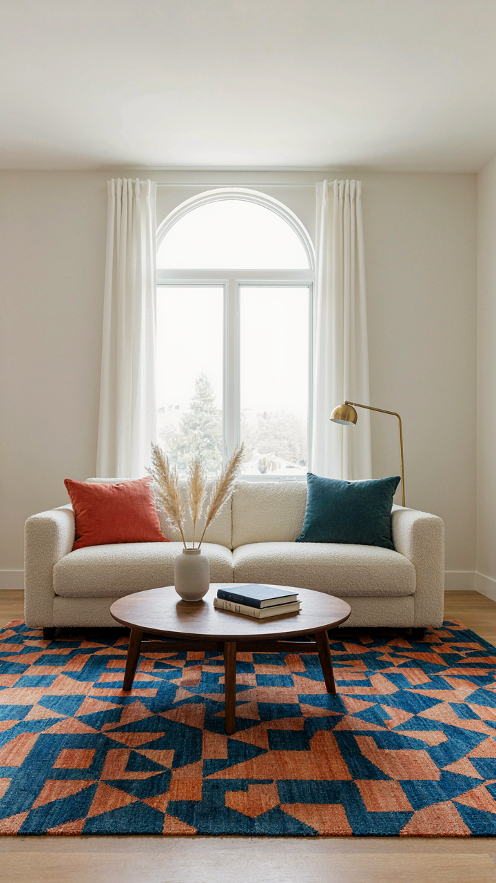
You want a French provincial living room because you believe a curated space signals taste and stability to whoever visits. The real mechanism: comfort is sensory, not visual. Your eyes see a room for thirty seconds. Your skin, nose, and ears experience it for hours.

French provincial design survived centuries because it manipulated texture, not just color. Linen upholstery absorbs sound and feels distinct against skin. Terracotta and stone release subtle mineral scent. Wood furniture emits volatile organic compounds that signal age and authenticity to your brain. Curved lines on seating reduce acoustic harshness by diffusing sound waves instead of reflecting them sharply. None of this appears in a photograph. This is why the room feels different in person than in the inspiration image.
Proximity Creates Harmony, Not Symmetry
Gestalt psychology names the mechanism: your brain groups objects by proximity and similarity, not by perfect balance. A French provincial living room doesn’t need mirror-image symmetry to feel coherent. Curved seating arranged in loose clusters—a settee angled toward two chairs, a console table positioned near but not opposite—creates visual unity through relationship, not duplication.
The curved line itself is the load-bearing principle here. Where rectangular furniture creates sharp sight lines and dead zones, curved edges establish continuous flow. Your eye travels around the room without jarring stops. Objects grouped by function and proximity feel intentional even when they’re asymmetrical. Position curved seating at an angle to the fireplace or window rather than squared directly across. Repeat curved forms in mirrors, table edges, and architectural trim. This isn’t decoration; it’s spatial problem-solving.
The French Traditional Living Room: Cultivating Patina, Not Perfection
Age And Wear As Design Elements
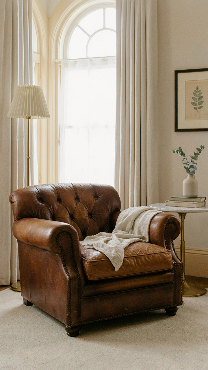
You want permission to stop obsessing over flawlessness. That’s the real motive here. French provincial design borrows from archaeology, which teaches us that layered evidence of time increases authenticity value. A scratch on a Louis XV chair frame signals legitimacy. A worn linen cover proves actual use. This is the opposite of the sterile recreation most people attempt.

Patina functions as a trust signal in French provincial rooms. The design tradition emerged from rural estates where furniture remained in use across generations. Pieces accumulated marks, stains, and color shifts. Rather than replace them, owners integrated them into the aesthetic. This practice became codified in the style itself. Build patina deliberately through material choices and deliberate wear patterns rather than pristine restoration.
Avoiding The Showroom Trap
The common advice says “curate carefully” or “edit ruthlessly.” Wrong framing. The real problem is treating your living room as a display case instead of a lived environment. Showrooms exist to sell furniture through visual perfection. Your space exists to function. French provincial rooms that feel authentic contain visible usage marks, non-matching upholstery on pieces from different eras, and furniture positioned for actual conversation rather than magazine photography.
Stop rotating pieces seasonally or deep-cleaning slipcovers monthly to maintain pristine appearance. Instead, select fabrics that age visibly and improve with use. Linen, wool, and aged leather show patina as a feature, not a flaw. Arrange seating toward the room’s center or fireplace, not toward a wall that photographs well. The mechanism is simple: use the room first, photograph it never.
Lighting As Legacy: Illuminating Your French Living Room
The Three Light Sources Every Room Actually Needs
You want your living room to feel intentional and expensive without admitting you’re terrified of bad lighting. Here’s what actually works: French provincial rooms succeed because they use layering borrowed from theater lighting design, where intensity, position, and color temperature work together as a system, not scattered fixtures. Most people treat lighting like decoration. It’s the opposite. It’s infrastructure.

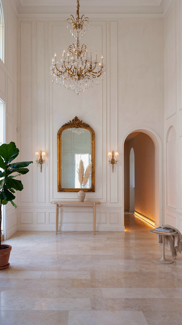
Task lighting handles functional demands—reading, conversation, movement. Ambient lighting sets baseline visibility without glare or harshness. Accent lighting emphasizes architectural detail or focal points. French provincial design uses all three deliberately. A chandelier provides ambient light. Sconces flanking a mirror add task lighting. Wall washers highlight plasterwork or paneling. The mistake everyone makes is choosing one primary fixture and hoping it solves everything. It doesn’t.
Curves Meet Structure: Lighting The Architectural Bones
French provincial rooms contain curves everywhere—arched doorways, rounded mirror frames, curved furniture legs—and your lighting must acknowledge this geometry, not fight against it. Use wall sconces positioned at the curve’s peak to cast light horizontally into the room, which flattens the wall slightly and makes the curve read as intentional rather than accidental. Curved architectural elements need light coming from an angle that follows their contour, not straight-on illumination that erases dimensionality.
Place uplighting at the base of arched openings to reveal the depth of the stone or plaster. Position pendant lights in the center of curved ceiling coves rather than off to the side. The goal is making architectural curves perform for the eye through strategic shadow and highlight placement. Install dimmers on all layered light sources so you control intensity moment to moment. That’s how you move from a lit room to a designed space.
The Investment Mindset: Building A French Provincial Living Room That Lasts
Timeless Pieces Over Temporary Status
You want this room to signal that you have taste and money. That’s the real reason you’re reading this. The mechanism is simple: trends die faster than furniture depreciates, so buying trend-adjacent pieces guarantees you’ll hate them in three years and replace them at a loss.
French provincial design survived because it wasn’t built on novelty. Curved lines in provincial furniture emerged from practical joinery and hand construction, not marketing cycles. When you buy a piece with structural integrity and honest materials, you’re buying optionality. You can refinish it, reupholster it, or move it to another room without it looking dated.
- Solid wood frames: Oak, walnut, or beech frames withstand reupholstering cycles. Avoid particleboard disguised as wood veneers. Check the underside and joints before purchasing.
- Upholstered curves: Settees and chairs with curved arms and backs hold their shape longer when stuffed with natural materials like horsehair or cotton batting instead of foam.
- Stone or marble surfaces: Console tables and side tables with stone tops resist scratches and maintain visual weight across decades without refinishing.
- Brass or iron hardware: Original or reproduction brass hardware ages gracefully and can be cleaned or patinated. Modern chrome or plated finishes flake and look cheap after five years.
- Wool or linen textiles: These materials fade evenly and wear predictably. Synthetics pill, stain permanently, and trap odors that fabric cleaning cannot reverse.
The real play isn’t buying expensive pieces. It’s buying pieces where the construction method matches the material. A hand-carved wooden frame with curved lines costs more upfront because labor is built in. That labor is what survives time. Cheap curves on cheap frames break at the joints because they were never designed to be stressed.
Care Rituals That Preserve Value
Maintenance isn’t aesthetic preference. It’s economics. Every season you skip cleaning wax buildup, you’re accelerating oxidation and wood degradation that costs money to reverse.
French provincial rooms require specific care protocols because curved lines collect dust and the joinery traps moisture. Dust curved surfaces weekly with a soft microfiber cloth. Wax wood furniture twice yearly with paste wax, working in the direction of the grain. Never use oil-based products on finishes you plan to refinish later. Clean upholstered curves with a handheld vacuum using the brush attachment, hitting seams and crevices where dust compacts. For spills on fabric, blot immediately, never rub. Test any cleaning solution on an inconspicuous spot first. Humidity control matters more than cleaning frequency. Keep indoor humidity between 40-55 percent. Dry air causes wood to split and finish to crack. High humidity warps frames and ruins upholstery. Check joints annually for movement, especially on curved pieces that bear weight unevenly. Tighten any loose joinery before structural damage spreads. A single loose joint can destabilize an entire frame within seasons.
The Real Obstacle To Timeless Design Isn’t Taste; It’s Your Fear Of Committing To Principles
Most people fail at French provincial design because they treat it like a buffet. They grab a curved chair here, add some floral there, and end up with chaos masquerading as elegance. The shift you need is this: stop collecting objects and start building a system. Pick one curved line principle, one color palette, one texture story, and commit ruthlessly. Pull up Pinterest right now and save exactly five rooms that make you stop scrolling. Study what they repeat, not what they vary. Timeless design rewards obsession, not compromise.