
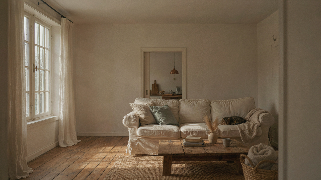
The Myth Of Universal Warmth: Joanna Gaines Paint Colors Are Not A Shortcut
Why Her Colors Fail In Your Home
You want her colors to work because you want proof that good taste can be bought off a paint chip. Here’s the mechanism: Joanna Gaines’ palette works in her specific environments because of three locked variables—natural light direction, wall material reflectance, and architectural proportion—that you almost certainly don’t have. Her colors aren’t universally warm. They’re contextually warm in her context.
A color that reads as inviting cream in a 12-foot ceiling with north-facing light becomes institutional in a 8-foot room with afternoon sun pouring through western windows. The undertones stay the same. The perception changes completely. Most people blame the paint. The real problem is they copied the color without copying the room’s physical properties first.
Beyond Color: Architecture Dictates Mood
Architecture works like a lens in optics: it bends and focuses light before it ever hits your walls. This means the spatial envelope determines what a paint color can actually do, not the other way around. You can pick perfect Joanna Gaines whites and warm neutrals, but if your room lacks the proportions and light geometry her homes have, the color becomes evidence of the mismatch.
Her farmhouse interiors work because they combine high ceilings, large unbroken wall planes, and strategic window placement. These structural elements give warm paint colors room to breathe and reflect. Apply her exact paint color to a cramped hallway with poor natural light and you’ve just made it feel smaller and colder. The first move is always measuring light and proportion. The paint selection comes after.
Your Farmhouse Isn’t Cold, Your Lighting Is Dead Wrong
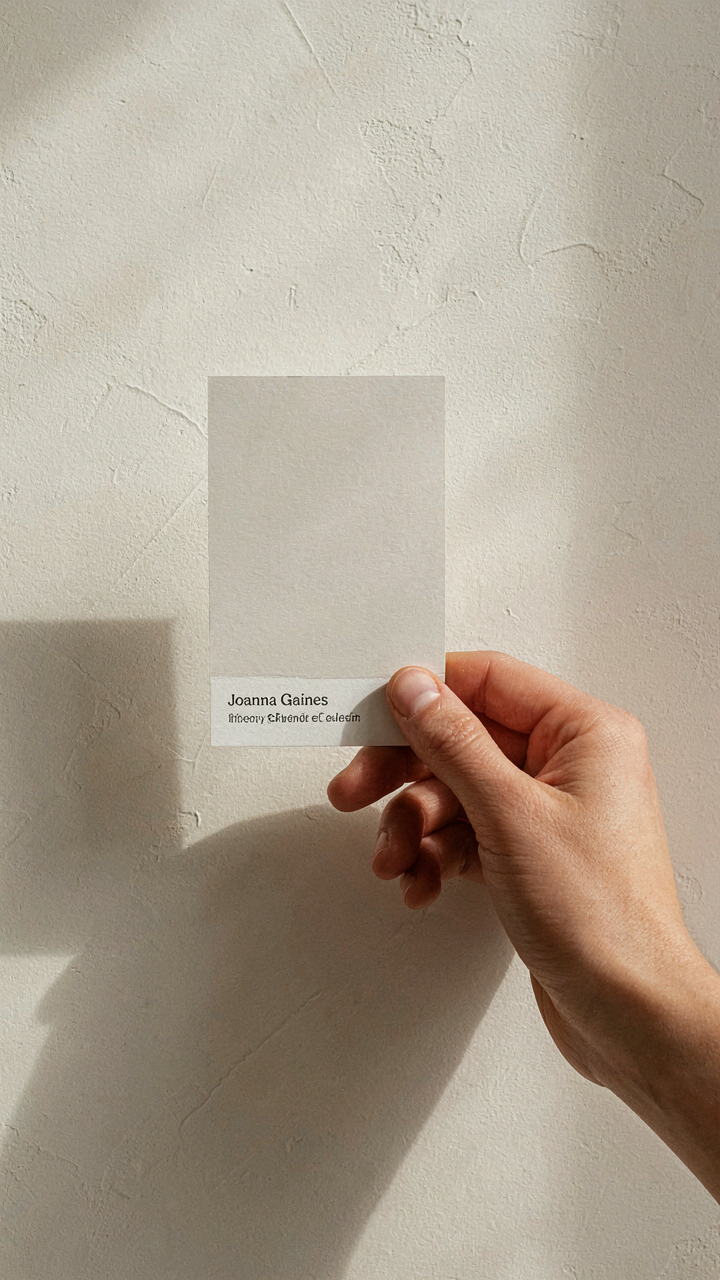
Natural Light The Ultimate Color Shifter
You’re blaming the paint when you should blame the sun. You want warmth on your walls but you haven’t measured when light actually hits them, so you’re gambling with color selection. Light is physics, and in physics, wavelength determines perceived temperature. A Joanna Gaines warm white reads one way at 9 AM and entirely different at 4 PM depending on your room’s orientation and window placement.

North-facing rooms receive indirect, cool-shifted light all day. South and west exposures deliver warm light in afternoon hours. East rooms get a brief warm window at sunrise then shift cool. Before selecting any Gaines palette color, map your light path across the wall for one full day. The paint doesn’t change. The light does. Your perception changes with it.
Artificial Light Manipulating Perceived Warmth
Everyone says “get good lighting” and stops there. That’s incomplete advice that costs you thousands in failed repaints. Color temperature of bulbs matters more than brightness. A Joanna Gaines cream like “Shiplap” reads institutional under 4000K LED but genuine and warm under 2700K incandescent. The bulb’s Kelvin rating determines how your paint reflects back at you. Lower Kelvin means warmer cast. Higher Kelvin means cooler, clinical cast.
Install 2700K bulbs in farmhouse spaces before finalizing any paint choice. Test your selected Gaines color under that specific lighting for at least three evenings. Observe how it shifts when you dim the bulbs to 50 percent. Artificial light is a lever you control completely. Most people ignore it and then blame the paint for looking “off.” Your bulbs create the warmth your eyes perceive, not the wall alone.
The Contextual Harmony Protocol: Beyond Magnolia Paint Colors Joanna Gaines
Your Outdoor View Sets The Anchor
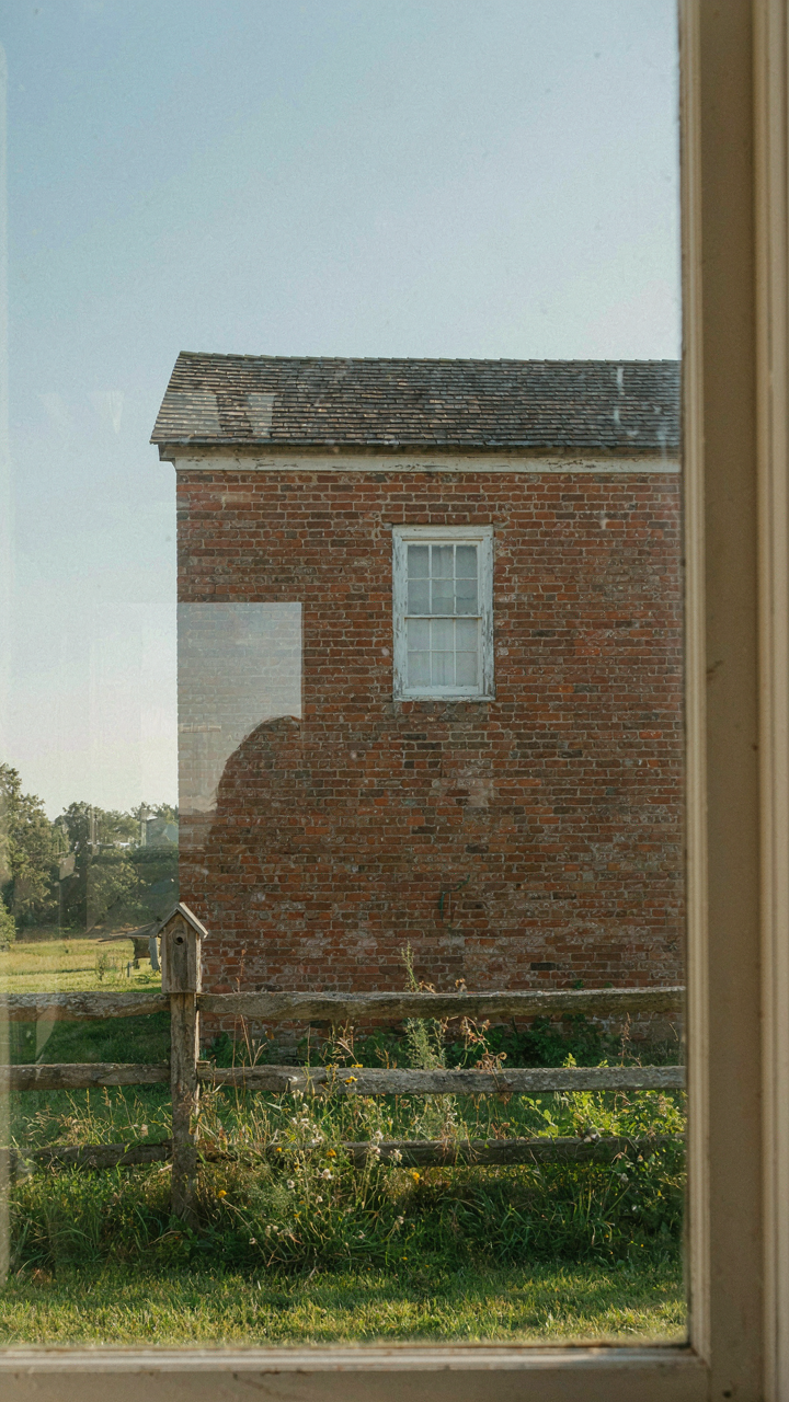
You want permission to skip the thinking part and just pick a paint color that looks good in photos. Here’s what actually matters: your exterior landscape is the visual anchor that determines which undertones your interior palette can handle without creating cognitive friction. This is borrowed from perceptual psychology, where the concept of “figure-ground relationship” explains how the brain prioritizes what it sees first. Your farmhouse exterior is the ground; interior colors are the figure. They must relate or the eye rejects the combination as incoherent.

Joanna Gaines addresses this directly in her palette choices by starting with what surrounds the house. If you’re surrounded by warm-toned brick, weathered wood fencing, or tan gravel, pushing cool-gray interiors creates a mismatch. The outdoor materials create a visual contract your interior must honor. When she selects colors like Magnolia’s Swiss Coffee or Alabaster for interiors in projects with natural wood siding, it’s because those warmer whites reflect the wood’s undertone back into the room. The mechanism is simple: the outside world enters through windows before any paint color does.
Materials Already Dictate Your Undertone
The common advice says “just go with what feels right.” That’s incomplete because it ignores that existing materials in your space have already locked in their undertone bias. Joanna Gaines paint colors work because they acknowledge what’s already physically present in the room. Granite countertops, hardwood floors, or existing cabinetry are material facts, not suggestions. They broadcast undertones whether you acknowledge them or not.
If your kitchen has warm-toned oak cabinets that aren’t going anywhere soon, selecting a cool-gray like Tricorn Black for the walls creates active visual tension. The cabinet undertone and wall undertone fight for dominance instead of cooperating. Gaines typically selects warm whites, soft creams, or greige tones from her Magnolia line because these undertones sit neutral enough to complement rather than compete. The protocol: audit every material surface in the room first, identify its dominant undertone, then choose a paint color with an undertone that either matches or genuinely contrasts on purpose, never by accident.
Joanna Gaines Favorite Colors: Decoding Her Hidden Design Language
Color As Emotional Amplifier
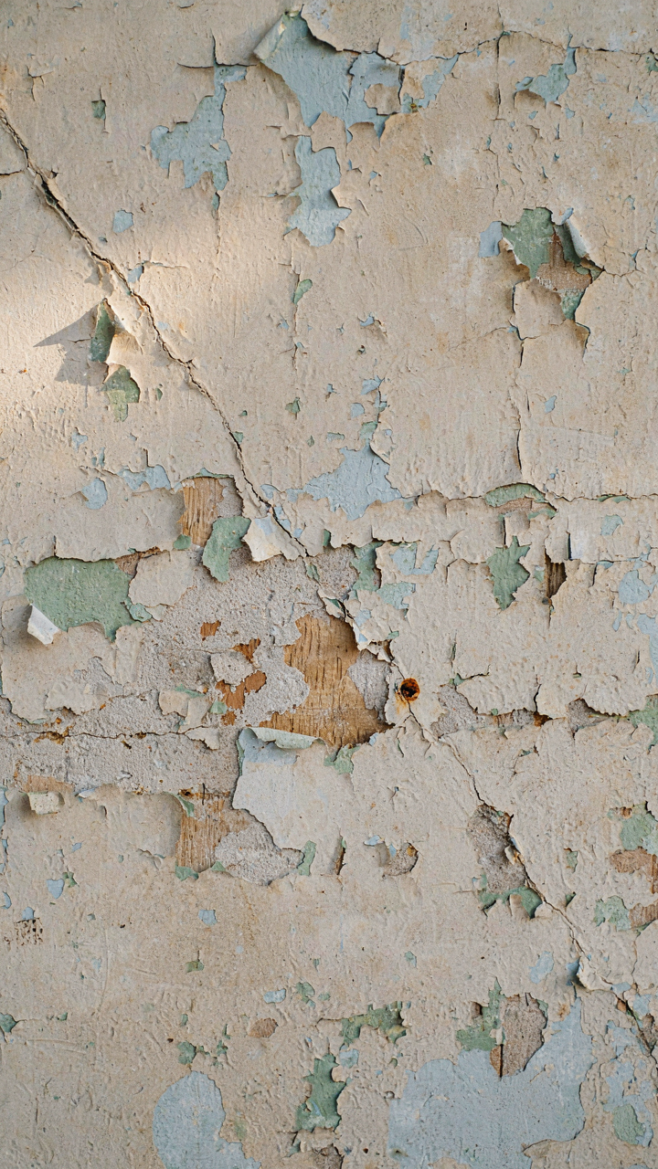
You want to know her colors because you think they’ll make your house feel like hers. That’s not how this works. Color functions like an emotional lever in psychology: same hue, different saturation or undertone, and you’ve moved the dial from calm to anxious. Joanna’s palette works because she understands saturation thresholds. Her creams aren’t pure white. Her grays carry warmth. The specificity matters more than the name.

Her colors appear in her homes because they suppress visual noise. A room painted in flat, lifeless beige creates tension your brain can’t name. Joanna’s Magnolia brand colors land in the saturation sweet spot where your nervous system relaxes without feeling bored. The mechanism isn’t magic. It’s deliberate restraint with invisible depth underneath.
The Farmhouse Hue That Actually Came From Economics
The “farmhouse” color story is incomplete without understanding rural America’s actual material constraints. Farmers didn’t choose soft neutrals for aesthetic reasons. They built with what was affordable and available: whitewashed lime, natural wood, unpainted stone. The palette emerged from poverty and practicality, not design vision. Joanna’s colors borrow that visual language but strip away the scarcity that created it. This matters because her colors work by triggering familiarity, not authenticity.
The colors that dominate her spaces—Alabaster, Shiplap, Swiss Coffee—exist because they reference a period when paint choice meant nothing and material longevity meant everything. Modern farmhouse doesn’t replicate that era. It copies its appearance while ignoring why those colors existed. When you paint your wall Joanna’s preferred warm white, you’re not channeling 1890s rural design. You’re applying a contemporary interpretation that borrows legitimacy from history it doesn’t actually reproduce. Start by identifying which colors actually appear in original farmhouse structures in your region, then match saturation, not name.
The “Ecological Niche” Approach To Joanna Gaines Green Paint Colors
How Colors Function As Visual Relationships
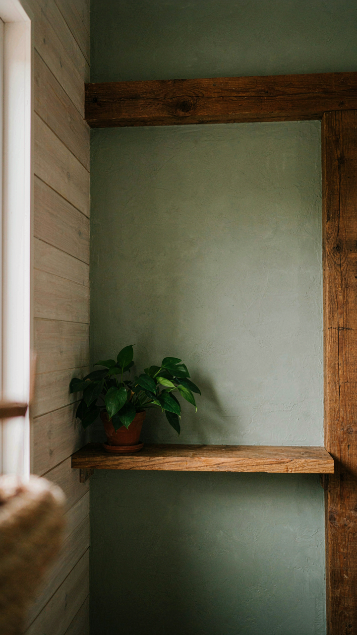
You want your room to feel intentional without looking designed, which is harder than it sounds. In ecology, a niche is the role an organism plays within its environment. A paint color functions the same way: it doesn’t exist in isolation. Joanna’s greens work because they occupy a specific visual niche relative to the materials around them. Shiplap, wood beams, and stone don’t just sit next to the paint. They demand a color that responds to their undertones, not one that fights them.

The mechanism is straightforward. Joanna’s greens like Magnolia’s “Sea Salt” and “Alabaster” paired with deeper greens succeed because they establish hierarchy through value, not contrast. The darker green anchors a wall while the lighter shade breathes on trim. This relationship creates visual stability. You’re not choosing a color in a vacuum. You’re positioning it within a system of materials and light conditions that already exist in your space. The green earns its place by completing what’s already there.
Sourcing Palette Logic From Context, Not Trend
The common advice says to grab inspiration from nature and bring it indoors. That’s lazy. Nature’s palette works because it evolved constraints: limited light sources, material scarcity, survival pressure. Your farmhouse has different constraints. Joanna’s greens succeed because they honor your walls’ exposure to natural light, your existing wood tones, and your climate’s seasonal shifts. “Silo White” as a trim paired with a warm green wall doesn’t mimic nature. It exploits the principle nature already solved: contrast without aggression.
The action is this: map your room’s actual conditions before choosing green. Note where direct sun hits the wall at different times. Identify your wood’s undertone, whether it leans warm or cool. Check your flooring against a potential green at three different times of day. Joanna’s greens appear consistent across her portfolio because they’re built from this same diagnostic process, not borrowed from a color wheel. The green you pick succeeds when it answers the specific ecology of your room, not when it matches someone else’s Instagram feed.
Joanna Gaines Interior Paint Colors: The Unseen Layers Of Texture
How Finish Changes Everything
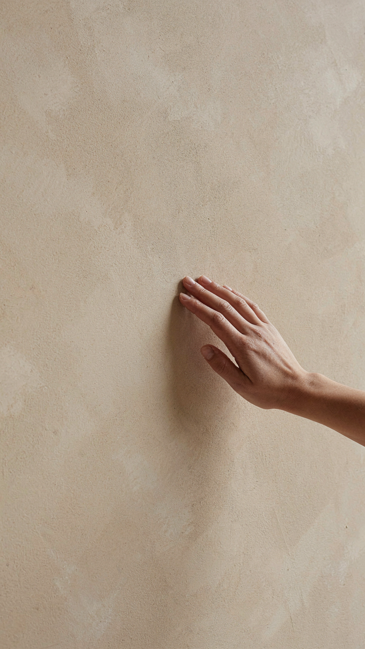
You want your room to look intentional without admitting you’re paying attention to technical details. Here’s what nobody tells you: finish type controls how much light your walls absorb, which fundamentally changes how a color reads in space. This is basic physics, not opinion. Matte finishes scatter light across the surface. Eggshell and satin finishes reflect light more uniformly. Gloss reflects it sharply. Joanna Gaines typically specifies flat or matte finishes for her signature farmhouse interiors because they absorb ambient light and make warm neutrals feel grounded.

The color you choose matters less than the finish you pair it with. A warm beige in flat absorbs warmth and reads as settled. The same beige in eggshell bounces light back and feels brighter, sometimes colder depending on undertones. Gaines uses matte specifically to anchor spaces because farmhouse design relies on visual weight and depth, not shine. If you want the warmth to stick, match the finish to the mood you need. Flat over eggshell for intimate spaces. Eggshell over flat for transitional areas where you need breathing room.
Surface Texture Over Solid Color
The real mechanism here is contrast. Adding texture to painted walls creates shadow play that solid color cannot replicate. This isn’t decoration, it’s dimensional strategy. Walls in farmhouse interiors don’t sit flat. Gaines layers textured surfaces over matte base colors to create visual complexity without pattern overload. The texture catches light inconsistently, making warm neutrals feel alive instead of monochromatic and dull.
Shiplap over paint, wallpaper textures, or intentional brush marks all serve the same function: they break the monotony of a single color field. The warm paint becomes a base layer, not the entire story. When you add dimensionality through surface treatment, the color itself reads warmer because your eye registers depth and shadow, not flatness. Specify your texture choice before you select paint, because the texture will determine how much light reflection you actually need from the finish itself.
The “Dimmer Switch” Effect: Why Joanna Gaines Wall Colors Work
How Much Visual Weight A Color Really Carries
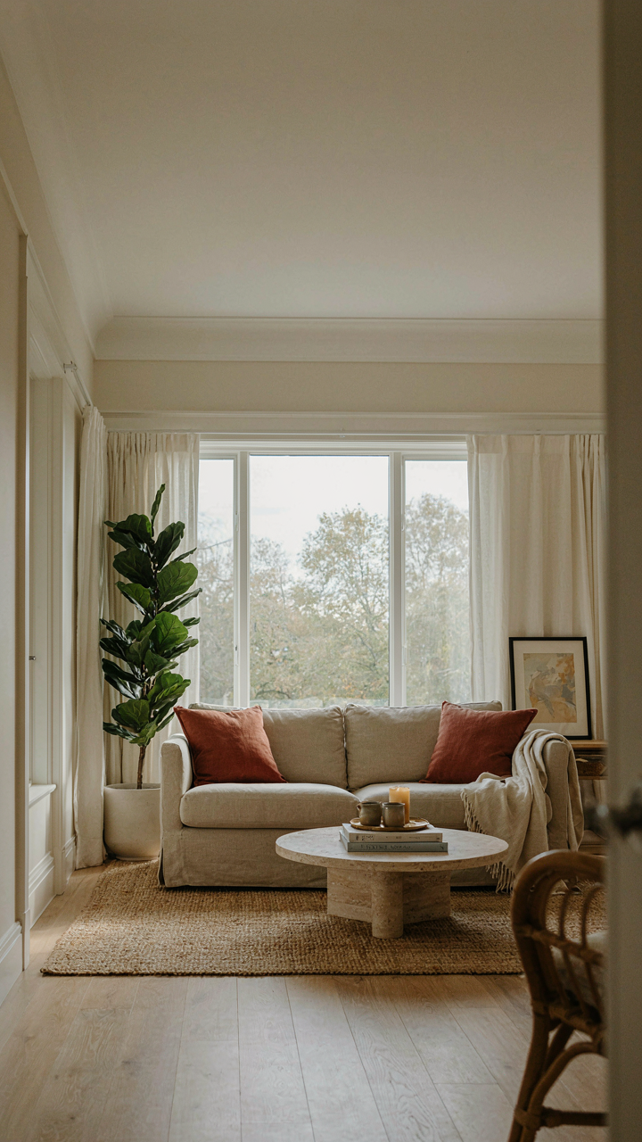
You want to know this because you’re afraid of picking a color that makes your room feel smaller or heavier than it actually is. The real mechanism here borrows from physics: saturation and value operate like mass. A wall painted in Joanna Gaines’ “Shiplap” (near white with minimal undertone) occupies less visual weight than “Magnolia Black” because it reflects more light and demands less cognitive processing from your eye. The farmhouse palette trades high-saturation colors for low-saturation, high-value tones that sit back instead of advance.

Value matters more than hue in determining how a color behaves on a large wall surface. Joanna Gaines’ warm neutrals like “Swiss Coffee” and “Alabaster” work because they sit in the mid-to-high value range, which means they feel open rather than cave-like. The common mistake is treating all warm colors equally. A warm sage or warm taupe can still feel heavy if its value is too low. The protocol is simple: sample your chosen color on a minimum of four-foot sections on the actual wall, at three different times of day, before committing.
Ceiling And Trim Creating Spatial Illusion
Most designers say paint ceilings white to make rooms taller. That’s incomplete advice that ignores how Joanna Gaines actually uses this principle. The real tactic involves contrast ratio between wall, ceiling, and trim. When you drop the ceiling just one or two values lighter than the wall color, you create visual separation without the stark white-wall contrast that can feel clinical. In farmhouse work, keeping trim at or near the ceiling value collapses the visual distinction between them, which expands perceived wall height because there’s no horizontal line cutting the space.
The mechanism works because your eye follows the strongest contrast. Joanna Gaines typically uses “Bright White” or “Pure White” trim against warm wall colors in the value range of six or seven out of ten. The ceiling matches the trim or sits one shade warmer. This creates a unified upper boundary that doesn’t interrupt sightlines. The wall appears to climb higher because nothing visually stops it at the ceiling line. Test this by painting just the ceiling and trim in your target colors first, before committing the walls.
Magnolia Home Paint Colors: Avoiding The Homogenized Trap
The Risk Of Copying Without Understanding
You want the Joanna Gaines effect without admitting you’re buying status through her name. Here’s what actually happens: most people treat her paint palette like a checklist, applying the same warm neutrals in identical sequences room to room, which erases the one thing that made those spaces work in the first place. The mechanism is borrowed from economics—what worked as scarcity (her curated selections) becomes worthless the moment it becomes commoditized (everyone using the same four colors). You’re competing against thousands of other homes running the identical script.

The real separation comes from understanding why Joanna selected specific undertones for specific rooms, not replicating the colors themselves. Her warmth works because it responds to natural light, existing materials, and architectural bones in each space. Copy the decision-making process, not the paint can. That’s the only move that survives replication.
Building Warmth That Stays Yours
The tactical approach demands you audit three variables before opening a single Magnolia paint chip: your dominant light direction, your existing material palette (wood species, stone, hardware finishes), and the emotional load you want the room to carry.
- Morning Light Exposure: North and east-facing rooms absorb cooler light, requiring warmer undertones (think ochre or burnt sienna bases rather than pure beige) to prevent flatness and visual coldness throughout the day.
- Existing Wood Tones: Match your paint’s undertone family to the wood already in the room—warm honey oak needs different warmth than cool gray reclaimed timber, or the colors fight each other.
- Architectural Style Alignment: Farmhouse aesthetics lean toward earthy, muted warmth, but forcing a paint color that contradicts your room’s actual proportions and ceiling height creates discord, not charm.
- Material Reflection Patterns: Matte finishes absorb warmth differently than satin or semi-gloss, so test your final color choice in the exact finish you plan to use on the actual wall.
- Accent Contrast Method: Layer warmth by placing your primary warm neutral against cooler trim or cooler accent walls—this contrast is what makes warmth read as intentional rather than accidental.
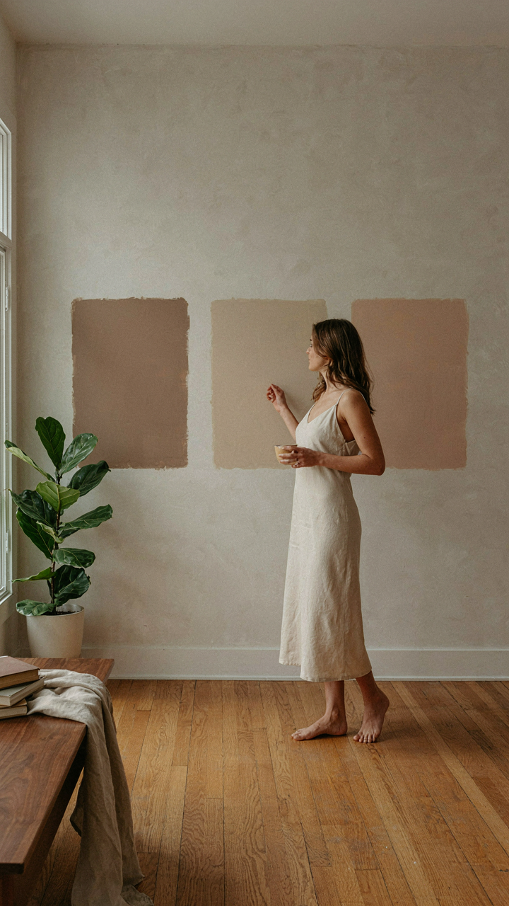
The execution step is simple: buy sample pints of three candidates, paint two-foot sections on different walls in the same room, observe them across all daylight hours and artificial lighting conditions, then eliminate two. This removes opinion and replaces it with direct evidence. Your warmth becomes uncopyable because it’s calibrated to your actual space, not someone else’s farmhouse.
Beyond The Swatch: The Enduring Power Of Timeless Palette
Color Combinations That Outlast Trends
You want proof your choices matter. You’re afraid of painting yourself into a corner that looks dated in five years. The real mechanism here is borrowed from physics: color combinations operate under the principle of saturation equilibrium. When Joanna Gaines pairs warm neutrals like Shiplap with softer accent tones, she’s not creating visual interest through contrast alone—she’s establishing a system where no single color dominates the visual field long enough to feel trendy or exhausting.

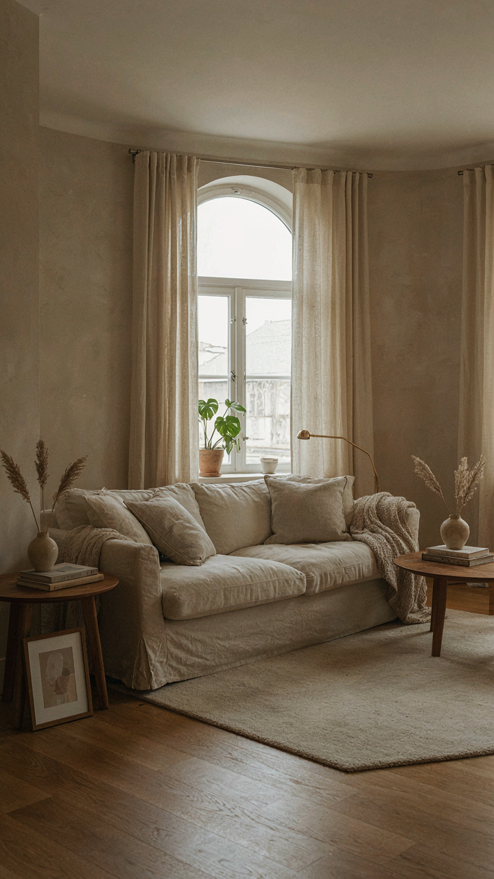
Classic pairings like cream with soft greige, or warm white with muted terracotta, remain viable because they sit in a narrow band of the color spectrum where human perception doesn’t anchor them to a specific decade. These combinations worked in 1990, work now, and will work in 2035 because they’re not dependent on fashion cycles. The durability comes from restraint, not novelty. Test this yourself: repaint one accent wall in a bold saturated color this month, then walk past it for six months. Notice how fast it reads as dated. Repaint it in Joanna’s Magnolia White or warm greige, and the fatigue never sets in.
Substance Over Seasonal Shifts
Most advice tells you to choose colors you love and ignore trends. That’s incomplete. The real play is understanding that trends move fast because saturated, high-contrast choices command attention and tire quickly. Joanna’s palette wins because it inverts this dynamic—her colors whisper rather than shout, which means they don’t trigger the psychological wear-out cycle that forces repainting.
Investing in enduring style means choosing colors that function more like neutral backdrops than design statements. When you pick Joanna Gaines approved warm neutrals, you’re buying flexibility across decade-long windows, not just seasons. The mechanism is straightforward: colors that sit in the warm neutral band (ranging from ivory through greige to soft taupe) remain compatible with whatever furniture, fixtures, or accent pieces you introduce later. This is why farmhouse aesthetics using her palette still feel current—you’re not fighting the walls every time you update a throw pillow or change hardware.
The Pursuit Of Warmth Isn’t About Paint, It’s About Confronting Your Design Ignorance Head-on
Most people pick Joanna Gaines paint colors because they saw them somewhere else. That’s not design, that’s copying homework. Real warmth comes from understanding why certain colors work in your specific space, not from following a list. Stop scrolling inspiration boards and start asking yourself one question: what feeling do I actually want when I walk through that door? Pick one Joanna Gaines warm neutral this week. Paint a single wall. Live with it for three days. That friction between expectation and reality teaches you more than a thousand articles ever will. Design confidence isn’t inherited, it’s earned through small, deliberate mistakes.



