The “Long Narrow House Plans” Illusion: Deconstructing The Box
Remove Walls Before Adding Square Footage
You want to feel like you’re not living in a hallway. That’s the real problem here, and it drives most narrow lot decisions into dead ends. The mechanism comes from sight lines. In architecture, unobstructed sightlines create perceived depth the same way a long hallway appears deeper when you remove the doors. Most narrow farmhouse plans fail because they treat width as the enemy instead of recognizing that visual continuity is what matters. A 24-foot-wide home with open kitchen-to-living-room flow reads larger than a 32-foot-wide home chopped into cellular rooms.
The practical move is eliminating load-bearing walls between common living areas during the frame stage, not after. Beam placement becomes critical here. A properly sized steel or laminated beam running the length of the home lets you drop walls while maintaining structural integrity. This costs less than adding footage and solves the spatial compression problem at the source. Most narrow lot farmhouse plans keep walls in place because removing them requires structural engineering upfront. That friction point is where most designs fail.
Double Height Spaces At The Heart
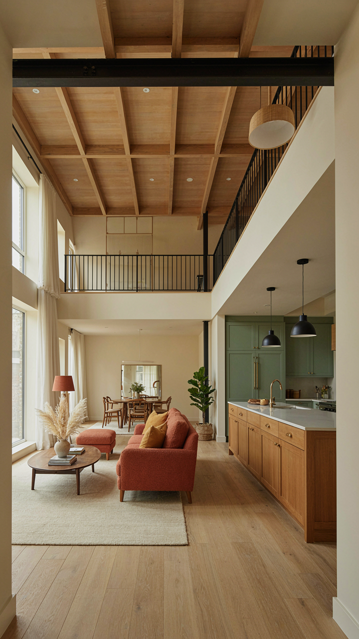
Vertical space is unused real estate in most narrow designs, and that’s where the real expansion lives. Early farmhouse construction didn’t maximize ceiling height because labor and materials made it inefficient. Modern narrow lot plans repeat this mistake by running standard eight-foot ceilings through the entire footprint. A two-story void in the central living area changes perception of the entire home. This works because human perception of volume isn’t just floor area; it factors in enclosure height.
Position the double height at the home’s widest dimension, typically where the kitchen, dining, and living zones converge. A 20-by-24-foot space with 16-foot ceilings over the main living zone absorbs the compressed feeling of the narrow footprint entirely. Connect this void to a mezzanine or upstairs walkway so sight lines extend vertically as well as horizontally. The technical requirement is straightforward: engineer the second floor to cantilever slightly over the void or use a partial floor to maintain structural support. This single intervention redefines how the entire home feels.
The Farmhouse Protocol: Rethinking “Open Floor” On A Thin Strip

Zoning Without Walls
You want to feel rich without admitting you’re building on a postage stamp. Here’s the mechanism: architects borrowed from retail design the concept of “visual merchandising”—the idea that spatial perception isn’t about square footage, it’s about how many distinct zones your eye can register without hitting a dead end. Narrow lots kill this because they force you into a single sightline. You break that by using floor level changes, material shifts, and strategic furniture placement as invisible walls. The zones feel separate because they function separately, not because drywall divides them.

Traditional “open floor” advice tells you to demolish boundaries and install one massive kitchen-living-dining cavity. That’s lazy and it backfires on narrow lots because a 12-foot-wide by 40-foot-deep space reads as a hallway, not a home. Instead, drop the kitchen floor 4 inches, shift to a different material at the living room threshold, angle a peninsula to create a subtle edge. Each zone gets its own microclimate and purpose without blocking sightlines. A person standing at the entry can still see into multiple areas, but they feel like separate rooms.
Seamless Indoor Outdoor Transitions
Narrow lots have one advantage nobody articulates: perimeter access. Your 50-foot depth means at least two walls touch the outdoors, sometimes three. The real move is treating exterior space as an extension of the functional layout, not as an afterthought. This isn’t just a porch—it’s a spatial pressure valve. When the interior feels compressed, the eye needs relief. Frameless sliding glass doors, zero-threshold transitions, and continuous flooring material between house and deck collapse the boundary and make the interior feel larger than its walls actually are.
Farmers understood this instinctively. Covered porches and transitional spaces between seasons existed because they served a function, not because they looked nice. On a narrow lot, a 10-foot-deep covered porch or screened extension effectively doubles your perceived living depth. Use matching decking materials on the exterior to create the illusion of floor continuity. Install operable glass walls that can fully retract, not just slide partway. The outdoor room becomes usable square footage that the eye counts as part of the main living space the moment those barriers disappear.
Narrow Modern Farmhouse Plans: The Verticality Lever
Stacked Living Optimizes Cubic Footage
You want a farmhouse that doesn’t feel cramped, but you’re terrified the square footage won’t deliver. The real mechanism is this: narrow lots force you to build up instead of out, and most designers treat that as a constraint. It’s actually an advantage if you stack functional zones by use intensity rather than by floor. Kitchen and dining occupy the ground plane where entry traffic flows. Bedrooms and bathrooms live above where noise and foot traffic matter less. This isn’t new thinking, but most narrow lot farmhouse plans ignore it entirely, stacking rooms randomly instead.

The vertical separation actually reduces perceived congestion. A 1,600-square-foot farmhouse on a 40-foot lot feels larger than a sprawling 1,800-square-footer because your eye never processes the full footprint at once. Each level reads as its own contained space. Builders commonly waste this advantage by treating each floor as a miniature version of a wide-lot plan, creating hallways and dead zones. Instead, eliminate unnecessary circulation. Bedrooms open directly off landings. Bathrooms attach to bedrooms without hallway buffers. This compression reclaims 80-120 square feet per level that conventional layouts squander.
Light Shafts Change Vertical Perception
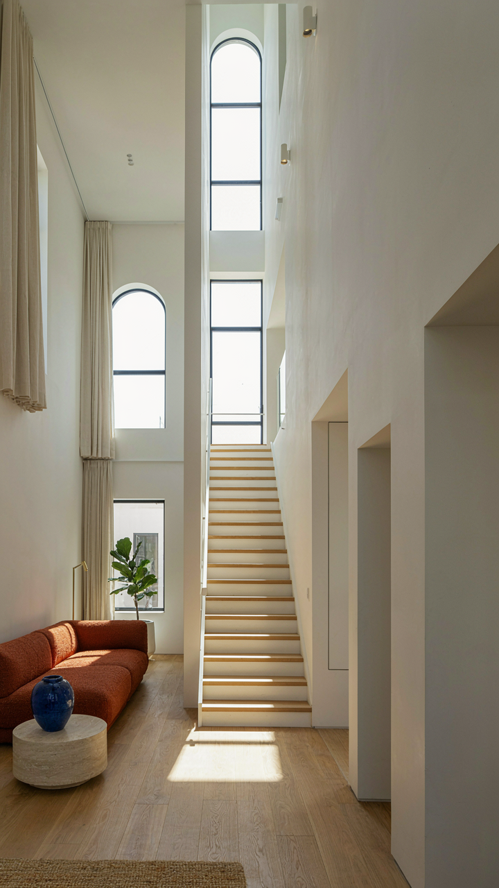
Vertical stacking fails if light doesn’t move between levels, which is a physics problem: light travels in straight lines and stops at ceilings. You need to interrupt that pattern with intentional apertures. A double-height foyer with a second-story window above ground-floor glazing allows light to penetrate two levels simultaneously. This isn’t skylights scattered randomly across the roof. It’s deliberate shafting that creates sightlines between floors, making the interior feel connected rather than stacked.
Most farmhouse plans add skylights for “character.” That’s marketing. Functional light shafts serve a structural purpose: they collapse the visual distance between floors. A stairwell with a window on the landing creates a secondary light path. An upper-floor bedroom window positioned above a first-floor living room window extends daylight depth. Builders measure this by running sight lines during schematic design, not by adding windows after the fact. The result is a narrow plan that reads as open because light continuity suggests spaciousness without square footage.
Beyond The Blueprint: The Sensory Expansion Method For Narrow Floor Plans
When Sound Becomes Architecture
You want this house to feel bigger because you’re afraid a narrow lot means cramped and cheap. Here’s what actually happens: sound behaves like a fluid in enclosed spaces. Hard surfaces bounce noise around, creating acoustic density that makes rooms feel smaller than they are. Soft surfaces absorb sound, creating perceived space through silence.

Narrow farmhouse plans benefit from strategic material placement. Ceiling height matters less than acoustic control. Install soft finishes on one or two walls, not all four. This breaks up reflections without looking soft. Wool insulation in walls dampens noise transmission between rooms. The result is psychological distance even when square footage stays the same.
Texture As Spatial Currency
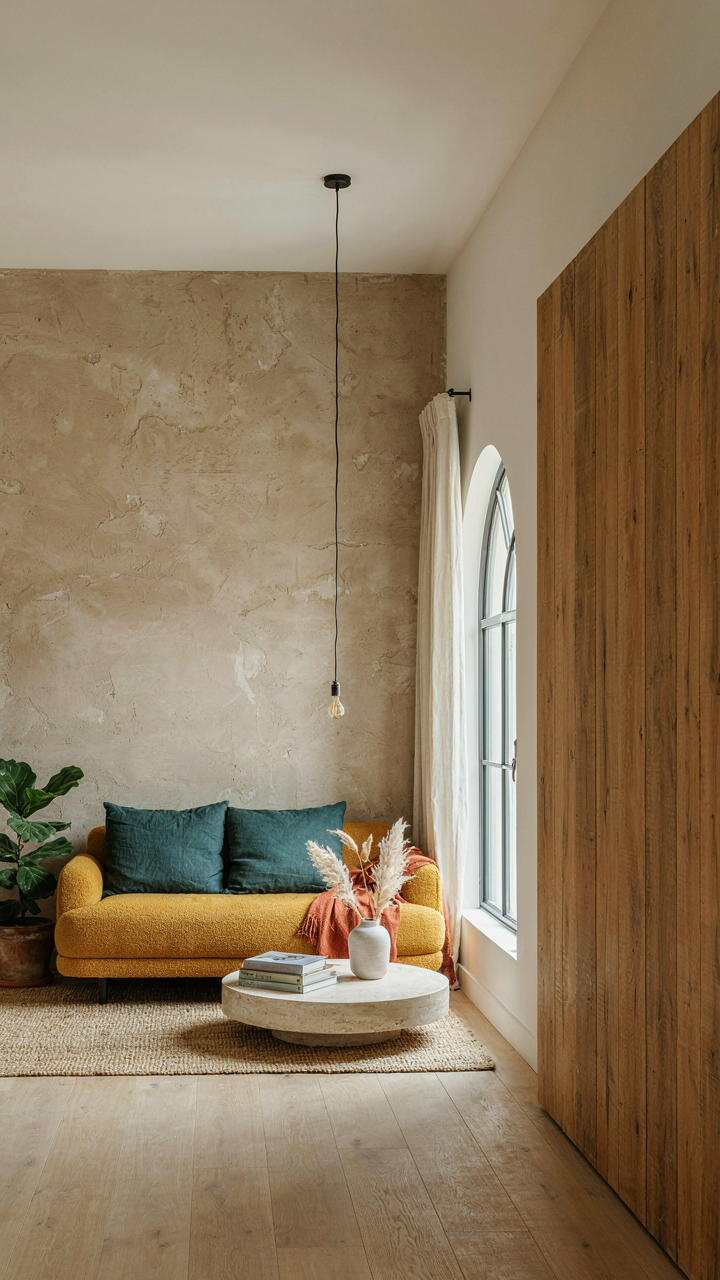
The common advice says add texture for visual interest. Wrong framing. Texture works through touch and shadow, not decoration. Your nervous system reads surface variation as spatial complexity. A rough plaster wall scatters light differently than drywall, creating micro-shadows that expand perceived depth in a 14-foot-wide living room.
Narrow lot farmhouses use mixed materiality to break visual monotony. Reclaimed wood on one accent wall, plaster on another, board and batten on the third. Each surface absorbs light differently. This layering forces your eye to move more, which feels like movement through space. Vary finish type every 12 to 15 linear feet of wall. The tactile shift signals a mental transition between zones without actual walls.
Narrow Lot House Plans Open Floor: The Light Amplification Strategy

Windows Positioned For Depth, Not Just View
You want your narrow lot farmhouse to feel bigger because you’re anxious about wasting money on a box. Here’s the mechanism: light travels in straight lines until it hits a surface. On a narrow lot, your problem isn’t the square footage—it’s that walls feel close. Strategic window placement breaks that claustrophobia by extending sightlines and bouncing light deeper into the plan.

Place primary windows on opposing long walls, not clustered on one facade. This creates a light corridor that runs the full depth of the home. Secondary windows on gable ends amplify this effect by introducing light at angles that reach interior zones the primary windows miss. Position windows at varying heights to distribute light across vertical planes, not just the floor plane where it gets trapped and absorbed by furniture.
Reflective Surfaces That Actually Work
Most advice says “add mirrors”—which is useless without understanding the physics of reflection. In optics, the angle of incidence equals the angle of reflection. On a narrow lot farmhouse, this means mirror placement must account for light source trajectory. A mirror placed perpendicular to a window wall reflects incoming light deeper into the plan. A mirror facing a wall absorbs the benefit and wastes the tactical advantage.
Install mirrors on interior walls perpendicular to your primary light sources, not on the walls receiving direct light. Place them to catch morning or afternoon sun and redirect it toward the home’s deepest zones. Glossy finishes on cabinet hardware, stainless steel appliances, and light-colored tile backsplashes multiply this effect without obvious artifice. The mechanism works because reflected light multiplies perceived depth by creating visual layers the eye interprets as distance.
The Unseen Square Footage: Maximizing Outdoor Integration For Narrow House Plans
Courtyards And Patios As True Room Extensions
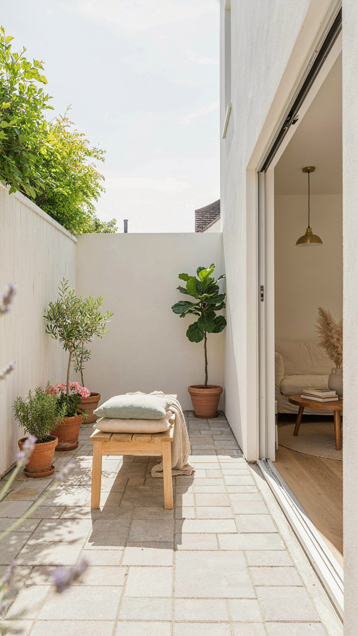
You’re worried that a narrow lot means your house will feel cramped. The real mechanism is this: outdoor space doesn’t feel like overflow storage if you design it as an architectural room with defined walls and a clear function. A courtyard on a narrow lot works because it trades lateral sprawl for vertical definition. The surrounding walls of the house, a fence line, or strategically placed structures create the same spatial enclosure you’d get from an indoor room, but you’ve added usable square footage without widening the footprint.

Courtyards and patios fail when they’re treated as leftover space instead of intentional rooms. Position them adjacent to the main living area so the transition is direct and the sightline extends from inside to outside without a dead zone. The patio becomes functional dining, work, or lounging space only when it’s sized for a specific use and connected to the interior program. A 12-by-16-foot courtyard with a defined edge and clear purpose reads as an extra room, not a decorative gap.
Borrowing Landscape Views
The principle here comes from landscape architecture, not real estate marketing: the concept of “borrowed scenery” means you frame external views as if they’re part of your property, multiplying perceived space without owning it. On a narrow lot, this isn’t aesthetic softening. It’s a direct spatial multiplication tactic. Position windows, sliding doors, and sight lines to capture trees, open fields, or distant hills. The eye travels past your property line, and the interior suddenly feels 40 percent larger because the brain extends the space into the landscape you’re framing.
Most narrow lot plans waste this. They treat windows as light sources instead of visual depth tools. Orientation matters more than window count. A single large window facing a distant tree line multiplies perceived depth more than three small windows facing the neighbor’s fence. Align the long axis of your main living space perpendicular to your best view. This single design choice converts the visual field into functional square footage your brain actually registers as yours.
Types Of Narrow Farmhouse Plans That Defy Convention

The Shotgun House Reimagined With Light Tunnels
You want to feel like your narrow lot didn’t force you into compromise. That’s the real concern here, and most designers solve it wrong by adding windows randomly instead of understanding the physics of how light actually moves through a thin space. Shotgun houses use depth as a tunnel—light enters at one end and travels the full length if you remove interior walls strategically. The mechanism is simple: unobstructed sightlines from front to back create the illusion and reality of depth. When you can see completely through the house, your brain doesn’t register the lot width as a constraint.

The modern farmhouse version drops the random hallway and creates “light wells”—zones where windows on opposite walls force daylight to cross the interior rather than just skim the perimeter. Position the main living area in the center third of the structure, flanked by windows on both narrow sides. This isn’t decoration. It’s structural psychology applied to layout. Builders often miss this because they think adding more windows everywhere solves narrow lot problems. It doesn’t. Directional light that travels horizontally through the center transforms how people experience the whole footprint.
Central Core Organization With Open Circulation
Military logistics borrowed the term “hub and spoke” for a reason—one central node makes every satellite location more efficient. Your narrow farmhouse needs this same principle. Instead of spreading utilities, stairs, and mechanical systems along one wall like common narrow designs do, stack them in a central spine that anchors the entire plan. This core becomes the organizing principle for every square foot around it.
The payoff comes from what you remove, not what you add. When your mechanical systems, plumbing, and stairs occupy one concentrated core, the rest of the floor plate becomes unbroken usable space. Open circulation means rooms flow into each other without dead zones or transition hallways that waste square footage on a tight lot. The central core acts as the load-bearing anchor for the roof structure, so builders don’t fight code requirements. Design the kitchen around this spine, run stairs up through it, and suddenly your narrow lot plan reads like a normal house that happens to be on a narrow lot.
The Perceptual Dynamics Of Narrow Lot Farmhouse Plans: Applying Cybernetics

How Movement Through Space Reshapes Perception
You want to believe a narrow lot farmhouse can feel spacious because you’re hoping to buy rural land you can actually afford. The real mechanism comes from cybernetics: feedback loops. In a narrow lot home, user movement itself becomes the input that determines perceived width. Every time you navigate through a space, your body creates a feedback signal to your brain about its actual dimensions versus its visual ones. Staggered sightlines, offset doorways, and angled interior walls interrupt the direct perception of constraint. The narrowness never vanishes, but the loop of movement prevents your brain from settling into the linear panic that defines a corridor.

Traditional farmhouse plans fail on narrow lots because they copy the original aesthetic without the land scale that made it work. They stack rooms along a spine and call it done. The counter-move is forcing the inhabitant into multiple micro-paths rather than one compressed journey. A kitchen angled fifteen degrees off the main axis, a hallway that jogs instead of runs straight, a stair placed off-center: these aren’t decorative choices. They’re interrupts in the negative feedback loop your nervous system runs when confined. Your movement pattern determines your spatial perception more than the tape measure does.
Structural Rhythm As Active Stabilization
Homeostasis means a system maintains balance despite external pressure. Narrow lot farmhouse plans must do this through rhythm, not square footage. Load-bearing walls, beam spacing, and structural bays become your design language. The colonial farmhouse used regular timber framing intervals partly for structural efficiency but accidentally created a visual meter that made spaces feel intentional rather than cramped. Modern narrow lots need the same principle: repeating structural intervals that feel inevitable, not like they’re desperately trying to fit the constraint.
Vaulted ceilings and open beams pull the eye vertically when horizontal space fails. This isn’t about making things “feel bigger” through false tricks. It’s about repositioning the body’s balance point. When your eye moves up more than it moves left-right, the nervous system recalibrates what it considers the primary dimension of the space. The structural elements become a visual anchor that stabilizes perception against the psychological strain of lateral confinement. Specify beam intervals at four-foot centers, run them continuously through the main living zone, and the narrow lot stops signaling danger.
The Furniture And Fixture Fallacy: Less Is Not Always More
Pieces That Work Double Duty
You want to feel smart about owning less stuff. That’s the real pull here. But the mechanism is different: narrow lots punish you for static objects that serve one purpose only. Every piece must earn its square footage or it steals it. This isn’t minimalism. It’s efficiency.
- Murphy beds with integrated desks: Folds vertical during day to expose workspace. Drops horizontal at night. Solves bedroom and home office in one footprint without sacrificing either function.
- Kitchen islands with storage underneath: Provides prep surface, dining counter, and cabinetry in one object. Eliminates the need for a separate pantry or prep table in tight galley kitchens.
- Sofa tables with drawers and shelving: Acts as entry console, bar seating, and closed storage simultaneously. Typical narrow lot front rooms lose 40 square feet to redundant furniture pieces; this consolidates three uses.
- Extending dining tables: Contracts to fit tight spaces, expands for entertaining. Prevents the dead space that comes from picking one permanent size.
- Bench seating with hinged tops: Dining or entryway seating that opens to reveal storage. Removes the need for a separate storage bench or cabinet.

The math is brutal: add five single-purpose pieces to a 280-square-foot living area and you’ve lost 60 square feet to visual congestion and traffic obstruction. Multi-functional pieces don’t just save space—they restore spatial perception by removing objects from the field of view.
Where Walls Do The Work
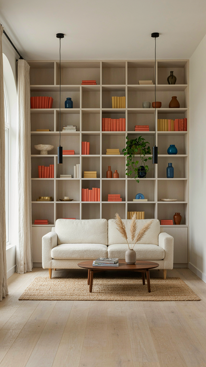
Built-ins solve what furniture can’t: they don’t take up floor area because they’re part of the structure. Farmhouses with narrow lots benefit from this approach more than conventional homes because the footprint forces you into linear room layouts. You have no choice but to use vertical space aggressively.
Installing shelving, cabinetry, and storage directly into walls eliminates the floating furniture problem that makes cramped spaces feel chaotic. A built-in bookcase along a hallway costs less than a freestanding unit and saves the 18 inches a typical bookshelf needs to breathe. Bedroom closets extended with custom built-in wardrobes increase usable storage by 30-40 percent compared to standard builder-grade closets. Kitchen window seats with storage beneath transform dead wall space into functional seating and concealed storage. Custom pantries built into wall cavities between studs add 15-25 cubic feet of organized storage without eating floor space.
The installation happens during framing or finish work. You measure the exact wall dimensions, account for electrical outlets and HVAC, and build the cabinetry to fit. This requires coordination with your builder upfront—not a retrofit decision. Narrow lot farmhouse plans that account for built-ins in the architectural drawings cost 8-12 percent more to execute but recover that investment instantly through usable square footage gains and reduced furniture spending.
Narrow Farmhouse: The Psychological Impact Of Deliberate Design

Where Your Eye Lands First
You want this section because you’re afraid a narrow lot plan will feel cramped no matter what you do. The real mechanism isn’t square footage. It’s attention. Your brain processes space through focal points, not tape measures. A narrow farmhouse without clear visual anchors reads as a hallway, even if it has adequate dimensions. A narrow farmhouse with deliberate focal points reads as intentional. Farmhouses historically used fireplaces, staircases, and architectural details as anchors. Modern narrow lot designs replicate this by positioning windows, built-ins, or material changes at key sightlines.
When you enter a narrow space, your eye travels the length of it or settles on a destination. Control that destination and the space transforms. A vaulted ceiling that terminates in a window at the far end. Shiplap accent walls positioned perpendicular to the length axis. A substantial kitchen island that breaks the linear plane. These aren’t decorative choices. They’re navigation tools that interrupt the sense of confinement. The design principle borrowed from visual hierarchy in graphic design applies directly here: the eye follows contrast and weight. Position contrast at the end of your sight line, not along its sides.
The Weight Of Less
Every design article tells you to embrace open floor plans for narrow lots. This advice misses the actual problem. Open plans in narrow spaces create visual noise because the eye has nowhere to rest. Curated minimalism solves this by removing competing surfaces and creating disciplined negative space. This isn’t minimalism as aesthetic trend. It’s minimalism as functional editing. A narrow farmhouse with three furniture pieces and one dominant color reads larger than the same space packed with objects of equal visual weight.
Farmhouse style originally developed in rural areas where storage was built-in and decoration was sparse by necessity, not choice. Modern narrow lot designs should steal this constraint. Built-in shelving instead of free-standing cabinets. Wall-mounted lighting instead of floor lamps that consume square footage. A single material palette instead of competing finishes. Each removal creates visual breathing room. The mechanism is straightforward: fewer elements competing for attention means each element occupies more perceptual space. Start by removing one category of objects from your main living area and observe how the remaining space shifts.
The Real Obstacle: Your Mindset, Not Your Lot, Dictates Your Farmhouse’s Freedom

Most people design around limitations instead of through them. Your narrow lot doesn’t constrain you, it forces better decisions. Open floor plans, vertical storage, and intentional sightlines aren’t compromises. They’re what separates a cramped house from a strategically sparse one. Pull up three narrow lot farmhouse plans today and sketch which rooms you’d eliminate entirely, not shrink. The farmers who built on thin strips of land weren’t apologizing for space. They were multiplying its value.