The Illusion Of Cozy Compact: Why Your Ranch House With Front Porch Fails

Generic Coziness Costs Money You Don’t See
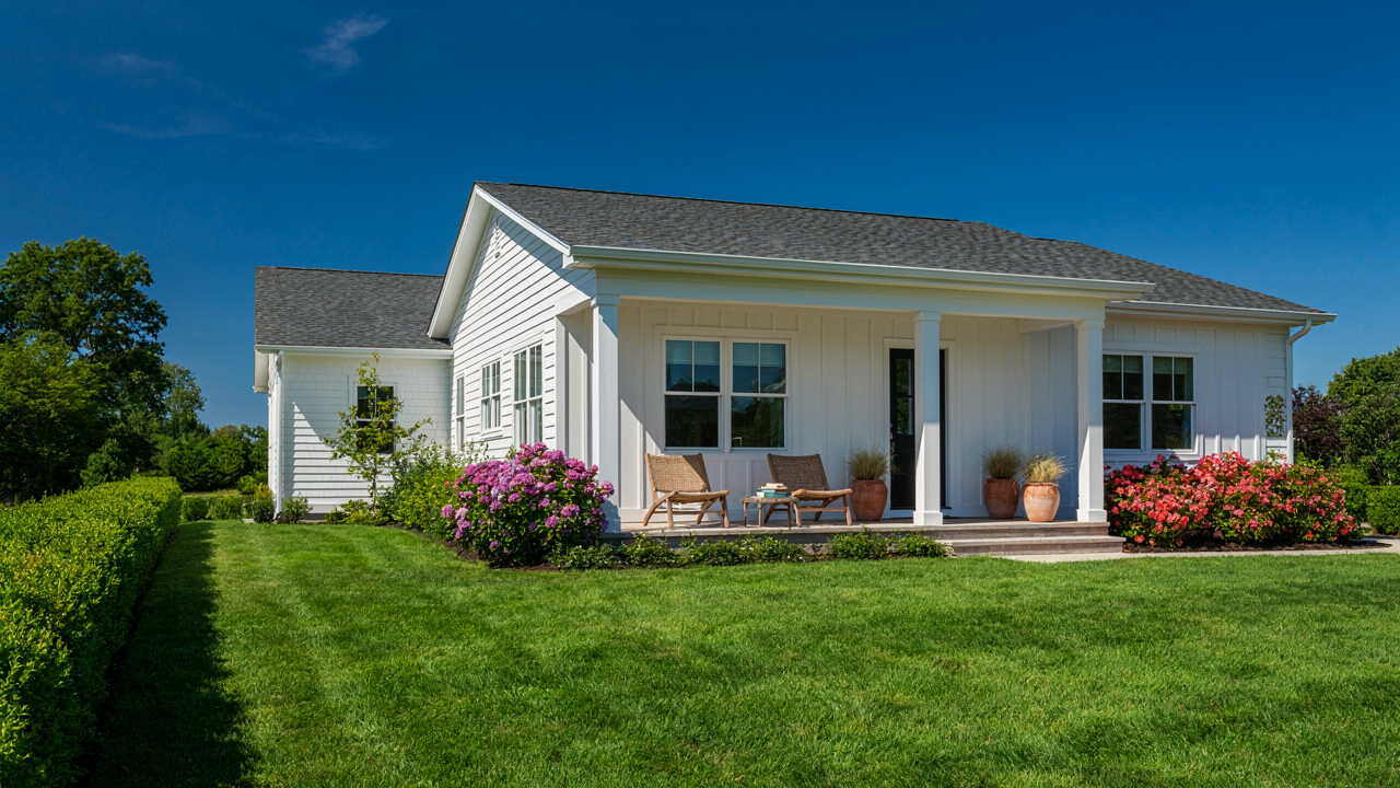
You want to believe a smaller footprint saves money. It doesn’t, not really. The actual cost hiding in “cozy compact” ranch cottages is operational inefficiency built into the floor plan from day one. When a 1,200-square-foot ranch style cottage forces traffic patterns that funnel movement through the center of the home instead of around its perimeter, you lose thermal zones, waste heating and cooling cycles, and create spatial bottlenecks that feel cramped despite the square footage. The front porch becomes visual theater while the interior layout punishes daily living.
Ranch cottages emerged in the 1930s-1940s as a response to affordable suburban development. They prioritized lot efficiency and manufacturing speed, not inhabitant experience. That lineage matters because it means the floor plan was built around cost reduction, not function. Most ranch style cottage layouts compress the living core too tightly, placing bedrooms adjacent to common areas with no acoustic buffer. You end up paying heating bills for wasted conditioned air and dealing with noise bleed you can’t fix without gutting walls. The “charm” of compact becomes a financial and acoustic liability the moment you actually occupy it.
Function Over Form Starts With Flow
Open concept is the lazy man’s answer to cramped ranch layouts, and it doesn’t work. Pushing walls down creates one continuous temperature zone that refuses to hold heating or cooling efficiently, and it destroys the one actual advantage a ranch cottage has: the ability to compartmentalize space. The real blunder in most ranch house with front porch designs is the kitchen placement. Builders positioned kitchens at the center of the footprint to minimize plumbing runs, which means meal preparation becomes a bottleneck for household traffic. Someone cooking blocks the only clear path to the bedrooms.
The layout you need reverses this logic. Kitchen should sit at the perimeter with direct exterior access for service and ventilation. Bedrooms need acoustic separation from living zones through strategic placement of utility walls and hallways. The front porch works best as visual and thermal buffer when it connects to the entry without forcing you through the living room first. This requires moving appliances, rerouting utilities, and redesigning the entry sequence. That’s renovation cost. The alternative is accepting a floor plan that works against you every single day you occupy it.
The 80/20 Rule For Modernized Ranch House Interiors
Where Your Space Actually Matters
You want to feel like you’ve done something smart with your compact layout without spending money you don’t have. Here’s what nobody says: ranch cottages operate on attention scarcity, not square footage scarcity. Like supply chain logistics, you have chokepoints. One kitchen entry, one living room focal point, hallway sightlines that broadcast clutter to every room. Identify those three to four zones first. Everything else is noise.

The mechanism is simple. A 900-square-foot ranch forces you to choose. You can either spread your effort thin across seven rooms or concentrate visual control and functional density in the zones people actually inhabit. The living room-kitchen threshold determines whether the whole interior reads as chaotic or intentional. The entry hallway determines first impression. The bedroom anchor determines whether you sleep near accumulated visual friction. Map these zones before you buy anything.
Utility First, Aesthetics Second
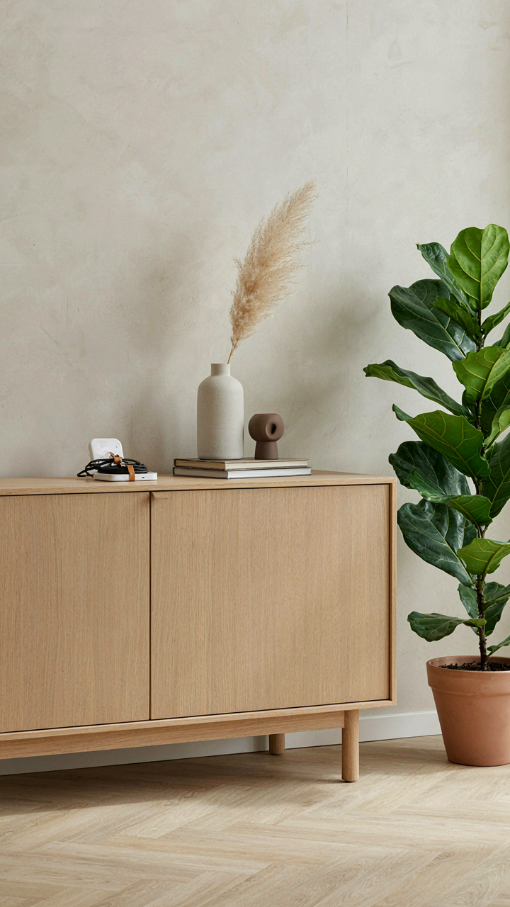
The common advice says “choose pieces that work double duty.” That’s incomplete. You need furniture that dissolves into function so completely that you stop seeing it as furniture. A low-profile console table near the entry isn’t beautiful because it’s styled well. It works because it catches keys, mail, and the visual weight of entryway chaos before that weight enters your sight line. The object vanishes into its purpose.
Ranch cottages punish decoration. Every square foot of surface that doesn’t serve a mechanical function becomes visual debt. A side table holding decorative bowls competes with a side table holding charging cables, remotes, and reading material. One costs attention daily. Deploy furniture by asking what task it eliminates, not what mood it creates. A compact credenza with closed storage handles media, dishware, and seasonal items in under five square feet. That’s the standard.
The “Turing Test” For Small Cottage Homes: Functional Simplicity

When Design Stops Pretending
You want proof that your compact layout works before you commit money to it. That’s the real question hiding under all the mood boards and Pinterest saves. In computer science, the Turing Test measures whether a machine behaves indistinguishably from a human. Apply that logic to ranch style cottage design: every element must pass the functionality test or it fails the whole system. A room that looks good but doesn’t work the way you live is architectural theater. Strip away the performance. What actually moves through the space? What gets used daily versus what sits there looking purposeful?

Ranch cottages built between the 1950s and 1970s nailed this because builders had hard constraints: limited square footage meant every inch had to earn its place. The floor plan wasn’t designed around aesthetics first. It was reverse-engineered from how families actually moved through kitchens, hallways, and bedrooms. Open concept wasn’t a trend yet, so hallways connected functional zones deliberately. That forced clarity. You can’t hide dysfunction behind an aesthetic when space is scarce. The cottage either worked or it didn’t.
Design That Actually Computes
Most advice about small spaces says “use vertical storage” and calls it a day. That’s incomplete. The real problem is that people add elements based on what they think a cottage should contain rather than what they actually need. A decorative console table in a hallway wastes walking space. Oversized furniture chosen for “impact” makes rooms feel smaller. Extra trim work adds visual noise without adding function. These aren’t style choices. They’re failures of the Turing Test.
Start with movement patterns, not decoration. Walk through a room and mark every time you change direction or reach for something. Those moments reveal where function fails. If you keep bumping a chair to pass through, that chair computes wrong. If a doorway creates dead space on both sides, redesign the entry. If cabinet hardware catches your sleeve, it’s poorly placed. A functional ranch cottage cottage interior demands this ruthlessness: measure twice, add nothing decorative until the bones work perfectly.
Mid Century Modern Ranch House: Borrowing Biometric Principles
Space Design Follows Human Movement
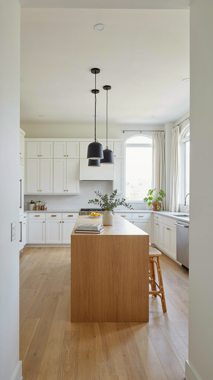
You want your cottage to feel effortless because you’re tired of fighting layouts that punish you for existing in them. Here’s what actually matters: biology, not aesthetics. In biomechanics, we call the efficiency of movement through space “kinetic economy”—the ranch style cottage applies this by eliminating wasted steps between functional zones. Mid-century designers didn’t talk about this principle explicitly, but they built it into every plan. The kitchen, living room, and bedroom sit within arm’s reach, not scattered across a rambling footprint.

A compact ranch cottage forces you to think like a nervous system, not a museum. Every movement has friction. The original ranch layouts from the 1950s were built for working families, not for showing off square footage. Hallways stayed short. Doorways aligned. You move through the space in patterns, not searches. When you position your kitchen island perpendicular to the main entry, you’ve already won—traffic doesn’t collapse into your cooking zone. Design that wastes motion wastes money and sanity.
Traffic Flow Mirrors Neural Efficiency
Common advice says “open concept solves everything,” and it’s wrong. An open plan trades one problem for five others: noise bleeds, heat scatters, and you cook under surveillance. Neural pathways concentrate signals to reach targets faster, not by removing walls everywhere. Your cottage’s circulation should work the same way. Designate clear routes between the entry, kitchen, bathroom, and bedroom. These paths are your priority.
The ranches that feel genuinely livable have what you might call “channeled openness”—walls stay where they separate functions, but sightlines connect major zones. A wall between kitchen and living room doesn’t trap you; it anchors sound and contains heat while a 4-foot opening lets you monitor kids or guests. Measure your entry-to-kitchen distance: if it’s under 15 feet with fewer than two direction changes, your flow works. That distance is your protocol checkpoint for any layout revision.
The “Leverage Point” Protocol For Ranch House Remodel
Find The Hinge, Not The Hinges
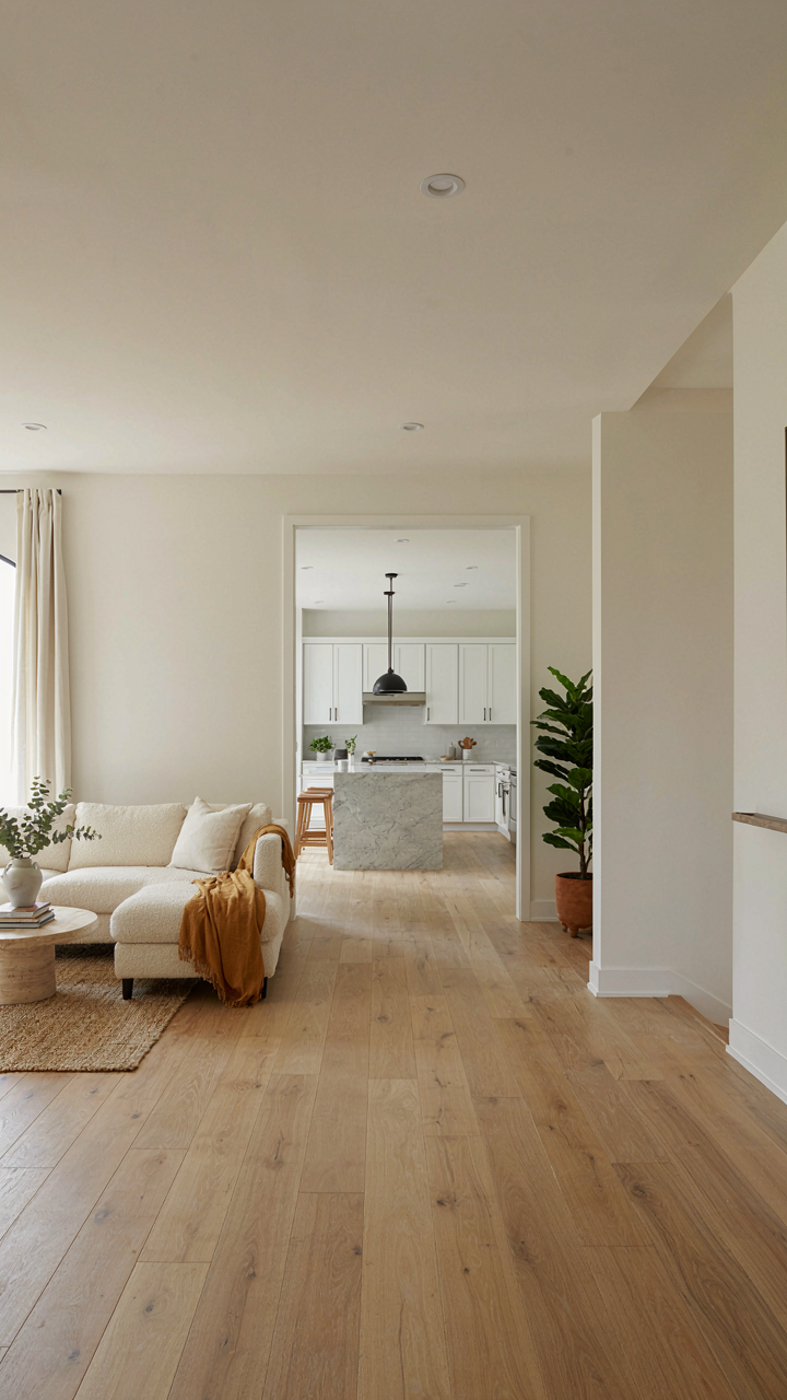
You want this section because you’re tired of renovation advice that treats every problem equally, as if relocating a wall costs the same as repainting trim. It doesn’t. In systems theory, a leverage point is where small force creates disproportionate effect. Ranch cottages have tight footprints by design, which means one structural decision cascades through the entire living experience. The open floor plan trend misses this: ranch homes don’t need to be opened up everywhere. They need one strategic shift that reorganizes how you move through 800 to 1,200 square feet.

The real mechanism is constraint, not expansion. A ranch cottage’s inherent limits force you to choose: relocate the kitchen to the center of the home, move the bedroom wall six feet inward, or reconfigure the entry sequence. Pick wrong and you waste money on cosmetics. Pick right and you unlock 30 percent more usable space without touching a single additional wall. The leverage point isn’t the biggest renovation. It’s the one that forces everything else into better proportion.
Where Walls Move To Unlock Everything
Structural shifts in ranch remodels follow a priority hierarchy, not aesthetic preference. Load-bearing walls determine which moves are actually possible, which is why most contractors start there and stop thinking. You need the opposite approach: identify what your daily friction actually is, then work backward to the wall that, if moved, eliminates it.
- Kitchen to center spine: Moving the kitchen from a side position to the middle of the home creates natural sight lines from bedrooms to living areas. This single shift often eliminates the need for additional windows or artificial lighting. Most ranch homes waste the kitchen as a dead zone. Centering it unlocks adjacent spaces.
- Hallway compression: Ranch cottages waste 60 to 80 square feet on hallway dead space. Removing or consolidating hallway walls and routing entry traffic through the living room recovers that footage without opening the entire floor plan. The entry becomes part of the living space, not a buffer.
- Bedroom wall relocation: Moving the wall between a bedroom and living area by four to six feet creates a true secondary living zone while keeping the bedroom functional. This is cheaper than adding square footage and feels like a genuine expansion in a compact footprint.
- Bathroom repositioning: Relocating the bathroom to serve both bedroom and kitchen reduces plumbing runs and opens sight lines. Grouped utilities cost less to move and create functional hubs instead of isolated fixtures.
- Roof line continuity: Opening the ceiling from living room to kitchen by removing a soffit or lowering a dropped ceiling adds perceived space without moving a single load-bearing wall. This is the cheapest structural shift with the largest visual payoff.
The protocol is concrete: map your actual daily movement through the cottage for one week, mark where you experience friction, then identify the single wall that, if moved or removed, eliminates that friction. Get structural approval before anything else. That one wall is your leverage point.
Modern Ranch Style Homes: The “Systems Thinking” Approach To Exterior
The Exterior As One Integrated Machine
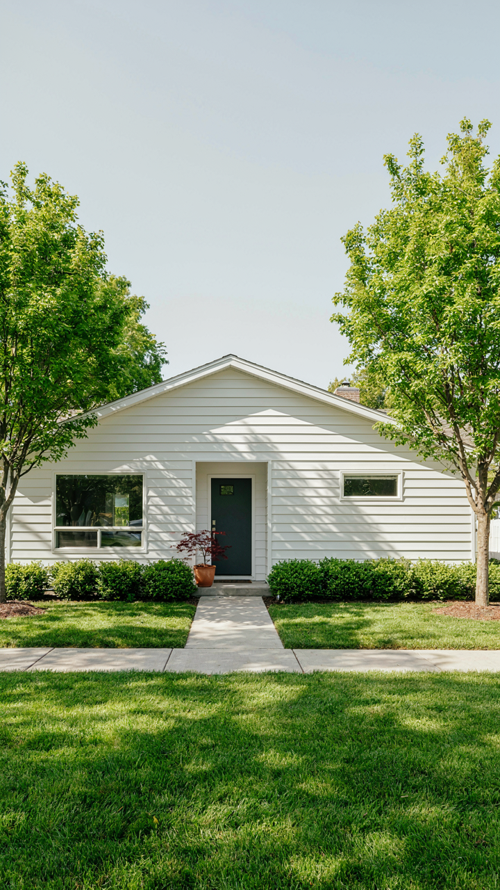
You want your ranch cottage to look intentional, not like you stumbled into it. Here’s the mechanism everyone avoids stating: most people treat the exterior as disconnected pieces—roof, siding, landscaping, entry—instead of a coordinated system where each element reinforces the others. Borrow from systems thinking in engineering: your exterior functions like a closed-loop feedback system. Change one input, and every other output shifts. The low-pitched roof line determines how water moves, which shapes where you place plants, which affects shadow patterns on your walls, which influences how the house reads from the street.

Ranch-style homes built between the 1950s and 1970s succeeded because their horizontal proportions forced this integration. You couldn’t separate the foundation line from the window placement without breaking the entire visual rhythm. Modern ranch cottages fail when owners add trendy details without understanding how they disrupt that balance. The real work is mapping dependencies: roof overhang affects both weather protection and the depth of your foundation plantings. Siding material determines maintenance schedules, which determines how often you’re outside working on the house, which determines whether people perceive it as lived-in or neglected.
How Landscape, Light, And Interior Space Connect
The most common advice here is wrong: “just add trees for privacy.” That’s lazy. Landscape placement is load-bearing in ranch design because these homes expose their interiors to exterior views. Your window placement already committed to specific sight lines. Plant placement either completes that visual intention or contradicts it. When you position a mature shrub three feet from a south-facing window, you’re not decorating—you’re engineering how much afternoon light enters your kitchen, which changes wall temperature, which affects heating costs.
Light quality shapes how the ranch cottage reads to visitors before they enter. The horizontal massing of these homes means light hits their facades at sharp angles during morning and evening. A properly placed deciduous tree casts dappled shadow that softens the home’s profile. Evergreen screening blocks winter wind and defines property boundaries without making the house feel bunker-like. Your entry sequence—the path from driveway to door—connects landscape, roof overhang, and window placement into one legible experience. Map your property’s sun angles first, then position plants and exterior features to work with those patterns, not against them.
Beyond The Blueprint: The Unseen Costs Of Generic Ranch House Designs
Where Standard Designs Fail You
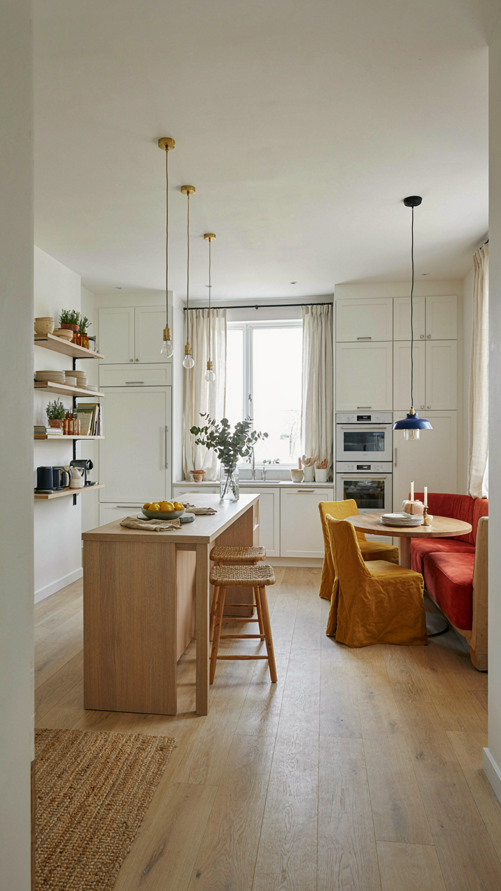
You want to believe a proven floor plan saves money. It doesn’t. The real mechanism is this: off-the-shelf ranch designs optimize for builder profit margins, not your actual lifestyle. They distribute square footage evenly across rooms regardless of how you live. A generic 1,200-square-foot ranch assumes equal value in a master bedroom and a third guest room. Your wasted space becomes invisible until you’re living in it.

Standard designs hide their inefficiency in what economists call deadweight loss. The hallways are longer than necessary. Mechanical systems reach every corner redundantly. Kitchen placement ignores natural light patterns. These choices solve nothing about your site, climate, or family rhythm. They solve the builder’s need to replicate one plan across fifty lots. You pay the cost while someone else captures the benefit.
When Customization Masquerades As Optimization
Most people conflate customization with optimization and waste thousands on the difference. Customization means changing what exists. Optimization means designing for constraint first. You can customize a bad plan infinitely and still own a bad plan. The contractor will happily add a window, expand a closet, or relocate a wall. Each change feels like progress. None of it addresses whether the core layout matches your actual patterns of movement and use.
Real optimization in a compact ranch cottage starts with one question: what activities happen daily versus weekly versus never? Then you build the layout around frequency, not convention. A family that cooks nightly needs kitchen efficiency. A couple that works from home needs spatial separation. Someone who hosts rarely doesn’t need a formal dining room. Optimization kills rooms. Customization decorates them. Identify which problem you’re actually solving before you hire the architect.
Modern Ranch House: The “Antifragile” Interior Design
Designing For Resilience Over Trend
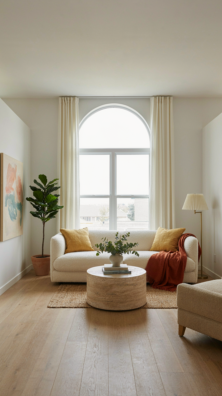
You want this section to work because you’re afraid you’ll design yourself into a corner, trapped by choices that age badly or demand constant renovation. That’s the real problem. The mechanism is this: ranch interiors survive because they’re built on constraint, not abundance. Open floor plans and load-bearing wall placement force you to work within limits. Those limits become your competitive advantage. You can’t chase every aesthetic shift because the structure won’t allow it. This is resilience by default, not by intention.

When you design a ranch cottage, you’re inheriting a floor plan that resists over-customization. The compact footprint and modest ceiling heights mean you can’t install trendy oversized elements. You work with what the space actually demands, not what Instagram told you to want. This friction is where durability lives. Spaces that force constraint don’t age like spaces built on abundance. They just get used differently as needs change.
Spaces That Absorb Unexpected Use
Disruption improves a space when the space is built to absorb it, not resist it. Apply this principle from systems engineering: a ranch cottage gains resilience through functional redundancy, not specialized zones. An extra half-bath becomes guest overflow or storage. A utility corner becomes a home office. Low ceilings and modest square footage mean every surface, wall, and corner gets pressed into multiple uses over time. Spaces designed too specifically fail the moment their original purpose changes. Ranch layouts don’t fail. They repurpose.
The real advantage shows up in year five or ten, when life demands something the original layout didn’t anticipate. A home office shift. A parent moving in. A shift from entertaining to quieter living. Dense, straightforward layouts absorb these changes because they were never designed to be precious about any single function. Continuity of flooring, simple cabinetry systems, and neutral surfaces mean renovations happen incrementally, not catastrophically. Document your material choices and dimensions now, so future changes build on what exists instead of tearing it down.
Your True Obstacle Isn’t The Size Of Your Ranch; It’s Your Inability To Distinguish Between Aesthetic Aspiration And Functional Architecture
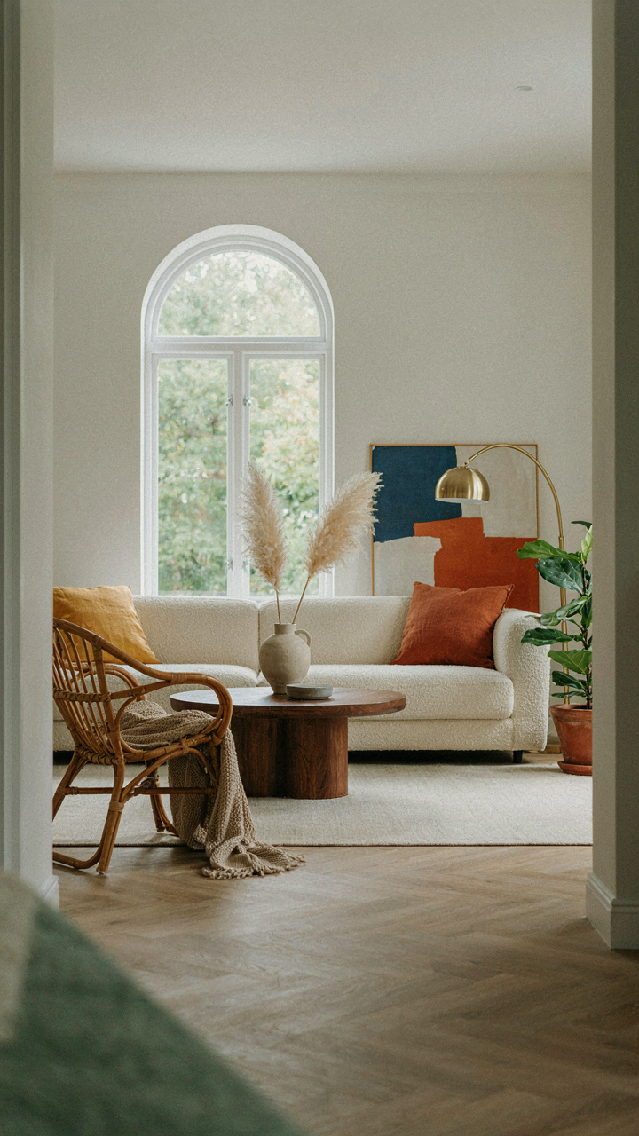
Most people buy into ranch style cottage design because it looks good in photos. They confuse visual appeal with livability. The real work happens when you stop asking “what looks cute” and start asking “what actually works for how I live.” Before you redesign anything, walk through your space for three days and document what frustrates you. Not what Instagram says should frustrate you. What actually does. The gap between those two things determines whether your cottage becomes a home or an expensive Instagram set.