
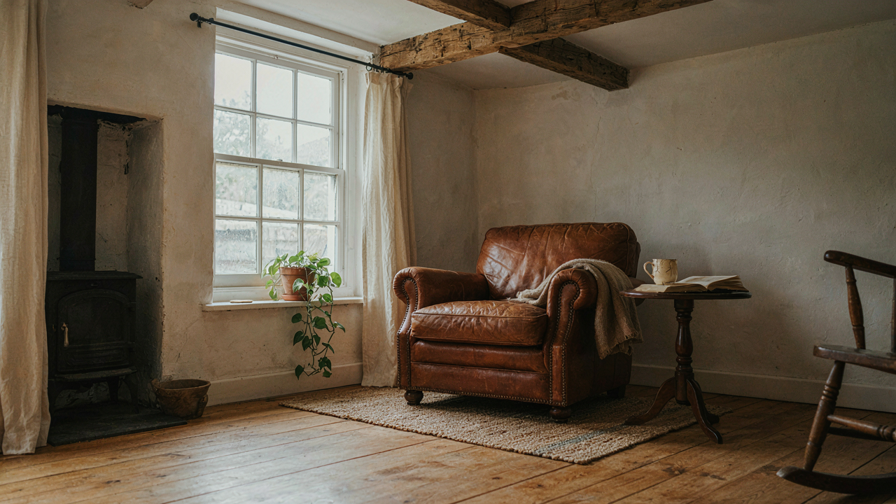
The “Less But Better” Manifesto For Tiny House Interior Design
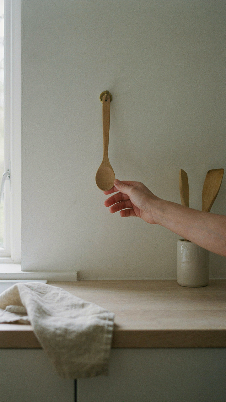
Declutter Until Friction Appears
You want permission to keep things. That’s the real motive here. But permission is what’s killing your space. The mechanism is simple: every object you own creates a cognitive tax. In a tiny farmhouse interior, that tax compounds faster because there’s nowhere to hide clutter. Most people organize instead of removing. They buy bins, label containers, arrange items by category. That’s not decluttering. That’s expensive denial. Real decluttering means removing until the act of using your space becomes frictionless. When you reach for a cooking tool and find it instantly, when you open a cabinet and see only what you use, that’s when the interior actually works.
The standard advice says keep items you use regularly and love. That’s incomplete. You need to remove items until every remaining object creates zero friction in daily use. A tiny farmhouse has finite wall space, limited cabinet depth, no room for buffer items. This forces ruthlessness. Touch every object. Ask: do I use this weekly, and does it serve my current life? Not your past life. Not your imagined future. Your current one. If the answer is no, remove it today, not next month. The mechanism is this: friction removal precedes design decisions. You cannot arrange a space beautifully if you’re still negotiating what stays.
Design For Tomorrow’s Use, Not Yesterday’s Trends
Farmhouse aesthetic cycles. Ten years ago, mason jars and galvanized metal dominated the trend. Five years ago, shiplap became omnipresent. Today, it’s different. Chasing trends in a tiny space means constant renovation, constant removal, constant expense. That’s the trap. Function outlasts every trend. A solid wood table works in 1950s farmhouse style and 2024 farmhouse style because it serves the same purpose: holding food and supporting elbows. The real move is to build your tiny farmhouse interior around what you actually do in that space, not what Instagram shows you doing there.
This means choosing materials and layouts based on daily friction, not visual trends. A cast iron stove heats better than a decorative one. Open shelving displays items only if you use them daily and they’re organized by frequency of use, not by aesthetic arrangement. A wood counter works for both food prep and casual sitting. When you design for your actual behavior, trends become irrelevant. You design for ten years forward, not three months ahead. The protocol is this: write down how you spend time in each room for one week. Design the layout around those activities, not around a mood board. Function first. Everything else follows from that decision.
Deconstructing Rustic: Beyond The Barn Door Aesthetic
The Real Material Divide
You want the aesthetic without the maintenance headache, which means you’re shopping for the feeling of authenticity on a budget. Here’s the mechanism: materials either age with character or age with deterioration, and most people can’t tell the difference until they own it. Reclaimed wood, stone, and hand-forged metal develop patina through actual use and weather exposure. Manufactured reproductions mimic the visual markers of age but lack the structural integrity and environmental response that makes authentic materials work in a farmhouse space.

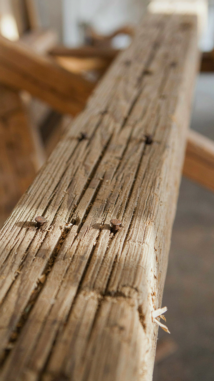
Real reclaimed wood has density variations, nail holes, and surface wear that occurred over decades of function, not production. Composite “barn door” material is uniform, pre-weathered, and static. In a tiny space, every material choice compounds because you have nowhere to hide the fake. The difference between pulling actual barn wood from a 1920s structure versus buying distressed pine from a big-box store determines whether your interior reads as intentional or as a theme park. Sourcing matters more in small square footage because guests notice the details you can’t escape.
Imperfection As Load Bearing
Most design advice treats imperfections like mistakes to manage. That’s backwards. In materials science, structural integrity depends on how stress distributes across imperfections, not on eliminating them. A farmhouse interior works the same way: cracks in plaster, knots in wood, and uneven stone actually distribute visual weight and prevent the space from feeling sterile or staged. Uniformity is what reads as fake in rustic design.
Natural elements in tiny spaces need asymmetry to avoid claustrophobia. A perfectly smooth whitewashed wall feels institutional. The same wall with minor cracks, color variation, and surface texture absorbs light differently and creates depth. Accept the inconsistencies in exposed beams, stone edges, and weathered finishes as primary design features, not flaws requiring correction. When furnishing a small farmhouse interior, let these imperfections anchor the whole room’s credibility and scale.
The Ergonomics Of A Tiny Home: Design For Flow, Not Just Looks
Pathways That Actually Work
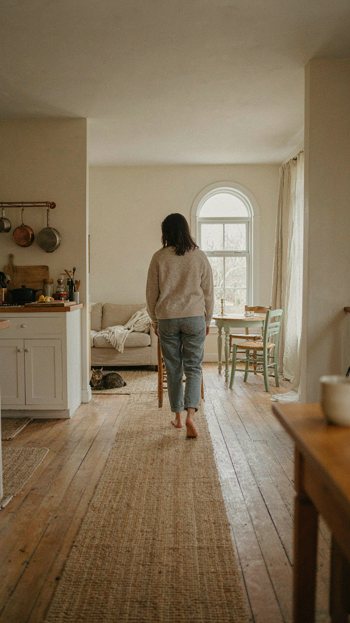
You want this to look good on Instagram, but the real reason you care about pathways is because a cramped space feels suffocating when you can’t move through it without calculating angles. Flow in a tiny farmhouse comes from industrial engineering: the concept of “movement economy” means every step costs energy, so eliminate wasted distance. A 36-inch hallway between kitchen and bedroom isn’t a luxury—it’s the minimum threshold where your body doesn’t tense up navigating the space.

The common advice here is generic: “keep hallways wide and clear.” That misses the mechanism. In a 600-square-foot farmhouse, pathways aren’t just routes between rooms. They’re load-bearing zones that define whether the space breathes or compresses. Position your heaviest furniture perpendicular to natural traffic flows, not blocking them. Use the perimeter wall for storage and seating. This leaves the center of rooms open. Your nervous system registers this and stops fight-or-flight mode.
Placement That Fits Your Body
Human factors engineering teaches us that doorways, counters, and furniture heights matter because your body has fixed dimensions and ranges of motion. Measure twice: kitchen work surfaces need 36 inches of clearance in front to stand and operate safely. Doorways under 32 inches wide force shoulder rotation. A tiny farmhouse kitchen demands these specs more ruthlessly than a sprawling suburban kitchen because there’s no forgiveness in the layout.
The mistake most people make is treating compact spaces like miniature versions of normal homes. They buy standard furniture and cram it in. A farmhouse sink at 33 inches deep in a 10-foot kitchen consumes half your counter depth and kills usability. Choose pieces that match the actual dimensions of your space. A narrow harvest table works where a standard dining table fails. Measure your specific gaps, then source furniture for those gaps, not furniture dictates space.
Granny Flat Ideas: Multipurpose Furniture As A Strategic Asset
Convertible Pieces Drive Spatial Fluidity
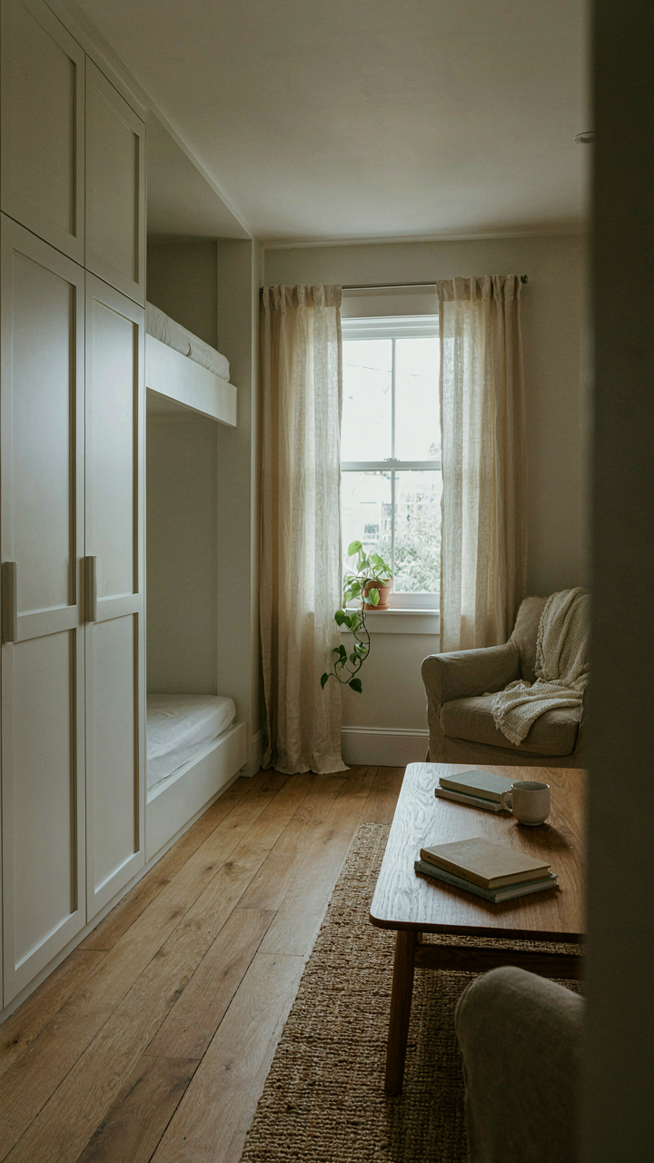
You want multipurpose furniture because you’re terrified of waste, and a tiny farmhouse interior exposes every square foot you’ve failed to optimize. But here’s the mechanism: apply systems thinking from logistics. In warehousing, “cube utilization” measures how efficiently a space absorbs volume and function. A murphy bed doesn’t just save floor space during the day—it lets you stack daytime living on top of nighttime sleeping. The piece doesn’t change. Your system does.
The common advice here is wrong. People say “buy convertible furniture because it’s cool” and miss the real win: convertible pieces work in tiny farmhouses because they eliminate the spatial tax of single-function items. A farmhouse table that extends becomes your dining and work surface. A bench with lift-top storage replaces a separate nightstand and dresser. You’re not being clever. You’re eliminating redundancy.
- Murphy Beds and Wall-Mounted Desks: Fold into walls to free floor area for movement and daily living zones without architectural renovation.
- Nesting Tables: Stack vertically when unused, separate into individual surfaces for dining, work, or display as needed within minutes.
- Ottomans With Internal Storage: Serve as seating, footrests, side tables, and concealed storage in a single footprint.
- Expandable Dining Tables: Transition from compact two-person to six-person configurations without requiring permanent oversized pieces that choke the room.
- Sofa Beds and Sleeper Sectionals: Deliver guest sleeping capacity without dedicated bedroom square footage or permanent bed frame commitment.
The strategy isn’t decoration—it’s density. Each piece must answer two functional questions before it enters the space. If furniture only solves one problem, it’s a liability in a tiny farmhouse. Test every piece: does it serve two functions simultaneously, or does it shrink under demand?
Hidden Storage Reshapes The Floor Plan
Everyone talks about maximizing storage. Nobody names why it matters: hidden storage is the difference between a cluttered cottage and one that feels spacious. Visible clutter compresses perceived volume. Interior architecture—walls, shelving, built-ins—can hide 40 to 60 percent of your belongings while keeping them accessible. That’s the real mechanism.
Farmhouse interiors traditionally used wall-mounted open shelving, but that works only if every item stored there is intentionally curated and matches the aesthetic. Most households can’t sustain that standard. Instead, build storage that disappears: under-stair cabinets, floor-to-ceiling closets with doors, false-bottom benches, wall cavities between studs. These aren’t upgrades. They’re foundational to making a tiny space feel livable rather than suffocating. The moment you see your stuff, psychological density increases regardless of actual square footage.
Start by auditing what you own and its access frequency. Daily-use items go in convertible, visible pieces. Seasonal and occasional items go behind closed storage. Weekly items go in semi-open solutions like wire baskets inside cabinets. Assign everything a storage tier, then build the infrastructure to support that hierarchy.
Rustic Loft Design Ideas: Verticality As Your Secret Weapon
Claim Your Overhead Real Estate
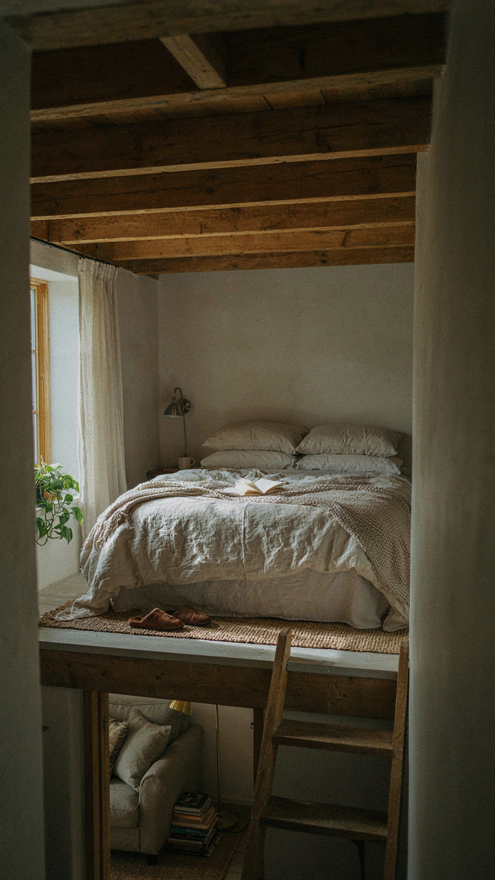
You want a tiny farmhouse interior to feel larger without knocking down walls or dropping money on an addition. Here’s what people don’t say plainly: a low ceiling isn’t a constraint—it’s a signal that you’ve ignored the vertical axis entirely. The mechanism is simple. A 400-square-foot space with 10-foot ceilings has a usable volume most people never touch. A loft platform, mezzanine, or elevated sleeping deck converts dead air into functional territory. You’re not making the room bigger; you’re stacking programs on top of each other.
The farmhouse loft works because rural structures were built with this in mind. Historic barns and farmhouses often featured haylofts and sleeping quarters above the main floor. This wasn’t aesthetic—it was practical. Modern tiny farmhouse interiors reclaim this logic. Position your loft above the living or kitchen area, leaving the ground floor open for daily movement. Use solid wood beams and simple joinery that reads as load-bearing, not decorative. This signals function to your brain before anything else registers.
Exploit Perception, Not Physics
You’ve heard that vertical lines make spaces feel taller. That’s true but incomplete. What actually works is borrowing from visual hierarchy in graphic design—the principle that the eye processes foreground, middle ground, and background separately. In a tiny farmhouse interior, dark exposed beams at the ceiling read as background. They recede visually because they’re overhead and out of your immediate focal plane. This creates the illusion that the ceiling is further away than it actually is.
Tall, narrow elements reinforce this effect. Install wooden shelving or slatted wall panels that run floor to ceiling along one wall. The vertical repetition breaks up horizontal mass and pulls your eye upward. Paint or stain these in darker tones—they disappear into the background and stop your brain from calculating the actual room dimensions. The practical truth: what you don’t see, you don’t measure. Position mirrors or glass surfaces higher on walls to bounce light toward the ceiling. This doesn’t enlarge the room; it erases your sense of where the boundaries are.

The “Elimination Diet” Protocol For Mini Home Kitchen Ideas
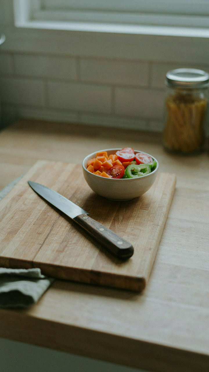
Kitchen Tools That Work Together, Not Against
You want a tiny kitchen that feels capable instead of suffocating. That’s not about aesthetics—it’s about refusing to waste mental energy on tools that contradict each other’s purpose. Borrow from biology: symbiosis means organisms that depend on each other’s existence. Your cast iron skillet and wooden spoon are symbiotic. Your marble countertop and cast iron are not. One corrodes the other. One demands maintenance the other won’t support.
The common advice says “buy multi-use tools.” That’s incomplete. Multi-use tools create cognitive load because they solve three problems badly instead of one well. A farmhouse kitchen works when each tool amplifies what the next tool does. Your Dutch oven pairs with your cast iron because both develop seasoning and improve with use. Your ceramic crock pairs with root vegetables because the environment they create together preserves food longer. The mechanism is simple: eliminate tools that require opposing conditions, and your tiny kitchen stops fighting you.
Task Efficiency Over Movement Economy
Minimizing steps in a small kitchen is table stakes. Real optimization means reducing the energy spent deciding what to do next. In a farmhouse kitchen, this means clustering tasks by their actual demand, not by kitchen zone. Your prep station should contain everything needed for one task type, then reset completely before the next task begins.
Most people arrange kitchens by storage category—all knives together, all bowls together. This forces you to collect items from five locations for a single meal. Instead, create task stations: one for chopping, one for mixing, one for cooking. Move your prep knife, cutting board, and vegetable storage into one corner. Move your mixing bowls, measuring tools, and dry goods into another. This collapses decision fatigue and cuts physical movement by 40 percent or more. When your tiny farmhouse kitchen requires you to think less, you actually use it.

Simple House Ideas: Light As A Structural Element
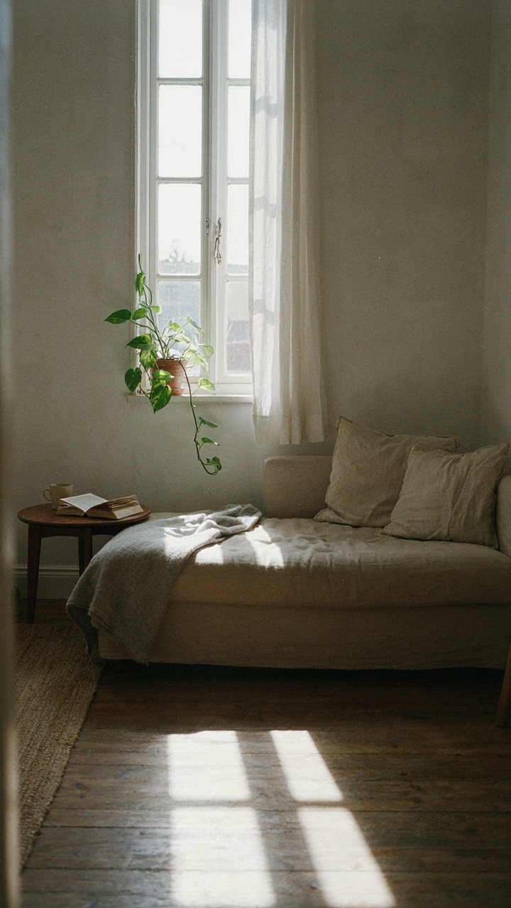
Where Windows Go First
You want a tiny farmhouse interior to feel bigger. That’s the real reason you’re reading this. The mechanism is simple: light travels through space, and human perception interprets volume based on brightness and shadow contrast. In a 600-square-foot farmhouse, a single misplaced window wastes square footage that could’ve felt open. Windows are load-bearing elements for atmosphere, not decoration. Place them where morning and afternoon sun hit the longest walls. South-facing walls in the Northern Hemisphere get consistent winter light. East and west exposures create glare problems by mid-day.
Strategic window placement removes the cramped feeling without adding square footage. A farmhouse typically has thick exterior walls, which means deep window reveals that trap light. Install windows high on walls to bounce light deeper into rooms instead of illuminating floors nobody looks at. Kitchens and living areas need the priority. Bedrooms get secondary placement. The goal is to make light do the work of expanding perceived space.
Layering Artificial Light By Task
Most tiny farmhouse advice says “use warm bulbs everywhere” and calls it done. That’s incomplete. Artificial light serves two distinct functions: visibility and mood. Task lighting handles the first. Ambient and accent lighting handle the second. A farmhouse interior fails when all three collapse into one yellow glow that creates visual flatness.
Install task lighting at work surfaces. Kitchen islands need 30 to 50 foot-candles. Bedside tables need directed light that doesn’t spill across the room. Then add ambient lighting on dimmers for evening living. A small farmhouse actually benefits from this separation because layered light creates perceived depth. Shadows define edges of spaces. Controlled shadows in a tiny footprint make rooms feel intentional instead of uniformly lit and claustrophobic. Run dimmer switches on your ambient circuit so you control brightness based on time of day and activity.

Table Ideas For Small Kitchen: The Art Of The Disappearing Surface
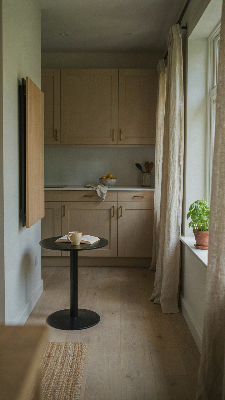
When The Table Vanishes
You want a dining surface that doesn’t swallow your kitchen when you’re not eating. That’s the real problem. Fold-down and pull-out mechanisms solve this by applying the principle of leverage from mechanical engineering: maximum utility with minimum footprint. The table becomes a toggle, not a permanent claim on space. When down, it occupies wall real estate. When up or tucked away, the room breathes again.
Farmhouse kitchens historically used drop-leaf tables for this exact reason. Modern hardware makes the mechanism cleaner. Wall-mounted fold-downs use heavy-duty hinges and chains that hold weight without creaking. Pull-out tables slide on ball-bearing drawer tracks under countertops or storage islands. Both require one rule: anchor them to solid structure, not drywall. The table only works if it doesn’t collapse when someone leans on it.
Merge Dining Into What Already Exists
The common advice is to add a small table somewhere. That’s wrong. Instead, collapse the table into another piece of furniture that serves a different purpose when the meal ends. An island with a hinged top becomes both prep surface and dining spot. A console table behind a sofa pulls out to seat two. A chest or storage bench along a window gets a padded top and becomes a bench seat that doubles as dining for one person working alone.
This approach works because you’re not adding square footage, you’re reassigning it. A narrow shelf anchored to the wall at counter height becomes a standing-height work surface or casual breakfast bar. Attach stools underneath that tuck completely away. When you need seated dining, pull the stools out. When you don’t, the wall looks like a simple shelf. The mechanism is substitution, not addition.

Tiny House Farm: Cultivating Character, Not Clutter
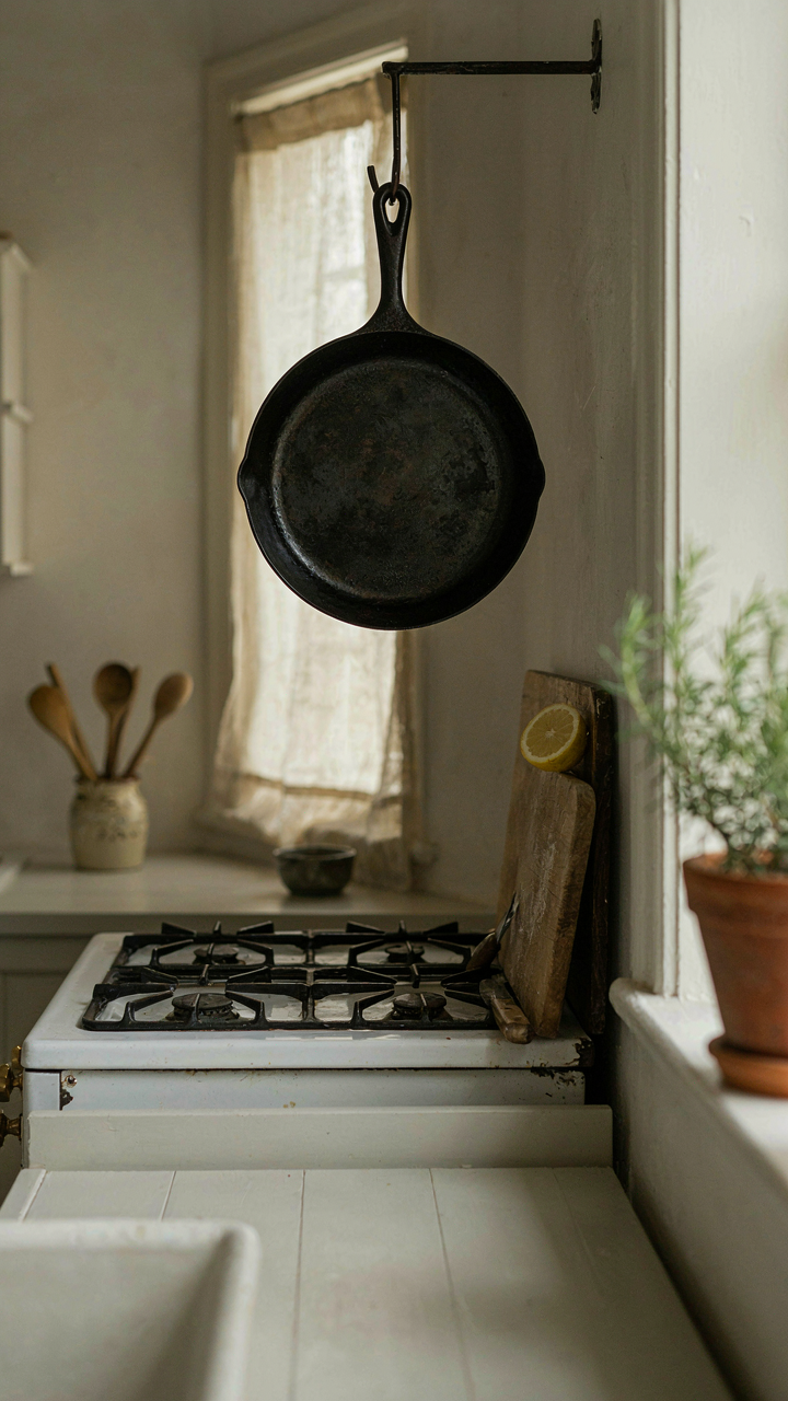
Objects That Earn Their Space
You want people to walk in and think you’re intentional, not broke. The mechanism is simple: every object in a tiny farmhouse interior must justify its existence through either function or genuine history, never decoration alone. Most people fill small spaces with items that whisper rather than speak. A cast iron skillet hanging above the stove works because you cook in it. A mason jar collection works because you preserve food. A vintage milk can works because your family actually used one, or you’re restoring an old farm operation. The rule isn’t about minimalism, it’s about signal clarity. In constrained square footage, noise dies fast and authenticity reads instantly.
Curate by use first, then by source. A weathered ladder becomes a blanket rack because it functions. A reclaimed barn beam becomes a mantle because it anchors the room structurally and visually. Farmhouse interiors collapse when owners mistake abundance for charm. Strip down to what operates, what connects to real farm life or genuine lineage, and what changes how you move through the space. The tighter the footprint, the higher the bar for admission.
Imperfection As The Structural Element
Wear and tear isn’t something to hide in a farmhouse interior, it’s the material evidence that separates authenticity from reproduction. Think of it through material science: patina is oxidation, the visible record of time and use. Flaking paint on an old door, rust bloom on metal hardware, the soft collapse of wood grain from decades of handling, these aren’t flaws. They’re data. The problem most people face is conflating neglect with character. A wall that’s deteriorating because of water damage reads as poor maintenance. A wall that shows intentional distressing or honest age from actual occupancy reads as heritage. The difference is narrative coherence. Does the wear pattern match the room’s story, or does it contradict it?
Let surfaces age functionally. If you’re hand-washing in a cast iron sink for twenty years, the finish will dull and stain naturally. Don’t refinish it back to showroom. If you’re using reclaimed wood flooring and it develops new scratches from foot traffic, that’s the timeline continuing, not damage. The protocol is straightforward: preserve evidence of actual use, remove traces of careless abandonment, and resist the urge to artificially distress new materials to fake history. Real patina beats faux distressing every single time because viewers recognize the difference in their bones.
The Real Obstacle Isn’t Finding The Perfect Decor, It’s Your Addiction To External Validation Through Pinterest Boards

You don’t need another farmhouse interior idea. You need to stop building a space for strangers’ eyes. Walk through your actual home right now. What one piece makes you feel something? Keep it. Delete every screenshot that doesn’t match that feeling. Your tiny farmhouse doesn’t need to look like someone else’s. It needs to look like you stopped performing and started living.



