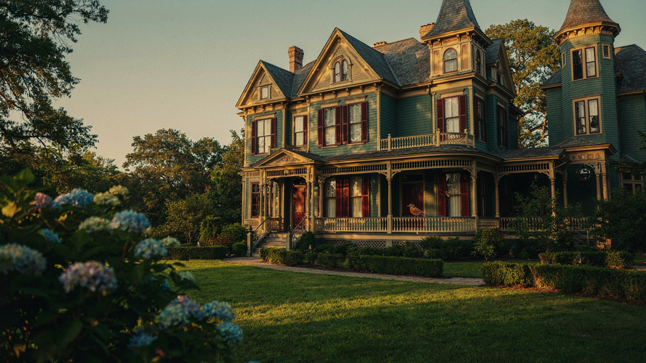
The Victorian Exterior Deception: Why Most Schemes Fail
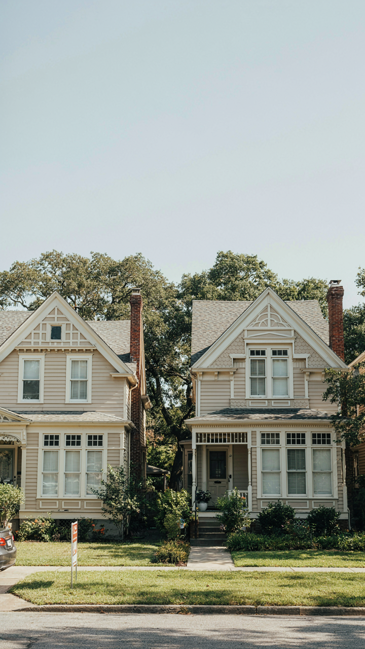
The Palette Trap That Kills Differentiation
You want your house to look expensive and intentional, but most Victorian color schemes fail because they prioritize blending with neighborhood consensus instead of standing out. The mechanism is simple: when you copy what everyone else is doing, you become invisible. Generic palettes—cream with dark green shutters, beige with burgundy trim—are safe because they’re everywhere. They’re also why your house looks like every other Victorian on the block that got a paint job from the same contractor recommendation list.
Real Victorian exteriors didn’t use color to fit in. They used it to signal wealth and taste. A property owner in the 1880s chose specific combinations because they communicated status through rarity and technical execution. When you follow modern “safe” palettes, you’re abandoning the original function of Victorian color entirely. The goal isn’t harmony with your neighbors—it’s distinction through informed choice. Start by naming what you actually want the house to communicate, then reverse-engineer the palette from that objective instead of borrowing someone else’s color scheme.
Historical Accuracy As Competitive Advantage
Ignoring historical context for modern trends is common advice, but it’s backwards strategy. Modern trends fade in two to four years. Historical accuracy doesn’t. The real mechanism here is borrowed from marketing: scarcity creates value. When you use authentic Victorian-era color combinations, you’re using something most people won’t recognize or replicate because they don’t understand the historical rules. Authentic Victorian palettes were driven by available pigments and regional building traditions, not by contemporary Pinterest boards.
The Victorians worked with limited pigment chemistry. They favored deep jewel tones—aniline dyes didn’t arrive until mid-century, which is why earlier properties lean toward earths and iron oxides. Region mattered too: New England Victorians used different schemes than San Francisco ones because local stone, brick, and available materials set the baseline. When you research your specific house’s era and geographic location, you find the actual constraints that shaped its original design. From there, you can make informed choices that hold their value longer than trends do. Document the architectural details and construction date of your property first, then build the color scheme from those facts.
Victorian House Paint Colors: The Unseen Language Of Status
Color As Social Currency
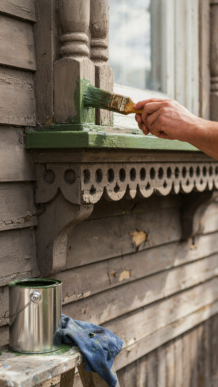
You want to know which colors to paint your Victorian house because you’re afraid of picking wrong and telegraphing that you don’t belong in the neighborhood. This is real. Paint color was a signaling system in the 19th century, and it still is. Think of it in terms borrowed from economics: color functioned as a positional good. Your neighbors could read your social standing before you opened the front door.

The Victorians inherited color theory from their predecessors but weaponized it. Deep, saturated hues required expensive pigments and skilled application. A house painted in rich burgundy, forest green, or slate blue announced that the owner could afford the labor and materials. Faded, thin colors meant either poverty or neglect. The paint job was an annual or biennial expense for the affluent. Most people couldn’t maintain it.
Affluence Encoded In Pigment
The common advice says “use authentic period colors.” That’s incomplete. The real mechanism: specific pigments were proxies for wealth because they literally cost more to produce and maintain. Deep exterior reds came from iron oxide sources that required processing. True greens demanded expensive copper compounds or complex mineral mixtures. These weren’t cheap.
Wealthy Victorians favored what we now call the “scheme colors”: deep greens (hunter, forest), burgundies, dark grays, and slate blues. A single coat of authentic Victorian green required labor hours most households couldn’t justify. The pigment alone signaled capital. When you see a well-preserved Victorian exterior in these tones today, you’re looking at what affluence looked like in 1880. The mechanism works the same now: saturated, deep colors require commitment and resources. They still communicate differently than pale shades.
The Pigment To Prestige Protocol: Engineering Perception
Where The Eye Lands First
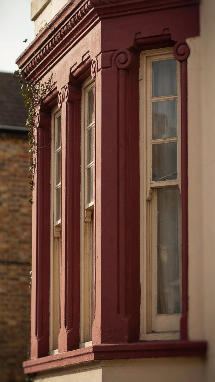
You want people to notice your house before they notice anyone else’s. That’s the mechanism at work here. Color placement operates like visual hierarchy in graphic design: you control what the brain processes first, second, and third. Most homeowners spray the whole facade one color and wonder why it reads as flat. Victorians were built with articulation—trim, cornices, bay windows, porches. Your job is to weaponize that geometry with color contrast.

The hierarchy isn’t random. Paint the main walls a recessive color—deep greens, warm grays, muted burgundies—these were actual Victorian choices because they anchored the composition. Then place accent colors on elements that project: cornices, window frames, door surrounds, brackets. The contrast creates depth without adding square footage. This is optical manipulation. The house doesn’t get bigger. Your perception of it does.
Details That Command Attention
Architectural features aren’t decorative accidents on a Victorian. They’re the structure’s language. A dentil molding, a gable end, a wraparound porch column—these aren’t ornaments to downplay. They’re canvases. Paint them differently and they become focal points that organize the entire composition.
Here’s what actually works: choose a secondary color for trim that sits two to three shades lighter or darker than your body color. If your walls are forest green, your trim should be cream or ivory, not just “a lighter green.” The contrast has to read. Gable ends perform differently than siding trim because they’re vertical focal points. Paint them a third accent color—often a deeper or warmer tone—and they anchor the composition at the top. This isn’t about following rules. It’s about making features impossible to ignore.
Blue Victorian House: Beyond The Obvious Choice
The Real Cost Of Blue Paint On Old Homes
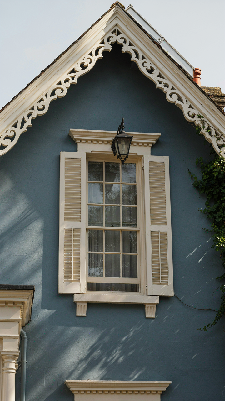
You want blue because you’ve seen it work on someone else’s Victorian, and you’re betting it transfers directly to yours. It doesn’t. The mechanism here is material context. Blue performs differently depending on what substrate sits underneath—whether you’re working with original clapboard, brick, or stone fundamentally changes how the color reads. Victorians built between 1837 and 1901 used blue selectively, not as a default choice. When blues appeared, they were typically deep, muted, and paired with specific trim strategies that most modern applications ignore entirely.

The mistake most homeowners make is treating Victorian blue like contemporary blue. Period homes used prussian blue, indigo, and slate blue derived from mineral pigments with natural transparency and depth. Modern latex blues are opaque and flat by design. This isn’t a subtle difference. A historically grounded blue on a Victorian creates visual hierarchy through shadow and dimension. A standard commercial blue sits on the surface like plastic. The fix requires either mineral-based paint formulations or acceptance that your blue will read as contemporary, not period.
When Blue Becomes Structural Rather Than Decorative
In economic terms, blue functions as either a signal or noise. Signal means it communicates something true about the house’s character and construction. Noise means it’s just there, taking up visual space without purpose. Victorian homes with substantial architectural detail—bracket corbels, corner boards, projecting eaves—can absorb blue because those elements create natural visual breaks and scale. Simple box-form Victorians with minimal ornamentation have nowhere to anchor a blue exterior. The color dominates instead of complementing, and the house reads smaller and flatter as a result.
The operational difference between a blue that elevates and one that merely exists comes down to trim strategy. Historical Victorians paired blue walls with cream, white, or buff trim that created contrast and defined architectural edges. When you skip this protocol—applying blue walls with minimal or matching trim—you eliminate the visual structure the color needs to function. Blue without contrast becomes background. Install cream-colored trim first, let it define the architectural narrative, then introduce blue as a secondary element that highlights rather than overwhelms.
Victorian Homes Exterior: The Dominance Hierarchy Of Tones
Where The Eye Lands First
You want people to notice your house before they notice the neighbors’. That’s the real reason you care about this. The mechanism is visual hierarchy—military strategy applied to color. In warfare, you concentrate force on the objective. In Victorian exteriors, you concentrate visual weight on what commands attention, then support it with subordinate tones that recede. The dominant color anchors the eye. Supporting colors confirm the hierarchy without competing for it.

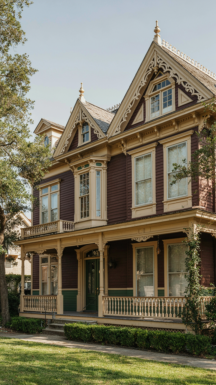
Victorians built this system into their homes intentionally. The main body color—typically deep earth tones like chocolate brown, forest green, or burgundy—occupied seventy to eighty percent of wall space. Trim, brackets, and cornices received lighter, contrasting colors that enhanced architectural detail without overwhelming the base. This wasn’t accidental. Builders understood that a chaotic color distribution destroyed a home’s visual authority. One color commanded. Others obeyed.
Contrast That Actually Registers
The common advice says “use complementary colors.” That’s incomplete and misses why contrast works. Contrast operates on value, not just hue. A light cream trim against a dark green body creates visual separation because of brightness difference, not because cream and green are opposite on the color wheel. This distinction changes everything about how you execute the strategy. High value contrast makes architectural elements pop. Low value contrast makes them disappear, regardless of hue relationship.
Victorian exteriors leveraged this ruthlessly. A deep burgundy base with cream or pale yellow trim didn’t just look good—it forced the trim to command visual attention through pure brightness. The eye tracked the light elements first because they demanded it. Darker secondary colors like deep forest green or slate on lower bands and details grounded the composition without competing. This created visual command and control. Pick your dominant color, then select trim that differs by at least four to five value steps on a ten-step scale for genuine visual separation.
Modern Victorian Exterior Color Schemes: A Calculated Subversion
When Historical Constraint Becomes Design Advantage
You want permission to paint your Victorian something bold without feeling like you’re destroying value. The mechanism is this: authenticity isn’t about replication, it’s about respecting the proportional logic that made the original work. Victorians used color hierarchy deliberately—dominant tones receded, accent colors drew the eye to architectural detail. Modern schemes that ignore this hierarchy feel wrong, even if the colors themselves are period-adjacent. The constraint is the strategy.

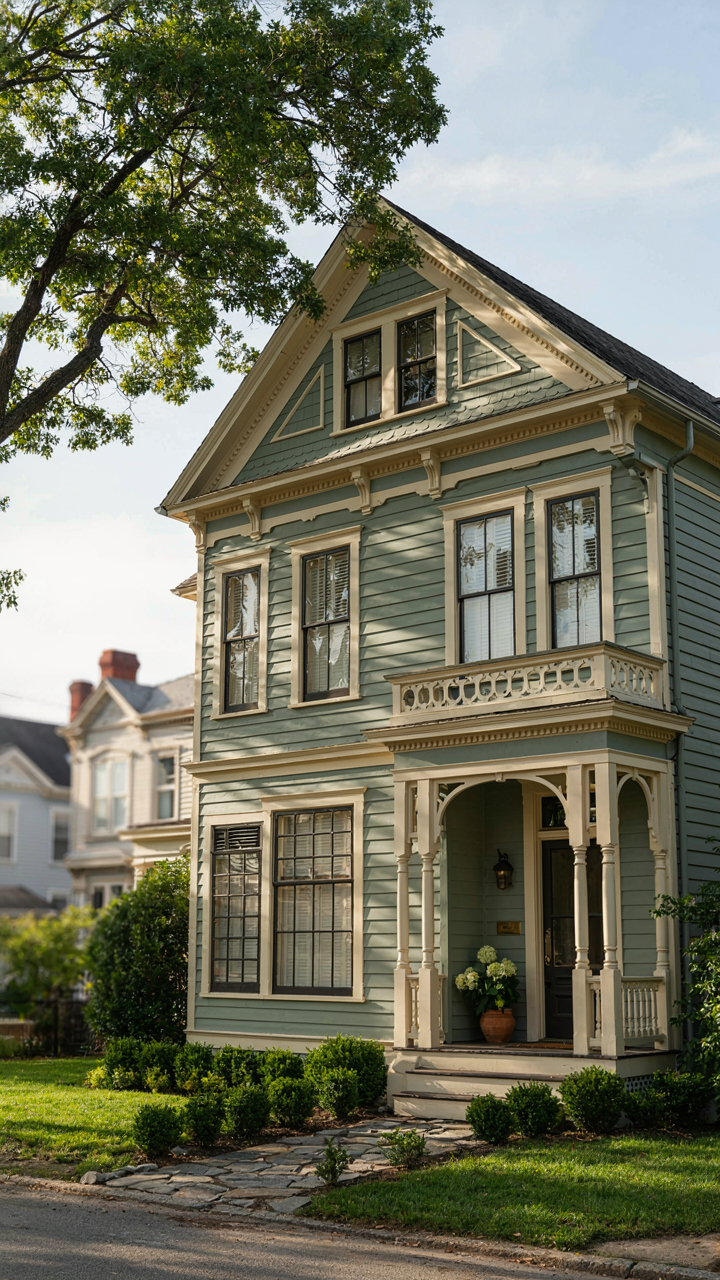
Integrating contemporary hues works because Victorians themselves operated within market limitations and regional availability, not some frozen aesthetic ideal. A muted sage or deep charcoal performs the same visual job as the original ochre or slate, provided you maintain the same depth relationship between base coat and trim. The real error isn’t choosing a non-period color. It’s abandoning the proportional thinking that made period colors work in the first place.
The Architecture Of Restraint
Paint strategy borrows from information design: signal-to-noise ratio determines whether a space reads as coherent or chaotic. Your Victorian’s exterior has three noise sources—body color, trim color, and accent color. Most modern attempts fail by treating each independently, creating visual static. The calculation requires keeping two of these muted while the third carries intent. This mirrors how original Victorians functioned.
- Body and Trim Separation: Use a 3-to-5-value contrast on the Munsell scale between primary siding and architectural trim. This reads as intentional, not accidental.
- Single Accent Zone: Restrict bold modern hues to one element—a door, gable trim, or window surround. Distributing color everywhere dilutes the effect.
- Depth Over Brightness: A deep contemporary tone reads more authentically than a bright one. Saturation matters more than hue when maintaining period coherence.
- Complementary Pairs from Period Palettes: Charcoal with cream, forest green with taupe, burgundy with pale gray. These combinations appeared in actual Victorian paint records and translate into modern schemes.
- Material Finish Consistency: Flat or chalky finishes on body color, semi-gloss on trim. The sheen differential creates hierarchy without requiring extreme color contrast.
Modern reverence means respecting the decision-making framework, not copying the exact output. When you understand why Victorians constrained their palettes, you know exactly which rules you can break and which ones anchor the entire composition. Paint the door a contemporary deep navy. Keep the body and trim conservative. The architecture sustains the integrity.
Victorian Exterior Color Schemes: The Profit Driven Palette
The Market Read On Color Choice
You care about this because you’re betting your money on a decision that feels invisible to you. Color choice determines perceived value before anyone tours the interior. Real estate pricing uses anchoring: the first visual impression sets the buyer’s mental offer price, and exterior color is the anchor.

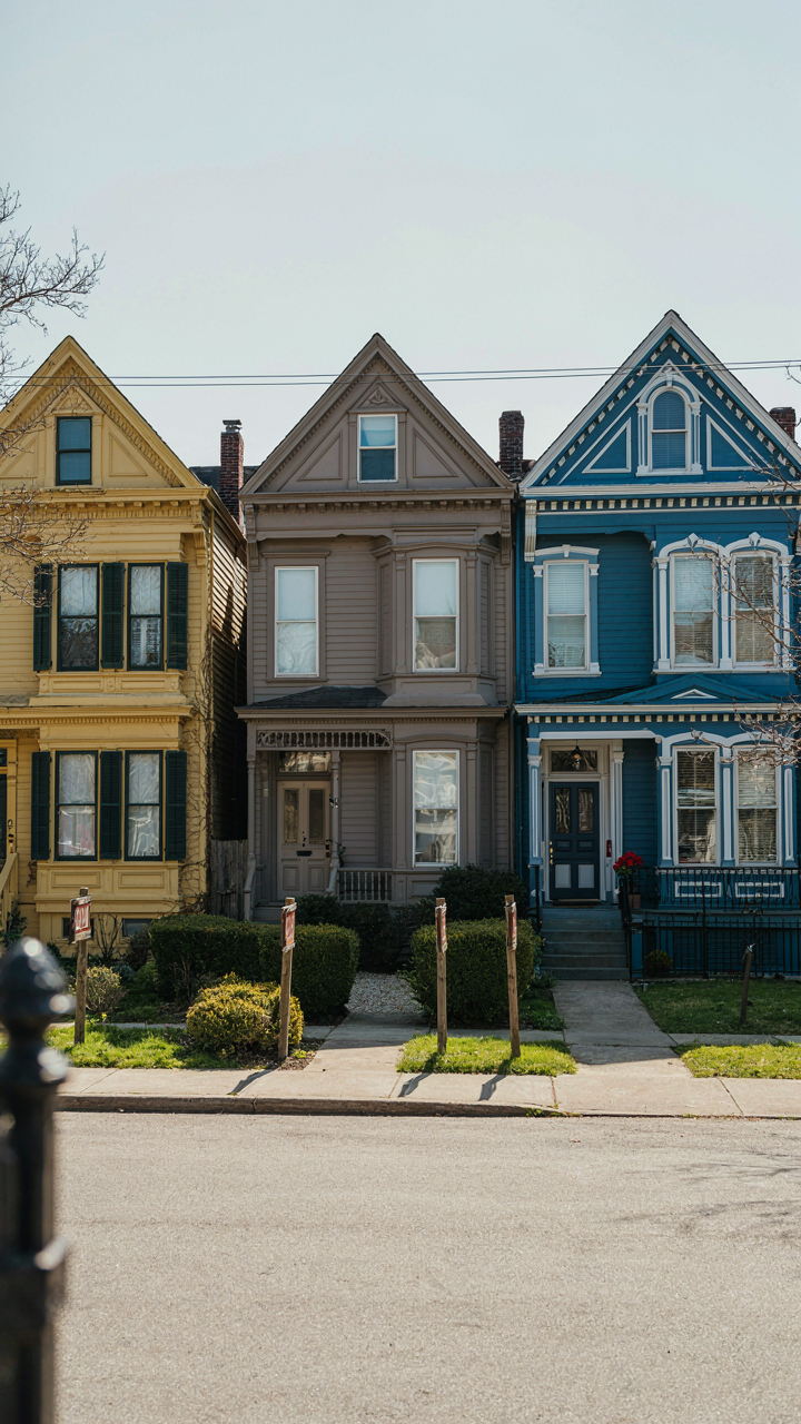
Victorian homes sit in a specific market segment. Buyers of these properties expect historical accuracy or deliberate deviation. Standard suburban beige reads as neglect on a Victorian. The mechanism is contrast sensitivity: your brain compares what it sees against category expectations. Match the expectations or justify the deviation with execution. Pick neither path and you’ve left equity on the table.
The Costly Color Mistakes Most Owners Make
The common advice is wrong: Victorian homes don’t need to be dark or muted. That’s lazy historicism. The real cost of bad color choice is buyer friction, which translates to price negotiation leverage moving against you.
Victorian exteriors used strong pigments because they had to. Lime based paints of the era didn’t hold pale shades well. Dark colors masked dirt and weathering. Modern paint technology changed the equation entirely. Pale colors now perform as well structurally as dark ones. Choosing dark because “Victorians were dark” wastes your house’s actual competitive advantage. Choose pale or jewel tones if they suit your specific architecture, accent materials, and neighborhood context. The decision must be intentional, not inherited. Before you select any palette, photograph three comparable sold homes in your area. Document their colors and final sale prices relative to asking price. This creates your local data set. Price reduction percentage reveals whether your color choice costs you negotiating position.
Victorian House Exterior Colors: The Antidote To Aesthetic Mediocrity
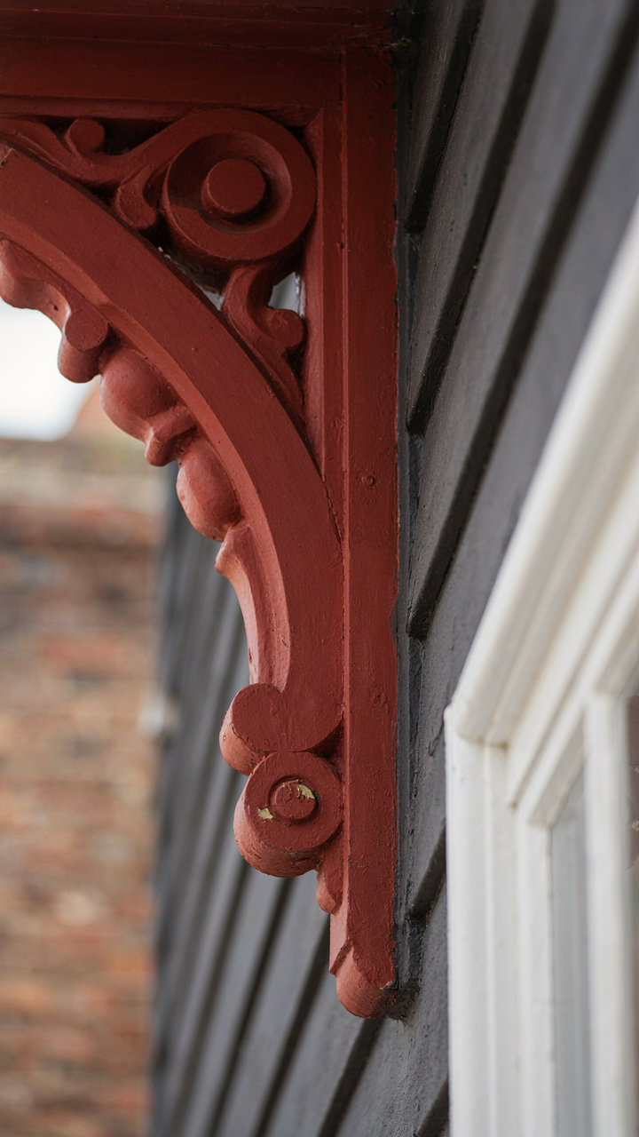
The Constraint That Breeds Distinction
You want your house to stand out without looking like you’re trying. That desire for effortless superiority is exactly why most people fail at Victorian color schemes. The mechanism is simple: constraint forces specificity. Victorian architecture inherited strict color hierarchies from the period’s material limitations and class signaling systems. You couldn’t just pick colors randomly in 1880. The palette was ruled by what pigments cost, what surfaces held paint, and what your neighbors would tolerate. That friction created coherence. When you ignore those constraints today and treat the palette like a decorative playground, you produce visual noise instead of presence.

The real play is understanding that Victorian color theory operated on depth and shadow, not brightness. Dark base colors anchored the structure. Mid-tones created definition on trim and architectural details. Accent colors appeared only on the highest or lowest points of visual hierarchy. This wasn’t aesthetic preference. It was physics applied to wood and plaster. Apply the same logic backward: start by mapping where light actually hits your facade at different times of day, then assign color intensity to those zones rather than treating every surface as equally important.
When Trends Become Camouflage
The conventional wisdom says paint your Victorian house in historically accurate colors. That’s incomplete advice that produces forgettable results. Historical accuracy is a constraint, not a strategy. Most Victorians built in your region used the same three base colors because material costs and fashion forced convergence. You’ll blend in perfectly while believing you’re authentic. The real differentiation happens when you know the rules well enough to apply them selectively rather than mimicking a museum piece. Curb appeal isn’t restoration. It’s strategic emphasis.
The mechanism is contrast hierarchy. Your eye lands first on whatever deviates most from expectation within a coherent system. A deep charcoal body with cream trim reads as conventional Victorian. A deep charcoal body with a precisely chosen sage or terracotta accent on a secondary architectural feature reads as intentional. The color itself matters less than its placement and the restraint shown everywhere else. Execute this by identifying three distinct architectural zones on your facade, assigning a base color to the largest zone, a supporting tone to mid-level details, and reserving your accent color for one architectural feature that catches morning or afternoon light. Nothing else changes.
Your Greatest Obstacle Isn’t Color Choice; It’s The Fear Of Being Truly Distinct
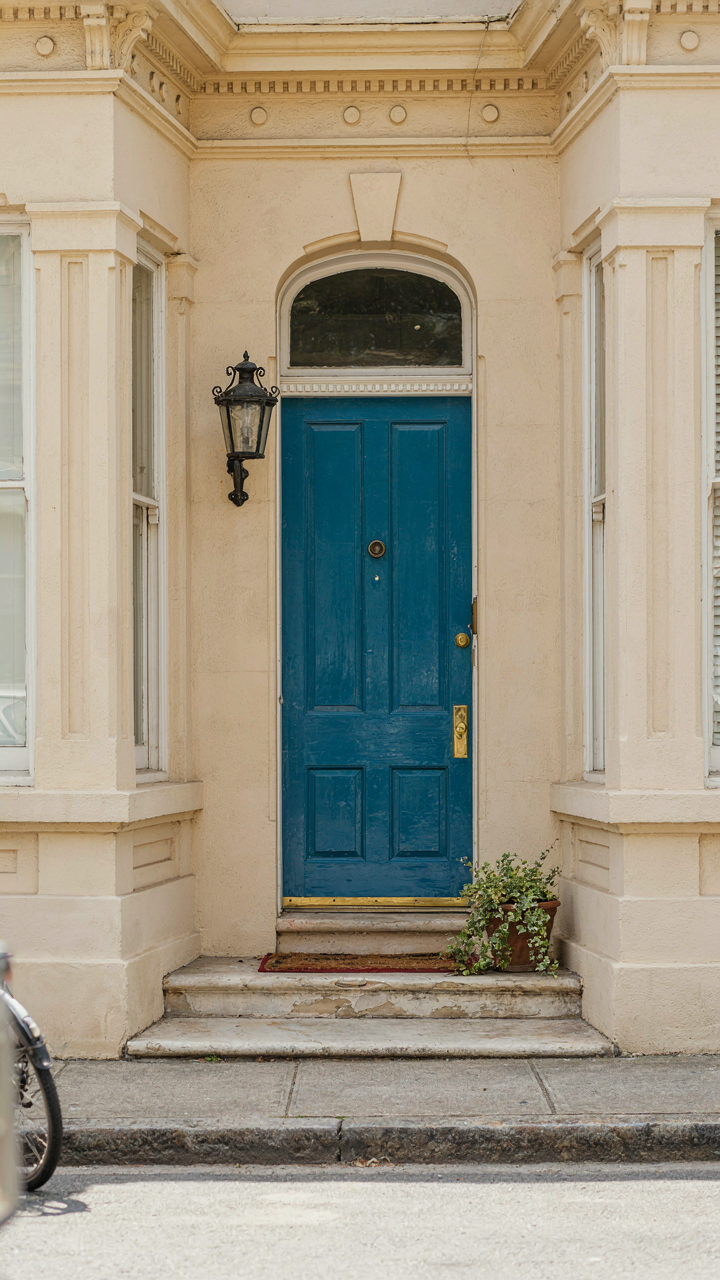
Most people paint their Victorian houses the safe colors. Grays. Creams. The colors everyone else chose. They call it “timeless.” It’s actually just cowardice wearing a fancy hat. Your house doesn’t need to match the neighborhood. It needs to match your vision. Pick one color that makes you uncomfortable. The one that feels too bold. Paint your front door that color this week. Stop asking for permission from people who don’t live in your house.