
The Myth Of More: Why “Rich Layered Style” Is A Lie
Victorian Excess Isn’t Required
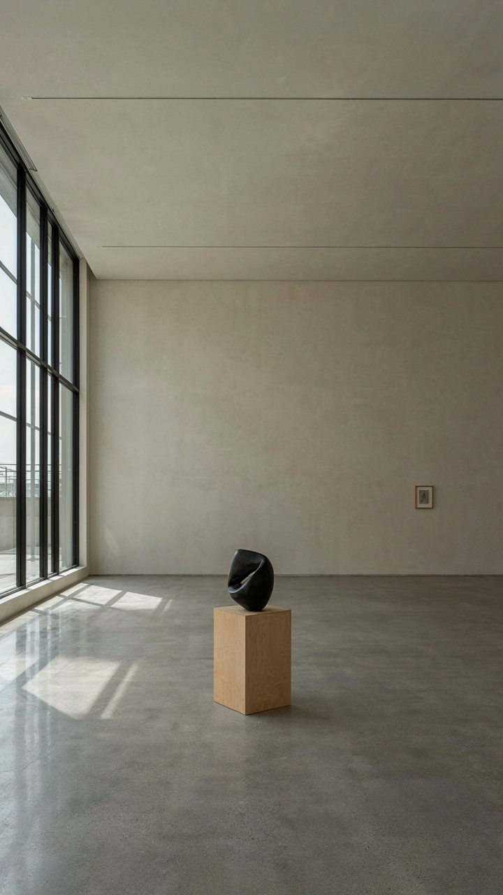
You want permission to buy more things without feeling guilty about it. Here’s the mechanism: the Victorians didn’t actually fill every surface because they had good taste—they filled surfaces because manufacturing exploded and showing wealth meant displaying acquisition. The aesthetic you’re after doesn’t require replicating their consumption habits. Authentic Victorian rooms had restraint baked in. They layered meaning, not inventory.
The common advice tells you to “add more texture and pattern everywhere.” That’s backwards. Early Victorian interiors, particularly from the 1850s through 1870s, operated on a clear hierarchy: one dominant fabric per room, accent pieces chosen for visual weight, and negative space as a design tool. Mass production came later and diluted the standard. You’re not recreating the era by drowning your room in objects. You’re recreating the era by understanding why each object belonged there.
Curated Depth Beats Accumulated Clutter
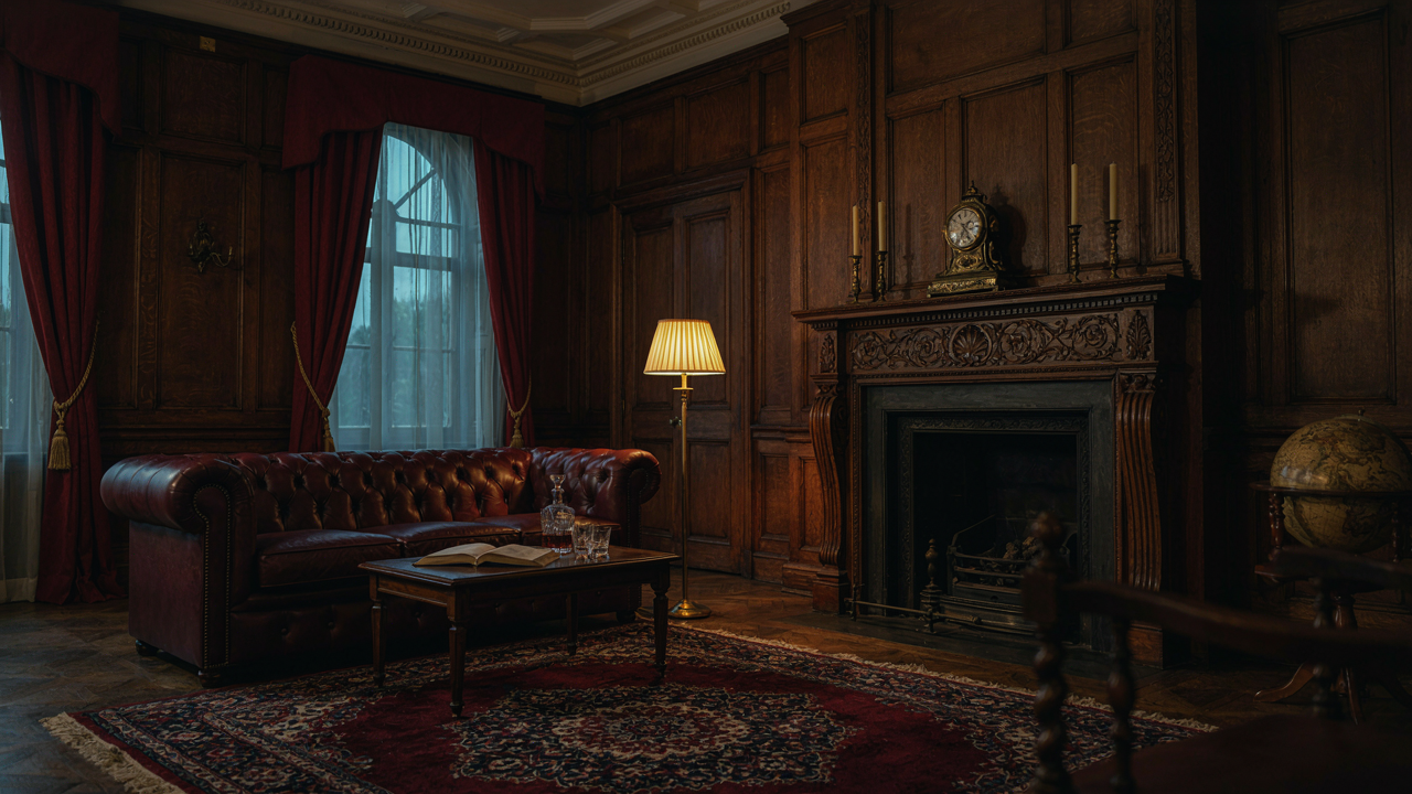
Clutter is what happens when you mistake quantity for personality. Depth happens when each layer serves a function or creates contrast. Think of it like signal-to-noise ratio in communication: every element either amplifies the message or weakens it. In a Victorian living room, depth comes from material variance, scale differences, and intentional color blocking, not from fitting more stuff into the space.
A curated room has three to five anchor pieces. A layered room adds supporting textures in precise positions: a rug over wood flooring, a throw across a chair arm, wall panels that break up monotone paint. The difference is deliberate exclusion. You’re saying no to 90 percent of what you see so the 10 percent you keep actually registers. Start by identifying what stays. Everything else is noise being mistaken for style.
Victorian Home Decor Modern Living Room: The Integration Delusion
When Eras Actually Clash
You want permission to break the rules without looking broke. That’s the real driver here. The mechanism is contrast: Victorian rooms worked because every element reinforced a single visual hierarchy. Mix in modern pieces and you either create intentional tension that reads as design, or you create confusion that reads as compromise. There’s no middle ground, no “blend.” Either the juxtaposition matters or it doesn’t.

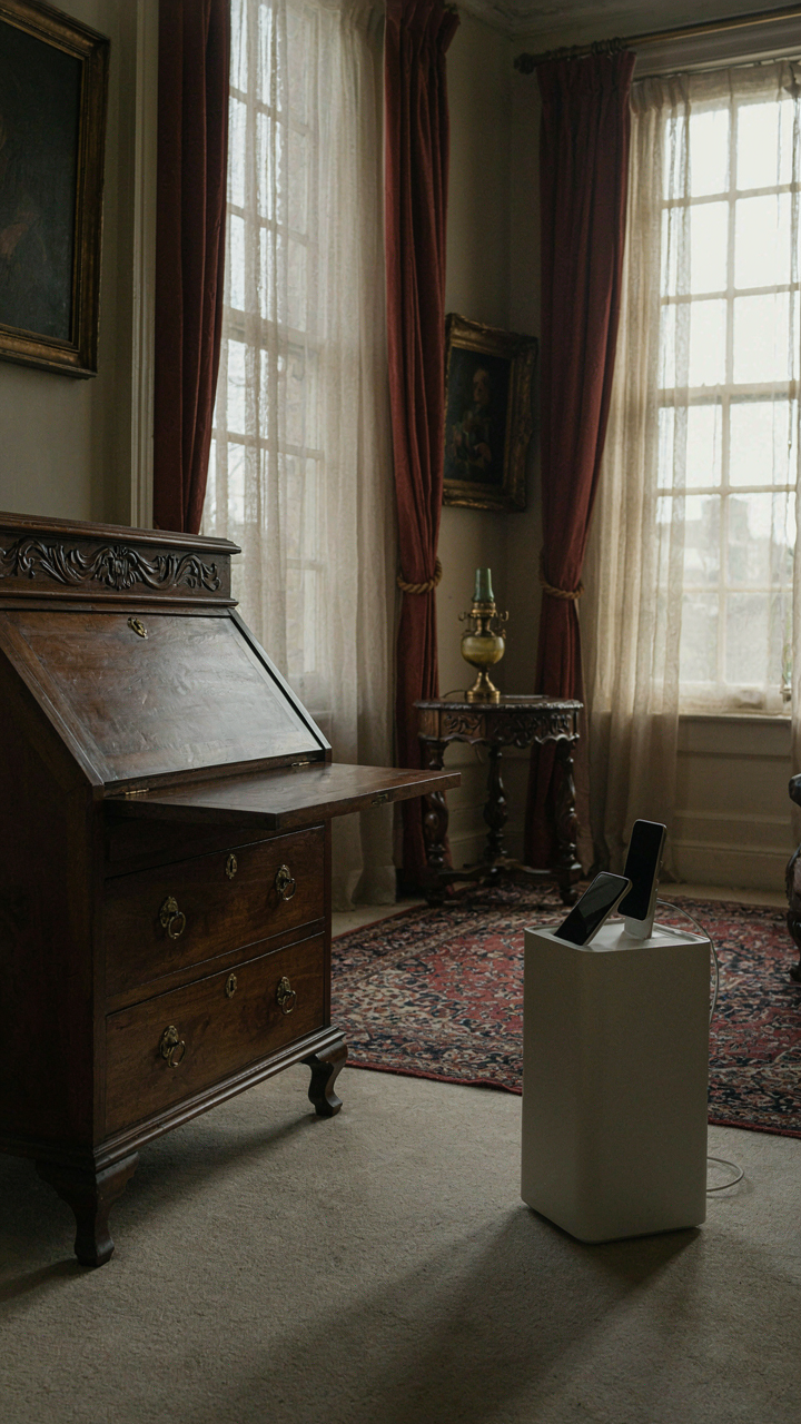
Victorian interiors operated on visual weight and material specificity. A mahogany secretary desk commanded a corner because its mass and finish were deliberate choices within that taxonomy. Drop a minimalist console table next to it and you’ve introduced a competing language. The room notices. Visitors notice. Your eye can’t settle because the rules changed mid-sentence. Own that conflict or eliminate it—but stop pretending fusion happens naturally.
Function Without Apology
Modern life demands outlets, storage that closes, seating that doesn’t require a chiropractor. The common advice says “hide your technology” or “find Victorian-looking solutions.” Wrong. Victorian rooms didn’t have those problems, so retrofitting them with camouflage wastes both the historical authenticity and the modern utility. Instead, place modern utility visibly but in its own zone.
A media console doesn’t belong against a Victorian fireplace wall. It belongs on the opposite side of the room, acknowledged as a separate system. Similarly, outlet placement and charging stations should cluster away from heritage furniture groupings. This isn’t about concealment—it’s about zoning. You’re creating two functional languages within the same room, each operating at full strength in its own area. The Victorian seating arrangement handles conversation. The modern zone handles information and entertainment. Both work because they don’t pretend to be the same thing.
The Echo Chamber Effect: Escaping Generic Victorian House Design Interiors
What Everyone Gets Wrong About Victorian Rooms
You want a Victorian room because it signals taste and history. That’s the real reason you’re here, not because you love gas lamps. The problem: most people copy the same five design moves they saw online, creating rooms that look like they came from the same catalog. Think of Victorian design like an immune system—the moment a style becomes popular, the market floods it with antibodies that dilute the original signal until nothing distinctive remains.

The actual Victorian living room was not one thing. It changed dramatically between 1837 and 1901. Early Victorian rooms favored darker woods and symmetry. Mid-Victorian introduced clutter and pattern layering. Late Victorian stripped some of that back and leaned into Art Nouveau influences. When you copy a “Victorian aesthetic” without knowing which era you’re referencing, you end up with a confused room that borrows from all three periods at once. That’s the trap everyone falls into.
The Unfashionable Historical Details That Actually Work
Most design advice skips the genuinely useful Victorian references because they’re not photogenic or trendy. The Victorians solved real problems—they needed rooms that functioned through seasons without central heating, managed light in industrial cities, and accommodated multiple activities in one space. Their layering wasn’t decorative excess; it was strategic. A Rococo Revival chair placed near a window wasn’t random—it caught better light for reading and positioned the sitter away from drafts.
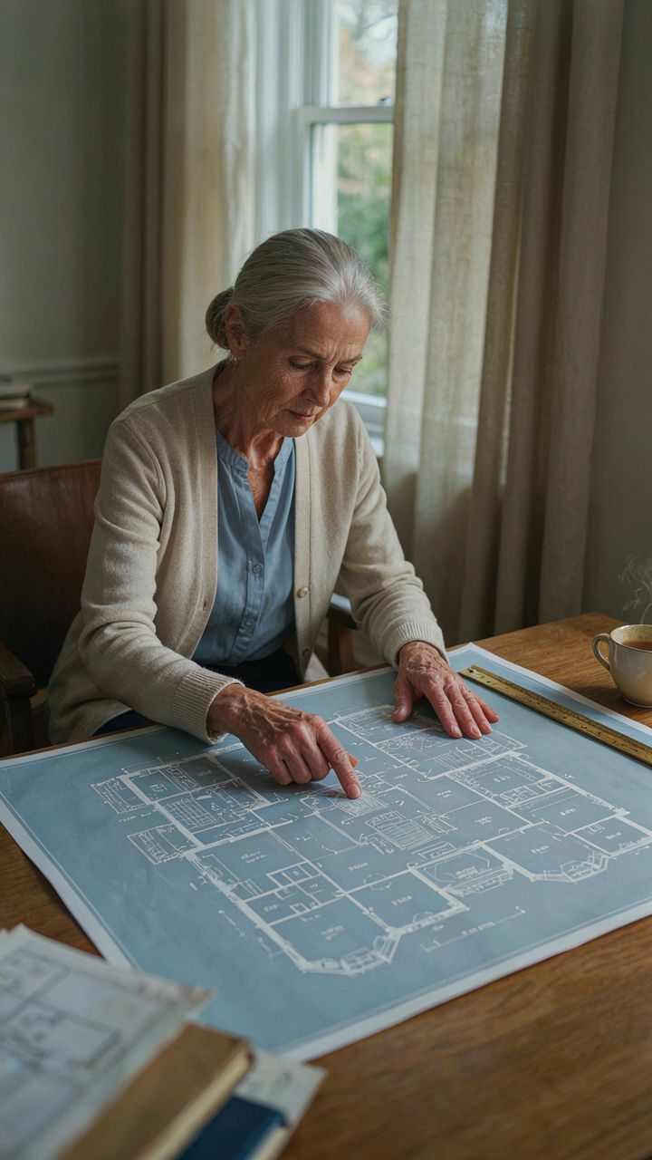
Pull from the specific domestic manuals that shaped actual Victorian rooms: The Art of Decorating Modern Homes by Wharton and Codman (1897) prioritized proportion and room flow over pattern saturation. Household management texts from the 1880s reveal why Victorians arranged seating in conversation clusters facing each other rather than toward a focal point. Study floor plans from actual Victorian homes instead of modern recreations. The mechanism is simple: find what solved a real functional need in the Victorian period, then apply that logic to your space. Your room will feel authentic because the thinking behind it is authentic.
Minimalist Victorian: The Oxymoron That Isn’t
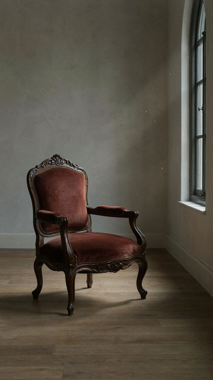
Restraint As A Design Decision
You want permission to strip down Victorian without feeling like you’re betraying the style, because you’re afraid emptiness looks cheap. The mechanism is this: Victorian design didn’t fail because it was ornate. It failed when people added ornament without structural logic. Real restraint means removing everything that doesn’t anchor the room’s focal point or serve the material it occupies.

The Victorians themselves understood editing. They didn’t fill every wall. A parlor had one dominant piece—a mantelpiece, a bay window, a heavily upholstered sofa—and everything else supported it through scale and void. Minimalist Victorian isn’t fewer objects. It’s fewer objects that don’t belong to the composition you’re building.
Material Density Over Object Count
Common advice says “pick fewer pieces.” That’s incomplete. The real variable is material substance. One heavy mahogany chair with hand-carved details and original upholstery does more work than six lighter reproduction pieces. Victorian spaces read as Victorian through material commitment, not through quantity of items filling square footage.
Select pieces with visible grain, hand-applied finishes, or construction methods that show age and craft. A single brass-trimmed secretary desk with dovetailed drawers anchors a room harder than three decorative side tables. The density of one quality object—its weight, its finish, its provenance—creates the visual richness that makes restraint feel intentional rather than incomplete.
Victorian Modern Homes: The Unseen Structure

Load Bearing Walls And Your Layout
You want a Victorian living room that feels expensive without looking like a museum, but you’re afraid of breaking something structural that costs forty grand to fix. Here’s the mechanism: Victorian homes built their walls to carry weight, not to be moved. Load-bearing walls run perpendicular to floor joists—they’re the skeleton holding the house up, not decorative dividers you can demolish for an open concept.

Most Victorian structures use brick or stone outer walls with interior timber framing. The walls that matter sit directly above the foundation and support the floor above them. Before you touch any wall, a structural engineer reads the framing pattern, not your Pinterest board. The layout you inherit isn’t a design choice—it’s an engineering reality that determines whether your living room renovation costs five thousand or fifty.
Wall Thickness And Load Path Transfer
Structural engineering teaches us that force flows downward along the shortest path. A Victorian living room’s walls aren’t uniform thickness by accident—thicker walls exist where the load concentrates. Outer walls run 14 to 18 inches thick. Interior walls typically measure 6 to 8 inches. The difference isn’t about aesthetics; it’s about how much weight each wall carries down to the foundation.
When you adapt a Victorian living room for modern function, you’re not just choosing where furniture goes. You’re respecting load paths that existed before you were born. Remove an interior wall without support beams, and the floor above sags. Install a modern fireplace in a spot that doesn’t align with the original structure, and you’re adding dead weight to joists that already strain. Every modification travels downward through existing wood and masonry into the ground.
The “Old Sitting Room” Paradox: Function Over Fantasy
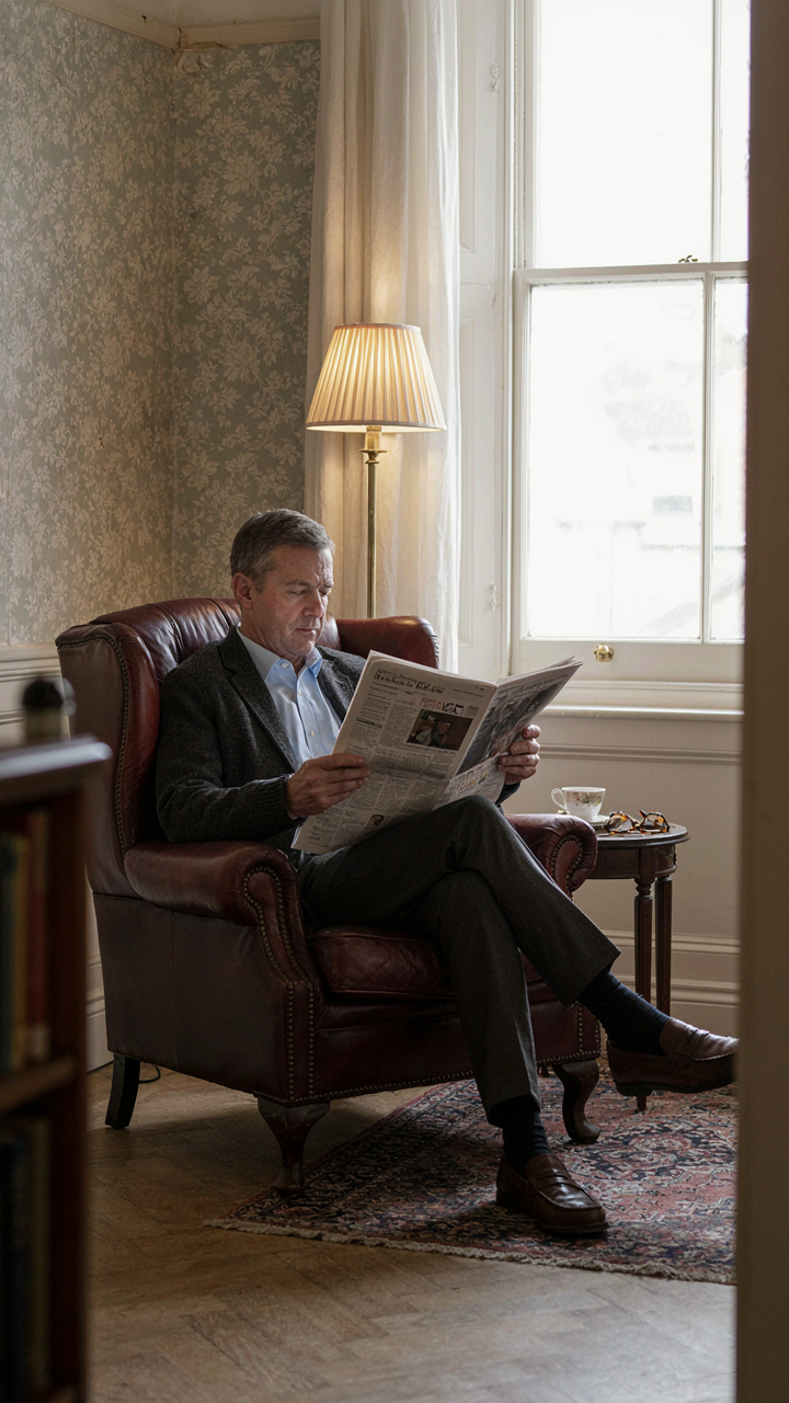
Why The Victorian Sitting Room Actually Mattered
You want to recreate Victorian aesthetics without understanding why Victorians built these rooms in the first place, which means you’ll end up with costume theater instead of functional space. The Victorian sitting room wasn’t a showpiece for guests. It was a segregated social container where specific behaviors happened under controlled conditions. Men conducted business or read alone. Women managed domestic life, needlework, and correspondence. The room enforced separation by function and by gender. This architectural segregation was the entire point.

The sitting room emerged because Victorian homes grew large enough to require specialized zones. Unlike medieval or Georgian homes where rooms served multiple purposes, the industrial wealth of the 1800s allowed families to dedicate entire rooms to single functions. A sitting room wasn’t a bedroom, a dining room, or a parlor. It occupied its own zone in the house plan, usually on the main floor away from servants’ quarters. The furniture, lighting, and acoustic properties all reflected this functional specificity. When you ignore this layer, you’re just decorating.
Translating Function Into Your Space
The mistake most people make is thinking Victorian sitting rooms work in modern homes because they look nice together. They don’t. Modern living demands speed and flexibility. Victorian rooms demanded stillness and compartmentalization. You can’t copy the aesthetic without understanding the functional skeleton underneath, so stop trying to retrofit 1800s social codes into 2024 life.
Start by identifying what your sitting room actually needs to do. Reading without interruption. Conversation with intent. Focused work. Pick no more than three functions. Victorian rooms succeeded because they excluded competing activities through design, not decoration. Use furniture placement to create acoustic separation from main living areas. Choose lighting that supports reading without creating glare on screens. Select seating that holds its position for hours without requiring adjustment. The layered aesthetic Victorians achieved came from supporting function, not hiding it. Build the structure first. Add the velvet second.
Old Victorian Home Interior: Deconstructing Authenticity
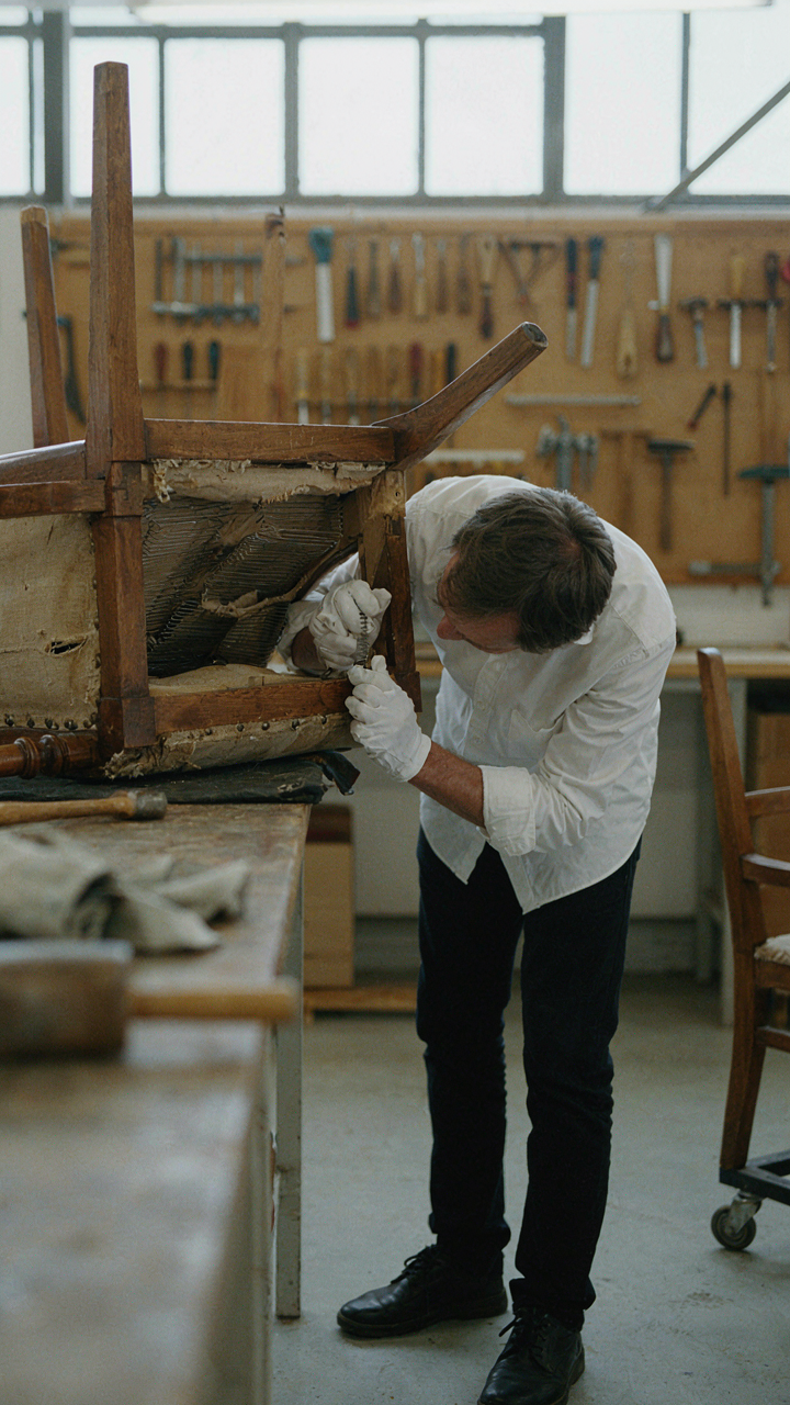
The Difference Between Period And Pastiche
You want people to know you didn’t just buy the look off a showroom floor. The real mechanism here is constraint. Authentic Victorian interiors operated under material and manufacturing limits that shaped every choice. Reproduction pieces ignore those limits entirely, which is how you spot them instantly.

A genuine Victorian living room from 1880 contains objects made before 1900. The wood grain patterns differ from modern stains. Upholstery shows hand-tied springs underneath, not sintered foam. Wallpaper came from hand-blocked or early mechanical printing, leaving slight irregularities modern production erased. The gap between authentic and fake isn’t aesthetic taste. It’s the presence or absence of period-appropriate production constraints baked into the object.
Sources That Prove Lineage
Start with auction catalogs and estate sales, not decorator shops. These force you to verify provenance or admit you’re guessing.
- Original Auction Houses: Christie’s and Sotheby’s Victorian catalogs document maker marks, construction methods, and acquisition history that retail vendors skip entirely.
- Regional Antique Dealers Specializing In Period Furniture: Single-focus dealers invest in authentication expertise and relationships with appraisers. They lose credibility instantly from misrepresentation.
- Museum Collection Records: The Met, V&A, and period house museums publish detailed object analysis including materials, techniques, and manufacturing locations online.
- Maker Documentation And Trade Catalogs: Original manufacturer catalogs from firms like Herter Brothers or Rococo Revival makers show exact specifications and options available during production years.
- Physical Inspection Reports From Professional Conservators: Conservators identify wood species, joinery methods, hardware manufacturing date, and finish composition. This report costs money but eliminates guesswork.
Verification takes time. That’s the entire point. If a piece moves too easily into your space without questions, it wasn’t made in an era that resisted easy answers.
The Victorian Interior Design Style: The Scarcity Principle
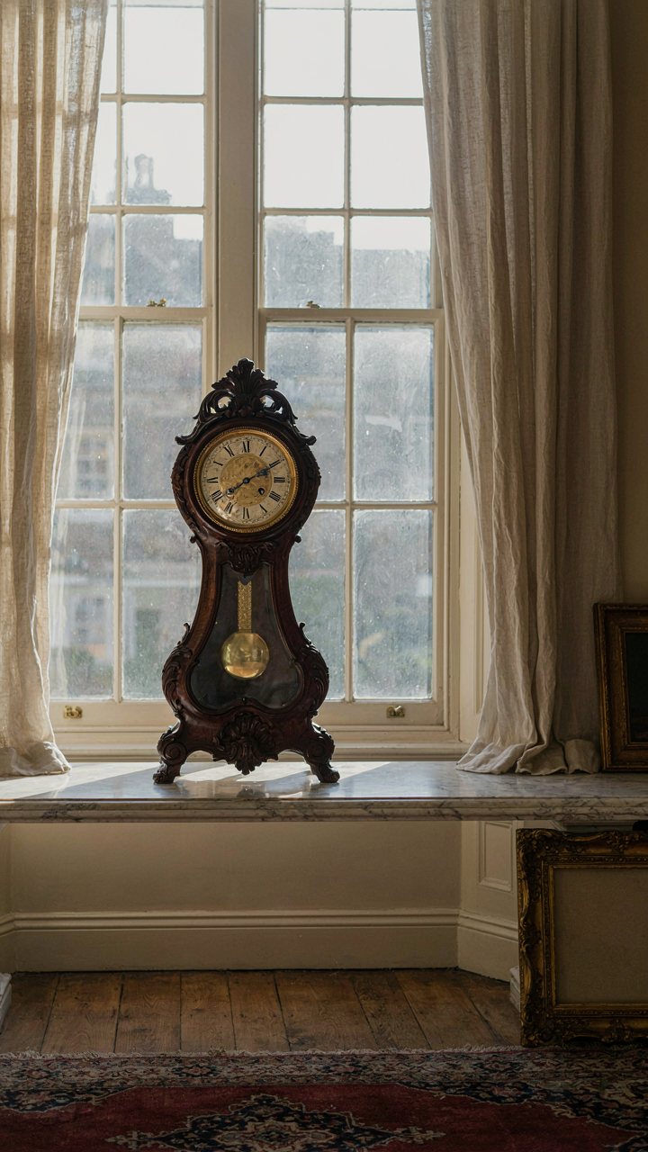
Why Empty Space Costs More Than Stuff
You want permission to buy less and feel sophisticated doing it. Here’s the mechanism: in economics, scarcity drives perceived value. Apply this to Victorian living rooms and the dynamic flips. The Victorians filled rooms because they could afford to display wealth through abundance. Today, restraint signals the opposite. A room with breathing room, with surfaces that don’t compete for attention, reads as expensive taste.

The common advice is backward. Design guides tell you to layer everything, treat the room like a cabinet of curiosities. That’s confusing abundance with abundance of choice. Victorian rooms were dense because mass production hadn’t yet democratized objects. Replicating that density today just reads as clutter. The real move is taking the Victorian proportion and subtracting the noise.
Invest In Fewer Pieces That Carry Weight
Curating fewer, higher-impact pieces means choosing objects that function as focal points rather than fillers. A single Chesterfield sofa with authentic Victorian frame and construction anchors the room. A carved marble fireplace surround. One statement mirror with an ornate Victorian frame. Three pieces can do what twelve used to require. The constraint forces intentionality.
The math works because your eye doesn’t scatter. When each object has real presence, the room gains coherence instead of visual fatigue. A Victorian room built on this principle demands investment in authenticity. Reproduction pieces work, but only if they’re executed at a level that justifies their placement. Stop buying objects to fill gaps. Start buying objects that eliminate the need for gaps.
The Victorian Living Room Aesthetic: Beyond Superficiality
What Actually Separates Real From Costume
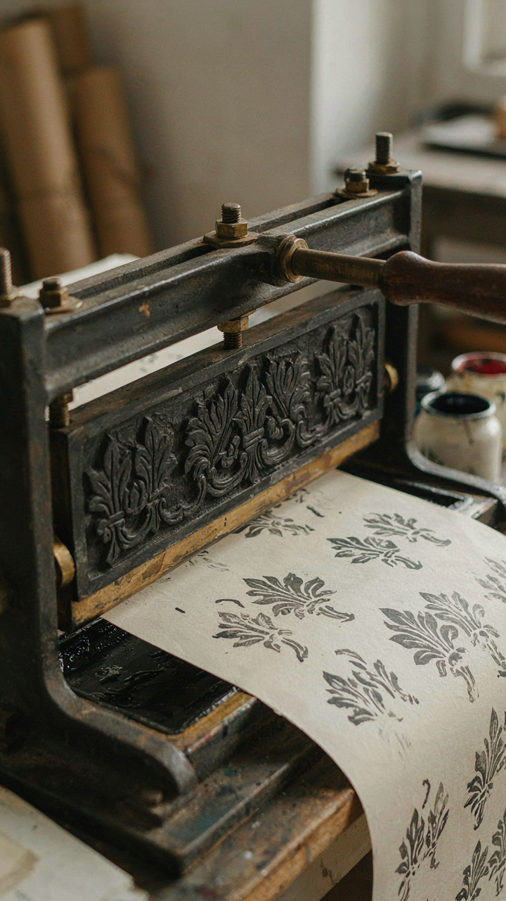
You want this section because you’re afraid your room will look like a theme park attraction instead of a considered space. The real mechanism is constraint. Victorian design worked because it operated within strict material and structural limits. Wallpaper came in specific patterns because printing technology was expensive. Furniture had carved details because that was cheaper than upholstery. Ornament wasn’t decoration—it was the structural language available.

Most people skip this and just buy velvet. They treat the aesthetic as a costume to apply. The actual work is understanding why Victorians made the choices they did, then building from those principles rather than the surface. Your room becomes coherent when you grasp the economic and technical reality that shaped the style, not when you accumulate objects that look Victorian.
Restraint Defines The Entire Period
Think of Victorian design like supply chain strategy. Scarcity forces elegance. The Victorians didn’t fill rooms with every ornament they could make—they chose what would survive the cost. A single piece of Axminster carpet dominated a floor not because they loved carpet but because it was a significant investment. Walls carried one paper pattern, not five competing aesthetics.
The common advice is to layer everything and create abundance. That’s backward. Restraint and deliberate selection built the actual Victorian living room. You commit to one wallpaper, one dominant textile, one focal furniture piece. Everything else supports that choice. The mechanism is hierarchy: one primary element, secondary supporting pieces, empty wall space that means something. Your room gains authority when you remove options, not add them.
The “Curated Chaos” Method For Your Victorian Living Room
Controlled Layering Beats Symmetrical Emptiness
You want permission to own more stuff without looking like you’re hiding behind clutter. Here’s the mechanism: Victorian interiors operated on visual density as a status signal. Empty walls meant poverty. Filled walls meant you could afford to collect. The shift happened because modern design—a 20th-century reaction—flipped the value. But Victorian depth still works because it creates friction for the eye. Movement through space beats stillness.
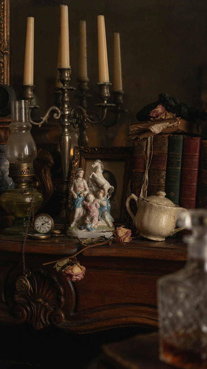
The common advice is to “balance” a room by spacing things evenly. That kills the point. Victorian rooms didn’t balance. They accumulated. A mantelpiece held 12 objects, not 3 symmetrical ones. A side table held a lamp, books, a small sculpture, and a tray. The rule: group objects in odd numbers, vary heights by 6 to 12 inches, and leave no visual resting point at eye level. Density signals abundance. Abundance signals resource control.
Saturation Without Sensory Collapse
The physics term is signal-to-noise ratio. In a Victorian room, the noise is the abundance. The signal is what you want seen. Your job is tuning the ratio so the eye finds hierarchy instead of chaos. Too much noise with no signal and you get visual fatigue. Too little noise and you’re back to modernist emptiness.
Fabric is your control mechanism. Use one dominant textile across multiple pieces—a burgundy damask on the sofa, the same damask as throw pillows, a smaller repeat on a side chair. This creates visual continuity underneath the layering. Color works differently than pattern. Limit your palette to three colors maximum, then let pattern and texture variations do the work. Wallpaper anchors the room. Heavy drapery anchors the windows. Everything else hangs off those two anchors without competing for dominance.
The Real Obstacle To Timeless Design Isn’t A Lack Of Inspiration, But An Abundance Of Unexamined Assumptions

You already know what a Victorian living room looks like. That’s the problem. You’re designing from memory, not intention. Pull one piece from your space right now—that chair, that mirror, that color you’re “supposed” to use—and ask why it’s actually there. Most people can’t answer. They’re copying a feeling instead of building a room. Stop collecting Victorian aesthetics and start asking which elements solve your actual life. The difference between generic and timeless is the difference between following a formula and following a conviction.



