

Beyond Beige: Deconstructing The Colonial Living Room Myth

The Instagram Problem With Historical Authenticity
You want to believe your room is “colonial” because it signals taste and restraint to people who visit. The truth is simpler: most colonial living room advice online is theater, not history. People grab paint colors, add a mantel, hang a portrait, and call it done. They’re not recreating a colonial space. They’re applying a aesthetic filter over modern life and calling it period-accurate.
The actual colonial living room served brutal functional purposes. Families gathered there to manage heat from a single fireplace in winter. Furniture faced inward toward that fireplace, not outward for entertaining. Rooms were smaller, darker, colder. The aesthetic you see in design magazines removes all friction and replaces it with Instagram-ready surfaces. That’s not colonial. That’s what happens when you strip away the mechanism that made the original design necessary.
When Style Becomes Costume
The mechanism at work here is substitution, borrowed straight from theater. You’re substituting the appearance of restraint for actual constraint. A colonial home had to use heavy woods and simple joinery because those materials lasted and worked with available tools. A modern “colonial” room chooses those materials from thousands of options for the feeling they provide. One is necessity. One is nostalgia cosplay.
Most colonial room ideas skip the actual problem those spaces solved. That fireplace wasn’t decorative. It was survival. The trim work wasn’t aesthetic preference. It was structural reinforcement around hand-sawn joinery that needed visible support. When you copy the visual without understanding the why, you end up with a curated fiction that feels hollow once you see it clearly. The concrete step forward is this: before you choose a colonial element, understand what problem it originally solved that your modern room still has.
The Axiom Of Authenticity: Unearthing True Colonial Interior Design

Original Sources Beat Curated Feeds
You want to feel like you’re making a sophisticated choice, not a generic one. Here’s the mechanism: most people source colonial design from Instagram boards curated by decorators who prioritize visual appeal over historical accuracy. They strip context. Original colonial homes, documented through museum records, archaeological surveys, and period inventories, show you what colonists actually built and why. The difference isn’t subtle. A 1780s parlor inventory from Connecticut reveals function first, aesthetics second. You see wool upholstery, pine frames, and sparse arrangement designed for heat efficiency and practical living. You don’t see the coordinated color palettes and symmetrical styling that modern design demands. Museums like Colonial Williamsburg and Old Sturbridge Village maintain records and room settings based on archaeological evidence and primary documents, not trend forecasting. Start there before touching Pinterest. The gap between what survived and what got romanticized will recalibrate your entire approach to the room.

Regional colonial styles emerged from climate, available materials, and trade routes, not aesthetic preference. A Massachusetts saltbox living room used different wood, plaster techniques, and proportions than a Charleston parlor because survival mattered more than style. Weather, timber availability, and local craftsmanship drove every decision. New England colonists worked with hardwoods and built tighter, lower ceilings to retain heat. The South favored higher ceilings and deeper porches for air flow. Mid-Atlantic homes split the difference. These weren’t design choices—they were survival solutions that later became regional signatures. Recognizing this distinction prevents you from mixing incompatible regional elements and building a room that signals “I assembled this from multiple design blogs” instead of “this reflects an actual place and time.”
Regional Styles Serve Different Climates
New England colonial living rooms prioritize heat retention and practical storage. Rooms were compact, fireplaces large and deep, walls heavily plastered and often whitewashed. Trim was simple, often just a baseboard and door surround in locally milled pine. Furniture clustered near the hearth. This wasn’t cozy aesthetic—it was necessity. Winters demanded concentrated warmth. Ceilings sat lower to trap heat. Windows stayed small to reduce cold infiltration. Every design choice answered a climate problem.
Southern colonial living spaces were built to manage heat and humidity. Ceilings ran ten to twelve feet tall, allowing hot air to rise and create natural ventilation. Rooms opened to porches and exterior spaces. Fireplaces served social function more than heating one. Trim was often more elaborate, reflecting both available materials like heart pine and the labor economics of plantation households. The formal parlor emerged as a defined room type in the South earlier than in the North, shaped by entertaining practices tied to agricultural wealth and enslaved labor that freed time for social display. Understanding this context prevents you from treating colonial design as timeless aesthetics when it was actually responsive building.
Mantels And Trim: The Architectural Grammar Of Colonial Style Interior

How Mantels Establish Visual Hierarchy
You want a mantel because it signals you understand proportion and restraint. That’s the real motive. The mechanism is simple: colonial mantels work because they obey the mathematics of the room itself. A mantel’s height, depth, and shelf thickness must correspond to the wall’s total dimensions and the fireplace opening below it. Builders in the 1700s didn’t overthink this. They measured the surround opening first, then scaled the mantel shelf to sit proportionally above it, usually between eight and sixteen inches deep depending on wall height.

The surround itself consists of two distinct zones: the fireplace opening and the frame around it. Colonial builders used a 1:1.5 ratio between the opening height and the surround’s vertical trim width. This wasn’t decoration. It was load-bearing geometry translated into visual rhythm. Your mantel shelf sits on this frame and must extend equally on both sides of the opening to feel stable, typically four to eight inches per side. Measure your fireplace opening width first, then design backward.
The Language Trim Profiles Actually Speak
Forget the idea that colonial trim is just decorative molding applied to walls. That’s wrong. Trim profiles controlled how light hit the surface and where your eye moved through the room. Molding in colonial interiors functioned as a visual grammar, similar to typography in graphic design where letterform weight directs reader attention through a page. A colonial room uses three to four distinct trim profiles working together: a deep cornice at the ceiling line, a running wall trim at chair rail height, a baseboard at the floor, and a mantel surround around the fireplace.
Each profile has a specific job. Cornice molding is deepest and catches overhead light to define the ceiling plane. Chair rail trim sits mid-wall and creates a horizontal pause that breaks up tall walls and anchors furniture placement. Baseboard trim grounds the room and hides the gap where walls meet floor. Mantel surround trim frames the focal point and uses the deepest profiles to capture attention. The profiles graduate in complexity from simple to ornate based on room importance. Your living room mantel uses the most elaborate profile; a bedroom uses simpler geometry. Select molding profiles by light behavior first, decoration second.
The Scarcity Principle: Curation In Your Colonial Design Interior

When Constraint Becomes Currency
You want permission to buy less because overfilled rooms feel chaotic, and you’re hoping design rules will justify your restraint. Economics calls this scarcity, and it works identically in your colonial living room: limited resources force deliberate allocation. Colonial homes were built before mass production. Furniture was expensive, space was divided by function, and every piece earned its place through utility or status. That constraint created the aesthetic. Modern colonial design that ignores this mechanism produces rooms that look staged rather than lived in, filled with colonial-adjacent objects that cancel each other out.

The mechanics are simple. When you remove choice, each remaining object gains weight. A single Windsor chair becomes noticeable. One mantel arrangement commands attention. A room with six carefully chosen pieces reads as intentional; the same room with twenty colonial-reproduction items reads as indecision disguised as decoration. Scarcity forces prioritization, and prioritization is what makes a room feel designed rather than accumulated.
Quality Density Over Quantity Spread
The common advice says buy fewer pieces but make them high quality, which is incomplete. You can own one expensive reproduction sofa and still wreck the room with ten cheap accessories. The real mechanism is this: intentional selection creates visual rhythm, while abundance creates noise. Colonial design relies on negative space and proportion. A mahogany table occupies visual real estate differently depending on what surrounds it. Empty wall space is not a problem waiting for a solution; it’s the backbone of the design.
Start by identifying the functional anchors: seating, the mantel, one focal point. Everything else is optional. Each additional piece must either serve function, echo proportion, or reinforce the colonial vocabulary through wood tone, hardware detail, or silhouette. If it does none of these, it dilutes the room. Your decision point is not whether something is beautiful in isolation; it’s whether it strengthens or weakens the relationship between what already exists. Remove one thing before adding another.
Modern Colonial Furniture: The Integration Imperative

When Old Bones Need New Blood
You want this to work because mixing eras feels safer than committing fully to either one, and it signals taste without the risk of looking dated. Here’s the mechanism: colonial interiors operate on proportion and restraint. The scale of furniture, the negative space, the relationship between pieces and walls—these follow rules. Contemporary furniture has different rules. It’s smaller, lower, often without legs. Drop a modern sectional into a colonial room and the visual weight collapses. Integration isn’t about matching styles. It’s about rhythm. You introduce contemporary pieces by respecting the colonial room’s spatial grammar: maintain sightlines, preserve wall prominence, keep furniture elevated and defined rather than grounded and sprawling.

The math is straightforward. Colonial rooms typically feature 10 to 12-foot ceilings, substantial trim at chair rail height (around 36 inches), and mantels that anchor walls vertically. Contemporary pieces work here only when they respect vertical emphasis and breathing room. A low modern sofa reads as visual clutter against detailed molding. A high-backed upholstered piece with legs and a defined footprint reads as intentional. The difference isn’t subtle. It determines whether the room feels curated or confused.
Legibility Over Matching
The common advice says blend by color palette or fabric. Wrong. You don’t need pieces to match aesthetically. You need them to read as deliberate choices within the colonial framework. A natural linen modern chair sits next to a colonial wingback not because they share a hue, but because both pieces claim distinct footprints and neither competes for visual authority. Legibility means each object occupies its own space without visual noise.
Colonial rooms encode hierarchy through placement and scale. The mantel dominates. Seating arranges around it. Contemporary furniture disrupts this only when it breaks the rule of thumb: every piece should either support the vertical axis or sit comfortably in secondary positions. A minimalist console table behind a sofa works because it doesn’t challenge the room’s vertical story. A sculptural modern accent chair works in a corner because it reads as an afterthought, not a rival focal point. Position first, then select pieces that honor their assigned weight.
The Patina Protocol: Cultivating A Colonial Inspired Living Room

Materials That Earn Their Character
You want your room to look expensive and established without admitting you just bought it all last month. That’s the real move here. Think in terms of biological succession: materials don’t age randomly, they follow predictable decay patterns. Wood darkens and softens. Metal oxidizes. Plaster develops micro-fractures. Colonial spaces worked because they used materials that visibly improved under use and time.
- Heart Pine Flooring: Darkens from honey to deep amber over decades as UV exposure accumulates. Modern heart pine replicates this density and grain structure authentic colonials possessed.
- Hand-Forged Iron Hardware: Develops rust patina naturally. Unlike modern electroplated hardware, wrought iron actually benefits from oxidation and use patterns.
- Plaster Walls: Develops fine cracks and settles unevenly, creating visual texture. Lime-based plaster (period-accurate) carbonates and hardens over time in ways drywall cannot.
- Reclaimed Brick: Already carries genuine aging patterns from prior structures. Each brick shows differential weathering from its original exposure.
- Aged Brass: Oxidizes from bright to dark brown or green patina. This transition happens consistently and signals material quality to anyone paying attention.

The mechanism is simple: use materials with inherent reactivity. Avoid anything manufactured to look old straight from the factory. Real aging is visible because the material responds to its environment differently over time. Paint a new board to look distressed and it reads as effort. Use actual heart pine and it reads as estate.
The Distress Problem
The common advice is to distress everything and call it authentic. That’s backwards. Most manufactured distress looks applied because it follows predictable patterns. Real wear is random, localized, and uneven. A colonial mantel shows damage at human contact points: where hands grip, where candles sat, where heat from the fireplace warped the finish unevenly.
Genuine wear reveals material layers. A colonial paint finish that’s actually aged shows wood grain coming through at edges because traffic abraded it away. Fake distressing just scratches a top layer. The difference is whether the damage tells a story of use or tells a story of someone trying too hard. Stick to materials that age authentically and let time or authentic use patterns do the work. Don’t sand edges down yourself.
Light And Shadow: The Unseen Elements Of A Living Room Colonial Style
Windows As The Primary Light Source
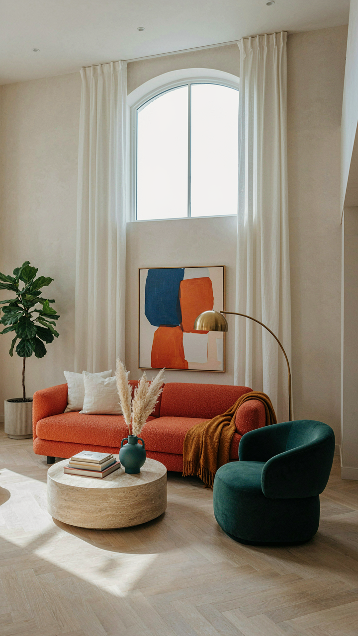
You want this room to feel authentic because authenticity signals taste and money. Here’s what actually matters: colonial homes had small windows by modern standards, and they weren’t positioned for even light distribution. Architects used physics then the same way we do now—candlelight and firelight cast directional shadows, creating depth perception that makes a room feel larger. Colonial living rooms exploited this constraint deliberately. The mechanism is asymmetrical illumination, not the flat, shadowless lighting we default to today.

Position your seating to catch natural light from one direction only. East or north-facing windows work best because they deliver consistent, non-glare illumination throughout the day. Avoid the temptation to install large picture windows or skylights—they destroy the period. Small, divided-pane windows held up by muntins create the shadow patterns that actually read as colonial. Place your primary seating perpendicular to the window, not facing it directly. This forces occupants to live with directional light, which is the entire point.
Firelight As The Dominant Evening Lighting
Most advice tells you to add recessed lighting or track lighting to a colonial room after dark. That’s wrong and it kills the style. Fire produces light that moves, dims, and concentrates in one zone—it’s not uniform. Colonial homes lived by this constraint for 200 years because they had no other option. You can replicate the behavioral pattern without pretending you live without electricity.
Install wall sconces flanking the mantel and position them to cast light downward and outward, mimicking how firelight would travel from a working hearth. Use 40 to 60 watt equivalent bulbs in warm color temperature, around 2700K. Keep ambient overhead lighting minimal or nonexistent after dark. Your eye should follow the light source to the mantel first, then secondarily to the rest of the room. This hierarchy of illumination determines where attention lands and how the space feels inhabited.
Architectural Inspiration Colonial Style: Beyond The Blueprint
Load Bearing Decisions Shape Room Layout
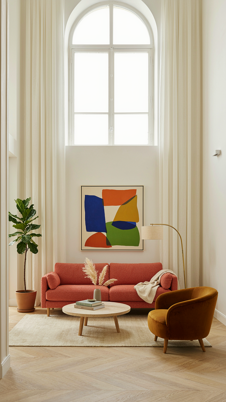
You want your space to feel intentional and expensive, so you’re looking for the secret formula. There isn’t one. What exists instead is structural logic: colonial builders didn’t place mantels and trim arbitrarily. They followed the load paths of the house itself. Think of it in engineering terms—load distribution determines where walls run, where support beams sit, and therefore where you can anchor permanent architectural elements. The mantel didn’t exist for decoration; it framed the hearth because the fireplace was the structural center of early colonial homes, bearing weight and heat. When you replicate this in a modern living room, you’re not copying aesthetics. You’re copying the mechanical reasoning that made the original design work.

The mantel’s placement, trim orientation, and wall paneling all trace back to where compression actually occurred in the original structure. Colonial joinery didn’t hide this logic—it displayed it. When you see substantial trim work and deep mantels in colonial interiors, you’re looking at functional elements doing real work, not applied decoration. Understanding this distinction changes how you proportion and position these elements in your own space. A mantel that looks right isn’t necessarily the one that matches a period photo. It’s the one that responds to your room’s actual proportions and where its architectural weight naturally falls.
Frame Permanence Into Every Transition
The common advice says to add trim and it will feel colonial. That’s incomplete. Real colonial interiors used trim as a load-transfer device between different materials and planes. Wall meets ceiling, wood meets plaster, room meets room—transitions needed structure, not just visual softening. The trim carried the eye and the eye carried the load. Board and batten, dado rail, crown molding, and base trim all served as transition zones where materials could move, settle, and age without cracking visible seams. This is why colonial trim runs thick and deep—it’s absorbing movement and stress, not sitting on the surface.
When you install colonial-style trim in a modern living room, treat each piece as an anchor point for visual and structural permanence. The crown molding doesn’t just meet the ceiling; it establishes where the upper wall ends and the ceiling plane begins, creating a clear hierarchy. The base trim grounds the wall to the floor plane with the same intention. Mantel shelves project from the wall with substantial brackets or corbels because they’re designed to take weight and deliver visual confidence that they won’t fail. Every trim element should feel load-bearing even if it isn’t—the visual weight must match the dimensional depth.
The Counter Intuitive Colonial Palette: Depth Over Brightness

Earth Tones Work Because Scarcity Shaped Them
You want your room to signal taste without announcing effort. Colonial palettes work because they’re rooted in material reality, not Instagram aesthetics. The pigments colonists used came from what the land provided: ochres, umbers, charcoal, iron oxide. These weren’t choices. They were constraints that became visual language.
- Ochre and Burnt Sienna: Iron oxide pigments that appear in colonial interiors across New England and the Mid-Atlantic. Warm, forgiving on walls, and historically accurate to the period’s dye sources.
- Deep Charcoal: Created from wood ash and charred bone, used for trim and architectural details. Reads as sophisticated weight without the starkness of pure black.
- Muted Clay Red: Found in colonial brick, plaster, and paint formulations. Creates visual continuity between exterior and interior without the artificial brightness of modern reds.
- Slate Gray: A cooler anchor tone that colonists achieved through slate dust mixed into lime wash. Balances warm earth tones and prevents the room from feeling monotonous.
- Cream and Off White Trim: Aged linen or tallow-based whites, not brilliant white. The slight yellow undertone mirrors how light actually aged pigments in period homes.

Depth beats brightness because depth sustains attention. Your eye doesn’t fatigue from resting on ochre. A rich charcoal mantel doesn’t demand explanation. These tones absorb light instead of reflecting it back at you, which is why colonial rooms feel inhabited rather than sterile. The mechanism is simple: depth creates psychological settlement.
The Problem With Designer Whites
Skip the advice that colonial rooms need “crisp whites” or “soft pastels” to feel period. That’s backwards. Those tones come from industrial paint chemistry and marketing. Colonial interiors didn’t have that luxury. Walls were limewash or distemper, which dried to matte, warm finishes that bear almost no resemblance to today’s white vinyl.
Predictable pastels fail because they signal indecision. A pale blue or dusty rose reads as safe, hedged, uncommitted. Colonial rooms that endure use color with conviction. Deep sage, warm gray, or terracotta on main walls forces you to commit. The mantel then becomes the visual anchor instead of competing for attention. This is intentional hierarchy, not accident.
The Real Obstacle Isn’t Finding Ideas; It’s Overcoming Your Fear Of Genuine, Unfiltered Expression
Most people slap colonial trim into a room because it’s “supposed to work,” not because it actually speaks to them. You’re scared to commit to what you actually want. Pick one element today, a mantel or crown molding style, that makes you feel something instead of nothing. Build everything else around that single honest choice. Your home won’t scream at you until you stop whispering what others want to hear.