
The Tyranny Of Identical Twins: Why Perfect Symmetry Kills Character
Visual Weight Beyond Measurement
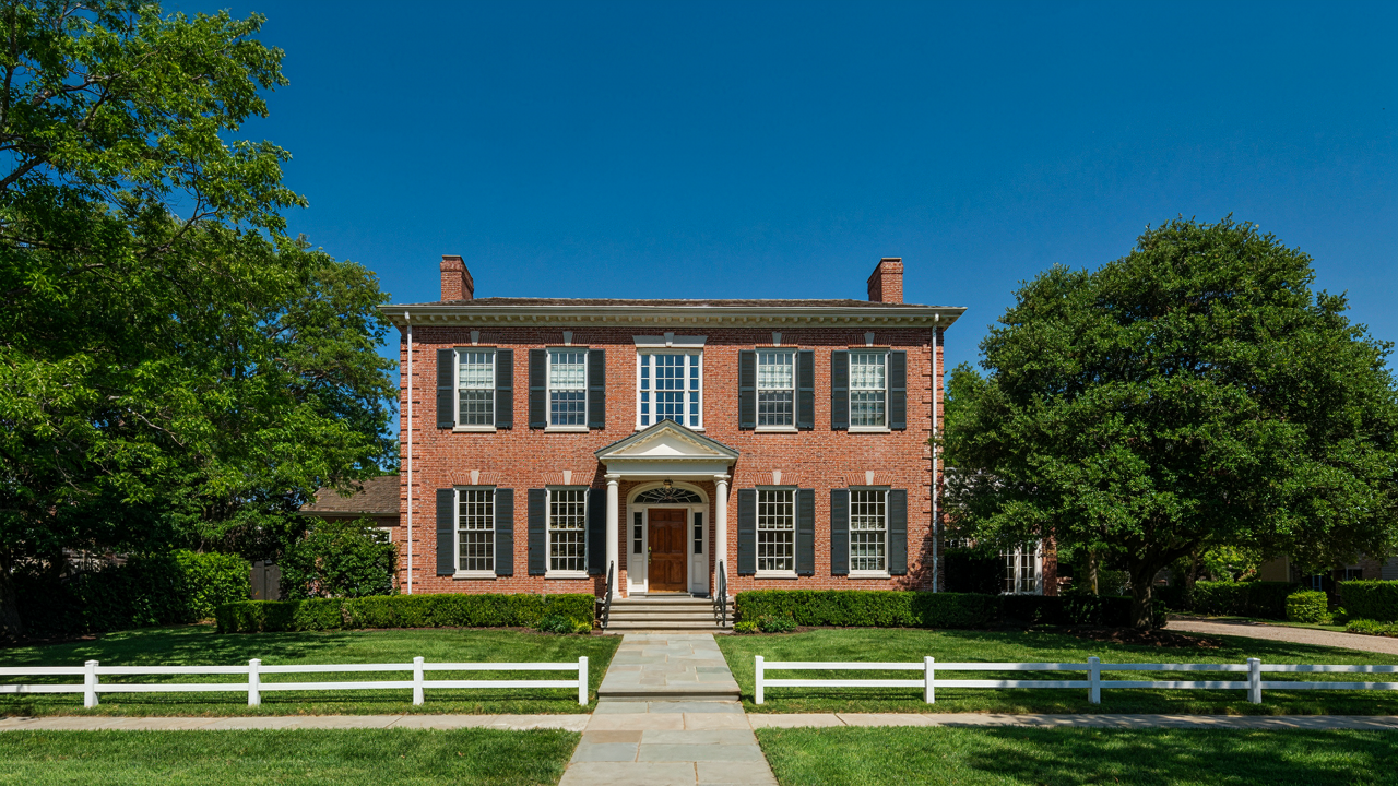
You want perfect symmetry because you think it signals control. It doesn’t. It signals fear of judgment. Here’s the actual mechanism: symmetry in federal architecture isn’t about mirror-image placement—it’s about visual weight distribution. A federal facade balances mass, not necessarily matching elements on both sides. The left and right halves should feel equally “heavy” to the eye, but heaviness comes from material density, window size, shadow depth, and proportion, not from identical repetition.
Classical architects knew this. They placed a heavy stone belt course at mid-level or ran a darker brick bond along one side to counterbalance a larger window cluster on the other. The human eye reads complexity and variation as intentional sophistication. A facade where the left side has five-over-five sash windows and decorative keystones while the right side mirrors it exactly reads as lazy, not balanced. When you copy-paste, you’re not creating balance—you’re creating boredom dressed as order.
Dynamic Interest Through Measured Imbalance
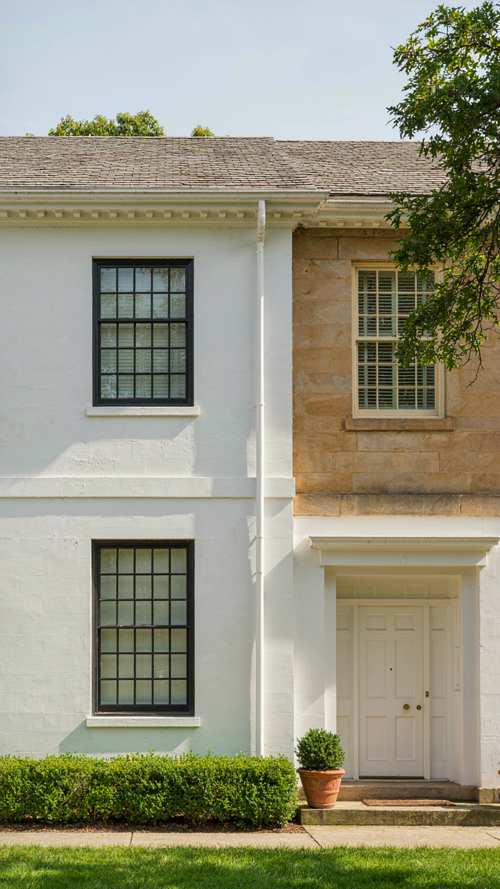
Subtle asymmetry works because it respects the viewer’s intelligence. Introduce it by varying window heights within the same orderly grid, offsetting the entrance door by one window module instead of centering it, or using masonry texture changes that don’t announce themselves. Federal style houses like those built in Baltimore and Philadelphia between 1780 and 1820 often show this—the front door slightly off-center, a side-light window of unequal size, or a single ornamental detail that breaks pattern without chaos.
The mechanism: your eye seeks pattern, finds it, then rewards you for spotting the deliberate break. This creates engagement instead of dismissal. Apply this by designing your facade on a grid, establish the symmetry, then remove or alter one deliberate element per section—one window size variation, one stone course break, one cornice detail asymmetry. Document why each break exists; it should solve a functional problem or respond to the site’s actual light or approach angle. This transforms a facade from regulation to architecture.
Deconstructing The Federal Architecture House: Unseen Angles Of Power

Symmetry Without The Mathematics Trap
You want to believe there’s a formula because formulas feel safe. There isn’t one. The golden ratio doesn’t drive federal house design, and architects never used it as their grid. Builders of the 1780-1820 period worked from symmetry as a principle, not a ratio—they balanced mass and void around a centerline because it communicated order and restraint. That’s the actual mechanism: visual weight distribution, not mathematical precision.

Federal facades succeed because both sides mirror each other across a vertical axis. The math works backward from that choice, not forward into it. A centered door, matching windows left and right, and equivalent rooflines create the effect. You apply symmetry first, then measure it. Trying to reverse-engineer golden ratio proportions into an existing federal facade wastes time and produces nothing but frustration.
Focal Points Operate Like Anchors, Not Distractions
Naval architecture teaches that weight concentration determines stability, and federal facade design borrows this principle: focal points anchor the entire composition. The front door isn’t decorative. It’s the load-bearing element of the visual structure. Everything else—windows, cornice detail, pediments—exists to direct the eye inward toward that entry point.
Mirrors and reflective surfaces are amateur moves. Real focal point manipulation means controlling what stops the eye first, then controlling where it travels next. A recessed doorway with sidelights pulls vision inward. A raised portico creates depth. A decorative surround frame establishes hierarchy. You don’t need symmetrical elements to bounce light around—you need purposeful placement that makes the viewer’s gaze move predictably through the composition.
The “Visual Gravity” Protocol For Federal Style

How Mass Gets Redistributed Optically
You want your house to look intentional, not accidental. Here’s what actually matters: federal style homes from the 1780s-1820s didn’t rely on symmetry alone to feel stable—they manipulated where the eye perceives weight to live. Think of it like load-bearing in structural engineering. In masonry, weight flows downward through the densest material. Visually, weight flows toward whatever the eye reads as “solid”—darker materials, denser patterns, heavier trim, lower placement. A federal façade that looks balanced isn’t balanced by accident; it’s balanced because elements redirect optical mass.

The simplest move: anchor visual weight at the basement level. Rusticated stone, darker brick, or heavy quoins at the corners signal structural foundation before your brain even processes it rationally. The entrance door—typically the visual focal point—sits above this base, which makes it read as supported rather than floating. Federal architects positioned the most ornamental elements (cornices, dentil molding, window pediments) higher up specifically because they’re lighter in visual mass. Repetitive elements distribute optical weight evenly across the façade, preventing the eye from settling on one unstable point.
Counterweight Through Strategic Placement
The amateur assumption is that balanced means identical on both sides. That’s not how federal style actually works. A federal façade distributes visual mass through contrast and interruption, not mirror imagery. One side might have a projecting pavilion or a deeper entry portico; the opposite side compensates with bolder window surrounds or heavier cornice detailing. The eye doesn’t count—it weighs. Different elements at different scales create equilibrium.
Chimneys work as counterbalances. A federal home with a prominent chimney on the left side gains optical stability because chimneys read as vertical anchors. The right side doesn’t need an identical chimney; it needs something that commands visual attention at comparable height and solidity—a bay window, a pedimented projection, or heavier trim work around the upper windows. Shutters, too, function as visual ballast. Painted wood shutters flanking windows add perceived thickness and weight. The protocol: identify which side of your façade feels optically heavier, then add contrasting elements to the lighter side that match in visual density, not in form.
Beyond Black Shutters: Color As A Counter Weight
What Color Actually Does To Balance
You want people to notice your house is intentional, not just a box someone painted beige. Color in Federal architecture functions like counterweight in mechanical systems—it redistributes visual mass to correct imbalance. The 1780-1820 Federal period leaned on symmetry, but symmetry alone reads as sterile without strategic color deployment. Builders understood this instinctively. They didn’t just slap black shutters on cream facades because it looked nice. They used color contrast to anchor focal points and prevent the eye from drifting into boredom.

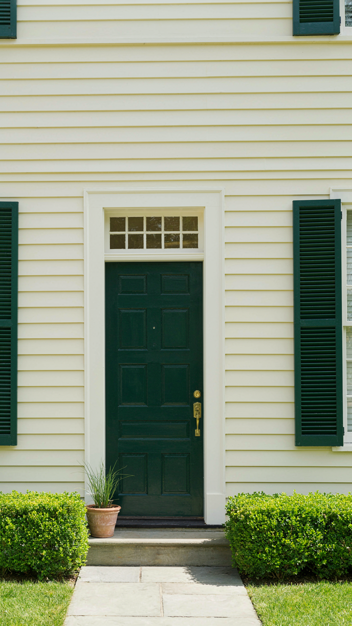
The standard advice—keep it muted, stick to period colors, stay safe—misses the real mechanism. Period homes weren’t uniform. Architects used deep greens, brick reds, ochres, and charcoals alongside whites and creams. The constraint wasn’t color range. It was coordination. Color worked as visual punctuation. A dark front door on a light facade doesn’t clash because it’s bold. It clarifies. It tells the viewer where the entry is. Without it, the facade becomes a flat plane. With it, the facade has structure.
Contrast Creates Hierarchy Without Fuss
Stop thinking of contrast as decoration. Think of it as information architecture. A Federal facade with balanced proportions needs visual anchors, or the viewer’s attention scatters. Doors, shutters, and trim trim provide those anchors through color separation, not ornament. The contrast does the work.
Deep-painted doors command attention because they advance toward the observer while light walls recede. This isn’t psychology—it’s optics. The eye lands on the darkest or most saturated element first. In Federal homes, this meant the entrance becomes the focal point without elaborate pediments or fussy details. Shutters flanking windows in contrasting tones create a frame effect. The eye reads grouped elements before individual ones. Consistent shutter color across the facade creates horizontal rhythm. This reduces visual chaos and emphasizes the geometry you already built into the proportions.
The Greek Revival Ghost: Mastering Historical Tension
When Federal Meets Classical Restraint
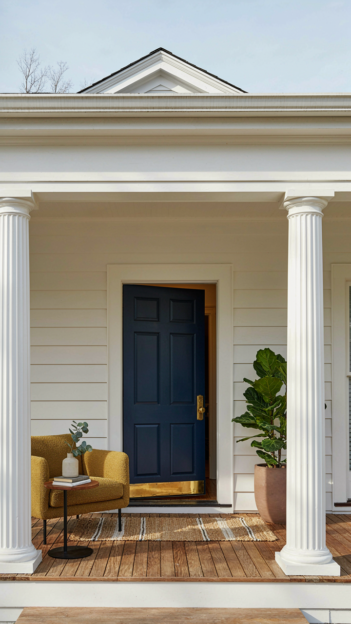
You want permission to break the rules without looking incompetent. That’s the real fear here. The mechanism at work is constraint itself. Federal style houses operate on proportional discipline, not ornament abundance. When Greek Revival elements enter the conversation, most designers panic and add both styles at full volume. The tension dissolves. What actually works is understanding that Federal architecture borrowed from classical sources already, just with measured restraint. Greek Revival amplified those borrowed elements but kept the same underlying logic of balance and order.

The difference is temperature, not direction. Federal uses classical proportion as the skeleton. Greek Revival turns that skeleton visible with bolder columns, steeper pediments, and heavier moldings. When you combine them authentically, you’re not mixing styles at all. You’re revealing the classical DNA that Federal architecture always contained, then deciding how loudly to voice it on your facade. This is why random eclectic mixing fails. You need one governing principle underneath both periods.
Copying The Grammar, Not The Vocabulary
Architecture operates like language. Federal style developed a grammar of rhythm and symmetry from ancient structures, but economics and taste shifted what words got used. Greek Revival took the same grammar and swapped vocabulary. Instead of delicate dentil molding, it used thick triglyph and metope patterns. Instead of shallow pilasters, it placed robust engaged columns. The structure and intent stayed identical. Most advice tells you to pick one style cleanly. That’s incomplete. What matters is matching the grammatical logic across your design moves, even when you adjust the visual weight.
When you see a Federal house with Greek Revival additions that works, the addition didn’t abandon Federal’s proportional grid. It honored the existing rhythm while increasing visual mass in ways the original building could absorb. This means measuring the existing bay widths, cornice heights, and window ratios before adding anything. Your new columns should sit within the visual weight already established by existing openings. The protocol is structural alignment first, then vocabulary selection. This prevents the diluted or chaotic appearance that kills most historical blending attempts.
The Brick Colonial Deception: Materiality Over Decoration
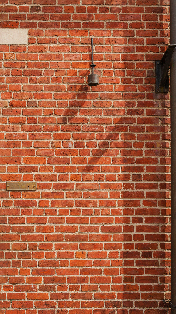
Surface Depth Without Ornament
You want brick because it reads as “real” and “established”—code for: you’re buying perceived permanence. Here’s what actually happens: brick’s tactile surface catches light differently than smooth materials, creating visual depth without moldings or applied trim. This is basic physics. A flat painted surface needs decoration to break monotony. Brick does that work through texture alone. Federal architecture exploited this by treating the facade as a material expression, not a canvas for carving.

The common mistake is treating brick as passive backdrop. It isn’t. Mortar joint depth, brick color variation, and face orientation all create shadow lines that shift throughout the day. A well-executed federal brick facade needs no applied ornament to feel substantial because the material itself generates visual interest. This is why federal homes read as balanced—the eye moves across real surface variation rather than getting caught on applied details.
Bonding Patterns That Signal Structure
The pattern you choose tells a lie about how the wall actually works, and buyers feel that lie subconsciously. Common bond, Flemish bond, and English bond aren’t decorative choices—they’re structural statements. Federal builders used Flemish bond on front facades because the alternating pattern of headers and stretchers creates horizontal visual rhythm without trim work. That rhythm makes a facade feel composed and intentional rather than stacked.
- Flemish Bond: Headers and stretchers alternate in each course. Creates strong horizontal lines and was the status choice for federal front facades in the Northeast from 1780-1820.
- Common Bond: Stretcher courses with periodic header courses. Structurally functional but reads as less refined. Interior walls and secondary facades used this to signal hierarchy.
- English Bond: Alternating full courses of headers and stretchers. Visually heavier than Flemish. Appeared on federal homes in maritime regions where brick was plentiful and cost didn’t restrict pattern choice.
- Brick Color Variation: Uneven firing created natural variation in colonial brick. Federal architects used this—darker headers against lighter stretchers amplified the bond pattern without added cost.
- Joint Width: Tight joints (less than a quarter inch) read as more refined. Wider joints accommodate settling and signal less precision—common in secondary facades or rural federal work.
The weight you perceive in a federal facade comes from pattern consistency, not from brick thickness. A well-executed Flemish bond creates visual stability because your eye follows the organized rhythm downward. Disrupted patterns—misaligned courses, random header placement—destroy that sense of balance faster than any other single factor. This is why old federal homes hold their presence through centuries while later reproductions feel uncertain.
The Federal Colonial House: Proportionality Is A Feeling, Not A Formula
Why Your Brain Craves Symmetry First
You want permission to stop second-guessing yourself. Symmetry in federal style houses works because human brains evolved to read faces and bodies. Facial recognition is hardwired. We scan for bilateral balance as a signal of health and stability. Federal architecture borrowed this biological mechanism directly. The centered door, matched windows, and symmetrical mass trigger the same neural pathway that made us trust other humans. You’re not being sentimental when balanced facades feel right. You’re being neurological.

Federal homes use this to their advantage by placing the strongest visual anchor—the entry—dead center. The fenestration mirrors left to right. The roofline sits stable and horizontal. Every element signals competence through bilateral repetition. This isn’t decoration. This is evolutionary shorthand saying the structure won’t collapse and the inhabitant isn’t unstable. The brain reads balance as trustworthiness in buildings the same way it reads it in faces.
The Rhythm Windows Create In Your Peripheral Vision
Most design advice tells you to space windows evenly. That’s incomplete. What actually matters is the interval—the distance between windows creates a visual beat your brain processes before you consciously see the facade. This is rhythm theory, borrowed from music and neurobiology. In federal homes, the rhythm is typically regular. One window, space, one window, space. The repetition becomes predictable. Predictability is what your cortex is scanning for.
Federal builders spaced windows using the facade width divided by the number of openings they needed. This produced natural intervals that felt inevitable, not calculated. A typical three-story federal home had five windows across the front, generating a rhythm your eye moves through without strain. Break that rhythm and the facade feels wrong before you name why. Install six windows in the same span and the spacing compresses. Your brain detects the broken meter instantly. Match the interval to the wall proportions and the windows disappear into the composition. The facade becomes one object instead of scattered holes.
The Illusion Of Authentic Federal House Design: Reclaiming Creative Control
Authenticity As A Trap
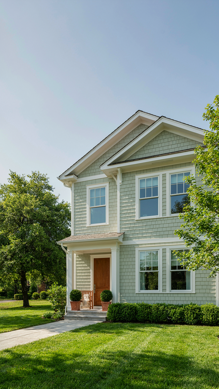
You want permission to break the rules without feeling like a fraud. That’s what historical accuracy sells you—cover. The mechanism is this: treating Federal style as a locked museum exhibit kills the energy that made it work in the first place. Federal homes from 1780 to 1820 weren’t built from rulebooks. Builders adapted proportions, materials, and details to what their region had, what clients could afford, and what looked good in their specific light.

The common advice is wrong. Architects and designers push “period-correct” details as the path to credibility, but that approach reverses cause and effect. What made Federal houses endure wasn’t rigid adherence to a formula—it was the underlying logic of balanced facades, restrained ornamentation, and honest proportion. Copy the formula and miss the principle. Miss the principle and your house reads as staged, not lived in.
Working Principles Over Period Details
Federal design rests on three operational truths that transcend its historical moment. First, balance through asymmetry—the facade doesn’t mirror itself, but the visual weight distributes evenly across the composition. Second, restraint amplifies impact. Third, details serve structure, not decoration. These aren’t rules you follow. They’re mechanisms you deploy.
Modern interpretations that work understand this distinction. A contemporary Federal-inspired house keeps the language of six-over-six windows and side-gable roof, but uses materials available now. You might use Hardie board instead of wood clapboard. You might simplify ornamental details because the scale of your site demands it. You might shift the proportions of the entry to match how people actually approach your front door. The house reads as Federal because it obeys the principles, not because it photographs like a restoration project. Your job is identifying which elements communicate the style’s intent and which are just historical habit.
The Facade Illusion: Your Obsession With Symmetry Masks Deeper Architectural Truths
You’ve been chasing balance like it’s the whole game. It’s not. Federal style houses seduce you with symmetry, but the real power lives in proportion, material hierarchy, and how light actually moves across your walls. Stop designing facades. Start designing experiences. Walk into three federal homes this week and feel where your eye naturally travels. You’ll realize symmetry is just the wrapper. The structure underneath is what actually arrests you.