
The Myth Of “Matching” Your Bungalow Exterior Colors
Generic Palettes Ignore Your Home’s Actual Structure
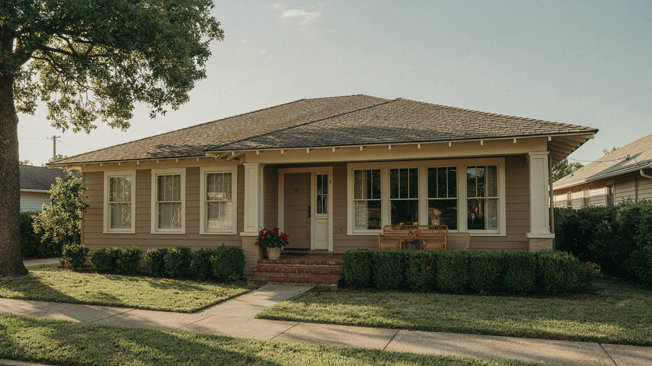
You want permission to pick a safe color so nobody judges you. The real problem is that generic palette advice treats all bungalows as interchangeable boxes. They’re not. A bungalow’s classic lines demand specificity because those lines create shadow and proportion that either get enhanced or buried depending on your color choice. Wrong color flattens what makes the form work.
Most design guides push “harmonious” schemes borrowed from color theory without accounting for how bungalow geometry actually reads. The overhang depth, the horizontal emphasis of the roofline, the proportion of foundation to wall to eave—these create a specific visual hierarchy. A palette that works for a Colonial fails for a Craftsman bungalow because the line work is different. You need colors that reinforce the lines your house already has, not colors that sound good in theory.
The Real Work Starts With Intentional Constraint
How you choose color is an act of constraint, not expansion. Military strategy calls this “economy of force”—concentrating your effort where it matters. With bungalow exteriors, that means selecting your color first based on how it renders the dominant horizontal and vertical lines, then building secondary colors around that decision.
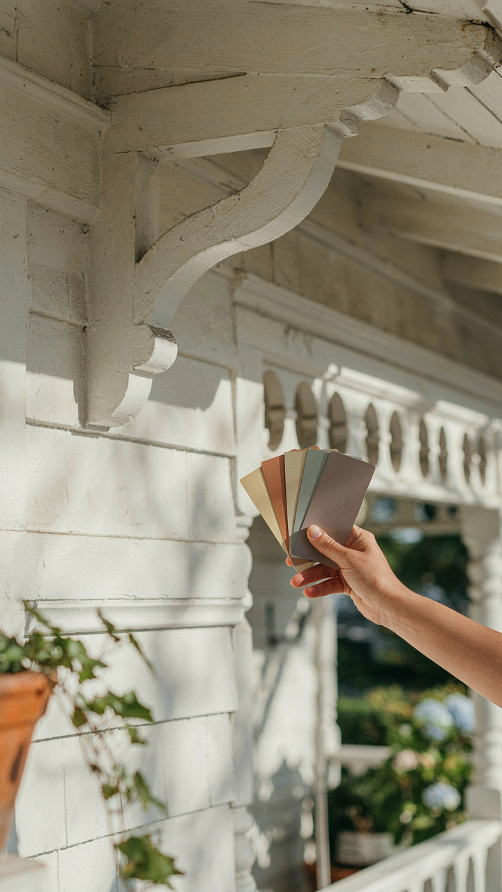
Most homeowners reverse this. They pick a color because they like it, then add trim and accent colors hoping they’ll somehow work. The result is visual noise that competes with the architecture instead of serving it. Start by identifying which lines matter most on your specific house. Then choose a color that makes those lines readable from the street. Secondary colors follow that choice, not the other way around.
Deconstructing The Bungalow Exterior Makeover Mentality
What Actually Separates Timeless From Trendy
You’re hoping a fresh coat of paint fixes something you can’t name. The mechanism is this: bungalow design emerged between 1900 and 1930 with a specific constraint—horizontal proportion and material honesty. Colors that worked then weren’t chosen for fashion. They matched the actual material palette available and the regional vernacular building tradition. Craftsman bungalows used earth tones because those pigments were cheap and stable. Coastal bungalows ran to grays and whites because salt air and simple lime wash dominated. Strip away the trend cycle and you see the real pattern: enduring bungalow colors solve a structural problem first, then read as beautiful second.

The mistake everyone makes is reversing that order. You pick a color because it’s “in” or because it’s the opposite of what neighbors chose. That’s status anxiety masquerading as design. The actual work is matching your color to the bungalow’s footprint, roof material, and the light quality of your specific geography. A sage green that anchors a 1920s bungalow in Portland behaves completely differently on the same style home in Arizona. One signals restraint. The other signals stubbornness. The difference is regional light, not palette theory.
When Repainting Is The Expensive Habit
Economics has a concept called the replacement cycle cost. Apply it to bungalow painting: you can repaint every three years because you’re chasing trends, or you can paint once every seven to ten years because you chose a color aligned with the structure itself. The math is brutal. Reactive painters spend 150 percent more over two decades than strategic ones. You’re not just paying for labor and materials again. You’re paying for the disruption, the exposure of underlying wood or siding damage during prep, and the compound effect of paint buildup.
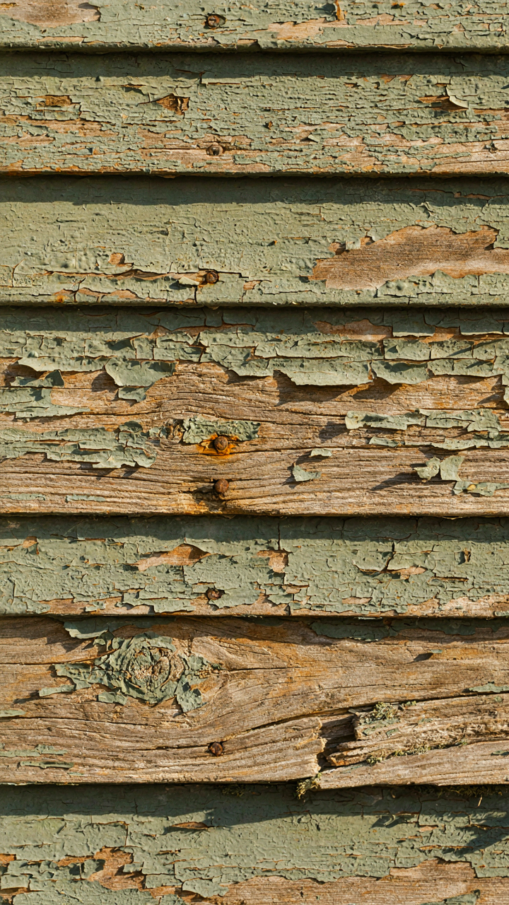
Here’s what separates the two: strategic color investment accounts for the bungalow’s actual lifespan before major siding replacement. Craftsman-era bungalows often carry original or early-era wood siding. Paint adheres differently to aged wood than new substrate. Choose a color that won’t demand matching undertones or special primers every time you refresh. Neutral earth tones, soft grays, and muted warm whites accommodate wood aging gracefully. When you finally repaint, you’re refreshing, not correcting. That’s the protocol: pick a color you can defend ten years from now, not one you’re already tired of.
The Craftsman Bungalow Exterior: A Masterclass In Subtlety
What The Craftsmen Actually Believed
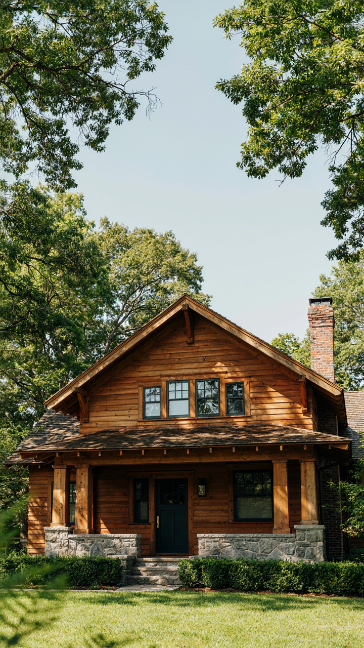
You want your bungalow to look intentional, not like you let Pinterest choose your house. The Craftsman movement rejected factory-made sameness, which means their color theory wasn’t about trends—it was about honest material expression. Craftsmen selected exterior colors to reveal what the building was made of, not hide it. Earth tones dominated because they matched the materials: natural wood siding, clay brick, stone. The goal was visual integrity, not decoration.
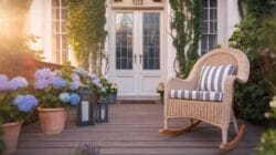
This philosophy created a hard constraint that modern homeowners ignore. You can’t slap a trendy gray over wood siding and claim Craftsman authenticity. The color had to honor what existed beneath it. Deep greens, warm browns, and muted ochres worked because they complemented the inherent character of the materials, creating coherence between surface and structure.
Materials Determine The Palette
Ecology provides the operating principle here: organism and environment shape each other, not independently. Apply this to bungalows—the exterior materials and surrounding landscape act as the environment that constrains your color choices. A bungalow clad in natural wood siding demands warmer undertones than one faced with brick or stone. The native vegetation matters too. A bungalow surrounded by mature oaks and evergreens tolerates different colors than one in open terrain.
Start by identifying what’s already there, not what you want. The existing materials on your bungalow—whether original or replaced—set the boundaries. A brick bungalow with a 1940s renovation in different colored siding creates a conflict that paint alone cannot resolve. The surrounding trees, soil color, and sky exposure form a visual context. Choose colors that sit within that context rather than fight against it. This determines your actual viable range before aesthetics enter the conversation.
Modern Bungalow Exterior: When Minimal Meets Timeless
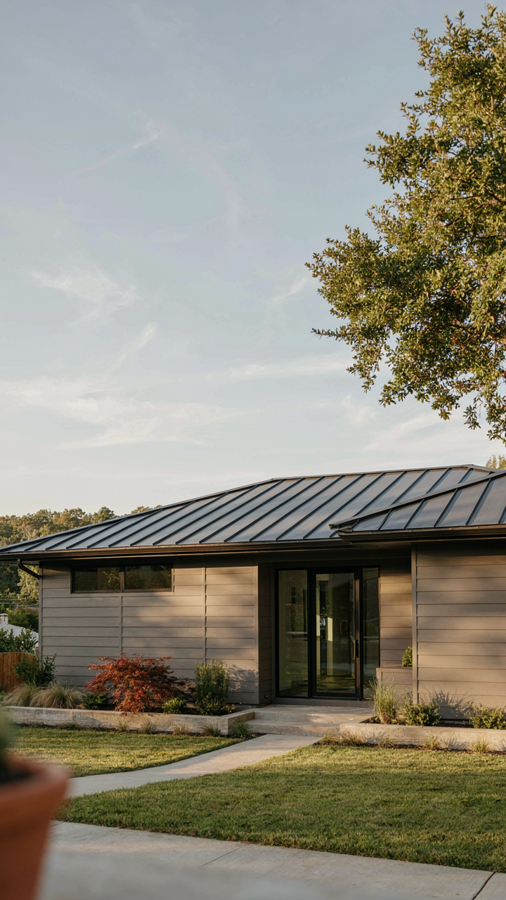
Color As Architectural Restraint
You want permission to keep things simple without looking cheap. Here’s the mechanism: in architecture, constraint forces intentionality. Every color choice on a minimal bungalow reads as deliberate because nothing masks bad decisions. Classical bungalows already stripped ornament down to proportion and material. Modern versions strip further, using color not as decoration but as mass definition. The restraint itself becomes the statement.
Muted palettes work because they let form breathe. Soft whites, warm grays, deep charcoals, and muted earth tones recede visually, emphasizing the bungalow’s geometric bones instead of covering them. Your color should anchor the structure, not compete with it. This isn’t minimalism for its own sake. It’s the recognition that bungalows succeed through honest proportion, not applied ornament. Pick a single dominant exterior color and commit to it across walls, trim, and soffits for visual cohesion.
Material Honesty Over Period Accuracy
The common advice is wrong: you don’t need authentic 1920s materials to honor classic bungalow form. What you need is material integrity. Modern fiber cement boards, metal standing seam roofing, and composite trim match the original intent of bungalow design, which was honest expression of available materials, not fetishization of specific products. The form follows the logic. The color follows the material.
Pairing modern materials with classic proportions demands color discipline. If you use fiber cement in a warm gray, the flatness of the finish works with the geometry rather than against it. Metal roofing in charcoal or muted bronze reads authentic to the era’s industrial aesthetic without requiring original slate or clay tiles. The mechanism is specificity: when materials are sincere about their nature, understated colors enhance rather than apologize for them.
The 1920s Bungalow Exterior: Echoes Of An Unseen Era
What Actually Survived From The Twenties
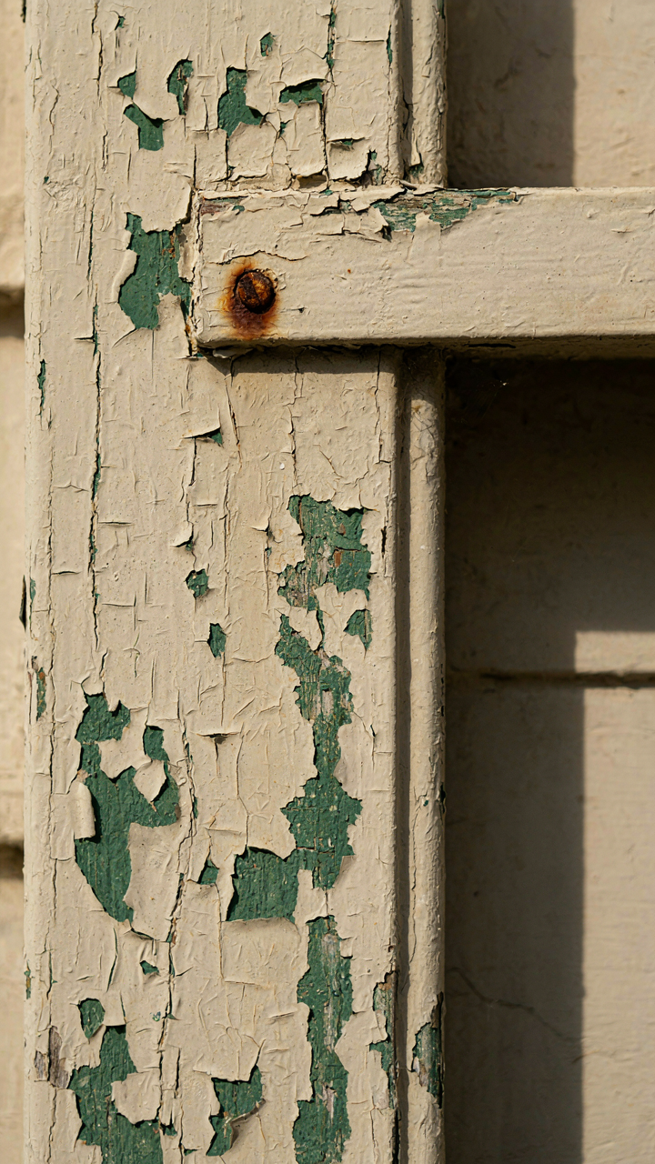
You want historical accuracy because it signals taste. The real mechanism is simpler: most 1920s bungalows didn’t survive with original paint. What we call “historical color palettes” are educated reconstructions based on surviving trim, foundation stains, and period paint formulations, not pristine time capsules. Manufacturers like Benjamin Moore and Sherwin Williams documented their available pigments then. Those records tell us what homeowners could actually buy, not what they necessarily chose.
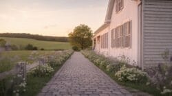
The dominant exterior colors on 1920s bungalows were muted earth tones and soft greens, driven by both aesthetics and paint chemistry limits. Lead-based paints produced colors that read differently than modern acrylics, muting everything slightly. Ochres, sage greens, warm grays, and deep browns dominated working-class and middle-class bungalows. Cream and pale yellow appeared frequently on smaller cottages. The color constraint wasn’t taste, it was raw material availability and cost.
The Mistake Everyone Makes With Period Matching
The common advice here is wrong: restoration guides often push you toward “authentic period colors” as though one palette existed. That’s lazy thinking. Regional availability, income level, and climate all shaped what color a specific 1920s bungalow actually wore. A bungalow in Southern California faced different UV degradation than one in the Pacific Northwest. Working-class neighborhoods used cheaper pigments that shifted faster. You’re not chasing one historical truth; you’re identifying which specific constraint shaped your house.
To avoid anachronism, study what paint could actually exist on your bungalow’s exterior in its build year and location. Check whether your trim is original wood or a later replacement. Look at foundation stains and trim shadows where paint protected the underlying surface. If your bungalow was built in 1925 in a mill town, research what colors the local hardware store stocked then, not what a high-end San Francisco architect specified. Period accuracy requires local specificity, not guesswork.
The Brick Bungalow Exterior: Leveraging Inherent Texture
Matching Trim To Your Brick Undertone
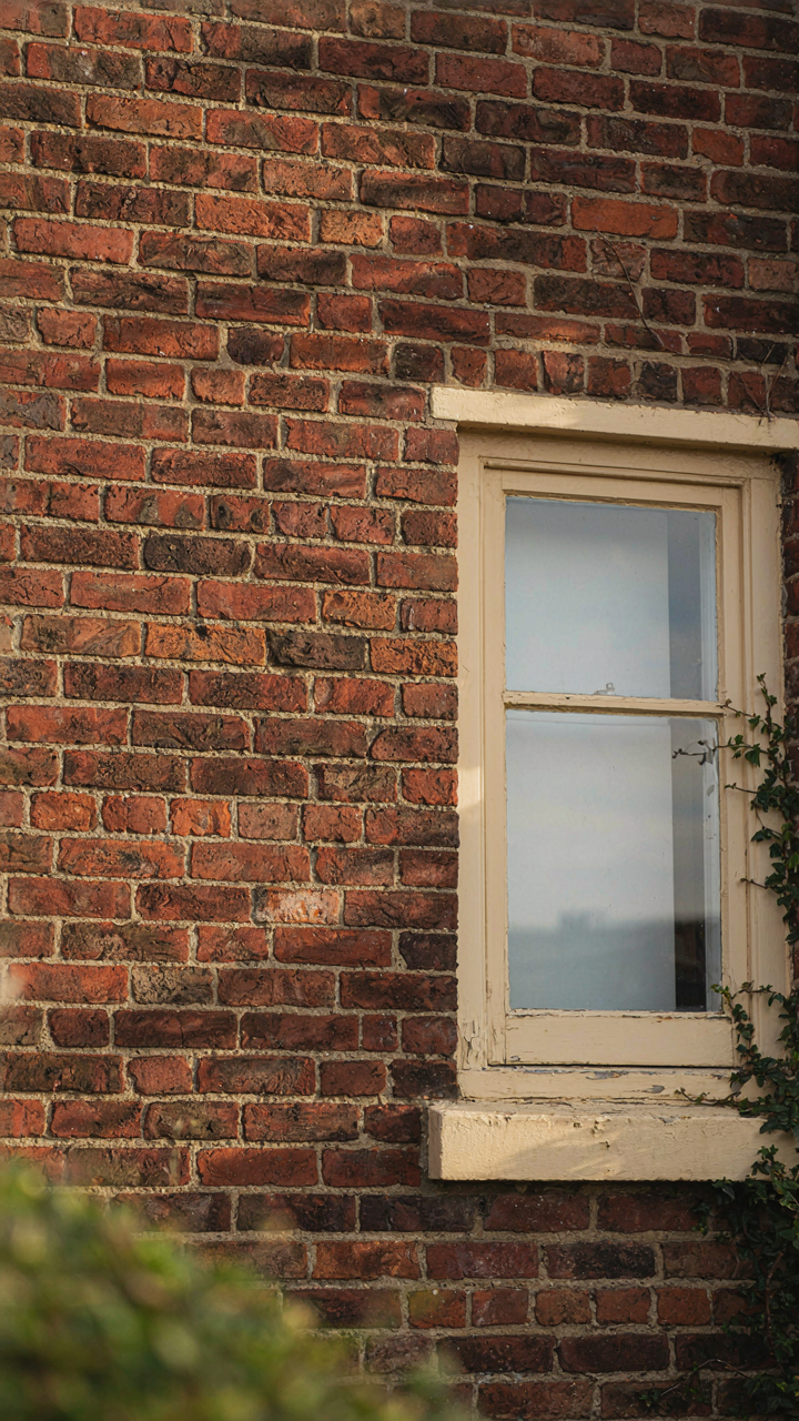
You want your brick bungalow to look intentional, not like you inherited someone else’s color mistakes. The mechanism is simple: brick contains undertones—red, orange, brown, or gray—and trim colors either amplify or neutralize those undertones. Get this wrong and your house reads as confused.
Brick manufacturers achieve color through clay composition and firing temperature. Red brick contains iron oxide. Brown brick contains more manganese. Gray brick results from specific clay and cooler kilns. Your trim color must account for what’s actually in your brick’s molecular structure, not what you wish was there.
- Warm red brick with white trim: Creates maximum contrast and reads as traditional. White amplifies the red’s warmth rather than fighting it.
- Warm red brick with cream or off-white trim: Softens contrast while keeping clarity. Reduces the institutional appearance that pure white can create on certain brick tones.
- Brown or tan brick with dark green trim: Brown brick contains yellow undertones. Dark green complements those undertones without competing. Common in Arts and Crafts bungalows.
- Brown brick with charcoal gray trim: Gray trim neutralizes brown’s warmth. Works when you want restraint rather than dramatic separation between materials.
- Gray brick with warm taupe or greige trim: Gray brick is recessive. Warm trim prevents the house from reading as cold or institutional. Taupe sits between gray and brown in temperature.
Most homeowners default to white trim on any brick because it’s the safe choice. That’s the problem. White works on certain brick undertones and fights against others. Test your brick’s undertone by placing white paint chips, cream chips, and gray chips directly on the mortar joint in afternoon light. One will disappear into the brick. That’s your signal that contrast is working.
Paint And Accent Against The Brick Field
Trim color is one lever. Accent colors on doors, shutters, or fascia boards are another. The real mistake people make is treating brick as passive background instead of an active color participant in your exterior palette.
Brick doesn’t recede. It competes for attention. When you add a bold accent color—say, a deep teal front door—the brick either fights that door or harmonizes with it. The physics principle here is saturation: high-saturation colors placed next to high-texture, high-saturation materials create visual noise unless they share color family lineage. Your door color should sit in the same hue family as your brick’s undertone, just at different saturation or value.
A painted door works best when it mirrors or extends the brick’s undertone rather than introducing an entirely foreign hue. If your brick reads warm and orange-toned, a rust or burnt sienna door reads intentional. A cool teal door reads like a design mistake that will feel stale in three years. Painted shutters operate the same way. They should look like they belong to the brick, not fight it for dominance.

The fascia board and soffit color also matters more than most people think. Kraft paper-colored fascia or soffit on a red brick bungalow creates dead space. The eye has nowhere to travel. Matching the fascia to the trim color, then pulling the accent color to the door alone, creates a clearer visual hierarchy and prevents visual fatigue. Your accents should be singular and strategic, not scattered across every surface.
Green Exterior House Colors: Nature’s Immutable Algorithm
Biomimicry Replicates What Actually Works
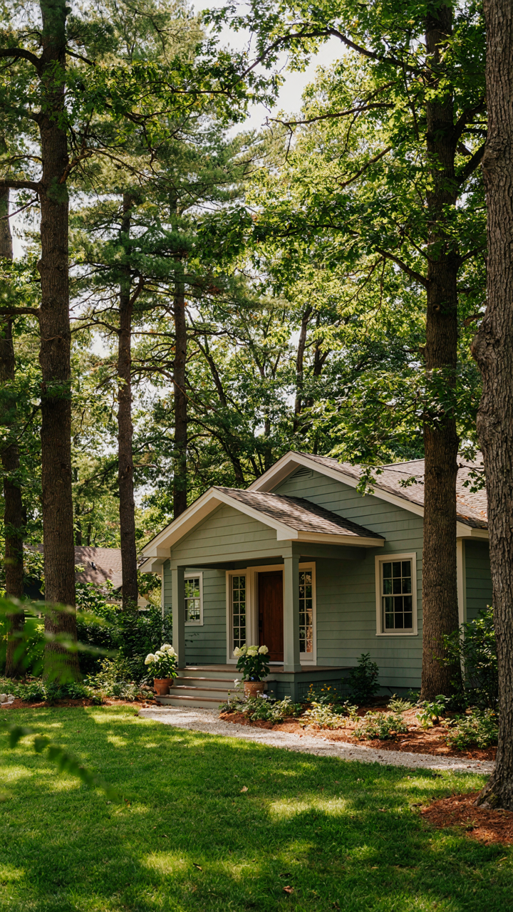
You want green because it feels safe, and you’re right to trust that instinct. Biomimicry borrowed a term from ecology: “fitness landscape.” Think of it as the visual terrain your eye navigates. Green exterior colors occupy a fitness peak because they mirror the dominant hue across human habitat for millennia. Your nervous system reads green as stable, resourced, alive. Bungalows painted in authentic greens appear grounded, not tentative.
The mechanism is neurological, not romantic. Historic bungalows used greens derived from iron oxide and copper compounds available in the Arts and Crafts era. Deep forest greens, sage, and muted olive weren’t aesthetic choices alone—they were what pigments produced reliably. Modern exterior paints replicate this palette because it works, not because designers got nostalgic. The color coordinates with brick, stone, and wood trim without requiring visual negotiation. Your eye processes it as complete.
Evolution Hardwired The Response
The common advice says “choose green because nature is calming.” That’s incomplete and misses the actual mechanism. Evolutionary psychology shows we weight colors based on resource prediction. Green signals water proximity, plant density, survivable terrain. A bungalow exterior in green isn’t triggering relaxation—it’s triggering territorial recognition. Your brain categorizes the structure as resourced, maintained, worth approaching.

Certain greens resonate more than others because saturation matters. Oversaturated greens read artificial and trigger skepticism. Muted, slightly desaturated greens—the kind found in lichen, aged patina, deep forest understory—trigger recognition. A bungalow painted in true sage or heritage forest green makes a specific claim: this structure belongs to a person who understands restraint. Test this: compare a bungalow in neon green against one in authentic deep green, then observe which one feels inhabited versus which feels like a mistake.
Beyond “Pretty Bungalows”: The Geometry Of Perception
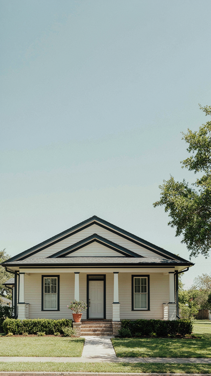
Color Shifts How People Read Your Home’s Actual Shape
You want to know this because a color mistake makes your bungalow look smaller, cheaper, or unstable. Here’s the mechanism: color doesn’t just sit on a surface. It contracts or expands perceived volume through value contrast and saturation. Light colors push walls outward. Dark colors pull them inward. A bungalow’s horizontal lines already fight gravity visually. The wrong color choice amplifies that fight or resolves it entirely.
Physics calls this optical density. Apply it here: a low-value exterior color absorbs light and compresses perceived depth, making a squat bungalow look even more compressed. A high-value color reflects light and opens the form. This isn’t aesthetic opinion. It’s how the human eye processes visual information. Warm colors also advance toward the viewer, making nearby surfaces feel closer. Cool colors recede. On a bungalow’s compressed facade, this matters structurally for how the eye settles on proportion.
Gestalt Principles Shape Color Grouping
The common advice says “pick colors you love.” That’s incomplete. Gestalt principles explain why certain color combinations feel coherent and others feel fractured. Proximity, similarity, and continuation are the three mechanics that matter on a bungalow exterior. When trim, siding, and accent colors cluster in similar value ranges, the eye groups them as one unified form. When they diverge sharply, the eye fragments the building into competing pieces.

A bungalow with wide eaves and deep overhangs creates natural shadow lines. Color must either reinforce those lines through contrast or harmonize across them through continuity. Most owners choose wrong because they treat each surface independently instead of as parts of a visual system. The principle of closure means your eye completes interrupted lines. Use it: a trim color that echoes the roof value lets the eye trace the roofline continuously, reinforcing the horizontal stability the form already communicates. That coherence is what reads as intentional design, not accident.
The Bungalow Exterior: A “Less Is More” Color Protocol
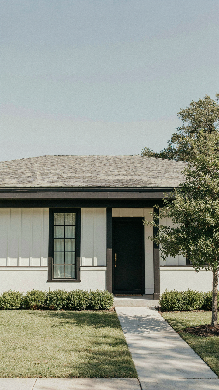
Why Adding Colors Always Fails
You want your bungalow to look intentional and expensive. That fear drives you to layer on colors. Here’s the mechanism: every additional color competes for attention and dilutes the architectural impact. Bungalows have clean, horizontal lines and low-pitched roofs. They work because they’re visually quiet. The moment you introduce a third or fourth color, you’re fighting the form instead of amplifying it. Complexity reads as confusion, not sophistication.
The cost of complexity isn’t financial. It’s perceptual. Your eye has to work harder to process the palette, which means it stops registering the structure itself. Classic bungalow design from the early twentieth century proved this: the best examples used two, sometimes three colors maximum. The exterior color scheme worked when it receded and let the geometry speak. Restraint signals control. Chaos signals uncertainty.
Restraint Through System, Not Taste
Color theory borrows the concept of tension from physics. Analogous colors have low tension. They sit next to each other on the color wheel and create harmony without friction. This matters for bungalows because their geometry already carries weight visually. A monochrome scheme or analogous palette removes the need for your eye to reconcile competing tones. The siding becomes one unified plane. The trim becomes the only accent. The foundation reads as grounding.
Strategic limitation means choosing your single dominant color first, then selecting one trim color with logical contrast. Cream or off-white siding with darker trim, or soft taupe with white. No secondary accent colors on shutters or doors unless they echo the trim exactly. This protocol forces you to commit to the structure’s lines instead of decorating around them. The exterior gains coherence because every element reinforces the same visual hierarchy.
Decoding Your Environment: The Contextual Color Method
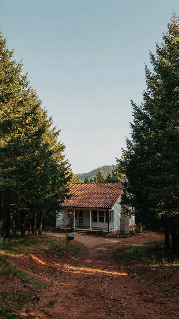
What Your Landscape Actually Tells You
You want to pick a color that won’t look out of place the moment you drive up to it. That’s the real fear here. The mechanism is simple: bungalows sit inside an ecosystem of existing colors, and borrowing from ecology, the principle of “niche saturation” applies. Your exterior color either fills an empty visual slot in the neighborhood or it competes directly with what’s already there. Most people ignore the geology and flora entirely, then wonder why their bungalow reads as wrong.
Start by identifying the dominant soil tone in your area. Clay-heavy soils lean toward rust and ochre. Sandy regions show pale beige and cream undertones. Next, map the foliage around you: deciduous trees shift color seasonally, while evergreens anchor a constant green. Observe how natural light hits your street at different times. Morning sun bleaches colors differently than afternoon light. These three inputs—soil, vegetation, and light patterns—form the actual constraint set for what will harmonize, not clash.
Blending In Without Disappearing
The common advice says find a color you love and paint it. That’s incomplete. A bungalow’s classic proportions rely on restraint, not self-expression. The real task is calibrating how visible or recessive you want the house to be while maintaining coherence with the surrounding context.
Study the color temperature of neighboring houses. If most lean warm (cream, tan, warm gray), a cool-toned exterior reads as a deliberate statement, not harmony. If your street favors muted tones, a saturated color will isolate your bungalow visually. The goal isn’t matching exactly—it’s understanding the chromatic grammar your neighbors already established, then deciding whether to speak that dialect or intentionally diverge. Pick your bungalow’s color only after auditing three houses on each side of your street during midday and overcast conditions.
Your Fear Of Breaking Tradition Is The Real Barrier To A Truly Remarkable Bungalow
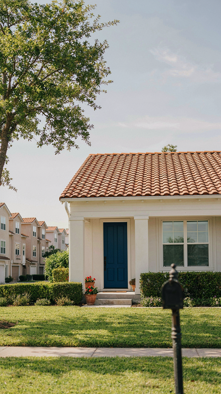
You think your bungalow needs to look like every other bungalow on the block. That’s the trap. The constraint isn’t your home’s architecture or your neighborhood’s expectations. It’s your own hesitation to commit to a color that actually moves you. Stop polling your neighbors. Stop researching what’s “safe.” Pick one bold exterior color today that makes you want to come home. Your bungalow doesn’t need permission to be memorable.



