
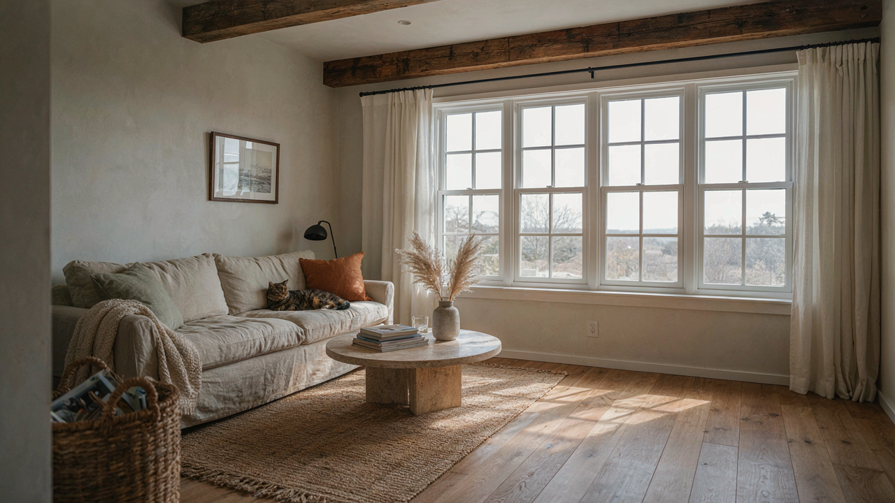
The “Less But Better” Principle Of Cape Cod Style Interior
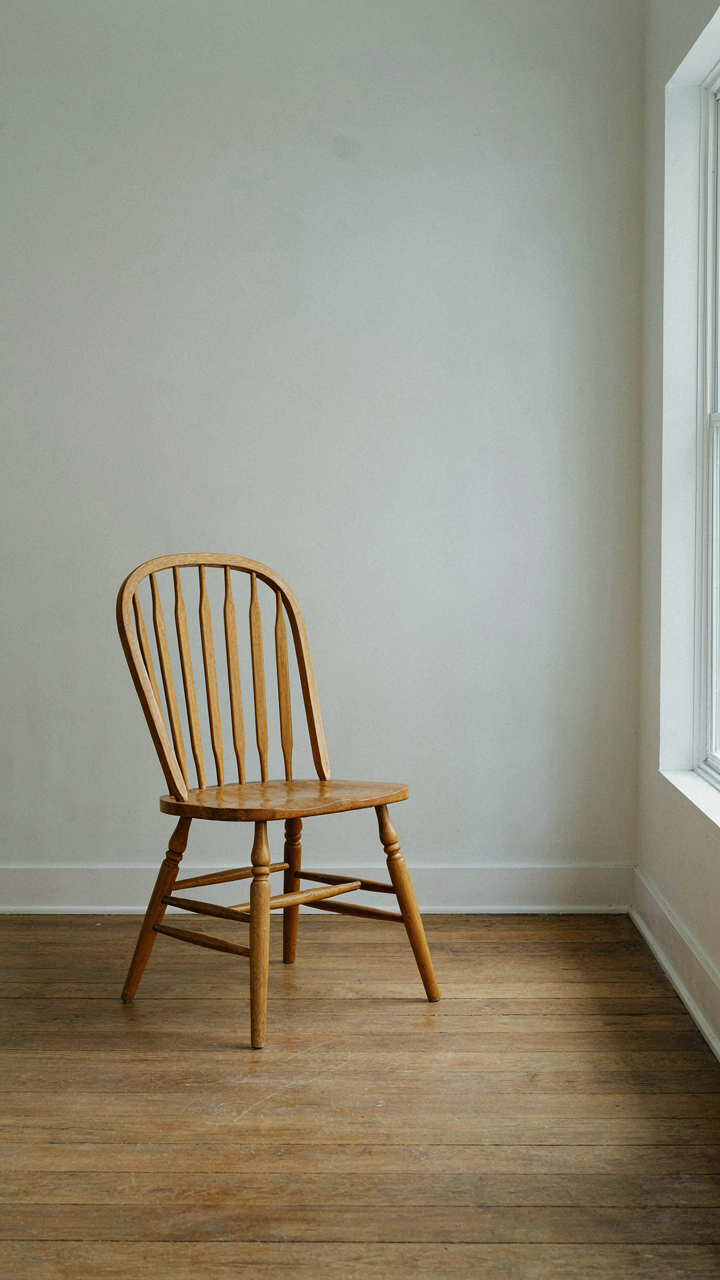
Intentionality Over Accumulation
You want permission to buy less stuff and still feel like your home is finished. That’s the real draw here. Cape Cod style interior strips this down to a mechanism borrowed from economics: opportunity cost. Every object you place consumes visual real estate. The Victorians filled rooms to signal wealth. Cape Cod rejected that entirely. Coastal New England homes built between the 1600s and early 1800s operated under hard constraints: space was tight, money was tied to fishing and farming, and winters demanded function over decoration.
This constraint became the aesthetic. A Cape Cod interior forces a single question before purchase: does this object earn its place, or does it just occupy it? You remove the middle ground where most interiors live. That middle ground is where visual noise compounds and rooms feel cluttered despite containing “nice” things. The mechanism is simple: reduce the candidate set ruthlessly, then invest in quality within that reduced set. Each piece must justify its existence through either utility or genuine visual contribution. This eliminates the paralysis of endless options and the guilt of half-decorated spaces.
Function As The Ultimate Aesthetic
The common advice here is backwards. Most design writing separates “function” and “aesthetics” into two competing concerns. Cape Cod style interior proves they’re the same thing. A Windsor chair isn’t beautiful because someone decided to make it beautiful. It’s beautiful because its form follows exactly what the human body needs, what local materials allowed, and what a maker’s hands could produce without machinery. That convergence of constraint, material, and use creates what people mistake for style.
Cape Cod interiors apply this everywhere. Whitewashed walls came from lime wash being cheap and durable on salt-exposed coastal homes, not from an aesthetic preference. Wide plank flooring existed because large trees were available and smaller planks would warp in humid coastal air. Built-in shelving maximized space in tight homes and eliminated the need for freestanding furniture. When you design a room by this standard, you stop buying decorative objects and start selecting pieces that solve a real spatial or functional problem first. The aesthetic follows automatically.
Deconstructing The Cape Cod Aesthetic Interior Myth

The Real Palette Beyond Surface Color
You want to know the palette because you think nailing the color formula signals you’ve mastered the style. Here’s what actually happens: Cape Cod interiors use constraint as their mechanism, borrowed from naval design principles where material limitation forced clarity. The palette isn’t blue and white because someone decided those colors photograph well. Early Cape Cod homes used what local materials provided: whitewashed walls from lime plaster, dark wood from ships and salvage, and muted earth tones from natural pigments that didn’t fade.

Modern interpretations strip this down wrong. They layer navy walls with white trim and call it done. Real Cape Cod palettes work through contrast of value, not color matching. You see cream against dark exposed beams, soft grays next to weathered wood, warm whites beside charcoal shutters. The restraint comes from using three to four colors maximum per room, then letting material texture do the work paint can’t. Start by identifying your dominant material first, then build the palette around what makes that material read clearly against its background.
Resisting The Tourist Shop Trap
The common advice says add nautical accents and rope details. That’s how you end up with a staged Airbnb nobody actually lives in. Kitsch enters Cape Cod interiors the moment you add something for its symbolic value instead of its function. A ship wheel on the wall doesn’t belong there because it solves a problem. Rope-wrapped mirrors, anchor throw pillows, and lighthouse figurines signal you’ve confused historical context with decoration.
Authentic Cape Cod homes borrowed from maritime life out of necessity, not nostalgia. Rope served as structural material. Weathered wood existed because homes faced salt spray. Whitewashed walls reflected heat. Each detail had a job. When decorating, ask whether an object functions first or decorates. A recessed shelf holds books. Exposed beams support structure. Wide plank flooring wears well. If you’re choosing something purely because it looks nautical, remove it and try again with something that earns its place through utility or material honesty.
The Subtle Art Of Decluttering Your Cape Cod House Interior

Why Emptiness Feels Like Failure
You want permission to own less because you’re afraid emptiness signals poverty. The real mechanism is psychological essentialism: your brain treats objects as containers for identity and status. Cape Cod interiors exploit this ruthlessly by stripping away everything except what proves necessity and intentionality.

Essentialism says an object’s essence doesn’t change based on quantity. One hand-thrown ceramic bowl carries the same craft signal as twelve. A single framed nautical chart tells the same story as a gallery wall. Cape Cod design weaponizes this principle: fewer items force each one to work harder, which makes the space feel deliberate instead of accumulated. You’re not choosing simplicity. You’re choosing ruthlessness about what earns its place.
The Mechanism Behind One In One Out
Everyone knows the rule. Nobody implements it because they misunderstand what triggers the resistance. When you add something new without removing an equal item, you’re not just adding clutter. You’re signaling that your standards have dropped. You’ve admitted the old item no longer meets the threshold.
The real protocol is different from the advice floating around. Set a threshold for each category before you buy. If you own four throw blankets and want a fifth, you must identify which four no longer meet the threshold. Name it plainly. Remove it before the new one arrives. This forces a decision at the moment of purchase, not after. It stops the creep. Cape Cod interiors stay Cape Cod because the owners apply friction to entry, not just removal.
Light: The Unseen Architect Of Cape Cod Home Interior
Windows As Load Bearing Light Infrastructure
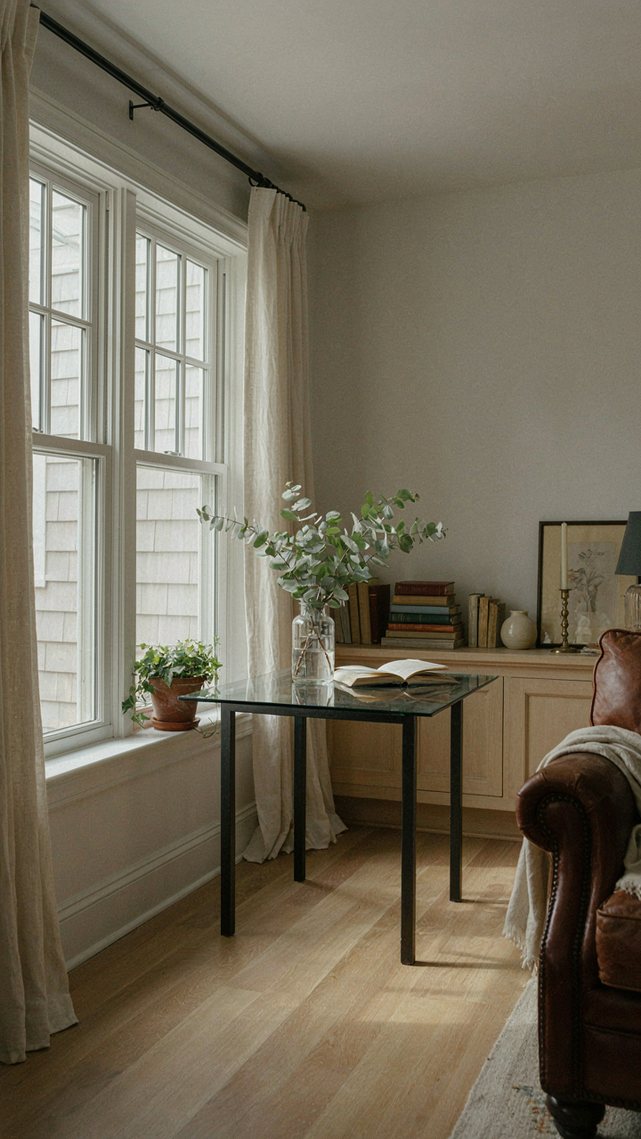
You want your Cape Cod interior to feel effortless and timeless, but you’re actually anxious about whether the space will feel dark and claustrophobic. The mechanism is simple: Cape Cod homes were built in a region with intense seasonal light variation, so their window placement wasn’t decorative—it was functional load-bearing design. Using architectural language, windows operate as the structural support system for ambient illumination in Cape Cod interiors.

Cape Cod homes traditionally feature symmetrical, double-hung windows placed to maximize southern and eastern exposure. The pitched roofline actually works against you here—it cuts off midday light in winter when you need it most. The counterintuitive fix: position your primary seating and work zones on the south-facing wall, then use shallow shelving or glass furniture to avoid blocking that incoming light path. Never put solid furniture against south-facing walls.
Layered Artificial Light Without The Drama
Generic advice tells you to use “warm lighting” and calls it done. That misses the actual problem: Cape Cod interiors fail under artificial light because people install overhead fixtures that flatten the space into a single brightness plane. You need three distinct light layers working together, not competing.
Start with task lighting near functional zones—reading areas, kitchen counters, bathroom mirrors. Then add accent lighting to pick out architectural details like crown molding or beadboard. Finally, use dimmable ambient light only as the base layer. This hierarchy means you’re never relying on one fixture to do all the work. Install dimmer switches on all three layers so you control the ratio between them based on time of day and season. The protocol: test each layer independently before using them together.
Materiality In Cape Cod House Interior Ideas: Beyond Surface
Natural Textures That Actually Last
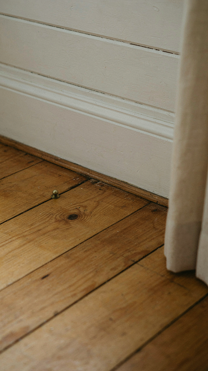
You want materials that signal “authenticity” without requiring constant maintenance. That’s the real game here. Cape Cod interiors work because they prioritize tactile honesty over visual performance. Wood, linen, wool, and plaster aren’t chosen for their aesthetic appeal alone. They’re chosen because they degrade predictably and age visibly without looking neglected.

The common advice says “embrace imperfection.” That’s incomplete. Cape Cod materiality follows a principle from materials science: fatigue resistance. Materials that survive repeated cycles of salt air, humidity, and temperature swings without structural failure become the foundation. Wide-plank pine flooring, whitewashed shiplap, and linen upholstery weren’t romantic choices. They were practical decisions made by people without budget for replacement.
The Economics Of Durability First
Durability dictates material choice before aesthetics does. Most interior design reverses this priority and pays the price. Cape Cod interiors that outlast twenty years share one trait: every material selected withstands the coastal environment or accepts graceful degradation as part of its function. Concrete, sealed wood, brass hardware, and ceramic tile aren’t glamorous. They simply outlast alternatives in high-moisture conditions.
Budget allocation reveals the mechanism. Invest heavily in structural and foundational materials. Floors, walls, hardware, and furnishings that touch skin or weather get the premium selections. Decorative elements, paint colors, and textile accessories get rotated or replaced. This inverts the typical high-end interior model where visual impact receives the largest spend and durability remains an afterthought. Select materials based on their failure timeline, not their Instagram performance.
The “Curated Comfort” Protocol For Cape Cod Decorating Ideas
What Actually Makes Objects Worth Keeping
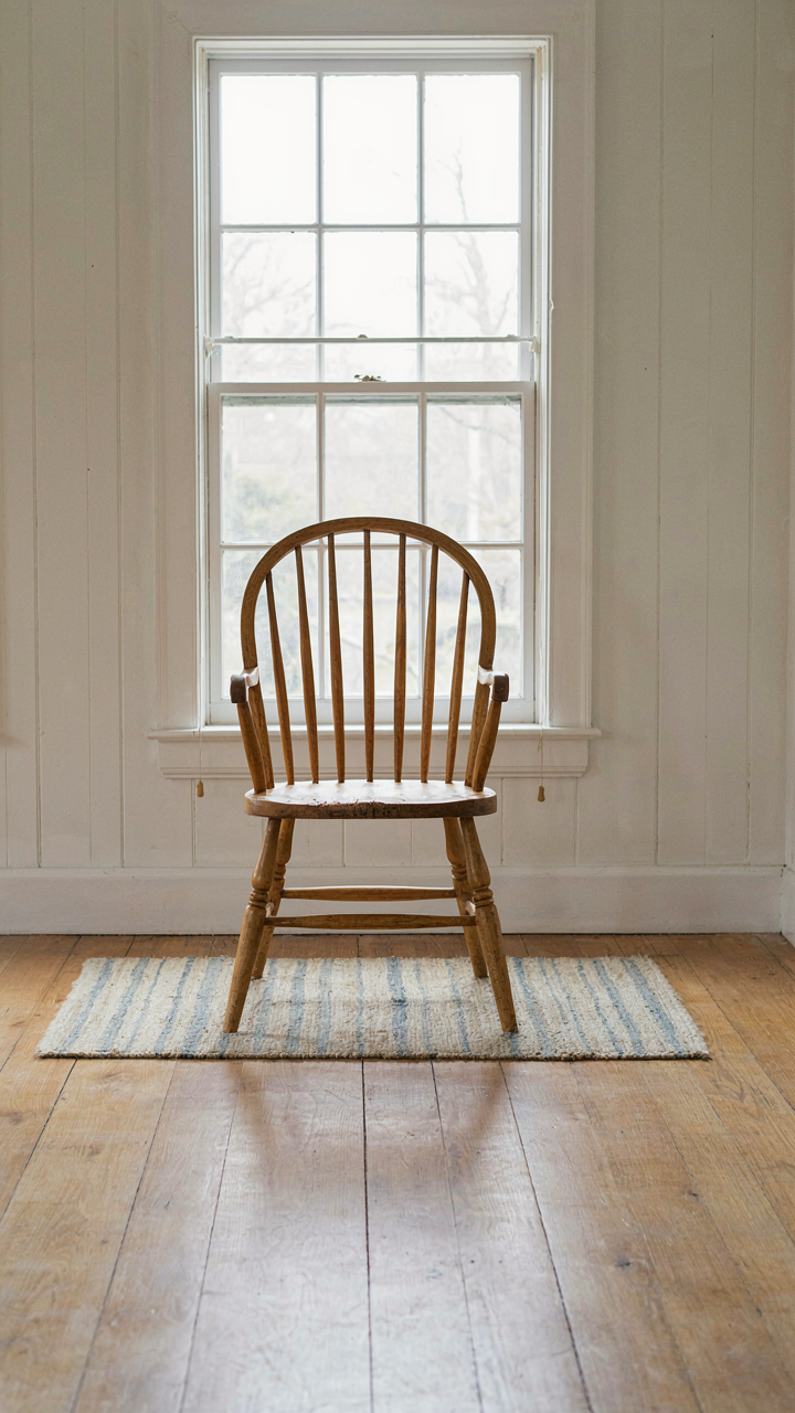
You want permission to own fewer things without feeling poor. That’s the real reason this matters. Economics teaches scarcity value: objects gain worth through limitation, not abundance. Cape Cod design applies this ruthlessly. Coastal New England homes were built small by necessity, not aesthetics. Settlers didn’t have storage. Every piece earned its place or left.

This constraint created the visual language people now pay to recreate. A single antique Windsor chair in a room reads as intentional. Twenty chairs read as a thrift store haul. Cape Cod interiors force you to stop collecting and start selecting. The mechanism is simple: restrict the number of objects, increase the perceived value of each. Your space doesn’t feel cluttered because clutter requires volume. Nothing sits idle here.
The Real Cost Of “Conscious” Decorating
Most advice on mindful decor is marketing for slower consumption. Buy less, but buy better, the narrative goes. That’s incomplete. Cape Cod style doesn’t ask you to spend more per item or feel virtuous about purchases. It asks you to understand the actual cost of ownership: the spatial weight, the visual noise, the maintenance load every object demands.
A piece of driftwood has zero maintenance. A decorative vase you never use costs you attention every time you see it. White linen upholstery on a sofa in a high-traffic room costs you stress. The protocol isn’t about ethics or sustainability. It’s about calculating whether an object’s presence adds more than it takes. If it doesn’t pull its weight in function or visual clarity, the honest move is to remove it, not rationalize keeping it.
Furnishing Your Cape Cod Style Homes Interior With Purpose
Buy Pieces That Don’t Expire
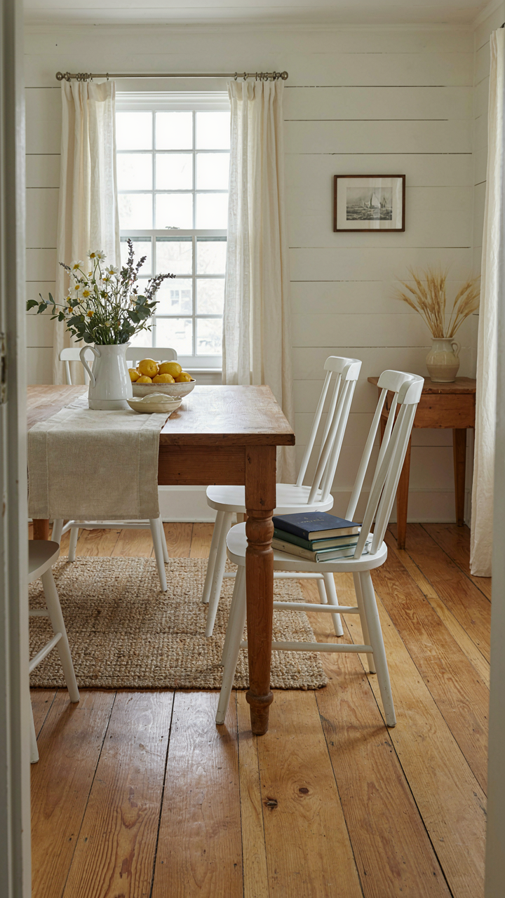
You want permission to spend money and feel smart about it later. Here’s the mechanism: Cape Cod interiors survived because they reject trend cycles entirely. Borrow from economics the concept of depreciation, and reverse it. In Cape Cod, a spindle-back chair or shaker table gains cultural weight with age instead of losing market value. These pieces hold their function and aesthetics across decades because they solve problems without announcing themselves.

The furniture that works in this style comes from the mid-Atlantic craftsman tradition and early American practicality, not from seasonal design pushes. A solid wood farmhouse table, white painted chairs, or a linen upholstered settee in neutral tones will function identically in 2025 and 2045. You’re not buying trend insurance. You’re buying furniture that stops mattering as decoration and starts mattering as infrastructure.
Comfort Is A Structural Problem, Not A Feeling
Most people confuse soft with comfortable, then wonder why their back aches after an hour on the couch. Comfort in Cape Cod interiors stems from ergonomic geometry: seat height relative to leg length, backrest angle supporting the spine, cushion density that holds you without collapsing. A chair with proper proportions at 16 to 18 inches high, a backrest angled between 100 and 110 degrees, and a seat depth of 16 to 18 inches will perform better than a marshmallow sectional that looks inviting but destroys posture.
Cape Cod designers understood this through observation and repetition, not marketing copy. Woven rush seats on ladder-back chairs, simple wooden frames, and minimal upholstery force the furniture to solve the problem through shape, not material excess. Before you select a piece, measure it against your body metrics. Test the angles, not the aesthetics. Then leave it in place for a month before deciding whether it works. Your nervous system knows the difference.
The Exterior Interior Dialogue: A True Cape Cod Style House Interior Design
When Walls Stop Mattering
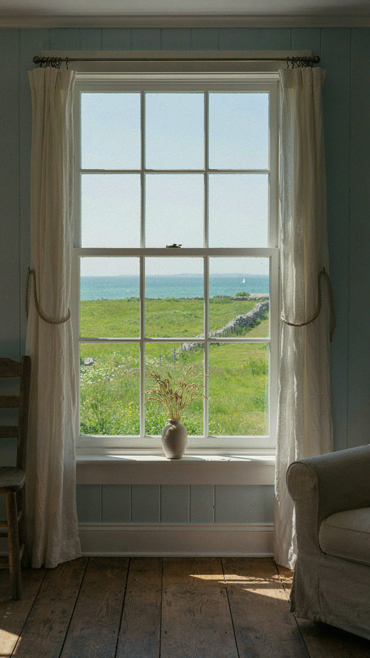
You want your home to feel bigger without actually renovating. That’s the real driver here. Cape Cod interiors work because they dissolve the boundary between inside and outside, which costs almost nothing to implement but reads as intentional design. Borrowed from architecture’s concept of threshold, Cape Cod style treats doors and windows not as barriers but as framing devices. The mechanism is simple: what you see outside becomes part of your visual square footage inside.

Early Cape Cod homes on Massachusetts coastal properties were built with deep eaves and wide windows positioned to capture light and views, not for aesthetics but survival. Settlers needed to monitor weather and water. The design accidentally created perpetual visual connection. Modern Cape Cod interiors replicate this by using large operable windows, minimal window treatments, and interior sightlines that extend directly to landscaping or water views. The exterior becomes your largest wall color.
Landscape As Your Fifth Wall
Most people treat landscaping as decoration outside the home’s real design system. It’s not. In Cape Cod style, plantings function as a material palette the interior directly responds to. When you can see salt marsh grasses, beach roses, or hydrangeas from your living room year round, your interior color scheme coordinates with them. This isn’t about matching. It’s about creating visual continuity so the eye doesn’t fracture between inside and outside.
The practical move is this: before choosing interior paint or upholstery, document what’s visible through your primary windows across all seasons. Winter views dominate in New England climates since foliage disappears. Select interior neutrals that anchor the space when the landscape goes dormant, then let seasonal blooms add color temporarily. Doors should open directly onto functional outdoor seating or pathways, not just views. The landscape stops being peripheral and becomes part of your daily movement pattern.
Avoiding The “Coastal Cliché” In Your Cape Cod House

Stop Copying Pinterest And Start Copying Constraint
You’re reading this section because you’re afraid your space will look like every other Cape Cod knockoff on Instagram. The mechanism is simple: most people confuse style with a shopping list. They buy the predetermined items (weathered wood, nautical accents, white paint) and call it done. That’s not design. That’s decoration by consensus.

Real Cape Cod interiors emerged from function, not aesthetic choice. Coastal New England builders used what was available and durable. They built low ceilings to trap heat. They used wide-plank floors because that’s what ships produced. They painted walls white because lime-based whitewash was cheap and protected wood. These constraints created the actual style. When you skip the constraint and jump to the aesthetic, you get a theme park version.
The Actual Source Of Your Personal Direction
Borrowing from systems thinking, every design system has an attractor: the core principle that makes all other decisions coherent. In Cape Cod interiors, the attractor isn’t “coastal vibes.” It’s the principle of reducing waste and maximizing durability in a harsh environment. Once you identify your own constraint, everything else arranges itself.
Your constraint might be different from the original Cape Cod builder’s, but it has to exist. Maybe it’s that you hate maintaining decorative objects. Maybe you work from home and need serious natural light. Maybe you have young kids and need surfaces that survive impact. Your personal constraint becomes the filter. Every piece you bring in either serves that constraint or gets rejected. That filter is what separates an intentional space from a catalog room.
The Enduring Value Of Understated Elegance In Cape Cod Style Interior
Simplicity That Actually Compounds
You want permission to stop trying so hard. That’s the real reason you’re reading this. Cape Cod style interior design works through subtraction, not accumulation, and that mechanism compounds over time like compound interest in economics. Early compound interest looks weak. In year one, a $100 investment at 10% adds $10. Boring. In year twenty, that same rate adds $673. The math flips. Cape Cod interiors operate the same way. Neutral palettes, natural materials, and restrained furnishings don’t grab attention on day one. They never photograph like maximalist spaces. But they remain functionally unchanged after five years, ten years, two decades. No trend reversal. No regret purchases accumulating dust. No constant refresh cycle burning money and attention.
The reason most design ages poorly is overstatement. Trendy paint colors, statement pieces selected for visual impact, surfaces chosen for shine instead of durability. Cape Cod rejects all three. A whitewashed wood wall won’t embarrass you in three years. A simple linen sofa won’t feel dated. A hand-forged iron fixture performs identically in 2025 and 2035. The interiors that last aren’t the ones that tried hardest to impress on move-in day. They’re the ones that stayed honest about what a room actually needs to do. When you stop designing for approval and start designing for function, compounding returns begin immediately.
Design Decisions That Resist Obsolescence
The history of Cape Cod style interior traces to practical constraints, not aesthetic theory. Eighteenth-century New England builders used what was available and durable: local timber, simple joinery, muted earth tones from natural pigments. That wasn’t a trend cycle. That was problem-solving under scarcity. Modern Cape Cod design inherited that framework, which means it inherited resistance to fashion. You can’t obsolete a decision that was never fashionable to begin with. Shaker furniture, wainscoting, exposed beams, wide-plank flooring, brick fireplaces. None of these choices were ever “in.” They were always just sensible.
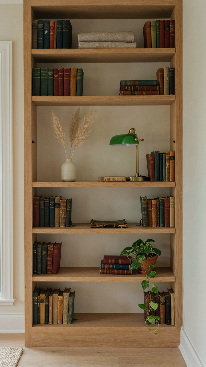
Mindful design means every element earns its place through function first, aesthetics second. A built-in bookcase isn’t there because shelving looks good. It’s there because you need storage and wall space is limited. A fireplace mantel isn’t a styling opportunity. It’s a heat source with a practical ledge. This priority order kills the impulse to replace things. When something works, you keep it. When it works and looks restrained, you keep it even longer. The protocol is: before adding or changing anything in a Cape Cod interior, name its function. If you can’t name it, it doesn’t go in. If you can name it clearly, you’ll still want it ten years later.
The Real Obstacle Isn’t Finding The Right Decor, It’s The Fear Of Subtracting What Doesn’t Genuinely Belong
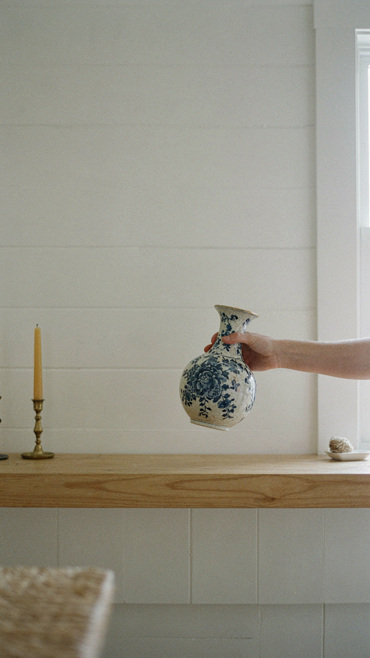
Most people suffocate their cape cod style interiors with clutter before they even start decorating. You own too much. Your rooms are choking on things you don’t actually like. Stop shopping for the perfect piece and start throwing out what’s fake. Walk through your house today and remove three items that don’t spark genuine comfort. That single move beats any design rule you’ll ever read. A cape cod interior doesn’t forgive noise, so silence it first.



