The Chintz Fallacy: It’s Not About The Fabric
Pattern As Narrative, Not Decoration
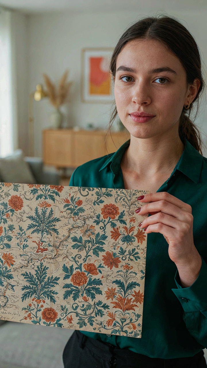
You want chintz in your home because you think it signals taste. The real mechanism is simpler: pattern tells a story about where something came from, and your brain craves that signal. Chintz emerged from India through the East India Company in the 17th century. British printers copied the botanical and floral motifs, then sold the narrative of exotic discovery back to the middle class. The pattern itself was never the point. The provenance was.
When you select a chintz, you’re not choosing a look—you’re anchoring a claim about knowledge and history. English country homes used chintz because the pattern connected them to trade routes and global commerce. The fabric itself is cotton with a glazed finish, practical and durable. But you buy it for the story it carries. Every authentic chintz print references a botanical source or a regional textile tradition. Choose patterns with traceable origins—toile de Jouy, William Morris designs, or documented 18th-century prints—and the room stops being decorated and starts being contextual.
Rejecting Mass Produced Prints For Authentic Stories
The common advice says “find chintz you love.” Wrong. You need chintz that documents something real. Mass-produced chintz prints today copy the visual language but strip the narrative. A generic floral sprawl on cheap cotton tells no story. It broadcasts confusion. Authentic English country chintz comes from archives: Liberty of London, V&A Museum collections, or documented historical archives. These prints connect to specific moments—Victorian naturalism, Arts and Crafts reactions against industrial production, or earlier trade documentation.
Warm wood in English country rooms exists in tension with chintz patterns. The wood tells time through grain and patina. The chintz tells origin through pattern. When you pair them, you’re not decorating—you’re creating a chronology. Source your chintz from printers who reference historical documents, not trend cycles. This means paying attention to whether a print reproduces an actual 18th or 19th-century source or invents something new. One anchors your room in verifiable reality. The other just sits there looking busy.
Warm Wood: The Foundation, Not The Finish Line

Patina As Evidence Of Actual Use
You want aged wood because it signals you didn’t buy everything last month. That’s the real pull, and there’s nothing wrong with naming it. But here’s the mechanism: patina works in English country decor because it breaks visual monotony through randomness. Biology calls this “natural variation”—the absence of factory precision that makes a room feel inhabited rather than curated.

Surface marks, color shifts, and worn edges aren’t flaws to hide. They’re proof the wood absorbed light and touch over years. A new oak bookcase reads as decoration. A piece with darkened corners, lighter patches where hands grip, and finish worn thin at edges reads as furniture that survived something. English country design builds on this principle: nothing should look purchased yesterday. The wood must show friction with time.
Layering Timbers For Visual Depth
The mistake most people make is treating wood tones like a paint palette where you pick one and stick with it. That’s wrong. English country interiors layer different wood species and finishes to create spatial complexity without clutter. Oak, walnut, pine, and elm coexist in the same room not by accident but by design.
Each timber absorbs light differently. A honey-toned dresser next to dark walnut paneling next to pale pine floorboards doesn’t create visual noise—it creates rhythm. The eye moves through the space because it’s tracking tonal variation, not scanning a flat, uniform surface. Mix old and new woods deliberately: an inherited chest of drawers beside a recent farmhouse table forces the room to tell a story rather than display a theme. This is how you avoid the staged hotel lobby feeling that kills authenticity in country decor.
The Accumulation Protocol: Curation Over Consumption
The 80/20 Rule For English Country Pieces
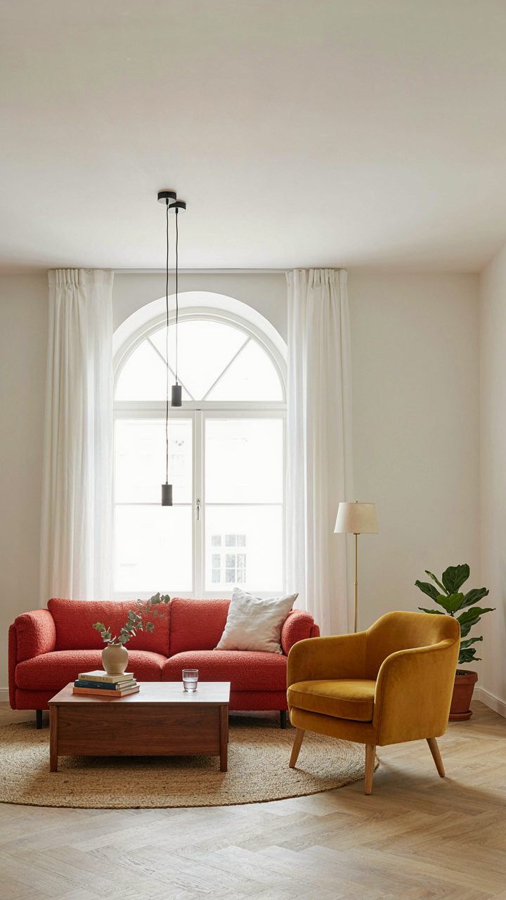
You want permission to stop buying. Economics calls this the Pareto principle, but in English country decor it means this: 20 percent of your pieces will generate 80 percent of the visual impact. A single substantial chintz sofa outworks ten decorative accessories. A hand-oiled walnut sideboard from the 1970s carries more weight than scattered trinkets. The mechanism is concentration. Your eye settles on dominant forms first, not background noise.

Most people reverse this. They fill space with volume, assuming density equals richness. English country design proves the opposite. Identify the anchor pieces in each room: the bed frame, the main seating, the storage. Invest your money and attention there. A worn leather wingback chair in genuine saddle brown does more work than a room full of new accent pillows. Build from these few loadbearing elements, then stop acquiring.
Scarcity Creates Authority
Fewer pieces resonate because your brain treats them differently. When an object is rare in a space, it becomes visible. When everything competes for attention, nothing lands. This is why Victorian parlors felt cluttered but weren’t chaotic: arrangement mattered more than count, but the count stayed disciplined. A single piece of Delft blue pottery on a shelf reads as intentional. Three dozen pieces read as hoarding.
The real mechanism is this: scarcity forces curation, and curation demands you know why something belongs. You can’t hide behind volume. A chintz chair must justify itself through pattern quality, frame condition, or historical accuracy. A Cotswold stone bowl must earn its place. This friction is the entire point. When acquisition costs attention instead of money, you stop accumulating garbage and start building a room that actually works. Your final inventory becomes a reflection of genuine taste, not impulse and accident.
British Country Home Interiors: Beyond The Showroom
The Worn Surface Tells A Story
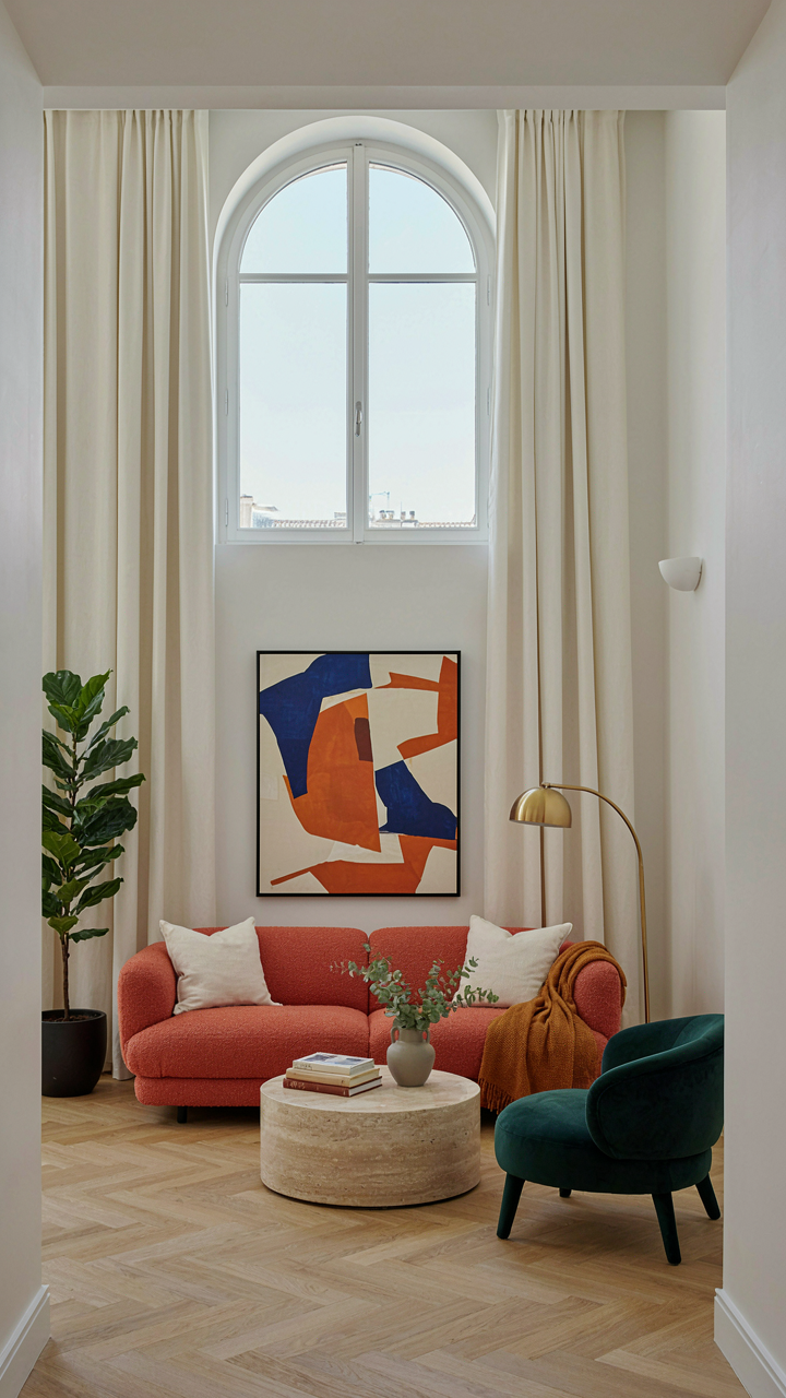
You want to believe your home looks lived in without actually living in it—that’s the real draw here. English country design operates on a principle from material science called entropy: disorder increases over time. The style doesn’t fight this. It banks on it. A chintz sofa with faded patches, wood with visible grain variation and color shift, a floorboard that’s darker from foot traffic—these aren’t flaws to hide. They’re proof the space has history.

Most design advice tells you to distress things artificially. That’s backward. Real wear patterns follow physics. They concentrate where hands grip, where light hits daily, where movement happens. A chair arm darkens because skin oils accumulate there over decades. Wood grain shows stress where wood expands and contracts seasonally. You can’t fake the randomness of actual use. Start with quality bones instead: solid wood pieces that age gracefully, tight weaves in chintz that soften rather than shred, finishes that develop patina instead of peeling.
Objects That Carry Weight
Heirlooms aren’t decoration. They’re anchors that make a room feel inhabited by people, not a catalog. The mechanism is simple: when a piece has provenance, your brain registers it differently. A mahogany side table your grandmother owned creates spatial authority that a new reproduction can’t match, regardless of price. English country homes traditionally mixed periods deliberately because families kept what worked and added pieces as circumstances changed. That’s not constrained taste. That’s economic reality turned aesthetic.
The common mistake is treating heirlooms as museum pieces—isolated, precious, untouchable. That inverts the original function. Your grandmother’s china actually sat on tables. The Turkish rug took footsteps. A room filled with inherited objects that serve their intended purpose reads as coherent and lived-in. Objects you use beat objects you display. Arrange inherited pieces into daily rotation: use the old serving dish, place the antique mirror where it reflects light into a dark corner, keep the vintage tray on the coffee table holding current books. Functional placement is what signals authenticity.
English Living Room Ideas: Designed For Life, Not Likes
Comfort And Utility As The Foundation
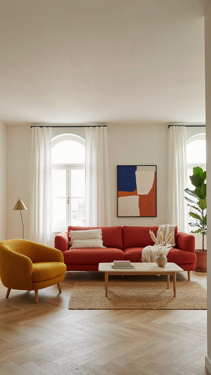
You want this room to look intentional. That’s the real driver. But here’s the mechanism: English country design doesn’t separate comfort from aesthetics. It collapses the distinction. A worn leather wingback chair isn’t “rustic charm”—it’s a functional object that has absorbed years of use. The fabric shows it. The wood frame carries weight properly. Form follows function, and the visual result emerges from honest material choices, not styling decisions made for approval.

Chintz works in country interiors because it performs. The glazed cotton weave resists dust and wear. It takes pattern well. Warm wood furniture—oak, walnut, mahogany—gains patina that cannot be faked or rushed. These materials age visibly and improve functionally. You sit on a sofa because it’s deep and supportive, not because it photographs well. The aesthetic follows the use pattern, not the reverse.
Creating Lived In Moments Over Staged Moments
Most advice says to “arrange vignettes” as if you’re curating a museum. Wrong frame. English country living rooms reveal function through arrangement. A side table holds a reading lamp, a worn novel, a tea cup ring on the wood. A blanket drapes over the chair arm where people actually use it. Bookshelves arrange by frequency of access, not color coordination. These aren’t styled moments—they’re evidence of living.
Chintz cushions sit where bodies rest, not where light hits them best. A small wood side table bears scratches from glasses and lamp bases. The room documents how people actually move through the space. This is the opposite of the Instagram aesthetic. Visitors sense the difference immediately—it feels occupied by a person with priorities, not managed by a curator. Arrange your furniture to solve movement patterns first, then observe what the room looks like when it’s genuinely functional.
English Cottage Interiors: The Art Of The Undone
Windows Before Walls
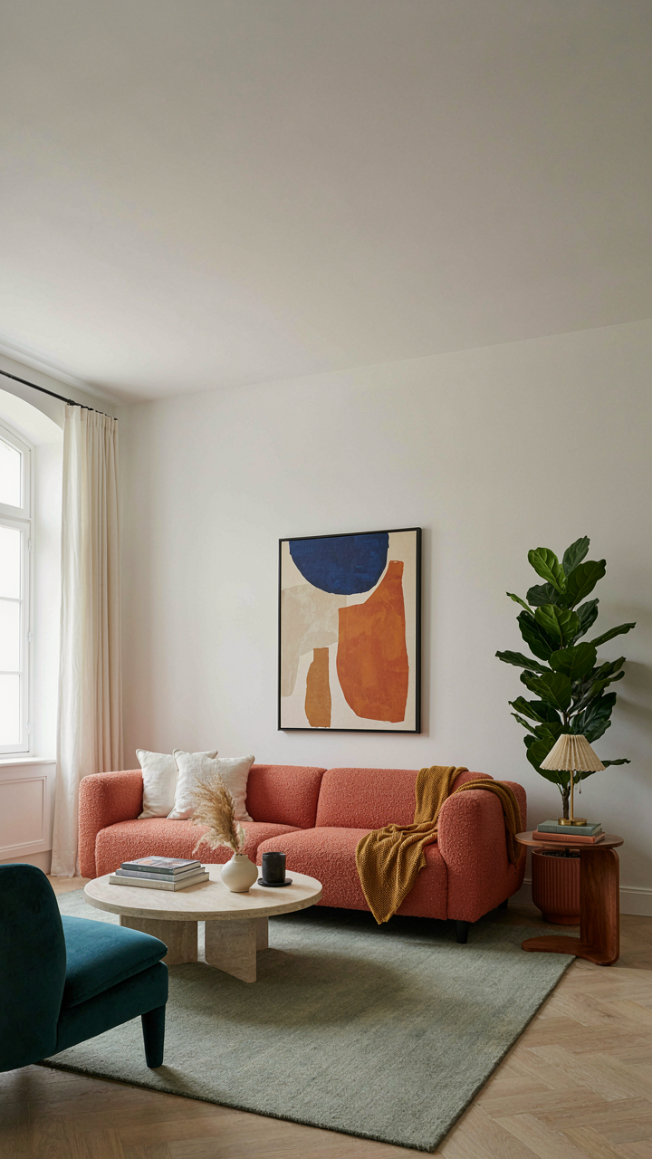
You want people to think your home just happened this way, that you didn’t try. That’s the real motive here. The mechanism is this: natural light doesn’t forgive laziness, which means it exposes intention. In English country decor, windows function like aperture settings in photography. A wide aperture (large, unobstructed windows) collapses depth and flattens the room. A controlled aperture (mullioned windows, shutters, gauze) creates layers. The cottage aesthetic depends on layered light, not bright light.

Stop treating windows as holes to fill with fabric. Chintz curtains hung on wooden poles work because they filter and scatter light across the room, creating uneven patches that read as age and authenticity. The filtered light hits warm wood differently than direct sun does. It ages the wood visually without actually aging it. Position windows to let morning light hit wood grain first. This becomes your baseline. Everything else in the room either supports or competes with this light story. Get the light right first, then place your furniture around how it lands.
Objects With Their Own History
Personal artifacts don’t belong in a room because they make you feel good. They belong because they break the rule that everything matches. English cottage rooms work on controlled contradiction, not harmony. You place a horse racing print next to chintz because the contrast proves the room evolved through time, not through one designer’s afternoon.
The strategic part: place objects with actual history in sight lines where they create small disruptions. A worn leather-bound book on a side table next to a chintz-upholstered chair. A clay pot on a shelf that doesn’t match the finish of the wood. These aren’t decorative. They’re proof that the room has purpose beyond looking intentional. Arrange artifacts along the path you walk through the space, not clustered in corners. Each object should sit where light changes its appearance throughout the day.
Traditional English Country Style: Legacy, Not Trend
When The Bones Matter More Than The Budget
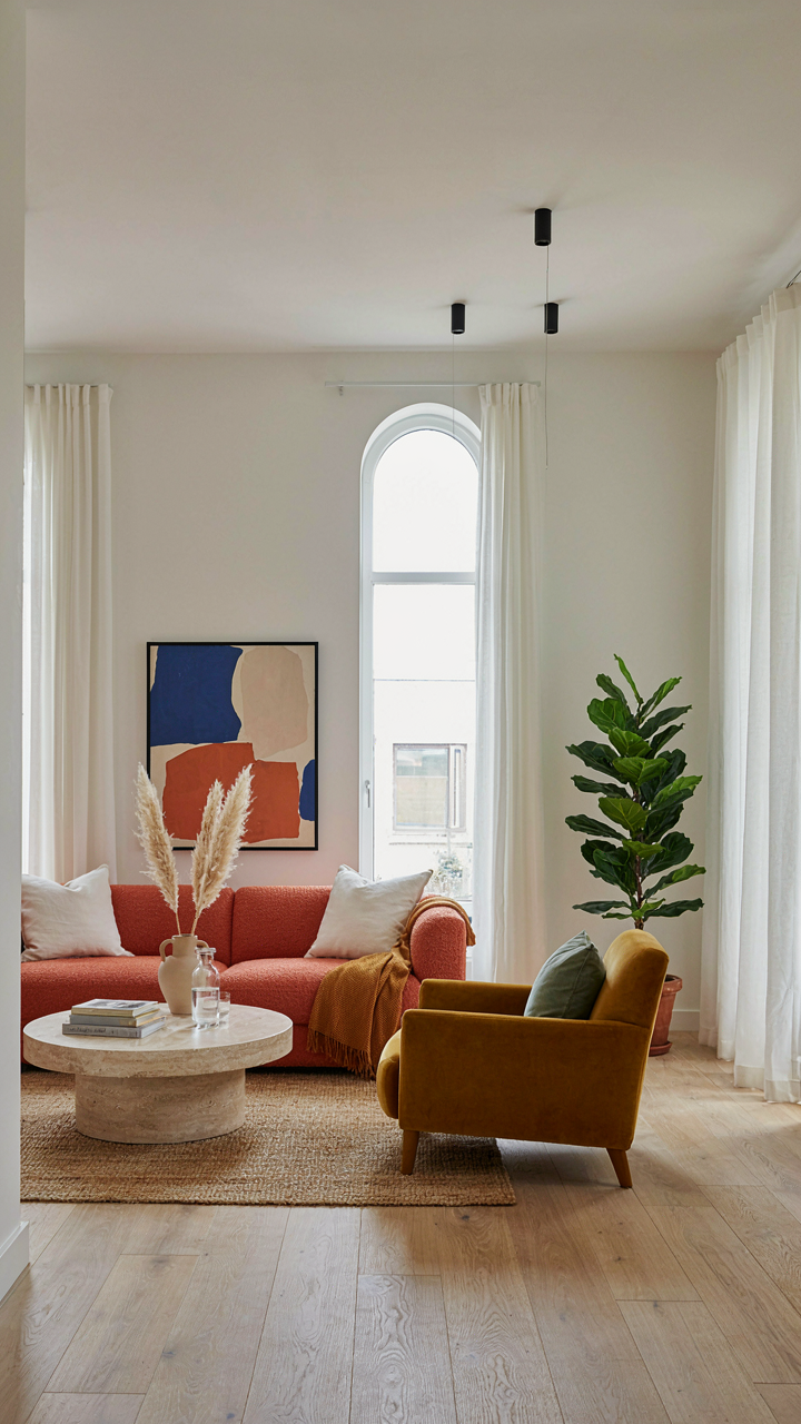
You want permission to spend money on something that won’t look dated next season. Here’s the mechanism: English country design doesn’t follow trends because it’s rooted in actual structural constraints and material availability from the 18th and 19th centuries. When you understand why a room was built the way it was, you stop chasing aesthetics and start making decisions that compound in value.

Georgian and Victorian architecture determined room proportions, ceiling heights, and window placement based on load-bearing walls and natural light patterns. Chintz became dominant because the printing technology and dye availability of that era made it the practical choice for softgoods. When you design around these facts instead of Instagram aesthetics, your spaces age forward rather than backward.
Spending Right Eliminates The Replacement Cycle
The consensus advice says buy cheaper items and replace them often. That’s backwards. Economics calls this “cost per use over time,” and English country decor exposes this math immediately because quality timber, proper upholstery, and real chintz actually appreciate functionally when maintained. A single worn leather wingback chair holds more design weight than five disposable pieces.
Invest in solid wood frames for upholstered pieces, authentic chintz fabrics with higher thread counts, and architectural elements you can’t reproduce cheaply. A mahogany side table or a properly constructed sofa becomes your baseline investment. When your supporting pieces are durable, you stop replacing and start refining, which means your actual cost per year drops significantly while your room gains coherence.
Upscale Cottage Interior Design: The Subtlety Of Wealth
Texture And Depth Over Visible Labels
You want people to know you have money without looking like you’re trying. That’s the real lever here. Quiet luxury works because it operates on scarcity of knowledge, not visibility of price tags. In military strategy, this is called asymmetric advantage: you gain superiority not by showing your strength but by making others uncertain whether you have any at all. English country interiors do this through layered texture and material depth that signal investment to those who know and read as “just old” to those who don’t.

The mechanism is straightforward. A hand-blocked linen chintz costs three times what machine-printed versions do. Nobody sees that cost difference in the finished room. What they see is how light moves through the weave, how the pattern holds complexity across distance, how the fabric hangs with weight. Aged wood beams, patinated brass hardware, worn leather bindings on shelves, faded botanicals in original frames: these communicate accumulated time and selective curation. The visitor doesn’t calculate the cost. They calculate the likelihood that this room happened by accident.
- Hand-blocked chintz in muted palettes: Requires labor-intensive printing methods. Machine versions look flat even at distance. The subtle color variation reads as intentional restraint, not budget limitation.
- Brass and bronze hardware with patina: Raw or polished finishes look recent and cheap. Aged patina signals decades of use. Hardware becomes invisible because it belongs.
- Layered wood tones from different periods: Mixing walnut, oak, and elm frames suggests collection over time. Matchy-matchy wood finishes signal newness and coordinated purchasing.
- Faded textiles and worn upholstery: Strategic fading from sun exposure reads as authentic inheritance. Perfect condition chintz looks theatrical and new, defeating the purpose.
- Original artwork and framing choices: Unmatted botanicals, amateur watercolors, and period-appropriate frames suggest personal acquisition rather than decorator selection.
The common mistake is thinking quiet luxury means sparse or minimal. It doesn’t. It means full rooms with zero visual shouting. A chintz-covered wingback next to a side table layered with stacked books, a worn Turkish rug anchoring dark wood furniture, walls lined with paper that costs more per roll than mass-market alternatives but reads as simple pattern work. Restraint here means restraint from trend signals, not from furnishing the space completely.
When Maximalism Requires Strategic Omission
The counterintuitive truth: English country maximalism fails when every surface gets attention. Most decorators stuff rooms and call it abundance. Real English country interiors are cluttered by design but quiet by discipline. They’re full rooms where nothing competes for dominance because nothing shouts.
Pattern mixing in chintz-heavy schemes works only when you stop thinking about “balance.” Instead, establish a single dominant pattern and let secondary patterns recede through color repetition. A large-scale floral chintz on the sofa anchors the room. Smaller-scale chintz or solid linen on chairs echoes one color from that primary pattern. Walls stay neutral or use a corresponding tone. Books, objects, and collected items fill the remaining space, but they’re neutral vessels holding the story of the room. The eye never lands confused about what matters. Everything matters equally because the underlying color palette tied it together before you added anything.
Restraint operates here like a hydraulic valve. You open fully on layering and depth but close entirely on color variation and visual jangling. A room can hold ten different patterns if they share a limited palette. It can hold numerous wood tones if they’re warm and aged rather than bright and varied. The mechanism is palette consistency, not object sparseness. Start with three colors that work together, then repeat them relentlessly across all materials, textiles, and finishes. Every new layer you add must pull from that established palette or it reads as decorating mistake rather than collected abundance.

Large Front Room Ideas: The Unapologetic Statement
Anchoring Expansive Spaces With Commanding Pieces
You want a large front room because it signals you have resources and taste. The real problem: empty space reads as neglect, not luxury. Borrow from architecture’s load-bearing principle. A commanding piece carries the visual weight of the entire room, preventing the space from feeling hollow. In English country design, this means one substantial anchor—a substantial sofa, a fireplace surround, or an oversized case piece in warm wood—positioned to command sightlines from entry.
The mistake most people make is distributing furniture evenly, as if the room needs permission to breathe. Don’t do this. A large front room demands a single visual hierarchy. Place your anchor perpendicular to the main entrance so it claims the space immediately. Chintz upholstery on that anchor piece adds pattern density without fragmentation. The warm wood frame around the room—beams, paneling, or substantial furniture legs—creates a perimeter that contains the vastness.
Dividing Grand Rooms Into Functional Zones
Zoning operates like spatial partitioning in urban planning: you’re carving distinct functions into one continuous floor without walls. In a large front room, this means anchoring separate conversation areas, a reading nook, or a desk station through furniture placement and visual markers like area rugs in complementary tones. Warm wood pieces serve as zone dividers more effectively than light furniture because they carry visual weight and create psychological boundaries.
Chintz patterns should shift slightly between zones rather than match identically—a floral chintz in the seating area, a coordinating geometric chintz in an adjacent zone. This signals transition without overwhelming the eye. Position warm wood side tables, bookcases, or console pieces at zone edges to reinforce separation. The strategy works because humans navigate space through contrast and repetition, not through continuous pattern. End with this concrete action: map your room into three functional zones on paper, then place one commanding warm wood piece at each zone’s center.
Your Fear Of Too Much Is Simply A Lack Of Understanding What Lasts
Most people think English country decor fails because they layer too much. Wrong. It fails because they layer the wrong things. Chintz fades. Wood deepens. One dies. One lives. Pick pieces that improve with age, not pieces that photograph well today. Walk into a room today and choose one object that will look better in ten years than it does now. That’s not decorating. That’s building something real.