
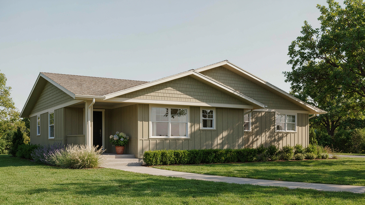
Beyond Beige: Why “Safe” Ranch House Exterior Colors Are A Trap
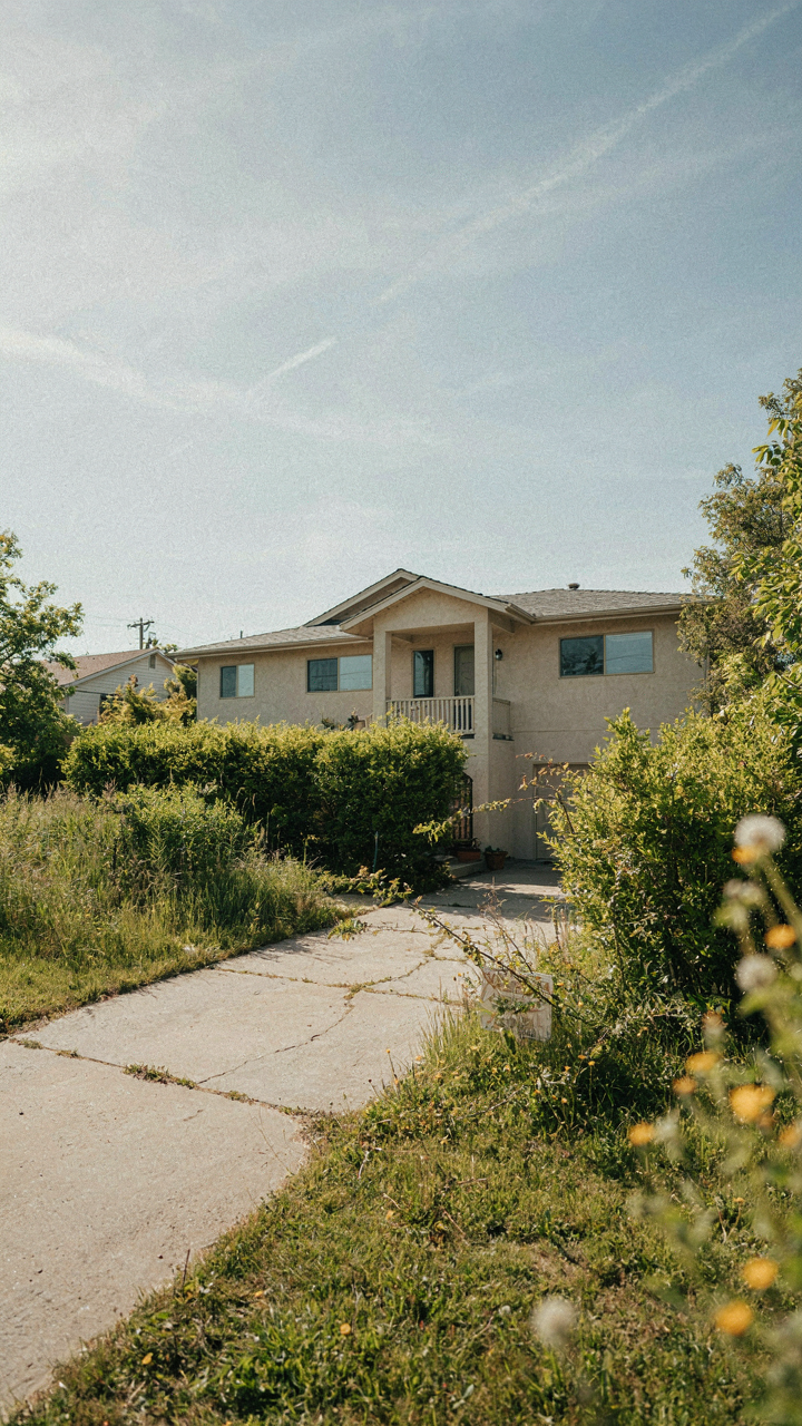
The Real Cost Of Playing It Safe
You’re drawn to beige and greige because you’re afraid of resale risk. Here’s what actually happens: Economics calls this “risk aversion,” but in ranch exterior color, it’s just camouflage. A safe color doesn’t protect your asset—it erases it. The market doesn’t reward invisible. It rewards clarity. Beige ranch homes sit longer because they fail to anchor a visual identity. You’re not protecting equity. You’re making your home forgettable to the exact moment when someone needs to remember it exists.
The math is brutal. A professionally chosen, bold ranch color costs the same to apply as beige. Resale data shows homes with intentional exterior color palettes move faster and list higher than those in neutral defaults. Beige isn’t a safety net. It’s a slow leak. You pay for paint labor either way. One compounds value through distinctiveness. The other compounds invisibility through compliance.
When Blending In Becomes Disappearing
Conformity looks like restraint until you realize your house occupies zero mental space in your neighborhood. Every street has ten ranches painted in the same taupe-to-gray spectrum. They blur together because they’re designed to. A ranch home’s low profile already works against visual impact—the horizontal lines, the overhanging eaves, the modest setback from the street. Choosing a color that vanishes into that architecture is doubling down on the problem.
The mechanism is attention scarcity. Your neighbors and potential buyers have limited focus. A ranch painted in consensus beige competes for zero attention. One painted in a considered, purposeful color—dusty sage, warm terracotta, even a restrained charcoal—creates immediate cognitive separation. The color doesn’t need to shout. It needs to register. Choose a color that refuses to disappear into the background, and you’ve fundamentally changed what your property communicates.
The Signaling Protocol: Your Ranch House Exterior As An Asset
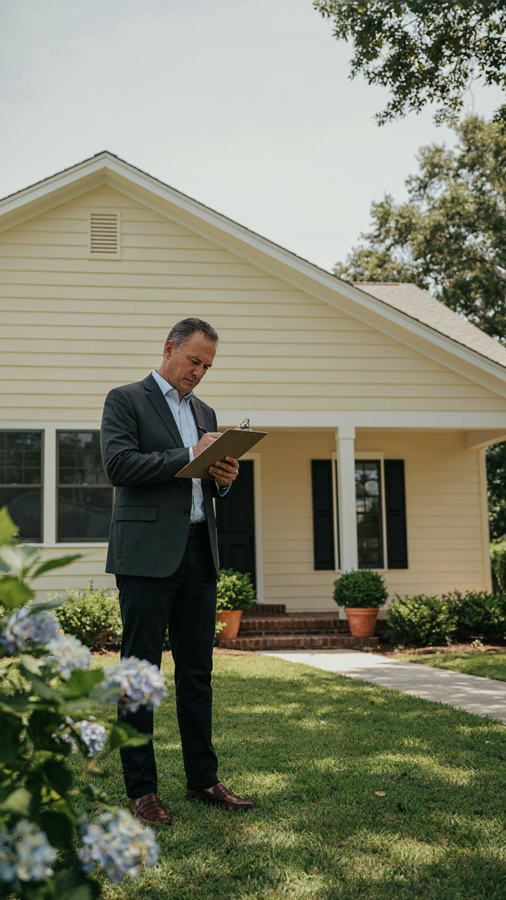
Color Choice Moves The Appraisal Needle
You care about this because you’re sitting on an asset you can’t ignore, and you suspect the wrong color choice costs you money when you sell. You’re right. Real estate appraisers and buyers operate on pattern recognition, not logic. Your exterior color functions like a signal in economics: it communicates maintenance level, taste alignment with market expectations, and perceived property age before anyone steps inside.
Neutral exterior colors—cream, beige, soft gray, taupe—consistently correlate with higher appraised values in ranch homes across most markets. This isn’t opinion. Appraisers anchor their assessments partly on comparable sales, and homes painted in consensus colors sell faster and closer to asking price. Bold colors like deep red, purple, or bright orange narrow your buyer pool and trigger unconscious quality questions, even if the home itself is immaculate. The mechanism is simple: deviation from market expectation creates friction in the buyer’s mind, and friction depresses offers.
What Each Color Category Actually Signals
Warm neutrals like cream and soft beige communicate “maintained, conservative, move-in ready” to traditional buyers and appraisers. These colors also mask minor staining and weathering better than stark white, which shows dirt and deterioration plainly. Cool neutrals like gray and greige signal “updated, modern-leaning” without radical departure. Appraisers tend to value these slightly higher in areas where mid-century ranch homes have undergone recent renovations.
Dark colors—charcoal, deep brown, slate—require flawless siding condition to work. Any fade, mildew, or weathering becomes visible immediately, which damages perceived maintenance level. Bright whites performed well historically but now read as either neglected (if dingy) or aggressively new (if pristine), creating valuation uncertainty. The protocol: match your color to your siding condition first, then to local market comps. Check five recently sold ranches within a mile of your home. If four of five are painted in warm neutrals, your choice is already made.
The “Contextual Leverage” Method For Ranch Style Homes Exterior Colors
How Nature Signals Through Color
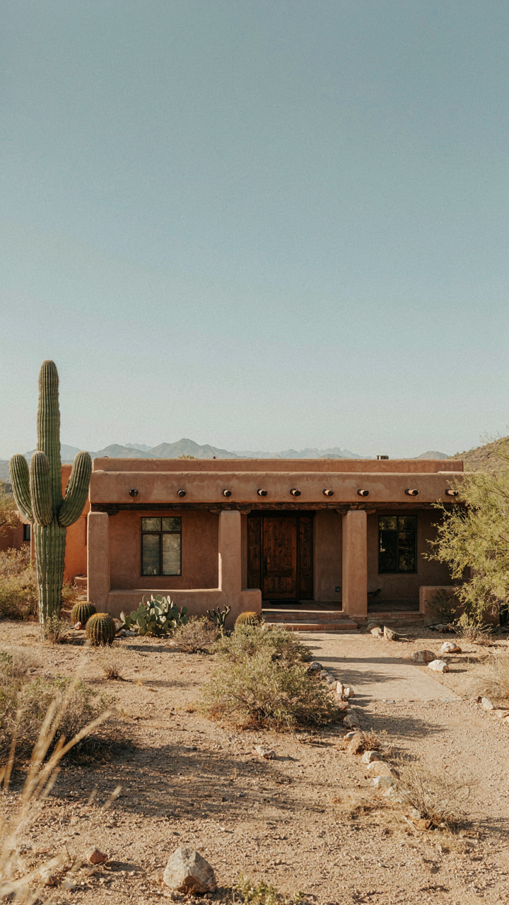
You care about this because you don’t want your house to look like everyone else’s, and you’re hoping some framework will save you from guessing. Here’s the real mechanism: biology uses color as communication, and ranches sit low to the ground where they compete visually with landscape context, not sky. In nature, mimicry works because the organism matches its environment to survive. Warning signals work the opposite way, standing out to communicate danger. Ranch exteriors operate in this same tension. A low-slung horizontal form needs color strategy that either anchors it into its surroundings or deliberately breaks from them. Most people choose beige and cream because they assume neutral equals safe. That’s incomplete thinking.
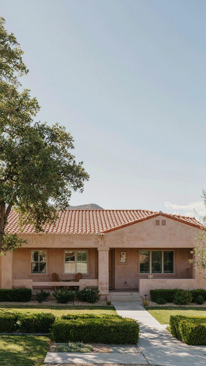
Color choice in ranches isn’t about taste. It’s about whether you’re signaling integration with your landscape or differentiation from it. Adobe tan, dusty sage, and warm grays anchor a home into earth tones and make the structure appear to belong rather than sit on top. Charcoal and deep clay reds do the opposite, making the horizontal mass read as intentional contrast. The mechanism matters because a ranch that matches its context recedes and feels larger on its lot. A ranch that contrasts commands visual territory without needing scale.
Translating Environmental Signals Into Paint Decisions
In ecology, organisms use mimicry to blend in and warning coloration to stand out. Both work. Ranch exteriors deploy the same logic: you’re either mimicking your landscape or broadcasting your presence. Your regional soil color, vegetation palette, and seasonal light should inform whether you blend or break. A ranch in Colorado clay country uses burnt orange and terracotta to signal belonging. A ranch in maritime regions uses muted greens and charcoal to echo stone and evergreen. The mistake everyone makes is choosing colors based on what’s “in style” nationally. That ignores the one variable that actually matters: what surrounds the building.
Direct sunlight exposure shapes how color reads on a ranch, especially at the low angles where ranch rooflines sit. South-facing walls bleach warm tones and deepen cool ones. North-facing sections flatten everything. Morning and evening light hit ranch exteriors at angles that reveal texture more than color choice alone. Instead of picking a color from a sample card in store lighting, observe your lot at different times of day and seasons. Then choose a color that signals either integration or contrast based on what you want the house to communicate about its relationship to the land.
The Psychology Of Exterior Color Schemes: Influencing Perception
How Color Temperature Shapes First Impression
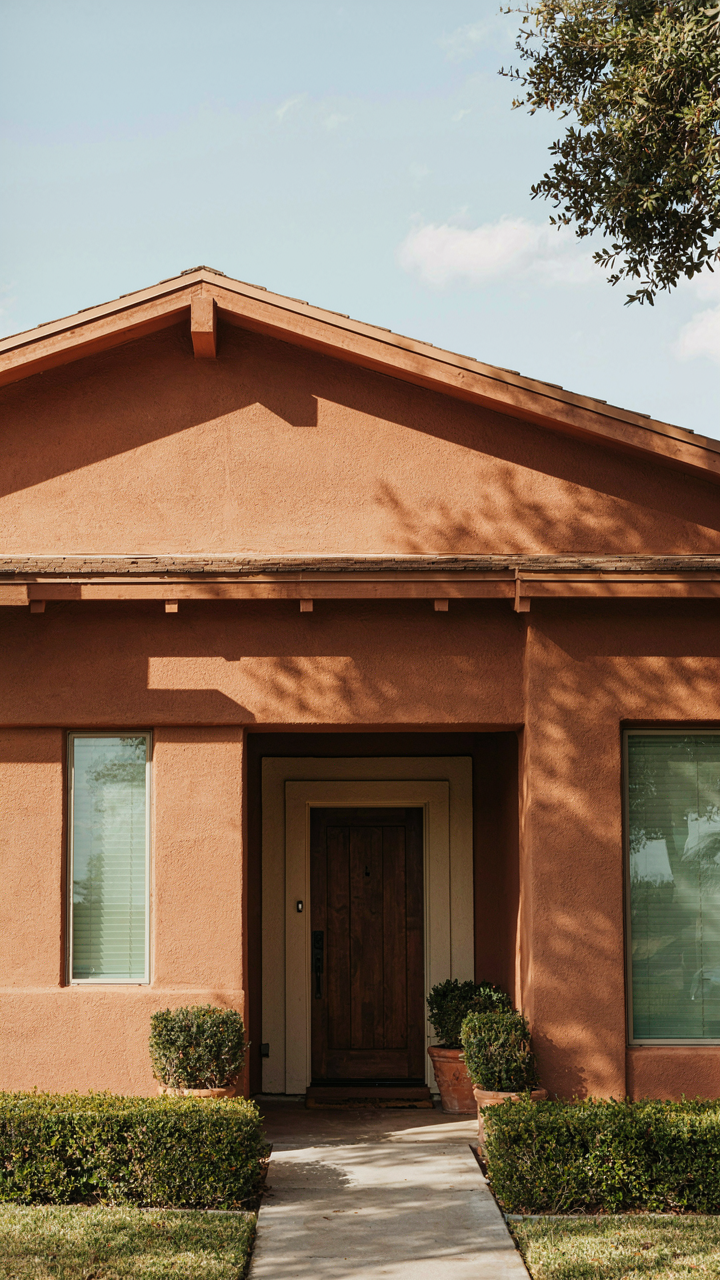
You care about this because your house communicates before you do, and most people read it wrong. Color temperature works like contrast in photography—it’s the mechanism that makes a structure feel close or distant, warm or cold, approachable or institutional. Warm colors (ochre, terracotta, warm gray) advance toward the viewer and compress the visual space. Cool colors (blue-gray, sage, charcoal) recede and elongate the facade. Ranch homes sit low and sprawl horizontal. Warm tones fight that flatness by creating visual weight at the perimeter. Cool tones accept it and amplify the plane instead.

The temperature you choose determines whether a ranch feels grounded or invisible. Warm exteriors work best on homes with strong shadow lines—deep eaves, brick patterns, or textured siding that gives the eye something to hold. Cool exteriors demand clarity: clean lines, minimal detail, and good light exposure so the color reads as intentional rather than dingy. Most people default to cool because it feels safe. That’s the trap. The real lever is matching temperature to your home’s existing geometry and material, not to what looks trendy in design magazines.
Contrast And Visual Hierarchy On Horizontal Lines
The ranch house spreads. Everything wants to disappear into the landscape. Contrast forces the eye to work and makes the structure legible. This is basic visual hierarchy from graphic design applied to buildings. A single-color ranch vanishes. A two-color ranch with trim, fascia, or a secondary wall color creates depth and breaks the horizontal monotony. The contrast doesn’t need to be dramatic—a shift of 3 to 4 value steps in the same color family works harder than you’d expect.
Most advice says “accent the trim” generically. That misses the mechanism. The trim only matters if it frames something real—an entryway, a garage face, a porch edge. Placing a contrasting color on the trim around a garage you can’t see from the street wastes the effect. Instead, identify the strongest horizontal line your ranch already has, then use contrast to interrupt it. A medium tan body with charcoal fascia. A soft gray with cream trim at eye level. The contrast must sit where the eye naturally lands when someone approaches. That placement is the protocol, not the colors themselves.
Ignoring Trends: Timeless Ranch House Exterior Colors That Endure
The Resale Trap Of Trendy Paint
You’re worried a safe color choice makes your ranch invisible at resale. Here’s the mechanism: trend-chasing exterior colors create a specific liability. When you paint your ranch in whatever’s popular now, you lock yourself into a narrow buyer preference window that closes the moment the trend shifts. Beige was safe in 2008. Gray felt fresh in 2015. Now both read as dated. Trends aren’t timeless because they’re designed to change.
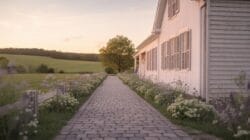
The math is brutal. A trendy color ages the house faster than an outdated one because buyers notice the deliberate choice to follow fashion. Classic colors don’t age—they plateau. They stay neutral not because they’re boring, but because they never claimed to be innovative. Resale buyers interpret stable colors as responsible maintenance, not indifference.
Neutrals With Depth, Not Flatness
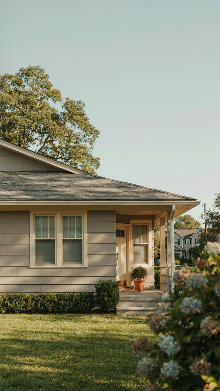
Forget the advice that ranch houses should be beige or white. That’s incomplete. The real distinction isn’t between color and no color—it’s between flat readings and dimensional ones. A true neutral has undertone weight. Warm grays with taupe or greige undertones hold value longer than pure grays because they contain information without announcing themselves.
The classics that endure are colors that respect the era the ranch was built in, not the era you’re selling in. Soft warm whites with cream undertones, muted earth tones drawn from native soil and stone in your region, and warm grays that read neither industrial nor sterile. Test samples on your house for three weeks across morning, afternoon, and evening light. Confirm the color doesn’t shift into pink, green, or blue under different conditions. That’s your protocol for selecting one that won’t trap you.
The Climate Equation: Regional Considerations For Ranch Exterior
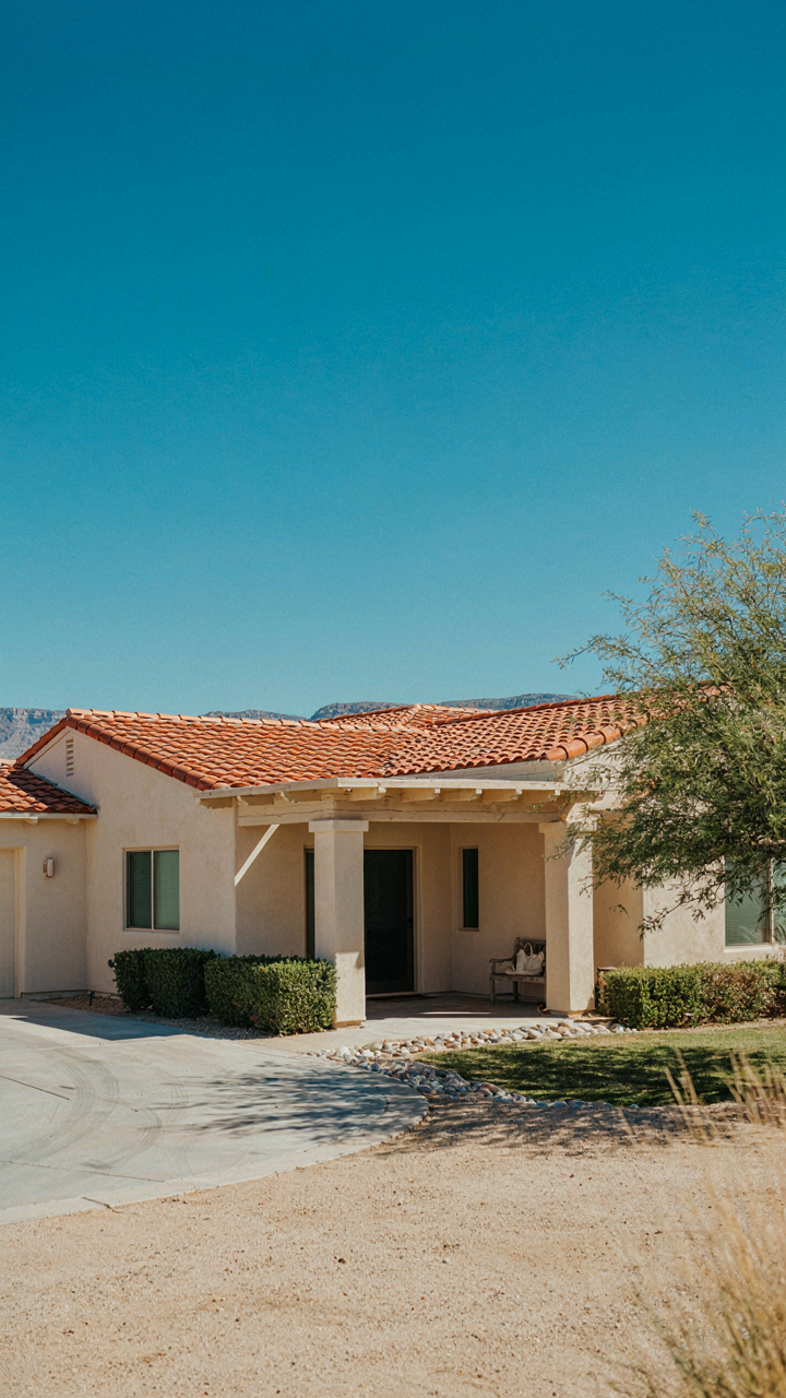
Sun Exposure And Color Fade: Material Science Basics
You’re worried about picking a color that’ll look tired in five years. Here’s the mechanism: UV radiation breaks chemical bonds in paint pigments. Think of it like metal fatigue in engineering, where stress cycles degrade material strength. Darker colors absorb more solar radiation, which accelerates pigment degradation and causes faster fading. Light colors reflect more energy, which is why they hold their appearance longer in harsh climates.
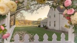
The common advice is just “pick light colors.” That’s incomplete. Pigment quality matters more than color value alone. Iron oxide reds and earth tones fade slower than synthetic reds and bright blues at the same tonal depth. Western and southern exposures face three to five times more UV intensity than northern walls. Select paint systems rated for your specific climate zone, not generic “exterior grade” products.
Adapting Palettes To Local Flora And Light Conditions
Most homeowners choose colors in their driveway under midday sun, then get shocked when morning and evening light reveal something totally different. Daylight color temperature shifts throughout the day. Morning light skews blue, afternoon light skews yellow, and late sun adds red. Ranch homes sit low and wide, so surrounding vegetation creates shadow patterns that shift seasonally. A beige that reads neutral in July reads gray-green in December when deciduous trees shed leaves and change light angles.
Drive the neighborhood at the exact time of day your house faces its strongest light exposure. Photograph colors on your actual wall, not paint chips. Regional flora matters too: homes near evergreen forests need colors that don’t war with deep green backgrounds, while desert properties compete with warm earth tones and sparse vegetation. Your palette should recede into or complement what’s already there, not scream against it. Spend time on-site at different seasons before locking in your choice.
Architectural Integrity: Honoring The Ranch House Form
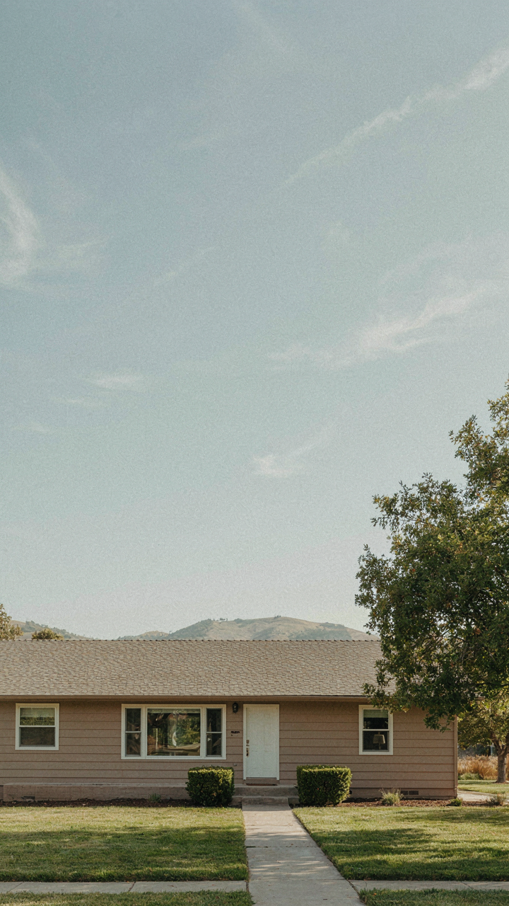
Work With The Horizontal Line, Not Against It
You want your ranch to look intentional, not like you got lucky with a color. That’s the real fear underneath this whole section. Here’s the mechanism: ranch homes operate on horizontal dominance. The long roofline, the stretched footprint, the bands of windows—these are structural facts, not suggestions. In architecture, negative space is the field term for what’s empty. Your color choice either amplifies that emptiness or clutters it. Most people choose colors that fight the form instead of resolving it.

The horizontal plane of a ranch demands colors that don’t interrupt its visual momentum. Earth tones, muted grays, and warm taupes work because they recede rather than advance. Colors that advance—bright reds, high-saturation yellows, pure whites—chop the house into segments. Cream, sand, and warm gray allow the roofline and foundation to do the organizing work. The color becomes a backdrop for proportion, not a competing element demanding attention.
Emphasize What Makes Your Ranch Different
Most ranch advice tells you to “accent” features. That’s backwards. You don’t accent a ranch; you clarify its specific geometry. Different ranches have different visual anchors. Some have deep eaves that create shadow lines worth highlighting. Others have brick chimneys or stone details that need color support, not distraction.
If your ranch has a horizontal band of clerestory windows or a recessed entry, your exterior color should allow those details to breathe. Matte finishes on trim work with semi-gloss or satin on body panels to create subtle contrast. Avoid the impulse to use a second color on your trim simply because you can. One cohesive color family with finish variation accomplishes what two colors cannot: it respects the ranch’s original simplicity while updating its presence.
The Cost Fallacy: Investing In Longevity, Not Just Aesthetics
Cheap Paint, Expensive Mistakes
You’re afraid you’ll waste money on paint that peels in three years. Here’s the mechanism: cheap exterior paint lacks binder density, so UV and moisture penetration accelerates failure. A $25 per gallon contractor-grade paint fails faster than a $60 per gallon premium formulation because it can’t hold pigment and protect substrate equally.

The math inverts when you measure cost per year of protection. Premium paint on a ranch home typically lasts 7-10 years. Budget paint lasts 3-4 years. You repaint twice while premium paint owners repaint once. Two labor cycles, two primer applications, two full prep jobs. That’s your actual cost.
- Acrylic latex over oil-based: Modern acrylics outperform oil on ranch exteriors because they expand and contract with temperature swings without cracking, common on low-slope rooflines and flat fascia.
- Binder-to-pigment ratio: Premium formulas use higher resin content, creating a denser film that resists alkali burn and chalking on mineral-heavy ranch siding materials.
- Primer selection by substrate: Bonding primers grip aluminum trim and galvanized gutters. Blocking primers stop bleed-through from redwood and cedar stain. Wrong primer kills the topcoat timeline.
- Sheen matters for function: Flat finish hides imperfections but shows dirt and weathers faster. Satin balances durability and appearance on ranch homes, resisting mildew better than flat in humid climates.
- Regional formulation differences: Paints sold in Arizona contain different UV stabilizers than those sold in the Pacific Northwest. Buy locally formulated paint, not national stock clearance paint.
The labor cost to repaint a 1,400 square foot ranch home runs $1,200 to $1,800 per cycle. Cheap paint forces two cycles in twelve years. Premium paint forces one. You’re not paying more for paint. You’re paying once instead of twice.
Strategic Material Choices For Enduring Curb Appeal
The common advice says pick colors you love and pick durable paint. Wrong. You need to match material to climate stress and color retention mechanism. Ranch homes sit low and horizontal, which means eaves catch different UV angles than two-story homes, and foundation areas stay damp longer.
Fiber cement boards hold color better than vinyl because they don’t off-gas and fade chemically like PVC polymers do. Vinyl siding in cream or beige shows chalking visibly after five years. Fiber cement in the same colors shows weathering, not failure. On trim and fascia, aluminum gutters accept acrylic paint better than wood because wood expands seasonally and breaks paint adhesion. Metal stays dimensionally stable.
Color selection feeds directly into longevity. Earth tones and muted greens (think 1950s ranch palette) hide dust and pollen better than bright whites or grays. White ranch homes in dusty or pollen-heavy regions require cleaning every 18 months to maintain appearance. Warm taupe or soft clay tones require cleaning every 3-4 years. The mechanism is visibility of particulate matter, not paint quality. Match color to your regional dust load and cleaning frequency you’ll actually maintain.

The Unspoken Rules Of Ranch Style Homes Exterior Colors Ideas
Your Neighbors Are Already Judging Your Choice
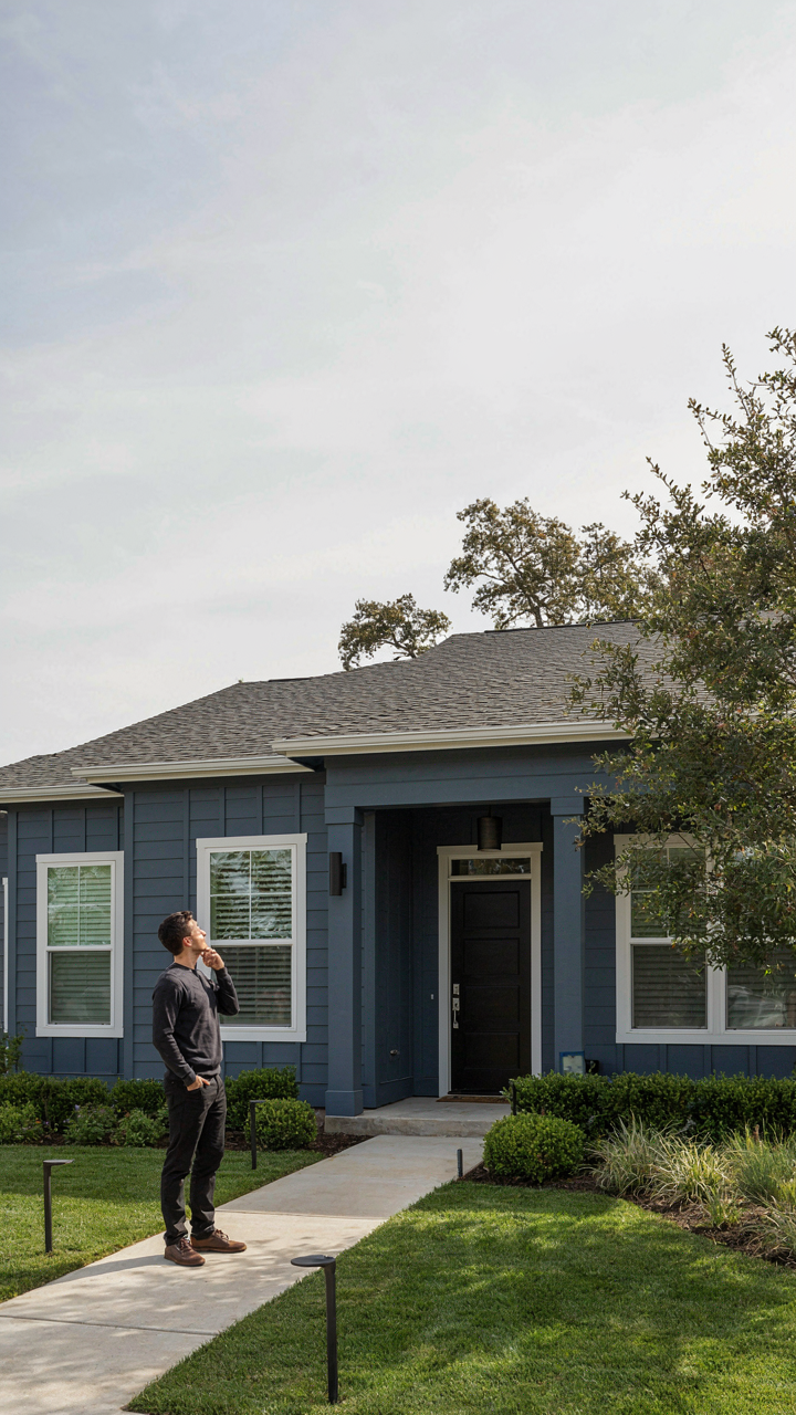
You’re worried people will think your house looks cheap or broken. That’s the real reason you’re reading this. Here’s the mechanism: ranch homes sit low and visible. They occupy the same visual weight as surrounding properties. Color deviation reads faster than architectural deviation because it’s flat, immediate, and impossible to rationalize as “character.” Neighborhoods operate on unwritten frequency matching. Pick a color outside the local bandwidth and you signal either wealth (rare renovation) or indifference (the feared one).
Most subdivisions cluster around three to five dominant colors: cream, tan, brick red, and gray variations. This isn’t accident. Developers lock early homes into these palettes because buyers felt safer. The pattern stuck. Deviation now carries social cost regardless of the actual color’s merit. Your ranch against eight similar ranches in different shades creates a hierarchy in people’s minds before they consciously notice it. The mechanism is visual conformity as invisible currency.
Breaking Rules Requires Specificity, Not Courage
Ignoring neighborhood codes because you want to “express yourself” is naive. That’s not breaking rules intelligently. Intelligent rule-breaking targets the mechanism, not the symptom. You break the color code only when you simultaneously upgrade materials or execution so dramatically that the neighborhood recalibrates its entire judgment of your property upward. A ranch painted in deep charcoal reads as bold only if the trim, hardware, and landscaping are objectively newer and cleaner than surrounding homes.
The actual lever is renovation visibility. Paint a ranch an unexpected color while keeping original aluminum trim, weathered foundation, and overgrown shrubs, and neighbors interpret it as poor judgment. Paint it the same color but install modern stainless steel fixtures, refresh the soffit, and maintain sharp landscaping edges, and the same color reads as intentional. You don’t break the rule. You shift which rule applies. The neighborhood then judges you on execution quality instead of color conformity.
The Real Obstacle Isn’t Finding The Right Color; It’s Overcoming Your Fear Of Being Wrong
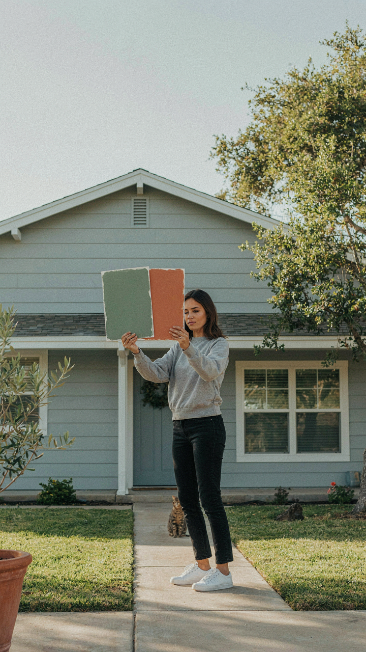
Most people stare at ranch house exterior colors for months, waiting for certainty that never comes. You won’t find it. Pick a color today, commit to it for two weeks, then drive past your house daily. Your gut will tell you if it works. Humans are terrible at imagining things. You’re better at reacting. Stop seeking permission from Pinterest and start trusting your eyes. The worst color choice beats analysis paralysis every time.



