
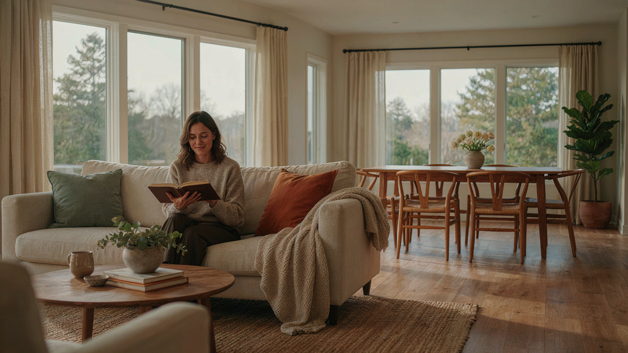
The Open Concept Delusion: Why Less Wall Is Rarely More Function
The Social Echo Chamber Problem
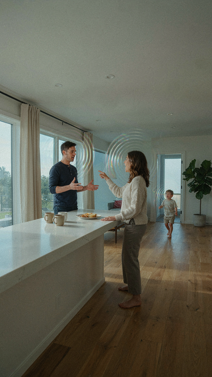
You want open flow because you think it signals modern living and design competence. Here’s the mechanism: open-concept ranch layouts weaponize acoustic sociology. Sound travels unobstructed through connected spaces, meaning every conversation, TV, kitchen noise, and argument broadcasts into every room simultaneously. The ranch home’s already-modest ceiling heights amplify this effect. You eliminate walls to gain sightlines but lose acoustic privacy, forcing inhabitants into constant social performance or enforced isolation behind closed doors elsewhere.
Ranches built before the 1970s never featured open kitchens for a reason. The period’s design separated zones functionally, not for restraint but for control. Cooking odors stayed contained. Noise stayed localized. Family members could occupy the same home without occupying the same acoustic space. Open-concept reverses this: it creates the illusion of togetherness while delivering the reality of intrusion. You don’t live in flowing space. You live in a room where everyone hears everything.
When You Actually Need Walls Back
The popular take says open-concept works for young couples or small households. False. Even two people need separate acoustic territories. A bedroom shouldn’t hear the kitchen. A home office shouldn’t broadcast into living areas during calls. Ranch homes solve this through their modular footprint, not despite it. The real problem is that walls became aesthetically controversial before functionality re-entered the conversation.
Privacy isn’t antisocial or restrictive. It’s operational. Humans need spaces where other humans cannot hear, see, or interrupt. Modern ranch renovations that remove all walls then install glass doors or pocket doors are just admitting the original design was right. They’re paying money to rebuild containment after removing it. The direct approach: assess which rooms genuinely benefit from visual connection, then wall off the rest. Strategic walls don’t reduce function. They multiply it.
Ranch Interior Design: The ‘Defined Zones’ Protocol For True Flow
Visual Barriers Without Walls
You want open flow without feeling like you’re living in a warehouse. The real mechanism here comes from architecture: load-bearing vs. non-load-bearing walls. In ranch homes, most interior walls carry no structural weight, so the assumption is you should tear them down. Wrong. The problem isn’t the wall itself. It’s that you’ve eliminated the spatial definition that makes a room feel intentional instead of accidental.

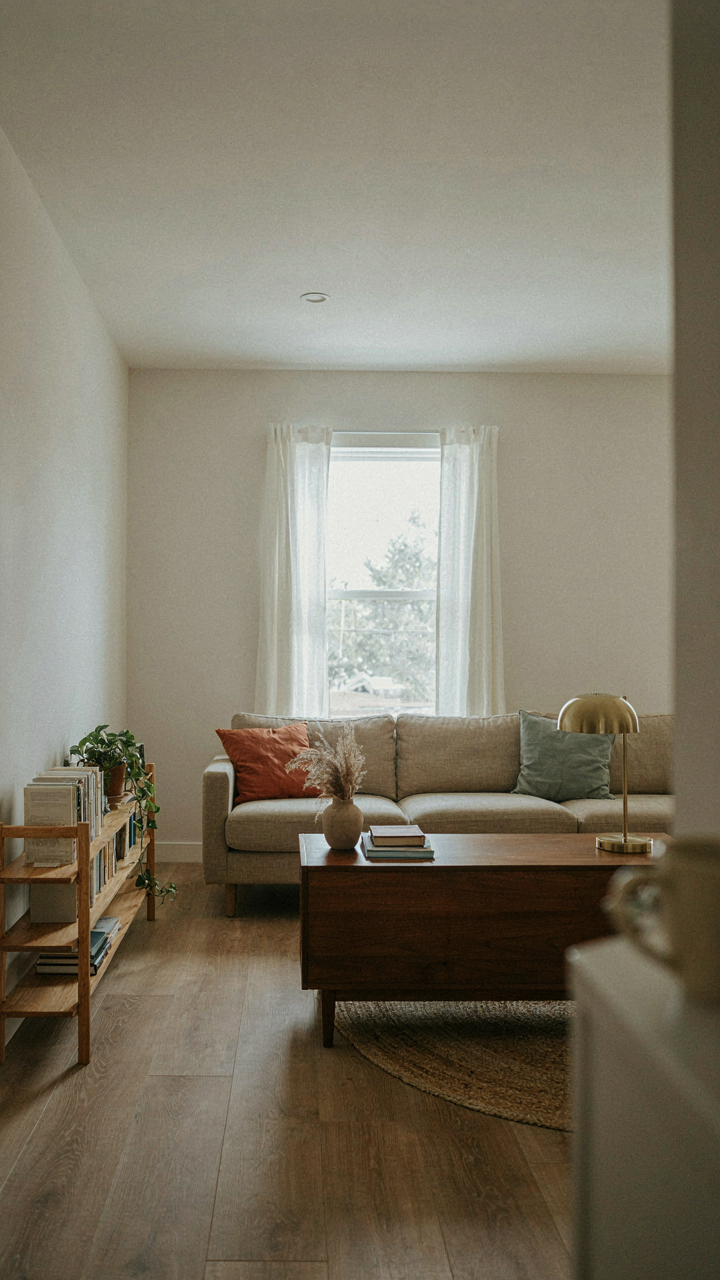
Visual barriers work because the human eye reads interruption as boundary. A low credenza, a partial height wall, or a room divider doesn’t block movement or sightlines the way a full wall does, but it registers psychologically as a threshold. Ranch homes from the 1950s and 1960s were built with this exact tension: open plans with strategic sightline breaks through half-walls, columns, or floating shelving. You’re not building walls. You’re building permission structures that let people understand the purpose of each zone without physically containing it.
Furniture As Spatial Architects
Furniture placement determines how people move through a room before they ever consciously choose a path. This is spatial organization borrowed from wayfinding in urban design: objects create invisible corridors. In ranch homes, the typical mistake is scattering pieces for symmetry or centering everything on a focal point. That creates dead zones and forces traffic through the middle of conversation areas.
Instead, position furniture to form conversation clusters that anchor specific functions. An L-shaped sofa with a side table and chair facing it creates a contained social zone without walls. A console table behind a sofa serves as a visual barrier between the living area and kitchen entry. Low bookcases perpendicular to walls channel foot traffic along edges, not through centers. The furniture itself becomes the architecture. Arrange it to signal purpose first, then aesthetics follow.
Modern Ranch Interior: Light, Lines, And The Illusion Of Expansion
Windows As Load Bearing Structure
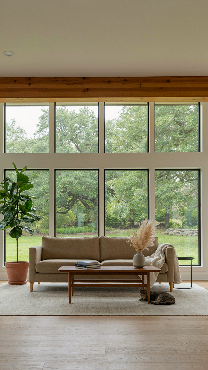
You want your ranch to feel bigger without moving walls because you’re tired of feeling cramped. Here’s the mechanism: windows don’t just add light—they extend the visual boundary of a room. In ranch homes, the low ceiling height and compact footprint create perceptual walls. Strategic window placement breaks that boundary by pulling the eye outward and upward into borrowed landscape. This isn’t decoration. It’s spatial physics applied to interior geometry.
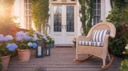
Ranches built in the 1950s through 1970s typically featured single-pane or early double-pane windows in modest quantities. Modern ranch interiors gain expansion by repositioning existing openings or enlarging them toward the property line. Place windows opposite the room’s deepest wall to create sight lines that extend depth. Skylights in central hallways multiply perceived volume by adding a vertical dimension the original design rarely offered.
Horizontal Planes That Push Space Forward
Everyone says “arrange furniture to create flow.” That’s lazy. The real tool is the horizon line—borrowed from landscape architecture, this is the eye’s resting point that defines spatial depth. In ranch interiors, horizontal planes control how far the eye travels before stopping. Lower sightlines compress space. Extended sightlines expand it.
Floating shelving, low-profile media consoles, and long credenzas running perpendicular to walls create continuous horizontal lines that guide the eye across distance rather than down into a corner. Keep these elements at eye level or below to avoid visual clutter at the top of the room. Paint walls behind horizontal furniture one shade lighter than the furniture itself—this removes the visual “stop” and extends the perceived plane backward into the wall.
Ranch House Aesthetic: The ‘Prairie Style’ Connection To Purposeful Space
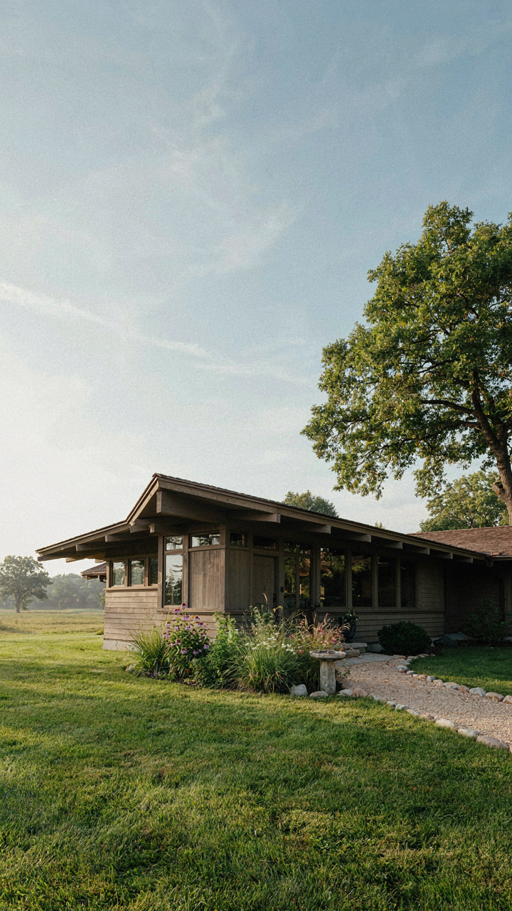
What Frank Lloyd Wright Actually Solved
You want this section to legitimize your ranch home as architecturally serious, not just a postwar default. Here’s the mechanism: Wright’s Prairie style treated interior space like a system where walls didn’t divide rooms—they organized movement. He borrowed from architecture’s own first principle: load-bearing structure determines everything else. In ranch homes, the open floor plan isn’t decoration. It’s the load-bearing concept applied to how people actually flow through daily life, eliminating walls that serve ego instead of function.
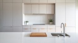
Wright rejected the compartmentalized Victorian home where each room locked onto itself. He designed sight lines and circulation patterns that let one space breathe into the next without loss of definition. Modern ranch interiors copy this by using material transitions—shifts in flooring, ceiling height, or cabinetry—instead of walls to create distinct zones. The practical takeaway: define spaces through what you place in them and how materials change, not through barriers.
Sightlines And The Landscape They Frame
The ranch home’s relationship to its exterior plot is not aesthetic sentiment. It’s behavioral design. Large windows and glass sliding doors in ranch homes weren’t added for charm. They were positioned to collapse the boundary between inside and outside so the landscape becomes part of the interior spatial plan. This matters because it expands perceived square footage and anchors the open floor plan to something real outside the walls.
Prairie style properties sat low on the land with deep eaves and bands of windows that framed views like a curated collection. Ranch homes inherited this but simplified it: one long facade facing outward, minimal setback, direct sightline to landscaping or hardscape. When furnishing a ranch interior, position seating and major pieces to reinforce these sightlines rather than block them. This turns the exterior into a visual anchor for the open floor plan, preventing the space from feeling aimless.
Modern Prairie Style Interior: The Art Of The Hidden Transition
Where Materials Stop And Rooms Begin
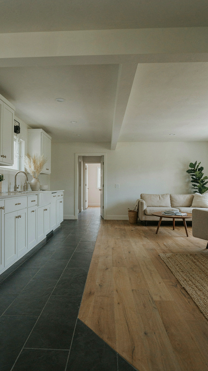
You want people to feel the space flows without seeing the seams. That’s the real goal here, not just aesthetics. Material shifts work like property lines in urban planning: they mark territory without building walls. A ranch home’s strength is its ability to move between zones, but the movement only reads as intentional when materials change, not when they vanish.

The mechanism is contrast without interruption. Tile stops and wood begins. Carpet meets stone at a threshold you can feel underfoot before your eye registers it. Drywall textured in the living room becomes smooth in the hallway. These shifts tell your brain a new functional area exists without requiring a door, a wall, or any structural barrier. The open floor plan depends on this grammar.
Ceilings That Signal Without Shouting
This runs counter to the advice that says “keep ceilings uniform for continuity.” That’s incomplete. Ceiling height, texture, or finish variations work like architectural punctuation. A dropped soffit over the kitchen, a beamed section over the living area, a flat expanse in the bedroom wing—each one signals transition without visual clutter.
The ranch style thrives on horizontal sightlines, but subtle vertical cues anchor different functions to different zones. A change from popcorn to smooth drywall overhead costs almost nothing and reads instantly. Recessed lighting placement changes the apparent ceiling plane without altering its actual height. The protocol is simple: identify functional boundaries first, then deploy one ceiling treatment per zone. Never apply the same finish everywhere and expect the space to feel organized.
Ranch Style Home Decor Ideas: The ‘Psychology Of Perception’ Method
How Proximity Shapes Room Function
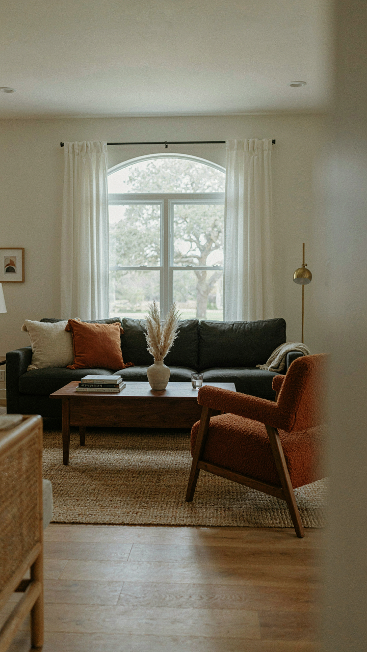
You want your ranch to feel bigger without spending money on renovation. That’s the real driver here. Gestalt psychology calls this the proximity principle: objects placed close together appear as a single unit, while separated objects read as distinct zones. In ranch layouts, you don’t have walls to define spaces. You use furniture grouping instead. Place your seating cluster, your side table, and your lighting fixture within 18 inches of each other. The brain stops treating them as scattered items and reads them as one anchored zone.

This clusters perception, not just objects. When furniture floats randomly across an open floor plan, your eye works harder and the space feels chaotic. When pieces sit near each other with intentional spacing, the room reads as organized even though the square footage hasn’t changed. The open flow stays intact because you’re using visual proximity, not walls. Position your sofa, coffee table, and console table as a tight grouping. Leave the perimeter clear. The brain now sees one defined living area in an otherwise open volume.
Creating Visual Rest Points
Most ranch advice tells you to “add color” without explaining what color actually does in open layouts. Color creates focal points your eye lands on and stops at. These are visual anchors. In ranch interiors, your eye travels farther because there are no wall breaks to interrupt the line of sight. A single accent wall, a bold area rug, or a painted built-in bookcase stops that travel. Pick one anchor per main zone: living, dining, sleeping areas if they’re visible from one vantage point.
The mechanism is straightforward. Choose a color that contrasts with your base palette. This forces visual hierarchy. Your eye sees the anchor first, treats it as a resting point, then moves to secondary elements. In open ranch floor plans, this prevents the visual exhaustion that happens when the eye has nowhere to land. Use deep charcoal, sage green, or terracotta for one statement piece per zone. Don’t scatter color everywhere. One anchor per 200 to 300 square feet of open space maintains flow while giving the eye a reason to pause.
Ranch Style Homes Interior: Avoiding The ‘Museum Effect’ In Open Spaces
Warmth And Texture Over Starkness
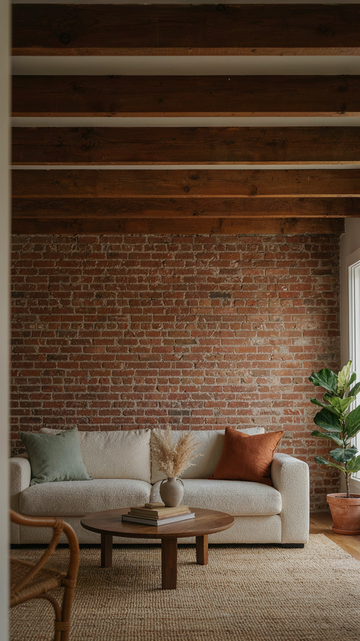
You’re worried that open-concept ranch homes feel cold and impersonal without walls to break up the space. The real mechanism at work is thermodynamic: hard surfaces reflect sound and light energy back into the room, creating acoustic and visual harshness. Drywall, concrete, and polished floors amplify this problem in ranch layouts because sound has nowhere to dissipate.

The fix is material interruption. Introduce surfaces that absorb energy instead of reflecting it. Wood beams (real or structural), brick accents, and natural fiber area rugs reduce acoustic bounce and create visual rest stops. Textured wall treatments like shiplap or board and batten break up sightlines. These aren’t decorative choices, they’re acoustic and optical corrections that make open spaces feel inhabited rather than hollow.
Personal Narrative Through Curated Objects
This is where most people fail. They scatter objects randomly and call it “personal.” Real curation means each item either tells a specific story about the inhabitant or serves a visual function in the spatial flow. Generic farmhouse decor achieves the opposite: it signals that nobody actually lives here.
- Travel acquisitions with provenance: Objects from places you’ve been create authentic narrative anchors. Display them in clusters on shelving near seating areas, not spread thin across surfaces.
- Functional craft pieces: Handmade ceramics, woven baskets, or woodturned items work in ranch homes because they bridge decoration and utility. Ranch design respects function above ornament.
- Family photography in intentional groupings: One curated wall display beats scattered frames throughout. Anchor it to a specific room zone, typically near the main seating area.
- Books arranged by actual reading: Stacked on side tables or shelved openly shows intellectual life. Ranch homes benefit from visible reading material more than other styles because open flow makes bookshelves into architectural features.
- Collected objects from a single category: Vintage ceramics, old tools, or regional art become a collection with narrative rather than random accumulation that reads as clutter.
The difference between a lived-in ranch and a museum is the absence of intentionality. Every object should occupy its spot because of a specific reason, not because designers suggested filling empty surfaces. Arrange your curated pieces in clusters near functional zones, not distributed evenly across the space like decoration taxes.
Ranch Interior Design: The ‘Feedback Loop’ Of Living And Adapting
Watch How Your Family Actually Uses The Space
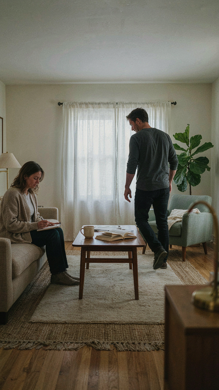
You want to believe your design plan works perfectly on the first try. It won’t. Ranch homes evolved from post-war efficiency, and their open flow only functions when you stop guessing about traffic patterns and start observing them. Live in the layout for two weeks before moving furniture or committing to zone placement. Watch where people naturally congregate, where they get bottlenecked, where dead space accumulates.

The mechanism here borrows from systems thinking: feedback. A ranch’s interconnected rooms create a living organism that reveals its own inefficiencies once inhabited. Children route around the coffee table. Someone always cuts through the dining room to reach the kitchen faster. The TV orientation forces people into awkward angles. Document these friction points without judgment. They’re data, not failures.
Design Evolves Through Repeated Testing
The typical advice says plan it all out beforehand. That’s incomplete and ignores how ranch homes actually work. Open floor plans demand iteration because sight lines, acoustics, and thermal flow only become obvious when bodies occupy the space. Make your first design adjustable, not permanent. Use furniture placement, temporary partitions, and loose zoning before investing in built-ins or permanent changes.
Each adjustment teaches you something concrete about how your specific layout performs. Move the seating cluster six feet left and suddenly the conversation area feels less isolated. Reposition the kitchen island and the work triangle becomes functional instead of theoretical. This cycle compounds. Your third iteration beats your first because you’ve eliminated assumptions. The protocol is simple: place, observe, adjust, repeat monthly for three months before declaring anything permanent.
Ranch Style Apartment: Maximizing Flow In Compact Modern Ranch Homes
Furniture That Pulls Double Duty
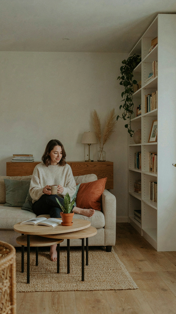
You want to feel like your space is bigger without admitting you live in a small footprint. The mechanism is simple: every object either creates dead zones or activates them. In compact ranch homes, furniture that serves one purpose is wasted real estate. A console table behind a sofa acts as a room divider and work surface. An ottoman stores blankets while functioning as seating or a coffee table. Floating shelving replaces traditional nightstands and holds books, plants, or electronics. The math is straightforward: reduce object count while increasing functional density.

Modular pieces beat built-in everything here. A sectional sofa designed to reconfigure lets you adapt the layout when traffic patterns change or when you need floor space for movement. Nesting tables compress to one surface during the day, expand for gatherings. Wall-mounted desks fold flat when not in use. This is how ranch apartments maintain openness without feeling hollow. You install nothing permanent that you might regret, which matters when rental restrictions or future resales enter the equation.
Going Vertical Instead Of Horizontal
Floor space is the real currency in a ranch apartment, so stop treating walls like decoration. This borrows from vertical farming: instead of spreading resources across acreage, concentrate them upward. Ranch homes built between the 1950s and 1970s typically have 8-foot ceilings, which gives you real vertical capacity most people ignore. Floor lamps with shelving underneath them, wall-mounted cabinets above doors, pegboards for tools or accessories, floating desk shelves stacked three high instead of one long credenza on the floor. Every inch above waist height is profit.
The ceiling itself becomes storage. Pendant lights that hang lower than standard recessed fixtures save you from dead overhead space. Tall bookcases anchored to walls pull the eye upward, making rooms feel less confined. This isn’t about decoration or making things “feel” bigger through optical tricks. Installing vertical storage means you remove horizontal clutter, which actually increases usable floor space and keeps movement patterns clear. Measure your wall height first, then buy or build upward until you hit diminishing returns.
Ranch House Aesthetic: The ‘Intentional Incoherence’ Rule
Visual Rhythm Through Controlled Contrast
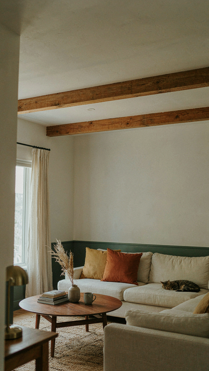
You want your ranch to feel curated instead of scattered. The real mechanism: ranches fail when owners treat the interior as one continuous neutral zone. Open floor plans demand tactical breaks, not uniformity. Think of it like graphic design’s principle of contrast and emphasis. Without deliberate visual stops, your eye has nothing to anchor on. Attention collapses. The space reads as bland, not clean.
The fix isn’t adding more stuff. It’s placing specific elements where the eye naturally rests. A dark accent wall in the den grounds that zone. A material shift from drywall to shiplap at the kitchen threshold creates separation without a door. Flooring transitions mark territory. Your brain reads these boundaries as intentional, not accidental. That distinction determines whether guests sense design or see neglect.
Texture And Tone Layering
Contrasting elements demand specificity, not randomness. Raw wood beams against smooth drywall. Matte finishes next to polished surfaces. Warm and cool tones in adjacent spaces. Ranches built from 1950 onward relied on these shifts to prevent visual fatigue in sprawling layouts. A room of identical texture and tone reads as flat, regardless of square footage.
Start with your anchor material in each zone. If the living room centers on a leather sectional, shift the bedroom to linen. If kitchen cabinets are warm oak, run cooler-toned flooring or backsplash tiles nearby. The contrast doesn’t need to scream. It needs to exist. When you walk from warm to cool, from rough to smooth, your spatial perception sharpens. The home stops feeling like one room and starts feeling like a sequence. That’s where intentional incoherence becomes a strength instead of a problem.
Your Ranch Home’s True Enemy Isn’t Walls; It’s The Unexamined Assumption That More Open Equals More
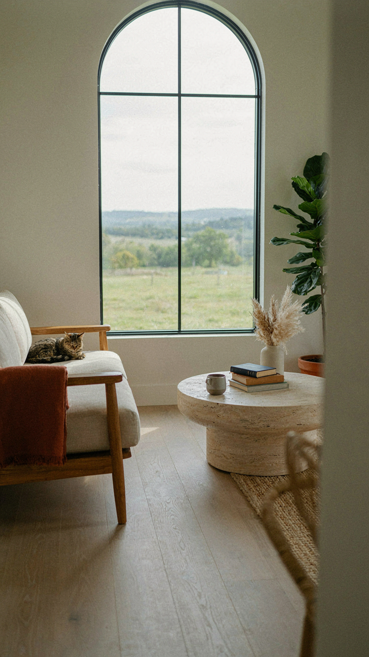
Stop designing for Instagram and start designing for how you actually live. Your ranch home doesn’t need every wall demolished. It needs intentional zones that let you move freely without sacrificing focus or comfort. Walk through your space today and identify one wall you’ve been meaning to remove. Don’t remove it. Instead, ask why you wanted it gone in the first place. The answer will tell you everything. Open doesn’t mean better; it means purposeful.



