
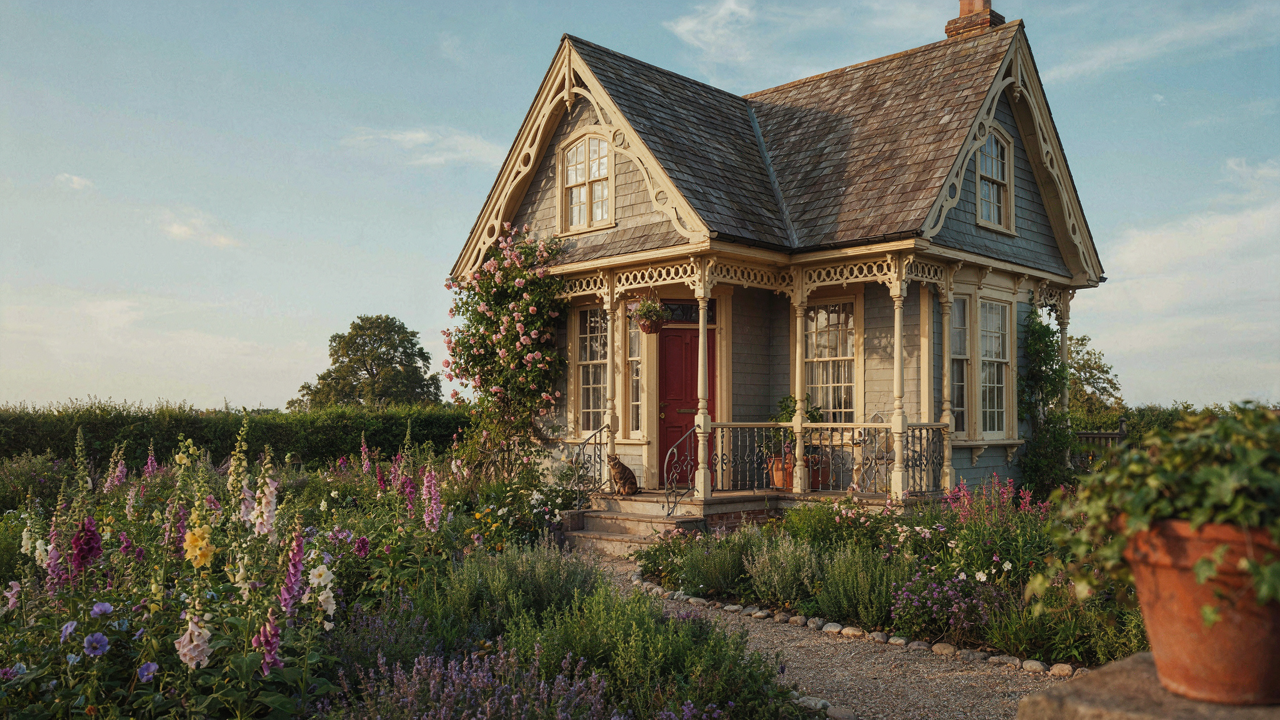
The “Compact Period Charm” Fallacy: It’s Not About Replication
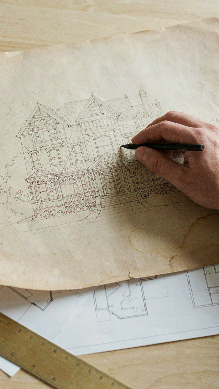
Historic Accuracy Versus Evocative Design
You want permission to skip the research because authenticity sounds exhausting and expensive. Here’s the mechanism: Victorian cottages weren’t built to a single blueprint. Regional variations, builder preference, and material availability meant no two cottages matched exactly. This breaks the replication trap entirely. You’re not chasing a museum piece. You’re building a spatial logic that reads as Victorian to the eye and functions for modern living.
The real constraint isn’t historical accuracy. It’s coherence. A Victorian cottage used specific proportions, window styles, and material relationships because they solved actual problems: daylighting in small rooms, heat retention, structural efficiency with available materials. Copy those principles, not the surface details. A period-appropriate window placement works better than a random one because it reflects 150 years of trial and error, not sentiment.
Why Faithful Restoration Often Fails
Most cottage restoration advice assumes you want to reverse time. That’s wrong. Faithful restoration kills the space because it ignores occupancy. Victorian cottages housed larger families in tighter quarters using different heating, cooking, and sanitation systems. Replicating those constraints today produces a beautiful but unlivable box.
The mechanism here mirrors thermodynamics: a closed system fighting entropy loses. Introduce modern systems (plumbing, electrical, HVAC) without adapting the spatial layout and you create hidden inefficiencies. Poor airflow. Dead zones. Thermal loss through original single-pane windows. The solution isn’t compromise. It’s targeted intervention. Keep the visual language and proportional relationships. Upgrade the performance envelope quietly. This means insulating from inside, hiding modern services in walls during renovation, and selecting replacement windows that match original divisions while adding insulation value.
The Kinetic Principle: How Victorian Small House Spaces Move
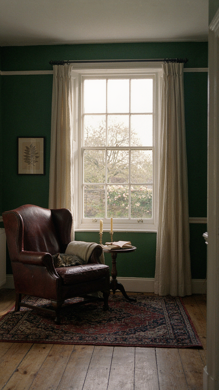
How Sight Lines Create Apparent Size
You want your compact Victorian cottage to feel larger than it is without admitting you’re working with actual square footage constraints. The mechanism is pure physics: light travels in straight lines, and your eye follows those lines to estimate distance. Victorian cottages exploit this by aligning doorways, windows, and corridors to extend the viewer’s sightline as far as possible. A hallway that dead-ends reads as cramped. A hallway that frames a window at its terminus reads as passage into space.

Victorians didn’t need to name this principle to use it. They positioned interior doors and exterior windows along the same visual axis. When you stand in a small parlor and see through a doorway to a window beyond, your brain calculates depth based on that continuous line, not the actual room dimensions. Manipulate sight lines first, add furniture second. Orient key openings toward garden views or opposite exterior walls rather than interior walls.
Shadow Depth Creates Spatial Illusion
The common advice says “add mirrors and light colors to open up small spaces.” This is incomplete because it ignores what Victorian interiors actually do with shadow and contrast. In physics, depth perception requires differential lighting: areas of shadow recede while lit areas advance. This is called aerial perspective, and it’s how your eye judges distance in any space.
Victorian cottages use deep interior colors—forest greens, burgundies, charcoal—not despite their small scale but because of it. Dark walls with contrasting white trim create shadow gradients that trick the eye into perceiving volume. A small room painted entirely pale reads flat and boxlike. A small room with dark walls, pale ceiling, and strategic window placement creates visual recession. Position primary light sources—windows or lamps—to cast distinct shadows on walls opposite them. This establishes depth cues your eye cannot ignore.
Victorian Cottage House: The Hierarchy Of Embellishment
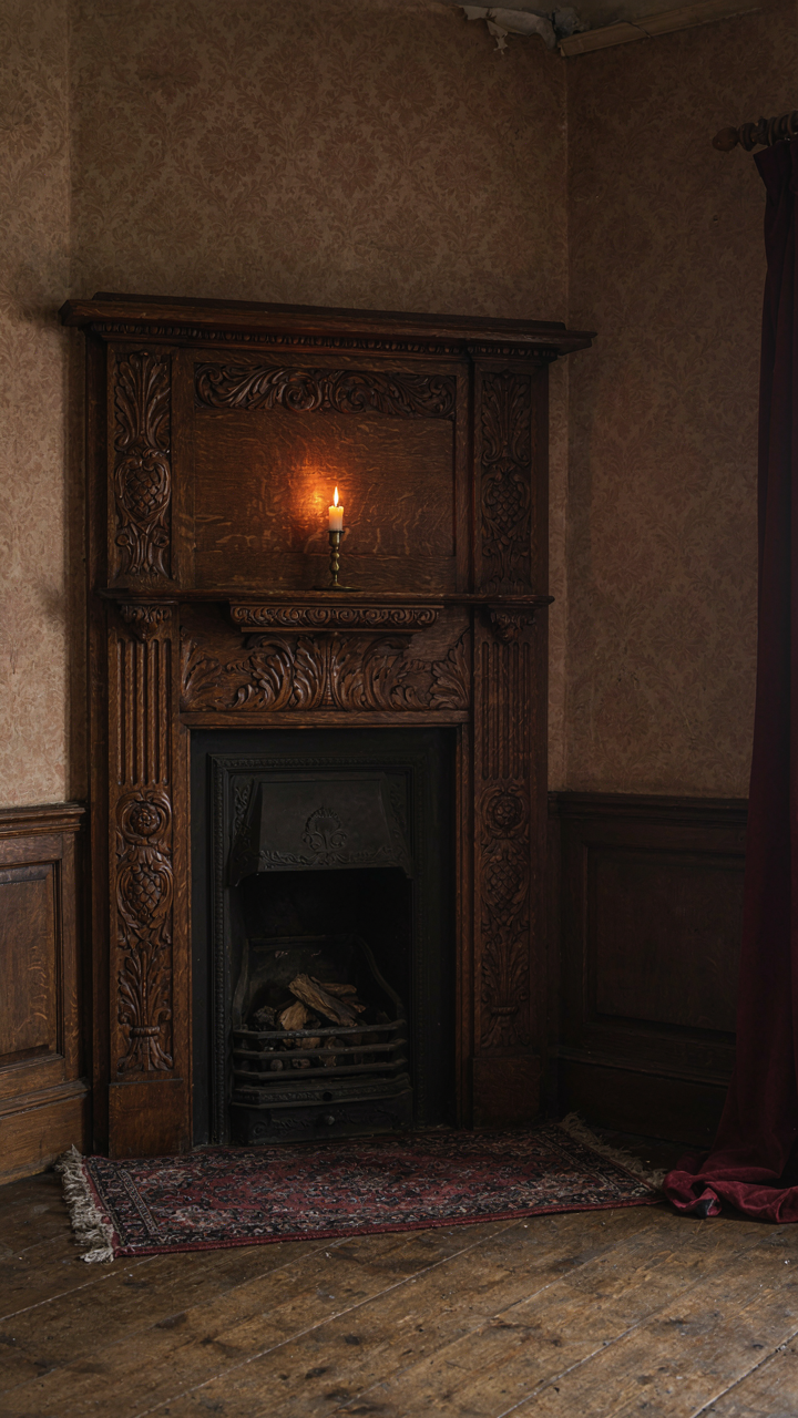
Where Every Detail Earns Its Space
You want permission to fill a small room with Victorian details without looking like a museum overflow. The real mechanism is constraint-based design: in economics, scarcity increases value. Apply that backward. In a compact cottage, fewer ornamental elements actually read as more intentional, more expensive, more controlled. Most people get this inverted and add trim, wallpaper, and fixtures until the space collapses under visual weight.

The Victorian era produced cottage designs precisely because not everyone could afford a manor. Cottages required restraint by economics, not taste. A single statement architectural feature—a fireplace with carved surround, a bay window with deep sill, crown molding in one room—creates perceived richness far more effectively than distributed ornamentation. Pick one focal point per room and let it dominate. Everything else becomes supporting architecture, not competition.
Subtract Before You Add
The common advice says layer textures and patterns for authentic Victorian feel. That’s incomplete. What actually works is this: identify the primary architectural element that already exists or can be easily installed, then build backward from there. A recessed window seat doesn’t need busy wallpaper behind it. Deep baseboards don’t need patterned carpet beneath them. Restraint is the mechanism that makes individual details visible.
In a compact cottage, visual friction compounds. Each additional pattern, color, or texture reduces the perceivable impact of every other element. Install one primary feature per room first, then wait two weeks before adding anything else. This forced pause reveals what the space actually needs versus what you thought it needed. Apply this: identify, install, observe, then decide on secondary details only if the primary element still reads as incomplete.
Victorian Exterior: The Deceptive Grandeur Protocol
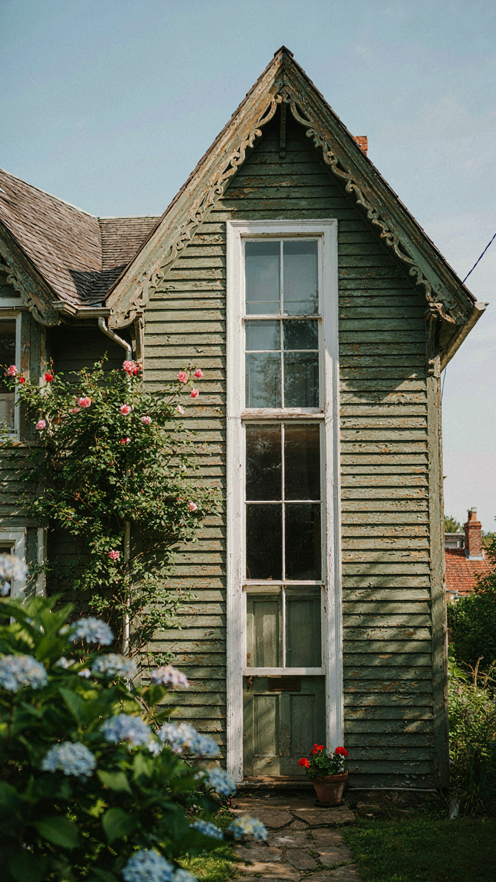
Trim Work That Rewrites Proportion
You want people to think your cottage is bigger than it actually is. That’s the real driver here. Trim operates on the same principle as a column in classical architecture: vertical lines elongate perceived height, horizontal lines expand perceived width. Victorians weaponized this. They didn’t add trim for decoration. They added it to manipulate how the eye measured the building.

Narrow vertical trim around windows and doors pulls the eye upward, making eaves feel higher than they measure. Horizontal trim bands below rooflines push the visual weight down, creating the illusion of a deeper structure. The mechanism is direct: your eye follows the line, and your brain calculates size based on line direction, not actual dimensions. A cottage with aggressive vertical trim reads taller. A cottage with strategic horizontal bands reads broader.
Color And Texture As Visual Weight
Everyone says paint your cottage a neutral color. That’s incomplete advice. Color and texture don’t just look nice. They control how light behaves on surfaces, which physically changes how large or small the structure appears to a viewer standing thirty feet away. Darker colors absorb light and recede. Lighter colors reflect light and advance. Texture does the same work through shadow depth.
Victorians used this deliberately. They painted trim lighter than siding to push trim forward visually, making it read as applied detail rather than integrated structure. Rough texture on lower portions grounds the building. Smoother texture on upper portions makes those sections feel lighter and less massive. The protocol: paint primary siding a mid-tone, trim pale or contrasting, and vary texture vertically to reset the eye’s scale calculation at each transition point.
The “Cute Victorian House” Illusion: Psychology Of Scale
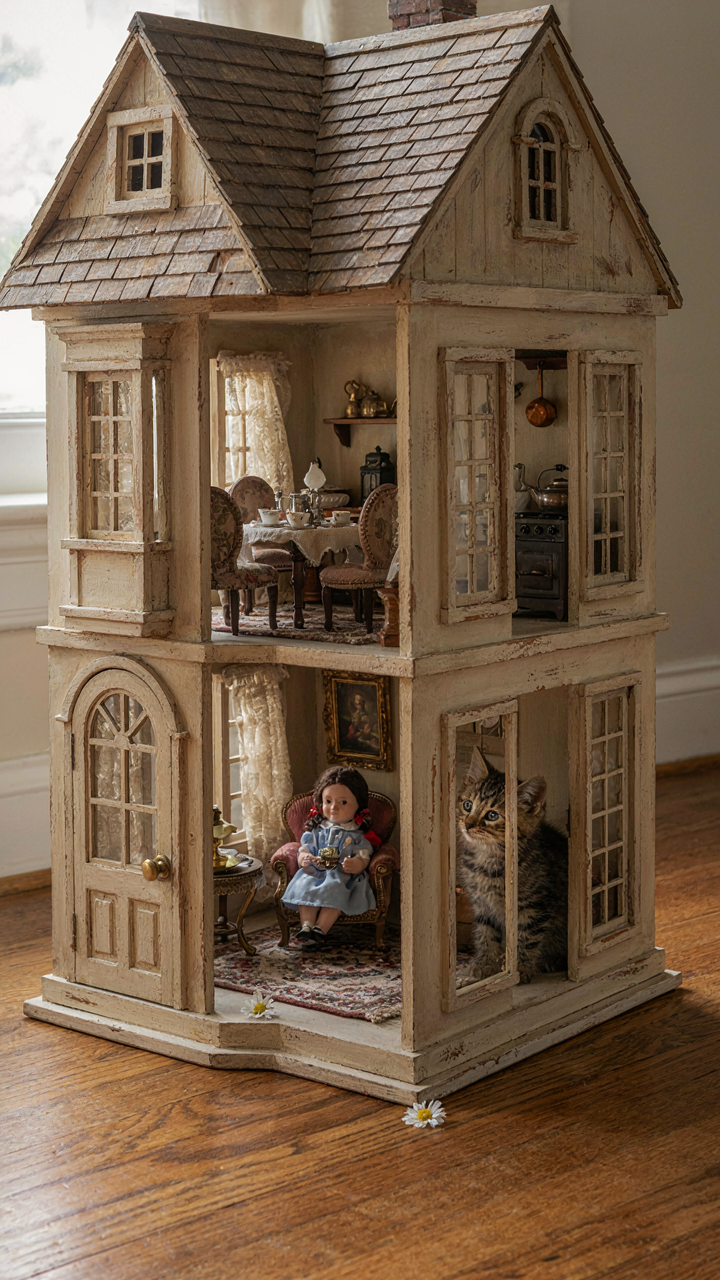
How Proportion Dictates Perceived Charm
You want a Victorian cottage because you think smallness equals coziness, and coziness equals status. That’s the motive nobody names. The real mechanism is proportion. In architecture, proportion refers to the mathematical relationship between elements—doors to walls, windows to facades, rooms to ceilings. Victorians understood this viscerally. A 10-foot ceiling in a 12-by-14-foot bedroom doesn’t feel cramped; it feels intentional. The human eye reads ratio, not square footage.

Charm is measurable. It comes from consistency in scale relationships across a space. Victorian cottages used the golden ratio and simple ratios like 1:1.5 in their room dimensions and fenestration patterns. Modern builders ignore this entirely, scaling down rooms but keeping standard ceiling heights, which breaks the proportion. When you shrink a Victorian cottage properly, every element scales down together—door frames, window panes, baseboard heights, mantelpiece depths. Skip this and you get a doll house, not a cottage.
Miniaturization Versus Thoughtful Scaling
Everyone says small spaces need light colors and minimal clutter. That’s incomplete. The difference between miniaturization and thoughtful scaling is structural, not stylistic. Miniaturization copies Victorian details at reduced size without adjusting the spatial logic—tiny crown molding in a 7-foot room, delicate fixtures that dwarf actual function. Thoughtful scaling respects the original proportional relationships while fitting modern living patterns into smaller footprints.
A genuine Victorian cottage cottage achieves scale through constraint, not downsizing. Original cottages had low ceilings by modern standards—eight to nine feet was typical—because rooms stayed warm and acoustically alive. Walls were thicker, windows smaller, trim bolder relative to wall space. When you adapt this for today, you’re not reducing everything equally. You’re prioritizing what matters: ceiling height that enables vertical space perception, window proportion that frames views correctly, door width that accommodates furniture passage, trim scale that anchors the eye rather than disappears.
Victorian Style Cottage: Curating The Narrative, Not The Museum
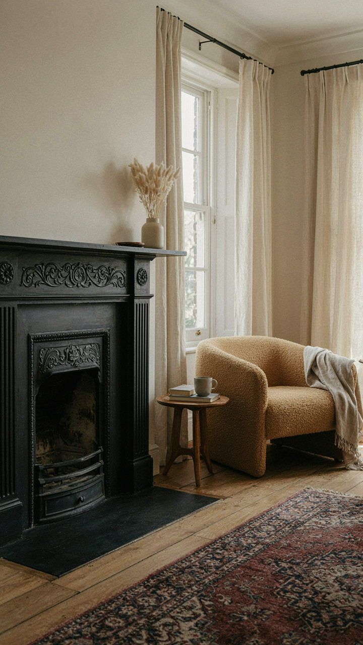
The Elements That Actually Signal Period
You want people to walk in and immediately know this is Victorian, without asking. That’s the real driver here—status through authenticity, not accident. The mechanism is constraint. Victorian design worked because strict material limitations forced coherent choices. Plaster, wood, cast iron, and tile dominated because they were available. Work within those four materials and you’ve already anchored the narrative.
- Fireplaces with cast iron surrounds: The hearth was structural necessity and visual anchor in Victorian homes. Cast iron surrounds, often ornamental but functional, create immediate period credibility and remain operational today without retrofit.
- Picture rails and dado rails: Horizontal wood molding dividing walls was practical (protected plaster from furniture damage) and aesthetic. Installing these rails, even in small rooms, signals intentional Victorian understanding rather than surface decoration.
- Sash windows with working shutters: Double-hung windows with vertical panes were standard, not decorative. Authentic shutters fold flat against the wall and function. Reproduction versions miss the mechanical honesty that made them period-correct.
- Tile work in hearths and entries: Victorian cottages used ceramic tile for durability and visual interest. Encaustic tiles with geometric patterns or simple glazed tiles anchor authenticity in high-traffic zones where wear was expected.
- Wood flooring in original layouts: Victorian cottages featured narrow-plank hardwood, typically pine or oak, laid throughout. Keeping or restoring original floorboards (or matching period-appropriate width) maintains spatial continuity without requiring full replacement.

Forget “inspired by Victorian style.” That phrasing is where authenticity dies. You either commit to materials and proportions that actually existed or you commit to honest modern function. Half measures broadcast uncertainty and waste budget on props that read as inauthentic to anyone paying attention.
Hiding Modern Requirements Without Apology
Most advice tells you to hide your electrical outlets and pretend they don’t exist. That’s cowardice. The actual mechanism here is layering—modern systems operate behind or within authentic surfaces, not alongside them pretending to belong.
Your HVAC ductwork, wiring, and plumbing are infrastructure, not design elements. Run them in walls where possible. Where they must be visible, conceal them in period-appropriate casings—wooden conduit boxing, plaster enclosure, or routing through existing architectural features like soffits and chimney chases. Modern cottage heating (radiant floor or discreet wall units) replaces Victorian radiators without creating visual conflict when installed thoughtfully. Kitchen and bathroom fixtures should function cleanly without Victorian theatricality. A simple white subway tile kitchen works because it’s visually neutral and honest about being modern plumbing, not because it “feels Victorian.” Document your modern systems clearly for future buyers and inspectors. A well-maintained cottage with updated electrical, plumbing, and HVAC is more valuable and livable than one strangled by period-correct fantasy.
Victorian Cottage Exterior: The Front Yard As A Framing Device
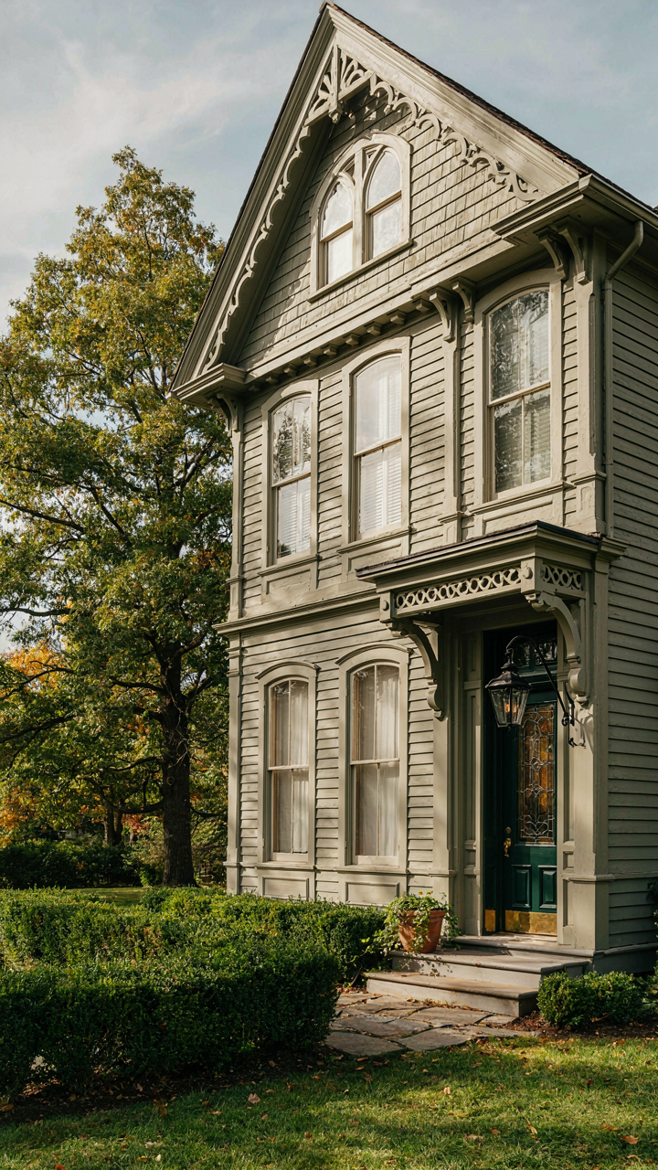
Landscaping That Directs Attention To Structure
You want the front yard to make your cottage look intentional, not accidental. That’s the real driver here. The mechanism is borrowed from architecture itself: negative space. Victorian cottages work because they sit inside a composed frame, not because they’re buried under ornament. The landscaping isn’t decoration. It’s a visual argument that says “look at this building.”

The cottage exterior only reads as Victorian when the eye lands on specific details: the pitched roofline, the proportional windows, the material transitions. Overgrown or shapeless planting obscures those details. Strategic clearing does the opposite. Remove sight lines that compete. Keep plantings low enough along the front facade that the wall plane and fenestration remain the focal point. This isn’t about minimalism. It’s about controlled contrast.
Plants That Serve The Composition
Most Victorian cottage advice pushes roses and lavender because they “look period.” That’s incomplete. Period-appropriate plants matter less than plants that don’t fight the architecture. The real work is selecting species that maintain form, stay contained, and don’t demand constant intervention.
Boxwood, yew, and privet do this work. They accept pruning. They hold structure through seasons. They read as deliberate boundaries rather than wild growth. Herbaceous plants like catmint work if grouped densely and cut back hard after bloom. The principle is simple: plants either frame the cottage or they compete with it. Choose species that accept their role as supporting elements, not the show.
Small Victorian Cottage: Mastering The Art Of Strategic Omission
What Actually Needs To Go
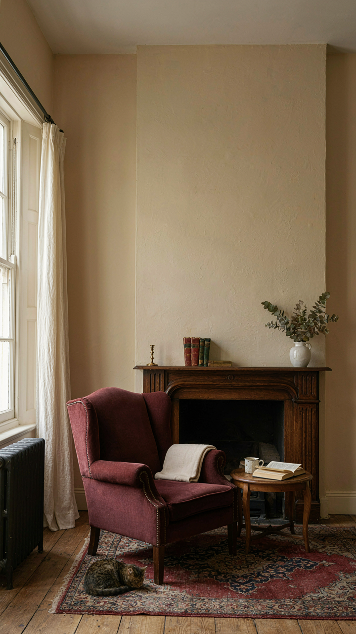
You’re hoping that removing clutter will magically make your space feel bigger and more valuable. Here’s the mechanism: Victorian design rewards specificity, not abundance. Every object in a small cottage competes for visual weight. Victorians didn’t fill rooms with everything at once—they layered pieces seasonally and functionally. The real constraint isn’t square footage. It’s decision fatigue. You remove what doesn’t earn its place through either utility or genuine visual contribution.

Start by identifying pieces that serve no function beyond “I thought it looked nice.” Decorative plates stacked three deep on a wall. Figurines crowding a mantelpiece. Throw pillows that outnumber seating. In a compact Victorian cottage, each item must justify itself. Remove duplicates first. One ornate mirror per room, not four. One side table, not two. The cottage doesn’t need more things. It needs fewer things, chosen with intention.
Breathing Room As Architecture
In physics, a vacuum isn’t empty—it’s a force. Apply that logic to your cottage: blank wall space isn’t wasted area. It’s an active design element that makes what remains visible. Small Victorian cottages suffered historically because they were densely packed. Modern restoration work proves the opposite works better. Walls need to breathe. Mantelpieces need sight lines. Shelves need gaps between objects.
The practical move: measure the wall space. If 60 percent is covered, reduce to 40 percent. Leave the upper third of walls bare. This creates visual height in low-ceilinged rooms common to Victorian cottages built before 1900. A single oil painting or print on a large expanse of wall reads louder than five pieces clustered together. The mechanism is contrast. Negative space makes positive objects impossible to ignore.
Victorian House Front Yard: The “Welcome Mat” Effect
How Pathways Control Narrative
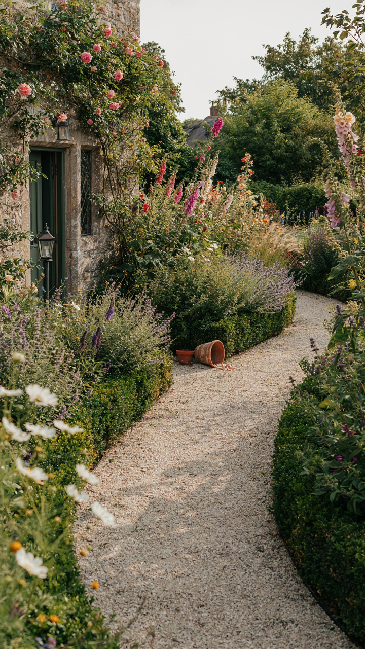
You want people to see your house and think you have taste, not just money. That’s the real reason you care about the entrance sequence. Pathways work like narrative structure in writing: they force the viewer’s eye through a predetermined experience. Victorian cottages used this ruthlessly. A straight path from street to door reads as utilitarian. A curved path with vegetation screening creates anticipation because the brain processes partial information as more valuable than immediate revelation.

The Victorian approach wasn’t accident. Cottage owners designed pathways to hide the full facade until the visitor reached a specific point. Stone, gravel, or packed earth materials created texture underfoot that signaled transition from public to private space. Width mattered too. Narrower paths on approach, wider at entry, manipulated perceived distance and slowed foot traffic psychologically. The mechanism isn’t beauty. It’s withholding information until the optimal moment of reveal.
Stacking Depth Without Square Footage
Common advice says add more plants. That’s incomplete. What actually works is borrowing from architecture’s principle of setback progression: each receding layer must occupy less visual weight than the one before it. In Victorian cottage yards, this meant front hedging set tight to the property line, then a gap, then secondary plantings, then the cottage itself. Each layer sits further back, so your eye travels through distinct planes instead of seeing everything at once.
Border plants were typically lower than foundation plantings, which stayed lower than the cottage mass. This vertical rhythm creates the illusion that the lot extends deeper than it actually does. Iron railings or low stone walls between layers amplified the effect by adding horizon lines. The practice wasn’t decorative filler. It was spatial compression achieved through deliberate hierarchy. To apply this: identify your three depth zones from street to door, assign each a material or plant height tier, and maintain the descending visual weight throughout.
Cottage Victorian House: Investing In Impact, Not Inventory
The Decisions That Actually Signal Period
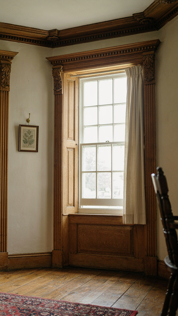
You want people to notice you restored a Victorian cottage properly, not just that you spent money. Here’s the mechanism: Victorian design operates on constraint, not abundance. The Victorians didn’t fill every surface because they had unlimited resources—they did it because industrial production made ornament cheap relative to clean craftsmanship. Reverse that equation. Focus your budget on what commands attention from ten feet away, not what fills drawers.
Crown molding, fireplace mantels, and window casings represent 80 percent of perceived authenticity in a Victorian cottage interior. These elements sit in your direct line of sight constantly. A poorly restored cottage shows bad millwork instantly. Good millwork reads as period-correct without announcing itself. Strip the impulse to furnish every room densely. A sparsely furnished Victorian cottage with correct trim reads richer than an overstuffed one with lazy finishes.
Where Money Moves, Where It Stalls
This advice about “investing in what matters” is incomplete garbage when applied to cottages. You can’t skimp on hidden systems and expect the visible ones to hold value. The real trade is between structural integrity and decorative restoration. A Victorian cottage with sound joists, stable foundations, and functioning systems survives fifty years. One with pristine wallpaper and rotting window frames becomes someone else’s problem.
Spend aggressively on roof, foundation, plumbing, and electrical updates before touching a single period detail. These systems cost money whether visible or not, and they determine whether the cottage remains livable. Only after systems are solid should you allocate remaining budget to millwork, hardware, and finishes. The cottage teaches this plainly: poor bones kill period authenticity faster than any aesthetic choice.
The Real Charm Of A Victorian Cottage Isn’t In Its Past, But In Your Present Intentionality
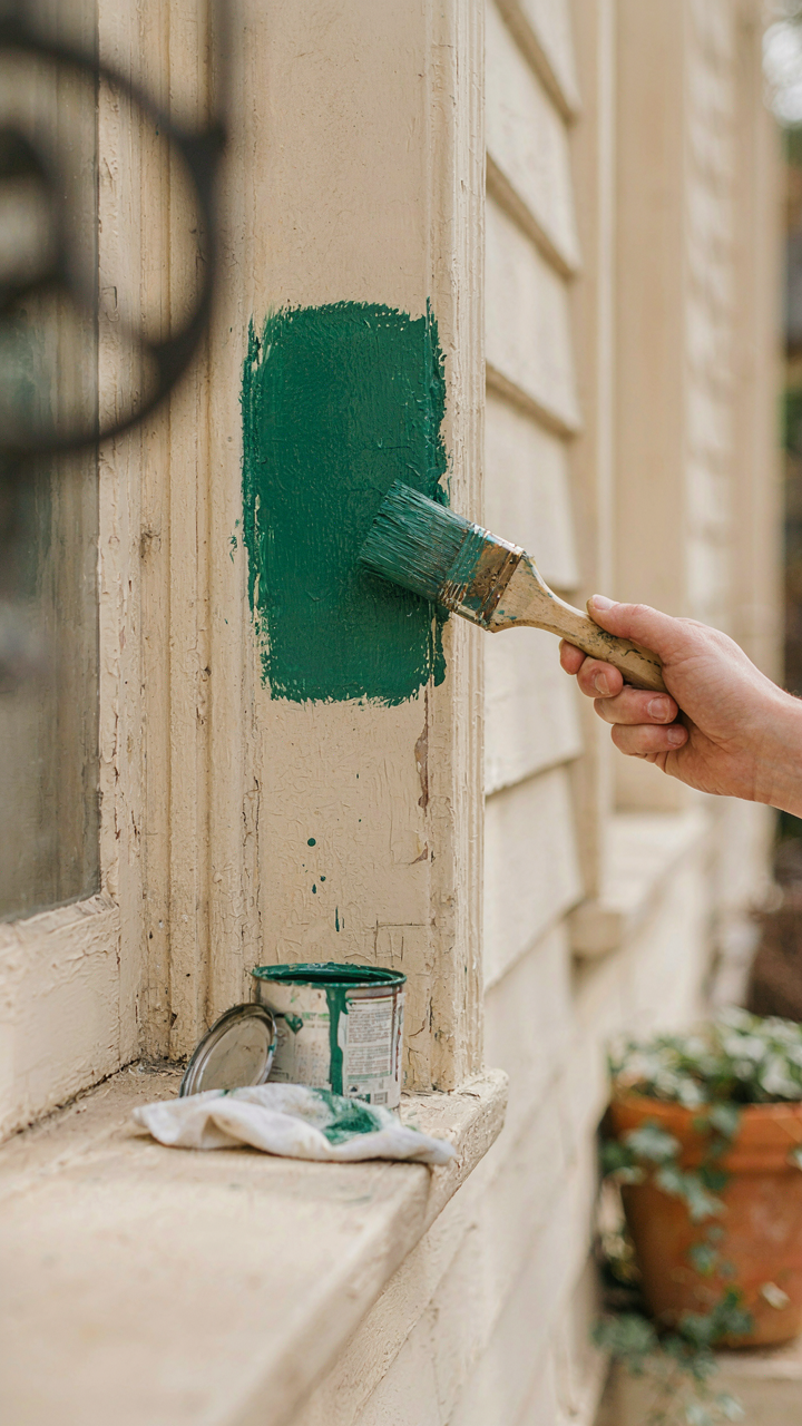
Most people romanticize Victorian cottages and then do nothing. They scroll, pin boards, and imagine. You’re different because you’ll pick one element today and commit to it. Not the whole aesthetic. One thing. A color palette. A fireplace detail. A garden corner. The cottages that actually work aren’t museums. They’re homes where someone decided what mattered and stopped chasing everything else. Your Victorian cottage doesn’t need perfection. It needs your conviction.



