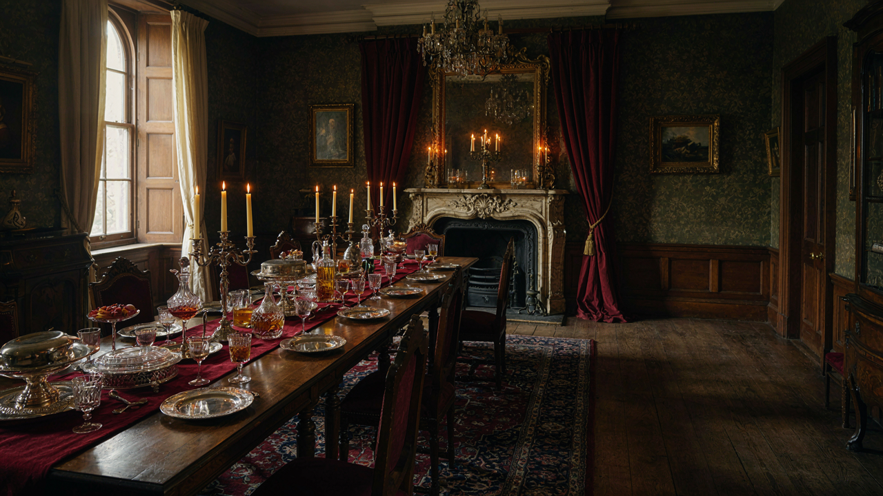
The Victorian Dining Room: A Stuffy Specter Or Strategic Statement?
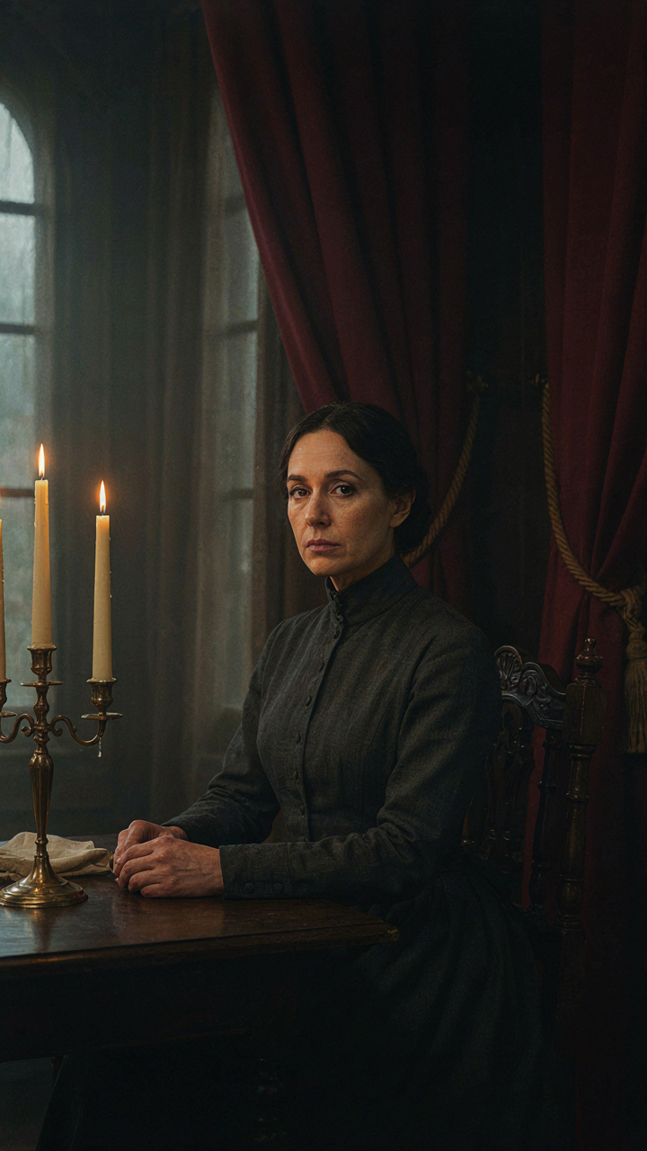
Why Formality Fails Without Structure
You want your dining room to signal taste and control. Most people assume “formal” means dark wallpaper, heavy furniture, and rigid seating. That’s not formal. That’s just expensive clutter masquerading as taste. Real formality in the Victorian era worked because it followed a protocol. The Victorians designed their dining rooms around the actual mechanics of how people move, sit, and interact during a meal. Without that underlying system, you get a room that feels like a museum nobody wants to visit.
The common advice says to buy period furniture and call it done. Wrong. Victorian dining rooms succeeded because they solved a specific problem: how to seat dozens of people in a room where the host controls the entire experience. The tablecloth wasn’t decoration. The placement of the sideboard wasn’t aesthetic. Every element enforced a hierarchy and a rhythm to the meal. Your formal gathering fails when you decorate without this logic. You’re arranging objects instead of engineering behavior.
The Strategic Use Of Constraint
Discomfort is a tool in thermodynamics, and your Victorian dining room operates by the same principle. Heat doesn’t flow evenly through a space. It concentrates where resistance exists. The Victorians built dining rooms with high ceilings, narrow windows, and heavy drapery. This wasn’t romantic. This was functional constraint. The room stayed cool in summer. The candlelight stayed focused. Guests stayed alert instead of sprawling across chairs like they own the place.
Modern formal dining fails because we’ve removed all constraint. We make chairs comfortable. We brighten every corner. We remove friction. The result: gatherings feel loose, unfocused, and cheap. When you introduce deliberate constraint, guests shift their behavior. A straight-backed chair demands posture. A single candelabra forces people to lean in to see faces. Constraint creates engagement. The mechanism is simple: remove comfort and you remove passivity. Your guests arrive ready to perform instead of zone out.
Beyond Beige: Escaping The Generic Victorian Dining Room Trap
The Rules Nobody Names
You want to feel safe. That’s the real reason you’re reading this—you don’t want to make a choice that reads as wrong. The Victorian dining room operates like game theory: there are unspoken moves everyone copies, and deviation signals either ignorance or wealth enough to ignore consensus. Most people follow these moves without seeing them as choices at all.

The real structure comes down to three invisible rules. First: darker walls signal formality and expense. Second: symmetry everywhere communicates control. Third: historical accuracy matters only insofar as it signals you know the rules well enough to follow them. Break rule one and your room feels cheap. Break rule two and it feels chaotic. Break rule three and people question your taste without knowing why. These aren’t laws of physics—they’re social proof masquerading as design principle.
Color And Proportion Over Dogma
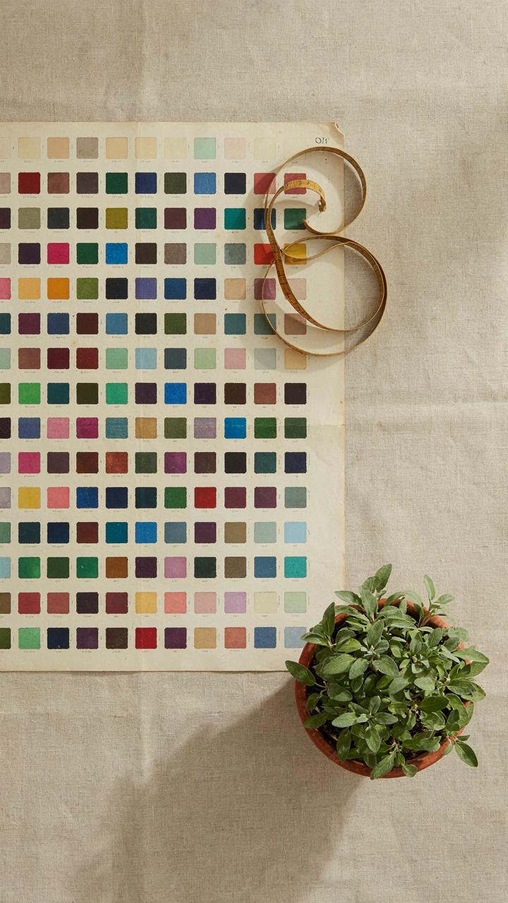
Everyone tells you Victorian means deep jewel tones. That’s incomplete. The real mechanism is contrast and light management, not color prescription. A Victorian dining room that works uses color to force your eye into specific zones—typically darker walls with a lighter ceiling to prevent the space from collapsing inward. But the actual color depends entirely on your room’s natural light source and window placement, not on what worked for someone else’s 1870s mansion.
Test this: paint one wall in the color you think Victorian demands, then live with it for two weeks. If the room feels smaller because light dies at the entrance, you’ve sacrificed function for historical aesthetic. The proportion rule works backward from most advice—constraint the width of your darker zone by your ceiling height and window ratio, not by era-appropriate color charts. If your ceiling is eight feet and your windows face north, a forest green wall will crush the room. Adjust down to sage. This is the step most people skip.
The Ornate Decor Deception: More Isn’t Always More In A Victorian Style Dining Room
When Maximalism Becomes A Liability
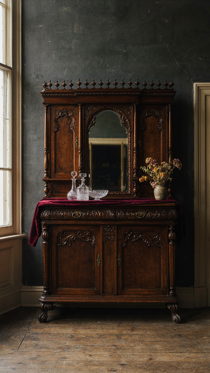
You think stuffing a room with ornamental pieces signals taste and wealth. That’s the real motive here, and it backfires. Victorian design actually works like architectural load-bearing: every element either supports the structure or weakens it. The Victorians themselves understood proportion. They layered pattern and texture with restraint, not chaos. A heavily carved sideboard dominates a wall. A mahogany table anchors the room. These pieces breathe because nothing fights for attention.

The mistake most people make is confusing Victorian with cluttered. The era produced excess, yes, but successful dining rooms in the 1800s deployed abundance strategically. A wallpapered wall supported one focal point, not three competing ones. Curtains framed windows without drowning them. Ornament appeared where construction naturally created it: chair rails, cornice molding, table legs. Adding more than this creates visual noise that collapses the room’s hierarchy.
Where The Eye Should Stop
A focal point in interior design functions like a thesis statement: everything else serves it. In a Victorian dining room, your focal point should be a single architectural or furnishing element that commands the space without needing backup. The fireplace mantel, if present, works because it’s fixed. A substantial sideboard works because it’s proportional to the room. A chandelier works because it occupies the ceiling’s natural power zone.
Here’s what kills this: treating the room like a stage for every piece you own. Spreading visual weight across four walls means the eye never settles, which triggers fatigue in guests. Instead, assign one wall as your anchor. Place your most significant piece there, whether that’s the sideboard or a mirror in an ornate frame. Leave the remaining three walls simpler. This creates depth and allows the room to function as a space for gathering, not a museum display where people feel observed by objects.
Edwardian Dining Room Influence: Subtle Shifts, Monumental Impact
When Less Becomes The Status Signal
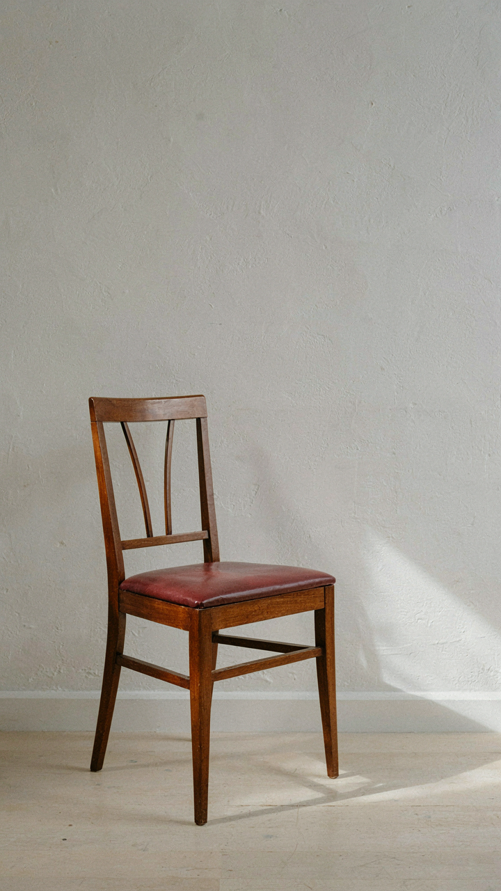
You want this section because you’re worried your Victorian dining room reads as cluttered instead of curated. Here’s the mechanism: Victorian design prioritizes abundance as proof of wealth. Edwardian design inverts this. It uses restraint as proof of confidence. The Edwardians didn’t reject Victorian forms. They edited them. They removed the ornament that didn’t earn its place. This shift happened between roughly 1901 and 1910, a narrow window where taste reversed itself entirely without abandoning the period’s bones.

The practical difference lives in surface tension. Victorians loaded every wall, table, and chair leg with carving, inlay, or applied decoration. Edwardians kept the architectural bones but stripped away the noise. Think of it in musical terms: Victorian is tutti, Edwardian is the same orchestra playing half the notes. A mahogany sideboard doesn’t need acanthus leaves climbing its legs to convey quality anymore. The wood grain itself becomes the statement. This reframing matters because it solves the real problem most people face: how to make a formal dining room feel intentional rather than inherited.
Taking The Edit, Not The Excess
The common advice says “blend periods.” That’s lazy. You don’t blend. You transplant specific restraint mechanisms from the Edwardian moment into your Victorian frame. Keep the proportions, the room height, the marble top tables. Eliminate the fussy applied ornament, reduce the upholstery pattern density, and let negative space work for you. The Edwardians inherited the same chairs, walls, and hardware as their predecessors. They simply demanded less visual competition per square inch.
Start by auditing your existing pieces. If a chair has carved legs, keep them. If it has carved legs plus upholstered details plus nailhead trim plus heavy fringe, the fringe goes first. A Chippendale-style dining chair reads formal without a contrasting trim band on the seat cushion. Pare back the table linens from damask with Madeira lace overlay to a single quality linen cloth. The table shape, the wood, and the silver placement settings carry the formality now. This isn’t minimalism. It’s controlled hierarchy.
The Modern Victorian Dining Room Protocol: Blending Eras For Timeless Authority
When Constraints Become Your Competitive Advantage
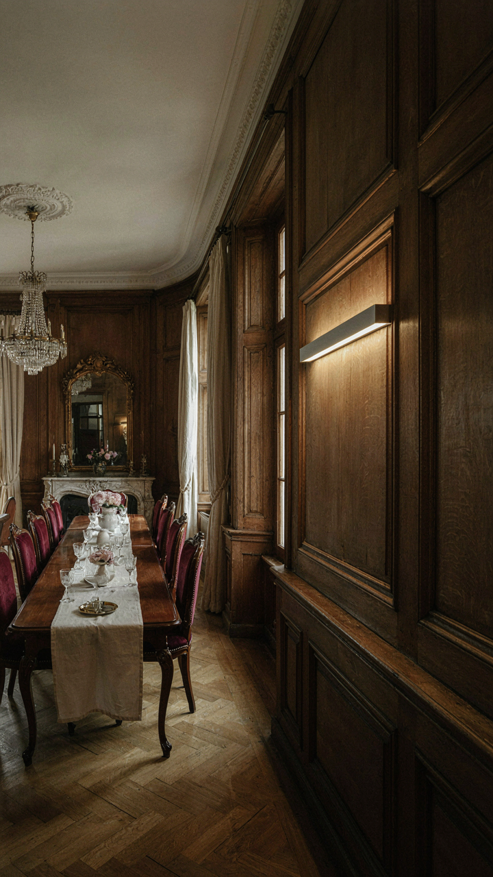
You want this section because you’re afraid a fully Victorian room reads as museum piece, killing any chance of seeming current. The real mechanism at work here is constraint-based design: Victorian dining rooms succeed precisely because their formal rules create a skeleton you can modify without the structure collapsing. Paleontologists call this punctuated equilibrium, the idea that evolution doesn’t move in smooth curves but in sudden jumps within stable frameworks. A Victorian dining room operates the same way, your changes land harder because the baseline period aesthetic absorbs them without losing identity.

The Victorian era locked certain non-negotiables into place: symmetry, layered materials, intentional formality, and clear zones for different functions. These aren’t limitations you fight. They’re load-bearing walls you work inside. When you introduce a modern material or contemporary art piece, it reads as deliberate choice rather than confusion because the period framework holds firm. The room doesn’t become “Victorian-ish” or “modern-Victorian.” It becomes a Victorian room making a specific statement about 2024.
Fusion Means Editing, Not Adding
Most advice tells you to “blend” eras. That’s incomplete. Fusion only works when you remove something first. The common mistake is layering modern onto Victorian like you’re decorating, not designing. You keep the heavy drapes, add sleek lighting, throw in a contemporary rug, and end up with visual noise that serves no authority. Real fusion requires you to identify what the Victorian dining room does well that modern spaces abandon, then let that strength breathe by removing unnecessary period detail elsewhere.
Start by keeping the architectural bones: the molding, the ceiling height plays, the formal table placement. Strip away one unnecessary layer of ornamentation that typical Victorian rooms feature, like excessive wall paper or redundant textile layers. Replace that removed layer with one modern element that serves a function Victorians didn’t have access to, like integrated lighting or acoustic treatment. The room reads unified because you’ve made a trade, not an accumulation. The final step is living in that specific configuration for two weeks before adding anything else.
Victorian Home Dining Room Lighting: Engineering Atmosphere, Not Just Illumination
Light As Territorial Control
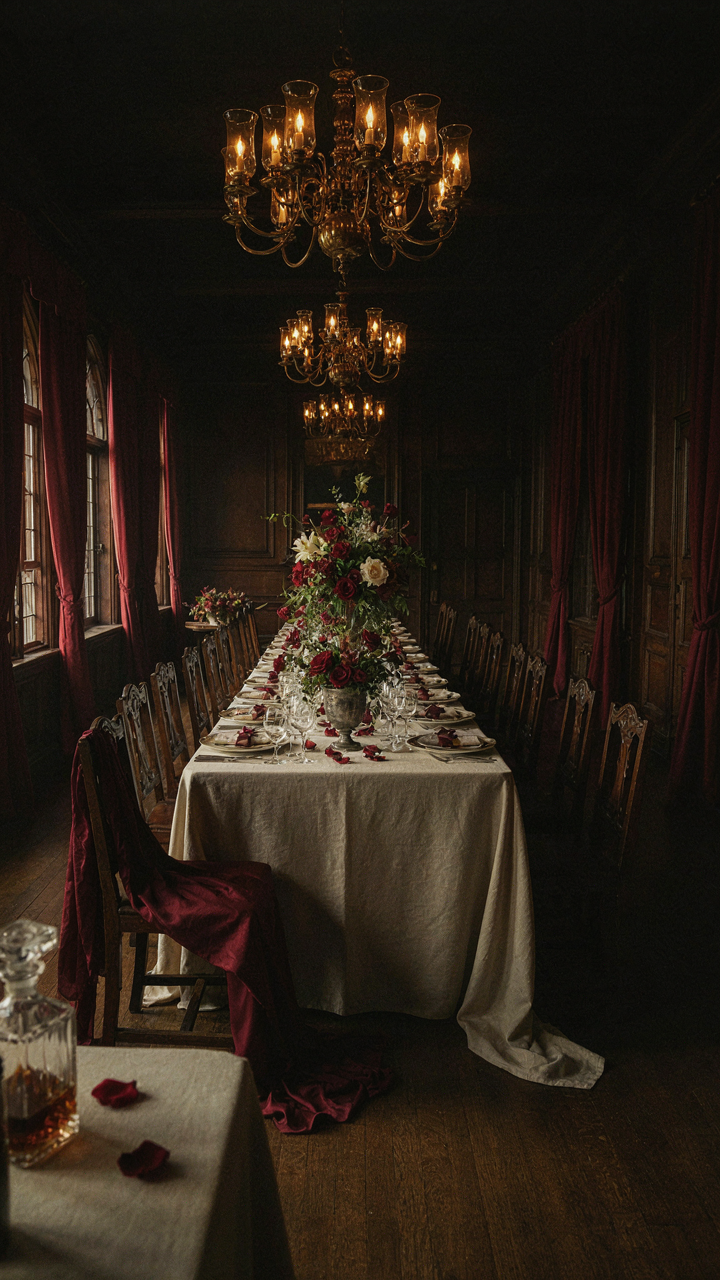
You want people to feel like they’re in your world when they sit at your table. That’s the real reason lighting matters here. Victorians understood this through military strategy: concentration of force. Candlelight and gas fixtures weren’t distributed evenly across a room. They targeted the table itself, leaving perimeter walls dim. This created visual hierarchy. Your guests focused downward on food, faces, and conversation. The room dissolved into shadow beyond arm’s reach. Control the light, control where attention lives.

Gaslight burners, introduced in the 1820s, gave Victorians their first tool for precision illumination. They mounted them on walls above the sideboard or centered on the ceiling to cast light downward onto the dining table. The mechanism was brutal and effective: concentrate brightness where status displays happen—the meal, the silver, the china—and let everything else fade. This wasn’t decoration. This was architecture for human behavior.
Shadow Architecture For Spatial Depth
The consensus advice says “add more light for elegance.” Wrong. Victorians added calculated darkness. Shadow isn’t absence of light. It’s the strategic placement of it, which creates depth perception. Your brain interprets sharp contrast between bright and dim as distance. A fully lit dining room feels flat and shallow. A lit table surrounded by shadow feels cavernous and intentional. The room becomes bigger because your eye can’t measure its edges.
Candelabras placed on the table and sideboards created pools of light separated by dark zones. The corners stayed dim. Alcoves receded further. This wasn’t accident or budget constraint. This was intentional depth engineering. When you dine in shadow-play lighting, the space feels substantial. Your guests can’t see the room’s actual dimensions, so their minds construct something grander. Install your light sources at table level and above it, leaving walls and floor transitions dark. The room proves larger than its actual square footage.
Curating The Victorian Dining Room Decor: Artifacts, Not Just Objects
Every Object Needs A Reason For Being There
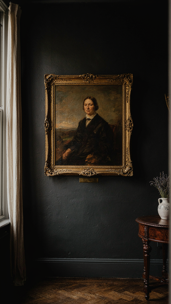
You want your dining room to broadcast taste without looking like you tried. That’s the real motive here. But the mechanism is borrowed from archaeology: Victorians didn’t collect objects—they collected narratives. Each piece had provenance, purpose, and a story that justified its placement. A Meissen porcelain service wasn’t decoration. It was proof of access to Continental trade routes. A mahogany sideboard wasn’t furniture. It was documentation of a specific historical moment when that wood arrived in England.

The trap most people fall into is treating curation like interior design—picking things that match. Wrong. You’re building a timeline. Start with one anchor piece from the 1850s-1880s that reflects your actual interest, not what looks good in photos. Everything else serves that piece. A single oil painting from that era, a specific furniture maker, a particular china manufacturer. Once you commit to that center, the rest of the room assembles itself because you’re not choosing randomly anymore.
When Display Cases Become Dead Weight
This is where conventional advice fails completely. People think the solution to “busy” is “less stuff.” It’s not. The problem is disconnection. A room full of unrelated objects feels cluttered. A room full of related objects feels intentional. The difference lies in visual hierarchy through narrative, not through negative space.
- Dining table as anchor: Choose one era-specific table that becomes the reference point. Everything else calibrates to its wood tone, proportions, and construction method from that period.
- Matching service sets: Victorian tables used coordinated china, glassware, and flatware intentionally. Buy one complete service from a single manufacturer rather than scattered pieces.
- Sideboards as storytellers: Position one sideboard to hold pieces that show active use—serving pieces from the same era and maker, not random decorative objects.
- Wall treatment as frame: Paint or paper that reflects the period of your anchor pieces. This constrains the visual field so each object reads as part of one collection, not a museum.
- Lighting as function: Gas light fixtures or their convincing electric replicas from the specific Victorian decade you’re referencing. Period-appropriate lighting makes every other object read correctly.
The mechanics are simple: establish one clear period reference, source pieces that cluster around that reference, and let empty wall space exist. When someone enters the room, they should sense coherence before they sense fullness. Remove anything that breaks the timeline—a Regency piece in an 1870s room is visual noise. Your job is elimination, not accumulation.
Maintaining Your Dining Room Victorian Edge: Beyond The Initial Setup
Evolving The Space With Intent
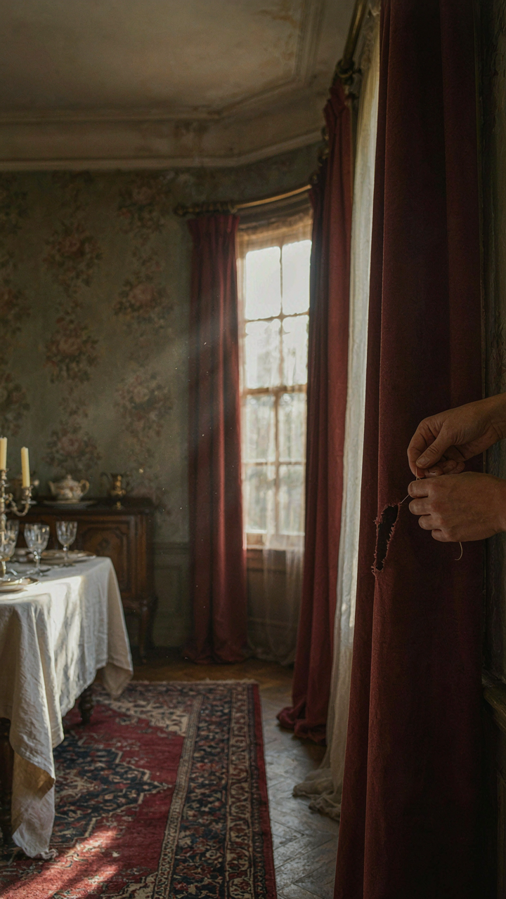
You care about this because you’re afraid the room will feel dated the moment you stop thinking about it. Here’s what actually happens: Victorian dining rooms decay through neglect disguised as stability. Treat maintenance like compound interest in design—small interventions now prevent the collapse later. The space either holds its period integrity or gradually absorbs whatever you throw at it next.

Fabric fades. Wood darkens unevenly. Finishes dull. These aren’t aesthetic problems yet—they’re signals that the room’s original language is disappearing under a layer of accident. Victorian dining rooms demand intentional choices about what changes and what stays fixed. Decide which elements carry the period forward and which ones service function. This distinction separates a maintained room from a neglected one that happens to have old furniture in it.
Resisting The Urge To Finish It
The common advice is wrong: a Victorian dining room is never finished, and treating it like a project with an endpoint kills it. Your real instinct is to fill gaps and declare completion. Instead, restraint is the actual mechanism at work here. Each addition should answer a specific problem, not fill dead air or complete a mental checklist.
Leave breathing room. Victorian interiors were crowded by modern standards, but they were crowded with purpose, not anxiety. A wall that feels bare probably is bare—and that’s functional. The room improves when you add something that genuinely serves the next gathering, not when you achieve some imaginary aesthetic threshold. Approach updates on a three-year cycle, not a three-month sprint.
The Real Problem Isn’t The Decor; It’s Your Timid Imagination
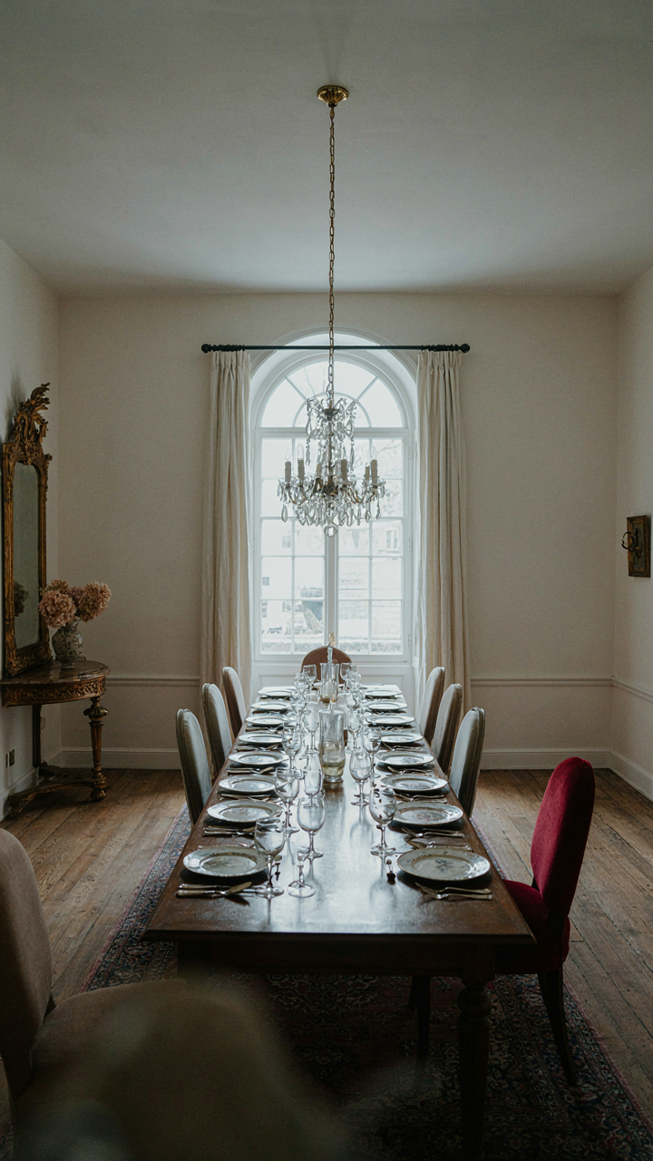
Most people inherit Victorian dining room aesthetics instead of owning them. They copy, they play it safe, they apologize for darkness with too many mirrors. The mechanism that separates a stunning formal space from a forgettable one isn’t furniture. It’s conviction. Pick one element today—a chandelier, a wall color, a fabric—and commit to it without hedging. The room transforms the moment you stop seeking permission to exist in it.